10,000 search results
(0.034 seconds)
- Sambelethok by RGB Studio,
$19.00 Sambelethok an excellent font for modern hand-lettered logo designs. Sambelethok is a font intended for logotype creation. But with almost 500 glyphs inside the font, you can also create many of other typography designs. Stylistic Alternates, Swashes, Contectual Alternate and Ligatures is a list of features from OpenType which you can use to pairing the letters each other powerfully. This font is great for your next creative project such as Logotype, printed quotes, invitations, cards, product packaging, headers, Letterhead, Poster, Apparel Design, Label, and etc. Files Include : Basic Latin A-Z and a-z Numbers Symbols PUA Encode Multilanguage Support Thanks and have a wonderful day, If you have any questions, please get in touch with us Don't forget to check out our other products.
 - Kremlin Pro by ParaType,
$30.00 The first version of Kremlin was designed at ParaType (ParaGraph) in 1995 by Tagir Safayev. Based on an informal handwriting. Kremlin is a Russian word for a fortress or a citadel. The reason why the author selected this word for the font name is not quite clear even for him. Probably the appearance of the text line set in this font resembled a tight fence. Later the font was expanded in character set and got two style variations with extended proportions. The suffix "Pro" in the name was added to distinguish the new version from the previous one. The derivative work was done by Dmitry Kirsanov and Gennady Fridman in 2010. The font is recommended for advertising and display typography.
 - Ivory Coast by Aminmario Studio,
$20.00 Introducing Ivory Coast font is modern and elegant handwritten with a quick stroke pen effect. Comes with regular and italic. With built in Opentype features, this script comes to life as if you were writing it yourself. This font is great for your creative projects such as watermark on photography, and perfect for logos & branding, photography, invitation, watermark, advertisements, product designs, stationery, wedding designs,label, product packaging, social media, movie titles, books titles, a short text even a long text letter and good for your secondary text font with sans or serif. And also for special events or anything that need handwritting taste. Don't hesitate if you have any questions. Thanks for checking out this font. I hope you enjoy it! AminMario
 - Gundrada ML by HiH,
$12.00 Gundrada ML was inspired by the lettering on the tomb of Gundrada de Warenne. She was buried at Southover Church at Lewes, Sussex, in the south of England in 1085. The Latin inscription on her tomb, STIRPS GUNDRADA DUCUM, meaning “Gundrada, descendant of the Duke” may have led to the speculation that she was the daughter of William, Duke of Normandy and bastard son of Robert the Devil of Normandy and Arletta, daughter of a tanner in Falaise. In 1066 William defeated Harold at the Battle of Hastings and was crowned William I of England. More commonly known as William the Conquerer, he commissioned a string of forts around the kingdom and charged trusted Norman Barons to control the contentious Anglo-Saxon population. William de Warenne, husband of Gundrada, was one of these Barons. There has also been the suggestion that Gundrada may have been the daughter of William’s wife, Matilda of Flanders, by a previous marriage. According to the Dictionary of National Biography (Oxford University Press, Oxford, England 1921-22), both of these contentions are in dispute. Searching the past of a thousand years ago is like wandering in a heavy fog: facts are only dimly in view. Regardless, I know that I found these letterforms immediately engaging in their simplicity. Unadorned and unsophisticated, they have a direct honesty that rests well in the company of humanistic sans serifs like Franklin Gothic or Gill Sans, appealing to a contemporary sensibility. The lettering on the tomb is in upper case only. Although Gundrada does not sound Norman French to me, her husband certainly and her father probably were Norman French. Nonetheless, the man that carved her tombstone was probably Anglo-Saxon, like most of the people. For that reason, we are quite comfortable with a fairly generic lower case from an Anglo-Saxon document of the time. The time was a time of transition, of contending language influences. This font reflects some of that tension. Features 1. Multi-Lingual Font with 389 glyphs and 698 Kerning Pairs. 2. OpenType GSUB layout features: onum, dlig, liga, salt & hist. 3. Tabular Figures and Alternate Old-Style Figures. 4. Alternate Ruled Caps (line above and below, matching to brackets). 5. Central Europe, Western Europe, Turkish and Baltic Code Pages. 6. Additional accents for Cornish and Old Gaelic. 7. Stylistic alternates A, E, y and #. 8. Ligatures ST, Th, fi and fl. 9. Historic alternate longs. The zip package includes two versions of the font at no extra charge. There is an OTF version which is in Open PS (Post Script Type 1) format and a TTF version which is in Open TT (True Type)format. Use whichever works best for your applications.
 - Copihue by Letritas,
$30.00 Copihue is the newest font from the foundry of Juan Pablo De Gregorio. A Sans-Serif with some humanist hints, it displays simple and subtle yet sober, vivid strokes. This font’s personality unfolds itself as long as we are reading it. The aim of Copihue is neither to be as neutral as a grotesque font nor to become as predictable as a fully geometric typeface can be. This typography wants to appeal to the likes of designers who prefer all-rounder fonts, the ones who fit well in most layouts. With this purpose in mind, Juan Pablo studied elements of different typefaces and styles to cast them into Copihue, which boasts a personality that makes it a great fit for different compositions and designs. Copihue has a slanted version with "real italics". These italics are slightly more condensed than the regular version, in order to give it a different text texture. The typeface has 9 weights, ranging from “hair” to “black”, and two versions: "regular" and "italic". Its 18 files contain 749 characters with ligatures, alternates, small caps, oldstyle and tabular numbers, fractions, and case sensitive figures. It supports 219 Latin-based languages, spanning through 212 different countries. Copihue supports this languages: Abenaki, Afaan Oromo, Afar, Afrikaans, Albanian, Alsatian, Amis, Anuta, Aragonese, Aranese, Aromanian, Arrernte, Arvanitic (Latin), Asturian, Atayal, Aymara, Bashkir (Latin), Basque, Bemba, Bikol, Bislama, Bosnian, Breton, Cape Verdean Creole, Catalan, Cebuano, Chamorro, Chavacano, Chichewa, Chickasaw, Cimbrian, Cofán, Corsican Creek,Crimean Tatar (Latin),Croatian, Czech, Dawan, Delaware, Dholuo, Drehu, Dutch, English, Estonian, Faroese, Fijian Filipino, Finnish, Folkspraak, French, Frisian, Friulian, Gagauz (Latin), Galician, Ganda, Genoese, German, Gikuyu, Gooniyandi, Greenlandic (Kalaallisut)Guadeloupean, Creole, Gwich’in, Haitian, Creole, Hän, Hawaiian, Hiligaynon, Hopi, Hotc?k (Latin), Hungarian, Icelandic, Ido, IgboI, locano, Indonesian, Interglossa, Interlingua, Irish, Istro-Romanian, Italian, Jamaican, Javanese (Latin), Jèrriais, Kala Lagaw Ya, Kapampangan (Latin), Kaqchikel, Karakalpak (Latin), Karelian (Latin), Kashubian, Kikongo, Kinyarwanda, Kiribati, Kirundi, Klingon, Ladin, Latin, Latino sine Flexione, Latvian, Lithuanian, Lojban, Lombard, Low Saxon, Luxembourgish, Maasai, Makhuwa, Malay, Maltese, Manx, M?ori, Marquesan, Megleno-Romanian, Meriam Mir, Mirandese, Mohawk, Moldovan, Montagnais, Montenegrin, Murrinh-Patha, Nagamese Creole, Ndebele, Neapolitan, Ngiyambaa, Niuean, Noongar, Norwegian, Novial, Occidental, Occitan, Old Icelandic, Old Norse, Oshiwambo, Ossetian (Latin), Palauan, Papiamento, Piedmontese, Polish, Portuguese, Potawatomi, Q’eqchi’, Quechua, Rarotongan, Romanian, Romansh, Rotokas, Sami (Inari Sami), Sami (Lule Sami), Sami (Northern Sami), Sami (Southern Sami), Samoan, Sango, Saramaccan, Sardinian, Scottish Gaelic, Serbian (Latin), Seri, Seychellois Creole, Shawnee, Shona, Sicilian, Silesian, Slovak, Slovenian, Slovio (Latin), Somali, Sorbian (Lower Sorbian), Sorbian (Upper Sorbian), Sotho (Northern), Sotho (Southern), Spanish, Sranan, Sundanese (Latin), Swahili, Swazi, Swedish, Tagalog, Tahitian, Tetum, Tok Pisin, Tokelauan, Tongan, Tshiluba, Tsonga, Tswana, Tumbuka, Turkish, Turkmen (Latin), Tuvaluan, Tzotzil, Uzbek (Latin), Venetian, Vepsian, Volapük, Võro, Wallisian, Walloon, Waray-Waray, Warlpiri, Wayuu, Welsh, Wik-Mungkan, Wiradjuri, Wolof, Xavante, Xhosa, Yapese, Yindjibarndi, Zapotec, Zulu, Zuni.
 - Sterling Script by Canada Type,
$54.95 Sterling Script was initially meant to a be digitization/reinterpretation of a copperplate script widely used during what effectively became the last decade of metal type: Stephenson Blake's Youthline, from 1952. The years from 1945 to 1960 saw a heightened demand for copperplate faces, due to post-war market optimism, as well as the banking and insurance industries booming like never before, which triggered the need for design elements that express formal elegance and luxury. The name Sterling Script is a tip of our hat to England, the Stephenson Blake foundry's country of origin. It is also a historical hint about copperplate scripts having been used mainly for banking and bonds in the 19th century. Originally we just wanted to resurrect a gorgeous metal type from the ashes of forgotten history. But after the main font was done we saw that the original s really needed an alternate. We made one. But we felt sorry for the original s and didn't want to see it dropped from use altogether, so we saved it by building a set of ligatures that solve the minor connection problem with the s at large sizes. Before the completion of the ligatures, a few different alternates were also drawn, and we were faced by the fact that the single font we set out to do was now a much larger set than we anticipated. While thinking about how to split up our unexpected bundle of large characters, we drew a few more alternates and some swashes. This abundance "problem" reached a certain point where there was no looking back, so we just decided to go all the way with this font. We added many more alternates, swashes, ligatures, and two full sets of each beginning and ending lowercase letter. The result is over 750 characters of sheer elegance. Sterling Script has many features that set it above and beyond other copperplate scripts: - It has 2 beginning and 2 ending alternates for every single lowercase character. The beginning and ending variants on the vowels are also available in accented form in the appropriate cells of the character map. - Sterling Script is the ultimate elegant font choice for luxury design. Very elegant, but not too soft. Its strong and confident shapes convey a message that is real, comforting and assuring. - One of the eventual purposes of expanding Sterling Script this extensively was to create a script that finds the middle ground between formal and informal without compromising either trait, a script where the degree of formality can be gauged, tweaked, cranked up or toned down depending on the layout's needs. Aside from beginnings and endings, there are multiple variations for the majority of the basic characters. This is a formal script on steroids, where twirls and swashes can be set to come out unexpectedly from any place in the word, which is great for reducing the inherent rigidity of words set in copperplate scripts and "humanizing" them whenever needed. This is especially useful for wedding, postcard and invitation design, where not every viewer of the collateral material has something to do with banking or insurance. - With such an extensive character set, a designer can easily set a word or a sentence in 10 or more different ways, and choose the perfect one for the task at hand. This is particularly useful for work where details are of utmost importance, like logos, slogans, or elegant engravings that consist of one to three words. Let those swashes and twirls intertwine for maximum elegance. The Sterling Script complete package consists of 7 fonts: Sterling Script, Alternates, Beginnings, Endings, Swashes, Swash Alternates, and Ligatures. Sterling Script is available in five different purchase options and price ranges. But with such a massive offering of variation, the Sterling Script complete package is definitely the most value-laden set in its class. Once you use Sterling Script, you will never want to go back to other copperplates.
 - Chubby Cheeks - Unknown license

- Sreet Pieces by Tomatstudio,
$12.00 Now everyone can create simple pieces of graffiti in an easy way. With all our experiences in the real graffiti scene combined with our skill in creating fonts, we create these "Street Pieces." This is a simple version of a wildstyle graffiti piece; you can clearly read the font; unlike heavy wildstyle, which not everyone can read clearly, your message is still clear with this font. It's very easy to use, but for a better result, you should adjust the kerning and lead manually because the real graffiti is like that, and use your own graffiti style because there are no rules in graffiti. In this package, you’ll get two fonts. "Street Pieces Line" for the line, and "Street Pieces Fill" for the fill. Don’t forget to combine with "alternate" fonts; see the preview fonts for the sample; and also add a drop shadow or extrude effect to make it more realistic.
 - Slighty Script by ijemrockart,
$15.00 Introducing my new font Slighty Script is a unique blend of classic and modern font. imperfect style ups and downs, like a dance letters, smooth, clean and simple. Perfect for wedding, event, invitation, escort card, table number, header menus, display, logos, slider blog, custom address, stamps, packaging, greeting card, etc. Slighty Script including alternate glyph and beautiful swirl in a font including stylistic sets, Ligatures etc. The Open Type features can be accessed by using Open Type savvy programs such as Adobe Illustrator CS, Adobe Indesign & CorelDraw X6-X7 and Microsoft Word. And this Font has given PUA unicode (specially coded fonts). so that all the alternate characters can easily be accessed in full by a craftsman or designer. If you don't have a program that supports OpenType features such as Adobe Illustrator and CorelDraw X Versions, you can access all the alternate glyphs using Font Book (Mac) or Character Map (Windows).
 - Wonderting Script by ijemrockart,
$15.00 Introduce my new font Wonderting Script is a unique blend of classic and modern font. imperfect style ups and downs, like a dance letters, smooth, clean and simple. Perfect for wedding, event, invitation, escort card, table number, header menus, display, logos, slider blog, custom address, stamps, packaging, greeting card, etc. Wonderting Script including alternate glyph and beautiful swirl in a font including stylistic sets, Ligatures etc. The Open Type features can be accessed by using Open Type savvy programs such as Adobe Illustrator CS, Adobe Indesign & CorelDraw X6-X7 and Microsoft Word. And this Font has given PUA unicode (specially coded fonts). so that all the alternate characters can easily be accessed in full by a craftsman or designer. If you don't have a program that supports OpenType features such as Adobe Illustrator and CorelDraw X Versions, you can access all the alternate glyphs using Font Book (Mac) or Character Map (Windows).
 - Rasfire by Nathatype,
$25.00 Do you need versatile font for your design? Meet Rasfire, a serif font family that makes your design project becomes a delightful experience. Everything you need is already here. It generates simple and modern vibes. What's particularly nice about this font is how it works equally good in header or smaller text. With 8 different styles to this font family, ranging from thin to extra bold, you have variety of ways, you can put this simply-styled serif to use. It is also has more fascinating features that helps you maximize your design. Features: Multilingual Supports Numerals and Punctuations PUA Encoded It can be used for many design projects, such as poster, logo, book cover, branding, heading, printed product, merchandise, quotes, social media campaign, etc. Learn more about how to use it by seeing the font preview. Thank you for purchasing our fonts. Please don’t hesitate to contact us, if you have any further question or issues. We’re happy to help. Happy Designing.
 - Groove Inktrap Display by Godbless Studio,
$30.00 BLANC GROOVE INKTRAP, a font with a futuristic and experimental concept created with a strong and charismatic character. following the current trend design style. BLANC GROOVE INKTRAP is made experimentally following a futuristic style recipe with alternate characters made with outstanding INKTRAP and display that makes this font more stylish and varied. BLANC GROOVE INKTRAP is a variable font that has 18 Font, 9 weights with 2 Variable from thin to black & Italic. also includes alternates that are more varied with variables. BLANC GROOVE INKTRAP is a versatile font system, designed primarily for display uses with a need of visual impact. What's Include : Thin & Italic Light & Italic ExtraLight & Italic Regular & Italic Medium & Italic SemiBold & Italic Bold & Italic ExtraBold & Italic Black & Italic Feature : Alternate Character Ligature Discretionary Ligature Multilingual Support Numeral & Punctuation Symbol etc Wish you enjoy our font and if you have a question, don't hesitate to drop message & I'm happy to help.
 - Joyful Heart by Azetype,
$12.00 Have you ever used a handwritten font on your design project? Have you ever felt bored or dissatisfied with its glyphs style that looks stiff and doesn't flow even doesn't really characterize the peculiarities of a handwritten font? Or fonts that don't have alternative glyphs so they look monotonous in a word or even sentence. And in the end, it makes your projects so far from your expectations, even your clients. It's so frustrating, isn't it? Just wake up from your dissatisfaction and this is your time to make a good choice for your design project. So, we have a solution to fix it. We introduce 'Joyful Heart' just for you. This is a font that really characterizes from the handwritten style. This font is crafted carefully in every its single scratch, created to look as close to a natural handwritten font so that it can create the perfect combination on each glyph. Happy Creating www.azetypestudios.com
 - Chef's Slice Novice, a font designed by Graham Meade under the banner of GemFonts, is a playful yet sophisticated typeface that embodies the whimsical essence of culinary art. Its design intricately ...
- Bourton by Kimmy Design,
$10.00 Bourton is the sans-serif cousin to Burford. In addition to a new look, it boasts more layering options, stylistic alternatives, graphic extras and even comes with its own script font! For a hand-drawn look, check out Bourton Hand Okay… so here’s everything you get with Bourton! Bourton Layering Fonts • 6 Base Layer Fonts (Base, Inline, Marquee, Stripes A, Stripes B, Stripes C) • 6 Top Layer Fonts (Base Drop, Dots, Line Light, Outline Light, Outline Medium, Outline Bold) • 6 Extrude Fonts (Extrude, Outline, Shade A, Shade B, Shade C, Shadow) • 5 Drop Shadow Fonts + 5 solo styles (Drop Shadow, Drop Extrude, Drop Line, Drop Stripes A, Drop Stripes B) • 2 Line Fonts for secondary text (Line Medium, Line Bold) Bourton Script • Light • Bold Bourton Extras Ornaments, banners, frames, borders, flags and line break (OTF, EPS, AI with User Guide for OTS) Flourishes (OTF, EPS, AI with User Guide for OTS). Happy Creating!
 - Quiet Time by ParaType,
$25.00The font was developed as a part of a corporate identity project for a pillow shop on the base of existing logo. It’s an attempt to reflect the space of a dream -- virtual reality where objects don’t have solid shapes, but present just hardly noticed disappearing contours. This idea determines the design of letters that resemble illustrations rather then alphabetical symbols and are based on ultra thin stems. The font was designed by Elena Kolesnikova and released by ParaType in 2009. - Mystery Shot by PizzaDude.dk,
$17.99 Mystery Shot is not your every day all-caps comic font. It is handdrawn with a permanent marker, which explains the sometimes rough edges. I've made 2 versions that mixes for great results. The stroke of the outline version is designed to fall slightly off here and there, and that was done on purpuse to enhance the handmade look of the regular version. What's more is that I added 5 slightly different versions of each letter, and the font has multilingual support!
 - King & Queen by Fikryal,
$18.00 Introducing King & Queen – Display Serif font. This font is very suitable to be applied in various aspects of design, and your branding. Also, it’s perfect for logos, branding, title, social media posts, advertisements, product packaging, product designs, label, photography, watermark, special event, magazine, web designs, etc. Features : King & Queen (All Caps) Multilingual Support, including Latin, Western Europe, Central/Eastern Europe, Baltic, Turkis, Romanian, etc. If you have any questions please don’t hesitate to contact me follow my Instagram: fkryall Thank you
 - Jungle Mask by Ergibi Studio,
$21.00 Jungle Mask This typeface has been made carefully to make sure its premium quality and luxury feel. The many alternate character on serif makes this typeface unique and stands out rather than the regular sans font, perfectly for headlines, logos, posters, packaging, T-shirts,coffee shops, restaurants, magazine's headers, signs or gift/post cards,cafe's and weddings or any type of advertising purpose. If there is a problem, question, or anything about my fonts, don't hesitate to ask! Big Thanks Ergibi Studio
 - 1590 Humane Warszawa by GLC,
$38.00 This family was inspired by a font carved circa 1590 for a Polish editor. We don't know who was the punchcutter, nor the printer's name. We have added the special East European diacritics (Czech, Hungarian, Romanian, Croatian, Slovak, Slovenian, Sorbian )as the original font has only the Polish accents. It is a Garamond type, like our 1592 GLC Garamond or 1589 Humane Bordeaux, rough and a little approximate, but attractive. We recommend using OTF version with Windows Vista, providing a best compatibility.
 - Whalebone by Hanoded,
$15.00 For some reason I had to think of Moby Dick (the classic book by Herman Melville) when I was busy working on this font. No, I don’t live near the sea, nor do I have a pet whale. It’s just one of those things… Whalebone (named after Captain Ahab’s prosthetic leg) is a handmade, all caps brush font. It wasn’t actually made with a brush; I used a broken satay skewer and Chinese ink. Whalebone comes with discretionary ligatures for double letter combinations.
 - Baveuse 3D - Unknown license

- WILD1 Toxia by The Fontry,
$7.00 Toxia is a creepy—yes, eerie face, like something wet and poisonous clambering out of the swamp. It’s spooky too—yes, but it’s also frighteningly easy to read. Just don't let it drip on you! Toxia is just one font in a package of five known as Wild Bunch Pak #1.
 - Lillie by Fikryal,
$18.00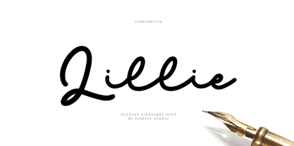 Lillie is an elegant signature font perfect for crafting, branding, invitation, stationery, wedding designs, social media posts, advertisements, product packaging, product designs, label, photography, watermark, special events, or anything. Included : Lillie multilingual support If you have any questions please don’t hesitate to contact me Thank you best regards, Fikryal Studio
 - Old Depot by 2D Typo,
$24.00 Old Depot is a newly reworked idea for the Depot Trapharet 2D font. It supports more languages and is available in more lettering. Old Depot stands out with its industrial nature of archaic spirit. It is a wonderful choice for solid uncompromising inscriptions or slogans. Don't be afraid to be brutal!
 - Double Tracker by Hanzel Space,
$25.00 Double Tracker is an inspiration for a font with paint strokes so that it has a texture that seems natural, done with an original ink stroke process.. The strong and sturdy design makes it ideal for eye-catching headlines, branding, packaging, magazines, sports, logos, and more. Happy Creating! Hanzel Studio
 - Kokomo by Hanoded,
$20.00 Kokomo is a beautiful handmade contoured font - which was drawn with an old-fashioned steel pen and Chinese ink. The open, shadowed letters are great for posters and ads. Kokomo comes with extensive language support and has an alternative lower case a, for those who don't like the one I used.
 - Melister by Cooldesignlab,
$10.00 Melister font is the new elegant font! This font is specially made for those of you who need an elegant touch to design your next project with perfect and stunning results. Melister is equipped with lines such as hand strokes which are very suitable for various purposes. Such as title, signature, logo, correspondence, wedding invitation, letterhead, nameplate, label, newsletter, poster, badge, Branding, Greeting Card, etc. So beautiful on invitations like greeting cards, and more!!! Melister includes alternate glyphs and beautifully renders fonts including set styles, ligatures, etc. The Open Type feature can be accessed using intelligent Open Type programs such as Adobe Illustrator CS, Adobe Indesign & CorelDraw X6-X7 and Microsoft Word. And this font has provided PUA unicode (custom code font). so that all alternative characters can be easily accessed in full by craftsmen or designers. If you don't have a program that supports OpenType features such as Adobe Illustrator and CorelDraw X Version, you can access all the alternative glyphs using Font Book (Mac) or Character Map (Windows). Thanks and love designing :-)
 - Sefund Ragat by Product Type,
$13.00 Introducing Sefund Ragat Bold Serif Font – a font that exudes strength and boldness with its thick and powerful serif design. Perfect for making a statement and standing out from the crowd, this font is sure to make an impact on any project. With its versatility and multilingual support, Sefund Ragat is suitable for various applications such as branding, headlines, packaging, and more. The font comes in various weights to provide more options and flexibility to match the desired tone and mood of the design. Incorporating Sefund Ragat into your design will elevate it to the next level, conveying a sense of authority and confidence to your audience. Don’t settle for ordinary, choose Sefund Ragat Bold Serif Font for your next project and make a bold statement. What’s Included : - File font - All glyphs Iso Latin 1 - We highly recommend using a program that supports OpenType features and Glyphs panels like many Adobe apps and Corel Draw, so you can see and access all Glyph variations. - PUA Encoded Characters – Fully accessible without additional design software. - Fonts include Multilingual support
 - Rocaie by astype,
$37.00 The Rocaie fonts are base on antique Rococo letters from an gilding workshop. I was very lucky to acquire this set of metal letters in early 2018. Each of the letters has ornaments engraved by hand into its cast brass shapes. When drawing the digital outlines, I tried to preserve the handmade look of the original leaf engravings. Each of the letters uses a slightly different ornament pattern: no pattern is repeated identically. I expanded the very limited character set of the original, adding all the missing characters that today’s commercial fonts are expected to contain. I made additional font styles to easily add colour layers, outlines, and 3D shadows to the typeface. It’s up to you to decide how to “build” your colour font! You can combine the predefined font styles Regular, Pearl, Solid, Outline, and Magnum with each other, or with the Fill font styles. But you don't need to use all font styles to compose something nice! Have as much fun as I did with this Baroque beauty and enjoy the vintage.
 - Against Perfection by Din Studio,
$25.00 Doing your design work in magical way? Yes, please. With Against Perfection you can boost your design performance to the max. Against Perfection is a brush script font combined with a pleasing serif font. This pairing of script and serif offers just enough sensuous curves for appealing design result. Together, these complementary fonts convey modern and elegant looks. The swoosh and brush style details make the whole word look custom-designed. On the other hand, the serif font has a nice, solid weightiness combined with smoothed-off shoulders. Further more, this font has fascinating features that helps you maximize your design. Features: Alternates Ligatures Stylistic Sets Multilingual Supports PUA Encoded Numerals and Punctuation It is perfect to be used for many design projects, such as poster, logo, book cover, branding, heading, printed product, merchandise, quotes, social media campaign, etc. Learn more about how to use it by seeing the font preview. Thank you for purchasing our fonts. Please don’t hesitate to contact us, if you have any further question or issues. We’re happy to help. Happy Designing.
 - FS Irwin by Fontsmith,
$80.00 New York vibes FS Irwin was born in New York while Senior Designer, Fernando Mello, was studying an intensive 5 week typeface design course at the Cooper Union. His brief was to design a perfectly clear typeface that could communicate well, without loud or overtly mannered design features. Fernando was influenced by the subway font in New York: ‘It is very in your face and clear, always in bold. It doesn’t shout much but at the same time is very present and unique. The design is completely different but it was this spirit I wanted to capture for FS Irwin.’ And the vibe of the city: ‘In a similar way to London, New York is so mixed and so cosmopolitan. I was amazed by the different styles and identities I saw there, and tried to encapsulate this essence to create something new, relevant and very now.’ Incisive quality Rather than focusing on quirks or distinctive characteristics, the key to FS Irwin is the quality of its design and spirit of simplicity. The design, proportions and details are usable and authentic and it is suitable for countless situations, without running the risk of being instantaneously noticeable. Families like this can be used on nearly anything, from more playful designs to serious corporate IDs. ‘Extensively tested and precisely drawn text-oriented typefaces are what I enjoy designing the most. There is a beauty and a different approach, a different way of making them interesting, sellable and usable rather than adding flicks or unexpected details.’ Inscriptions and calligraphy FS Irwin’s origin lies in Fernando’s studies in inscriptional lettering and writing-calligraphic exercises at the Cooper Union. Mello started the process by digitising his explorations and adapting them into a more workable sans serif structure. The traditional forms of writing which gave the basis to Latin type as we know it today were the perfect place to start. This influence can be seen in the proportion of the capitals and in slight writing-calligraphic details in the lowercase, such as the slightly angled, chiselled spurs and their open terminals.
 - Alisal by Monotype,
$29.99 Matthew Carter has been refining his design for Alisal for so long, he says, that when he was asked to complete the design for the Monotype Library, it was almost as if he were doing a historical revival of his own typeface. The illusion even extended to changes in his work process: although he now does all his preliminary and final drawing on screen, the first trial renderings of Alisal were done as pencil renderings. Alisal is best classified as an Italian old style design. Originally created between the late 15th and mid-16th centuries in northern Italy, the true Italian old styles were some of the first roman types. They tend to be the most calligraphic of serifed faces, with the axis of their curved strokes inclined to the left, as if drawn with a flat-tipped pen or brush. These designs offer sturdy, free-flowing and heavily bracketed serifs, short descenders, and a modest contrast in stroke weight. Alisal has nearly all the classic Italian old style character traits, plus a few quirks of its own. It is calligraphic in nature, with more of a pen-drawn quality than faces like Palatino or Goudy Old Style. It is more rough-hewn than either Goudy's Kennerley or Benton's Cloister, and is generally heavier in weight than most of the other Italian old style designs. One place where Alisal makes a clean break with traditional old style designs is in the serifs. While sturdy and clearly reflecting pen-drawn strokes, Alisal's serifs have no bracketing and appear to be straight strokes crossing the main vertical. Like Caslon or Trajanus, Alisal is a handsome design when viewed as a block of copy. Ascenders are tall and elegant, and serve as a counterpoint to the robust strength of the rest of the design. Alisal is available as a small family of roman and bold with a complementary italic for the basic roman weight, providing all that is needed for the majority of text typography. Alisal is not as well-known as some of Carter's other typefaces, but this lovely and long-incubated design was certainly worth the wait.
 - Anselm Sans by Storm Type Foundry,
$63.00One of the good practices of today’s type foundries is that they release their type families as systems including both serif and sans serif type. Usually, the sources of inspiration need to be well tried with time and practice, since production of a type family is such a laborious and complex process. From the beginning, it needs to be clear that the result will be suited for universal use. Such systems, complete with the broad, multi-lingual variations permitted by the OpenType format, have become the elementary, default instrument of visual communication. Non-Latin scripts are useful for a wide scope of academic publications, for packaging and corporate systems alike. And what about outdoor advertisement designated for markets in developing countries? Cyrillics and Greek have become an integral part of our OpenType font systems. Maybe you noticed that the sans serif cuts have richer variety of the light – black scale. This is due to the fact that sans serif families tend to be less susceptible to deformities in form, and thus they are able to retain their original character throughout the full range of weights. On the other hand, the nature of serifed, contrasted cuts does not permit such extremes without sacrificing their characteristic features. Both weights were drawn by hand, only the Medium cut has been interpolated. Anselm Ten is a unique family of four cuts, slightly strengthened and adjusted for the setting in sizes around 10 pt and smaller, as its name indicates. The ancestry of Anselm goes back to Jannon, a slightly modified Old Style Roman. I drew Serapion back in 1997, so its spirit is youthful, a bit frisky, and it is charmed by romantic, playful details. Anselm succeeds it after ten years of evolution, it is a sober, reliable laborer, immune to all eccentricities. The most significant difference between Sebastian/Serapion and Anselm is the raised x-height of lowercase, which makes it ideal for applications in extensive texts. Our goal was to create an all-round type family, equally suitable for poetry, magazines, books, posters, and information systems. - Rufina by TipoType,
$16.00 Rufina was as tall and thin as a reed. Elegant but with that distance that well-defined forms seem to impose. Her voice, however, was sweeter, closer, and when she spoke her name, like a slow whisper, one felt like what she had come to say could be read in her image. Rufina’s story can only be told through a detour because her origin does not coincide with her birth. Rufina was born on a Sunday afternoon while her father was drawing black letters on a white background, and her mother was trying to join those same letters to form words that could tell a story. But her origin goes much further back, and that is why she is pierced by a story that precedes her, even though it is not her own. Maybe her origin can be traced back to that autumn night in which that tall man with that distant demeanor ran into that woman with that sweet smile and elegant aspect. He looked at her in such a way that he was trapped by that gaze, even though they found no words to say to each other, and they stayed in silence. Somehow, some words leaked into that gaze because since that moment they were never apart again. Later, after they started talking, projects started coming up and then coexistence and arguments, routines and mismatches. But in that chaos of crossed words in their life together, something was stable through the silence of the gazes. In those gazes, the silent words sustained that indescribable love that they didn’t even try to understand. And in one of those silences, Rufina appeared, when that man told that woman that he needed a text to try out his new font, and she saw him look at her with that same fascination of the first time, and she started to write something with those forms that he was giving her as a gift. Rufina was as tall and thin as a reed, wrote her mother when Rufina was born. Photo (Fragilité): Karin Topolanski / Post: Raw (www.raw.com.uy) - María Pérez Gutiérrez
 - Noort by TypeTogether,
$51.60 Juan Bruce’s Noort is not a type family for wayfinding or mapmaking alone, but for clarifying information and engaging readers along their own journey. The information designer’s role is to bring clarity and style to overwhelming amounts of information, which fortunately is Noort’s purpose as well. Hierarchies submit to its will and layering colour only adds more presence to its active posture. Noort’s design uses the proven editorial text features of a large x-height, ample spacing, and low contrast to check all the boxes for paragraph text use. But it’s the long serifs, wide characters, and overall typographic presence that make it resilient and ease the task of reading in small point sizes. These details mean Noort is able to demonstrate importance not only with its five pitch-perfect weights, but with its brindled colour within a layout. Noort’s roman and italic styles play off each other by transplanting their design features. The roman style’s serifs are transferred in substance but expectedly increased in speed in the italic styles. And the italic’s inktraps and separated strokes are echoed amidst the roman’s upright structure. Where digitisation could have removed the influence of the hand, Noort retains the analogue nature of its creation. This antiphonal seeding of details creates a cohesive family that is as fascinating as it is functional. Noort’s axis and serifs have a slightly varying ductus — the directional flow that aids reading and character clarity. Its latent obviousness in text sizes immediately becomes its signature style when bumped up to subhead sizes. And since Noort’s counters are so wide and welcoming, its heavier weights can expand more within themselves than along their exterior edges. Noort’s ten total fonts cover the Latin A Extended glyph set to bring its unbordered, globetrotting sensibilities to your projects. OpenType features include ligatures, fractions, and several figure styles, along with mature-rather-than-overbearing swashes. Aligned with TypeTogether’s commitment to produce high-quality type for the global market, the complete Noort family can set digital and printed works with ease, capitalising on the dual needs of clear information and fascinating textual artistry.
 - Soho Gothic by Monotype,
$29.99 “There is just something magical about type design,” says Sebastian Lester. “If you draw a successful typeface it can travel the world, taking a part of you with it.” If this is true, his Soho® Gothic family has taken him far and wide. Understated, modern and exceptionally versatile, the family has been put to good use in just about every application imaginable. A good choice for virtually any type of project, The Soho Gothic family performs equally well as the backbone of a global brand as it would in an edgy fashion magazine. Versatile, extensive, customizable, and multilingual – the Soho Gothic typeface family has it all.With the same proportions as Soho, its slab serif cousin, Soho Gothic ranges across seven weights, from a willowy hairline to a brawny ultra – each with a complementary italic.Lester took care to ensure that the Soho and Soho Gothic designs work in perfect harmony. According to him, “The typefaces were developed alongside each other so that I could consider every aspect of each design and be certain that they would be absolutely compatible.”Soho Gothic is a more understated and more subtle design than Soho. Features that give the design its distinctive tone are the flat, crisp apexes of the diagonal characters like the A and V, and the marked horizontal stress in the a, g and s. “I wanted the family as a whole to radiate effortless modernity,” recalls Lester, “to be a master communicator that works in all conditions and at all sizes.” A collection of alternate and “semi-slab” characters were also part of Lester’s plan. “I like to develop alternate characters for all my type designs,” he says. “I believe they give graphic designers greater flexibility and make a typeface more valuable.” Soho Gothic is available as OpenType® Pro fonts that have an extended character set which supports most Central European and many Eastern European languages. If you’re looking to complete your designs, consider pairing it with Bembo® Book,Joanna® Nova,Neue Frutiger®,PMN Caecilia®,or ITC Stone® Serif.
 - Anselm Serif by Storm Type Foundry,
$63.00 One of the good practices of today’s type foundries is that they release their type families as systems including both serif and sans serif type. Usually, the sources of inspiration need to be well tried with time and practice, since production of a type family is such a laborious and complex process. From the beginning, it needs to be clear that the result will be suited for universal use. Such systems, complete with the broad, multi-lingual variations permitted by the OpenType format, have become the elementary, default instrument of visual communication. Non-Latin scripts are useful for a wide scope of academic publications, for packaging and corporate systems alike. And what about outdoor advertisement designated for markets in developing countries? Cyrillics and Greek have become an integral part of our OpenType font systems. Maybe you noticed that the sans serif cuts have richer variety of the light – black scale. This is due to the fact that sans serif families tend to be less susceptible to deformities in form, and thus they are able to retain their original character throughout the full range of weights. On the other hand, the nature of serifed, contrasted cuts does not permit such extremes without sacrificing their characteristic features. Both weights were drawn by hand, only the Medium cut has been interpolated. Anselm Ten is a unique family of four cuts, slightly strengthened and adjusted for the setting in sizes around 10 pt and smaller, as its name indicates. The ancestry of Anselm goes back to Jannon , a slightly modified Old Style Roman. I drew Serapion back in 1997, so its spirit is youthful, a bit frisky, and it is charmed by romantic, playful details. Anselm succeeds it after ten years of evolution, it is a sober, reliable laborer, immune to all eccentricities. The most significant difference between Sebastian/Serapion and Anselm is the raised x-height of lowercase, which makes it ideal for applications in extensive texts. Our goal was to create an all-round type family, equally suitable for poetry, magazines, books, posters, and information systems.
 - Laima by TypeTogether,
$39.00 Laima is the brush-formed stencil from Bogidar Mascareñas that will create an ovation for branding, album art, upscale venues, and packaging. If wide appeal, attention to detail, or international reach is necessary for your brand, consider Laima’s high-calibre design as your personal ambassador. The general font user is accustomed to stencil typefaces that have a brute look to them — industrial, mechanical, restrictive, or even militarised. Stencils are commonly used because they serve a function, like spray-painting over template letters, giving the reader a warning that must be heeded for safety, or a command to follow immediately. Wooden crates and grunge art are the medium and black or red paint are the norm. Laima, instead, creates a stencil from the world of calligraphy to turn all this on its head. Laima’s 12 stencil styles (six roman and six italic) use the junctures of calligraphic strokes as an opportunity to achieve an uncommon stencil effect, shifting to create unexpected shapes and the illusion of twisted, disconnected overlaps. Inspired by “Arte Nueva de Escribir”, an engravings book published by Francisco Palomares in 1776, Laima progressed well beyond its beginning as a Type and Media Master’s project at KABK, The Hague (NL). It sometimes required completely new character shapes to accommodate the space needed for clear diacritic marks, and was further enhanced with flourishes and alternates for liveliness and variety in individual or branded work. Laima’s italic begins with swashes and uses OpenType features to automatically turn them off with more than two successive capital letters. Use one swashed character for a drop cap, two for ligatured fun, turn them on or off at your discretion, or change the ascender length and swash shape to suit your creative need. With two styles of numerals and stylistic sets for final forms, Laima’s 12 styles and hundreds of Latin-based languages can turn simple words into an occasion that would immediately benefit high-class brands and special uses. Set that article title, release that new product, code your best-looking UI yet, letterpress that business card, and print that gourmet label. Whatever is next, Laima is the unexpected stencil partner to introduce it to an expectant world.
 - Sinzano by Typodermic,
$11.95 Hey there, cats and kittens. Have you heard the news about the grooviest typeface in town? That’s right, I’m talkin’ about Sinzano—the typeface that’s cool, collected, and interlocking! Now, you might be asking yourself, “What’s so special about Sinzano?” Well, let me tell you, this typeface is a real wild one. It’s got some serious style, with letterforms that interlock like a bunch of jazz cats jammin’ on stage. And don’t even get me started on the ligatures—they’re fascinating, man! Sinzano comes in three different styles, so you can choose the one that’s right for you. Sinzano Regular is a slender, slightly flared headliner, perfect for making a statement. Sinzano Sans is a similar concept, but with straight, flat ends, for a more modern vibe. And if you’re looking for something a little more modest, Sinzano Display is a companion typeface that’s broader and rounder, with just a touch of interlocking. So, if you’re ready to add some serious style to your designs, head on over to Sinzano, baby! This typeface is the real deal, and it’s gonna knock your socks off. Most Latin-based European writing systems are supported, including the following languages. Afaan Oromo, Afar, Afrikaans, Albanian, Alsatian, Aromanian, Aymara, Bashkir (Latin), Basque, Belarusian (Latin), Bemba, Bikol, Bosnian, Breton, Cape Verdean, Creole, Catalan, Cebuano, Chamorro, Chavacano, Chichewa, Crimean Tatar (Latin), Croatian, Czech, Danish, Dawan, Dholuo, Dutch, English, Estonian, Faroese, Fijian, Filipino, Finnish, French, Frisian, Friulian, Gagauz (Latin), Galician, Ganda, Genoese, German, Greenlandic, Guadeloupean Creole, Haitian Creole, Hawaiian, Hiligaynon, Hungarian, Icelandic, Ilocano, Indonesian, Irish, Italian, Jamaican, Kaqchikel, Karakalpak (Latin), Kashubian, Kikongo, Kinyarwanda, Kirundi, Kurdish (Latin), Latvian, Lithuanian, Lombard, Low Saxon, Luxembourgish, Maasai, Makhuwa, Malay, Maltese, Māori, Moldovan, Montenegrin, Ndebele, Neapolitan, Norwegian, Novial, Occitan, Ossetian (Latin), Papiamento, Piedmontese, Polish, Portuguese, Quechua, Rarotongan, Romanian, Romansh, Sami, Sango, Saramaccan, Sardinian, Scottish Gaelic, Serbian (Latin), Shona, Sicilian, Silesian, Slovak, Slovenian, Somali, Sorbian, Sotho, Spanish, Swahili, Swazi, Swedish, Tagalog, Tahitian, Tetum, Tongan, Tshiluba, Tsonga, Tswana, Tumbuka, Turkish, Turkmen (Latin), Tuvaluan, Uzbek (Latin), Venetian, Vepsian, Võro, Walloon, Waray-Waray, Wayuu, Welsh, Wolof, Xhosa, Yapese, Zapotec Zulu and Zuni.

