10,000 search results
(0.034 seconds)
- Mitosis by A New Machine,
$24.00 The dots forming this font are all hand positioned for maximum randomness! Great for display purposes or for logo work. Includes upper and lowercase, numbers, punctuation and Western European diacritics.
 - Yusyad by Eyad Al-Samman,
$20.00 The typeface Yusyad is designed mainly for a very sentimental and emotional reason. Metaphorically, it is a modest artistic gift offered virtually from the designer to one of his beloved and cherished persons in this life, namely, his loyal and devoting wife. She represents one of the most essential motives for many artistic and non-artistic works that the designer achieved during his life. This was done through her tranquil personality, infinite patience, sincere support, and endless encouragement. The designer's partner (i.e., the significant other) lives with him along with their three children looking both always for a life full of peace, achievements, philanthropy, and of course love. The typeface's name Yusyad is a portmanteau word consists of two morphemes. It is a simple name-meshing for two different names. Those names represent the name of the designer's wife (Yusra) and the name of the designer (Eyad). Yusyad is like an epithet that ties the two partners' honest and eternal relationship until the last day of their lives. Technically, Yusyad is a sans-serif condensed and display typeface. It comprises seven fonts with dual styles and multiple weights. Specifically, it has two main styles, namely, the normal and the inline design. The normal style comes in five weights (i.e., thin, light, regular, bold, and black) whereas the inline style has two weights (i.e., regular and bold). The typeface is designed with more than 700 glyphs or characters. Its character set supports nearly most of the Central, Eastern, and Western European languages using Latin scripts including the Irish and the Vietnamese languages. The typeface is appropriate for any type of typographic and graphic designs in the web, print, and other media. It is also absolutely preferable to be used in the wide fields related to publication, press, services, and production industries. It can create a very impressive impact when used in movies' or TV-series titles, posters, products’ surfaces, logos, signage, novels, books, and magazines covers, medical packages, as well as the product and corporate branding. It has also both of lining and old-style numerals which makes it more suitable for any printing or designing purposes. To end, Yusyad's condensed appearance—especially the inline style—makes it very memorable, eye-catching, and striking for advertising, marketing, and promotional purposes.
 - ITC Bodoni Seventytwo by ITC,
$29.99Giambattista Bodoni (1740-1813) was called the King of Printers; he was a prolific type designer, a masterful engraver of punches and the most widely admired printer of his time. His books and typefaces were created during the 45 years he was the director of the fine press and publishing house of the Duke of Parma in Italy. He produced the best of what are known as modern" style types, basing them on the finest writing of his time. Modern types represented the ultimate typographic development of the late eighteenth and early nineteenth centuries. They have characteristics quite different from the types that preceded them; such as extreme vertical stress, fine hairlines contrasted by bold main strokes, and very subtle, almost non-existent bracketing of sharply defined hairline serifs. Bodoni saw this style as beautiful and harmonious-the natural result of writing done with a well-cut pen, and the look was fashionable and admired. Other punchcutters, such as the Didot family (1689-1853) in France, and J. E. Walbaum (1768-1839) in Germany made their own versions of the modern faces. Even though some nineteenth century critics turned up their noses and called such types shattering and chilly, today the Bodoni moderns are seen in much the same light as they were in his own time. When used with care, the Bodoni types are both romantic and elegant, with a presence that adds tasteful sparkle to headlines and advertising. ITC Bodoni™ was designed by a team of four Americans, after studying Bodoni's steel punches at the Museo Bodoniana in Parma, Italy. They also referred to specimens from the "Manuale Tipografico," a monumental collection of Bodoni's work published by his widow in 1818. The designers sought to do a revival that reflected the subtleties of Bodoni's actual work. They produced three size-specific versions; ITC Bodoni Six for captions and footnotes, ITC Bodoni Twelve for text settings, and ITC Bodoni Seventytwo - a display design modeled on Bodoni's 72-point Papale design. ITC Bodoni includes regular, bold, italics, Old style Figures, small caps, and italic swash fonts. Sumner Stone created the ornaments based on those found in the "Manuale Tipografico." These lovely dingbats can be used as Bodoni did, to separate sections of text or simply accent a page layout or graphic design." - ITC Bodoni Twelve by ITC,
$29.99Giambattista Bodoni (1740-1813) was called the King of Printers; he was a prolific type designer, a masterful engraver of punches and the most widely admired printer of his time. His books and typefaces were created during the 45 years he was the director of the fine press and publishing house of the Duke of Parma in Italy. He produced the best of what are known as modern" style types, basing them on the finest writing of his time. Modern types represented the ultimate typographic development of the late eighteenth and early nineteenth centuries. They have characteristics quite different from the types that preceded them; such as extreme vertical stress, fine hairlines contrasted by bold main strokes, and very subtle, almost non-existent bracketing of sharply defined hairline serifs. Bodoni saw this style as beautiful and harmonious-the natural result of writing done with a well-cut pen, and the look was fashionable and admired. Other punchcutters, such as the Didot family (1689-1853) in France, and J. E. Walbaum (1768-1839) in Germany made their own versions of the modern faces. Even though some nineteenth century critics turned up their noses and called such types shattering and chilly, today the Bodoni moderns are seen in much the same light as they were in his own time. When used with care, the Bodoni types are both romantic and elegant, with a presence that adds tasteful sparkle to headlines and advertising. ITC Bodoni™ was designed by a team of four Americans, after studying Bodoni's steel punches at the Museo Bodoniana in Parma, Italy. They also referred to specimens from the "Manuale Tipografico," a monumental collection of Bodoni's work published by his widow in 1818. The designers sought to do a revival that reflected the subtleties of Bodoni's actual work. They produced three size-specific versions; ITC Bodoni Six for captions and footnotes, ITC Bodoni Twelve for text settings, and ITC Bodoni Seventytwo - a display design modeled on Bodoni's 72-point Papale design. ITC Bodoni includes regular, bold, italics, Old style Figures, small caps, and italic swash fonts. Sumner Stone created the ornaments based on those found in the "Manuale Tipografico." These lovely dingbats can be used as Bodoni did, to separate sections of text or simply accent a page layout or graphic design." - ITC Bodoni Ornaments by ITC,
$29.99Giambattista Bodoni (1740-1813) was called the King of Printers; he was a prolific type designer, a masterful engraver of punches and the most widely admired printer of his time. His books and typefaces were created during the 45 years he was the director of the fine press and publishing house of the Duke of Parma in Italy. He produced the best of what are known as modern" style types, basing them on the finest writing of his time. Modern types represented the ultimate typographic development of the late eighteenth and early nineteenth centuries. They have characteristics quite different from the types that preceded them; such as extreme vertical stress, fine hairlines contrasted by bold main strokes, and very subtle, almost non-existent bracketing of sharply defined hairline serifs. Bodoni saw this style as beautiful and harmonious-the natural result of writing done with a well-cut pen, and the look was fashionable and admired. Other punchcutters, such as the Didot family (1689-1853) in France, and J. E. Walbaum (1768-1839) in Germany made their own versions of the modern faces. Even though some nineteenth century critics turned up their noses and called such types shattering and chilly, today the Bodoni moderns are seen in much the same light as they were in his own time. When used with care, the Bodoni types are both romantic and elegant, with a presence that adds tasteful sparkle to headlines and advertising. ITC Bodoni™ was designed by a team of four Americans, after studying Bodoni's steel punches at the Museo Bodoniana in Parma, Italy. They also referred to specimens from the "Manuale Tipografico," a monumental collection of Bodoni's work published by his widow in 1818. The designers sought to do a revival that reflected the subtleties of Bodoni's actual work. They produced three size-specific versions; ITC Bodoni Six for captions and footnotes, ITC Bodoni Twelve for text settings, and ITC Bodoni Seventytwo - a display design modeled on Bodoni's 72-point Papale design. ITC Bodoni includes regular, bold, italics, Old style Figures, small caps, and italic swash fonts. Sumner Stone created the ornaments based on those found in the "Manuale Tipografico." These lovely dingbats can be used as Bodoni did, to separate sections of text or simply accent a page layout or graphic design." - ITC Bodoni Brush by ITC,
$29.99Giambattista Bodoni (1740-1813) was called the King of Printers; he was a prolific type designer, a masterful engraver of punches and the most widely admired printer of his time. His books and typefaces were created during the 45 years he was the director of the fine press and publishing house of the Duke of Parma in Italy. He produced the best of what are known as modern" style types, basing them on the finest writing of his time. Modern types represented the ultimate typographic development of the late eighteenth and early nineteenth centuries. They have characteristics quite different from the types that preceded them; such as extreme vertical stress, fine hairlines contrasted by bold main strokes, and very subtle, almost non-existent bracketing of sharply defined hairline serifs. Bodoni saw this style as beautiful and harmonious-the natural result of writing done with a well-cut pen, and the look was fashionable and admired. Other punchcutters, such as the Didot family (1689-1853) in France, and J. E. Walbaum (1768-1839) in Germany made their own versions of the modern faces. Even though some nineteenth century critics turned up their noses and called such types shattering and chilly, today the Bodoni moderns are seen in much the same light as they were in his own time. When used with care, the Bodoni types are both romantic and elegant, with a presence that adds tasteful sparkle to headlines and advertising. ITC Bodoni™ was designed by a team of four Americans, after studying Bodoni's steel punches at the Museo Bodoniana in Parma, Italy. They also referred to specimens from the "Manuale Tipografico," a monumental collection of Bodoni's work published by his widow in 1818. The designers sought to do a revival that reflected the subtleties of Bodoni's actual work. They produced three size-specific versions; ITC Bodoni Six for captions and footnotes, ITC Bodoni Twelve for text settings, and ITC Bodoni Seventytwo - a display design modeled on Bodoni's 72-point Papale design. ITC Bodoni includes regular, bold, italics, Old style Figures, small caps, and italic swash fonts. Sumner Stone created the ornaments based on those found in the "Manuale Tipografico." These lovely dingbats can be used as Bodoni did, to separate sections of text or simply accent a page layout or graphic design." - ITC Bodoni Six by ITC,
$40.99Giambattista Bodoni (1740-1813) was called the King of Printers; he was a prolific type designer, a masterful engraver of punches and the most widely admired printer of his time. His books and typefaces were created during the 45 years he was the director of the fine press and publishing house of the Duke of Parma in Italy. He produced the best of what are known as modern" style types, basing them on the finest writing of his time. Modern types represented the ultimate typographic development of the late eighteenth and early nineteenth centuries. They have characteristics quite different from the types that preceded them; such as extreme vertical stress, fine hairlines contrasted by bold main strokes, and very subtle, almost non-existent bracketing of sharply defined hairline serifs. Bodoni saw this style as beautiful and harmonious-the natural result of writing done with a well-cut pen, and the look was fashionable and admired. Other punchcutters, such as the Didot family (1689-1853) in France, and J. E. Walbaum (1768-1839) in Germany made their own versions of the modern faces. Even though some nineteenth century critics turned up their noses and called such types shattering and chilly, today the Bodoni moderns are seen in much the same light as they were in his own time. When used with care, the Bodoni types are both romantic and elegant, with a presence that adds tasteful sparkle to headlines and advertising. ITC Bodoni™ was designed by a team of four Americans, after studying Bodoni's steel punches at the Museo Bodoniana in Parma, Italy. They also referred to specimens from the "Manuale Tipografico," a monumental collection of Bodoni's work published by his widow in 1818. The designers sought to do a revival that reflected the subtleties of Bodoni's actual work. They produced three size-specific versions; ITC Bodoni Six for captions and footnotes, ITC Bodoni Twelve for text settings, and ITC Bodoni Seventytwo - a display design modeled on Bodoni's 72-point Papale design. ITC Bodoni includes regular, bold, italics, Old style Figures, small caps, and italic swash fonts. Sumner Stone created the ornaments based on those found in the "Manuale Tipografico." These lovely dingbats can be used as Bodoni did, to separate sections of text or simply accent a page layout or graphic design." - Celtic Knots by Clanbadge,
$20.00 While it is obvious that this is an ornamental style font, it is more than that: it is a Celtic Knotwork design tool! Irish, Scottish, Welsh, even Norse and Viking cultures have used knotwork designs for millenia. These ancient traditional interwoven designs are experiencing a revival as Celtic culture gains exposure in the modern world. Intricate Celtic knots are featured everywhere from jewelry to tattoos. While many enjoy them simply for their beauty and fascinating twists, they can also be used to add an air of myth, magic and mystery to any project. The interlaced lines make them perfect for wedding invitations, borders, dividers and rules, web graphics, and logos. I began using Celtic knotwork designs in my own work as part of my knifemaking and jewelry making hobbies. I read all of the books I could find about Celtic knots and at first I drew them by hand with pencil and paper. Then as I realized how nice it would be to have "undos" I switched over to using Corel Draw. Draw proved to be a natural for this type of artwork with tools like contour and the trim function. But even with these great tools, it was still tedious to create these designs. I noticed that I was able to reuse a lot of parts in repetitive sections. I developed a small library of reusable bits and chunks of Celtic designs. I found them so useful and fun to work with that I began thinking about ways to market my Celtic design kit. I thought about CDR and EPS formats, but then I thought of creating this toolset as a True Type Font. That way anyone with ANY program that uses fonts could easily create Celtic knotwork designs. Word processors, embroidery programs, engraving programs, jewelry design programs, CAD/CAM programs...almost every program can use fonts. I was also interested in CNC work and thought that this font would work well for applications such as laser etching, vinyl signs, and machining. With that in mind, I designed each character of the font with extremes of accuracy. If one character from the font is used at one inch tall, every control point will be placed to an accuracy of better than 0.0001 inch. I wanted every piece to meet exactly with the next, with no possibility for misalignment. The different styles are all very carefully created to fit accurately with each other. So the Filled Style fits exactly into the Outline Style, and the Inverse Style fits precisely around the Outline Style so as to make up the background behind the knotwork. Combining the styles allows you to have complete creative control. By assembling the nearly 200 pieces it is quite easy to produce very complex designs. It is actually a bit like playing with a puzzle and many people really enjoy putting the pieces together to make designs. In fact, I have had many customers tell me of how they love playing with this font and making knots into the wee hours of morning. If you like puzzles then you will absolutely love this font! And creating the patterns is just the beginning of the fun! If you apply your favorite Photoshop tricks on them you can make anything from dazzling chrome knotwork to carved stone. Photoshop plug-ins like SuperBladePro are great for converting knotwork text into corroded bronze or rusted iron. Use your knotwork to add texture to a virtual landscape, or add them as surface embelishments on architecture and furniture. You can also make round knotwork by using this font with "WordArt" (WordArt is included with every copy of Microsoft Word. See http://clanbadge.com/round_knots.htm for a tutorial on how to make round knotwork). For Crafters there are limitless uses for this font. It has been used for embroidery, jewelry, leatherwork, stencils, stained glass, quilting, painting, pyrography, woodcarving and lots more. We have even sold copies to monks for use in decorating handmade books!
 - Opera House by Solotype,
$19.95This is a fake and a fraud and not a bad-looking type. We did this to imitate the look of an old wood poster font, but it is completely new. Don't tell anyone. Please note: no lowercase. - Manifesto Bold by Solotype,
$19.95In digitizing this old font, we took great liberties with the design, removing some jarring elements. The result reads much more smoothly than the original, retaining the overall character of the original. Hope you don't mind, Mr. Beeler. - Yaungtinai by IM Studio,
$18.00 Yaungtinai is actually a unique font, I made it with the relaxed spontaneity of my hands. designing formal fonts but with a classic elements, which makes it very suitable for wedding media, book covers, greeting cards, logos, branding, business cards and certificates, even for any design work that requires a classic, formal or fancy appearance. Try Yaungtinai, enjoy the wealth of OpenType features and let the powerful yet elegant excitement delight you and increase your creativity! You can use this font very easily. There are many features in it. Yaungtinai contains the full set of lowercase and uppercase letters, punctuation, numbers, and multilingual support. This font also includes several alternative Ligature and Stylistic Set styles for those of you who have software that can work with OpenType (Corel Draw / Photoshop / Illustrator / InDesign). If you don't have a program that supports OpenType features like Adobe Illustrator and CorelDraw X Version, you can access all alternative glyphs using Font Book (Mac) or Character Map (Windows). Don't forget to see, buy, like, and share with friends.
 - Glass Light by Wiescher Design,
$49.50 Glass Light was designed in 1912 by Franz Paul Glass for the Genzsch & Heyse foundry. The font is stylewise related to the "Lo types" of the same period. Glass designed a lot of decorative elements to go along with the font. I added Swashes, endletters and smallcaps to the set to make it complete. Since this type of font will probably not be used by many professionals, I did not put all the letters into one big OTF-version since most people don't have OTF-savy software. These fonts can and should be mixed for optimal results. Your decorative designer Gert Wiescher
 - Quwen King by Product Type,
$17.00 Who says design has to be boring? The Quwen King font is the secret key to bringing power, glitz, and gaming style to any of your projects. Quwen King is the perfect solution for projects that require a unique touch. From powerful movie displays to exciting games and stunning streaming events, this font captivates and dominates in a variety of languages. With Quwen King, you don't just get a font, you get the tools to bring creativity, charm, and fun to your designs. Enhance your projects with Quwen King Font now, and enjoy amazing results that will make your designs stand out!
 - Adventuro by Pen Culture,
$15.00 Proudly present ”Adventuro – Retro Serif Font” Adventuro is retro serif font. this font has a retro look also has a modern feel. This font has more than 20 alternates that will help you in project design such as branding, logos, packaging, magazine imagery, posters and many more. Feature and what will you get: Uppercase and lowercase Stylistic alternate Punctuation Multilingual Support I really hope you enjoy it – please do let me know what you think, comments & likes are always hugely welcomed and appreciated. More importantly, please don’t hesitate to drop me a message if you have any issues or queries. Thank you
 - Bonami by Ivan Rosenberg,
$19.00 Bonami Font is a modern calligraphy font with many alternative characters and ligatures. Bonami font includes multilingual support for Western and Central Europe. These are ideal for blog website, logos. instagram, branding, invitations, business cards, weddings and many more. This hand-lettered font comes with 4 up to 20 alternates for both uppercase and lowercase characters, beginning and ending swashes and ligatures for different styles. For access to Stylistic Alternates is required software with glyphs panel like Photoshop and lllustrator. No special software is required to use Ligatures. If you have any questions or suggestions don't hesitate to contact me. Ivan
 - Choko Milky by Java Pep,
$10.00 Introducing a fun and bold font called Choko Milky. This font includes an extrude style to combine with the regular version to make the Choko Milky stand out even more. Choko Milky has OpenType features such as swash, terminal form, and stylistic set s01-s02. Fonts Package includes: - Choko Milky - Choko Extrude - OpenType features ( swash, terminal form, stylistic set) How to use character map for access OpenType features https://www.youtube.com/watch?v=KV7n5nxmsLs&feature=youtu.be Thank for using this font, if you have any question don't hesitate to comment below or contact java.indonesian@yahoo.com. Have a nice day.
 - Jonathan Andrea by Ergibi Studio,
$20.00 JONATHAN ANDREA A font combination, Modern signature and elegant Sans, we made this font with care and detail touchwhich makes the perfect font combination that you can apply for your design that needs an elegant touch, classy looks, and minimalist. perfectly for headlines, wedding, social media, logos, posters, packaging, T-shirts,coffee shops, restaurants, magazine’s headers, signs or gift/post cards,cafe’s and weddings or any type of advertising purpose. What's Included : Standard glyphs Ligatures International Accent Works on PC & Mac Simple installations If there is a problem, question, or anything about my fonts, don't hesitate to ask! Big Thanks ~ Ergibi Studio
 - Killer Garbage by PizzaDude.dk,
$19.00 Killer Garbage is a grunge version of my Spitzenklasse font. It's worn and torn real bad - but not more than the font is still legible even at very small sizes. I don't fancy grunge fonts that only has one or two versions of each letter available. The text usually gets very static and predictable, because the same letters are repeated again and again. That's why I have included 6 different versions of each letter in this font! And the great thing about this is that the letters automatically cycles as you type! Forget everything about repeating the same letters all the time!!!
 - Arameza by Creative17studio,
$9.00 Introducing Arameza, a stunning serif font. Arameza comes with a thin, luxurious and elegant font style. This font is very versatile for a variety of design purposes. don't forget the luxurious impression that is in each character, it gives added value in every design project, such as poster design, invitation cards, web writing, banner design, packaging, branding, business cards and many other design projects that can be supported by this font.This font also supports multilingual. features: - complete basic characters (uppercase/lowercase) - Numeral & punctuation marks - Multilingual support - multiple ligatures - some alternative characters Any question? just ask. Thank you
 - You Suckin' Thief - Unknown license

- Stanford Breath by Arterfak Project,
$20.00 Introducing 'Stanford Breath' a vintage decorative font inspired by the western typography and victorian style. this font has strong look with the rounded serif, all-caps, and decorative uppercase. Collected from many references such as vintage signage, logo, badges, and old-fashioned graphics. Stanford Breath is complete with extra ornaments that look great to combine. This font is perfect for many display purposes. You can use this font for posters, labels, logos, signboards, t-shirts, book covers, decorations, merchandise, and more! Multilingual support with a ton of alternate characters! Fonts Featured : Uppercase Smallcaps Numbers & punctuations Stylistic Set 01-14 Custom ligatures Accented characters: ÀÁÂÃÄÅÆÇÈÉÊËÌÍÎÏÑÒÓÔÕÖØÙÚÛÜÝÞŒŠŽßàáâãäåæçèéêëìíîïñòóôõöøùúûüýþÿœšž Stanford Breath font is PUA Encoded which means you don't need any special software to access the OpenType features.
 - Elegist by Nathatype,
$29.00 It’s the ultimate way to be you. Elegist is a sans serif font that match your every design projects. Through this font, it creates simple, clean yet versatile looks. It is also cleanly designed font that’s easy to read and will look great in a variety of sizes. Features: Alternates Lower and uppercases Numerals and Punctuations This font is perfectly used for many design projects, such as poster, logo, book cover, branding, heading, printed product, merchandise, quotes, social media campaign, etc. Get more inspiration about how to use it by seeing the font preview. Thank you for purchasing our fonts. Please don’t hesitate to contact us, if you have any further question or issues. We’re happy to help. Happy Designing. Tags
 - TT Lovelies Script by TypeType,
$29.00 TT Lovelies Script useful links: Specimen | Graphic presentation | Customization options About TT Lovelies Script: Without any false modesty we can say that TT Lovelies Script is one of the most complicated projects we have ever carried out – there are 1115 glyphs, more than 2000 contextual alternates, 10000 kerned pairs and a large number of OT features, including ligatures and Old Style numbers. The most important characteristic of this font is that it is really seamless. We've done the impossible: in TT Lovelies Script, even capital letters are connected to lower-case letters without any breaks. The base for our typeface is original calligraphy by Russian designer Alena Korobanova. The beautiful handwriting was painstakingly crafted into a fully functional font. TT Lovelies Script is a very lively and playful typeface with some unpredictable nuances. Turn on the use of OpenType features CALT & DLIG in your graphic editor and use the font to the full. Every lower-case letter has characteristic pen strokes which begin and end a word. The pen strokes are turned on automatically when you accordingly type two hyphens at the beginning and at the end of a word. For instance, type '- - apricot - -' and you'll see the beautiful pen strokes at the beginning and at the end of the word. TT Lovelies Script uses a great number of contextual alternates and ligatures which help maintain the handwritten impression. For each letter, a separate grapheme is created for the end of a line, and we've also integrated the Case Sensitive OpenType feature to make working with upper-case characters easier. We've enabled onum, sups, sinf, numr, dnom, frac, ordn as well in order to work with figures. To benefit from all of these wonderful options, you need to use software which supports OpenType features. TT Lovelies Script language support: Acehnese, Afar, Albanian, Alsatian, Aragonese, Arumanian, Asu, Aymara, Banjar, Basque, Belarusian (cyr), Bemba, Bena, Betawi, Bislama, Boholano, Bosnian (cyr), Bosnian (lat), Breton, Bulgarian (cyr), Cebuano, Chamorro, Chiga, Colognian, Cornish, Corsican, Cree, Croatian, Czech, Danish, Embu, English, Erzya, Estonian, Faroese, Fijian, Filipino, Finnish, French, Friulian, Gaelic, Gagauz (lat), Galician, German, Gusii, Haitian Creole, Hawaiian, Hiri Motu, Hungarian, Icelandic, Ilocano, Indonesian, Innu-aimun, Interlingua, Irish, Italian, Javanese, Judaeo-Spanish, Judaeo-Spanish, Kalenjin, Karachay-Balkar (lat), Karaim (lat), Karakalpak (lat), Kashubian, Khasi, Khvarshi, Kinyarwanda, Kirundi, Kongo, Kumyk, Kurdish (lat), Ladin, Latvian, Laz, Leonese, Lithuanian, Luganda, Luo, Luxembourgish, Luyia, Macedonian, Machame, Makhuwa-Meetto, Makonde, Malay, Manx, Maori, Mauritian Creole, Minangkabau, Montenegrin (lat), Mordvin-moksha, Morisyen, Nahuatl, Nauruan, Ndebele, Nias, Nogai, Norwegian, Nyankole, Occitan, Oromo, Palauan, Polish, Portuguese, Quechua, Rheto-Romance, Rohingya, Romansh, Rombo, Rundi, Russian, Rusyn, Rwa, Salar, Samburu, Samoan, Sango, Sangu, Scots, Sena, Serbian (cyr), Serbian (lat), Seychellois Creole, Shambala, Shona, Slovak, Slovenian, Soga, Somali, Sorbian, Sotho, Spanish, Sundanese, Swahili, Swazi, Swedish, Swiss German, Swiss German, Tagalog, Tahitian, Taita, Tatar, Tetum, Tok Pisin, Tongan, Tsonga, Tswana , Turkish, Turkmen (lat), Ukrainian, Uyghur, Vepsian, Volapük, Võro, Vunjo, Xhosa, Zaza, Zulu.
 - Moomeecoco by Allouse Studio,
$16.00 Proudly Presenting, Moomeecoco A Script Dotted Line Font Moomeecoco is perfect for any titles, logo, product packaging, branding project, megazine, social media, wedding, or just used to express words above the background. Moomeecoco also come with Multi-Lingual Support. Enjoy the font, feel free to comment or feedback, send me PM or email. Thank You!
 - Display Patrol by Hanoded,
$15.00 I have always liked handmade display fonts - maybe that’s why I have so many of them! Display Patrol is a rather fat, in your face font. It is completely handmade and comes in two distinct styles: regular and dots. Use it for your posters, books and product packaging. I am sure it will stand out!
 - OC Blimp by OtherwhereCollective,
$99.00The inflatable font you never knew you always wanted! With its two axes you can literally blow this variable display font up and watch it float away… Uppercase display font built on OC Format Sans Print Bd Support for 84 languages 6 preset static Inflate styles gradually inflate and stay on the baseline. 6 preset static Float styles gradually inflate and rise from the baseline. Baseline punctuation and certain symbols don’t float to provide a grounded context. Various un-inflatable symbols carry over from Format Print Bd because they might come in handy as is. With a complete alternate set and double number ligatures years and zip codes don’t look repetitive (think 1991 – 10022 that sort of thing) Double letter ligatures prevent visual repetition in words like “balloon” and “coffee”. - Centennial Script by Canada Type,
$24.95 Centennial Script was designed and cut by Hermann Ihlenburg in 1876 (the centennial of American independence, hence the typeface's name) for the MacKellar, Smiths & Jordan foundry in Philadelphia. Ihlenburg was then only 33 years old, and these beautiful forms put him on his way to become the most prolific and innovative deco, ornamental and script typeface designer and punch cutter of the nineteenth century. In trying to be a true homage to the history of the new world, Centennial Script transcends its then-contemporary deco fashion to embrace script elements historically similar to lettering found on maps or political documents of the 18th century. Letters like the p and s extend themselves high and mighty to accentuate words and lines of text in a fancy hand-drawn manner. The dots on the i and j are those of a careful scribe who acknowledges the importance of the document being lettered. The lowercase letters connect with two slight angular motions of the hand, also very carefully and elegantly. Even the ligatures and ending swashes Ihlenburg made for this face were reminiscent of a mapmaker's patient hand, though Ihlenburg's elegant touch in them cannot be mistaken. Although Centennial Script was one of the few Ihlenburg faces to make it to film type technology, the transition was neither credited nor faultless. The film type version was a bit sloppy in the way the connectors were made, so the lowercase needed a lot of manual work to typeset properly. To alleviate such waste of time for the user of this digital version, the connectors were redrawn according to the original metal ones made by Ihlenburg himself, and tested thoroughly in print to ensure the quality of the typeface's flowing cursive nature. This wasn't an easy task, and very time-consuming, since the changing angles on both ends of the connection made it impossible to escape from having to build every lowercase letter with both left and right connectors that would fit with the rest of the letters. This is one typeface that couldn't be revived in any other manner than the way it was originally made, regardless of more than 130 years of technological advances since the face was designed. Centennial Script comes in all popular font formats, and supports most Latin-based languages. Also included is an Alts fonts that contains alternates, ligatures, snap-on swash endings, some ornaments, as well as a complete set of the lowercase without left side connectors, for a more natural combination when following a majuscule, or just in case the user finds it fit to set the copy in a non-connecting script instead of the face's original connected flow. Centennial Script Pro, the OpenType version, combines the main font with the Alts font in a feature-packed single font. Use the ligature feature to set wordmarks like Mr, Ms, Mrs, Dr, and &Co, the stylistic alternates feature to replace some letters with their alternative forms, the contextual alternates feature for better uppercase-lowercase sequences, and the titling feature to set your text in a disconnected script. Centennial Script is the only script we currently know of that can be set connected or disconnected simultaneously, either using the titling feature in the OpenType Pro version, or manually in the other formats.
 - Nasalization Free - Unknown license

- Rainy Candy by Illushvara,
$14.00 Hello, We are so excited to announce our new fonts "Rainy Candy" is unique display font. Use it to make your ideas even more realistic like a kids, sweet packaging, merchandise and create spectacular the Christmas designs! Features : Uppercase and lowercase Numbers Symbols Multilingual Accent What you get : Rainy Candy. OTF If you have any question, don’t hesitate to contact me. Happy Designing !!! Thank You, Bayu Suwirya
 - Sabrina Pamella by Bluestype Studio,
$15.00 This is our newest product called Sabrina Pamella. Sabrina Pamella is a stunning signature font with a bold vibe. It will turn any design idea into a true standout. This font is suitable for use on business cards, weddings, t-shirt designs, logos, magazines, quotes, fashion, watermarks, invitations, signatures. What's include: - Alternate Characters - Multilingual Support - Swashes Thank you, and don't forget to check out our other products.
 - Anfield by Natural Ink,
$16.00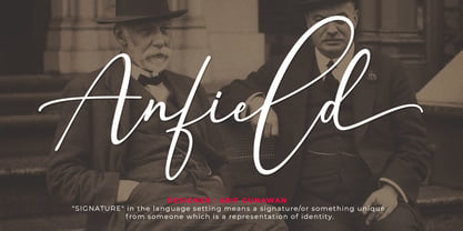 Anfield Signature is a natural handwritten font, this font Is perfect for logos, invitations, stationery, wedding designs, social media posts, advertisements, product packaging, product designs, label, photography, watermark, special events, or anything. Anfield Signature comes with a full set of uppercase and lowercase letters, lowercase swashes, multilingual symbols, numerals, punctuation. If you have any questions please don't hesitate to drop me a message.. Thank You!
 - Fathir Script by Abo Daniel,
$15.00 Fathir is made with a true real handwritten style. The font comes with three style of titling and ending swash. It is very easy to access the swash characters even if you don't use pro software. The sample images show you the possibilities. Fathir is perfect for branding, quotes, logo, invitation, packaging, business card, and more. I hope you love this lovely font. Regards, Abo Daniel
 - Shefira by Unitype Studio,
$19.00 Shefira is a modern and elegant serif font. It is a super unique ligature font that you wont forget! Shefira was built with OpenType features and includes more than 56 ligatures, alternate, numbers, punctuation, and it also supports other languages. It’s the perfect fit for all luxury projects, such as wedding invitation, signatures, luxury logos, printed quotes, grettings cards, social media headers, product packaging and many more!
 - Blues Malone by Subectype,
$17.00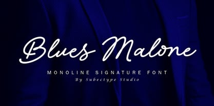 Blues Malone is a monoline signature font with an elegant style. It has good readability and is perfect for logos, invitations, wedding, signatures, Branding, clothing, headline, and much more! Blues Malone comes with ending swash alternate which will make your design more beautiful and elegant. I hope you enjoy this font. If you have any questions please don't hesitate to drop me a message :) Thank You, Subectype
 - Waiting Awakmu by RGB Studio,
$16.00 Waiting Awakmu is a classy handwritten font, This is a truly versatile font combining sophisticated, casual and even fun sides depending on the style you use. Files Include : Basic Latin A-Z and a-z Numbers Symbols PUA Encode Multilanguage Support Thanks and have a wonderful day, If you have any questions, please get in touch with us Don't forget to check out our other products.
 - Sugar Free by PizzaDude.dk,
$17.00 Don't be afraid to taste something sugar free - most times you will be surprised how good it tastes! My Sugar Free font may not look as very much at first glance - but play around with the Regular and Italic versions (and notice the 4 different versions of each letter, that automatically cycles as you type!) and you will see how lively the font is!
 - Stink Buster by Bogstav,
$16.00 There’s nothing stinky about this font, don’t worry! But what’s is up with Stink Buster is a whole lot of serifs gone bad! Each letter is loosely based upon the classic slab serif style, but influence by grafitti and comics just made them crooked and off the grid. But despite that, the font works great if you have a message that you want shouted out loud!
 - Aslock by Ergibi Studio,
$19.00 Aslock is a display serif font that embraces classic modern vibes and look elegant. Its delicate curves and refined details create a sense of sophistication Aslock brings a touch of charm and sophistication to branding, With its versatility and contemporary appeal Uppercase I hope you enjoy this font. If you have any questions please don't hesitate to drop me a message :) Big Thanks ~ Ergibi Studio
 - Listing Packs by Jehansyah,
$9.00 Listing Packs family this is a font family with a bold and large appearance, this font is perfect for all types of displays that look unique and bold, there are several variants of the character you use, and make sure you don't miss it, very suitable for all types of design, crafts, social media , magazines, books, banners, and this design is very potential for you to have
 - Cruxially by Proportional Lime,
$19.99 Religious symbols are endless much like that amazing variety of types of religion. This font contains nearly 500 glyphs. Many are crosses, but there are other treasures besides. 50% of the profits from this font will be donated to the restoration fund of the historic Beckerath Organ at Trinity Lutheran in Cleveland, Ohio which radically changed the course of organ building in the western hemisphere.

