10,000 search results
(0.033 seconds)
- Honilad Script by Barland Studio,
$15.00 Honilad Script is a unique blend of classic and modern font. With an imperfect style up and down, like a dancing letters, smooth, clean and simple. Honilad Script perfect for wedding, event, invitation, escort card, table number, header menus, display, logos, slider blog, custom address, stamps, packaging, greeting card, etc. Honilad Script includes alternate glyph and beautiful swirl in a font including stylistic sets, Ligatures etc. The OpenType features can be accessed by using Open Type savvy programs such as Adobe Illustrator CS, Adobe Indesign & CorelDraw X6-X7 and Microsoft Word. And this Font has given PUA unicode (specially coded fonts). so that all the alternate characters can easily be accessed in full by a craftsman or designer. If you don't have a program that supports OpenType features such as Adobe Illustrator and CorelDraw X Versions, you can access all the alternate glyphs using Font Book (Mac) or Character Map (Windows). If you have any question, don't hesitate to contact me. Thank You!
 - Zekton Free - Unknown license

- Pakenham Free - Unknown license

- Mufferaw Free - Unknown license

- Larabiefont Free - Unknown license

- True Believer by Comicraft,
$19.00 Hold the line, True Believer! Stand together. Stick up for the vulnerable. Challenge bullies. Don't let the forces of evil reign supreme. Expelliarmus! A worthy companion to our Balloon Lettering family FACE FRONT, TRUE BELIEVER is a scripty serif handwriting font for wizards everywhere. Features Four fonts (Regular, Italic, Bold & Bold Italic) with upper and lowercase characters.
 - Elliana Samantha by Bluestype Studio,
$15.00 This is our newest product called Elliana Samantha. Elliana Samantha is a stunning signature font with a cool twist. Get inspired by its modern simplicity! This font is suitable for use on business cards, wedding invitations, t-shirt designs, logos, magazines, quotes, fashion, watermarks, invitations, signatures. Thank you, and don't forget to check out our other products.
 - Maghrib by Ergibi Studio,
$15.00 Maghrib Calligraphy typeface is the new font in our collection. This font contains two versions, one clean and textured style and is having a lot of additional swashes. Maghrib is ideal for logos, badges, clothing, product packaging, headlines, T-shirt/apparel, posters, or anything which needs a calligraphic touch. If you have any questions, don't hesitate to contact us.
 - Juki by Illushvara,
$14.00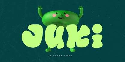 Juki is a handwritten font with bold display fun character. The groovy letters make this font great for logotype, headline, poster film, food packaging, magazine, labels or any type of advertising purpose. FEATURES : Uppercase, Lowercase, Number, Punctuation, Multilingual, PUA Encode, Opentype. If you have any question, don’t hesitate to contact me. Happy Designing !!! Thank You, Illushvara Design
 - Roney JNL by Jeff Levine,
$29.00If it's at all possible to "Deco-ize" an Art Deco font even more, it's been done with Roney JNL. Named for one of the classic hotels built during the heyday of Miami Beach, this font is a stylized version of Jeff Levine's Metalet Modern; a design derived from an actual 1940s home movie titling set. - Messy Linocut 2D by 2D Typo,
$24.00 Don't try to find logic in this font, nor the harmony of the forms. It is meant to be crank. All the letters were first cut in linoleum and then digitized. Hence, everything is alive. You will find no uniform elements. We think this font will find its use in the hands of a brave designer.
 - Yulia Khaira by Jehansyah,
$20.00 Yulia khaira This beautiful script font is perfect for all design needs, will keep it simple but look special, plus several alternatives that support your design, make sure you don't miss it, and it's your favorite font supported by PUA encoded, which is easy to access include : Yulia khaira latin numeric punctuation Alternate 400+ Thank you very much
 - ITC Franklin by ITC,
$40.99 The ITC Franklin™ typeface design marks the next phase in the evolution of one of the most important American gothic typefaces. Morris Fuller Benton drew the original design in 1902 for American Type Founders (ATF); it was the first significant modernization of a nineteenth-century grotesque. Named in honor of Benjamin Franklin, the design not only became a best seller, it also served as a model for several other sans serif typefaces that followed it. Originally issued in just one weight, the ATF Franklin Gothic family was expanded over several years to include an italic, a condensed, a condensed shaded, an extra condensed and, finally, a wide. No light or intermediate weights were ever created for the metal type family. In 1980, under license from American Type Founders, ITC commissioned Victor Caruso to create four new weights in roman and italic - book, medium, demi and heavy - while preserving the characteristics of the original ATF design. This series was followed in 1991 by a suite of twelve condensed and compressed designs drawn by David Berlow. ITC Franklin Gothic was originally released as two designs: one for display type and one for text. However, in early digital interpretations, a combined text and display solution meant the same fonts were used to set type in any size, from tiny six-point text to billboard-size letters. The problem was that the typeface design was almost always compromised and this hampered its performance at any size. David Berlow, president of Font Bureau, approached ITC with a proposal to solve this problem that would be mutually beneficial. Font Bureau would rework the ITC Franklin Gothic family, enlarge and separate it into distinct text and display designs, then offer it as part of its library as well. ITC saw the obvious value in the collaboration, and work began in early 2004. The project was supposed to end with the release of new text and display designs the following year. But, like so many design projects, the ITC Franklin venture became more extensive, more complicated and more time consuming than originally intended. The 22-font ITC Franklin Gothic family has now grown to 48 designs and is called simply ITC Franklin. The new designs range from the very willowy Thin to the robust Ultra -- with Light, Medium, Bold and Black weights in between. Each weight is also available in Narrow, Condensed and Compressed variants, and each design has a complementary Italic. In addition to a suite of new biform characters (lowercase characters drawn with the height and weight of capitals), the new ITC Franklin Pro fonts also offer an extended character set that supports most Central European and many Eastern European languages. ITC Franklin Text is currently under development.
 - DIN Next Arabic by Monotype,
$155.99 DIN Next is a typeface family inspired by the classic industrial German engineering designs, DIN 1451 Engschrift and Mittelschrift. Akira Kobayashi began by revising these two faces-who names just mean ""condensed"" and ""regular"" before expanding them into a new family with seven weights (Light to Black). Each weight ships in three varieties: Regular, Italic, and Condensed, bringing the total number of fonts in the DIN Next family to 21. DIN Next is part of Linotype's Platinum Collection. Linotype has been supplying its customers with the two DIN 1451 fonts since 1980. Recently, they have become more popular than ever, with designers regularly asking for additional weights. The abbreviation ""DIN"" stands for ""Deutsches Institut für Normung e.V."", which is the German Institute for Industrial Standardization. In 1936 the German Standard Committee settled upon DIN 1451 as the standard font for the areas of technology, traffic, administration and business. The design was to be used on German street signs and house numbers. The committee wanted a sans serif, thinking it would be more legible, straightforward, and easy to reproduce. They did not intend for the design to be used for advertisements and other artistically oriented purposes. Nevertheless, because DIN 1451 was seen all over Germany on signs for town names and traffic directions, it became familiar enough to make its way onto the palettes of graphic designers and advertising art directors. The digital version of DIN 1451 would go on to be adopted and used by designers in other countries as well, solidifying its worldwide design reputation. There are many subtle differences in DIN Next's letters when compared with DIN 1451 original. These were added by Kobayashi to make the new family even more versatile in 21st-century media. For instance, although DIN 1451's corners are all pointed angles, DIN Next has rounded them all slightly. Even this softening is a nod to part of DIN 1451's past, however. Many of the signs that use DIN 1451 are cut with routers, which cannot make perfect corners; their rounded heads cut rounded corners best. Linotype's DIN 1451 Engschrift and Mittelschrift are certified by the German DIN Institute for use on official signage projects. Since DIN Next is a new design, these applications within Germany are not possible with it. However, DIN Next may be used for any other project, and it may be used for industrial signage in any other country! DIN Next has been tailored especially for graphic designers, but its industrial heritage makes it surprisingly functional in just about any application. The DIN Next family has been extended with seven Arabic weights and five Devanagari weights. The display of the Devanagari fonts on the website does not show all features of the font and therefore not all language features may be displayed correctly.
 - DIN Next Devanagari by Monotype,
$103.99DIN Next is a typeface family inspired by the classic industrial German engineering designs, DIN 1451 Engschrift and Mittelschrift. Akira Kobayashi began by revising these two faces-who names just mean ""condensed"" and ""regular"" before expanding them into a new family with seven weights (Light to Black). Each weight ships in three varieties: Regular, Italic, and Condensed, bringing the total number of fonts in the DIN Next family to 21. DIN Next is part of Linotype's Platinum Collection. Linotype has been supplying its customers with the two DIN 1451 fonts since 1980. Recently, they have become more popular than ever, with designers regularly asking for additional weights. The abbreviation ""DIN"" stands for ""Deutsches Institut für Normung e.V."", which is the German Institute for Industrial Standardization. In 1936 the German Standard Committee settled upon DIN 1451 as the standard font for the areas of technology, traffic, administration and business. The design was to be used on German street signs and house numbers. The committee wanted a sans serif, thinking it would be more legible, straightforward, and easy to reproduce. They did not intend for the design to be used for advertisements and other artistically oriented purposes. Nevertheless, because DIN 1451 was seen all over Germany on signs for town names and traffic directions, it became familiar enough to make its way onto the palettes of graphic designers and advertising art directors. The digital version of DIN 1451 would go on to be adopted and used by designers in other countries as well, solidifying its worldwide design reputation. There are many subtle differences in DIN Next's letters when compared with DIN 1451 original. These were added by Kobayashi to make the new family even more versatile in 21st-century media. For instance, although DIN 1451's corners are all pointed angles, DIN Next has rounded them all slightly. Even this softening is a nod to part of DIN 1451's past, however. Many of the signs that use DIN 1451 are cut with routers, which cannot make perfect corners; their rounded heads cut rounded corners best. Linotype's DIN 1451 Engschrift and Mittelschrift are certified by the German DIN Institute for use on official signage projects. Since DIN Next is a new design, these applications within Germany are not possible with it. However, DIN Next may be used for any other project, and it may be used for industrial signage in any other country! DIN Next has been tailored especially for graphic designers, but its industrial heritage makes it surprisingly functional in just about any application. The DIN Next family has been extended with seven Arabic weights and five Devanagari weights. The display of the Devanagari fonts on the website does not show all features of the font and therefore not all language features may be displayed correctly. - DIN Next Cyrillic by Monotype,
$65.00DIN Next is a typeface family inspired by the classic industrial German engineering designs, DIN 1451 Engschrift and Mittelschrift. Akira Kobayashi began by revising these two faces-who names just mean ""condensed"" and ""regular"" before expanding them into a new family with seven weights (Light to Black). Each weight ships in three varieties: Regular, Italic, and Condensed, bringing the total number of fonts in the DIN Next family to 21. DIN Next is part of Linotype's Platinum Collection. Linotype has been supplying its customers with the two DIN 1451 fonts since 1980. Recently, they have become more popular than ever, with designers regularly asking for additional weights. The abbreviation ""DIN"" stands for ""Deutsches Institut für Normung e.V."", which is the German Institute for Industrial Standardization. In 1936 the German Standard Committee settled upon DIN 1451 as the standard font for the areas of technology, traffic, administration and business. The design was to be used on German street signs and house numbers. The committee wanted a sans serif, thinking it would be more legible, straightforward, and easy to reproduce. They did not intend for the design to be used for advertisements and other artistically oriented purposes. Nevertheless, because DIN 1451 was seen all over Germany on signs for town names and traffic directions, it became familiar enough to make its way onto the palettes of graphic designers and advertising art directors. The digital version of DIN 1451 would go on to be adopted and used by designers in other countries as well, solidifying its worldwide design reputation. There are many subtle differences in DIN Next's letters when compared with DIN 1451 original. These were added by Kobayashi to make the new family even more versatile in 21st-century media. For instance, although DIN 1451's corners are all pointed angles, DIN Next has rounded them all slightly. Even this softening is a nod to part of DIN 1451's past, however. Many of the signs that use DIN 1451 are cut with routers, which cannot make perfect corners; their rounded heads cut rounded corners best. Linotype's DIN 1451 Engschrift and Mittelschrift are certified by the German DIN Institute for use on official signage projects. Since DIN Next is a new design, these applications within Germany are not possible with it. However, DIN Next may be used for any other project, and it may be used for industrial signage in any other country! DIN Next has been tailored especially for graphic designers, but its industrial heritage makes it surprisingly functional in just about any application. The DIN Next family has been extended with seven Arabic weights and five Devanagari weights. The display of the Devanagari fonts on the website does not show all features of the font and therefore not all language features may be displayed correctly. - DIN Next Paneuropean by Monotype,
$92.99DIN Next is a typeface family inspired by the classic industrial German engineering designs, DIN 1451 Engschrift and Mittelschrift. Akira Kobayashi began by revising these two faces-who names just mean ""condensed"" and ""regular"" before expanding them into a new family with seven weights (Light to Black). Each weight ships in three varieties: Regular, Italic, and Condensed, bringing the total number of fonts in the DIN Next family to 21. DIN Next is part of Linotype's Platinum Collection. Linotype has been supplying its customers with the two DIN 1451 fonts since 1980. Recently, they have become more popular than ever, with designers regularly asking for additional weights. The abbreviation ""DIN"" stands for ""Deutsches Institut für Normung e.V."", which is the German Institute for Industrial Standardization. In 1936 the German Standard Committee settled upon DIN 1451 as the standard font for the areas of technology, traffic, administration and business. The design was to be used on German street signs and house numbers. The committee wanted a sans serif, thinking it would be more legible, straightforward, and easy to reproduce. They did not intend for the design to be used for advertisements and other artistically oriented purposes. Nevertheless, because DIN 1451 was seen all over Germany on signs for town names and traffic directions, it became familiar enough to make its way onto the palettes of graphic designers and advertising art directors. The digital version of DIN 1451 would go on to be adopted and used by designers in other countries as well, solidifying its worldwide design reputation. There are many subtle differences in DIN Next's letters when compared with DIN 1451 original. These were added by Kobayashi to make the new family even more versatile in 21st-century media. For instance, although DIN 1451's corners are all pointed angles, DIN Next has rounded them all slightly. Even this softening is a nod to part of DIN 1451's past, however. Many of the signs that use DIN 1451 are cut with routers, which cannot make perfect corners; their rounded heads cut rounded corners best. Linotype's DIN 1451 Engschrift and Mittelschrift are certified by the German DIN Institute for use on official signage projects. Since DIN Next is a new design, these applications within Germany are not possible with it. However, DIN Next may be used for any other project, and it may be used for industrial signage in any other country! DIN Next has been tailored especially for graphic designers, but its industrial heritage makes it surprisingly functional in just about any application. The DIN Next family has been extended with seven Arabic weights and five Devanagari weights. The display of the Devanagari fonts on the website does not show all features of the font and therefore not all language features may be displayed correctly. - Xiomara - Personal use only

- Backpack by Mans Greback,
$59.00 Don't forget this backpack while on your next design journey. Friendly and fun, Backpack proves very useful if you forgot to pack yourself a soft and rounded font. So strap up and get designing!
 - Cyclo by Cubo Fonts,
$39.00 Ainsi que le considérait Geoffroy Tory, typographe et philosophe de la Renaissance, chaque lettre de l'alphabet peut être dessinée à partir d'un cercle et d'un trait. La fonte "cyclo" actualise et radicalise ce principe graphique visionnaire. Le pack contient une version "regular" assez sage et une version "alternate" plus fantaisiste dans les accents et des signes de ponctuation. La fonte cyclo est dont adaptée à tous les usages (titres, sous-titres, chapitres et blocs de text), et peut servir efficacement l'identité visuelle de votre projet.
 - Blue Goblet Serif by insigne,
$6.99 Blue Goblet is a series of fonts and ornaments by Cory Godbey and Jeremy Dooley. This best selling series has now been extended to include a new member, Blue Goblet Serif. Blue Goblet Serif comes with a variety of weights and also an outline version. Blue Goblet is hand-lettered by the artist, Cory Godbey, and is organic, spontaneous and exuberant. Characters bounce and dance above and below the baseline and x-height, making this a whimsical and fun script. Not only is Blue Goblet Serif a excellent choice, it also is a member of a wide family of different fonts. You can use it side by side with the original Blue Goblet, and there are a wide range of ornaments available, totaling over 350 illustrations! These illustrations include frames, florals and other text ornaments that can be inserted into your text and resized at will. This makes the Blue Goblet series a great pick when you want a type system that works very well together for a very unique and consistent look. The Blue Goblet series continues to grow and be expanded, making it a valuable investment. Blue Goblet Serif also includes auto replacing ligatures that make it appear that the script was drawn by the artists own hand, just for you! Blue Goblet Serif also includes a wide variety of alternates that can be accessed in any OpenType enabled application. Blue Goblet includes over 150 OpenType glyphs, and is loaded with features including an even more unique alternate alphabet. Included are swash alternates, style sets, old style figures and small caps. Please see the informative PDF brochure to see these features in action. OpenType enabled applications such as the Adobe suite or Quark can take full advantage of the automatic replacing ligatures and alternates. This family also includes the glyphs to support a wide range of languages. Blue Goblet Serif is great choice for display and short blocks of display text, children's books, packaging, or other unique applications. Fill in the counter spaces with color for a unique look, or alternate the different weights. Use Blue Goblet whenever you want to inject a sense of fun and whimsy to your designs. Give the Blue Goblet series a try today!
 - StarTrack by HandletterYean,
$18.00 Imagine you want an interesting font that fits in many designs yet looks neat and also eye-catching. Don't worry anymore because it is answered. We present you with a special font named StarTrack. StarTrack is a must-have display font that enjoyable, pleasant, and elegant. It looks neat and suitable for your simple or complicated design. This font looks great for packaging, business cards, invitations, posters, labels and all kinds of your designs. Get this font into your collection now. Check out our font collection for more great and artistic fonts. Pick your most favorite font and use it as you like to reach your goals. What's included: 1. StarTrack font file 2. This font completed with: standard glyph, ligatures, punctuation & symbols, underline, and italic font style 3. Works both on Mac & PC 4. Simple installation 5. Accessible in the Adobe Illustrator, Adobe Photoshop, Adobe InDesign, and CorelDraw 6. Support multilingual; ä ö ü Ä Ö Ü ß ¿ ¡ You will love this font!
 - Hopferian by 2D Typo,
$28.00 This font has been developed based on the engraving by the German artist Daniel Hopfer (1470-1536) listing the Latin ABC. While creating the font I tried to preserve the archaism and certain imperfection characteristic for the prototype to accentuate its charm. Fanciful convolution on the serif make it a bit fairy-tale like and cheerful. The font is also available with decorated dots as in the original version. All the letters in the font are capital.
 - SF Handwriting by Sultan Fonts,
$40.00 The SF Handwriting font family is designed for educational and printing purposes. It is a carefully crafted font that supports Arabic, Latin, Persian, and Urdu. The font is characterized by its clarity, ease of reading, and visual appeal. It is also convenient to use in small sizes. The SF Handwriting font family includes three weights: Regular, Bold, and Black. The Dotted style is designed with a straight background for printing and overwriting by children or other users.
 - Kenwyn by Talbot Type,
$19.50 Kenwyn is a bold, geometric, Egyptian style slab-serif display font. It comes in two variations — Single Dot and Double Dot — each with an accompanying Stencil variation. Essentially a blend of circles and squares, Single Dot features a circular counter at the centre of each character, while Double Dot uses a lower and upper circle. Although the two variations are similar in principle, the results are visually quite different.
 - Vintage Melody Personal Use - Personal use only

- Rooster Squad by Alexander Sharkov,
$9.00 Let me introduce our new handwritten font - the Rooster Squad! Our dangerous font is designed for completely different missions. Suitable for logo and package design, user interface design, online and print use, comics and more! The font contains letters from a huge number of languages. Contains Latin and Cyrillic alphabets. We also designed various ligatures and alternate letters to add variety to our cool and dangerous typeface. The font will be constantly updated and developed! Don't know what to do with your cool new project? Call the Rooster Squad!
 - Wesker by SimpleType Studios,
$15.00 Introducing our Wesker - Sans Serif Display Font Collection—a stunning blend of style, versatility, and impact. With 15 fonts, 5 weights, and 3 widths to choose from, your designs will shine like never before. Each font is meticulously crafted to leave a lasting impression, offering unparalleled elegance and precision. Whether you're creating logos, packaging, or posters, our collection empowers you to make a bold statement. Don't settle for ordinary—unlock the power of extraordinary typography. Order our Sans Serif Display Font Collection today and elevate your designs to new heights.
 - Rotten by Pen Culture,
$15.00 Rotten is modern and elegant serif font. This font bring modern minimalist and elegant concept, this font will be very suitable for branding needs, logo design, posters and much more. This font is equipped with ligatures and beautiful alternates, you can mix and match them very easily in your projects. I really hope you enjoy it – please do let me know what you think, comments & likes are always hugely welcomed and appreciated. More importantly, please don’t hesitate to drop me a message if you have any issues or queries. Thank you
 - Astogria Bejha by Figuree Studio,
$18.00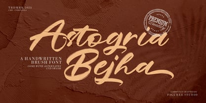 Introducing Astogria Bejha! Astogria Bejha is modern hand-drawn brush font that combines attractive curves with a fresh urban edge; delivering a stylish brush font that is guaranteed to add an eye-catching appeal to your logo designs, brand imagery, handwritten quotes, product packaging, merchandise, social media post, or website font. Features: Uppercase and Lowercase Number and Punctuation Ligature Stylistic Alternate Swash Versatile for branding, headline, or printing product Detailed dry brush markers I hope you enjoy this font. If you have questions, don't hesitate to give me a message Thank You!
 - Sambar by Twinletter,
$15.00 Sambar is our newest display font, which has been meticulously created in every typeface to achieve a true graffiti-style shape. If you don’t utilize this font, all of your outside events and activities will feel out of place. This graffiti font is great for product logos, poster titles, headlines, packaging, film titles, logotypes, gorgeous writing, and trendy graffiti designs, among other things. Of course, if you utilize this font in your numerous creative projects, they will be perfect and outstanding. Use this typeface right away for your one-of-a-kind and remarkable projects.
 - Carolissa by Motokiwo,
$15.00 Carolissa is a script brush font with handwriting style. It's a simple and classy font that is suitable for various design project. With dynamic and spontaneous flow gestures, Carolissa will add more drama to your project. This font includes uppercase, lowercase, numeral, punctuation, ligature, and the multilingual support is also already PUA encoded. I believe in Leonardo da Vinci, that "Simplicity is the ultimate form of sophistication." If you have any issue or question, don't hesitate to drop me a message or email at motokiwodesign@gmail.com. I hope you enjoy the font!
 - Black Stones by Illushvara,
$14.00 Hello, Black Stones is a display brush script font with rock music concept. The strokes alternates make this font outstanding and looks like handwritten grunge line very great for logotype. This type of font perfectly made to be applied especially in headline, esport logo, food packaging, fashion magazine, labels or any type of advertising purpose. This font support Multilingual Languages. FEATURES : -Uppercase -Lowercase -Number -Punctuation -Multilingual -PUA Encode -Opentype -Alternates -Ligatures FILES INCLUDED If you have any question, don’t hesitate to contact me. Happy Designing !!! Thank You, Illushvara Design
 - The Stories by Struggle Studio,
$16.00 The Stories is a retro styled font with a stunning style that can make the most of your design projects. This font gives a touch of retro style that was famous in the 60-70s. This font has an alternative style for Uppercase and Lowercase, Ligature, which can be adapted to your design needs so you don't waste time creating extrusion effects. The total glyph for this Stories Script font is 454 and for Stories Display it is 185, so you can choose according to the right style.
 - Ghost Hunters by Illushvara,
$14.00 Ghost Hunters is a display brush spooky font with horror halloween consept. The strokes alternates make this font outstanding and looks like grunge brush line very great for logotype and any promotion about Halloween Seasons. This type of font perfectly made to be applied especially in headline, apparel logo, food logotype, fashion, poster film, music, invitations or greeting cards or any type of advertising purpose. This font support Multilingual Languages. FEATURES : Uppercase Lowercase Number Punctuation Multilingual PUA Encode Opentype Alternates If you have any question, don’t hesitate to contact me. Happy Designing !!!
 - Omiwa by Orenari,
$14.00 Omiwa is a playful Display font with a unique character that is perfect for all design purposes. With unique alternate characters you can combine it into awesome waves! - This font is semi-ALL-Caps font, because some characters have lowercase (f, g, i, j, r). - The characters with Stylistic Alternates : A, H, K, M, N, R, U, V, W, X, Y I really hope your projects will be cool with this font, and please don't hesitate to drop me a message if you have any questions or you wanna share some jokes!
 - Classic Marker by Illushvara,
$18.00 Hello, Classic Marker is a display brush font with handwritten consept inspired with classic marker line. The strokes alternates make this font outstanding and looks like grunge line classic very great for logotypes. This type of font perfectly made to be applied especially in headline, logo, food packaging, fashion magazine, labels or any type of advertising purpose. This font support Multilingual Languages. FEATURES : Uppercase Lowercase Number Punctuation Multilingual PUA Encode Opentype Alternates Ligatures If you have any question, don’t hesitate to contact me. Happy Designing !!! Thank You, Illushvara Design
 - Home Track by Illushvara,
$15.00 Hello, Home Track is a display slab font. More explore the basic slab font speciality the uppercase mix with a vintage adventure style and make an unique alternates line. Will make your design strong, bold and stand out. With playful line this font perfects for headline, poster film, banner product, website, logo labels or any type of advertising purpose. This font support Multilingual Languages. FEATURES : Uppercase Number Punctuation Multilingual PUA Encode Opentype Character Alternates FILES INCLUDED : Home Track. Otf If you have any question, don’t hesitate to contact me. Happy Designing !!! Thank You, Illushvara Design
 - Sassy by Just Bia,
$10.00 Introducing Sassy: a sans serif font! Sassy is a cute handwritten font. It maintains its classy calligraphic influences while feeling contemporary and fresh. This versatility will appeal to a wide range of crafty ideas, from letterheads and titles, to stationery. This font is perfect for: • greeting cards • packaging • social media and more! As the nature of the characters is hand-drawn some "wonky" lines might be found which helps to add another touch of organic in the font! Don't hesitate to reach out if you need any further information. Bia
 - Holicya by Dumadi,
$35.00 Holicya is a retro-style font with a stunning style that can make the most of your design projects. This font gives a touch of the retro style that the 60-70s was famous for. This font has alternative styles for Uppercase and Lowercase, Ligature, ss01, ss02, ss03 to ss04 which can be customized to suit your design needs so you don't waste time creating extrusion effects. The total glyphs for this font is 356 so you can choose according to the right style. Sincerely, Toni Dzulham - Dumadistyle


