10,000 search results
(0.022 seconds)
- Osmosis by HIRO.std,
$17.00 Osmosis is Display Font This font describes about modern life, stylist, modern, retro, vintage and easy to use. Osmosis inspired by modern life, retro and vintage. FEATURES - Uppercase and Lowercase letters - Numbering and Punctuations - Support Ligatures - PUA Encoded Characters - Multilingual Support - Works on PC or Mac - Simple Installation USE Osmosis Display Font works great in Logotype, T-shirt/ Apparel Design, Title, Poster and Magazine. Enjoy using! Thanks. HIRO.std
 - Everglow Script by Seniors Studio,
$29.00 Everglow Script is retro signage font, bold and clean. There are so many variations on each character. Include Opentype stylistic alternates, standard ligatures and multilingual support. You are able to create so many different typographical layouts easily and quickly. Make sure you use OpenType savvy program and simply open Glyph Palette to access all of the glyphs. This font is suitable for t-shirts, signage, logos, branding, packaging etc.
 - Lamar Pen by Three Islands Press,
$39.00 Mirabeau Buonaparte Lamar had an exotic name for a historic Texan, but he left his mark beginning in 1836, the year of Texas independence and the first year that pioneers other than mountain men made their way West. Lamar went on to become the young republic’s first elected vice-president (to President Houston) and second president -- and to author a number of interesting letters in his elegant, stylish hand. (Mirabeau B. Lamar grew up a well-to-do southerner from Georgia, and his penmanship shows it.) One of the most interesting aspects of designing old handwriting fonts, to me, is pausing to reflect on the actual moment that the letter-writer is sitting at his or her desk or table, pen in hand, putting thoughts to words -- 150 to 200 years ago. Has a complete character set, and plenty more.
 - Northern Monk by Kaer,
$19.00 Hi, guys! I like creating fonts with a story. Once me and my family were traveling and exploring the northern area of our region and came across an inscription carved on the wall of a monastery tower. It inspired me to create a full set of a multulingual font, but there is no lowercase letters. What's included? Only uppercase Multilingual support Numbers Symbols Punctuation Ligatures If Northern Monk is not ok, please check out my Celtic Spiral font https://www.myfonts.com/fonts/kaer/celtic-spiral/ I hope you enjoy this font. Follow my shop to receive updates of products and the very hottest news! If you have any question or issue, please contact me: kaer.pro@gmail.com Please request to add additional characters and glyphs if you need! Thank you!
 - Tuna by Ligature Inc,
$49.00 Tuna is simply a contemporary body text font. It is contemporary, meaning the merge of charming broad-nibbed calligraphic style with optimized readability on screen – showing that the roots of writing and typesetting are still in charge when reading “Anna Karenina” on your Kindle till 4 o’clock in the morning. Tuna has a natural fit for cross-media use because the design is based on forms characterized by different conditions of constancy, stability and good readability. Well-defined shapes and distinctive details only become apparent when used in larger sizes, making Tuna a true all-rounder. With more than 700 glyphs in 10 styles created with a maximum of consideration, it has all the qualities of a modern OpenType font serving the needs of today's communication. If you would like to read more about the Typeface please visit our promo site.
 - Donatella by Arendxstudio,
$18.00 Donatella - Handwritten Fonts are elegant handwritten fonts, with texture, to be as authentic as possible while still being able to read clearly on your project. Donatella is a truly versatile font - combining sophisticated, casual and even fun sides depending on the style you use. A complete set of upper and lower case letters, and a second set of lowercase letters, Donatella - Handwritten Font also has 37 Ligatures for question just email.
 - Crima by Gatype,
$12.00 Crima Font Black Serif totality and elegance. One of the newest releases that can only be done now, naturally drawn with pinpoint accuracy. Crima has the perfect signature and subtlety for your next project. It perfectly represents the retro and vintage aesthetic. I recommend this font for your next logo, invitation, and home decor project that needs a succinct alternative combination touch! The Criman font comes with available strong characters: Get inspired by the image above and feel free to share with me what you get by using this font.
 - Pre Code Movies JNL by Jeff Levine,
$29.00 The hand lettered credits from the 1931 melodrama “Safe in Hell” inspired the typeface Pre Code Movies JNL, which is available in both regular and oblique versions. The design is strongly influenced by the popular Art Deco style of thick-and-thin characters and also features rounded corners. The font’s name comes from the early era of talking pictures and the short period before the establishment of the Hays Office in 1934 when Hollywood did not self-censor itself. Many then-taboo topics were exploited on film until Will Hays cracked down on such productions. To read more about Pre-Code Hollywood, visit the Wikipedia link: https://en.wikipedia.org/wiki/Pre-Code_Hollywood
 - Red Mignolet by FadeLine Studio,
$15.00 Red Mignolet is a hand-drawn slab type brush font. This font adopts a bold, firm, natural and trendy style. Very suitable to meet your design and packaging product needs at this time, especially when the current trend is Branding on MUG or CUP with natural fonts like painted!
 - Baleny by Craft Supply Co,
$15.00 Baleny Elegant Font Duo is a combination of a serif font & beauty handwritten script font based on the expression of real handwriting. Baleny Elegant Font Duo will work perfectly for fashion, e-commerce brands, trend blogs, wedding boutiques or any business that wants to appear upscale and chic.
 - Auberge Script by Sudtipos,
$79.00 It took me a long time, but I think I now understand why people of my generation and older feel the need to frame current events in an historical context or precedents, while most of the young couldn't care less about what happened ten years ago, let alone centuries back. After living for a few decades, you get to a point when time seems to be moving quite fast, and it’s humbling to see that your entire existence so far can be summed up in a paragraph or two which may or may not be useful to whoever ends up reading the stuff anyhow. I suppose one way to cope with the serenity of aging is trying to convince yourself that your life and work are really an extension of millenia of a species striving to accept, adapt to, and improve the human condition through advancing the many facets of civilization -- basically making things more understandable and comfortable for ourselves and each other while we go about doing whatever it is we are trying to do. And when you do finally convince yourself of that, history becomes a source of much solace and even a little premonition, so you end up spending more time there. Going far back into the history of what I do, one can easily see that for the most part it was ruled by the quill. Western civilization’s writing was done with quill pens for more than thirteen centuries and with newer instruments for about two. By the mid-18th century, the height of the quill experience, various calligraphy techniques could be discerned and writing styles were arranged in distinct categories. There are many old books that showcase the history of it all. I recommend looking at some whenever the urge comes calling and you have to get away from backlit worlds. Multiple sources usually help me get a better perspective on the range of a specific script genre, so many books served as reference to this quill font of mine. Late 17th century French and Spanish professional calligraphy guides were great aides in understanding the ornamental scope of what the scribes were doing back then. The French books, with their showings of the Ronde, Bâtarde and Coulée alphabets, were the ones I referenced the most. So I decided to name the font Auberge, a French word for hotel or inn, because I really felt like a guest in different French locales (and times) when I going through all that stuff. Because it is multi-sourced, Auberge does not strictly fit in a distinct quill pen category. Instead, it shows strong hints of both Bâtarde and Coulée alphabets. And like most of my fonts, it is an exercise in going overboard with alternates, swashes, and ornamental devices. Having worked with it for a while, I find it most suitable for display calligraphic setting in general, but it works especially well for things like wine labels and event invitations. It also shines in the original quill pen application purpose, which of course was stationery. Also, as it just occurred to me, if you find yourself in a situation where you have to describe your entire life in 50 words or less, you may as well make it look good and swashy, so Auberge would probably be a good fit there as well. This is one quill script that no large bird had to die for. A few technical notes The Auberge Script Pro version includes 1800 glyphs, everything is included there. Also latin language support. We recommend you to use the latest design application to have full access to alternates, swashes, small caps, ornaments, etc. The images from the gallery uses this version. For better results use the fonts with “liga” feature on. Awards During 2014 the early develop of Auberge Script was chosen to be part of Tipos Latinos, the most important type exhibition in South America.
 - Vianova Serif Pro by Elsner+Flake,
$59.00 The font superfamily Vianova contains each 12 weights of Sans and Slab and 8 weights of the Serif style. The design from Jürgen Adolph dates back into the 1990s, when he studied Communication Design with Werner Schneider as a professor at the Fachhochschule Stuttgart. Adolph started his carrier 1995 at Michael Conrad & Leo Burnett. He was responsible for trade marks as Adidas, BMW, Germanwings and Merz. He has been honored as a member of the Art Directors Club (ADC) with more than 100 awards. On February 26, 2014, Jürgen Adolph wrote the following: “I was already interested in typography, even when I could not yet read. Letterforms, for instance, above storefronts downtown, had an irresistible appeal for me. Therefore, it is probably not a coincidence that, after finishing high school, I began an apprenticeship with a provider of signage and neon-advertising in Saarbrücken, and – in the late 1980s – I placed highest in my field in my state. When I continued my studies in communications design in Wiesbaden, I was introduced to the highest standards in calligraphy and type design. “Typography begins with writing” my revered teacher, Professor Werner Schneider, taught me. Indefatigably, he supported me during the development of my typeface “Vianova” – which began as part of a studies program – and accompanied me on my journey even when its more austere letterforms did not necessarily conform to his own aesthetic ideals. The completely analogue development of the types – designed entirely with ink and opaque white on cardboard – covered several academic semesters. In order to find its appropriate form, writing with a flat nib was used. Once, when I showed some intermediate designs to Günter Gerhard Lange, who occasionally honored our school with a visit, he commented in his own inimitable manner: “Not bad what you are doing there. But if you want to make a living with this, you might as well order your coffin now.” At that time, I was concentrating mainly on the serif version. But things reached a different level of complexity when, during a meeting with Günther Flake which had been arranged by Professor Schneider, he suggested that I enlarge the offering with a sans and slab version of the typeface. So – a few more months went by, but at the same time, Elsner+Flake already began with the digitilization process. In order to avoid the fate predicted by Günter Gerhard Lange, I went into “servitude” in the advertising industry (Michael Conrad & Leo Burnett) and design field (Rempen& Partner, SchömanCorporate, Claus Koch) and worked for several years as the Creative Director at KW43 in Düsseldorf concerned with corporate design development and expansion (among others for A. Lange & Söhne, Deichmann, Germanwings, Langenscheidt, Montblanc.”
 - Vianova Slab Pro by Elsner+Flake,
$59.00 The font superfamily Vianova contains each 12 weights of Sans and Slab and 8 weights of the Serif style. The design from Jürgen Adolph dates back into the 1990s, when he studied Communication Design with Werner Schneider as a professor at the Fachhochschule Stuttgart. Adolph started his carrier 1995 at Michael Conrad & Leo Burnett. He was responsible for trade marks as Adidas, BMW, Germanwings and Merz. He has been honored as a member of the Art Directors Club (ADC) with more than 100 awards. On February 26, 2014, Jürgen Adolph wrote the following: “I was already interested in typography, even when I could not yet read. Letterforms, for instance, above storefronts downtown, had an irresistible appeal for me. Therefore, it is probably not a coincidence that, after finishing high school, I began an apprenticeship with a provider of signage and neon-advertising in Saarbrücken, and – in the late 1980s – I placed highest in my field in my state. When I continued my studies in communications design in Wiesbaden, I was introduced to the highest standards in calligraphy and type design. “Typography begins with writing” my revered teacher, Professor Werner Schneider, taught me. Indefatigably, he supported me during the development of my typeface “Vianova” – which began as part of a studies program – and accompanied me on my journey even when its more austere letterforms did not necessarily conform to his own aesthetic ideals. The completely analogue development of the types – designed entirely with ink and opaque white on cardboard – covered several academic semesters. In order to find its appropriate form, writing with a flat nib was used. Once, when I showed some intermediate designs to Günter Gerhard Lange, who occasionally honored our school with a visit, he commented in his own inimitable manner: “Not bad what you are doing there. But if you want to make a living with this, you might as well order your coffin now.” At that time, I was concentrating mainly on the serif version. But things reached a different level of complexity when, during a meeting with Günther Flake which had been arranged by Professor Schneider, he suggested that I enlarge the offering with a sans and slab version of the typeface. So – a few more months went by, but at the same time, Elsner+Flake already began with the digitilization process. In order to avoid the fate predicted by Günter Gerhard Lange, I went into “servitude” in the advertising industry (Michael Conrad & Leo Burnett) and design field (Rempen& Partner, SchömanCorporate, Claus Koch) and worked for several years as the Creative Director at KW43 in Düsseldorf concerned with corporate design development and expansion (among others for A. Lange & Söhne, Deichmann, Germanwings, Langenscheidt, Montblanc.”
 - Vianova Sans Pro by Elsner+Flake,
$59.00 The font superfamily Vianova contains each 12 weights of Sans and Slab and 8 weights of the Serif style. The design from Jürgen Adolph dates back into the 90th, when he studied Communication Design with Werner Schneider as a professor at the Fachhochschule Stuttgart. Adolph started his carrier 1995 at Michael Conrad & Leo Burnett. He was responsible for trade marks as Adidas, BMW, Germanwings and Merz. He has been honoured as a member of the Art Director Club (ADC) with more than 100 awards. On February 26, 2014, Jürgen Adolph wrote the following: “I was already interested in typography, even when I could not yet read. Letterforms, for instance, above storefronts downtown, had an irresistible appeal for me. Therefore, it is probably not a coincidence that, after finishing high school, I began an apprenticeship with a provider of signage and neon-advertising in Saarbrücken, and – in the late 1980s – I placed highest in my field in my state. When I continued my studies in communications design in Wiesbaden, I was introduced to the highest standards in calligraphy and type design. “Typography begins with writing” my revered teacher, Professor Werner Schneider, taught me. Indefatigably, he supported me during the development of my typeface “Vianova” – which began as part of a studies program – and accompanied me on my journey even when its more austere letterforms did not necessarily conform to his own aesthetic ideals. The completely analogue development of the types – designed entirely with ink and opaque white on cardboard – covered several academic semesters. In order to find its appropriate form, writing with a flat nib was used. Once, when I showed some intermediate designs to Günter Gerhard Lange, who occasionally honored our school with a visit, he commented in his own inimitable manner: “Not bad what you are doing there. But if you want to make a living with this, you might as well order your coffin now.” At that time, I was concentrating mainly on the serif version. But things reached a different level of complexity when, during a meeting with Günther Flake which had been arranged by Professor Schneider, he suggested that I enlarge the offering with a sans and slab version of the typeface. So – a few more months went by, but at the same time, Elsner+Flake already began with the digitilization process. In order to avoid the fate predicted by Günter Gerhard Lange, I went into “servitude” in the advertising industry (Michael Conrad & Leo Burnett) and design field (Rempen& Partner, SchömanCorporate, Claus Koch) and worked for several years as the Creative Director at KW43 in Düsseldorf concerned with corporate design development and expansion (among others for A. Lange & Söhne, Deichmann, Germanwings, Langenscheidt, Montblanc.”
 - Goldtext by Attractype,
$10.00 f you like being creative with bold serif fonts, then the BOLDTEXT font could be your choice. The thick and sharp shape will direct the eye to your special design. A legible letter style will form words that are easy to read. You can use this font to design logos, titles, magazines, comics, text effects, banners and more. Feel free to contact me about this font.
 - Shiny Ink Display by Lloyd David Designs,
$14.99 Hi there, thanks for looking at my first typeface. It began as one of my original sketches back in 2019 as a freelance graphic designer trying to create unique letterforms that I could use for posters or websites with other possible use cases in mind for commercial use. The sketches were then passed on to and worked on with Vladimir Tsagolov who has more experience in creating professional typefaces, the experience for me was invaluable, and I have many more typefaces I'm now working on. Shiny Ink Display is a collection of hand drawn fonts based on the flow of reflective viscous ink with 7 styles, some styles can be interchangeable and used on top of each other. For example, Shiny Ink Display Plain, can be used with Shiny Ink Display Plain Lined to create shadows underneath it, at angles not available with the Shadow styles you'll see in the font collection. Shiny Ink Display has various use cases, maybe even infinite, but more specifically for posters or websites with large text, though it bodes quite well at smaller sizes, and is visually appealing to its viewers as long as it's at a legible font size. When it comes to font pairing, Shiny Ink Display works especially well with Monospace and sans-serif fonts. You can check the poster examples on this page to help you imagine what you could do with the font styles. I also had in mind manufactured products, but I could leave that to you to create your ideas with the available font styles. In regards to languages or typing on a keyboard, most of the English/European latin or cyrillic language keys are supported, so you'll have lots of glyph characters to play with for a number of ideas you may have. All the best with your projects using my fonts, if there are any issues, don't hesitate to contact me for support: lloyddaviddesigns.co.uk - Lloyd David
 - Stenzilla by DarezD,
$13.00 Stenzilla is a stencil font based on a rounded sans serif, a careful design, with cuts on the same diagonal axis for the curved strokes and elegant slight curves on the oblique strokes. Useful for branding, highlighted paragraphs, signs, headlines, or reading text. The design incorporates characters from the Cyrillic alphabet, special characters, and characters with diacritical marks. It has the versatility of a sans serif that allows it to be used in a wide variety of designs and styles along with the cut-stroke grace of a stencil font.
 - Olivia01 - Personal use only

- Violette01 - Unknown license

- Speed Bump by Three Islands Press,
$19.00 I, uh, don't know quite what to say. I'd toiled so long over Pumpkinseed back in '96 that I guess I needed a good, wild ride to shake out the head cramps, or something. Whatever grabbed me, it forced me to sit down and design a typeface real fast directly in Fontographer (had never done that before). Took less than two hours to finish the regular character set. No way to explain it, but the exercise actually paid off -- I think. And now that there was Speed Bump, there simply had to be a companion dingbat set. (Beats the heck out of me.) So check out Speed Bump's wacky character(s) and, if you're really bored, the 200-some-odd little pictures in Speed Bump Pi.
 - Patrilya Script by Mercurial,
$12.00 Patrilya Script A New Romantic Script Calligraphy made with a touch of lovely and charming attraction that adds to the impression of a beautiful and elegant. a charming typeface and So beautiful on invitation like greeting cards, wedding invitation, branding materials, business cards, quotes, posters, headings, signature, logos, t-shirt, letterhead, signage, label, news, posters, badges and more Patrilya Script has a script typeface and extra letters and included floral ornaments that allows you to be more fancy and more extraordinary in designing. Patrilya Script requires no special software to use or access the alternate letters. You can even use Patrilya Script in basic writing apps like Word For those with Opentype capable software ( Photoshop CC or any version of Illustrator/ Indesign), Patrilya Script also comes with Opentype features such as access to all the alternate letters and double letter ligatures. And this Font has given PUA unicode (specially coded fonts). so that all the alternate characters can easily be accessed in full by a craftsman or designer. Don't forget to check out other cool fonts on our store and wait for new fonts. Follow our shop for upcoming updates including additional glyphs and language support. feel free to send me a message, comment, like and share. Thanks
 - Smart Bars12 by Postage Saver Software,
$15.00 This is a special font for use creating US Postal Service "Intelligent Mail" barcodes. Those are the barcodes you see on most cards and envelopes. Commercial mailers get the best pricing by printing barcodes when they address the mail, saving the Postal Service a step. The barcodes are also used on reply mail and Share mail, and for "Informed Visibility" tracking. Software to create these barcodes, including the USPS Intelligent Mail Small Business (IMsB) tool, typically provide an output of 65 characters, each character being an A, D, T or F, corresponding to each of the styles of bar. SmartBars 12 replaces those characters with the corresponding bar. When doing a mail merge to print addresses, the user would set the barcode field on their merge template to be printed using SmartBars 12, at 12 point, regular, and the barcode will print with the correct bars and at the required size to meet USPS requirements.
 - Deadline Remastered by Comicraft,
$29.00 The hands on the clock tick inexorably on... the numbers on the digital display roll inevitably toward zero... time is tight, the fuse is getting shorter and the beads of sweat on your forehead are glistening in the red light of the LCD... you have come to a place where the only thing you feel are loaded guns in your face... can YOU handle the DREADED DEADLINE DOOM?!? TICK TICK TICK TICK TICK TICK TICK TICK TICK THRAKAKAKATHOOM! Uh oh… you blew it. Deadline Remastered features 18 static weights, including the new nearly square "Block", each with complete Western & Central European language support. Use the Solid & Open Variable fonts to access unlimited width and angle options.
 - Pagoda International by Poole,
$18.50Imagine there's an explosion in a comic book, the exclamation that follows is set in PAGODA INTERNATIONAL. This font is inspired by the graphics on one of Honolulu's 1950's skyscrapers - The Pagoda Hotel with the International Ballroom. Created by former wine label designer, Wesley Poole, Pagoda is the opposite of sophisticated elegance. "Big, fat, and horsy, that's what I was after. It's the wacky juxtaposition of these familiar shapes that makes it work. Just try a couple words. You'll be surprised! I'm glad this one's behind me. It's my first pancake." - Honey Bear by Letterara,
$12.00 Honey Bear is inspired by honey and cartoon fonts and features an incredibly fun and cute feel! Get inspired by its childlike charm. The features: • The style in this font includes: Regular & Italic • Works both on Mac & PC • Simple installations • Ligature • Support Silhouette • Accessible in the Adobe Illustrator, Adobe Photoshop, Adobe InDesign, CorelDraw, even work on Microsoft Word. • Multilingual Support: ä ö ü Ä Ö Ü ß ¿ ¡ To stay up to date for my latest job, follow me and let’s be friends because there will be many promos.
 - Green Home by DLetters Studio,
$18.00 Hello, This GREEN HOME Sans Serif font, has a Skinny, Stylish, and elegant Shape is perfect for your design ideas with the theme of Home Decorating, Home Idea, and is also very suitable as a complementary font for any of your photography and creative works. What’s Included : – Web Fonts – Ligature – Works on Win, Mac – Simple installations – Accessible in Adobe Illustrator, Adobe Photoshop, Adobe InDesign, even work on Microsoft Word. – PUA Encoded Characters – Fully accessible without additional design software. Hope you enjoy it with GREEN HOME font! Contact me if you have questions
 - Brotherhood by Ahmad Jamaludin,
$15.00 Introducing the New Display Font, Brotherhood! Brotherhood is monoline display sans font. This font suitable many project, like logo, lettering, quote, apparel, fashion, photography, watermark and many more!. This font has many alternate glyphs and ligature of type could help you make a stylish design, and alternate character could bring a good display. Each glyph made manually one by one with very diligent and consistency. Features : Uppercase Lowercase Numerals & Punctuations Accents (Multilingual characters) Ligature and Alternate What's included? Brotherhood OTF Message or email me if you need question : dharmasahestya@gmail.com. Thanks! dharmas Std
 - Zahran by NamelaType,
$19.00 Zahran is a lovely Latin and Arabic handwritten script, Inspired by modern calligraphy style. This style is a challenge for me in designing Arabic letters, I tried joining Arabic on one side so that the baseline shape is dynamic. Come with many feature; Stylistic alternate, character variant (cv01 to cv12), ligatures, multilingual characters, begining and ending swash, and lovely connecter for lowercase, that can be accessed with opentype feature. Zahran is perfect for branding project, product packaging, tile, logo, wedding, quotes and where ever you need lovely design.
 - Retro Nouveau JNL by Jeff Levine,
$29.00 Because of the large influx of Irish immigrants during the late 1800s and early 1900s, it was not unusual for songwriters of the day to craft songs around Irish themes, offering a nostalgic link to their homeland. One such 1917 piece entitled "You Brought Ireland Right Over to Me" had the title hand lettered on the sheet music cover in a sans serif design reflecting the popular Art Nouveau movement of the day. This design is now available digitally as Retro Nouveau JNL, in both regular and oblique versions.
 - Dinamica by Rezastudio,
$9.00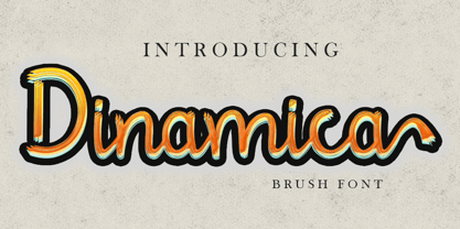 Dinamica is consisting of a stylish layered font. This font was created with contextual alternates opentype features to create slice effect. Denamica is perfect for branding projects, logo, social media posts, advertisements, product packaging, product designs, label, stationery and anything that you want. Here is that you get: Works on PC & Mac. Simple installations Supports multilingual Accessible in the Adobe Illustrator, Adobe Photoshop, Adobe InDesign, even work on Microsoft Word. PUA Encoded Characters – Fully accessible without additional design software. Drop me message if you have any questions. Happy Creating Thanks
 - Worriment by The Ampersand Forest,
$20.00 Worriment is a simple, one-off typeface; part of the Dreads collection from the Ampersand Forest. He was born of a whimsical sense of queasiness and unease — he's not just scary, he's Scary Fun! A little kitsch, a little horror. Great for use on Halloween-themed designs, and reminiscent of a "wizarding" look. In terms of letterforms, Worriment is a quirky blackletter-latin hybrid with a sharp, slightly bouncy baseline, and jangly angles, suitable for display use.
 - Sparticus by Solotype,
$19.95A European font from Bauer's foundry was the inspiration for the caps in the font. There was no lowercase, so we designed one. Although the original font was intended for display lines in advertising, our version reads quite well in smaller point sizes, too. - Humble Hearts by Joanne Marie,
$20.00 Humble Hearts is a mono script font designed to look handlettered and unique. With over 700 glyphs you will have lots of fun designing beautiful logos, t-shirts, wedding stationery, menus - the list is endless! Anyone can access the alternate glyphs via Font Book on a mac or Character Map in Windows to copy and paste into non designer software. Please take a look at all of the pictures to see this font at work. You can use the basic glyphs as a lovely script on it's own or you can make your designs really fancy using the alternates and swashes. You can choose to have the breaks in the swashes (as shown) or solid swashes. In addition to the multilingual characters included in this font are the following styles and glyphs: Alternates Ligatures Swashes Ornaments & Premade words
 - Mollinder by TypeClassHeroes,
$17.00 Mollinder is a Aesthetic script come with retro and refined style, you can explore and combine creating rhythm for comfortable reading. This font perfect for any projects, such logotype, stickers, greeting / wedding cards, packaging design, headlines, brand identity, t-shirt, posters, magazines, books, Instagram, websites, and many more. Feature Uppercase & Lowercase Number & Symbol International Glyphs Multilingual support Alternative Ligature Feel free to drop us a message any time and follow my shop for upcoming updates. Hope you enjoy it.
 - Eris Pro by DBSV,
$120.00 Rolling gemstones… The name "Eris" is again borrowed from Greek mythology, is related to the myth "the apples of Hesperides" which were gold and one of them got the Erida!!! More about this myth can be found on the web... And in this font (as in one section in the "Cyceon" font) I have mixed in the lower case with the capitals in many letters.I tried here to give a different illustration in lowercase letters, simply because of whims or because the monotony is tiring me!!! One can also mix here with two levels to get a third color depiction using the “ErisPro-Black” with “ErisPro-Strap” or “ErisPro-BlackIt” with “ErisPro-StrapIt” This series is composed and includes twenty-four fonts with 658 glyphs each, with true italics and supports Latin, Greek and Cyrillic.
 - Verse Sans by Hubert Jocham Type,
$39.00 In 2006 the art director of Emotion, a women’s psychology magazine, asked me to design a copy typeface for them. Before I actually got the job I started to work on a serif. I wanted it to be feminine but still clear and modern. On one hand there are the floral round elements and on the other hand the angular serifs. In the composition I wanted the two extremes to work together. All the other elements had to be harmonized. The proportions needed to match the magazine’s requirements. The ascenders and descenders are short enough to work in narrow columns but long enough to work in small sizes. As you can imagine, the emotion-job never happened. In copy you should not get heavier than Heavy. Extrabold and Ultrabold work best in display.
 - VTC-FreehandTattooOne - Personal use only

- VTC-BadEnglischOne - Personal use only

- Bastardilla - Personal use only

- Burdigala Sans by Asgeir Pedersen,
$19.99 Burdigala is a clean-cut, modern yet classic typeface inspired by Didones and Aicher’s Rotis family. Burdigala Sans is especially well suited for on-screen usage such as in apps and pdf documents. It is also ideal for larger amounts of (printed) texts in brochures, magazines and books. It is slighty narrow in order to conserve space, but spacious enough to faciliate reading and overall clarity. Check out its sibling, the Burdigala Semi Serif version. The expanded versions, being wider and more open, works equally well in media intended both for print and on-screen reading, e.g. in Pdf-documents etc. Burdigala is the ancient Roman name of the city of Bordeaux France.


