10,000 search results
(0.416 seconds)
- Saskya by Dear Alison,
$29.00 While I was in Boston in 2014, I visited the Museum of Fine Arts and to my good fortune there was an exhibit of etchings by Rembrandt, one of my favorite artists. As to be expected, many were simply gorgeous, but one especially caught my eye. It was an etching of a priest (Jan Cornelis Sylvius, Preacher) with an extensive amount of writing in Latin. While I'm not certain that it was Rembrandt's own hand, the script was beautiful and I was fascinated by it because it had to be written on the etching plate in reverse. I snapped a few photos using my phone and later found other editions on line. I was so taken by the script that it begged me to create a modern typeface from it. The result is Saskya, named after Rembrandt's wife Saskia. There were many ligatures and glyph variants in the print, of which I captured many of them and made them accessible via OpenType features. The complete alphabet was not present in the sample, however, I discovered some other source material to sensitively fill in those gaps, with a remaining last few that I created myself. A truly romantic hand, Saskya will work well for invitations of many sorts, and when you're looking for that 'old thyme' scripty feeling in your graphics.
 - Reiner Hand by Canada Type,
$24.95One of the earliest fonts published by Canada Type was Almanac, Phil Rutter's digitization of Imre Reiner's 1957 calligraphic typeface, London Script. In 2007, when the font was revisited for an update, it was shown that it too light for applications under 24 pt, and too irregular for applications over 64 pt. So the face was redigitized from scratch, using larger originals. This new digitization maintains a soft contour and, slightly darker and steadier stroke, and much better outlines for use at both extremes of scaling. Language support was also greatly expanded, and many alternates and ligatures were added to the redigitized character set. The name was also changed to Reiner Hand, to better reflect the origins of the design. Reiner Hand is soft and irregular jolts from a calligraphy master's hand. In a very Reineresque fashion, most characters include the one finishing stroke that makes professional calligraphers pause and ponder this additional touch to a letter's personality. Reiner Hand comes in all popular formats. The TrueType and PostScript versions come with 2 fonts, one of them loaded with alternates and ligatures. The OpenType version combines both fonts into one, and includes features for intelligent substitution in software that supports advanced typography. Language support includes Western, Central and Eastern European character sets, as well as Baltic, Esperanto, Maltese, Turkish, and Celtic/Welsh languages. - Agmena Paneuropean by Linotype,
$103.99Agmena™ has no historical precursor; it was designed from scratch by Jovica Veljovi? whose aim was to create a new book typeface. Although it generally has certain similarities with the group of Renaissance Antiqua fonts, it is not clearly derived from any of these. Clear and open forms, large counters and a relatively generous x-height ensure that the characters that make up Agmena are readily legible even in small point sizes. The slightly tapering serifs with their curved attachments to letter stems soften the rigidity of the typeface, bringing Agmena to life. This non-formal quality is further enhanced by numerous tiny variations to the letter shapes. For example, there are slight differences to the terminals of the b", the "d" and the "h" and minor dissimilarities in the forms and lengths of serifs of many of the letters. The tittles over the "i" and "j" and those of the German umlauts are almost circular, while the diamond shape that is more characteristic of a calligraphic script is used for the punctuation marks. Although many of these variations are only apparent on closer inspection, they are enough to give Agmena the feeling of a hand-made typeface. It is in the larger point sizes that this feature of Agmena comes particularly into play, and individual characters gain an almost sculptural quality. The italic variants of Agmena are actually real cursives. The narrower and thus markedly dynamically formed lowercase letters have a wider range of contrast in terms of line thickness and have the appearance of having been manually produced with a quill thanks to the variations in their terminals. The lowercase "a" assumes a closed form and the "f" has a descender. The italic capitals, on the other hand, have been consciously conceived to act as a stabilising element, although the way they have been inclined does not produce a simply mechanical effect. This visual convergence with the upright characters actually means that it is possible to use letters from both styles in combination. Agmena is available in four weights: Book, Regular, Semibold and Bold, and each has its matching italic variant. Veljovi? designed Book and Regular not only to provide an optical balance between various point sizes, such as between that used for the text and that used in footnotes, but also to take account of different paper forms: Regular for lined paper and Book for publishing paper. Agmena's range of characters leaves nothing to be desired. All variants include small caps and various numeral sets with oldstyle and lining figures for setting proportional text and table columns. Thanks to its pan-European language support, Agmena can be used to set texts not only in languages that use the Latin alphabet as it also features Cyrillic and Greek characters. The set of standard ligatures has been extended to include special combinations for setting Greek and Serbian. Agmena also has some initial letters, alternative glyphs and ornaments. Agmena is a poetic text font with forms and spacing that have been optimised over years of work to provide a typeface that is ideal for setting books. But its letters also cut a good figure in the larger font sizes thanks to their individual, vibrant and, in some cases, sculptural effects. Its robust forms are not merely suited to a printed environment, but are also at home among the complex conditions on terminal screens. You can thus also use Agmena as a web font when designing your internet page."Agmena has received the Certificate of Excellence in Type Design at the Type Directors Club of New York TDC2 competition in 2013. - 112 Hours by Device,
$9.00 Rian Hughes’ 15th collection of fonts, “112 Hours”, is entirely dedicated to numbers. Culled from a myriad of sources – clock faces, tickets, watches house numbers – it is an eclectic and wide-ranging set. Each font contains only numerals and related punctuation – no letters. A new book has been designed by Hughes to show the collection, and includes sample settings, complete character sets, source material and an introduction. This is available print-to-order on Blurb in paperback and hardback: http://www.blurb.com/b/5539073-112-hours-hardback http://www.blurb.com/b/5539045-112-hours-paperback From the introduction: The idea for this, the fifteenth Device Fonts collection, began when I came across an online auction site dedicated to antique clocks. I was mesmerized by the inventive and bizarre numerals on their faces. Shorn of the need to extend the internal logic of a typeface through the entire alphabet, the designers of these treasures were free to explore interesting forms and shapes that would otherwise be denied them. Given this horological starting point, I decided to produce 12 fonts, each featuring just the numbers from 1 to 12 and, where appropriate, a small set of supporting characters — in most cases, the international currency symbols, a colon, full stop, hyphen, slash and the number sign. 10, 11 and 12 I opted to place in the capital A, B and C slots. Each font is shown in its entirety here. I soon passed 12, so the next logical finish line was 24. Like a typographic Jack Bauer, I soon passed that too -— the more I researched, the more I came across interesting and unique examples that insisted on digitization, or that inspired me to explore some new design direction. The sources broadened to include tickets, numbering machines, ecclesiastical brass plates and more. Though not derived from clock faces, I opted to keep the 1-12 conceit for consistency, which allowed me to design what are effectively numerical ligatures. I finally concluded one hundred fonts over my original estimate at 112. Even though it’s not strictly divisible by 12, the number has a certain symmetry, I reasoned, and was as good a place as any to round off the project. An overview reveals a broad range that nonetheless fall into several loose categories. There are fairly faithful revivals, only diverging from their source material to even out inconsistencies and regularize weighting or shape to make them more functional in a modern context; designs taken directly from the source material, preserving all the inky grit and character of the original; designs that are loosely based on a couple of numbers from the source material but diverge dramatically for reasons of improved aesthetics or mere whim; and entirely new designs with no historical precedent. As projects like this evolve (and, to be frank, get out of hand), they can take you in directions and to places you didn’t envisage when you first set out. Along the way, I corresponded with experts in railway livery, and now know about the history of cab side and smokebox plates; I travelled to the Musée de l’imprimerie in Nantes, France, to examine their numbering machines; I photographed house numbers in Paris, Florence, Venice, Amsterdam and here in the UK; I delved into my collection of tickets, passes and printed ephemera; I visited the Science Museum in London, the Royal Signals Museum in Dorset, and the Museum of London to source early adding machines, war-time telegraphs and post-war ration books. I photographed watches at Worthing Museum, weighing scales large enough to stand on in a Brick Lane pub, and digital station clocks at Baker Street tube station. I went to the London Under-ground archive at Acton Depot, where you can see all manner of vintage enamel signs and woodblock type; I photographed grocer’s stalls in East End street markets; I dug out old clocks I recalled from childhood at my parents’ place, examined old manual typewriters and cash tills, and crouched down with a torch to look at my electricity meter. I found out that Jane Fonda kicked a policeman, and unusually for someone with a lifelong aversion to sport, picked up some horse-racing jargon. I share some of that research here. In many cases I have not been slavish about staying close to the source material if I didn’t think it warranted it, so a close comparison will reveal differences. These changes could be made for aesthetic reasons, functional reasons (the originals didn’t need to be set in any combination, for example), or just reasons of personal taste. Where reference for the additional characters were not available — which was always the case with fonts derived from clock faces — I have endeavored to design them in a sympathetic style. I may even extend some of these to the full alphabet in the future. If I do, these number-only fonts could be considered as experimental design exercises: forays into form to probe interesting new graphic possibilities.
 - Saturdays Girl - 100% free

- Zeyada - Personal use only

- CHEESE - Unknown license

- BikyBold - 100% free

- Butterfly Chromosome AOE - Unknown license

- Sekona - Personal use only

- Meet John Henry - Unknown license

- Norton - Unknown license

- Diehl Deco - Alts - Unknown license

- Drowning Monkey - Unknown license

- Schrill AOE - Unknown license

- Textan - Square - Unknown license

- KR Crowd Surfer - Unknown license

- Electric Hermes AOE - Unknown license

- Cheedo by Aah Yes,
$7.95Cheedo is a bold funky font with a white internal stripe, with two variations - one having occasional outline stars, the other without. The packages contain both OTF and TTF versions -install either OTF or TTF, not both. - MPI Old Style by mpressInteractive,
$5.00 Old Style is an example of classic roman type design. It has little contrast in stroke weight, small rounded serifs, open characters, and is very easy to read. It is based on wood type of unknown origin.
 - Excelsior LT by Linotype,
$36.99 Before designing this font, C.H. Griffith consulted the results of a survey of optometrists regarding optimal legibility. Excelsior was then presented by Mergenthaler Linotype in 1931 and remains one of the most legible and popular fonts worldwide.
 - Cotoris by Dharma Type,
$19.99 Cotoris is beautiful glyphic sans serif. This font includes ligatures and small caps for advanced typography which are accessible by OpenType features. Highly effective where a graceful and feminine design is desired. Rising Star on June 2007.
 - Bandoliers by PintassilgoPrints,
$19.90 Dusty and charmingly rustic, Bandoliers is a hand-drawn family of eight loud speaking fonts. Not quite sure which one to pick? Ask the dust... Or just take them all! (Be sure to put your earplugs in!)
 - Grostique by Aftertime Studio,
$20.00 Grostique is a bold and solemn sans serif font, perfectly suitable for daring projects that need an outstanding appearance. It works best on streetwear designs, logo branding, editorial designs, music posters, modern advertising campaigns, and many more.
 - LTC Bodoni 175 by Lanston Type Co.,
$39.95 Giambattista Bodoni created this modern typeface in 1790 which served as the structural model for Sol Hess’s faithful rendition. Hess made necessary adjustments for mechanical typesetting on Lanston’s Monotype composition system. Remastered in 2006 by Paul Hunt.
 - Clear Prairie Ornaments by Quadrat,
$25.00Clear Prairie Ornaments were designed as a set of ornaments and border elements to complement Clear Prairie Dawn. Many of the glyphs are based on rural and urban prairie motifs, including stars, wheat and even stylized outhouses. - Bandidas by Vozzy,
$5.00 Introducing a vintage look label font named "Bandidas".Typeface includes five styles plus aged version, for sample look at 4th preview. This font will good viewed on any retro design like poster, t-shirt, label, logo etc.
 - Old Landmark by HRDR,
$17.00 Old Landmark is a monoline script typeface, that inspired by the old advertising posters. Old Landmark comes with uppercase, lowercase, numerals, punctuation and many variations on each character, including OpenType alternates to let you customize your designs.
 - Gothic Special Medium Italic by Wooden Type Fonts,
$15.00 A revival of one of the popular wooden type fonts of the 19th century, suitable for text or display, short descenders, tall ascenders, the narrow, italic version, completing the family of 6 fonts in total, sans serif.
 - Antiqua Roman by Yuanchen Jiang,
$30.00 This typeface is called Antiqua Roman. The biggest feature of this typeface is each letter contains a very thin stroke. Design based on the original handwriting letters made by Fritz Helmuth Ehmcke in 1907. Redesigned in 2015.
 - HallowHell Dingbats by Just in Type,
$20.00 Halloween can be either fun or scary when you look closely. As well as the dingbats, Samuel Casal has created magnificent illustrations on the same theme. When enlarged, nightmarish fun is revealed behind the masks and fancies.
 - Caramel Sky by Melonaqua,
$8.00 Caramel Sky is a naturally handwritten font that comes with 5 different styles. This design was inspired by blackboard menu penmanships found on coffee shops. A fun and spontaneous typeface suitable for various home or business projects.
 - Lowndes by Greater Albion Typefounders,
$8.50 Lowndes is designed as a Blackletter display face with a spirit of fun rather than historical accuracy, and with an emphasis on legibility and clarity. It's ideal for festive design such as cards, posters etc... Have fun!
 - Marigold Butterfly by WNGSTD,
$15.00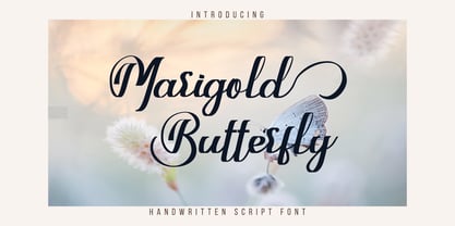 Marigold Butterfly is a unique and elegant handwritten font. It looks beautiful on a variety of designs requiring a personalized style. This font is PUA encoded which means you can access all glyphs and swashes with ease!
 - Copenhagen Grotesk Nova by David Engelby Foundry,
$15.00 Copenhagen Grotesk Nova is based on its 2015 predecessor (Copenhagen Grotesk). The Nova edition is carefully designed with new details, a simpler set of glyphs and with moderate descenders and ascenders in relation to less accentuated capitals.
 - Monotype Modern MT by Monotype,
$29.99 Monotype Modern, the first typeface produced by Lanston Monotype, was released in 1896, the same year the company introduced its hot metal typeseting machine. It is a Victorian variation on the vertically stressed, high-contrast Bodoni model.
 - Wotham by Aqeela Studio,
$20.00 Wotham is a beautiful signature font featuring a modern and attractive typeface created for branding any professional project. This is best applied to logos, branding, cards, packaging, book covers, wedding invitations, printed quotes, merchandise, and so on.
 - Forestland by Brithos Type,
$11.00 Forestland simplifies elegance into one truly outstanding handwritten font. It maintains its classy calligraphic influences while feeling contemporary and fresh. This versatility will appeal to a wide range of crafty ideas, from letterheads and titles, to stationery.
 - Changing by PintassilgoPrints,
$24.90 Changing is a lively font, loaded with many automatic interlock pairs that do their magic in OpenType aware applications. Its peculiar design and such choices for letter combinations make this a very dynamic, spirited and useful typeface.
 - Conflict by Typomancer,
$20.00 ‘Conflict’ is one of Typomancer’s early typefaces; it was released when the foundry started. After a few years, we decide to give it some major changes, including more weights, more glyphs, brand new outline, and revamped kerning.


