10,000 search results
(0.038 seconds)
- Alisal by Monotype,
$29.99 Matthew Carter has been refining his design for Alisal for so long, he says, that when he was asked to complete the design for the Monotype Library, it was almost as if he were doing a historical revival of his own typeface. The illusion even extended to changes in his work process: although he now does all his preliminary and final drawing on screen, the first trial renderings of Alisal were done as pencil renderings. Alisal is best classified as an Italian old style design. Originally created between the late 15th and mid-16th centuries in northern Italy, the true Italian old styles were some of the first roman types. They tend to be the most calligraphic of serifed faces, with the axis of their curved strokes inclined to the left, as if drawn with a flat-tipped pen or brush. These designs offer sturdy, free-flowing and heavily bracketed serifs, short descenders, and a modest contrast in stroke weight. Alisal has nearly all the classic Italian old style character traits, plus a few quirks of its own. It is calligraphic in nature, with more of a pen-drawn quality than faces like Palatino or Goudy Old Style. It is more rough-hewn than either Goudy's Kennerley or Benton's Cloister, and is generally heavier in weight than most of the other Italian old style designs. One place where Alisal makes a clean break with traditional old style designs is in the serifs. While sturdy and clearly reflecting pen-drawn strokes, Alisal's serifs have no bracketing and appear to be straight strokes crossing the main vertical. Like Caslon or Trajanus, Alisal is a handsome design when viewed as a block of copy. Ascenders are tall and elegant, and serve as a counterpoint to the robust strength of the rest of the design. Alisal is available as a small family of roman and bold with a complementary italic for the basic roman weight, providing all that is needed for the majority of text typography. Alisal is not as well-known as some of Carter's other typefaces, but this lovely and long-incubated design was certainly worth the wait.
 - Bodoni Classic Deco Two by Wiescher Design,
$39.50 Bodoni Classic Deco Two, like the original Bodoni Classic Deco, breaks all rules. Giambattista Bodoni himself would probably hate me for doing it; he was a real purist. The whole idea of the Bodoni typeface is no embellishments and here I go and decorate those nice clear letters. Shame on me! But I find this is a very nice and useful typeface for all kinds of cards and certificates. So I just did it for all of you out there that are not born purists, and want a little embellishment to their lives. And to make things worse, I added a small caps cut. I even decorated the numbers. This Bodoni is the condensed version!!! Enjoy! Yours, still breaking all the rules, Gert Wiescher
 - Rudilla by Encolab,
$10.00 Rudilla is a new modern script font with a smooth base line, trendy and feminine style. This font fits on T-shirts, thank you cards, quotes, greeting cards, logos, business cards and more. Perfect for use in ink or watercolors. Includes initial letters and terminals, alternatives and multiple language support. To enable OpenType Stylistic alternates, you need a program that supports OpenType features such as Adobe Illustrator CS, Adobe Indesign & CorelDraw X6-X7, Microsoft Word 2010 or newer versions. There are additional ways to access alternatives / swash, using Character Map (Windows), Nexus Fonts (Windows), Font Books (Mac) or software programs like PopChar (for Windows and Mac). Thank you very much for searching and telling me if you have questions.
 - Jumble by Laura Worthington,
$29.00 Jumble is friendly and cute treat for the eyes. Jumble draws you in with its thick, curvy strokes, jaunty counters, and a whimsical variety of counterforms with no two alike. For even more variety, Jumble includes 104 alternates for plus a handful of ligatures. Jumble conveys humor and warmth without being silly; its lack of straight lines and sharp edges makes it perfect for evoking tasty treats like frosted cakes or pies, or child-friendly toys and games. See what’s included! http://bit.ly/1RDnJjY This font has been specially coded for access of all the swashes, alternates and ornaments without the need for professional design software! Info and instructions here: http://lauraworthingtontype.com/faqs/
 - Lebensjoy by Monotype,
$29.99Lebensjoy was used by the Co-op chain stores in Sweden for a nationwide fortnightly flyer (called Livsgldje = Joy of Life) during 1993 and 1994. They wanted a simple but still lively and active letterform. - Heavenly by MrLetters,
$15.00 Heavenly Script is a modern calligraphic font with a very cool handwriting style, this font is perfect for your various design needs such as branding, wedding invitations, magazines, mugs, business cards, posters, and more. Heavenly Script is equipped with glyphs and alternative characters, allowing you to have many different character choices when starting your design. To use a variety of glyphs, you need a program that supports OpenType features like Adobe Photoshop Cs / Adobe Photoshop CC, Adobe Illustrator CS / Adobe Illustrator CC, Adobe Indesign and Corel Draw and many more programs that support OpenType. If you do not have a program that supports OpenType, you can access all alternative flying machines using Font Book (Mac) or Character Map (Windows) If you have any question, don't hesitate to contact me by email hello.mrletters@gmail.com. Thanks and happy designing :-)
 - Parkway by Chank,
$49.00 The Parkway font family was inspired the Parkway Theater marquee in south Minneapolis and the abandoned hotel signage along a strip of U.S. highway running from Tallahassee to Tampa in Florida. A classic retro font trio, the Parkways speak of nostalgia and Americana. Looks like the little metal tag that dealers stick on the trunk of new cars.
 - Marjac by Jeremia Adatte,
$29.00 Marjac is an angular and upright script typeface that is directly inspired by handwriting. It is created after "Jacno", a typeface designed in 1948 by French type and graphic designer Marcel Jacno. This unique bold design later inspired other typeface designers to create brush script typefaces like Roger Excoffon’s "Choc". You will also notice it has a "unicase" feel, sharing some lowercase letters in the capital letters. It is recommended to use it for any packaging designs related to quality hand-made products, advertising, web, film title sequence design, posters, magazines and book jackets. Marjac is loaded with an extended character set, supporting Central, Western and Eastern European languages. It has plenty of cool OpenType features like a fun automatic brush underline feature or newly-designed secret alternate letters (like capital A). Kerning and spacing (+ than 25,000 kerning pairs) have been meticulously made-to-measure to this specific brush typeface. Beautiful hand-made arrows and other symbols were created to accompany letters.
 - Movie Matinee JNL by Jeff Levine,
$29.00 A 1926 trade ad for the silent comedy “The Nut-Cracker” starring Edward Everett Horton has the film’s title hand lettered in a decorative bold sans serif design complete with highlight lines and accent dots. This festive type face is now available digitally as Movie Matinee JNL in both regular and oblique versions.
 - Weaver - Unknown license

- Syphon Spritz - Personal use only

- Adagio by profonts,
$51.99 Adagio Pro, that sounds like music, elegance and classic quality. That's exactly how Adagio Pro carries the message to the reader. Adagio Pro is a rather formal script with very beautiful, generous and swashy upper case that was redesigned, digitized, completed and expanded as OpenType in the profonts type studio.Adagio Pro comes with more than 1.100 characters covering the complete Latin glyph set for West and East including Baltic and Turkish. Additionally, there is a large selection of ligatures, character combinations and alternates to make this beautiful script design a perfect font for OTF-savvy applications like e.g. InDesign or Quark Xpress 7.Adagio Pro is a very distinguished, elegant and versatile script font well-suited for anything in the area of classical music, art, ballet etc. Also, it is good for certificates, reports, documents and alike.
 - Symphony by profonts,
$51.99 Symphony Pro… sounds like music, elegance and classic quality. That's exactly how Symphony Pro carries the message to the reader. Symphony Pro is a rather formal script with very beautiful, generous and swashy upper case that was redesigned, digitized, completed and expanded as OpenType in the profonts type studio. Symphony Pro comes with more than 800 characters covering the complete Latin glyph set for West and East including Baltic and Turkish. Addionally, there is a large selection of ligatures, character combinations and alternates to make this beautiful script design a perfect font for OTF-savvy applications like e.g. InDesign or Quark Xpress 7. Symphony Pro is a very distinguished, elegant and versatile script font well-suited for anything in the area of classical music, art, ballet etc. Also, it is good for certificates, reports, documents and alike.
 - Ballerina by profonts,
$51.99 Ballerina Pro... sounds like music, ballet, elegance and classic quality. That's exactly how Ballerina Pro carries the message to the reader. Ballerina Pro is a more of a formal script, light-weighted and quite beautiful, redesigned, digitized, completed and expanded as OpenType in the profonts type studio.Ballerina Pro comes with round about 600 characters covering the complete Latin glyph set for West and East including Baltic and Turkish. Additionally, there is a large selection of manually designed character combinations and alternates to make this beautiful script design a perfect font for OTF-savvy applications like e.g. InDesign or Quark Xpress 7.Ballerina Pro is a very distinguished, elegant and versatile script font well-suited for anything in the area of ballet, classical music, art, ballet etc. Also, it is good for certificates, reports, documents and alike.
 - ITC Kendo by ITC,
$29.99 ITC Kendo is the work of British designer Phill Grimshaw, suggesting the dash and verve of quick, sketchy calligraphy, complete with splatters of ink. Grimshaw says he worked deliberately against his own habits to create the forms, drawing the letters with slow deliberation" and a pointed pen. He overloaded the pen with ink and drew on rough paper, "applying a lot of pressure at the beginning of a stroke and easing off towards the terminals. Accidental splashes occurred frequently owing to the nib catching the 'tooth' of the paper." Those splashes were refined into features which enhance but do not overwhelm the characters and carefully worked so as not to leave an obvious white strip of unsplattered space between lines and letters. The initial capitals can be used alone or combined with the lowercase alphabet, and the font includes a full set of f-ligatures and some extra ligatures as well as decorative elements."
 - Estella Gardens by Timurtype,
$14.00 Introduced by Timurtype Studio! Estella Gardens is a Handbrushed Script Font This font showcases the timeless elegance of handbrush script fonts, where each stroke tells a story and adds a twist to your design. With organic lines and graceful curves, these fonts effortlessly blend modern sophistication with a touch of artisanal craftsmanship, creating a harmonious balance that elevates any project to a level of refined beauty and individuality. Let the art of hand-brushed script fonts transform your words into visual poetry, capturing the essence of your message with a touch of bespoke charm. Estella Gardens Font also supports multilingualism. Enhance your designs with our original fonts, feel free to comment or provide feedback, Enjoy the fonts 😊 Thank You
 - Sonus by Hoftype,
$39.00 Sonus – a new monoline family with dynamic-flow drive. Influenced by early English sans serifs - Powerful and energetic but with some classical features. Its firm structure makes it great for text and demonstrates its lively linearity in displays. Sonus comes in 16 styles, in OpenType format and with extended language support. All weights contain standard ligatures, proportional lining figures, tabular lining figures, proportional old style figures, lining old style figures, matching currency symbols, fraction and scientific numerals and arrows.
 - Roadhouse by Kimmy Design,
$10.00 Roadhouse is a layering typeface family that is part of the greater Evanston type collection, which is inspired by American typefaces commonly used at the turn of the century leading up to Prohibition. Roadhouse reflects the style of lettering used on tavern signage and printed ephemera during the early 20th century. The family comes with 31 layering fonts, from top layers like bevels, highlights, stripes, outlines, as well as extruding and drop layers. It also includes 2 script fonts, upright and oblique, as well as 9 complimentary text fonts for smaller text settings. Either get the entire family of extrusions, bevel angles or the basic family with ready to use fonts that don’t need to be layered. Roadhouse is a great display typeface for logos, branding, packaging, and advertising.
 - LiebeKlara by LiebeFonts,
$29.90 LiebeKlara is LiebeFonts’ most delicious gourmet creation yet. The mouth-watering look of savory swashes and the fine aroma of masterfully sprinkled contextual alternates will make everyone happy—your spouse, family, and friends. LiebeKlara is festive enough to sit on wedding menus, but still warm enough to give everyday dinner invitations the personal flavor they deserve. LiebeKlara likes company—for example when her girlfriend LiebeErika comes over and they have some LiebeOrnaments with their LiebeMenu. LiebeKlara also likes travelling! She speaks most Western languages fluently and with a cute accent. Try it for yourself—LiebeKlara is calorie-free but (or because) she is very delicate. We hope you like her as much as we do! Bon appétit! LiebeKlara comes with a tasty variety of ligatures and alternative forms available through OpenType features. (Please make sure your software supports OpenType if you wish to use the advanced features.) The font contains over 580 carefully hand-crafted glyphs—so it’s more like two or three fonts in one.
 - Frutiger Capitalis by Linotype,
$29.00Frutiger Capitalis Regular and Outline belong to the group of typefaces for the Linotype’s Type Before Gutenberg project. However, they are not based on direct historical sources. At first glance, they may seem related to the roman type Capitalis Monumentalis, but upon closer examination, the fonts reveal a vitality unknown to the characters the Romans etched in stone. Frutiger confesses that creating Capitalis was “a liberation”. After working on so many sophisticated and meticulously designed typefaces, Frutiger Capitalis was a breath of fresh air. Stylistically, Frutiger Capitalis Outline forms a bridge to Frutiger Capitalis Signs, a whole universe of its own. Frutiger Capitalis Signs is a personal cosmos of symbols, many are immediately “legible”, others leave room for interpretation. Some of the symbols are the product of Frutiger’s imagination, such as his “Life Signs” — soft, hand drawn figures whose lines have no apparent beginning or end, creating both interior and exterior spaces, new forms emerging at each glance. These contoured drawings have accompanied Frutiger throughout his professional life, a fantasy garden which has provided an important balance to his many years of disciplined typeface design. Yet he does not consider himself an artist. Frutiger says he simply “wants to tell stories, to draw thin lines, create contours of signs; that is my style”. - Duos Pro by Underware,
$50.00 Duos Pro, a script for illusionists, comes in 10 styles. Whatever style you pick: apply this speedy monolinear handwriting font in large sizes, because it is made for catching the attention. Take Duos Sharp, which comes with speedy strokes and sharp endings in light, regular and black weights. Or pick Duos Round, and its 3 styles with a softer voice and round endings. Some people call those endings “funky ball noses“, an odd but appropriate description. Round styles look more like round tip speedball lettering, but contrary to most speedball letterings they're written with a very high speed. Especially Duos Round Black is more cuddlesome than its sharper counterpart. For an even more intuitive feel, we added two more sets: Duos Brush & Duos Paint. Duos Brush combines monoline strokes with brush beginnings and endings, for that graphical, freshly lettered touch. A closer look will reveal how its brushed tails vary all the time. Duos Paint is made up out of rough & artistic painted strokes, with all its accompanying shortcomings. In contradiction to the finesses of lighter weights, Duos Paint Black scores in being the most nonchalant and impressionistic. Poésie brutale! As well as having the option to choose between (or mix) these 10 styles, Duos Pro has additional hidden functionalities. For example, every style has many alternate lettershapes and ligatures, offering various different results and lengths to display every single word. Or manually add one of the swashes for more emphasis. A bonus font, Duos Tools, includes tool icons, strokes and banners. If that ain’t enough, throw in some polysemic letters for smart, ambiguous communication if you like. Want to become a signpainter? Then be a signpainter. Always wanted to be an artist? This is your chance! Duos Pro boosts your look. Make your visual vocabulary as grandiose, dramatic, sensitive or picturesque as you want. But whatever you do, don't hesitate to apply Duos Pro “short & big”!
 - Grazia by Autographis,
$39.50 Grazia is a joining script with zero contrast. That means that I designed the line of the letters so, that they look equally thick all the time. The script is almost upright and has this 1930s look to it.
 - Illyrian by Solotype,
$19.95Our font of the original was only ten point, so we had to use our imagination to a great extent. As specialists in Victorian typography, we have found that many people do not like the "center alignment" idea, used on several old time faces, but we have been faithful to the original. So there! - Bupkis by Hanoded,
$15.00 Bupkis literally means ‘goat’s dropping’ in Yiddish, but it is used to say ‘nothing, zero, zilch’. Bupkis is a very nice handmade font. A little formal, a little uneven, a little unusual. Use for it whatever you like, but product packaging, cards and book covers do come to mind. Comes with a lot of diacritics.
 - The Vintage Town by Nathatype,
$29.00 Looking for a font that will make your branding stand out? Do you sometimes have an appetite for a bit more wholesome typography? Looking for a fabulous, retro, and adventure font? We've got what you want. The Vintage Town- A Script Font The Vintage Town is a script font that has a varied base line, fine lines, retro, and fun touches. This font features thick and angular letters that easy on the eyes and nice to look while it’s also easy to read. It is becomes more special with extruding version option. Fall in love with it's authentic feel and use it to create gorgeous titles., beautiful poster designs, eye-catching social media posts, cute logos, and many more. Our font always includes Multilingual Support to make your branding reach a global audience. Features: Ligatures Stylistic Set Swashes PUA Encoded Numerals and Punctuation Thank you for downloading premium fonts from Natha Studio
 - Costa Std by Typofonderie,
$59.00 A mediterranean style sanserif in 4 styles The original idea of Costa was to create a contemporary mediterranean typeface style. Costa is a synthesis of the purity, as found on Greek capitals, and softness, found in Renaissance scripts. First thing was the design concept that take its roots on the Chancery script. Such writing style appeared during Italian Renaissance. Later few typefaces have been developed from such cursive models. Today most serifed typeface italic take their roots on such triangular structure we can find on gylphs like the n, p, or d. The Costa capitals remains close to pure sanserif models when the lowercases features an ending serif on many letters like the a, n, d, etc. This ending serif being more like a minimal brush effect, creating a visual contrast and referencing the exoticness of the typeface. Knowing that the Costa typeface family began life in the 90s as a bespoke typeface for Costa Crociere, an Italian cruise company — it suddenly makes sense and explains well why Jean François Porchez focused so much on Italian Chancery mixed to a certain exotism. The curvy-pointed terminals of the Costa n can obviously get find on other glyphs, such as the ending of the e, c and some capitals. So, the sanserif looks more soft and appealing, without to be to pudgy or spineless. The general effect, when set for text, remains a sanserif, even not like Rotis Semiserif. Costa is definitly not a classical typeface, or serif typeface which convey past, tradition, historicism as Garamond does beautifully. Because of the Costa crocieres original needs, Costa typeface was designed to be appropriate for any uses. Anytime you’re looking for good mood, qualitative effects, informal tone, cool atmosphere without to be unconvential or blowzy, Costa will convey to your design the required chic and nice atmosphere, from large headlines sizes, brands, to small text sizes. It’s a legible typeface, never boring. A style without neutrality which doesn’t fit comfortably into any typeface classification! Does it proves the novelty of its design and guarantees as well as its originality? Its up to you to be convinced. Barcelona trip Originally not planned, this need appeared because of a trip to Barcelona at the time of the project, where Jean François was giving a lecture. He wanted to pay an homage to that invitation to create something special. So, he designed during his flight some variations of the Spanish Ch, following ideas developed by the Argentinian type designer Rubén Fontana for his typeface called Fontana ND (published by the Barcelona foundry Bauer). Then, he presented during his lecture variations and asked to the audience which design fit the best to their language. They selected the design you can find in the fonts today. Read more about pairing Costa Type Directors Club 2000 Typographica: Our Favourite Typefaces 2004
 - Salvador by Homelessfonts,
$49.00 Homelessfonts is an initiative by the Arrels foundation to support, raise awareness and bring some dignity to the life of homeless people in Barcelona Spain. Each of the fonts was carefully digitized from the handwriting of different homeless people who agreed to participate in this initiative. A biography/story of each homeless person captures their story, to help raise awareness and bring some dignity to the life of homeless people. Monotype is pleased to donate all revenue from the sales of Homelessfonts to the Arrels foundation in support of their mission to provide the homeless people in Barcelona with a path to independence with accommodations, food, social and health care. Salvador was born in a small village in the province of Seville, Spain where he lived until 2002. During many years he worked in restaurants, construction, and in the fields, until he decided to go try his luck in Palma de Mallorca. There he worked in hotels and in construction, until the economic crisis erupted and he was left without work or benefits of any kind and he began to live in the street: “The street has few good things, but it teaches you to be more selfless, to share with others what you have, even if it isn’t much.” In 2006, a friend encouraged him to come along to Barcelona and bought his plane ticket. Once there, things did not go much better and he had to continue living in the street. A year ago he left behind that life and now he explains his experience in guided tours to school groups: “I like it because I see that many of them are interested and they ask questions. It is good that they learn.”
 - Belgium by Craft Supply Co,
$15.00 Belgium Font Family is a modern serif font family whose design refers us to the style of modern sans serif. The distinctive features of Belgium Font Family are the relatively low contrast of strokes, the slightly squarish shapes of round characters and the emphasized business like simplicity.
 - Hugehito Brush by ijemrockart,
$13.00 Introducing a lovingly handmade new typeface, Hugehito Brush, a fun and imperfect modern brushed script font with a tough of uniqueness driven. Design like a professional with this typeface that fits perfectly for your wedding invitations, street ads, Instagram posts, t-shirt design, branding, and much more.
 - Book& by Holland Fonts,
$30.00A design reminiscent to school script and handwriting, yet slightly off beat, with a gracious and elegant motion. Originally designed for invitations for a book store, the typeface likes to think it refers refers to book typography of the 40s and 50s of the last century. - Ghetto by Bosstypestudio,
$12.00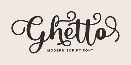 Ghetto is a modern script with handwriting, decorative characters, and dancing baselines! It's very suitable in use like blog headers, t-shirts, and for weddings, social media, product design, stationery, advertising, clothing, book covers, business cards, greeting cards, branding, merchandise, invitations and handmade quotes and more.
 - Gesture by Sinfa,
$16.00 A desire that is honored, a result that describes a gesture that combines script fonts with Signature to meet customer desires. The embodiment of the results that are more likely to be in a signature that is perfect for logos and branding, you determine it yourself .
 - Heavy Boxing by Vozzy,
$10.00 Introducing a vintage look label duo font named "Heavy Boxing". This family includes regular bold and strong font and cute handwritten script font. Regular font have different small and capitali letters. This font will good viewed on any retro design like poster, t-shirt, label, logo etc.
 - Gambino by Monotype,
$15.99 Childlike, sure; utterly affable, yes, but ultimately actually very cool. Yup, that’s Gambino. This chalky, super textured, semi connected script is a kooky playground pal and a grown-up technically savvy typeface all rolled into one. Upright yet tumbling, these simple, crayon-like letterforms are a delight.
 - Ottmar by Atom,
$17.00 Ottmar is a bold casual script font, created using a brush that is etched on paper with care to produce a unique and organic character. With contextual alternate and ligature it will give a very special nuance if used in the design. Hope you like it!
 - Eveningnews by Wiescher Design,
$39.50 Since many years I live in Munich and read the daily newspaper Abendzeitung. One morning they had redesigned the paper, using Eric Gill's Joanna for the body copy and a tweaked version of Franklin Gothic for the headlines. Since both typefaces are my all-time favorites, I was very pleased. The old hand-lettered title lettering designed by in-house designer Ernst Friedrich Adler around 1947 or 48 was untouched as it always was. Adler had worked for the newspaper an incredible 47 years! Ernst Friedrich Adler celebrated his 100th birthday in the summer of 2007 looking very healthy. But someone had adapted his title lettering for use in the chapter headings, and I did not like the way that was done. Every morning I saw those letters and thought "one day I have to clean that up". About 15 years later I finally did it! Being at it, I designed the whole typeface and added a second fancy cut. And, what do you know, the people at the Abendzeitung called me up and said they liked what I did and started using it. So since that day in 2005 I can read my morning paper without having to wonder about the chapter headings. Well maybe one day they will do another redesign and maybe they will use another one of my fonts. Your editorial typeface designer, Gert
 - Ubuvila by Scholtz Fonts,
$19.00African fonts are characterised by design considerations that differ from those of Europe and the Americas. At one extreme we have a relaxed and casual approach to life that values the quality of each moment in life far more than people do in the west. In this approach each element of the font, while being part of a community, nevertheless stands on its own and has its own "character". An African font that characterises this approach is Ubuvila (the word means relaxedness or relaxation in Zulu). There is no strict adherence to a design format in Ubuvila nor are the characters constrained by resting on the same baseline. They wander up and down in the sentence and find a comfortable resting place. - Nautical Fabulous by Letterhend,
$14.00 The Nautical Fabulous font features a perfect blend of boldness and condensed letterforms. Its clean lines and sharp edges give it a catchy look that is ideal for modern branding, striking headlines, and impactful displays. With its commanding presence, this font effortlessly stands out in any design composition. This font perfectly made to be applied especially in logo, and the other various formal forms such as invitations, labels, logos, magazines, books, greeting / wedding cards, packaging, fashion, make up, stationery, novels, labels or any type of advertising purpose. Features : Uppercase & lowercase Numbers and punctuation Alternates & Ligatures Multilingual PUA encoded We highly recommend using a program that supports OpenType features and Glyphs panels like many of Adobe apps and Corel Draw, so you can see and access all Glyph variations.
 - Hopferian by 2D Typo,
$28.00 This font has been developed based on the engraving by the German artist Daniel Hopfer (1470-1536) listing the Latin ABC. While creating the font I tried to preserve the archaism and certain imperfection characteristic for the prototype to accentuate its charm. Fanciful convolution on the serif make it a bit fairy-tale like and cheerful. The font is also available with decorated dots as in the original version. All the letters in the font are capital.
 - CTM Sans by Gspr one,
$- CTM Sans is a typeface of the grotesk category, it is designed based on a previous Herokid typeface, but with greater freedom to creative tastes and at the same time with more rebellion and errors (quite a few, but well-intentioned) than its predecessor. This makes Bellavista a somewhat messy clone, for the grotesk style. This font does not seek to be a correct typography, but rather fun and useful for the designer. I hope you like it

