6,147 search results
(0.015 seconds)
- Overland Stage JNL by Jeff Levine,
$29.00 There are very few Western-style stencil digital fonts available, hence Overland Stage JNL. In the days when stage coaches, wagon trains, the Pony Express and the first transcontinental railroad crossed the landscape of this country, merchants shipped their goods any way possible to the growing territories and states. Picture wooden cases filled with dry goods, hardware or foodstuffs marked in hand-cut stencil lettering and nailed shut for their cross-country journey. Companion fonts to complement this design are Frontiersman JNL (Western lettering with an inline engraving) and Frontiersman Black JNL.
 - Bernhard Fashion Pro by SoftMaker,
$15.99 Lucian Bernhard designed this typeface for American Type Founders in 1929. Bernhard Fashion sports tall ascenders, stylish embellishments, and much taller than normal capitals that drop below the baseline. This extra light typeface radiates elegance and lightness. SoftMaker’s Bernhard Fashion Pro typeface comes with a huge character set that covers not only Western European languages, but also includes Central European, Baltic, Croatian, Slovene, Romanian, and Turkish characters. Case-sensitive punctuation signs for all-caps titles are included as well as many fractions, an extensive set of ligatures, and separate sets of tabular and proportional digits.
 - Olivita by Plau,
$49.00 Innocent until proven otherwise, Olivita is a heavyweight interpretation of the Typewriter genre. Typewriter fonts have captivated generations of designers and found its way into infinite applications, including Milton Glaser’s classic I heart NY logo. Olivita is a fat-face take on the same idea. There’s a lot to negotiate in making type as bold as possible, with shapes having to contort and distort in order to make a cohesive whole. The x-height is tall yet ascenders and descenders are long. Super size it and see the rich, creamy texture come forward.
 - Manifold CF by Connary Fagen,
$35.00 Manifold® CF is a utilitarian typeface inspired by the precision of a computer terminal, softened by contemporary design and rounded corners. Manifold's unified letterforms and tall x-height are great for user interfaces, or track it out for a sophisticated look. Manifold also offers wide language support, including Cyrillic script, Vietnamese, and Pinyin Romanization. Manifold® CF excels as a headline or display typeface, and pairs well with contrasting simple serifs like Artifex CF and Artifex Hand CF. All typefaces from Connary Fagen include free updates, including new features, and free technical support.
 - Ask For Mercy by Comicraft,
$49.00 She’s tall and thin with elegant, long legs and striking features. She can be seen in Comicraft’s COMIXOLOGY ORIGINALS series, ASK FOR MERCY. No, not Mercy herself — we’re talking about the ASK FOR MERCY font! Yes, you asked for Mercy -- begged for it even -- and now we are granting it to you! Mercy Mercy Me. ASK FOR MERCY contains alternate uppercase alphabets, auto-ligatures for a more random, hand-drawn appearance, and Comicraft's revolutionary Crossbar I Technology™, which puts that tricky character in exactly the right places.
 - Madfool by Washabib Studio,
$13.00 A tall condensed sans serif font If you are looking for letters with attitude, Madfool is the perfect fit. It's a memorable, strong and elegant typeface. Madfool is a modern clean sans serif font. With bold stroke, fun character. To give you an extra creative work. Madfool font support multilingual more than 100+ language. This font is good for logo design, Social media, Movie Titles, Books Titles, a short text even a long text letter and good for your secondary text font with sans or serif. Make a stunning work with Madfool font.
 - Monotype Clearface by Monotype,
$29.99A rather narrow and compact design, Monotype Clearface combines both old style and antique characteristics. The lowercase letters are tall, the ascenders and descenders quite short. The intention was to produce a typeface that was easy to read in small sizes, hence the name. Monotype Clearface Bold was first cut for mechanical composition in 1922, and was based on the Clearface Gothic design created by Morris Fuller Benton for ATF in 1910. Although designed as a text face, Monotype Clearface is now more commonly used in advertising and display work. - Garamond Nova Pro by SoftMaker,
$9.99 Garamond Nova Pro is one of the fonts of the SoftMaker font library. It is a modern interpretation of the classic Garamond style. SoftMaker’s Garamond Nova Pro typeface family contains OpenType layout tables for sophisticated typography. It also comes with a huge character set that covers not only Western European languages, but also includes Central European, Baltic, Croatian, Slovene, Romanian, and Turkish characters. Case-sensitive punctuation signs for all-caps titles are included as well as many fractions, an extensive set of ligatures, and separate sets of tabular and proportional digits.
 - Nordique Pro by Leksen Design,
$29.00 Inspired by her Swedish and Norwegian heritage, Andrea Leksen created this modern geometric sans serif reminiscent of Scandinavian design and typography. With its tall x-height, Nordique will be best showcased at large sizes, in headlines and other display uses. The Light, Regular, Semibold and Bold versions each contain over 50 ornaments, swashes, alternates and borders to play with—a modern take on the traditional rosemåling and kurbits painting styles. See some of the creative and beautiful ways Nordique Pro can be used in this YouTube clip! Check out Nordique's cousin Nordeco!
 - Tropical Trouble by SavoringSurprises,
$10.00 Tropical Trouble is a hand lettered sans-serif font. The super tall and super skinny font could be used for a variety of projects, such as labels for a jar or a name on a tumbler! Contains over 200 accented characters for language support. Some of the languages supported are: English, Spanish, Portuguese, German, Italian, French, Polish, Catalan, Irish, Norwegian, Croatian, Gaelic, and more! If you would like to know if a certain language is supported, please contact me with the language and/or any special characters you want to know about.
 - Linotype Octane by Linotype,
$29.99Linotype Octane is part of the Take Type Library, selected from the contestants of Linotype’s International Digital Type Design Contests of 1994 and 1997. The font was designed by German artist Norbert Reiners, a tall, thin font with a narrow line width and marked stroke contrast. The regular and bold weights seem somewhat static while the italic cuts make a dynamic impression. Linotype Octane is available in four weights, each of which contains a number of ligatures. The cool and reserved Octane is best used for shorter texts and headlines in larger point sizes. - Kutilang by Allouse Studio,
$16.00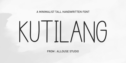 Proudly Present, Kutilang a Minimalist Tall Handwritten Font. Kutiling come along with Multi-Lingual Support to fulfill your need. We highly recommend using a program that supports OpenType features and Glyphs panels like many of Adobe apps and Corel Draw, so you can see and access all Glyph variations. Kutilang is perfect for any tittle, product packaging, branding project, megazine, social media, wedding, or just used to express words above the background. Enjoy the font, feel free to comment or feedback, send me PM or email. Thank You!
 - Engravers by Linotype,
$39.00In 1899, Robert Wiebking (who worked for a number of foundries in his time) designed an all-caps typeface named Engravers Roman (see Engravers #2). American Type Founders, Inc. (ATF) released a heavier variant in 1902, Engravers Bold, designed by Morris Fuller Benton. Engravers Bold was also released by the Barnhart Brothes & Spinder foundry. Today, Linotype's Engravers brings turn-of-the-century elegance directly to your keyboard. Use the Engravers typeface on any formal piece -- from table cards, to menus, invitations, or advertising work. Engravers is similar to Copperplate Gothic, Sackers Gothic and Nicolas Cochin. - Nannaula by UlianaShabanova,
$15.00 Welcome to the new font! A fun and playful handwritten font with universal letters that looks great in ALL CAPITAL letters or is regularly used in sentence cases. Perfect for book covers, children's books, birthday invitations, stationery, calendars, magazines, Instagram posts and more! Each letter is a tall, all caps typeface with lots of bouncy glyphs Please note that the Nannaula-colorvector font is COLOR and COLOR CANNOT be changed! BUT Nannaula-normal font is normal font and you can change the color:) Feel free to email me shabanovasprt@gmail.com if you have any questions. :)
 - Domestica by ArimaType,
$15.00 Domestica is made from a sans humanist design with a modern touch. Domestica is inspired by the strong character of the letters without leaving the aesthetics of the letterform. Every member of the Domestica family is also equipped with useful OpenType features such as Ordinals, Stylistic Alternates, Stylistic Sets, Standard Ligatures, Fractions, and Numerator & Denominator. Comes with 8 weights from Thin to Extra Bold with each matching Tilt. also one outline font Contains several OpenType features: Style Alternatives, Number Variations (fractions, table layers, numerators, denominators), and also includes extensive Latin.
 - Gold Spur by FontMesa,
$20.67 Gold Spur is a spurred version of the FontMesa Gold Rush set of fonts. Each version includes many extended characters for Western, Central and Eastern European countries. The Gold Spur Trail OpenType version has alternate double letter pairs included in the font and will automatically be substituted when used in Adobe CS products or other software that takes advantage of OpenType features. The $20.67 price of each font reflects the price of an ounce of gold in 1865 which was the year that the original Gold Rush font was created.
 - Monolight by Mostardesign,
$25.00 The Monolight font family is a modern and versatile creation that perfectly blends roundness and simplicity to give your designs a modern and elegant look. With its low-contrast characteristics, this font family can be used for a wide variety of communication projects, ranging from advertising posters to institutional communication media, to professional presentations. In addition to its aesthetic design, Monolight offers advanced technical features, including a set of stylistic variants that allow you to explore different options for customizing letter style. This font is also case sensitive, meaning uppercase and lowercase letters are designed to work harmoniously together. Furthermore, Monolight comes equipped with a complete set of old-style and tabular numerals, providing great precision in tables and professional documents. This feature is particularly useful for professionals in marketing, finance, and accounting who seek to give their tables a professional and well-organized appearance. Finally, the Monolight font is available in 9 weights ranging from Thin to Heavy with corresponding italics, allowing designers to play with contrasts and typographic effects to give their creations a unique and personalized look. With its advanced features and elegant design, the Monolight font is the perfect tool for communication and design professionals looking to create modern and professional projects that stand out from the competition.
 - Antimony Blue - Unknown license

- Greenwich Mean - Unknown license

- Miss Dottie NF by Nick's Fonts,
$10.00 The 1897 specimen book from Barnhart Brothers and Spindler showed a enchanting little face called Dotted Roman. Here's a faithful revival, ready to warm up the 21st century. Both versions support the Latin 1252, Central European 1250, Turkish 1254 and Baltic 1257 codepages.
 - PreCursive by Graffiti Fonts,
$9.99 This set of two fonts is intended for use by kindergarden & 1st grade teachers or anyone else teaching young children how to write. 2 Fonts are included, PreCursive Lined has the upper, lower & dotted mid line & the the Regular has only the letters.
 - Al Seg23 by Nihar Mazumdar,
$0.50 Al Seg23 is an alphanumeric display that has 3 diagonals in each corner as opposed to just 1 in a traditional 14 or 16-segment display. This alphanumeric font has 23 segments, with 16 inside segments, 6 outside segments and a middle dot.
 - Chottlen Script by Mans Greback,
$69.00 Chottlen Script is a vintage script typeface. Drawn and created by Toni Studio and Mans Greback in 2022, this cursive lettering has a sympatic character and a down to earth personality, perfect for your retro logotype or a rustic article headline. The Chottlen Script font family consists of Regular and Italic, and comes with multiple decorative swashy letters. Use * and # after any letter to make a tail. Example: Signature# Use _ anywhere in a word to make a swash. Example: Love_letter Use multiple underscores to make different swashes. Example: Hand_____writer The font is built with advanced OpenType functionality and has a guaranteed top-notch quality, containing stylistic and contextual alternates, ligatures and more features; all to give you full control and customizability. It has extensive lingual support, covering all Latin-based languages, from Northern Europe to South Africa, from America to South-East Asia. It contains all characters and symbols you'll ever need, including all punctuation and numbers.
 - Richtive Script by Mans Greback,
$69.00 Richtive Script is a sharp brush typeface. This calligraphy font's vivid style and strong movements instantly gets the attention of its spectator, and the lettering has a powerful motion while maintaining clarity. Drawn and created by Mans Greback and Toni Studio in 2022, this handwritten lettering has a wild appearance and a vigorous personality, perfect for a cool handwritten logotype. Write ¤ # < after any word to make a tail. Example: Signed¤ Use underscore _ to make a swash. Example: Super_man Use multiple underscores for different swashes. Example: Love______letter (Download required.) The font is built with advanced OpenType functionality and has a guaranteed top-notch quality, containing stylistic and contextual alternates, ligatures and more features; all to give you full control and customizability. It has extensive lingual support, covering all Latin-based languages, from Northern Europe to South Africa, from America to South-East Asia. It contains all characters and symbols you'll ever need, including all punctuation and numbers.
 - Black Seashore by Great Studio,
$17.00 Black Seashore is a script typeface with noble and vintage looks. Created in response to current graphic design trends. Inspired by classic labels, vintage packaging, and old sign paintings. This Black Seashore will add a touch of worldly knowledge to your artwork, Classic nuance is perfect for those of you who need fonts for especially the types of logos, clothing, signage, branding, packaging, advertising, and more. I have designed a number of examples, so you can see how it can be used. Black Seashore also has many alternatives for ascender, descenders, swash, and ligature. It also has several options for tail and underline. To provide a number of good possibilities to play and make some unique designs. Black Seashore is equipped with: • Uppercase, lowercase letters, numbers, punctuation & symbols • Multilingual support • Alternative style • Stylistic Set 01 - Stylistic Set 014 • Swash • Ligature If there are problems, questions, or anything about my font, please send an email to greatstudi92@gmail.com
 - Segment A Type by Kobuzan,
$35.00 Segment A is a powerful display type family with 18 styles inspired by condensed European grotesques of 19th-century, but with clear geometric proportions. In Black weights, the letterforms are inspired by the aggressive industrial graphic design of the 1960s and 70s. Both have 3 axes and are adjustable in weight, width and 10˚ italic. It is a typeface with narrow proportions, distinctive character, high-quality outline and lots of details. Characters have oblique cuts, sharp tails and highly visible ink traps. All this makes the font more aggressive and edgy. The huge x-height with short ascenders and descenders allows this typeface to be used in blocks with minimal line spacing. Features: – Total glyph set: 631 glyphs; – 18 styles (3 weights x 3 widths + italic); – Support 210+ languages; – Latin Extended; – Cyrillic Basic + Bulgarian letters; OpenType features: – Proportional numerals, tabular numerals, superiors, fractions; – Punctuations and symbols; – Arrows; – Stylistic alternates (ss01-ss05); – Ligatures; – Case-sensitive forms.
 - Reliant by Intellecta Design,
$32.90 Reliant is a free interpretation of the classic design from fonts "BernhardSchoenschrift", originally designed by Lucien Bernhard and "Liberty", designed by W.T. Sniffin for ATF in 1927, following the original designs from Lucien Bernhard. This enhanced OpenType version has complete sets in Greek and Latin alphabet with Central European, Vietnamese, Baltic and Turkish complete resources with all diacritic signs and punctuation marks plus extra characters belonging this ranges. A Cyrillic alphabet completes the font, and we thanks to Dmitry Greshnev from Green Type. He help us to fix our original Cyrillic alphabet to the Cyrillic readers. We added a extensive set of ligatures (stylistic and contextual alternates plus discretionary ligatures) providing a lot of letterform variations that make your design really special, plus swashes and tails ornaments (to artistic increase any letter of this font) more fractions and number ligatures (a strange idea from Iza W). Over 800 glyphs which you have total access using software such as InDesign, Illustrator, QuarkXpress and others.
 - PGF Qualta by PeGGO Fonts,
$24.00 "Qualta" was initially designed in 2017 as a submission for a type design assignment while at typography school, originally launched under Alt-A Foundry, "PGF Qualta" was developed specially for Publishing Agency under the supervision of Peggo Fonts Foundry, now with a complete Small Caps set, classic and old style numeric figures, lining and tabular forms, scientific and fractional notation set, arrows set, light parenthesis set. Set on producing a geometric sans, it started with the circular form drawn from a 50s television screen. The bloated shape gave an illusion of protrusion and so much open space to the rounded letters. A broken stem was then added to the lowercase to provide a notch that allowed the typeface legibility in smaller sizes. The typeface was then developed into eight cuts with their corresponding italics. The lower case g includes a variation with a transitional link derived from the upper case Q’s tangent tail. Qualta’s original concept was designed by Isabel Gatuslao and was developed by Pedro Gonzalez.
 - Marsden by J Foundry,
$25.00 Marsden is a bold, no-nonsense Grotesque. It was designed for display, branding, advertising, packaging or anywhere a strong voice is needed. Marsden is built on a geometric foundation, with just enough warmth to keep the style confident and lively. The family features 8 widths in 12 weights; from a Slim Hairline to an extremely bold Wide Super. The fonts flow from condensed to wide with design intent. The condensed forms feature flat sides and subtle curves, while the wider forms feature rounded sides and open curves. The character set is robust, covering extended latin. The default forms are contemporary with alternates including: single-story a, two-story g, curved terminal l, raised vertex M, rounded top A, fully rounded G, rounded leg R, straight tail Q and straight descender y, all separated into individual style sets for control and customization. Completing the family are the Text fonts where the weights, widths and spacing are adjusted for smaller use.
 - Azkia Script by madjack.font,
$15.00 Azkia Script is a beautiful and lovely script font with many alternative styles, ligatures, swashes, and multilingual glyphs. Azkia is a script typeface with a noble vintage look. Created in response to current graphic design trends. Get inspiration from classic labels, vintage packaging, and vintage sign painting. This Brightina script will add a touch of worldly knowledge to your artwork. The classic nuance is perfect for those of you who need fonts, especially for logos, clothing, signage, branding, packaging, advertising, and others. I've designed a number of examples, so you can see how they're used. Azkia Script also has many alternatives for ascender, descenders, swash, and ligature. It also has several options for tails and underscores. To provide a huge number of possibilities to play with and come up with some unique designs. Azkia Script comes complete with: • Uppercase, lowercase, numbers, punctuation & symbols • Multilingual support • Alternative styles • Swash • Binder If you have any problems, questions or anything about my fonts, please send us an email.
 - AwanZaman by TypeTogether,
$93.00 AwanZaman has a three-phase story, beginning with Dr Mamoun Sakkal’s two Arabic styles and culminating with Juliet Shen’s Latin extension. AwanZaman started as simply Awan, a commission for a modern, clean, monoline typeface for writing headlines and story titles in a forward-thinking Kuwaiti newspaper. Awan was based on the geometric forms of Kufic script, while in phase two, a second typeface (Zaman) was designed to add enough calligraphic Naskh details to make it easy to read in demanding newspaper settings. Together these two phases give the typeface a warm, familiar, and progressive look, as well as an explanatory two-part name — AwanZaman. Since most editorials use typical Naskh headline fonts with an exaggerated baseline, Awan’s rational forms immediately distinguish it as a modern and progressive voice in the crowded field of Arabic editorial typefaces. As the companion Arabic typeface, Zaman has the same basic proportions and forms as Awan, but with many cursive, energetic, and playful details. And since modern monoline fonts are increasingly being used to set extended texts, more features were borrowed from Naskh calligraphy to expand the typeface’s use from headlines into text setting. When using the AwanZaman Arabic family, Awan (geometric Kufic forms) is the starting point. To add the sweeping, energetic personality of Zaman (calligraphic Naskh forms), simply activate an alternate character through the option of 20 stylistic sets available in any OpenType-savvy software. The two typefaces function as one file — the AwanZaman Arabic family — allowing users to combine features from both designs to transform the appearance of text from geometric and formal to playful and informal. The third phase of AwanZaman’s development introduced a companion Latin typeface designed by Juliet Shen to fulfil the persistent need in the Arabic fonts market for modern and geometric bilingual type families. Due to the Arabic’s monolinear strokes, AwanZaman Latin was destined to be a sans serif with a tall x-height, larger counters, and corresponding stem thickness to harmonise with the Arabic’s overall text colour and page presence. But it needed much more. One of AwanZaman’s chief assets is making the two languages look on a par when typeset side by side. Arabic and English readers will have a different sense of what that entails, but this type family defers to the Arabic — graceful and artistic with a good mix of straight stems and curved forms. Latin in general doesn’t aesthetically flow the way Arabic does, yet the tone of the Latin needed to mirror both the Arabic’s more squarish curves and formal personality of Awan and the undulating and more playful shapes of Zaman without looking outlandish. That need was met by creating some novel Latin characters, which are accessed through four stylistic sets the same way as AwanZaman Arabic. The alternates are not just clever in the way they look and how they echo the Arabic aesthetic, but also in harmonising the disparate languages and serving designers well when needing a balanced, bilingual text face with a warm and lively voice. AwanZaman is a clever, seven-weight powerhouse that makes extensive use of OpenType’s stylistic sets (20 in the Arabic and four in the Latin) so writers and designers can make the most of everything from a single glyph in display sizes down to dense text in paragraphs. As AwanZaman Arabic has no italic, neither does the Latin; contextual distinction normally handled by italics is achieved by exploiting the family’s seven weights. AwanZaman’s intricate OpenType programming supports Persian and Urdu, with features such as the returning tail of Barri Yeh treated properly. From its inception in geometry to its melding of two worlds with novel forms, AwanZaman is a personal labor by designers Dr Mamoun Sakkal and Juliet Shen, and embodies the TypeTogether ideals of serving the global community with innovative and stylish typeface solutions. The complete AwanZaman Arabic and Latin families, along with our entire catalogue, have been optimised for today’s varied screen uses.
 - As of my last update in April 2023, "Winob" does not appear to be a widely recognized font within the traditional or digital typography communities, so my depiction will lean into imaginative interpr...
- NudE - Unknown license

- Badger Fatboy CTBT - Unknown license

- Ridicule - Unknown license

- CheckerHat - Unknown license

- Monstrosity by Comicraft,
$19.00 It breathes fire and its leathery hide is impervious to rocket propelled grenades and drone warheads! It destroys everything in its path! Is it a terrifying sound effect font or does it just want to be loved? One thing's for sure – no one is safe!
 - Klaklak by Fontroll,
$20.00 Oh no, not another typewriter font! But Klaklak is different. Not only has Klaklak four weights from worn out ink (light) to typing twice (bold), an Italic (which is Regular with authentic underlines as there is no Italic on typewriters) and an x-through font called Klaxxx (no need to erase your typos – just x them out (just kidding 😊)). It also does a lot to avoid repeating letterforms by first replacing about 320 common letter combinations by ligatures and then mixing them up with 4 style sets which results in about 1300 ligatures and more than 2600 glyphs in total per font. The result is a very realistic appearance of a mechanical typewriter. All you have to do is turn on Ligatures and Contextual Alternates in your favourite layout app. Of course Klaklak is multilingual, supports a lot of Latin based languages and has all glyphs for even demanding layout tasks. Enjoy!
 - Helter Slab by Dora Typefoundry,
$15.00 NEW! Helter is a slab-serif font that gives off a clean and very elegant feel that has a strong and bold look. the slab is thick and does not regret the size of the width. The slab-serif helter is perfect for your upcoming project which is applied especially to various other formal forms such as invitations, labels, logos, magazines, books, greeting / wedding cards, packaging, fashion, make up, stationery, novels, home decor labels, book / cover titles, special events and many more. Features: • Full set of uppercase letters, • Numbers & Punctuation • Characters with accents • Supports Multiple Languages This type of family has become a work of true love, making it as easy and enjoyable as possible. I really hope you enjoy it! I can't wait to see what you do with Helter Slab! Feel free to use the #Dora Typefoundry tag and # Helter Slab font to show what you've done visit my Instagram : https://www.instagram.com/doratypefoundry/
 - Alisal by Monotype,
$29.99 Matthew Carter has been refining his design for Alisal for so long, he says, that when he was asked to complete the design for the Monotype Library, it was almost as if he were doing a historical revival of his own typeface. The illusion even extended to changes in his work process: although he now does all his preliminary and final drawing on screen, the first trial renderings of Alisal were done as pencil renderings. Alisal is best classified as an Italian old style design. Originally created between the late 15th and mid-16th centuries in northern Italy, the true Italian old styles were some of the first roman types. They tend to be the most calligraphic of serifed faces, with the axis of their curved strokes inclined to the left, as if drawn with a flat-tipped pen or brush. These designs offer sturdy, free-flowing and heavily bracketed serifs, short descenders, and a modest contrast in stroke weight. Alisal has nearly all the classic Italian old style character traits, plus a few quirks of its own. It is calligraphic in nature, with more of a pen-drawn quality than faces like Palatino or Goudy Old Style. It is more rough-hewn than either Goudy's Kennerley or Benton's Cloister, and is generally heavier in weight than most of the other Italian old style designs. One place where Alisal makes a clean break with traditional old style designs is in the serifs. While sturdy and clearly reflecting pen-drawn strokes, Alisal's serifs have no bracketing and appear to be straight strokes crossing the main vertical. Like Caslon or Trajanus, Alisal is a handsome design when viewed as a block of copy. Ascenders are tall and elegant, and serve as a counterpoint to the robust strength of the rest of the design. Alisal is available as a small family of roman and bold with a complementary italic for the basic roman weight, providing all that is needed for the majority of text typography. Alisal is not as well-known as some of Carter's other typefaces, but this lovely and long-incubated design was certainly worth the wait.


