10,000 search results
(0.031 seconds)
- Cubio Mono by R9 Type+Design,
$38.00 Cubio™ Mono is a new monospaced geometric sans serif inspired by the hexagonal silhouette of isometric cubes. We applied this angular form through all aspects of Cubio™ type design from the overall look of letters and icons down to the small details such as the end of each letter stem and hexagonal dotted lines. This font family comes in 3 weights/styles: 300 (Regular), 500 (Medium), and 700 (Bold). With over 1,500 glyphs, Cubio™ Mono not only supports most Latin-based languages, but also features an extensive set of UX/UI icons, and patterns. Cubio™ Mono is a versatile typeface for both digital and traditional designs. Perfect for packaging design, logo design, print design, store signages, UX/UI web & apps designs. Cubio™ Mono packed with features such as case-sensitive marks, punctuations and math symbols. It also comes with an extensive set of box/compartment drawing glyphs to help you create a unique modern design without even using the line tools. We designed the Cubio™ Mono font system with your convenience in mind. It comes with two sets of hexagonal dotted line and icon positions (Mid Cap Height and Mid X-Height ), so you don’t have to use the baseline shift command to set them to the perfect spots. To find out more about Cubio™ Mono Opentype features and type specimen, please visit www.r9typedesign.com
 - Captain Shipwreck by Alphabet Agency,
$20.00 Outlaw marauders! Stand in awe of the magnificent Captain Shipwreck! Works excellent in all caps, and has a great set of lowercase to match. Capture this treasure of the high seas for a steal of only $20
 - Samman by Eyad Al-Samman,
$- Samman is a Kufic simple Arabic typeface. It can be used to decorate public signs in streets, airports, hospitals, schools, malls, hotels, mosques, and other public places. My family's surname is "Samman" which stands for the person who sells fat especially the one produced by cows ("Samn" in Arabic). Consequently, "Samman" Typeface was designed for eternizing the memory of my family. The main characteristic of "Samman" Typeface is the leaf-shaped style for some of its Arabic characters such as "Dad", "Sad", "Faa", "Meem" and others. The distinguishing artistic design of its "Haa" character adds a unique feature to this typeface especially when connected with other characters. The shape of the characters' "dot", "dots", and "point" is innovative; a triangle with a semi-circle shape. "Samman" Typeface is suitable for books' covers, advertisement light boards, and titles in magazines and newspapers. Its characters' modern Kufic styles give the typeface more distinction when it is used also in posters, greeting cards, covers, exhibitions' signboards and external or internal walls of malls or metro's exits and entrances. It can also be used in titles for Arabic news and advertisements appeared in different Arabic and foreign satellite channels.
 - Modern Love by Resistenza,
$39.00 Breaking from our catalog of typefaces to create a new handwritten font family, Modern Love was born out of our desire to see what would happen if we took a step back from the norm. We weren’t looking for the perfection of the many calligraphy techniques, but more of a natural way of writing with the same tools. Our escapist experiment into casual lettering culminated into 4 fonts: Modern Love Regular, Grunge, Rough and Caps. Modern Love Regular is a hand-painted script, each glyph individually designed with a pointed brush and walnut ink. The aim was to create an effortless hand-drawn feel while keeping the contrast high density. Playful, yet polished, this font works very well when accentuated with the family’s two distinctive styles: Modern Love Grunge, simulating a washed-out effect, perfect to add a vintage look to your projects; and Modern Love Rough, with its crunchy borders, makes letters visibly rough-around-the edges and gives large letters an unmistakeable pop. All three fonts include a hand-painted set of ornaments, swashes and alternates to limitlessly customize and decorate your texts, accessible through Opentype features. Modern Love Caps is the fourth font, a handwritten Sans Serif that ties the family together with its simplicity and readability. Designed with a pointed nib and Indian ink, this font boasts a different style that perfectly complements Modern Love Regular, Grunge and Rough. The result is a fresh font family perfect to create headlines, posters, DIY hand-lettered artwork, books, holiday cards, wrapping paper, invitations, T-shirts, labels, packaging for cosmetics, fashion supplies, food products, artisanal goods, and an endless array of options for your projects. Modern Love…when brush meets passion. Check out also ‘Modern Love Slanted’ Turquoise Nautica
 - Summer Fling by Comicraft,
$19.00 Summer Fling is a breezy brush script lettering font in the style of classic sign painting, complete with custom letter pairs and word ends to create authentic hand-painted feel. Consider this the perfect headline font for the Summer Blockbuster Romance you’re sure to pen in the warm, wine-soaked evenings ahead.
 - HU Masking Tape by Heummdesign,
$15.00 Masking tape, also known as painter's tape, is a type of pressure-sensitive tape made of a thin and easy-to-tear paper, and an easily released pressure-sensitive adhesive. It is available in a variety of widths. It is used mainly in painting, to mask off areas that should not be painted.
 - FM Pointifax by FontMeister,
$- The POINTIFAX family is a typographic flashback to computing of the early 1980s. POINTIFAX is based on a matrix of dots and looks like the output on an old computer screen. Each is built out of dots, horizontal and vertical lines.
 - Figgins Antique by HiH,
$12.00 “Hey, look at me!” cried the new advertising typefaces. With the nineteenth century and the industrial revolution came an esthetic revolution in type design. Brash, loud, fat display faces elbowed their way into the crowd of book faces, demanding attention. Those who admired traditional book types harumphed and complained. Robert Thorne had fired the opening round with his Fatface. With the cutting of Figgins Antique, the battle was well and truly joined. Job printing came into its own and it seemed like everything changed. The world of printing had been turned upside down and the gentile book-type aficionados recoiled in horror much as the rural landed gentry recoiled at the upstart middle class shopkeepers and manufacturers. William Savage, approvingly quoted by Daniel Berkeley Updike over a hundred years later, described the new display faces as “a barbarous extreme.” These were exciting times. According to Geoffrey Dowding in his An Introduction To The History Of Printing Types, “The types which we know by the name of Egyptian were first shown by Vincent Figgins in his specimen book of 1815, under the name Antique.” Of course, dating the design is not quite as simple as that. Nicolete Gray points out that Figgins used the same “1815” title page on his specimen books from 1815 to 1821, adding pages as needed without regard to archival issues. As a result, there are different versions of the 1815 specimen book. In those copies that include the new Antique, that specific specimen is printed on paper with an 1817 watermark. The design is dated by the 1817 watermark rather than the 1815 title page. Figgins Antique ML is an all-cap font. This typeface is for bold statements. Don't waste it on wimpy whispers of hesitant whimsies. And please don't use it for extended text -- it will only give someone a headache. Think boldly. Use it boldly. Set it tight. Go ahead and run the serifs together. Solid and stolid, this face is very, very English. FIGGINS ANTIQIE ML represents a major extension of the original release, with the following changes: 1. Added glyphs for the 1250 Central Europe, the 1252 Turkish and the 1257 Baltic Code Pages. Added glyphs to complete standard 1252 Western Europe Code Page. Special glyphs relocated and assigned Unicode codepoints, some in Private Use area. Total of 331 glyphs. 2. Added OpenType GSUB layout features: liga and pnum. 3. Added 86 kerning pairs. 4. Revised vertical metrics for improved cross-platform line spacing. 5. Redesigned mathamatical operators. 6. Included of both tabular (standard) & proportional numbers (optional). 7. Refined various glyph outlines.
 - FS Shepton by Fontsmith,
$80.00 Handy Andy Andy Lethbridge had only just completed his graphic design BA at the University of Portsmouth when he was spotted by Jason, who’d seen Andy’s exquisite hand lettering at his degree show and on Instagram. Keen to push the handwritten theme further, having recently launched a digitally-created, chalky script font (FS Sammy), Jason offered Andy a job and the chance to develop a suite of more stylised, truly hand-drawn fonts. Andy duly got out his pads, pencils and pens, and started experimenting with styles and textures. Magic followed. Imperfection perfected Most ‘handwritten’ typefaces are created entirely digitally. Not FS Shepton. From the start, the intention was to create a collection of alphabets of similar character but different texture and style – 100% hand-drawn and purposely imperfect, with the kind of inconsistent, organic shapes and textures of market stall signs, dashed off in chalk or paint. FS Shepton Regular, drawn with a wet brush pen, is solid with a rough outer edge and a casual but controlled feel. The dry brush used to create FS Shepton Light gives it more inner texture and a more formal, slanted, calligraphic style. FS Shepton Bold, drawn using a wider, looser dry brush pen, has a woody grain in the middle of its broad strokes and greater solidity where the brush moves more slowly. Fresh as a daisy Think of FS Shepton not as a family of three weights of the same font so much as a collection of three fonts penned by the same author. All of them – the light, regular and bold – were created independently as display fonts that offer something different to labelling, packaging, point-of-sale and advertising. Lovingly crafted by hand, they’re a good match for products and settings that share the same artisinal qualities: organic foods, drinks and healthcare products, as well as premium chocolate, coffee and condiments.
 - Saracen by Hoefler & Co.,
$51.99 Saracen is the Latin (wedge serif) member of The Proteus Project, a collection of four interchangeable type families designed in different nineteenth century styles. The Saracen typeface was designed by Jonathan Hoefler in 1992. Saracen is a design in the ‘latin’ style, characterized by wedge-shaped serifs, a genus of type that emerged in the mid-nineteenth century. A part of The Proteus Project, the typographic theme-and-variations based on related Regency styles, Saracen was created for Rolling Stone, in whose pages the typeface first appeared in 1993 . From the desk of the designer: Though the wedge serif printing type is a nineteenth century innovation, Saracen does not resemble any font from this era. It’s mysterious that typefounders of the Victorian age who sought the extreme and fanciful in their work — exploring all manner of serif treatments, and creating extra-condensed and super-expanded designs — never made a latin font of this straightforward proportion. <
 - Halogen Slab by Positype,
$29.00 When I released Halogen, I asked ‘Who doesn't want or need an expansive contemporary extended sans that has a sense of style and swagger… what if it had a lowercase, small caps and various numeral options… how could you say no?’ Go, click on the Halogen link and read on, if you're interested. Halogen was well-received, so I decided to take it further with Halogen Slab (the name kinda tips you off as to what kind of typeface it is, don't ya think?). As always, I prefer not to take short cuts and provide an anemic offering of glyphs — a modern typeface offered today must provide more than just the basics and this one does — lowercase, smallcaps, old style numerals, tabular forms, stylistic and titling alternates, fractions, case-sensitive features, and even an alternate uppercase ordinal set is included. Now go make cool print and digital things with it, and share them with me.
 - SysFlash by FSD,
$6.15 SysFlash is the version of Sys to use in Macromedia Flash at 10 point size.
 - Tara by Haiku Monkey,
$10.00Tara is a bold, fun handwriting font that scales really well to large point sizes. - Nightbird by Hanoded,
$15.00 A very detailed and scary brush font, made with ink, paint and stiff bristle brushes.
 - VLNL Sardines by VetteLetters,
$35.00 Sardines is a project by Jacques Le Bailly aka Baron von Fonthausen. This original version is the one that saw the light as a monospaced font student project and which would eventually grow into Vette Letters’ largest font family (see VLNL Neue Sardines). Sardines is an eclectic mash of classic curves and mathematical measurements, leaving a very distinct typographic flavor. While most of our type is market-fresh, this one comes out of the can, but it’s delicious nonetheless. And it’s great for adventurous BBQ-ing!
 - Pixel Engine by Sronstudio,
$23.00 Unleash a nostalgic vibe with 'Pixel Engine', a font that pays homage to the golden era of gaming. This pixel-inspired typeface effortlessly blends the charm of retro aesthetics with a touch of modern design. Ideal for gaming logos, pixel art, or any project that craves a vintage arcade feel, 'Pixel Enginel' brings a playful nod to the past while staying firmly rooted in the present. Features: - Uppercase & Lowercase - Numeral & Punctuation - PUA Encoded - Multilingual support - Simple Installation - Work both on Mac and Windows Thank you very much :)
 - Coffee Morning by me55enjah,
$10.00 Handmade sans serif with rugged and imperfect edges shapes. Coffee Morning with Milk has rounded edges bring a vintage look and alternate character make it more stylish. And Coffee Morning Sans has rough stroke, imperfect shapes, make this typeface has its own taste, like coffee in the morning, raw and strong. * COFFEE MORNING WITH MILK features: All Caps, small caps, numeral, punctuation, alternate characters & ligatures. * COFFEE MORNING SANS features: All Caps, numeral, and punctuation. Have a wonderful day with a cup of coffee in the morning :)
 - Selaive by Latinotype,
$39.00 Selaive is a geometric typeface that has an air of rebelliousness. The thick and thin versions give you the chance to play a coquettish and seductive game. Its flourishes make it a very dynamic typeface when composing a text, ideal for those who want to add a personal and glamorous touch to their compositions. Selaive is an excellent choice for fashion magazines, logotypes and shops. Languages include: Basic Latin, Western European, Euro, Catalan, Baltic, Turkish, Central European, Romanian and Pan Africa Latin. Programed by Daniel Hernández
 - Azorath by Sryga,
$22.00 Introducing Azorath, a groundbreaking typeface that marries the bold, unyielding lines of brutalist architecture with graceful fluidity and gentle curves. Azorath's unique design defies convention, capturing attention with its juxtaposition of strength and elegance. Each glyph, meticulously crafted, tells a story of innovation and versatility, making it perfect for both powerful headlines and delicate text. Azorath is your canvas for creating captivating narratives that leave a lasting impression. Elevate your projects with Azorath, where raw power meets graceful finesse in the world of typography.
 - Hollie Script Pro by Estudio Calderon,
$78.99 Hello! We want to introduce you Hollie Script, Estudio Calderón`s new font. A typeface that pays tribute to all letterers that created amazing signs in magazines, walls and windows through the brush lettering during many years, especially in the 50s and 60s. This font is 100% based on the brush traces, it has 2100 glyphs, contextual ligatures from two to four characters and alternates for each ligature. Type Trailer https://vimeo.com/117619553 Check out some uses of this font here https://fontsinuse.com/typefaces/38268/hollie-script
 - Chatterbox by Comicraft,
$49.00 Have you seen that new font from Comicraft it's lovely isn't it all soft and spongy it fair warms the cockles of me heart Mrs Robinson at number forty three she has one she got it down at the store on the corner you know the Indian convenience open all night my Albert gets his Heineken down there late of an evening and you know what I saw all manner of strange people down there last week super heroes I think they were Blimey!
 - Nevermine by IKIIKOWRK,
$17.00 Introducing Nevermine - Nineties Type, created by ikiiko. Is a solid & raw condensed typeface with unique shape of 90's era. This typeface is perfect for an event poster, magazine cover, hipster fashion brand, t-shirt, tote bag, quotes, or stylish text overlay to any background image. What's included? Uppercase & Lowercase Number & Punctuation Multilingual Support Works on PC & Mac Get also a good offer & FREEBIE at our site : www.ikiiko.com Enjoy our font and if you have any questions, you can contact us by email : ikiikowrk@gmail.com
 - MVB Calliope by MVB,
$39.00Gayle Sato, longtime friend of MVB Fonts, has amazing handwriting. It’s a natural, simple hand, with perfect rhythm. Devoid of flourishes, it doesn’t try to be beautiful. It’s just genuine, quick, and clean — the handwriting we all wish we had. The digitization by Mark van Bronkhorst captures these qualities. Retaining the roughness of a felt pen, MVB Calliope is a handwriting typeface that feels much more authentic than most, highly legible but still raw. The Regular was released in 2005, with the other weights shortly thereafter. - MVB Chanson d'Amour by MVB,
$39.00An old book found at a Paris bouquiniste contained samples of the typeface “Caractère de finance,” a bâtarde design by 18th century typefounder Pierre Simon Fournier. Rather than revive the type, Kanna Aoki decided to reinvent it, using a felt pen to achieve a rustic, handwritten quality, departing from the 18th century model as she saw fit. MVB Chanson d'Amour conveys a soulful elegance that stops short of the ostentatious, overwrought found in many formal scripts. It is lovely and sweet, but never saccharine. - Alota by Burntilldead,
$14.00 Say hi to “Alota” retro typeface. Inspired by 70’s design styles, a good decade where we saw many calm colors with groovy, bold, 3D and round shape. This font is very easy to use with hundreds of stylistic alternate (ss01-ss12) & powered with opentype feature. The font really bring a good statement for your logo design and can be the image of a design. Alota is very unique and easy to apply to any media; t-shirts, posters, sign boards, and social media needs.
 - Rasputin by Jehoo Creative,
$18.00 Rasputin is a sharp, curvy and versatile modern slab serif typeface with 4 weights. These are complemented by unique discretionary ligatures that pay attention to detail to make this font stand out and stand out in all its shapes and weights. Its sharp uniqueness, for example in the letter "A R K" provides a great personality type in the title and body text while maintaining optimized readability. Characters that are well-suited for a wide variety of applications from editorial design to branding, advertising, publicity and digital.
 - Procyon by Fatchair,
$6.95A dot-matrix style display font with a twist. - TB Abacus by TrueBlue,
$9.00A creative dot matrix font reminiscent of Abacus counters. - TOMO Joseph by TOMO Fonts,
$12.00 Joseph is a slab-serif face designed by TOMO. With a wood type look - letterpress print, this fatty comes in handy when is time to design an informal —yet strong—looking communication piece. Imagine this typeface on a T-shirt, even a mug! Sweet.
 - Grufy by Stefani Letter,
$12.00 Grufy is an awesome bold and fun display font that will look stunning on any poster flyer or print. It will put a modern twist on any design project with its urban charm. Use this font for your designs and explore its endless possibilities.
 - Arupala Grotesk by Jetsmax Studio,
$15.00 Arupala Grotesk is a Grotesk font this versatile typeface will grab readers’ Attention. This font was inspired by a character named H. Aroepala. This font is suitable for both formal and informal events and is also suitable for various types of print and digital media.
 - Wagner Silhouette NF by Nick's Fonts,
$10.00This roly-poly, rollicking display font is based on a design from the 1946 book Blue print text book of sign and show card lettering by Charles Louis Henry Wagner, who seems to have had an aversion to combination words (like blueprint, textbook and showcard). - Imprint by Monotype,
$29.99 In 1912 Gerard Meynell, with J.H. Mason, Ernest Jackson and Edward Johnston, commissioned this large x-height typeface modelled on Caslon’s designs from Pierpont and the Monotype Corporation as the text face for The Imprint, a short-lived magazine about fine printing and typography.
 - Marketing Stencil by Jeff Levine,
$29.00 Vintage (circa 1960s) packaging for Parker Cartridge Pen Erasers had the product description printed in bold stencil lettering featuring a squared look with rounded corners. This design has been recreated digitally as Marketing Stencil JNL, which is available in both regular and oblique versions.
 - AS Nerd by Ten Waffle Studio,
$6.00 AS Nerd is a contemporary brush script. AS Nerd is a beautiful typeface that mimics true handwriting closely. Use AS Nerd, and your documents will look stunningly beautiful from now on. Perfect for printing your personal thoughts be they silly, pensive or absolutely nonsense!
 - Simply Happy by Seemly Fonts,
$14.00 For stationery, logos, t-shirts, print design, website headers, photo frames, flyers, music album covers, posters, image sliders, and much more, Simply Happy is a handwritten typeface that works beautifully. Your favorite creative ideas will come to life when you add this typeface to them.
 - Kerad by Lemonthe,
$12.00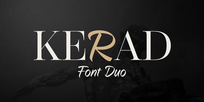 Kerad Font Duo is a captivating combination of modern serif and handwritten font, both seamlessly mixable to create a unique and appealing impression. It is suitable for various design projects such as logos, branding, packaging design, web design, titles, posters, printing, advertising, and much more.
 - Pheonies by Yumna Type,
$16.00 Pheonies is a handwritten font with a natural and unique design will make your project more beautiful. The font is suitable for your branding project, printing, logos dan wedding. Included: Pheonies (OTF) Features: Beautiful Ligatures Alternates Multilingual Support PUA encoded Numeral and Punctuation by Yumnatype
 - Stonehouse by Scriptorium,
$12.00Stonehouse is based on samples of Art Nouveau title lettering, adapted and expanded into a complete titling font. It has a nice intermediate weight ideal for titles on the web or in print, especially for section or topical headers within a body of text. - VVDS Pacifica by Vintage Voyage Design Supply,
$18.00 Pacifica – hand lettered elegant bold script for decorative typography inspired by American branding typography from end of XX century. Comes with different variates – filled, highlighted or pressed. Perfectly for headers, signs, logos, prints, etc. Comes with ending and some middle alternates and some standard ligatures.