10,000 search results
(0.039 seconds)
- Serif Sketch by Cititype,
$14.00 Serif Sketch simplifies elegance into one truly outstanding display font. Whether you’re looking for fonts for Instagram or calligraphy scripts for DIY projects, this font will turn any creative idea into a true piece of art!
 - Futuristic by WAP Type,
$10.00 Futuristic is modern display font with an incredibly futuristic feel. Whether you’re looking for fonts for Instagram or calligraphy scripts for DIY projects, this font will turn any creative idea into a true piece of art!
 - Ahmisya by Twinletter,
$15.00 The Ahmisya font will give your designs a genuine Middle Eastern feel. Use this font in your super projects to get everyone’s attention. Don’t put off adding an elegant Arabic touch to your design any longer.
 - Canadian Animals by Okaycat,
$29.50 Canadian Animals is a picture font with highly detailed illustrations drawn by hand. Comes in outline and silhouettes, it is easy to colour in photoshop. These detailed vector illustrations will help you create your ultimate design.
 - Unpretentious JNL by Jeff Levine,
$29.00 Simple, unassuming, yet fully functional in all sign, poster and headline applications is Unpretentious JNL and its oblique counterpart. Where plain, bold titling is necessary, this typeface will draw attention to the message with minimum effort.
 - PIXymbols Gridmaker by Page Studio Graphics,
$20.00Print quad paper and cross-stich chart grids, as large as your printer will allow. These blank grids are in sizes to match four fabric thread counts, plus 1/10", 1/8", and 1/2" grids. - Heartway by ARToni,
$19.00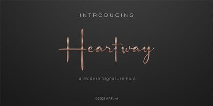 Heartway is a lovely and timeless handwritten font. It is the best choice for creating eye catching logos, branding and quotes. Every letter has a unique and beautiful touch, which will make your design come alive!
 - Blood Scratch by Creaditive Design,
$12.00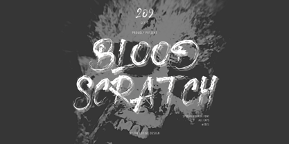 Blood Scratch is a creepy and brushed display font. It is perfectly suitable for any Halloween-related project or crafty idea, creepy film project and horror themes will be nice! The only limit is your imagination.
 - Better Friend by Trustha,
$17.00 Better Friend is an authentic handwritten signature font with personal touch. Created with a marker by hand makes each stroke more natural. This font fits all creative projects and will make each of your projects amazing!
 - Medinah by Trustha,
$15.00 Medinah is a stunning and bold script, completely suitable for a large number of designs. This font will leave you breathless, and give all your designs the impact they need to stand out from the crowd.
 - Kolgar by Letterena Studios,
$10.00 Kolgar is a modern and classy serif font with a modern twist. No matter the topic, this font will be an incredible asset to your fonts' library, as it has the potential to elevate any creation.
 - Playkidos by Stringlabs Creative Studio,
$25.00 Playkidos embodies fun, quirkiness and authenticity. This enchanting decorative font will turn any creative idea into a true standout. Get creative with its childlike playfulness, and use it to brighten up any kids and school project!
 - Veruzza Hollow by Sipanji21,
$10.00 Veruzza Hollow is a cute and modern display font. This enchanting font will turn any creative idea into a true standout. Get creative with its unique look, and use it to brighten up any crafting project!
 - Intense Emotion by Seemly Fonts,
$12.00 Intense Emotion is a cute and simple handwritten font. No matter the topic, this natural and friendly font will be an incredible asset to your fonts’ library, as it has the potential to elevate any creation.
 - Antown by Nurf Designs,
$12.00 Antown is a modern & formal sans family and has 4 variants (Regular, Italic, Bold & Bold Italic). It comes with uppercase, lowercase, numerals, punctuations, some alternate characters, and multilingual support. We hope you will enjoy our work.
 - Baby Gumbout by Mabhal Studio,
$15.00 Baby Gumbout is a cheerful, funny and friendly handwritten font. It will elevate a wide range of design projects to the highest level, be it branding, headings, wedding designs, invitations, signatures, logos, labels, and much more.
 - FractalCaps by Haiku Monkey,
$10.00FractalCaps was inspired by the self-similar nature of fractal geometry. It's a strictly decorative font, without accented characters. FractalCaps shines at large point sizes, and would be a good choice for wild and wooly posters. - Aspektogram by PizzaDude.dk,
$20.00A slim, crunchy and slightly worn-looking font. Comes with unique accented letters, ligatures for double letters and numbers along with OpenType alternate letters. You will need to use OpenType supporting applications to use the autoligatures. - Tornelsen Curkee by madeDeduk,
$16.00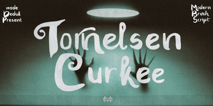 Really excited to introduce Tornelsen Curkee is a realistic brush script! Tornelsen Curkee will be perfect for all your designs project. Tornelsen Curkee Included: Uppercase Lowercase Number & Symbol International Glyphs Ligature Alternative Hope you enjoy it.
 - PIXymbols Signet Classic by Page Studio Graphics,
$29.00A font package to generate traditional three-letter monogram designs, or a single initial. Includes 29 borders, each accessed by a single keystroke on the computer keyboard. The borders will automatically line up with the initials. - Bakeryhouse by Fractal Font Factory,
$8.00 We present you a vintage type of layered font called "bakeryhouse". This font includes four styles (including effect styles). This font will be clearly visible on any retro design such as poster, packaging label, logo, etc.
 - Winterlust by Epiclinez,
$20.00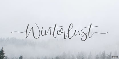 Winterlust is a lovely and timeless handwritten font. It is the best choice for creating eye catching logos, branding and quotes. Every letter has a unique and beautiful touch, which will make your design come alive!
 - Flambster by PizzaDude.dk,
$20.00Flambster is an uneven and quickly scribbled font - perfect to simulate ... well, uneven and quickly scribbled text! :) Comes with a good handful of ligatures! You will need to use OpenType supporting applications to use the autoligatures. - Gray Light by Ali Hamidi,
$10.00 Gray Light is a fun and friendly brushed display font. Whether you’re looking for fonts for Instagram or calligraphy scripts for DIY projects, this font will turn any creative idea into a true piece of art!
 - Oabestira by Mabhal Studio,
$15.00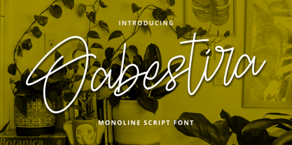 Oabestira is an asymmetrical and timeless handwritten font. It is the best choice for creating eye-catching logos, branding and quotes. Every letter has a unique and beautiful touch, which will make your design come alive!
 - Dirty Lizard by Sipanji21,
$20.00 Dirty Lizard is a display font with a graffiti style. It will elevate a wide range of design projects to the highest level, be it branding, headings, wedding designs, invitations, signatures, logos, labels, and much more!
 - Madore by Heinzel Std,
$15.00 Madore is an elegant and modern script font. It maintains its classy calligraphic influences while feeling contemporary and fresh. This versatility will appeal to a wide range of crafty ideas, from letterheads and titles to stationery.
 - Flamenco Inline by ITC,
$29.99Flamenco is the work of British artist Tony Geddes. Its versatile display style has an inline contour decoration and a controlled yet casual appearance. Flamenco will guarantee visual excitement across a vast range of advertising applications. - Reymond by Rockboys Studio,
$18.00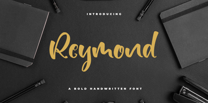 Reymond is a lovely and timeless handwritten font. It is the best choice for creating eye catching logos, branding and quotes. Every letter has a unique and beautiful touch, which will make your design come alive!
 - 112 Hours by Device,
$9.00 Rian Hughes’ 15th collection of fonts, “112 Hours”, is entirely dedicated to numbers. Culled from a myriad of sources – clock faces, tickets, watches house numbers – it is an eclectic and wide-ranging set. Each font contains only numerals and related punctuation – no letters. A new book has been designed by Hughes to show the collection, and includes sample settings, complete character sets, source material and an introduction. This is available print-to-order on Blurb in paperback and hardback: http://www.blurb.com/b/5539073-112-hours-hardback http://www.blurb.com/b/5539045-112-hours-paperback From the introduction: The idea for this, the fifteenth Device Fonts collection, began when I came across an online auction site dedicated to antique clocks. I was mesmerized by the inventive and bizarre numerals on their faces. Shorn of the need to extend the internal logic of a typeface through the entire alphabet, the designers of these treasures were free to explore interesting forms and shapes that would otherwise be denied them. Given this horological starting point, I decided to produce 12 fonts, each featuring just the numbers from 1 to 12 and, where appropriate, a small set of supporting characters — in most cases, the international currency symbols, a colon, full stop, hyphen, slash and the number sign. 10, 11 and 12 I opted to place in the capital A, B and C slots. Each font is shown in its entirety here. I soon passed 12, so the next logical finish line was 24. Like a typographic Jack Bauer, I soon passed that too -— the more I researched, the more I came across interesting and unique examples that insisted on digitization, or that inspired me to explore some new design direction. The sources broadened to include tickets, numbering machines, ecclesiastical brass plates and more. Though not derived from clock faces, I opted to keep the 1-12 conceit for consistency, which allowed me to design what are effectively numerical ligatures. I finally concluded one hundred fonts over my original estimate at 112. Even though it’s not strictly divisible by 12, the number has a certain symmetry, I reasoned, and was as good a place as any to round off the project. An overview reveals a broad range that nonetheless fall into several loose categories. There are fairly faithful revivals, only diverging from their source material to even out inconsistencies and regularize weighting or shape to make them more functional in a modern context; designs taken directly from the source material, preserving all the inky grit and character of the original; designs that are loosely based on a couple of numbers from the source material but diverge dramatically for reasons of improved aesthetics or mere whim; and entirely new designs with no historical precedent. As projects like this evolve (and, to be frank, get out of hand), they can take you in directions and to places you didn’t envisage when you first set out. Along the way, I corresponded with experts in railway livery, and now know about the history of cab side and smokebox plates; I travelled to the Musée de l’imprimerie in Nantes, France, to examine their numbering machines; I photographed house numbers in Paris, Florence, Venice, Amsterdam and here in the UK; I delved into my collection of tickets, passes and printed ephemera; I visited the Science Museum in London, the Royal Signals Museum in Dorset, and the Museum of London to source early adding machines, war-time telegraphs and post-war ration books. I photographed watches at Worthing Museum, weighing scales large enough to stand on in a Brick Lane pub, and digital station clocks at Baker Street tube station. I went to the London Under-ground archive at Acton Depot, where you can see all manner of vintage enamel signs and woodblock type; I photographed grocer’s stalls in East End street markets; I dug out old clocks I recalled from childhood at my parents’ place, examined old manual typewriters and cash tills, and crouched down with a torch to look at my electricity meter. I found out that Jane Fonda kicked a policeman, and unusually for someone with a lifelong aversion to sport, picked up some horse-racing jargon. I share some of that research here. In many cases I have not been slavish about staying close to the source material if I didn’t think it warranted it, so a close comparison will reveal differences. These changes could be made for aesthetic reasons, functional reasons (the originals didn’t need to be set in any combination, for example), or just reasons of personal taste. Where reference for the additional characters were not available — which was always the case with fonts derived from clock faces — I have endeavored to design them in a sympathetic style. I may even extend some of these to the full alphabet in the future. If I do, these number-only fonts could be considered as experimental design exercises: forays into form to probe interesting new graphic possibilities.
 - Jukebox Hero by Grype,
$19.00 As one of the most popular rock bands of the world, Foreigner has rocked the charts with 10 multi-platinum albums and sixteen top 30 hits in the last 40 years. But one might ask what a band this successful has been missing all these years? No head games here...a consistent typeface based on their logo is the answer. As fans of Foreigner, we've taken the essence of their iconic logotype and expanded it out into a full typeface in regular and bold weights to celebrate their 40th anniversary tour. The Jukebox Hero Family celebrates the typographic stylings of Foreigner, with the soft rounded terminals and an open geometric feel, including the unique stencil flavor of the original logo. It inherited the friendly stylings of the all Capitals logo that inspired it, and goes on to include a full standard character set with expansive international support of latin based languages, and two weights jumping from regular to a beefy bold. This family is ready to rock the charts for your designs towards that of a modern, comfortable appeal. Here's what's included with Jukebox Hero Family bundle: 413 glyphs - including Capitals, Lowercase, Numerals, Punctuation and an extensive character set that covers multilingual support of latin based languages. (see the 3rd graphic for a preview of the characters included) 2 weights: Regular & Bold. Fonts are provided in TTF & OTF formats. The TTF format is the standard go to for most users, although the OTF and TTF function exactly the same. Here's why Jukebox Hero Family bundle is for you: You're a die-hard Foreigner fan, and have a case of "Double Vision" and need both font weights. You're looking for a stylish and sophisticated soft sans-serif stencil typeface family. You've been waiting for fonts like these. You're looking for a Sci-fi vibe typeface that has a look that feels familiar. You just like to collect quality fonts to add to your design arsenal
 - No Manners by Bráulio Amado,
$22.00 Out of step with the world. What was the inspiration for designing the font? Brasilian street art Pixacao. What are its main characteristics and features? strange M and N. Usage recommendations: headlines, caps, hate letters
 - Areplos by Storm Type Foundry,
$53.00To design a text typeface "at the top with, at the bottom without" serifs was an idea which crossed my mind at the end of the sixties. I started from the fact that what one reads in the Latin alphabet is mainly the upper half of the letters, where good distinguishableness of the individual signs, and therefore, also good legibility, is aided by serifs. The first tests of the design, by which I checked up whether the basic principle could be used also for the then current technology of setting - for double-sign matrices -, were carried out in 1970. During the first half of the seventies I created first the basic design, then also the slanted Roman and the medium types. These drawings were not very successful. My greatest concern during this initial phase was the upper case A. I had to design it in such a way that the basic principle should be adhered to and the new alphabet, at the same time, should not look too complicated. The necessary prerequisite for a design of a new alphabet for double-sign matrices, i.e. to draw each letter of all the three fonts to the same width, did not agree with this typeface. What came to the greatest harm were the two styles used for emphasis: the italics even more than the medium type. That is why I fundamentally remodelled the basic design in 1980. In the course of this work I tried to forget about the previous technological limitations and to respect only the requirements then placed on typefaces intended for photosetting. As a matter of fact, this was not very difficult; this typeface was from the very beginning conceived in such a way as to have a large x-height of lower-case letters and upper serifs that could be joined without any problems in condensed setting. I gave much more thought to the proportional relations of the individual letters, the continuity of their outer and inner silhouettes, than to the requirements of their production. The greatest number of problems arose in the colour balancing of the individual signs, as it was necessary to achieve that the upper half of each letter should have a visual counterbalance in its lower, simpler half. Specifically, this meant to find the correct shape and degree of thickening of the lower parts of the letters. These had to counterbalance the upper parts of the letters emphasized by serifs, yet they should not look too romantic or decorative, for otherwise the typeface might lose its sober character. Also the shape, length and thickness of the upper serifs had to be resolved differently than in the previous design. In the seventies and at the beginning of the eighties a typeface conceived in this way, let alone one intended for setting of common texts in magazines and books, was to all intents and purposes an experiment with an uncertain end. At this time, before typographic postmodernism, it was not the custom to abandon in such typefaces the clear-cut formal categories, let alone to attempt to combine the serif and sans serif principles in a single design. I had already designed the basic, starting, alphabets of lower case and upper case letters with the intention to derive further styles from them, differing in colour and proportions. These fonts were not to serve merely for emphasis in the context of the basic design, but were to function, especially the bold versions, also as independent display alphabets. At this stage of my work it was, for a change, the upper case L that presented the greatest problem. Its lower left part had to counterbalance the symmetrical two-sided serif in the upper half of the letter. The ITC Company submitted this design to text tests, which, in their view, were successful. The director of this company Aaron Burns then invited me to add further styles, in order to create an entire, extensive typeface family. At that time, without the possibility to use a computer and given my other considerable workload, this was a task I could not manage. I tried to come back to this, by then already very large project, several times, but every time some other, at the moment very urgent, work diverted me from it. At the beginning of the nineties several alphabets appeared which were based on the same principle. It seemed to me that to continue working on my semi-finished designs was pointless. They were, therefore, abandoned until the spring of 2005, when František Štorm digitalized the basic design. František gave the typeface the working title Areplos and this name stuck. Then he made me add small capitals and the entire bold type, inducing me at the same time to consider what to do with the italics in order that they might be at least a little italic in character, and not merely slanted Roman alphabets, as was my original intention. In the course of the subsequent summer holidays, when the weather was bad, we met in his little cottage in South Bohemia, between two ponds, and resuscitated this more than twenty-five-years-old typeface. It was like this: We were drinking good tea, František worked on the computer, added accents and some remaining signs, inclined and interpolated, while I was looking over his shoulder. There is hardly any typeface that originated in a more harmonious setting. Solpera, summer 2005 I first encountered this typeface at the exhibition of Contemporary Czech Type Design in 1982. It was there, in the Portheim Summer Palace in Prague, that I, at the age of sixteen, decided to become a typographer. Having no knowledge about the technologies, the rules of construction of an alphabet or about cultural connections, I perceived Jan Solpera's typeface as the acme of excellence. Now, many years after, replete with experience of revitalization of typefaces of both living and deceased Czech type designers, I am able to compare their differing approaches. Jan Solpera put up a fight against the digital technology and exerted creative pressure to counteract my rather loose approach. Jan prepared dozens of fresh pencil drawings on thin sketching paper in which he elaborated in detail all the style-creating elements of the alphabet. I can say with full responsibility that I have never worked on anything as meticulous as the design of the Areplos typeface. I did not invent this name; it is the name of Jan Solpera's miniature publishing house, in which he issued for example an enchanting series of memoirs of a certain shopkeeper of Jindrichuv Hradec. The idea that the publishing house and the typeface might have the same name crossed my mind instinctively as a symbol of the original designation of Areplos - to serve for text setting. What you can see here originated in Trebon and in a cottage outside the village of Domanín - I even wanted to rename my firm to The Trebon Type Foundry. When mists enfold the pond and gloom pervades one's soul, the so-called typographic weather sets in - the time to sit, peer at the monitor and click the mouse, as also our students who were present would attest. Areplos is reminiscent of the essential inspirational period of a whole generation of Czech type designers - of the seventies and eighties, which were, however, at the same time the incubation period of my generation. I believe that this typeface will be received favourably, for it represents the better aspect of the eighties. Today, at the time when the infection by ITC typefaces has not been quite cured yet, it does absolutely no harm to remind ourselves of the high quality and timeless typefaces designed then in this country.In technical terms, this family consists of two times four OpenType designs, with five types of figures, ligatures and small capitals as well as an extensive assortment of both eastern and western diacritics. I can see as a basic text typeface of smaller periodicals and informative job-prints, a typeface usable for posters and programmes of various events, but also for corporate identity. Štorm, summer 2005 - Usagi Faux by Twinletter,
$15.00 Usagi is a display font created with original handwriting. It was created with the Japanese style in mind, therefore it’s ideal for Japanese-themed projects. If you utilize this font in all of your projects, you will achieve a stunning, appealing, and great result. Logotypes, food banners, branding, brochure, posters, movie titles, book titles, quotes, and more may all benefit from this font. Of course, using this font in your various design projects will make them excellent and outstanding; many viewers are drawn to the striking and unusual graphic display. Start utilizing this typeface in your projects to make them stand out
 - Gurinda by Twinletter,
$12.00 Gurinda sanserif font is our newest font project to go together with your unique and infinite creativity. Using this font as text is surely nice to the eye and read, and using it as a title will make your project seem enchanting and astound many people. Don’t be hesitant; all of your projects are unique, therefore make them unique with this typeface. of course, your various design projects will be perfect and extraordinary if you use this font because this font is equipped with a font family, both for titles and subtitles and sentence text, start using our fonts for your extraordinary projects.
 - Herova Italic by Gatype,
$9.00 HEROVA is a modern display font with a unique font.This customizable font will look great on a variety of design ideas such as, inding styles, high contrast and light weight fonts perfect for feminine logo signs, fashion & editorial design heads, branding projects,Clothing Branding, packaging, magazine titles, advertisements, T -shirts, postcards, valentines, posters, invitations, weddings, branding projects, social media posts, magazines, book covers and more! This will add a fun and friendly touch to any of your projects! This font is PUA encoded which means you can access all the glyphs and sweeps easily and more.
 - Skate Story by Epiclinez,
$18.00 Skate Story is a stunning hand brush font with a graffiti-style feel. Get inspired by its unique charm, and turn any design project into a true stand-out. This brush typeface is supporting multi-Languages, which include: Afrikaans Albanian Catalan Danish Dutch English Estonian Finnish French German Italian Norwegian Portuguese Spanish Swedish Zulu. Skate Story will look outstanding in any context, whether it’s being used on busy backgrounds or as a standalone headline! You will get : Skate Story Basic Latin A-Z & a-z. Numbers, symbols, and punctuations Swashes Multilingual Support. Accented Characters : ÀÁÂÃÄÅÆÇÈÉÊËÌÍÎÏÑÒÓÔÕÖØŒŠÙÚÛÜŸÝŽàáâãäåæçèéêëìíîïñòóôõöøœšùúûüýÿžß Thank you
 - The overthinkers by Joanne Marie,
$26.00 The overthinkers is a semi script hand lettering font for all of your hand lettering designs! With two sets of uppercase glyphs, three sets of lowercase and over 230 ligatures no two words will be same! So your designs will truly look hand lettered. With so much choice be careful not to overthink your designs ;). This font is perfect on it’s own or you may like to use it with your existing hand lettering fonts. Go ahead and try it out - it’ll compliment any design! It’s perfect for merchandise and food packaging, book designs, logos and much more.
 - Boldies by Illushvara,
$14.00 Boldies is a serif font, mixed the modern with the classic concept line serif. The Alternate shape will make your design look like Modern. But don't worry if you need the Design like Classic and Bold Serif, you just put the normal Uppercase and Lowercase. With many ligatures will make your design projects stand out! Add this font to your most creative ideas for Application, Art Gallery Poster or postcard, Architectural Logo Project, Classic Magazine, Product Skincare or Logotype you want to used! Support the Multilingual Language! If you have any question, don’t hesitate to contact me. Happy Designing !!! Thank You, Illushvara Design
 - Vaquero by Scriptorium,
$24.00Vaquero is a Wild West style font. It is characteristic of a lot of western era signage, with super-narrow characters and unusual decorative spurs and serifs. There are some similarities in Vaquero to some of our other western fonts. It sort of ties together the historic tradition of western era type and the more fanciful tradition of romantic type derived from the era of the wild west. It has the width, height and general letter shapes of Academy, but the decorative elements are similar to more fanciful fonts like Riudoso. The result is very evocative of the old west.