10,000 search results
(0.195 seconds)
- Okoye by XO Type Co,
$40.00 Okoye occupies a liminal space between the bonkers curviness of 19th-century grotesques and the sandblasted neutrality of 20th-century models. Both extremes are nice, but there’s something to be said for some neutrality with character left in place, yes? Okoye comes in 9 weights, Thin to Black. If you’re using it for interfaces, each weight lines up from 100-900 in the CSS specification you already know, with Regular sitting at 400 and Bold at 700. You’ll see what you expect to see without extra font-weight specification. There’s extensive Latin language support, a set of small caps which mirrors full-size caps (good for control labels), and arrows. Okoye will be your quirkhorse: hardworking, with personality.
 - Volaroid by Din Studio,
$22.00 Introducing Volaroid font duo , simply font with modern and vintage style combination. This will bring a modern and vintage atmosphere together. Minimalist design for your best project. Volaroid font best use for logotype, branding, and t-shirt printing. Whats included? : - volaroid script - volaroid sans Volaroid feature : - Swash (A-Z,a-z) - SS 1 (A-Z,a-z) - SS 2 (a-z) - SS 3 (a-z) - SS 4 (a-z) - S.Alt 1&2 (b,d,h,k,l,t) - PUA encoded - Multilingual Support. --- Notes = Every swash, stylishtic set and alternates have include in Volaroid Script (ttf.otf,woff) I hope this font can meet your design needs. Feel free to contact me in the message or direct email donis4design@gmail.com.
 - FM Bolyar Sans Pro by The Fontmaker,
$29.00 This is Bolyar Sans font family. For us it is a dream-come-true. It took more than 1 year hard work to transform the existing Bolyar Pro from Serif to Sans Serif version. The result really surprised even us from The Fontmaker and we decided to develop it in 9 instead of 7 weights. So at the end we created 7 different styles of Bolyar sans each consisting from 9 precise weights. Bolyar Sans is not just another font family in our portfolio - it is the essence from all our efforts thru the past 5 years to create a powerful type tool that could easily meet very diverse and complex demands of modern design. Furthermore, like all its predecessors, Bolyar Sans is a type concept created by Designers for Designers. If you are in wine and spirits industry, packaging design, or you just love to work with strong headlines that effortlessly could turn into brand logos, then you should definitely try our Bolyar Sans. It is designed for this. Of course there are plenty of different features like multilingual support, ligatures, alternates, we even added adaptive over- and underlining to make it even more complex in its use. Bolyar Sans pairs perfectly with other members of Bolyar Family - Pro , Ornate and Typecraft . So as you see Bolyar is developed as a type platform with own character and style. By using it you could be vintage, classic, modern, soft, even bold, rough and ornate. It is a visual bridge between different typographic periods united under Bolyar name. With our Sans version we aim to be contemporary and to provide powerful type tool to those designers who often love to swim between past and modernity.
 - Gilligan Shine by Colllab Studio,
$15.00 Presenting Gilligan Shine! A Handwritten Monoline Font with some Ligatures and Extra Dingbats. This font made with the perfect combining of each character. You can combine with Extra to get a unique combining. It looks original and can be used for all your project needs. Each glyph has its own uniqueness and when meeting with others will provide dynamic and pleasing proximity. This font can be used at any time and any project. You can see in the presentation picture above, Gilligan Shine looks stylish and unique on design projects. So, Gilligan Shine can't wait to give its touch to all your design projects such as quotes, poster design, personal branding, promotional materials, website, logotype, product packaging, etc. Besides that, Gilligan Shine also has some ligature that gives a surprise when you type certain characters combining. The ligatures are or, ss, on, ill, st, of, ar, arr, rr, ff, ll, tt, at, it, and itt. WHAT'S INCLUDED? 1. Gilligan Shine • The first version comes with uppercase, lowercase, ligatures, numeral, punctuation, symbols, and Standard Latin Multilingual Support (Afrikaans, Albanian, Catalan, Danish, Dutch, English, French, German, Icelandic, Indonesian, Italian, Malay, Norwegian, Portuguese, Spanisch, Swedish, Zulu, and More). 2. Extra Dingbat • Included 19 Dingbats. You can feature all with typing c_1 until c_19 A Million Thanks Colllab Studio
 - The Longlight by Colllab Studio,
$15.00 Presenting The Longlight! An Elegant Calligraphy Font with some alternates and ligatures. This font made with the perfect combining of each character. It looks original and can be used for all your project needs. Each glyph has its own uniqueness and when meeting with others will provide dynamic and pleasing proximity. This font can be used at any time and any project. You can see in the presentation picture above, The Longlight looks elegant and stylish on design projects. So, The Longlight can't wait to give its touch to all your design projects such as quotes, poster design, personal branding, promotional materials, website, logotype, product packaging, etc. Besides that, The Longlight also has some ligature that gives a surprise when you type certain characters combining. The ligatures are ee, ff, gg, gg1, ii, jj, ll, ll1, mm, nn, oo, pp, ss, tt, tt1, pp, and yy. WHAT'S INCLUDED? 1. The Longlight • The first version comes with uppercase, lowercase, ligatures, numeral, punctuation, symbols, and Standard Latin Multilingual Support (Afrikaans, Albanian, Catalan, Danish, Dutch, English, French, German, Icelandic, Indonesian, Italian, Malay, Norwegian, Portuguese, Spanisch, Swedish, Zulu, and More). 2. The Longlight Alternate • Included some alternates: f, g, i, j, l, p, s, t, y, and g. A Million Thanks Colllab Studio
 - Akahe by Product Type,
$17.00 Introducing Akahe, a font that blends traditional elegance with modern sophistication. With its thick strokes and serif edges, Akahe adds a touch of classic style to any design. And with its stylistic set options for upper and lowercase letters, you can personalize the font to suit your unique style. Whether you’re working on a website, a brochure, or a branding project, Akahe is the perfect font to elevate your designs. Its thick strokes and serif edges make it highly legible, so your designs will always be easy to read and understand. But Akahe isn’t just beautiful, it’s also versatile and functional. You can use its stylistic set options to customize the font to your specific needs, making it perfect for a wide range of design projects. And with its comprehensive character set, you can create designs in multiple languages. So why settle for a standard font when you can have Akahe? Download it today and start creating designs that are both classic and modern, sophisticated and stylish. Whether you’re working on a large-scale project or just looking for a new font for your personal designs, Akahe is a perfect choice. What’s Included : - File fon - All glyphs Iso Latin 1 - We highly recommend using a program that supports OpenType features and Glyphs panels like - many Adobe apps and Corel Draw, so you can see and access all Glyph variations. - PUA Encoded Characters – Fully accessible without additional design software. - Fonts include Multilingual support
 - Carbon by Typodermic,
$11.95 Carbon, the brutalist unicase typeface, boasts a refined modularity that is perfect for creating bold headlines. Its capsule forms make for a unique design element that will draw attention to any layout. Since the year 2000, graphic designers have been relying on Carbon to bring a strong visual impact to their work. This typeface is not just visually stunning, but it’s also highly versatile. Carbon comes in seven different weights, making it easy to adapt to any design need. It even includes italics for added variety. But what truly sets Carbon apart are the two special effect styles that allow designers to create truly distinctive designs. Carbon is not just a typeface, but a tool that designers can use to create memorable designs. Whether you’re designing for print or digital media, Carbon is the perfect choice for bringing your vision to life. With its unique features and versatility, it’s no wonder that Carbon has been a mainstay in graphic designers’ toolboxes for decades. Most Latin-based European writing systems are supported, including the following languages. Afaan Oromo, Afar, Afrikaans, Albanian, Alsatian, Aromanian, Aymara, Bashkir (Latin), Basque, Belarusian (Latin), Bemba, Bikol, Bosnian, Breton, Cape Verdean, Creole, Catalan, Cebuano, Chamorro, Chavacano, Chichewa, Crimean Tatar (Latin), Croatian, Czech, Danish, Dawan, Dholuo, Dutch, English, Estonian, Faroese, Fijian, Filipino, Finnish, French, Frisian, Friulian, Gagauz (Latin), Galician, Ganda, Genoese, German, Greenlandic, Guadeloupean Creole, Haitian Creole, Hawaiian, Hiligaynon, Hungarian, Icelandic, Ilocano, Indonesian, Irish, Italian, Jamaican, Kaqchikel, Karakalpak (Latin), Kashubian, Kikongo, Kinyarwanda, Kirundi, Kurdish (Latin), Latvian, Lithuanian, Lombard, Low Saxon, Luxembourgish, Maasai, Makhuwa, Malay, Maltese, Māori, Moldovan, Montenegrin, Ndebele, Neapolitan, Norwegian, Novial, Occitan, Ossetian (Latin), Papiamento, Piedmontese, Polish, Portuguese, Quechua, Rarotongan, Romanian, Romansh, Sami, Sango, Saramaccan, Sardinian, Scottish Gaelic, Serbian (Latin), Shona, Sicilian, Silesian, Slovak, Slovenian, Somali, Sorbian, Sotho, Spanish, Swahili, Swazi, Swedish, Tagalog, Tahitian, Tetum, Tongan, Tshiluba, Tsonga, Tswana, Tumbuka, Turkish, Turkmen (Latin), Tuvaluan, Uzbek (Latin), Venetian, Vepsian, Võro, Walloon, Waray-Waray, Wayuu, Welsh, Wolof, Xhosa, Yapese, Zapotec Zulu and Zuni.
 - Romantic Jets by Typodermic,
$11.95 Introducing Romantic Jets—a display typeface that breaks all the rules and challenges the traditional norms of typography. Inspired by the raw and rugged beauty of brutalist architecture, Romantic Jets infuses an unconventional and futuristic appeal to your designs. With its sharp edges and unconventional shapes, this typeface injects a unique technical aesthetic to your message. The way Romantic Jets uses negative space will not only make your text stand out, but also create a mesmerizing visual experience for your audience. But what truly sets Romantic Jets apart is its peculiar index holes. These little cutouts add a touch of quirkiness and playfulness to an otherwise bold and brutal typeface. Use them to add character to your designs, or make them the focal point of your message. Whether you’re looking to create a bold, eye-catching poster, a sleek and modern logo, or a futuristic sci-fi book cover, Romantic Jets is the typeface that will make your designs truly stand out. Try it out today and experience the power of unconventional typography. Most Latin-based European writing systems are supported, including the following languages. Afaan Oromo, Afar, Afrikaans, Albanian, Alsatian, Aromanian, Aymara, Bashkir (Latin), Basque, Belarusian (Latin), Bemba, Bikol, Bosnian, Breton, Cape Verdean, Creole, Catalan, Cebuano, Chamorro, Chavacano, Chichewa, Crimean Tatar (Latin), Croatian, Czech, Danish, Dawan, Dholuo, Dutch, English, Estonian, Faroese, Fijian, Filipino, Finnish, French, Frisian, Friulian, Gagauz (Latin), Galician, Ganda, Genoese, German, Greenlandic, Guadeloupean Creole, Haitian Creole, Hawaiian, Hiligaynon, Hungarian, Icelandic, Ilocano, Indonesian, Irish, Italian, Jamaican, Kaqchikel, Karakalpak (Latin), Kashubian, Kikongo, Kinyarwanda, Kirundi, Kurdish (Latin), Latvian, Lithuanian, Lombard, Low Saxon, Luxembourgish, Maasai, Makhuwa, Malay, Maltese, Māori, Moldovan, Montenegrin, Ndebele, Neapolitan, Norwegian, Novial, Occitan, Ossetian (Latin), Papiamento, Piedmontese, Polish, Portuguese, Quechua, Rarotongan, Romanian, Romansh, Sami, Sango, Saramaccan, Sardinian, Scottish Gaelic, Serbian (Latin), Shona, Sicilian, Silesian, Slovak, Slovenian, Somali, Sorbian, Sotho, Spanish, Swahili, Swazi, Swedish, Tagalog, Tahitian, Tetum, Tongan, Tshiluba, Tsonga, Tswana, Tumbuka, Turkish, Turkmen (Latin), Tuvaluan, Uzbek (Latin), Venetian, Vepsian, Võro, Walloon, Waray-Waray, Wayuu, Welsh, Wolof, Xhosa, Yapese, Zapotec Zulu and Zuni.
 - ITC Bodoni Seventytwo by ITC,
$29.99Giambattista Bodoni (1740-1813) was called the King of Printers; he was a prolific type designer, a masterful engraver of punches and the most widely admired printer of his time. His books and typefaces were created during the 45 years he was the director of the fine press and publishing house of the Duke of Parma in Italy. He produced the best of what are known as modern" style types, basing them on the finest writing of his time. Modern types represented the ultimate typographic development of the late eighteenth and early nineteenth centuries. They have characteristics quite different from the types that preceded them; such as extreme vertical stress, fine hairlines contrasted by bold main strokes, and very subtle, almost non-existent bracketing of sharply defined hairline serifs. Bodoni saw this style as beautiful and harmonious-the natural result of writing done with a well-cut pen, and the look was fashionable and admired. Other punchcutters, such as the Didot family (1689-1853) in France, and J. E. Walbaum (1768-1839) in Germany made their own versions of the modern faces. Even though some nineteenth century critics turned up their noses and called such types shattering and chilly, today the Bodoni moderns are seen in much the same light as they were in his own time. When used with care, the Bodoni types are both romantic and elegant, with a presence that adds tasteful sparkle to headlines and advertising. ITC Bodoni™ was designed by a team of four Americans, after studying Bodoni's steel punches at the Museo Bodoniana in Parma, Italy. They also referred to specimens from the "Manuale Tipografico," a monumental collection of Bodoni's work published by his widow in 1818. The designers sought to do a revival that reflected the subtleties of Bodoni's actual work. They produced three size-specific versions; ITC Bodoni Six for captions and footnotes, ITC Bodoni Twelve for text settings, and ITC Bodoni Seventytwo - a display design modeled on Bodoni's 72-point Papale design. ITC Bodoni includes regular, bold, italics, Old style Figures, small caps, and italic swash fonts. Sumner Stone created the ornaments based on those found in the "Manuale Tipografico." These lovely dingbats can be used as Bodoni did, to separate sections of text or simply accent a page layout or graphic design." - ITC Bodoni Twelve by ITC,
$29.99Giambattista Bodoni (1740-1813) was called the King of Printers; he was a prolific type designer, a masterful engraver of punches and the most widely admired printer of his time. His books and typefaces were created during the 45 years he was the director of the fine press and publishing house of the Duke of Parma in Italy. He produced the best of what are known as modern" style types, basing them on the finest writing of his time. Modern types represented the ultimate typographic development of the late eighteenth and early nineteenth centuries. They have characteristics quite different from the types that preceded them; such as extreme vertical stress, fine hairlines contrasted by bold main strokes, and very subtle, almost non-existent bracketing of sharply defined hairline serifs. Bodoni saw this style as beautiful and harmonious-the natural result of writing done with a well-cut pen, and the look was fashionable and admired. Other punchcutters, such as the Didot family (1689-1853) in France, and J. E. Walbaum (1768-1839) in Germany made their own versions of the modern faces. Even though some nineteenth century critics turned up their noses and called such types shattering and chilly, today the Bodoni moderns are seen in much the same light as they were in his own time. When used with care, the Bodoni types are both romantic and elegant, with a presence that adds tasteful sparkle to headlines and advertising. ITC Bodoni™ was designed by a team of four Americans, after studying Bodoni's steel punches at the Museo Bodoniana in Parma, Italy. They also referred to specimens from the "Manuale Tipografico," a monumental collection of Bodoni's work published by his widow in 1818. The designers sought to do a revival that reflected the subtleties of Bodoni's actual work. They produced three size-specific versions; ITC Bodoni Six for captions and footnotes, ITC Bodoni Twelve for text settings, and ITC Bodoni Seventytwo - a display design modeled on Bodoni's 72-point Papale design. ITC Bodoni includes regular, bold, italics, Old style Figures, small caps, and italic swash fonts. Sumner Stone created the ornaments based on those found in the "Manuale Tipografico." These lovely dingbats can be used as Bodoni did, to separate sections of text or simply accent a page layout or graphic design." - ITC Bodoni Ornaments by ITC,
$29.99Giambattista Bodoni (1740-1813) was called the King of Printers; he was a prolific type designer, a masterful engraver of punches and the most widely admired printer of his time. His books and typefaces were created during the 45 years he was the director of the fine press and publishing house of the Duke of Parma in Italy. He produced the best of what are known as modern" style types, basing them on the finest writing of his time. Modern types represented the ultimate typographic development of the late eighteenth and early nineteenth centuries. They have characteristics quite different from the types that preceded them; such as extreme vertical stress, fine hairlines contrasted by bold main strokes, and very subtle, almost non-existent bracketing of sharply defined hairline serifs. Bodoni saw this style as beautiful and harmonious-the natural result of writing done with a well-cut pen, and the look was fashionable and admired. Other punchcutters, such as the Didot family (1689-1853) in France, and J. E. Walbaum (1768-1839) in Germany made their own versions of the modern faces. Even though some nineteenth century critics turned up their noses and called such types shattering and chilly, today the Bodoni moderns are seen in much the same light as they were in his own time. When used with care, the Bodoni types are both romantic and elegant, with a presence that adds tasteful sparkle to headlines and advertising. ITC Bodoni™ was designed by a team of four Americans, after studying Bodoni's steel punches at the Museo Bodoniana in Parma, Italy. They also referred to specimens from the "Manuale Tipografico," a monumental collection of Bodoni's work published by his widow in 1818. The designers sought to do a revival that reflected the subtleties of Bodoni's actual work. They produced three size-specific versions; ITC Bodoni Six for captions and footnotes, ITC Bodoni Twelve for text settings, and ITC Bodoni Seventytwo - a display design modeled on Bodoni's 72-point Papale design. ITC Bodoni includes regular, bold, italics, Old style Figures, small caps, and italic swash fonts. Sumner Stone created the ornaments based on those found in the "Manuale Tipografico." These lovely dingbats can be used as Bodoni did, to separate sections of text or simply accent a page layout or graphic design." - ITC Bodoni Brush by ITC,
$29.99Giambattista Bodoni (1740-1813) was called the King of Printers; he was a prolific type designer, a masterful engraver of punches and the most widely admired printer of his time. His books and typefaces were created during the 45 years he was the director of the fine press and publishing house of the Duke of Parma in Italy. He produced the best of what are known as modern" style types, basing them on the finest writing of his time. Modern types represented the ultimate typographic development of the late eighteenth and early nineteenth centuries. They have characteristics quite different from the types that preceded them; such as extreme vertical stress, fine hairlines contrasted by bold main strokes, and very subtle, almost non-existent bracketing of sharply defined hairline serifs. Bodoni saw this style as beautiful and harmonious-the natural result of writing done with a well-cut pen, and the look was fashionable and admired. Other punchcutters, such as the Didot family (1689-1853) in France, and J. E. Walbaum (1768-1839) in Germany made their own versions of the modern faces. Even though some nineteenth century critics turned up their noses and called such types shattering and chilly, today the Bodoni moderns are seen in much the same light as they were in his own time. When used with care, the Bodoni types are both romantic and elegant, with a presence that adds tasteful sparkle to headlines and advertising. ITC Bodoni™ was designed by a team of four Americans, after studying Bodoni's steel punches at the Museo Bodoniana in Parma, Italy. They also referred to specimens from the "Manuale Tipografico," a monumental collection of Bodoni's work published by his widow in 1818. The designers sought to do a revival that reflected the subtleties of Bodoni's actual work. They produced three size-specific versions; ITC Bodoni Six for captions and footnotes, ITC Bodoni Twelve for text settings, and ITC Bodoni Seventytwo - a display design modeled on Bodoni's 72-point Papale design. ITC Bodoni includes regular, bold, italics, Old style Figures, small caps, and italic swash fonts. Sumner Stone created the ornaments based on those found in the "Manuale Tipografico." These lovely dingbats can be used as Bodoni did, to separate sections of text or simply accent a page layout or graphic design." - ITC Bodoni Six by ITC,
$40.99Giambattista Bodoni (1740-1813) was called the King of Printers; he was a prolific type designer, a masterful engraver of punches and the most widely admired printer of his time. His books and typefaces were created during the 45 years he was the director of the fine press and publishing house of the Duke of Parma in Italy. He produced the best of what are known as modern" style types, basing them on the finest writing of his time. Modern types represented the ultimate typographic development of the late eighteenth and early nineteenth centuries. They have characteristics quite different from the types that preceded them; such as extreme vertical stress, fine hairlines contrasted by bold main strokes, and very subtle, almost non-existent bracketing of sharply defined hairline serifs. Bodoni saw this style as beautiful and harmonious-the natural result of writing done with a well-cut pen, and the look was fashionable and admired. Other punchcutters, such as the Didot family (1689-1853) in France, and J. E. Walbaum (1768-1839) in Germany made their own versions of the modern faces. Even though some nineteenth century critics turned up their noses and called such types shattering and chilly, today the Bodoni moderns are seen in much the same light as they were in his own time. When used with care, the Bodoni types are both romantic and elegant, with a presence that adds tasteful sparkle to headlines and advertising. ITC Bodoni™ was designed by a team of four Americans, after studying Bodoni's steel punches at the Museo Bodoniana in Parma, Italy. They also referred to specimens from the "Manuale Tipografico," a monumental collection of Bodoni's work published by his widow in 1818. The designers sought to do a revival that reflected the subtleties of Bodoni's actual work. They produced three size-specific versions; ITC Bodoni Six for captions and footnotes, ITC Bodoni Twelve for text settings, and ITC Bodoni Seventytwo - a display design modeled on Bodoni's 72-point Papale design. ITC Bodoni includes regular, bold, italics, Old style Figures, small caps, and italic swash fonts. Sumner Stone created the ornaments based on those found in the "Manuale Tipografico." These lovely dingbats can be used as Bodoni did, to separate sections of text or simply accent a page layout or graphic design." - Kalgellise by SSI.Scraps,
$8.00 Kalgellise is an elegant brush font with a bold twist. It will inspire any design projects with its authentic charm.
 - PixelZoo by Just in Type,
$20.00PixelZoo gathers over 70 animal species turned into pixels. They are wild and domestic animals, mixing mammals, fishes and birds. - Antika by Letterara,
$12.00 Antika is a beautiful modern script font featuring flowing letters. It will add a romantic touch to any crafting project!
 - Storybook Initials NF by Nick's Fonts,
$10.00 This collection of decorative initials culled from specimen books of the late 1800s will add nostalgic charm to any project.
 - Comic Boys by Stringlabs Creative Studio,
$25.00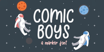 Comic Boys embodies fun, quirkiness and authenticity. This enchanting display font will turn any creative idea into a true standout.
 - Everything by PizzaDude.dk,
$20.00Everything is a simple, yet beautiful handwritten font. You will need to use OpenType supporting applications to use the autoligatures. - Book Sketch by Ziza Type,
$8.00 Book Sketch is hand written font which will deliver a friendly look to children books, label designs, posters or banners.
 - Brutto MF by Masterfont,
$59.00 This clean and geometric font family will suit you as a great companion fo signage, headline, website and much more.
 - Qilgabe by Letterena Studios,
$17.00 Qilgabe is a modern and stylish serif font. Add it confidently to your projects and you will love the results!
 - Desttina by Awanstudio,
$18.00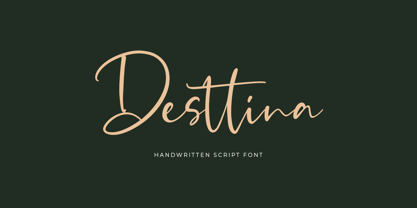 Desttina is a beautiful handwritten font with an amazing feel. It will add a smart charm to any design project!
 - Fanteo by Balevgraph Studio,
$10.00 Fanteo is a cool, modern and neat display font. This font is ideal for writing web designs, business cards, or pretty much anything else that requires a unique touch. What's Included? Uppercase & Lowercase Numbers & Punctuation Regular & Italic Multilingual Support PUA Encoded
 - Rumble by Comicraft,
$19.00 Hold on to your Hats and Stand in a convenient Door Frame, and be warned that anything you have on your desktop that is not nailed down is going to hit the floor when these characters thunder across your hard drive. Perfect for sound effects like BOOM! THOOM and, er... RUMBLE, this font family is an Earth Shaker!
 - Aromo by TipoType,
$19.00 Aromo was initially conceived for editorial purposes. This typeface mixes the versatility of a simple and modern sans-serif, with the sensibility of the humanist feeling: thus making it useful in a wide range of purposes when a balanced and friendly font, with elegant proportions and high readability is required. The functional nature of its design is complemented by a family of 14 variants (7 weights, plus their matching true italics) interpolated optically for application as a hierarchical resource, where the middle weights (Light, Regular) have been optimized for use in small bodies, while the extremes (Ultra Light, Black) where designed for display environments._ Aromo also offers a wide range of historical and discretionary ligatures, small caps, eleven different types of numerals and a set of more than 700 characters covering about two hundred languages of Latin script._
 - Bluset Now Mono by Elsner+Flake,
$35.00 Bluset Monospaced enlarges the re-worked and expanded text- and headline typeface family Bluest Now with 6 new cuts. The concept for Bluest Now was based, in its original form, on a corporate design typeface by Elsner+Flake in 2004, ordered by the Landor Agency for a large German energy corporation. Regularly re-worked and brought up to modern standards, the typeface is still used to this day. Because of its large x-height and its well-balanced appearance, Bluset Now Mono is also excellent for use in small typesizes. The three Roman cuts, Regular, Medium and Bold, and the corresponding obliques, allow a clear differentiation of base- and display applications for every typesize. The character complement has been created for 72 Latin-based language areas and thus allows a neutral text exchange across language borders. Translation Inga Wennik
 - Zt Shago by Khaiuns,
$26.00 Zt Shago is a font family of 3 eye-catching display forms, each style has its own character, from very strong and soft angles. When you're looking for a font with a fun message, you can find it in the zt Shago family. Zt Shago is the most extensive font family I've ever created, with 33 styles and 16 free font styles. The default and round styles come in regular & Italic. But for the free one I only have one on myfont, for other styles you can download at Gumroad. While extra rounded only has one weight, namely extra bold. Zt Shago also has several unique alternatives to the letters a, h, k, m, n, v, w, & z, thus enhancing your design style. I hope you have fun using zt shago Thanks for using this font ~ Khaiuns X zelowtype
 - Aromo by Underground,
$19.00 Aromo was initially conceived for editorial purposes. This typeface mixes the versatility of a simple and modern sans-serif, with the sensibility of the humanist feeling: thus making it useful in a wide range of purposes when a balanced and friendly font, with elegant proportions and high readability is required. The functional nature of its design is complemented by a family of 14 variants (7 weights, plus their matching true italics) interpolated optically for application as a hierarchical resource, where the middle weights (Light, Regular) have been optimized for use in small bodies, while the extremes (Ultra Light, Black) where designed for display environments. Aromo also offers a wide range of historical and discretionary ligatures, small caps, eleven different types of numerals and a set of more than 700 characters covering about two hundred languages of Latin script.
 - SCR-N by URW Type Foundry,
$39.99 SCR fonts are screen optimized (also called 'pixel fonts'). Unlike standard fonts (and like the few well-hinted fonts like Verdana or Arial), they give a crisp look on screen at very small sizes, thus increasing legibility. The perfect applications for those fonts are web pages and software user interfaces (computer, cellular phones, console games and any other system that uses a screen interface). Unlike most pixel fonts, SCR fonts contain kerning information. Kerning is the adjustment of space between certain pairs of characters (like 'AV') to make text look more fluid, thus increasing legibility and appeal. To benefit from this feature, auto-kerning must be activated in the application. In Photoshop, kerning must be set to 'Metrics'. Although SCR fonts are optimized for screen, they can be used for print (in Illustrator or Indesign for example) for a decorative 'computer text' effect. In this case, there is no constraint: they can be used as any other font. For screen use (in Photoshop, Fireworks, Flash... ), they have to keep aligned with the screen pixel grid not to look blurred or distorted. To achieve this, here are the guidelines to follow: RESOLUTION If the application permits it (Photoshop, Fireworks), document resolution must be set to 72 pixels per inch. SIZE The font size must be set to 10 (or multiples of 10) points. POSITIONING & ALIGNMENT The reference points of text fields and text blocks (upper left corner for left aligned text, upper right for right aligned text) must be positioned at integer values of pixels. In Photoshop, text can be precisely moved with [Edit Free Transform]. In Flash, movie clips containing text fields must also be positioned at integer values on the stage. Text must be aligned to the left or right only. Center alignment can be simulated with left alignment by adding spaces at the begin of each line. To dispense with the positioning and alignment constraints, text anti-aliasing can be turned off if the application permits it (Photoshop, Flash MX 2004). OTHER SETTINGS Leading (line spacing), tracking (letter spacing), manual kerning and baseline shift must be set either to integer values of points or to multiples of 100 units (depending on the application). Vertical and horizontal scaling must be set to 100%. Faux bold or Faux italic must not be used. The document must neither be resized on export, nor allow resizing (Flash Movies).
 - SCR-I by URW Type Foundry,
$39.99 SCR fonts are screen optimized (also called 'pixel fonts'). Unlike standard fonts (and like the few well-hinted fonts like Verdana or Arial), they give a crisp look on screen at very small sizes, thus increasing legibility. The perfect applications for those fonts are web pages and software user interfaces (computer, cellular phones, console games and any other system that uses a screen interface). Unlike most pixel fonts, SCR fonts contain kerning information. Kerning is the adjustment of space between certain pairs of characters (like 'AV') to make text look more fluid, thus increasing legibility and appeal. To benefit from this feature, auto-kerning must be activated in the application. In Photoshop, kerning must be set to 'Metrics'. Although SCR fonts are optimized for screen, they can be used for print (in Illustrator or Indesign for example) for a decorative 'computer text' effect. In this case, there is no constraint: they can be used as any other font. For screen use (in Photoshop, Fireworks, Flash... ), they have to keep aligned with the screen pixel grid not to look blurred or distorted. To achieve this, here are the guidelines to follow: RESOLUTION If the application permits it (Photoshop, Fireworks), document resolution must be set to 72 pixels per inch. SIZE The font size must be set to 10 (or multiples of 10) points. POSITIONING & ALIGNMENT The reference points of text fields and text blocks (upper left corner for left aligned text, upper right for right aligned text) must be positioned at integer values of pixels. In Photoshop, text can be precisely moved with [Edit Free Transform]. In Flash, movie clips containing text fields must also be positioned at integer values on the stage. Text must be aligned to the left or right only. Center alignment can be simulated with left alignment by adding spaces at the begin of each line. To dispense with the positioning and alignment constraints, text anti-aliasing can be turned off if the application permits it (Photoshop, Flash MX 2004). OTHER SETTINGS Leading (line spacing), tracking (letter spacing), manual kerning and baseline shift must be set either to integer values of points or to multiples of 100 units (depending on the application). Vertical and horizontal scaling must be set to 100%. Faux bold or Faux italic must not be used. The document must neither be resized on export, nor allow resizing (Flash Movies).
 - Daphyre by Typodermic,
$11.95 Step into the future with Daphyre, the ultramodern headline typeface that’s out of this world. Its soft edges and techno strokes will transport you back to the magnetic ink (MICR) inspired display types of the 1960s, while its wide, stark letterforms and massive x-height will have you feeling the Y2K vibes. Daphyre’s design is sleek and refined, eschewing the zany take on the MICR style for a more austere approach. The stroke logic emphasizes verticals, making each letterform stand out in its own right. The result is a sumptuous typeface that oozes sophistication and luxury. With Daphyre, you can make a statement that is both bold and elegant. Use it to convey high-end electronics, opulent weapons, and luxury vehicles, or let your creativity run wild and experiment with its myriad of possibilities. So why wait? Grab Daphyre today and step into the future with confidence! Most Latin-based European, Vietnamese, Greek, and most Cyrillic-based writing systems are supported, including the following languages. Afaan Oromo, Afar, Afrikaans, Albanian, Alsatian, Aromanian, Aymara, Azerbaijani, Bashkir, Bashkir (Latin), Basque, Belarusian, Belarusian (Latin), Bemba, Bikol, Bosnian, Breton, Bulgarian, Buryat, Cape Verdean, Creole, Catalan, Cebuano, Chamorro, Chavacano, Chichewa, Crimean Tatar (Latin), Croatian, Czech, Danish, Dawan, Dholuo, Dungan, Dutch, English, Estonian, Faroese, Fijian, Filipino, Finnish, French, Frisian, Friulian, Gagauz (Latin), Galician, Ganda, Genoese, German, Gikuyu, Greenlandic, Guadeloupean Creole, Haitian Creole, Hawaiian, Hiligaynon, Hungarian, Icelandic, Igbo, Ilocano, Indonesian, Irish, Italian, Jamaican, Kaingang, Khalkha, Kalmyk, Kanuri, Kaqchikel, Karakalpak (Latin), Kashubian, Kazakh, Kikongo, Kinyarwanda, Kirundi, Komi-Permyak, Kurdish, Kurdish (Latin), Kyrgyz, Latvian, Lithuanian, Lombard, Low Saxon, Luxembourgish, Maasai, Macedonian, Makhuwa, Malay, Maltese, Māori, Moldovan, Montenegrin, Nahuatl, Ndebele, Neapolitan, Norwegian, Novial, Occitan, Ossetian, Ossetian (Latin), Papiamento, Piedmontese, Polish, Portuguese, Quechua, Rarotongan, Romanian, Romansh, Russian, Rusyn, Sami, Sango, Saramaccan, Sardinian, Scottish Gaelic, Serbian, Serbian (Latin), Shona, Sicilian, Silesian, Slovak, Slovenian, Somali, Sorbian, Sotho, Spanish, Swahili, Swazi, Swedish, Tagalog, Tahitian, Tajik, Tatar, Tetum, Tongan, Tshiluba, Tsonga, Tswana, Tumbuka, Turkish, Turkmen (Latin), Tuvaluan, Ukrainian, Uzbek, Uzbek (Latin), Venda, Venetian, Vepsian, Vietnamese, Võro, Walloon, Waray-Waray, Wayuu, Welsh, Wolof, Xavante, Xhosa, Yapese, Zapotec, Zarma, Zazaki, Zulu and Zuni.
 - PR Bramble Wood 1 by PR Fonts,
$15.00 This font is a collection of spiraling vines with thorns. This can be suitable for themes where beauty is combined with suffering. Adjacent letters will provide left and right versions of the same design, and shift will access the inverted version. Combines well with: PR Bramble Wood 2, PR Hallow Doodles 01, PR Hallow Doodles 02, PR Cauldron, PR Swirlies 01, PR Swirlies 05.
 - Kuzimy by Twinletter,
$15.00 Introducing kuzimy Arabic style font. With this, Font lets you create designer-quality designs with ease. You will get a variety of styles for your project. They come in upper and lower case and alternate with different shapes. You will be able to easily create professional designs with an Arabic Style theme. This font gives you the best results when used in your projects.
 - Klepsydra by Hellig,
$12.00 When creating the font, I was inspired by the various names of musical groups and sci-fi movies. I took the hourglass shape as a basis and added various serifs to it, hence the name of my font appeared - Klepsydra, as in the Greek hourglass. This style has an abbreviation - "Z". I will develop this font family and will add new styles, as well as characters.
 - Malmont by Larin Type Co,
$15.00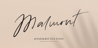 Malmont is an amazing handwritten font is light and elegant, and will emphasize your individuality in any project and will charm you with his signature. This font includes alternates and ligatures for lowercase. You can also use them to create a logo, branding, t-shirts, book covers, stationery, marketing, blogs, magazines, cosmetic, signboard and more. This font is easy to use has OpenType features.
 - Skinny Marker by Mvmet,
$12.00 Skinny Marker is a cool handwritten font, inspired by quick graffiti tags seen on streets. It will elevate a wide range of design projects to the highest level. You can use this font for many design ideas such as stickers, t-shirt designs, amazing logo designs, magazine or book covers, comics, cartoon drawings, and many more. This font will add a cool touch to your designs!
 - Japan Stamp by Pavel Boog,
$26.00 Japanese stamp - when creating this font, the author wanted to create a font unlike any other, taking inspiration from Japanese culture and history. It is one of a kind and unique font. It will immerse you in the historical era and add mystery to any of your projects. Anyone who wants to stand out among all this font will suit as out of place.
 - Agharti by That That Creative,
$15.00 Agharti is a bold condensed display font perfect for headlines with a punch. The lowercase glyphs reach as high as the capitals so even if you are not typing in all caps you will have a solid impactful block of text. These extra tall lowercase letters will be sure to catch attention from any viewer and add some playful delight to any design project.
 - Urban Daily by Mvmet,
$12.00 Urban Daily is a playful daily handwritten font, inspired by graffiti-style tags. It will elevate a wide range of design projects to the highest level. You can use this font for many design ideas such as stickers, t-shirt designs, amazing logo designs, magazine or book covers, comics, cartoon drawings, and many more. This font will add a super cool touch to your designs!