10,000 search results
(0.059 seconds)
- Peanut Slap by PizzaDude.dk,
$16.00 I love peanuts! Actually I eat peanuts every day, in the shape of Peanut Butter ... and it kind of slaps me in the face with energy and good taste! What a good way to start the day! The same thing could fit to this font: a good way to start your day is with a good design ... using my Peanut Slap font: Mix the 3 versions with your favourite colorscheme, play around with the transparency...and voila! Great results awaits you!
 - Fournier by Monotype,
$29.99 Fournier was made by Monotype in 1924. The design is based on types cut by Pierre Simon Fournier circa 1742, some of the most influential designs of the eighteenth century. Fournier's types were among the earliest of the transitional" style of typeface and were a stepping stone to the more severe "modern" style made popular by Bodoni later in the century. They had more vertical emphasis than the old style types, greater contrast between thick and thin strokes and little or no bracketing on the serifs. Fournier has a light, clean look on the page, provides good economy in text and retains an even colour.
 - kitten meat - Personal use only

- Bronkoh by Brink,
$30.00 Bronkoh: A Subtly Softened Sans. Bronkoh aims to give a friendly face and soft touch to type both on screen and in print. Humanist forms and generous apertures make this a sturdy and legible face while its softened curves and terminals give it an approachable and welcoming spirit. The large character set and extensive latin language support make Bronkoh a highly functional font; This in conjunction with eight weights from thin to heavy, and matching italics add to its versatility.
 - GaoYah Display by Stones Design Lab,
$20.00 GaoYah Display Thin is a type in very thin line, GaoYah means Elegance in Mandarin, some characters build in unique shapes can make a good memory. This font is suitable for huge titles display, in which way the line and detail shows elegance. It will make good performance in dark background as well. Including Basic English and Western Europe languages.
 - Kadigan by Missy Meyer,
$12.00 Kadigan: (noun) A placeholder word. A kadigan can be used to substitute for any other noun: persons (John Doe, Acme Company), places (Anytown, 123 Main Street) or things (whatchamacallit, thingamajig). Just like kadigans can be used in nearly any situation, the members of the Kadigan font family can be used in nearly any design! These sans-serif beauties are clear and easy to use, but they also have a little bit of wiggle in their strokes and weights, for a fun hand-lettered look! The three members of the family: - Kadigan Light: An all-purpose lightweight stroke, with sharp corners. - Kadigan: A nice mid-weight stroke, with slightly rounded corners. - Kadigan Heavy: A thick, chonky stroke with pillowy rounded corners. And each member of the family is packed with features, including: - All of the basic stuff you expect from every font; - 340+ extended Latin characters; - Cyrillic character set; - Greek character set; - Those character sets? Support over 110 languages! - 52 double-letter ligatures for variety (That's right, EVERY letter. I'm looking at you, savvy revved trekkers!); - A full set of small caps (including Cyrillic & Greek); - And more! (Seriously, it was hard to stop.) So whether your work is in English, Español, български, ελληνικά, Türkçe, or over a hundred other languages, this cute and fun sans-serif may be just what you've been looking for!
 - Glorich by Sarid Ezra,
$21.00 Introducing, Glorich, a modern sans family with alternates and ligatures! Glorich is a classic and modern all caps sans with ligatures and alternates! The other special thing about this font is for specific alphabet you can find slightly different between the uppercase and lowercase! This font fits in any project and design. You can use it for a tittle, logo, quotes, or become a pairing in any font. You will never go wrong with this font. This font also support multi language
 - Alpaim by EchadType,
$6.00 Alpaim is a minimalist sans serif font. Uniform characters and sharp geometric features create light modular sensation. Architectural nature of this font is perfectly suited for display use, graphic design, branding and even technical lettering. Originally designed in thin condensed version, now includes weight and width variation, Latin diacritics and Hebrew.
 - Pausefisk by Bogstav,
$18.00 I wanted to mix the handmade look with both comic and grafitti, but leaving an organic laid back feeling. The result is this: Pausefisk. A font with smooth, handdrawn curves and a total of 6 different versions of each letter. Pausefisk is actually something from my childhood: when the TV-programs where finished (yes, there were no TV after midnight!) the only thing to see was a camera pointed at a fishtank...and that went on for hours!
 - Red by Kevin Thrasher,
$20.00 Red began as an experiment, and turned into a larger project. Most super-black type designs are constructed of extremely simple and geometric elements. Most of them do not include a lowercase alphabet. Red is designed to be simultaneously more human, as black as possible, and as readable as possible. VIew the full specimen here.
 - Minnesota by Solotype,
$19.95Another of the “must have” wood types for those doing poster work with an old-time flavor. Very readable, therefore very useful. We did ads for an old western tourist railroad, and used this often. William Page was a prolific designer of wood types, and his fonts were at every poster print shop we visited. - Lightside by Subectype,
$18.00 Lightside is a brush script font, dapper handwritten font with a personal charm. With quick dry strokes and a signature style, Lightside is perfect for branding projects, homeware designs, product packaging - or simply as a stylish text overlay to any background image. Fonts include multilingual support. Please message me if you're unsure of any language support. Ligatures are also available for several lowercase characters (double-letters which flow more naturally). These are only accessible via software with OpenType capability or a glyphs panel, e.g. Photoshop/Illustrator. Note: in the preview there is a swash. I do not provide swash, I made the swash from the characters "Parenleft or right" and "backslash" I edited it in Corel Draw.
 - Martian Grotesk by Martian Fonts,
$35.00 Martian Grotesk is a large typeface family originally designed for the screen which consists of a variable font with 2 axes of variation and 63 styles: Condensed to Ultra Wide, Thin to Ultra Black. Aesthetics The font style is characterized by some brutality and assertiveness. Overhanging terminals, a closed aperture, and an almost complete lack of contrast lead to this effect. Additionally, some elements of the letters are especially enlarged. This font gives any text the impression of being a “signature” style. Nevertheless, we still maintain the golden mean between its rebellious nature and readability. Perfect for web development We created Martian Grotesk for the web and digital project world. When laying out web pages, frontend developers are constantly faced with the fact that uneven metrics do not allow text to be evenly placed on some design element, for example, on a button. Instead, they have to compensate in some way, like making the top padding smaller and the bottom padding larger in CSS. This little deal really hurts. Also, if your project adheres to design system principles, you might be unable to stand a lack of systematic approach when working with fonts. We researched and calculated vertical metrics and set them up in a way that guarantees equal space above the cap height and under the baseline. This enables the text labels to be evenly placed on buttons, inputs, lists, and forms. In addition, we found a proper ratio of the letter heights, so, with commonly used font sizes—10, 15, and 20 pixels—the glyph heights stick to the pixel grid. As a result, the letter shapes become sharper, which reduces the load on the reader's eyes and simply looks much better. The typeface also comes equipped with OpenType and TrueType hinting, and Martian Grotesk appears legible on most platforms, even when being rendered in small sizes. When coupled together, all the above features make Martian Grotesk a reasonable choice for any user interface design. Roadmap Martian Grotesk right now is a work-in-progress product. The font is completely ready for professional use, however, many great features are still ahead! For example, support for Extended Cyrillic characters, and italics. Pricing Purchasing an early version of the font presents the opportunity to get it at a very attractive price! That’s because with every new version, costs will go up to reflect the additional value that comes with every release. But after purchasing Martian Grotesk, all its future updates are included for free!
 - Another Wonder by Seemly Fonts,
$12.00 Another Wonder is a sweet and simple handwritten font. This font is ideal for stationery, logos, t-shirts, papers, print designs, website headers, picture frames, flyers, album covers, posters, image sliders, and many other things.
 - Buttoni by Letterhend,
$9.00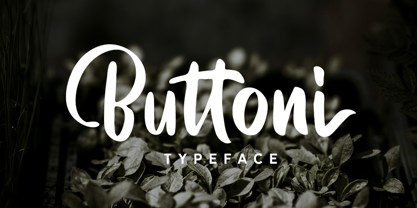 Buttoni is a playful font that you can use for many things. Perfect for quote or anything you want. This font also includes numbers, symbols, and multi-lingual support. Also comes with ligatures and alternates.
 - Staple by Ajeet Mestry,
$50.00 Staple is a Display Font. Each letter and number is made up of a clever arrangement of staples. Together, they retain the simplicity and beauty of a perfectly folded stapler pin. This creates a font that provides very good readability, solid shape and simple elegance that makes it perfect for use as a display font. To add elegance to the font, the letters and numerals are designed to retain the pin identity across all characters. Care has been taken so that the pins do not overlap. Nor are the pins bent or twisted into unnatural shapes to create the characters.
 - Heraldica Script by Sudtipos,
$79.00 Ornamented scripts are a Koziupa/Paul specialty, and Heraldica is one of their most expressive. It attains the very definition of deluxe by conjoining the classic thin-and-thick script treatment with thin-only counterpart strokes, then it goes the extra mile with a varied complement of overlaid flourishes. The usual assortment of multiple alternates and ending forms pushes it even further in class and versatility. Monograms, logos, jewelry packaging and book covers are only a few of the possibilities with such a high-end script. Crafted Koziupa and digitized by Ale Paul.
 - Henrician by Greater Albion Typefounders,
$16.50 Henrician can claim two sources of inspiration. One of these was a set of beautiful capital letterforms seen on the cover of a 19th century album of engravings. The engravings contained therein depicted lovely examples of half-timbered Tudor architecture and there was a clear 'Tudor' intent behind the letterforms. The second source of inspiration is more conceptual-the title lettering of period films from the 30's to the 60's…think if the opening text when Errol Flynn plays Robin Hood, or think of Richard the Lionheart, or even that great comedy Classic 'Carry on Henry', and it's discussion of Sir Thomas de Cobbler….but we digress! Henrician is a set of eight display and text (but perhaps not Body Text) faces in a 'Tudor Revival' spirit. Like any good revival design they are somehow at home with a wide range period themed design work, covering the medieval until, perhaps, the 18th century, just so long as we're more concerned with fun and appearance than strict historical accuracy. The family will be at home in the realms of advertising, posters, cover design and web design. Try Henrician out today!
 - Pleroid by Adam B. Ford,
$14.00 Designed to be a square font that isn’t square, Pleroid takes its cues from the shape of a square when “bulged” outward like a balloon. The caps are all rounded, the verticals are straight, and it has the feel of an old cathode-ray tube monitor—just the kind of thing for a retro-futuristic view of science fiction. Your robot approves.
 - Leuk by Wilton Foundry,
$29.00 The Dutch word “leuk" translates loosely to English as pleasant, jolly, funny, witty, clever, nice, sweet, kind, nice, amusing, entertaining, and funny. Leuk, the font, is a small, highly legible font with a witty, sociable personality that engages it’s readers. My challenge in designing Leuk was to find a unique feature to set apart the font without losing the fundamentals of type design. In the process of doing so, I created a virtual font “smile and wink” in the “o” upper and lowercase with integrated stencil-connecting strokes within the “a,e, k, z, o, ß” to reveal Leuk’s calligraphic roots. Legible and friendly, Leuk is designed for use in advertising, brochures, promotion, book cover design, packaging, and the like. The Leuk family consists of Leuk Light, Leuk Light Italic, Leuk Regular, Leuk Italic, Leuk Bold, Leuk Bold Italic, Leuk Black, Leuk Black Italic in Opentype format.
 - Horror Graffiti Cholo by Biroakakarati,
$10.99 This handwritten font is inspired by the cholo calligraphy of graffiti artists. It has a scary design, which is suitable for horor film posters and at the same time for signs and tattoo designs. It has an original style an effect font also available in a color version with drops of blood or paint to give a more lively touch. Try using it for your halloween party invitations or for your tattoo designs, for scary greeting cards. I used the word "Cholo" because this lettering in inspired by cholo-graffiti culture in Los Angeles in 70's years. The one of the best rappresent is Charles "Chaz" Bojorquez the father of cholo-lettering. Cholo because i think that in 70's in Los Angeles neighborhoods where graffiti-culture grow up there was a persons whit a mixed multicultural connexion and Chaz is one of them. Cholo-graffiti or Cholo-lettering is a specifing style o lettering. I think this is a good keyword for this lettering.
 - ITC Outpost by ITC,
$29.99Hal Taylor's ITC Outpost was not the result of a detailed design brief, nor was there a methodical development of key concepts or characters. Outpost just seemed to emerge all at once during a brief sketching session," says Taylor. "I guess what I was thinking of was an antiquated Western perception of some sort of Middle Eastern hand lettering - a 'mysterious East' sort of thing." ITC Outpost's sense of the exotic has an almost Art Nouveau quality, with its sensuous curves and sweeping strokes. The open bowls and opposing weight bias in many of the characters add to the design's striking personality. A suite of alternate and swash letters enables the setting of distinctive display copy. ITC Outpost's family of roman, italic, and swash characters is compact but versatile. The caps have the grace and authority of a titling face. Add in the lowercase and swash letters and copy is transformed into something lighthearted and full of verve. ITC Outpost creates dramatic headlines and adds a flourish to invitations, menus, logos and packaging An accomplished designer, Taylor has spent most of his career in the lettering and typographic arts. He began as a photo-lettering typographer, setting headlines and creating custom lettering, and now works in the publishing industry. " - Brush Of Zeuxis by nasirbaradari,
$15.00 Brush of Zeuxis is a font inspired by the ancient painter Zeuxis, this really cool-looking brush stroke font is here to make your designs look way better and cooler. This font can be used for as many things as you want, it can be used on a thriller poster or a music album, this font will look very cool in a rock album, and many, many more!
 - Jodith Gladyse by FadeLine Studio,
$12.00 Introduce Jodith gladyse! Jodith gladyse a new handwritten font with a style natural, sweet and simple. Made with great care to provide the natural and modern elements. The great thing about this font is you can find some style when you use it, examples such as natural handwriting style, unique, simple, elegant, and luxury. Very suitable to meet your various design needs that are trending now. Please try it!
 - Dans Le Toilette by Latinotype,
$25.00 Dans le toilette is a fun dingbat inspired by things that happen fast in the bathroom every morning. You can use them on posters, covers, patterns, brands and all kind of image with a vintage touch. Dans le toilette is part of the dingbats series designed by Coto Mendoza including Dans le cuisine, Dans le jardin and Dans le Noël. Make your day with a fun morning Dans le toilette!
 - Koumon by Muksal Creatives,
$8.00 Koumon is modern family of Display fonts. Koumon has 8 families font, starting from the small thin to the largest black. This typeface is versatile and can be used successfully in magazines, posters, branding, websites, etc.*
 - Aotani by Rezastudio,
$9.00 Aotani is a thin lettered and simple sans serif font. Masterfully designed to become a true favorite, this font has the potential to bring each of your creative ideas to the highest level! Email : rezamukhtazar6@gmail.com
 - Burkey by Muksal Creatives,
$10.00 Burkey is modern family of Display fonts. Koumon has 8 families font, starting from the small thin to the largest black. This typeface is versatile and can be used successfully in magazines, posters, branding, websites, etc.*
 - Pintanina by RodrigoTypo,
$45.00 Pintanina was developed in 2013 with many alternatives of alphabets as ligatures Based on the Comics of Condorito in the headlines, a typography very condensed, in 2015 was redesigned next to andrey kudryavtsev now with a much more finished design and a better Cyrillic and now 2017 with Franco Jonas, takes Pintanina and begins to generate all the Family of Thin, Light Regular, Bold, Extrabold, Black, also contains different dingbats that can be of help in the titles.
 - Italiko by Luca Bolognese,
$11.00 Italiko is a calligraphic font. The letters have been hand-drawn individually to extract the common strokes. The strokes have then been re-composed to give the font a more unified appearance. It comes in Black, Bold, Regular, and Thin. The Thin version is different as the extreme contrast in the font makes the thinner lines disappear. It is likely best used as a display font. There are ligatures for the combination of letters that can be written more quickly by using a single stroke and letters that are slightly different from the ‘Italic canon.’ You can select which one to use in your application (i.e., Word) using combinations of italic/bold: No selection -> Regular Bold -> Bold Italic -> Thin Bold Italic -> Black If you end up using the font, get in touch at https://github.com/lucabol/Italiko. Feel free to suggest improvements or let me know if you encounter problems.
 - Antique Stencil Borders JNL by Jeff Levine,
$29.00 Antique Stencil Borders JNL collects twenty-six vintage border designs from various sources for complementing copy set in stencil lettering or in stand-alone decorative projects. NOTE: The purchase of this font does NOT include license to replicate the designs as commercial products for resale. To do so, a Derivative Products License must be obtained by contacting Jeff Levine. Contact information is found within the End User License Agreement.
 - Hawaii Beach by Vozzy,
$10.00 Introducing a vintage look label font named "Hawaii Beach". You can see all available characters in the posters. This font has 6 styles (including layered shadow effect style) and will do well on any retro design like poster, t-shirt, label, logo etc. For using shadow effect layer: Type your text in Regular. Copy that and paste at the same position. Change the style to Shadow FX (for example).
 - Batelik by Sulthan Studio,
$10.00 Batelik -This is handwriting on paper using a pen and then we turn it into 3 styles such as regular Batelik which is original or natural handwriting without being cleaned or tidied up in the slightest while Batelik1, or Batelik2 I tidy it up and clean it, it's very modern and minimalist, it's really cool and it's amazing that you can try it for the job you're doing. letters are equipped with uppercase and lowercase letters, punctuation numbers and also language support
 - Coastly by Design A Lot,
$14.00 Meet Coastly, a handwritten font that makes you think about vacation, summer, holidays, friends and family. It’s a calm and relaxing font that works great headlines, posters, product design, quotes, branding, marketing materials and more. This font supports latin alphabet with its accents and glyphs. It also covers the most used punctuation marks and glyphs. Coastly is your friendly go to font. We made it thinking of the Amalfi Coast in Italy and its lemons, explaining its name and colour palette. Thinking of limoncello, lemonade from fresh squeezed lemons, granita, ice cream, beach and ferry trips. But we’ve also associated Coastly with your yearly holidays as: Christmas, Thanksgiving, Easter, New Years Eve, Mothers Day and so on. It’s a celebration of life and what its delights.
 - Varisse by AVP,
$19.00 Varisse spans over two centuries of type design and draws its inspiration from well-loved classics that are as fresh today as they were when they were created. The range stretches from a quintessential 18th century transitional serif to an uncompromising 20th century sans. Think Baskerville, think Gill. The idea was to create a family that shared similar forms and the same vertical metrics, allowing them to be mixed to provide impact and readability as required. With a generous x-height and a host of options, the Varisse family is ideally suited to branding, packaging, magazines and editorial. It also provides a wealth of opportunity in website presentation. The fonts are divided into five subfamilies by degree of ‘serification’. Varisse Sans Varisse Soft Sans Varisse (normal) Varisse Soft Serif Varisse Serif Each subfamily contains six weights and accompanying italics.
 - Pills by UNDT,
$45.00PILLS is a modular font based on overlayed circular and square forms, the characters have been spaced mathematically. 'PILLS' can have interesting side effects, when the leading is set very close. Feelings of anxiety, loneliness and depression can be avoided by 'PILLS'. Do not exceed daily dose. - Daily Smiles by Nathatype,
$29.00 Are you looking for a font that speaks beauty? Do you dream of creating headings that stand out and inspire creativity, imagination, and endless fun? Wait no more, we will give you the best choice. Daily Smiles-A Signature Font Inspired by the recent print design trend, the look of the script typeface is elegant and beautiful. Everything’s well with cursive! Show your opulence and decadence with this fancy font and blow your audience’s mind away as you put these cursive letters in your projects. Every detail of this beautiful font making it easy to present your brand or project in the best light. Go ahead and use it on your website, your social media branding, Pinterest banners, printed invitations, and more! Features: Ligatures Stylistic Sets PUA Encoded Numerals and Punctuation Thank you for downloading premium fonts from Nathatype
 - LiebeDoris by LiebeFonts,
$29.00 Inspired by a workshop with iconic American sign painter Mike Meyer, Ulrike of LiebeFonts set out to create a versatile, lovely typeface for sign painting that looks not at all like a font but rather like the letters on a unique, hand-painted storefront sign. LiebeDoris combines the best of two worlds: the beauty of all-American sign painting and the meticulous craft of German engineering. Each and every letter in each of the four different styles in LiebeDoris was hand-painted on large sheets of paper with a brush and ink, then carefully transferred for digital typesetting. So rather than being one typeface with different weights, think of LiebeDoris as a package of four individual designs that go together very well. Advanced OpenType features enable this font to really shine: every letter in this all-caps font comes in four variations, so that two of the same letters typed in a row won’t look the same, giving a truly handmade charm. (This feature requires layout software or a word processor with OpenType support.) And if you do have a storefront or a restaurant menu to prettify with LiebeDoris, you will love the integrated collection of store-themed catch words like “FREE”, “NEW”, and “SALE”. If you fall in love with LiebeDoris, you may also like our other best-selling fonts, LiebeErika and LiebeGerda, or our whimsical pictogram fonts such as LiebeMenu.
 - Gutknecht by Proportional Lime,
$9.99 Jobst Gutknecht was a highly successful printer in the city of Nuremburg from 1514 to 1542. He published the "Achtliederbuch" (the first Lutheran hymnal, with a whole 4 tunes) and many works by Martin Luther. This font is an accurate "recutting" of the font face Gutknecht used for the body text in his printed works. It has been extended to over 900 glyphs adding hundreds for modern use. It also presents many ancient things like old ligatures such as "tz", a hedera, and alternate style pilcrow for visual interest. And for those conservative types the modern lower case "k" is also available.
 - Alathena by Studio Sun,
$20.00 Alathena was inspired by the French art decade between art nouveau to art deco, comes with 2 style, Alternative swash and Modern deco, with some modified ligatures. Available with 6 Weights, Thin, Extra Light, Light, Regular, Bold, Extra Bold with support 75+ language (Latin Pro), and contains OpenType features. - Matching small caps for all weights. - Old Style Figure. - Full "f" Ligature set. - 20+ Optional (discretionary) ligatures. - Over 400+ Swash Characters. - Automatic Fractions. - Automatic Ordinals. - Extended language support for most Latin-based Western and Central European languages, including all the swash and alternate characters.
