10,000 search results
(0.309 seconds)
- Geneo Std by Typofonderie,
$59.00 A robust oldstyle, an elegant slab, 8 styles Geneo, created by Stéphane Elbaz, is a synthesis of historic and present-day visions of typography, a slab serif constructed on an oblique axis. Its subtle contrast evokes both Renaissance elegance and the robustness of the Egyptian typefaces that were in vogue during the 19th century. Geneo falls halfway between the classic styles of Garamond and Transitionnals, with aspects of contemporary slab serifs like Rockwell, Boton, as well a bit informal. From this blend of styles and genres, it emerges with a singular identity perfectly suited for modern illustrations of quality, savoir-faire, and culture. Geneo’s limited contrast has been carefully crafted to make the font adaptable for use as both text and headlines, as well as for small-print elements like footnotes, appendices, and captions. The variety and precision of certain weights, like Regular, allow minute adjustments of the font color in text compositions. This flexibility is especially useful for displaying on devices with high pixel densities such as the latest iPhone or iPad, on which text may appear too thin. Flexibility and sturdiness The sturdiness of Geneo makes it a perfect choice for posters, logos, print and any project that requires finesse and sophistication. It provides alternate versions of some letters such as g and a to give you the flexibility you need for your typographic projects. Geneo pairs perfectly with contemporary typeface genre. Geneo, a new typeface designed by Stéphane Elbaz Tokyo TDC 2014 Type Directors Club 2009
 - Bay Tavern by FontMesa,
$25.00 Bay Tavern is the first weathered version of our Tavern font that's based on Algerian. With three weights, open faced and outline versions to choose from you're sure to find the right style for your new project, restaurant menu, logo, t-shirt design or Pirate costume party. Bay Tavern includes all the same alternates as our regular Tavern font family. While our original Tavern font has been increased to include five weights additional weights for Bay Tavern will have to wait for now, adding the notched cut in's were all done by hand which causes a lot of cramping so a long break is needed before creating the extra weights. The Fill fonts in the Bay Tavern family are meant to be used with Bay Tavern Open fonts, if you're using Bay Tavern Open then select Bay Tavern Fill, if you're using Bay Tavern Open L then select Bay Tavern Fill L, if you're using Bay Tavern Open S then select Bay Tavern Fill S, if you're using Bay Tavern Open SL then select Bay Tavern Fill SL, the same rule goes for the Open X version.
 - TELETYPE 1945-1985 - Unknown license

- As of my last update, the MDRS-FD01 might not be widely recognized in mainstream typographic circles or it's a new or specific creation that hasn't fully entered the common design lexicon yet. Howeve...
- Weekend Warrior - 100% free

- Odisseia by Plau,
$20.00 Odisseia: Monospaced Typeface Made on Earth by Plau. Plau presents Odisseia, a monospace type family in 8 styles designed with simplicity of shapes and a humanist touch. We’ve ventured into monospace territory, where all letters must occupy the same amount of space. This style is usually associated with typewriters and computer terminal fonts. Like all monospaced fonts, every letter align vertically in a multi-line setting. The rhythm created is peculiar, since large letters such as m and w occupy the same space as narrow ones like i. Because we have 4 different weights: light, regular, bold and black the design of some characters have to be adapted to fit the same width and achieve a constant light/dark value throughout. These features make Odisseia suitable for a specific yet considerable range of uses, from computer coding to systemized communication such as brand identities. This style has been used from high-end brand identity to cutting edge digital applications. Odisseia sets a little shorter in comparison with other monospaced fonts, and bears a large x-height.
 - Trace by Linecreative,
$16.00 Introducing "Trace," a captivating display font that seamlessly marries the ancient mystique of Nordic symbols with a bold, futuristic modernity. This unique typeface transcends traditional boundaries, emerging as a striking fusion of historical symbolism and cutting-edge design. "Trace" is not merely a font; it's a visual journey that bridges the past and the future, offering a distinctive and versatile aesthetic. Inspired by Nordic symbols, "Trace" breathes new life into these ancient motifs, infusing them with a sleek and contemporary vibe. Each character carries the rich storytelling heritage of Nordic culture, interpreted through a lens of modern sophistication. The result is a font that is both timeless and forward-thinking, making it an ideal choice for those seeking a balance between tradition and innovation. As a display font, "Trace" commands attention with its bold and commanding presence. Its carefully crafted letterforms embody a sense of strength and purpose, while the subtle Nordic influences add an air of mystery and intrigue. Beyond its role as a traditional typeface, "Trace" transcends expectations by doubling as a symbol font. Unlock a treasure trove of symbolic possibilities, allowing you to weave intricate narratives or create visually stunning patterns that go beyond the constraints of traditional alphabets. Whether you're designing for futuristic branding, creating a visual language for a tech-forward project, or simply seeking a font that tells a story of cultural richness, "Trace" is your creative companion. Versatile and impactful, this font opens doors to a realm where ancient symbols and modern design converge, allowing you to explore uncharted territories in your creative endeavors. Embark on a design journey that spans centuries with "Trace. What you get, you will get: 1. Trace - Clean San serif font including Uppercase & Lowercase (ALL CAPS) characters, 2. Numbers and Punctuation 3. Support Multi language (Western Europe Latin)
 - Soul Adventures Cyr by Ira Dvilyuk,
$18.00 Soul Adventures Cyrillic Script adds hand look style to all your design projects: logos, signatures, labels, packaging design, and blog headlines. Also, it will look great in mugs, cards, gorgeous typographic designs, wedding stationery, and much more. An additional font Soul Adventures Symbols Font can help you to make a lot of pretty designs and logos. Soul Adventures script includes a full set of uppercase 2 sets of lowercase letters, numerals, a large range of punctuation, and 70 ligatures, giving a realistic hand-lettered style. The Cyrillic part of the font contains the uppercase letters and lowercase letters and 20 ligatures, giving realistic hand-lettered style. Soul Adventures Symbols is a font with over 36 unique, hand-drawn elements and swashes that can help to make your design more original. A different symbol is assigned to every uppercase or lowercase standard character plus numbers 0-9 so you do not need graphics software just simply type the letter you need. Multilingual Support for 32 languages: Latin glyphs for Afrikaans, Albanian, Basque, Bosnian, Catalan, Danish, Dutch, English, Estonian, Faroese, Filipino, Finnish, French, Galician, Indonesian, Irish, Italian, Malay, Norwegian Bokmål, Portuguese, Slovenian, Spanish, Swahili, Swedish, Turkish, Welsh, Zulu. And Cyrillic glyphs support for Russian, Belorussian, Bulgarian, Ukrainian, and Kazakh languages.
 - Nuit by Eurotypo,
$28.00 Nuit, a delightfully handwritten family font with strong character designed by Carine de Wandeleer. Its slight bounce and intentional irregularity, gives your words a wonderful flow. The fatness and thinness of their strokes give an impressive harmony. This new font family includes Regular, Italic, Bold and Bold Italic. It has OpenType features such as Stylistics alternates, Swashes, Ligatures, up to four Stylistic sets by letter, initial and terminal forms in upper and lower, ornaments that allow you to mix and match pairs of letters and a Central European language support to fit your design. This OpenType features may only be accessible via OpenType-aware applications, or the Character Map to view and copy any of the extra characters to paste into your favorite text editor/app. This will help your creativity and make it easier to make expressive and elegant your typographic work. Also with Nuit it is possible to write all in capitals. Nuit looks lovely on wedding invitations, greeting cards, logos, posters, labels, t-shirt design, logos, business-cards and is perfect for using in ink or watercolor based designs, fashion, magazines, food packaging and menus, book covers and whatever your imagination holds! Nuit was made to make your project more beautiful and attractive.
 - XMattsAnimals by Ingrimayne Type,
$9.95 Most of the letter keys are from animal drawings done by a six or eight year old child who has now grown up.
 - FS Lucas by Fontsmith,
$80.00 Pure and not-so-simple Maybe it’s the air of purity, openness and transparency that they transmit, but geometric typefaces are more popular than ever among leading brands. Based on near-perfect circles, triangles and squares, geometric letterforms look uncomplicated, even though making them readable is anything but – something the designers of the first wave of geometric fonts discovered nearly a century ago. Many of the world’s most recognisable brands in technology, retail, travel, food, manufacturing and other industries continue to be drawn to the straightforward, honest character that geometric fonts convey. Fontsmith set out in 2015 to develop a typeface in the same tradition, but optimised for the demands of modern brands – online and offline usage, readability and accessibility. And, of course, with the all-important Fontsmith x-factor built in. FS Lucas is the bold and deceptively simple result. Handle with care The letterforms of FS Lucas are round and generous, along the lines of Trajan Column lettering stripped of its serifs. But beware their thorns. Their designer, Stuart de Rozario, who also crafted the award-winning FS Millbank, wanted a contrast between spiky and soft, giving sharp apexes to the more angular letterforms, such as A, M, N, v, w and z. Among his inspirations were the colourful, geometric compositions of Frank Stella, the 1920s art deco poster designs of AM Cassandre, and the triangular cosmic element symbol, which led him to tackle the capital A first, instead of the usual H. The proportions and angles of the triangular form would set the template for many of the other characters. It was this form, and the light-scattering effects of triangular prisms, that lit the path to a name for the typeface: Lucas is derived from lux, the Latin word for light. Recommended reading Early geometric typefaces were accused of putting mathematical integrity before readability. FS Lucas achieves the trick of appearing geometric, while taking the edge off elements that make reading difficult. Perfectly circlular shapes don’t read well. The way around that is to slightly thicken the vertical strokes, and pull out the curves at the corners to compensate; the O and o of FS Lucas are optical illusions. Pointed apexes aren’t as sharp as they look; the flattened tips are an essential design feature. And distinctive details such as the open terminals of the c, e, f, g, j, r and s, and the x-height bar on the i and j, aid legibility, especially on-screen. These and many other features, the product of sketching the letterforms in the first instance by hand rather than mapping them out mechanically by computer, give FS Lucas the built-in humanity and character that make it a better, easier read all-round. Marks of distinction Unlike some of its more buttoned-up geometric bedfellows, FS Lucas can’t contain its natural personality and quirks: the flick of the foot of the l, for example, and the flattish tail on the g and j. The unusual bar on the J improves character recognition, and the G is circular, without a straight stem. There’s a touch of Fontsmith about the t, too, with the curve across the left cross section in the lighter weights, and the ampersand is one of a kind. There’s a lot to like about Lucas. With its 9 weights, perfect proportions and soft but spiky take on the classic geometric font, it’s a typeface that could light up any brand.
 - FS Lucas Paneureopean by Fontsmith,
$90.00Pure and not-so-simple Maybe it’s the air of purity, openness and transparency that they transmit, but geometric typefaces are more popular than ever among leading brands. Based on near-perfect circles, triangles and squares, geometric letterforms look uncomplicated, even though making them readable is anything but – something the designers of the first wave of geometric fonts discovered nearly a century ago. Many of the world’s most recognisable brands in technology, retail, travel, food, manufacturing and other industries continue to be drawn to the straightforward, honest character that geometric fonts convey. Fontsmith set out in 2015 to develop a typeface in the same tradition, but optimised for the demands of modern brands – online and offline usage, readability and accessibility. And, of course, with the all-important Fontsmith x-factor built in. FS Lucas is the bold and deceptively simple result. Handle with care The letterforms of FS Lucas are round and generous, along the lines of Trajan Column lettering stripped of its serifs. But beware their thorns. Their designer, Stuart de Rozario, who also crafted the award-winning FS Millbank, wanted a contrast between spiky and soft, giving sharp apexes to the more angular letterforms, such as A, M, N, v, w and z. Among his inspirations were the colourful, geometric compositions of Frank Stella, the 1920s art deco poster designs of AM Cassandre, and the triangular cosmic element symbol, which led him to tackle the capital A first, instead of the usual H. The proportions and angles of the triangular form would set the template for many of the other characters. It was this form, and the light-scattering effects of triangular prisms, that lit the path to a name for the typeface: Lucas is derived from lux, the Latin word for light. Recommended reading Early geometric typefaces were accused of putting mathematical integrity before readability. FS Lucas achieves the trick of appearing geometric, while taking the edge off elements that make reading difficult. Perfectly circlular shapes don’t read well. The way around that is to slightly thicken the vertical strokes, and pull out the curves at the corners to compensate; the O and o of FS Lucas are optical illusions. Pointed apexes aren’t as sharp as they look; the flattened tips are an essential design feature. And distinctive details such as the open terminals of the c, e, f, g, j, r and s, and the x-height bar on the i and j, aid legibility, especially on-screen. These and many other features, the product of sketching the letterforms in the first instance by hand rather than mapping them out mechanically by computer, give FS Lucas the built-in humanity and character that make it a better, easier read all-round. Marks of distinction Unlike some of its more buttoned-up geometric bedfellows, FS Lucas can’t contain its natural personality and quirks: the flick of the foot of the l, for example, and the flattish tail on the g and j. The unusual bar on the J improves character recognition, and the G is circular, without a straight stem. There’s a touch of Fontsmith about the t, too, with the curve across the left cross section in the lighter weights, and the ampersand is one of a kind. There’s a lot to like about Lucas. With its 9 weights, perfect proportions and soft but spiky take on the classic geometric font, it’s a typeface that could light up any brand. - HS Almisk by Hiba Studio,
$50.00 HS Almisk is a display typeface. It can be used for titles, logos and graphic projects, which support Arabic and. It has been created based on modern kufi style. It enjoys flexibility between sharp and curved lines in the structure of characters. This supports with a beautiful appearance and wonderful geometric structure. The sharp endings in the bottom of character also give an aesthetic addition to the character. (8) Weights has been created for this typeface between the Light weight and Black weight. Besides, those three additional weights which can be used in headline, has baseline parts are thicker than the vertical parts. One has a regular form and the others has a stencil form in the middle using various styles. This typeface with its diversity of (8) weights is intended to be an attempt for a good addition to Arabic typography.
 - Rainier by Kimmy Design,
$10.00 I was inspired to create the Rainier type family during my summer back home in the Pacific Northwest. The concept behind it may be simple - a hand crafted font family - but what it delivers is quite complex! Here is a breakdown of everything you get: FONT FAMILIES: Two sub-families with unique styles - Rainier North and Rainier West WEIGHTS: 4 weights per family, broken down numerically - 100 (light), 300 (regular), 500 (bold), 700 (black) OPENTYPE: In each family, there are tons of OpenType options, offering lots of customizable opportunities (in order to access all these goodies, you must be using Illustrator, Photoshop, Indesign or Publisher). Because Rainier is 100% handmade, contextual alternatives allow each letter has three subtle variations, this way it keeps that authentic hand-drawn look. Additionally, a full alphabet with special descending swashes, as well as start and end swashes for capitals and small caps. Titling alternatives offer a full character set just to help with readability! Meant for captions or smaller text, these letterforms are easy on the eye and a great complement to the regular alphabet. Stylistic Alternatives add a little fun, providing a unified cap height, no matter what case you are using (all caps, small caps or lowercase.) Discretionary Ligatures are created only for capitals, and takes specific letter pairs and creates a unique ligature between them To get a better understanding of everything, please check out the quicker user guide (http://bit.ly/1W0Bfma) and print if you so desire (http://bit.ly/23W9ZV6) that helps you navigate your way around and get the most out of Rainier! Unfortunately those links aren't working right now and soon I will have them fixed. So sorry! ORNAMENTS: In addition to the font, you get a set of awesomely rustic ornaments designed and drawn to go specifically with Rainier! - Rustic Northwest Illustrations - Banners & Flags - Frames - Flourishes - Lines & Line Breaks - Arrows There are a lot of extras packed in this set, so make sure you check out the Ornaments User Guide to get the most out of it! Check it out here: http://bit.ly/1rRVJRx And that’s all folks! Hope you enjoy Rainier!
 - Antique by Storm Type Foundry,
$26.00The concept of the Baroque Roman type face is something which is remote from us. Ungrateful theorists gave Baroque type faces the ill-sounding attribute "Transitional", as if the Baroque Roman type face wilfully diverted from the tradition and at the same time did not manage to mature. This "transition" was originally meant as an intermediate stage between the Aldine/Garamond Roman face of the Renaissance, and its modern counterpart, as represented by Bodoni or Didot. Otherwise there was also a "transition" from a slanted axis of the shadow to a perpendicular one. What a petty detail led to the pejorative designation of Baroque type faces! If a bookseller were to tell his customers that they are about to choose a book which is set in some sort of transitional type face, he would probably go bust. After all, a reader, for his money, would not put up with some typographical experimentation. He wants to read a book without losing his eyesight while doing so. Nevertheless, it was Baroque typography which gave the world the most legible type faces. In those days the craft of punch-cutting was gradually separating itself from that of book-printing, but also from publishing and bookselling. Previously all these activities could be performed by a single person. The punch-cutter, who at that time was already fully occupied with the production of letters, achieved better results than he would have achieved if his creative talents were to be diffused in a printing office or a bookseller's shop. Thus it was possible that for example the printer John Baskerville did not cut a single letter in his entire lifetime, for he used the services of the accomplished punch-cutter John Handy. It became the custom that one type founder supplied type to multiple printing offices, so that the same type faces appeared in various parts of the world. The type face was losing its national character. In the Renaissance period it is still quite easy to distinguish for example a French Roman type face from a Venetian one; in the Baroque period this could be achieved only with great difficulties. Imagination and variety of shapes, which so far have been reserved only to the fine arts, now come into play. Thanks to technological progress, book printers are now able to reproduce hairstrokes and imitate calligraphic type faces. Scripts and elaborate ornaments are no longer the privilege of copper-engravers. Also the appearance of the basic, body design is slowly undergoing a change. The Renaissance canonical stiffness is now replaced with colour and contrast. The page of the book is suddenly darker, its lay-out more varied and its lines more compact. For Baroque type designers made a simple, yet ingenious discovery - they enlarged the x-height and reduced the ascenders to the cap-height. The type face thus became seemingly larger, and hence more legible, but at the same time more economical in composition; the type area was increasing to the detriment of the margins. Paper was expensive, and the aim of all the publishers was, therefore, to sell as many ideas in as small a book block as possible. A narrowed, bold majuscule, designed for use on the title page, appeared for the first time in the Late Baroque period. Also the title page was laid out with the highest possible economy. It comprised as a rule the brief contents of the book and the address of the bookseller, i.e. roughly that which is now placed on the flaps and in the imprint lines. Bold upper-case letters in the first line dramatically give way to the more subtle italics, the third line is highlighted with vermilion; a few words set in lower-case letters are scattered in-between, and then vermilion appears again. Somewhere in the middle there is an ornament, a monogram or an engraving as a kind of climax of the drama, while at the foot of the title-page all this din is quietened by a line with the name of the printer and the year expressed in Roman numerals, set in 8-point body size. Every Baroque title-page could well pass muster as a striking poster. The pride of every book printer was the publication of a type specimen book - a typographical manual. Among these manuals the one published by Fournier stands out - also as regards the selection of the texts for the specimen type matter. It reveals the scope of knowledge and education of the master typographers of that period. The same Fournier established a system of typographical measurement which, revised by Didot, is still used today. Baskerville introduced the smoothing of paper by a hot steel roller, in order that he could print astonishingly sharp letters, etc. ... In other words - Baroque typography deserves anything else but the attribute "transitional". In the first half of the 18th century, besides persons whose names are prominent and well-known up to the present, as was Caslon, there were many type founders who did not manage to publish their manuals or forgot to become famous in some other way. They often imitated the type faces of their more experienced contemporaries, but many of them arrived at a quite strange, even weird originality, which ran completely outside the mainstream of typographical art. The prints from which we have drawn inspiration for these six digital designs come from Paris, Vienna and Prague, from the period around 1750. The transcription of letters in their intact form is our firm principle. Does it mean, therefore, that the task of the digital restorer is to copy meticulously the outline of the letter with all inadequacies of the particular imprint? No. The type face should not to evoke the rustic atmosphere of letterpress after printing, but to analyze the appearance of the punches before they are imprinted. It is also necessary to take account of the size of the type face and to avoid excessive enlargement or reduction. Let us keep in mind that every size requires its own design. The longer we work on the computer where a change in size is child's play, the more we are convinced that the appearance of a letter is tied to its proportions, and therefore, to a fixed size. We are also aware of the fact that the computer is a straightjacket of the type face and that the dictate of mathematical vectors effectively kills any hint of naturalness. That is why we strive to preserve in these six alphabets the numerous anomalies to which later no type designer ever returned due to their obvious eccentricity. Please accept this PostScript study as an attempt (possibly futile, possibly inspirational) to brush up the warm magic of Baroque prints. Hopefully it will give pleasure in today's modern type designer's nihilism. - 1756 Dutch by GLC,
$42.00 This family is inspired from the set of two styles, Roman normal and Italic, and the ornaments used by an unknown printer working around East Switzerland, circa 1750's. It is a Dutch style font, slightly bolder than usual Fournier's or Caslon's Roman fonts, with some emphasized serifs and finals parts and special letters as capital "U" for example. A set of initials, fleurons, ornaments and frame elements is joined to the family as a supplement. The two styles, Normal and Italic, are containing standard ligatures, a few alternative characters and titlings (who are more preferable than enlarged capitals). They are "small eye" or "Small x-eight" fonts. The standard characters set is completed with accented or specific characters for Western (Including Celtic) and Central Europe, Baltic, Eastern Europe and Turkish.
 - Halter - Unknown license

- Kyotce by Soerat Company,
$24.00 Kyotce is inspired by the Egyptian serif which has a strong and bold typeface. This family of 8 weights from Light to Bold along with italics and is perfect for advertising, packaging, logo, editorial and publishing, branding and other creative industries. Each style includes 700+ glyphs, Kyoto supports around 200 languages in the Latin and Cyrillic. This font provides advanced typographic support with features such as ligatures, alternate characters, old-style figures, fractions, numerator/denominator, superior/inferior, and various symbols.
 - Spitzkant by Julien Fincker,
$29.00 About the design Spitzkant is a serif typeface family that is characterized by strong contrasts. Pointed, sharp serifs and edges contrast with round and fine forms, making it very individual and expressive. This makes it particularly suitable for branding, editorial, packaging and advertising. The high-contrast display version has been complemented by a lower-contrast text version, making Spitzkant in combination suitable for both strong headlines and extensive body text. An allrounder that can be used for many purposes. Features The Spitzkant Head and Text family has a total of 2 optical sizes, 5 weights and 20 styles, from thin to bold and matching italics. With over 850 characters, it covers over 200 Latin-based languages. It also has an extended set of currency symbols and a whole range of open type features. For example, there are alternative characters as Stylistic Sets, Small Caps, automatic fractions and many other features. Ligatures Especially the extensive selection of ligatures (standard and optional) is a special feature which was an important part during the design process. With over 95 different ligatures there are many possibilities to give headlines and logos an individual touch. Get the Variable Font here: https://www.myfonts.com/fonts/julien-fincker/spitzkant-variable/
 - Niquitta Mirzani by Arterfak Project,
$17.00 introducing Niquitta Mirzani, a brand new font combination Script and Sans. The script means signature because the letterform created with quick handwriting, wide, signature-like. The sans serif designed with condensed shapes, semi-bold that gives a large space to be combined with the script one. You can mix and match this font with any layout possibilities. top-bottom, left-right, headline-tagline, or side by side. Niquitta Mirzani script carefully crafted with additional alternates and ligatures that allow you to create a natural typographic design. This font duo is perfect for display such as apparel, name cards, headline, logo, packaging, labels, signage, quote, and many more! The versatile design for many themes such as romantic, professional, formal, or playful! Fonts featured : Uppercase Lowercase Smallcaps Numbers & punctuation Multilingual PUA encoded Swashes Stylistic set 01-03 Ligatures.
 - Rikale by Sensatype Studio,
$15.00 A Fashion Modern serif font that we created special for elegant branding needs, with extra alternates in unique shape will be ready to add value of your brand. It so nice to leverage designer or product owner that need solutions to make their design look more classy and modern. And specially for Gingka font, We prepared any alternate characters to help you create unlimited variations for your creative needs. Rikale Condensed Fashion Modern Font ready with: Any options to get creative variations (combination of Alternate characters) Preview as a inspirations that you can do with Rikale font Ready with Lowercase and Uppercase characters Wish you enjoy our font. :)
 - Refina by Sensatype Studio,
$15.00 An Refina Feminine Beauty Serif font that we created special for elegant branding needs, with extra alternates in unique shape will be ready to add value of your brand. It so nice to leverage designer or product owner that need solutions to make their design look more classy and modern. And specially for Refina font, We prepared any alternate characters to help you create unlimited variations for your creative needs. Refina Feminine Beauty Serif ready with: Any options to get creative variations (combination of Alternate characters) Preview as a inspirations that you can do with Refina font Ready with Lowercase and Uppercase characters Wish you enjoy our font. :)
 - Flora by Sensatype Studio,
$15.00 A new Sans serif that we created special for branding needs, with extra ligature in unique shape add value of your brand. It so nice to leverage designer or product owner that need solutions to make their design look more stylish and modern. And specially for Flora font, We prepared any ligatures, and any alternate characters to help you create unlimited variations for your creative needs. Flora - Modern Branding Stylish Font ready with: Any options to get creative variations (combination of Alternate and Ligatures) Preview as a inspirations that you can do with Satisfy font Ready with Lowercase and Uppercase characters Wish you enjoy our font!
 - Maung by Sensatype Studio,
$15.00 A serif that we created special for elegant branding needs, with extra ligature and alternates in unique shape will be ready to add value of your brand. It so nice to leverage designer or product owner that need solutions to make their design look more classy and modern. And specially for Maung font, We prepared any ligatures, and any alternate characters to help you create unlimited variations for your creative needs. Maung serif font ready with: Any options to get creative variations (combination of Alternate and Ligatures) Preview as a inspirations that you can do with Maung font Ready with Lowercase and Uppercase characters Wish you enjoy our font. :)
 - Quning by Sensatype Studio,
$15.00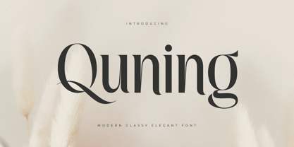 An Elegant serif font that we created special for elegant branding needs, with extra alternates in unique shape will be ready to add value of your brand. It so nice to leverage designer or product owner that need solutions to make their design look more classy and modern. And specially for Quning font, We prepared any alternate characters to help you create unlimited variations for your creative needs. Quning Modern Classy Elegant Serif Font ready with: Any options to get creative variations (combination of Alternate characters) Preview as a inspirations that you can do with Quning font Ready with Lowercase and Uppercase characters Wish you enjoy our font. :)
 - Hashtag by Agnieszka Ewa Olszewska,
$5.00 Hashtag is a type family of four types.The font contains over 360 carefully hand-crafted glyphs. Very elegant and gentle in big sizes but is very legible in smaller sizes and longer texts - in print or on screen. As an exclusively OpenType release, these fonts have an extended character set to support Central and Eastern European. Hashtag is perfect for logos, advertising, announcement, invites, thank you�s and correspondence, for packaging, and to create all yours fun and moderns designs you want. There are plenty of options to allow you to create something unique and special. I hope you like him as much as I do!
 - Monarch SS by Sensatype Studio,
$15.00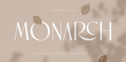 New Ligature serif that we created special for elegant projects with extra ligature and alternates in unique shape will be ready to add value of your brand. It so nice to leverage designer or product owner that need solutions to make their design look more elegant and luxury. And specially for Monarch font, We prepared any ligatures and any alternate characters to help you create unlimited variations for your creative needs. Monarch serif font ready with: Any options to get creative variations (combination of Alternate and Ligatures) Preview as a inspirations that you can do with Monarch font Ready with Lowercase and Uppercase characters Wish you enjoy our font. :)
 - Olivany by Sensatype Studio,
$15.00 A new Sans serif that we created special for branding needs, with extra ligature in unique shape add value of your brand. It so nice to leverage designer or product owner that need solutions to make their design look more stylish and modern. And specially for Young font, We prepared any ligatures, and any alternate characters to help you create unlimited variations for your creative needs. Olivany Modern Beauty sans serif font ready with: Any options to get creative variations (combination of Alternate and Ligatures) Preview as a inspirations that you can do with Olivany font Ready with Lowercase and Uppercase characters Wish you enjoy our font!
 - Carves by Sensatype Studio,
$15.00 CARVES is a Modern Display Font A new Display Serif that we created special for logo and branding needs, with extra unique shape that will add your brand value. It so nice to leverage designer or product owner that need solutions to make their design look more Unique and modern. And specially for Sugar font, We prepared any alternate characters to help you create unlimited variations for your creative needs specially for logotype or wordmark. CARVES Modern Display font ready with: Any options to get creative variations (combination of Alternates) Preview as a inspirations that you can do with Carves font Ready with All Uppercase characters Wish you enjoy our font :)
 - Maslen by Prestigetype Studio,
$19.00 Maslen is a modern and classy signature font designed with a artsy touch. Perfect use for classy visual brand identities, watermark on photography, signature or signature logo design, quotes, logos, headlines, titles, labels, websites, stationery, business cards, or any advertising purposes. Maslen includes: Uppercase and lowercase Numbers and punctuation Multilingual Alternates Ligatures We highly recommend using a program that supports OpenType features and Glyphs panels like many Adobe apps and Corel Draw so you can see and access all Glyph variations. We hope you enjoy our font - please do let us know by emailing us at info@prestigetype.com or prestigetypestudio@gmail.com if you need something!
 - Original SS by Sensatype Studio,
$15.00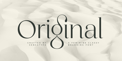 Original is a Feminine Classy Branding Font A new font that we created special for branding needs, with extra ligature in unique characters add value of your brand. It so nice to leverage designer or product owner that need solutions to make their design look more stylish and modern. And specially for satisfy font, We prepared any ligatures, and any alternate characters to help you create unlimited variations for your creative needs. Original Branding font ready with: Any options to get creative variations (combination of Alternate and Ligatures) Preview as a inspirations that you can do with Original font Ready with Lowercase and Uppercase characters Wish you enjoy our font. :)
 - Megate by Sensatype Studio,
$15.00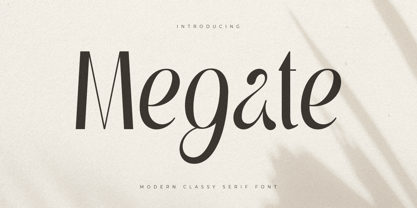 A Beauty serif font that we created special for elegant branding needs, with extra alternates in unique shape will be ready to add value of your brand. It so nice to leverage designer or product owner that need solutions to make their design look more classy and modern. And specially for Voyage font, We prepared any alternate characters to help you create unlimited variations for your creative needs. Megate Modern Classy Serif Font ready with: Any options to get creative variations (combination of Alternate characters) Preview as a inspirations that you can do with Megate font Ready with Lowercase and Uppercase characters Wish you enjoy our font. :)
 - Dangmen by Sensatype Studio,
$15.00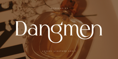 A serif that we created special for luxury branding needs, with extra ligature and alternates in unique shape will be ready to add value of your brand. It so nice to leverage designer or product owner that need solutions to make their design look more classy and modern. And specially for Dangmen font, We prepared any ligatures, and any alternate characters to help you create unlimited variations for your creative needs. Dangmen serif font ready with: Any options to get creative variations (combination of Alternate and Ligatures) Preview as a inspirations that you can do with Dangmen font Ready with Lowercase and Uppercase characters Wish you enjoy our font. :)
 - Basically by Sensatype Studio,
$15.00 An Elegant Modern Sans Serif font that we created special for elegant branding needs, with extra alternates in unique shape will be ready to add value of your brand. It so nice to leverage designer or product owner that need solutions to make their design look more classy and modern. And specially for Basically font, We prepared any alternate characters to help you create unlimited variations for your creative needs. Basically Elegant Modern Sans Serif ready with: Any options to get creative variations Preview as a inspirations that you can do with Basically font Ready with Lowercase and Uppercase characters Wish you enjoy our font. :)
 - Darla by Sensatype Studio,
$15.00 A Fashion font that we created special for beauty branding needs, with extra ligatures in unique shape will be ready to add value of your brand. It so nice to leverage designer or product owner that need solutions to make their design look more beauty and modern. And specially for Ray & Glow font, We prepared any ligatures characters to help you create unlimited variations for your creative needs. Darla Fashion font ready with: Any options to get creative variations (combination of Ligatures) Preview as a inspirations that you can do with Darla font Ready with Lowercase and Uppercase characters Wish you enjoy our font. :)
 - Kamerun by Sensatype Studio,
$15.00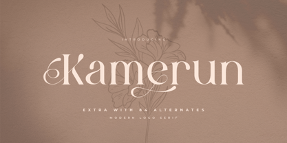 A serif that we created special for elegant branding needs, with extra ligature and alternates in unique shape will be ready to add value of your brand. It so nice to leverage designer or product owner that need solutions to make their design look more classy and modern. And specially for Kamerun font, We prepared any ligatures, and any alternate characters to help you create unlimited variations for your creative needs. Kamerun serif font ready with: Any options to get creative variations (combination of Alternate and Ligatures) Preview as a inspirations that you can do with Kamerun font Ready with Lowercase and Uppercase characters Wish you enjoy our font. :)
 - Kilura Style by Sensatype Studio,
$15.00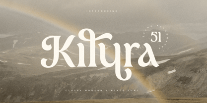 An Classy Modern Vintage Font font that we created special for elegant branding needs, with extra alternates in unique shape will be ready to add value of your brand. It so nice to leverage designer or product owner that need solutions to make their design look more classy and modern. And specially for Kilura font, We prepared any alternate characters to help you create unlimited variations for your creative needs. Kilura Classy Modern Vintage Font ready with: Any options to get creative variations (combination of Alternate characters) Preview as a inspirations that you can do with kilura font Ready with Lowercase and Uppercase characters Wish you enjoy our font. :)
 - Glosary by Sensatype Studio,
$15.00 New Unique font that we created special for modern projects with extra ligature in unique shape will be ready to add value of your brand. It so nice to leverage designer or product owner that need solutions to make their design look more elegant and luxury. And specially for Glosary font, We prepared any ligatures characters to help you create unlimited variations for your creative needs. Glosary Unique Contrast serif font ready with: Any options to get creative variations (combination of Ligatures) Preview as a inspirations that you can do with Glosary font Ready with Lowercase and Uppercase characters Wish you enjoy our font. :)
 - Morality by Sensatype Studio,
$15.00 Morality is a Modern Elegant Sans Serif Font that perfect for branding, logotyp, poster design, etc A new San Serif Font that we created special for Headline, Title and more stand out typography needs. It's so perfect to add your style and headline overview. And specially for Headline font, we crafted for unique style and modern feels so enjoy to create any project that will show your main idea out. Morality Modern Elegant Sans Serif Font ready with: Any options to get creative variations Preview as a inspirations that you can do with Morality font Ready with All characters Wish you enjoy our font. :)
 - Exited by Sensatype Studio,
$15.00 A Modern Sport Font that perfect for technology, sport, racing, action design project. A new Sans Serif Font that we created special for Headline, Title and more stand out typography needs that will add your variations. It's so perfect to add your style and headline overview. And specially for Headline font, we crafted for futuristic style and modern feels so enjoy to create any project that will show your main idea out. Exited Modern Sport Font ready with: Any options to get creative variations Preview as a inspirations that you can do with Exited font Ready with All Uppercase characters Wish you enjoy our font. :)


