10,000 search results
(0.047 seconds)
- Hocklyn by HansCo,
$15.00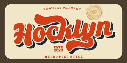 Hocklyn Font is a lettering retro vintage font. You will get alternate characters such as swash on some characters. Equipped with all complete characters ranging from uppercase letters, lowercase letters, numbers, punctuation marks and multi-lingual support, this font is ready to be used in any project. Very suitable for logotype, Stickers, Packaging design, Cricut Project, Headlines, Brand identity, T shirt or Apparel industry, Posters, Magazines, Books, YouTube, Instagram, Websites, Canva, Corjl or any of your creative design projects. Use this Hocklyn Font to add that special modern retro touch to any design idea you can think of! Enjoy!
 - Rushton by HansCo,
$15.00 Rushton is a lettering retro vintage font. You will get alternate characters such as swash on some characters. Equipped with all complete characters ranging from uppercase letters, lowercase letters, numbers, punctuation marks and multi-lingual support, this font is ready to be used in any project. Very suitable for logotype, Stickers, Packaging design, Cricut Project, Headlines, Brand identity, T shirt or Apparel industry, Posters, Magazines, Books, YouTube, Instagram, Websites, Canva, Corjl or any of your creative design projects. Use this Rushton font to add that special modern retro touch to any design idea you can think of! Enjoy!
 - Hadenut by HansCo,
$15.00 Hadenut Font is a lettering retro vintage font. You will get alternate characters such as swash on some characters. Equipped with all complete characters ranging from uppercase letters, lowercase letters, numbers, punctuation marks and multi-lingual support, this font is ready to be used in any project. Very suitable for logotype, Stickers, Packaging design, Cricut Project, Headlines, Brand identity, T shirt or Apparel industry, Posters, Magazines, Books, YouTube, Instagram, Websites, Canva, Corjl or any of your creative design projects. Use this Hadenut font to add that special modern retro touch to any design idea you can think of! Enjoy!
 - Frutiger Stones by Linotype,
$29.00In Adrian Frutiger, the discipline of a mathematically exact mind is joined with an unmistakable artistic sense. His independent work possesses the controllable language of letterforms. Personal and intensive, this work is the manifestation of his expressive will. Frutiger's precise sense of outline reveals itself two- or three-dimensionally in wood, stone, or bronze, on printing plates and in the form of reliefs. However, even his independent work can be understood as objectivized signs; in their symbolism, they are embedded in the fundamental questions of human existance. They might have developed in the spirit of playfulness, but their nature is always conceptual, directed towards a complex, yet harmonic, whole. Following function, form also necessarily follows the content of the language. The entire spiritual world becomes readable through letters. Essentially, Adrian Frutiger attempts to fathom the basic, central truth which defines our lives: change, growth, division - beginning and end. In a virtual synthesis, he seems to close the circle in which the world reflects itself in symbolic forms. Frutiger Stones is for Adrian Frutiger the example of his formal artistic sensibility par excellence. Searching for the fundamental elements in nature, he has discovered the pebble, rounded and polished over innumerable years by gently flowing water. And out of this, he has created his complete system, a ruralistic typeface of letters and symbols. It depicts animals and plants, as well as astrological and mythical signs. Because of its unique aura, Frutiger Stones is particularly well-suited to different purposes - in headlines and prominent pictograms, as symbol faces, illustrations, and more. - Slate by Monotype,
$34.99 A typeface of grace, power and exceptional versatility, the Slate collection is a truly beautiful design that achieves stellar levels of readability, both in print and on screen. Created by the award winning type designer Rod McDonald, this six-weight sans serif family is a rare example of sublime aesthetics meeting world-class functionality. The typeface’s legible letterforms embody an amalgam of the best traits of both humanistic and grotesque letterforms. “I didn’t want a face with an ‘engineered’ look, or with any noticeable design gimmicks or devices,” admits designer McDonald. “I wanted a pure design. I confess that I was ruthless with any character that wanted to stand out from the rest.” The Slate collection is available in six weights with complementary italics, with slight changes in structure from the light to the black weights. Its light weight is reminiscent of early American sans. Whether for use in display work or in longer-form settings, few typefaces possess the beauty and power of this design, leaving the Slate family an excellent addition to any designer’s typographic quiver.
 - Hua by YXType,
$14.99 Hua type family is a sans-serif with very humanist details to represent the essence of nature. It features 14 weights from the very thin to the very bold, generously covering a wide range of the natural spectrum. Aiming to represent the soft and elegant side of nature, Hua features very unique italics that have their own take on the identity. The letterforms of the italic fonts are inspired by the lineage of both traditional calligraphic approaches for serifs and much simpler forms for sans-serifs. Hua provides very crisp performances on screens and its large x-height combined with fine-tuned proportions help it retain legibility very well on smaller sizes. Features: • Support for 200+ Latin languages • Double & single storie “a” & “g” • Unique italic letterforms • Low contrast with unique details • Small caps with symbols • Arbitrary and defined fractions • Support for superscript & subscript in normal & scientific alignments • Proportional lining, proportional old-style, tabular lining, tabular old-style
 - Full Neue by Bülent Yüksel,
$19.00Full Neue is the younger brother of original Full Sans, Full Slab and Full Tools. Ideally suited for advertising and packaging, editorial and publishing, logo, branding and creative industries, poster and billboards, small text, way-finding and signage as well as web and screen design. Full Neue provides advanced typographical support for Latin-based languages. An extended character set, supporting Central, Western and Eastern European languages, rounds up the family. The designation “Full Neue LC 50 Book” forms the central point. The first figure of the number describes the stroke thickness: 10 Thin to 90 Bold. Full Neue LC comes 5 weights and italics also Full Neue SC comes 5 weights and italics total 20 types. The family contains a set of 485 characters. Case-Sensitive Forms, Classes and Features, Small Caps from Letter Cases, Fractions, Superior, Inferior, Denominator, Numerator, Old Style Figures just one touch easy In all graphic programs. Full Neue is the perfect font for web use. You can enjoy using it. - Full Slab by Bülent Yüksel,
$19.00Full Slab is the younger brother of original Full Sans, FullNeue and Full Tools. Ideally suited for advertising and packaging, editorial and publishing, logo, branding and creative industries, poster and billboards, small text, wayfinding and signage as well as web and screen design. Full Slab provides advanced typographical support for Latin-based languages. An extended character set, supporting Central, Western and Eastern European languages, rounds up the family. The designation “Full Slab LC 50 Book” forms the central point. The first figure of the number describes the stroke thickness: 10 Thin to 90 Bold. Full Slab LC comes 5 weights and italics also Full Slab SC comes 5 weights and italics total 20 types. The family contains a set of 485 characters. Case-Sensitive Forms, Classes and Features, Small Caps from Letter Cases, Fractions, Superior, Inferior, Denominator, Numerator, Old Style Figures just one touch easy In all graphic programs. Full Slab is the perfect font for web use. You can enjoy using it. - Rigide by Gerald Gallo,
$20.00 Rigide is a clean, contemporary, geometric, condensed font family. There are 6 fonts in the Rigide family, Rigide Light, Rigide Light Oblique, Rigide Medium, Rigide Medium Oblique, Rigide Bold and Rigid Bold Oblique. The Rigide fonts are ideal for headlines, titles, branding, small blocks of text or wherever a fresh font is desirable.
 - Richfont BT by Bitstream,
$50.99Based on Mr. Hubbard's own hand printing, Richfont Medium is an extremely casual design. Actually light in weight, it renders best at 14 point and above. Richfont Light and Bold are available from the designer. - Gerig by Twinletter,
$18.00 Gerig is a unique, stylish, and fun font that is unlike most other fonts. Having an anatomical shape between thin and thick lines makes it beautiful and visually unique from most other fonts make your project more stunning by adding this font. It is a font that every designer, writer, and programmer should have in their library. because this font is unique, stylish, and fun. Cool ligature and alternative fonts help add a unique flair to your project. Make the most of your designs by using this font today. What’s Included : Standard glyphs Iso Latin 1 Simple installations We highly recommend using a program that supports OpenType features and Glyphs panels like many Adobe apps and Corel Draw, so you can see and access all Glyph variations. PUA Encoded Characters – Fully accessible without additional design software. Fonts include Multilingual support
 - Midtown Groveed by Ronny Studio,
$19.00 Midtown Groveed is an elegant classic serif typeface. A simple font, with a thin size, adds an elegant and classy impression. This typeface is perfect for elegant logos, branding, travel promotions, layout magazines, beauty products, product packaging, quotes, or simply as a stylish text overlay onto any background image. 2 Style Font : Regular Bold Midtown Groveed Features : All Caps Numbers & Punctuation Ligature Alternate Multilingual Support Simple installation All of features and special characters of this font are included in one file. So it is easy to accessed by using program or software that support the opentype like Adobe Illustrator, Adobe Photosop, and Adobe Indesign). This font also very easy to use because compatible for all software even for non-opentype supported. Please comment us if you have any questions Thank you and have a nice day. thank you
 - Dulce by Latinotype,
$49.00 Dulce is a swash typeface with an elegant and romantic touch. It is thin, but it becomes thick where two terminals meet and it also has swelling at terminals. Its wide range of ligatures makes it a versatile typeface, suitable for headlines and short phrases. You will see all of these ligatures on the screen, enabling “standard ligatures” and “discretionary ligatures” options. Ornaments are also included, which can be very useful for designing. Dulce is ideal for magazines, logotypes, advertising, etc. Use it for whatever you want and enjoy!
 - Popstone by Creativemedialab,
$20.00 Groovy style font becomes one of the most popular fonts these days, many designers use it to create a fun and happy themes design projects. Popstone is one of a unique groovy font from our collection, it contains 10 weights from thin to black including variable format. It also has alternatives and a lot of fun ligatures to play with. Popstone is a fun, funky, and versatile font family, you can use it for poster, logo, retro or vintage theme, DIY projects, baby, kids, 70s, 80s style, and much more.
 - Autor by Latinotype,
$29.00 Autor is a medium-contrast sans serif font with a dynamic stroke modulation. Its clean look and angled terminals give your designs a ‘sharp’ and contemporary feel. Autor Family comes in 7 weights, ranging from Thin to Black, with matching italics, resulting in a total of 14 styles. Autor is well-suited for editorial design, body text in books and magazines, headers and titles. It can also be used—as a display font—for logotypes, branding, advertising and publishing. The font includes a character set containing more than 400 glyphs that support over 200 languages.
 - Redoneta by Rafael Jordan,
$30.00 Redoneta™ is a contemporary geometric sans serif family of 6 weights with its matching italics. From a refined Thin to a solid Regular and a forceful Bold gives us multiple voices and uses according its multipurpose vocation. Also, its smooth and clean shapes gain more personality with his alternates: from rounded to square and angular forms across 7 combinable stylistics sets. Dozens of Latin languages supported and other OpenType features as fractions, superscript, subscript, tabular figures, arrows and more give useful tools to the user for editorial design, web or others intensive uses.
 - Sunwish Maverick by Arterfak Project,
$17.00 Sunwish Maverick is an experimental psychedelic typeface with playful thick-thin curves that looks dynamic for your vintage design. Inspired by art nouveau typography and modern bold serif that you can apply for display, headline, groovy posters, retro flyers, decals, fashion, magazines, and many more! Sunwish Maverick is an All-caps font that consists of alternates characters you can mix and match and PUA Encoded so you don't need any software to access the features. What you'll get : Numbers & punctuations Symbols Stylistic alternates Multilingual characters. Thank you for your support!
 - Anteb by Typesketchbook,
$55.00 Anteb font family is one of those large and useful families that you really can’t miss if you are looking for typeface combining originality and legibility. Anteb is one of these – a sans serif with modern look designed very smart with rounded corners. It is developed in 10 separate weights ranging from Thin to ExtraBlack, each coming with Alternate version, which is well suited for a variety of typographic applications such as headlines and small texts. The Anteb font family supports multiple languages and is available as both webfont and desktop font.
 - Kimberlie Display by Attract Studio,
$23.00 Kimberlie is a luxurious display serif font with unique character by combining geometric shapes with organic curvy details. It is a unique typeface for your individual personality. Inspired by old-style serif and contemporary serif fonts. The extreme contrast between thick and thin strokes gives a harmonic and stylish look. Elegant and sensuality didone serif enhanced by ligatures, alternates and swashes. Kimberlie features OpenType with 1025+ glyphs, 210 Stylistic Alternates, 486 Ligatures. Perfect for a wide range of uses. From greeting cards to magazines, wedding invitations, logos to website etc.
 - Butterfly Wingz by Ingrimayne Type,
$5.00 IngrimayneType has put letters inside a variety of objects, including bowling pins, book covers, coffee mugs, teapots, pumpkins, Christmas ornaments, train cars, tombstones, old bottles, circles, and rectangles. In each case the letters were placed on a single shape. The use of the Opentype feature of contextual alternatives makes it easy to use two different but alternating shapes. ButterflyWingz puts its letters on the right and left wings of a butterfly. The wings provide a large surface for drawing letters, but they have a odd shape so letters must be distorted to fit. The wings are symmetrical but some letters are not, so the right and left wing versions of the same letter are sometimes quite different. Without the contextual alternative feature one could design a typeface like ButterflyWingz but the user would have to alternate upper and lower case keys. With contextual alternatives turned on, the computer automatically alternates the letters creating a line of complete butterflies. Turning on the Opentype feature stylistic styles one (ss01) replaces the empty spaces with empty wings. However, sometimes an empty wing at the end of a line is unwanted and it can be removed by changing the typeface or by turning off the stylistic style for that character. The family contains two styles, a filled style and an outline style. They can be used separately or together in layers to add color. (Empty wings are on the logicalnot and registered characters.) ButterflyWingz is hard to read and should be used in small doses for decorative effects.
 - As of my last update in April 2023, the font Am Sans Light, crafted by the talented designer Volker Busse, is a testament to the beauty of minimalist design in typography. This font belongs to the br...
- Arenzi - Unknown license

- Zapfino Extra X by Linotype,
$29.99Today's digital font technology allowed the world-renowned typeface designer/calligrapher Hermann Zapf to finally realize a vision he first had more than fifty years ago: creating a typeface that could capture the freedom and liveliness of beautiful handwriting. The basic Zapfino™ font family, released in 1998, consists of four alphabets with many additional stylistic alternates that can be freely mixed together to emulate the variations in handwritten text. In 2003, Herman Zapf completely reworked the Zapfino design, creating Zapfino™ Extra. This large expansion of the Zapfino family was designed in close collaboration with Akira Kobayashi. Zapfino™ Extra includes a cornucopia of new characters. It features exuberant hyper-flourishes, elegant small caps, dozens of ornaments, more alternates and ligatures, index characters, and a very useful bold version, named Zapfino™ Forte. A version of the 1998 Zapfino typeface ships as one of the pre-installed fonts included with Mac OSX. The Mac OSX version's letters are four times larger than the Linotype standard. In order to minimize compatibility problems for Macintosh users, Linotype has created OSX versions of its Zapfino Extra Pro typefaces, which have been enlarged to correlate visually with the Mac OS Zapfino system font. These special Linotype fonts can be distinguished by the letter X" in their name. Zapfino Extra is an OpenType format font, which is available in two versions. Which version you purchase should depend on which software applications you use the most and what features they support! The Contextual version of Zapfino Extra Pro contains a treasure-trove of extra contextual features. When created in 2004, this was the most advanced OpenType font released to date. By purchasing this version, users of OpenType-supporting applications, such as Adobe InDesign, may access all of the features available in the entire Zapfino family through just two fonts, Zapfino Extra LT Pro (Contextual) and Zapfino Forte LT Pro! Unfortunately, most non-Adobe applications currently do not support the contextual features made possible by recent OpenType developments. Users of Quark XPress and Microsoft Office should instead purchase all of the non-contextual fonts of Zapfino Extra Pro family, in order to access all of the Zapfino Extra family's 1676 glyphs. The Zapfino Extra family's character set supports 48 western and central European languages. Use Zapfino Extra to produce unusual and graceful advertisements, packaging, and invitations. Zapfino Extra is so joyously abundant that it's tempting to over-indulge, so be sure to check out the tips for working well with the possibilities." - Bullets by Wiescher Design,
$6.00 BulletNumbers come in very handy for all kinds of lists that don't exceed 100 categories. I have long since been using my own Bullets in positive and negative and four styles, serif, sans, engravers and script, a fitting one for every occasion. Now I added six more designs and perfected the Bullets for all of you. The following is a »must read«! Here is how to use them: (Important! Set letterspacing to '0', otherwise the two digit numbers will have gaps!!!) The numbers 1-0 reside on the standard keys. Two digit numbers 01-99 can be composed out of left and right half circles by using (lowercase) 'abcdefghij' for the first digit (left half circle) and 'lmnopqrstu' for the second digit (right half circle). The critical pairs (all combinations with 1) can be found in various places. Type '!' for 10, '#' for 11, '$' 12, '%' for 13, '&' for 14, '(' for 15, ')' for 16, '*' for 17, '+' for 18, ',' for 19, '-' for 21, '.' for 31, '/' for 41, ':' for 51, ';' for 61, '?' for 81, '_' for 91. The two arrows are on the < and > keys. '100' can be found with shift+option+1. Last but not least, the capital letter bullets A-Z can be found on the shift+letter A-Z. Your very practical Gert Wiescher
 - Rolphie by Aah Yes,
$9.95 Rolphie can be your go-to sans-serif, with 16 easy-to-read weights and 10 versions for each weight, and the subtlety of choice that represents. The versions contained in each weight are: Regular; Condensed; Half-Condensed; Expanded; Small Capitals: and their italic counterparts. (At heavier weights particularly it seemed to be justified to have two Condensed versions). Plus there's 20 funky versions with the letters all shook up (that would make a good title for a song), or jumbled around, plus some Shadow, Doubled-Up, College, and other FX versions. In total there's 180 variations, giving a comprehensive selection of both standard and funky fonts, and that subtle degree of choice of weight. To make things easier, the weights are put in ascending numerical order from 01 to 16, and the FX versions have been stuck in the 80s and 90s, (like two musicians I know). There are grouped packages available for certain weights (which have 10 fonts in them) and the complete family package (180 fonts) which represent better value than the individual fonts, and there's a basic package containing the Normal and Italic versions of all 16 weights (32 fonts). A limit of 5 sub-family packages has been imposed, unfortunately, which precludes a more comprehensive selection. To let you know what's in the font that you might otherwise never know about . . . With Discretionary Ligatures on, you get special characters if you type Mc St. Rd. Bd. Ave. c/o No. (p) (P) - include the full-stop/period. With Stylistic Alternates switched on, you get plenty of extra characters - including a WiFi symbol (type Wifi or WiFi) / bullet numbers instead of ordinary numbers / that different U-dieresis / special characters for c/o No. Mc / an upside down ~ / a huge bullet, and different forms for cent, dollar, percent, per-thousand. As you'd expect, there's all the accented characters for all Western European scripts using Latin letters, and standard ligatures, plus other Open Type features including Class Kerning, Slashed-Zero, Historical Forms, Sub- and Superscript numbers, fractions for halves, thirds and quarters, Ornamental forms giving bullet numbers, etc. There's also the main mathematical operators, symbols like card-suits and male/female signs and so on, and some more obscure stuff like schwa and O-horn, U-horn - and there's lots more if you can Access All Alternates. Much will depend on what your software recognises. The Small Caps versions have (intentionally) lost the ligatures for lower case ff, fi, fj, fl, fr, fu, ffi, ffj, ffl, ffr, ffu. The names for the weights are not absolute - we had to make up some names to make them stretch out to sixteen - so rather - see them as relative to each other, being in ascending numerical order by weight.
 - Senlot Didone by insigne,
$35.00 Senlot Didone enchants with this fresh and cutting-edge sequel. It’s a modern interpretation of Senlot that says glamor and seduction. The typeface adds to the original high contrast sans serif with it’s modern high contrast shape, and features a new beauty with the distinctive sinuosity of contrasting forms. Senlot Didone is the sleek, serifed, high contrast follow-up to Senlot, and it's low contrast sequel, Senlot Sans. A serif typeface suitable for text and display work joined in 2019. Senlot Didone includes a wide range of OpenType features, including titling capitals, superscripts and subscripts, and oldstyle figures. Senlot Didone is composed of 3 widths: Condensed, Normal, and Extended, with 9 weights and their italics for a total of 54 fonts with more than 800 glyphs. Senlot Didone is a great display typeface for logos, branding, packaging, and advertising. With its broad palate of options, the font covers over 72 Latin-based languages. Dress your text in any of nine separate styles from Thin to Bold. With Senlot Didone, there's no need to compromise on another font with fewer features. Simple, elegant, and versatile, Senlot Didone now makes perfect more possible. Take the show by storm with this high contrast serif. The seductive figure of Senlot Didone is here to entice your viewer.
 - Adelbrook by Vibrant Types,
$36.00 Adelbrook is a dynamic serif typeface that keeps calm. It enriches text with the archaic structure of humanist type, because its characters arrange in a harmonious rhythm with a dynamic stroke, asymmetric serifs and stems that lean in the direction of reading. These characters have gravity and are firmly on the baseline. The tapered stems define a heaviness that end in emphasized foot serifs. Actually all the details are heftier the lower they are. This is particularly evident in a subtle vertical hairline variation, light or unapplied head serifs, and clipped upper dots. The clearness of the semi-serif italics with a brushy nature integrates perfectly in a subtle way. All these details result in a sophisticated text typeface with a sharp contemporary design.
 - HGB Santo by HGB fonts,
$16.00 Must a letter always have a symmetrical basic form? What happens when the shape of the letters stretch like an arc in the reading direction? When writing with a broad nib, this is easily achieved. The HGB Santo examines the effect of this formal principle on the readability of a text. First attempts have shown a warm and reader-friendly typeface. Six shades from Light to Black, each with an italic should be sufficient for most applications. Small caps and old-style figures are available via OpenType features as well as some ornamental forms in the italics.
 - Excalibur Stone by Comicraft,
$19.00 After the death of Uther Pendragon, long before Arthur was King of the Britons and before Galahad was destined to find the Holy Grail, the mighty sword Excalibur appeared, thrust into a Stone bearing the inscription; “Whosoever Pulleth Out This Sword of this Stone and Anvil, is Rightwise King Born of England!” While no champion worthy of becoming king was able to pull the sword, England was plunged into the Dark Ages... the legend on the stone aged, and became cracked and weathered... much as one might find on your stone tablet, ipad or mobile device. See the families related to Excalibur Stone: Excalibur Sword.
 - CA Weird Stories by Cape Arcona Type Foundry,
$19.00 A font from outer space, CA Weird Stories - the perfect font for science fiction novels or to create a spooky atmosphere. A bit too weird and a bit too slanted for this world. Treat yourself with the ability to stack the two styles on top of each other to create great special FX. You may even consider to use the "fill" style on its own, it might look a bit uneven, as it was actually designed to be used in combination with the "shadow/regular" style, but hey – that's what this font is all about!
 - Mutamathil by Arabetics,
$32.00 The Mutamathil type family is the mid-size member of the Mutamathil type style. It has only one glyph for every basic Arabic Unicode character or letter. With each glyph being semi-symmetrical around its vertical axis, this family is mainly suitable for right to left ordering. The Mutamathil family includes all required Lam-Alif ligatures and uses ligature substitutions, and marks positioning but it does not use any other glyph substitutions or forming. Text strings composed using types of this family are non-cursive with stand alone isolated glyphs. The Mutamathil Taqlidi family includes both Arabic and Arabic-Indic numerals, all required diacritic marks, in addition to all standard English keyboard punctuations and major currency symbols. The fonts in this family support the following scripts: Arabic, Persian, Urdu, Pashtu, Kurdish, Baluchi, Kashmiri, Kazakh, Sindhi, Uyghur, Turkic, and all extended Arabic scripts.
 - Herold by HiH,
$10.00 Herold is a bold Art Nouveau advertising face released by H. Berthold, Berlin, Germany in 1901. It is also seen under the name “Herold Reklame.” The design is attributed to Hermann Hoffmann by the Klingspor Museum. A herold (‘herald’ in English, ‘heraldus’ in Latin) is one who delivers proclamations and announcements. Medieval heralds are often pictured with a horn with which to get everyone’s attention prior to performing his function. His only PA system was his own voice. Left and right glyphs of a herald with horn may be found at positions 137 and 172. Herold is quite compact with a high x-height, just right for making -- what else? -- announcements.
 - ITC Blaze by ITC,
$29.00ITC Blaze was designed by Patty King in 1995. It is a typeface which looks as though it were written by hand with a broad tipped pen on rough paper. The pointed ends of the characters and the leaning to the right give the font a dynamic, energetic feel. Blaze shows the influence of the late 1940s and is best suited for headlines and short to middle length texts. - Heavenly Bodies by Aah Yes,
$0.25 All 6 fonts use the characters A - K and a - k to show two planets/stars/moons moving across each other. Nice and simple. There's a different number of points on the stars, or they're different sizes, and some appear to pass left-to-right, and some appear to pass the other way. Just type in ABCDEFGHIJK or abcdefghijk and you'll see. Two fonts have all the characters on the same level, (All-Black and Black+White). The Offset font has the 'sun/moon' with one slightly above the other and in black and white, and Half has them all-black. Partial has them even further separated in 2-tone. NearMiss is a very close shave. Comma, hyphen, and full stop/period give just a single symbol; there's a Space, and that's it.
 - Zt Nezto Variable by Khaiuns,
$18.00 ZT Nezto is a new work that focuses on curved areas, bringing out an elegant and refined style. The emergence of this idea was due to the constraints when designing with W&V letters which were very difficult to combine with other letters, and also the desire to present new elements in the world of typography, thus making each design more unified between letters. ZT Nezto design with this charming curved shape and still maintains the identity of each weight so it is very beautiful to apply to web design, packaging, or branding. ZT Nezto is a very useful typeface for you and it also comes in eight weights with matching italics and comes with a variety of open type features. I hope you have fun using ZT Nezto Thanks for using this font ~ Khaiuns X zelowtype
 - Zt Nezto by Khaiuns,
$14.00 ZT Nezto is a new work that focuses on curved areas, bringing out an elegant and refined style. The emergence of this idea was due to the constraints when designing with W&V letters which were very difficult to combine with other letters, and also the desire to present new elements in the world of typography, thus making each design more unified between letters. ZT Nezto design with this charming curved shape and still maintains the identity of each weight so it is very beautiful to apply to web design, packaging, or branding. ZT Nezto is a very useful typeface for you and it also comes in eight weights with matching italics and comes with a variety of open type features. I hope you have fun using ZT Nezto Thanks for using this font ~ Khaiuns X zelowtype
 - Balega by Linotype,
$29.99 Balega is stencil-like display font, created by German designer Jürgen Weltin in 2002. Balega's letters are very bold, and have a slight italic slant. While some of the uppercase forms appear somewhat sharp, the lowercase is definitively round and friendly. Text set in Balega has a very forward moving motion, as the slant makes all of the letters seem to be lunging toward the right. This gives the typeface a very dynamic feel. Because the counterforms in and between the letters are very narrow, we recommend using Balega in posters and other larger displays, where its design may be truly appreciated. Balega is part of the Take Type 5 collection, from Linotype GmbH."
 - Funky Rundkopf NF by Nick's Fonts,
$10.00A 1990s-vintage Radiohead poster by Jermaine Rogers provided the go-by for this tight, trippy techno face. Jermaine's design, it turns out, was an adaptation of a Ray Larabie font, Dignity of Labour. This version cleverly combines stark geometry with Art Nouveau sensibilities to produce a kind of Digital DNA feel. This font contains the complete Latin language character set (Unicode 1252) plus support for Central European (Unicode 1250) languages as well. - Witchfinder by Die Typonauten,
$19.00 This font family is the first collection of almost all pictograms, signs and letters that refers to the topic of White Magic, witches and witch hunt. There are plenty of witch symbols, astrology signs, woodcuts and witch letters. The cryptic symbols are explained in an extra style. In addition to the symbols the scripts contain both: a digitized original manuscript from the ending 18th century and a modified newer script version. Bringing the light of the Enlightenment to the dark ages of suspicion, chasing and unjustness!
 - Casa Sans - 100% free


