10,000 search results
(0.044 seconds)
- Malibu by ITC,
$29.99Malibu was designed for ITC by Alan Meeks in 1992 and is a font with distinctive calligraphic roots. Pronounced stroke contrast and a marked leaning to the right give the font its energetic, lively image. The letters look almost as though cut from paper, their outer contours angular and pointed against a background. Flowing and demure, Malibu works well for both short texts and headlines. For best results, the lower case letters should be set close together. - Scandilover by Katsia Jazwinska,
$19.00 Scandilover Family was inspired by monochrome Scandinavian style kid rooms full of handwritten graphics, black and white accessories and prints. Scandilover is a playful display font with its personal charisma. Each letter in the font perfectly combines with another and all in all creates a text that is an entire illustration itself. Scandilover Script is a thin delicate font which isn’t devoid of playfulness too. Together with contrasting Scandilover they make funny lively combinations. Just try!
 - Corymbus by Nathatype,
$29.00 Unveil the artistry of the written word with Corymbus, a script font that captures the beauty of handwriting. The interplay between thick and thin lines creates a visual feast for the eyes. The whimsical irregularity mirrors the fluidity of natural handwriting. The distinctive hallmark of this font lies in its swinging endings-each letter playfully extends beyond its baseline, creating a sense of rhythm. Corymbus fits in headlines, logos, print media, editorial layouts, and many more.
 - Ribbonloops by Joe Hewitt Design,
$12.99 Ribbonloops is a sans-serif display typeface. The design has a far-reaching appeal by mixing a subtle elegance with clean lines. Perfect for branding, titles, logos, packaging and much more. Ribbonloops is available in Light, Regular and Bold weights. The outline style provides a light and airy alternative. Both Regular and Outline are also available in Oblique. The glyph set includes all languages covered in Basic Latin, Latin-1 Supplement and Latin Extended-A scripts.
 - Golfrush by Maulana Creative,
$14.00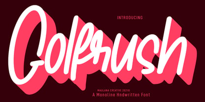 Golfrush is a casual handwritten font. With clean mono-line stroke, slant and fun character with a bit of ligatures. To give you an extra creative work. Golfrush font support multilingual more than 100+ language. This font is good for logo design, Social media, Movie Titles, Books Titles, a short text even a long text letter and good for your secondary text font with sans or serif. Make a stunning work with Golfrush font. Cheers, MaulanaCreative
 - Aseel by MAKYN,
$40.00 Aseel is a contemporary and legible typeface. It is intended to work well in the context of information and signage design. It also works well as a body text typeface as it is characterized by open counter forms and a large x-height. It is based on the Naskh calligraphic structure and has a medium stroke contrast. The letters are condensed to fit more information per line and it exists in three weights, regular, medium and bold.
 - Aesop by Fine Fonts,
$29.00 Aesop was developed from some book jacket lettering drawn by Michael Harvey for an edition of Aesop’s Fables by a master Japanese Artist. It is based upon a pen-drawn script, and is characterised by a lively sense of movement and grace. Aesop Plus, being an OpenType font, contains many alternative characters and additional ligatures which can be automatically substituted to enhance the liveliness of set text, where the application in which it is used, permits.
 - Faculty by Device,
$39.00 Faculty is a robust, warm and rational sans, with a large x-height that lends clarity in text and headline. Functional, clear and authoritative, it still has character. Stroke terminals are cut vertically or horizontally, minimising inter-letter gaps and lending it an even 'colour' in extended settings. Suitable for both headlines and text, the family has extensive language support, alternative characters, lining, tabular and old style numerals, making it a versatile all-purpose type system.
 - Simplywhiz by Maulana Creative,
$13.00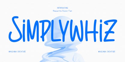 Simplywhiz casual handwritten font. With regular consist mono-line stroke, fun character with a bit of ligatures and alternates. To give you an extra creative work. Simplywhizt font support multilingual more than 100+ language. This font is good for logo design, Social media, Movie Titles, Books Titles, a short text even a long text letter and good for your secondary text font with sans or serif. Make a stunning work with Simplywhiz font. Cheers, Maulana Creative
 - Level by District,
$15.00 Level is a spurless sans serif family that takes a more calligraphic approach to the popular square sans. The subtle swelling and shrinking in the strokes of the curves and terminals contrast with the slight squared corners for a sans family that straddles the line between machine-made and human-crafted. Generous spacing and simple, narrow construction make for airy text that still conserves real estate on the page. Three weights include italics and small-caps + old-style numbers.
 - Highest Praise by Adam Ladd,
$25.00 Highest Praise is a bold and expressive brush script. It has condensed proportions and subtle texture on the edges, giving it a blend of modern and vintage qualities. While stylish and distinct, the typeface is very readable, making it great for branding, packaging, quotes, invitations, headlines, etc. Features include swash characters and alternate “s” to give a different look, double-letter ligatures for certain combinations, and extras (swashes, lines) built into the font to add decoration.
 - FF Elegie by FontFont,
$68.99 French type designer Albert Boton created this script FontFont in 2002. The family contains 2 weights: Regular and Italic and is ideally suited for advertising and packaging, festive occasions, film and tv as well as poster and billboards. FF Elegie provides advanced typographical support with features such as swashes, ligatures, alternate characters, and case-sensitive forms. It comes with a complete range of figure set options – oldstyle and lining figures, each in tabular and proportional widths.
 - Loktherns by Maulana Creative,
$11.00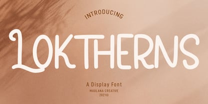 Loktherns is a handwritten display font. With mono-line stroke, upright, fun character. with a bit of ligatures and Small capital letter form. To give you an extra creative work. Loktherns font support multilingual more than 100+ language. This font is good for logo design, Social media, Movie Titles, Books Titles, a short text even a long text letter and good for your secondary text font with sans or serif. Make a stunning work with Loktherns font. Cheers, MaulanaCreative
 - Entsha by S.P.M.H,
$20.00 Entsha is a gorgeous sans-serif typeface that is both classically elegant and inherently modern. Create beautiful wedding invitations, use it as an elegant solution for your next magazine layout, or choose Entsha for any graphics that require a sleek look with a vintage flair. Entsha is based on classic letterforms for publishing and display graphics, so you can give your text a classic, elegant feel with Entsha's clean, high-contrast lines and alternating thick and thin strokes.
 - Atomic Kittens by Maulana Creative,
$15.00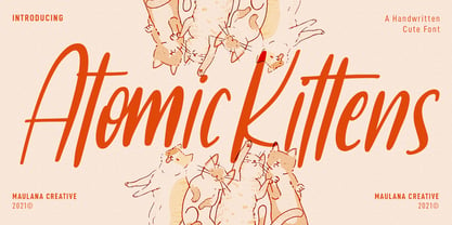 Atomic Kittens is a condensed handwritten display font. With regular mono-line stroke, fun character with some of ligatures. To give you an extra creative work. Atomic Kittens font support multilingual more than 100+ language. This font is good for logo design, Social media, Movie Titles, Books Titles, a short text even a long text letter and good for your secondary text font with sans or serif. Make a stunning work with Atomic Kittens font. Cheers, MaulanaCreative
 - Radicals by ITC,
$29.99Calligrapher Margaret Layson works in partnership with Australian typographer Harry Pears, bringing designs such as the wonderful Lindisfarne Nova family to life. They both work on the digital incarnation in a true collaboration. Originally from the UK, Margaret began her professional career as a geophysicist. After arriving in Australia in 1968, she began to work as a freelance calligrapher. Over the years she has maintained an interest in the history of writing, particularly the scripts and decorations in manuscripts. - Sunny Goldie by Maulana Creative,
$12.00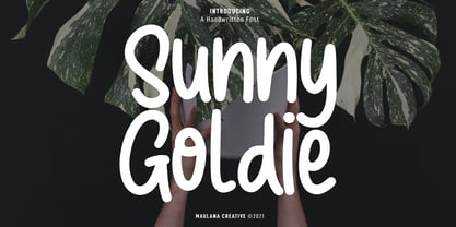 Sunny Goldie is a natural handwritten font. With regular mono-line stroke, fun character with a bit of ligatures. To give you an extra creative work. Sunny Goldie font support multilingual more than 100+ language. This font is good for logo design, Social media, Movie Titles, Books Titles, a short text even a long text letter and good for your secondary text font with sans or serif. Make a stunning work with Sunny Goldie font. Cheers, MaulanaCreative
 - Little Merry by Astageni,
$15.00 "Introducing Little Merry — the bubbly, round typeface that adds a touch of whimsy to your design endeavors! This fun and friendly script font boasts a bold style, perfect for sparking creativity in your projects. Whether you're crafting T-shirt designs, phone cases, greeting cards, invitations, mugs, or anything else you can imagine, Little Merry is here to infuse your creations with charm. Let your designs come to life with this delightful font and unleash your creative spirit!"
 - Captain Quill by Ascender,
$29.99Captain Quill is a lively calligraphic style script font designed by Jim Ford, based on the handwriting of a fictional pirate figure named Paul Pierce, aka Captain Quill. The Captain Quill font is an exciting font that's loaded with adventure, perfect for pirate-themed documents, scrapbooking, invitations and correspondence. Creative Professionals will find the Captain Quill font useful for everything from logos, packaging, menus & headlines, as it lends an old-worldly feel with its authentic rough texture. - Offstoke by Maulana Creative,
$14.00 Offsstoke is a fancy graffiti style font. With back slanted mono-line stroke, fun character with a bit of ligatures and alternates. To give you an extra creative work. Offsstoke font support multilingual more than 100+ language. This font is good for logo design, Social media, Movie Titles, Books Titles, a short text even a long text letter and good for your secondary text font with sans or serif. Make a stunning work with Offsstoke font. Cheers, Maulana Creative
 - Fineprint by Monotype,
$29.99The script typeface named Fineprint is based on its designer's own handwriting, or at least as Steve Matteson saw his handwriting on a really good day. Unlike many digitizations of handwriting, Fineprint maintains a consistent harmony and balance across its letters in a line of text. The Fineprint family includes a number of swash and alternate letterforms, which helps pull this quirky personal nature off. Use Fineprint whenever you want to make something appear personal, friendly, or informal! - The Morydane by Letterhend,
$19.00 Introducing Morydane a script font perfect for designers looking for a modern and casual style. With its clean lines and flowing curves, this font is ideal for adding an interesting touch to your designs,especially in logo, and the other various formal forms such as invitations, labels, logos, magazines, books, greeting / wedding cards, packaging, fashion, make up, stationery, novels, labels or any type of advertising purpose. Features : Uppercase & lowercase Numbers and punctuation Alternates & Ligatures Multilingual PUA encoded
 - Ringlings by Yanky Goldman,
$29.00 Ringlings stems from Yanky Goldman’s quest for a fresh and innovative display font that subtly attracts. Thus, this lively, dancing-in-the-sun typeface was created. Ringlings is ideal for logo design, package design, headlines and more. This single-stroke, semi-serif font family includes over 1,100 glyphs including uppercase, lowercase, stylistic sets, titling, petite caps, deco caps, ligatures, borders & ornaments and more. It supports most Latin and European languages. Ringlings is airy, light and quite versatile.
 - Hollestik by Maulana Creative,
$15.00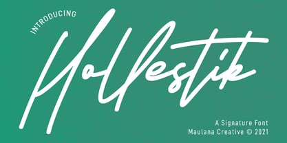 Hollestik is a casual signature font. With mono-line stroke, slanted and fun character with a bit of ligatures and lowercase alternates. To give you an extra creative work. Hollestik font support multilingual more than 100+ language. This font is good for logo design, Social media, Movie Titles, Books Titles, a short text even a long text letter and good for your secondary text font with sans or serif. Make a stunning work with Hollestik font. Cheers, MaulanaCreative
 - Lineare by Tipo,
$35.00 Lineare Serif is an attempt at solving the difficult problem of creating readable text type, seeking new ways to provide readers with some pleasure and rest as they walk along each line, creating a space where there is harmony between man and the printed form. Asymmetric serifs both in their height and width, medium contrast in the stroke, and balanced upward and downward movements make “Lineare Serif” a typeface featuring both attitude and aptitude for editorial purposes.
 - Vtc-NueTattooScript - Personal use only

- Wiblz Serif by The Ampersand Forest,
$19.00 Meet Wiblz (say “Vibbles!”). Wiblz is a Modern/Didone text family in the great tradition of squarish text families like Walbaum, Ibis, and Georgia. He has a high x-height and a great balance of legibility and readability. Plus, he supports the Latin alphabet, basic Cyrillic, Monotonic and Polytonic Greek, and the International Phonetic Alphabet. That makes him superlative in his usefulness and versatility! When searching for a didone typeface, it's often a struggle between blackness/legibility and stylishness/contrast. this is especially true of squarish didones, which number less than their round counterparts. Wiblz is an excellent balance between the two — clean and striking, good for uses from text to heading, and at home in print and on screen. Give him a try! He's a smart, adaptable, useful guy!
 - Bunaero Pro by Buntype,
$33.50 Buntypes Bunaero™ combines classical and contemporary characteristics to a unique and distinctive font family with extravagant but also harmonious appearance. The characters are clear, open and sometimes bellied. Especially the caps have a very high waistline. Based on this, four main states with different moods have been composed: The original Bunaero™, the more conservative “Classic”, the elegant and curvy “Up” and the matching ”Italic”. All states offer weights from a considerably thin „Hair“ to a real fat „Heavy“, so the family consist of 34 Styles, all with rather narrow width and very good legibility. The font was manually hinted and contains extensive handcrafted kerning tables to ensure flawless appearance in all media. It supports at least 99 languages incl. Vietnamese and provides ligatures, alternative glyphs, special localized forms and even more enjoyable OpenType® features. This Pro version of Bunaero also includes a lot of features for sophisticated users: Lining figures for headline setting; Intermediate linings and oldstyle figures for text setting; Tabular versions of all figures; Superiors, inferiors, numerators, denominators and automated fractions; Language specialities like a capital Eszett for the german language and extra characters with a polish kreska instead an acute; And many more. Further information: Bunaero™ Pro Specimen PDF Bunaero™ Pro OpenType® Quickguide Feature Summary*: -4 Moods: Normal, Classic, Up and Italic -9 weights: Hair, Light, Thin, SemiLight, Regular, SemiBold, Bold, ExtraBold and Heavy -Supports at least 99 Languages incl. eastern european and vietnamese languages -Overall width: Narrow or Space-Saving -Advanced f- ligature set including fb -Discretionary s- and c- ligatures -Alternative Characters: a, e, f, g, i, k, l, t, v, w, y, J, K, Q, R, and more -6 sets of figures: -Capital sized figures, oldstyle figures and intermediate figures, each in proportional and carefully adjusted tabular versions -Superiors, inferiors, numerators and denominators -Circled and negative circled figures -Capital German Eszett -Extra characters with Polish Kreska -Catalan Punt Volat -Extra characters with alternate minmalistic Cedille -Arrows -Automated feature for fractions as well as extended fraction character set -More than 1000 characters per font * Some features may only be available in OpenType®-savvy applications
 - Corleone by FontMesa,
$- Corleone was originally designed as a two font family in 2001 and offered for free. This year we've expanded the font family to twelve fonts including small caps and italics. While the new Corleone has been greatly refined and is a much more professional quality font we've decided to still offer the original two fonts for free. Corleone is the perfect font for t-shirts and other merch, the new small caps make this font stand out and bring attention to whatever you use it on. Corleone is the font you can't refuse. Tech notes: Corleone was designed after a famous movie logo in the 1970's with a title name that sounds a lot like The Grandfather if you know what I mean. The movies had three installments, my original font was patterned after the logo for the third movie, the new Corleone Primo and Secondo versions are patterned after the logos of the first two movies. The differences are noticed mostly in the lowercase letters. One thing you will not find in this font family is the puppeteer or puppet master hand because it's been registered as a separate trademark of Paramount Pictures. If you're using an application that works in layers then you'll be interested in the four extra over score glyphs included in some of the versions of this font. Sorry, MS Word does not work in layers so this feature will not work in MS Word. When you open up the glyph map in Adobe Creative Suite you should see the over score glyphs when you scroll down to the bottom. These extra over score glyphs allow you to extend the top line of a single capital letter, with four different lengths you should be able to mix and match to achieve the length that you desire. When using the over score glyphs it's best to divide your word or headline into separate text objects, the cap being one object and the remaining letters being the second. If you try using the over score glyphs on a single text object then with each over score that you add the text after it will get pushed down the line.
 - Arigola by Hashtag Type,
$27.97 Arigola is a beautiful slab serif defined by its Art Nouveau spirit that gives it a particular charm; one that is eye pleasing and helps distinguish products against its competitors. Naturally highlighting words to give a striking title and create an extra visual weight, Arigola embraces natural forms inspired by the living world with great rhythm. Arigola offers an excellent range of alternative characters to add personality to projects and stand out from the crowd with its own voice. Full details include 4 weights with over 500 characters, manually edited kerning and a range of OpenType features.
 - Chanley by Flawlessandco,
$9.00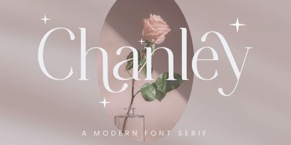 Chanley, a sleek and sophisticated modern serif font that is sure to make a statement. With its clean lines and contemporary design, Chanley strikes the perfect balance between elegance and versatility. An Original typeface that suitable for any graphic designs such as branding materials, t-shirt, print, business cards, logo, poster, t-shirt, photography, quotes .etc This font support for some multilingual. Modern Sweet Retro that contains uppercase A-Z and lowercase a-z, alternate character, numbers 0-9, and some punctuation. If you need help, just write me! Thanks so much for checking out my shop!
 - CA Saygon Text by Cape Arcona Type Foundry,
$40.00 CA Saygon Text is the logic consequence of CA Saygon. It is much calmer and therefore also suitable for reading texts and everyday’s editorial tasks. Basic shapes and proportions were adopted from Saygon and continued in such a way that a font family from Thin to Extrabold resulted. A fundamental inspiration were early static grotesque typefaces such as Akzidenz Grotesk. Nevertheless, the typeface was by no means intended to have a historical look. Thus, a relatively high x-height was chosen, which makes the typeface quite economical in type-setting, since the letters appear visually larger. A relatively small line spacing with good legibility can be achieved due to the small ascenders and the low cap height. Letters like f and t, which otherwise tend to end in curves, were given right angles, which on the one hand meets certain design elements of the original Saygon, but on the other hand also refers to contemporary trends in typeface design. A special feature are the five styles in which CA Saygon Text can be used. The default setting is the Helvetica style, with two-storey a and g. The Futura style has a single-storey a and a two-storey g accordingly. The third style with two-storey a and three-storey g is called the Franklin style. But the real highlight is the Cape style with single-storey a and three-storey g – a real rarity up to now. Let yourself be inspired by this unusual typeface. If you like it even more progressive, you should try the flat style, which continues the right angles in a, g, and y as well. Thanks to the Cyrillic and Latin Extended character sets, a huge linguistic area is covered that even extends to Vietnam! Even the exotic German capital-double-s is available and appears automatically when typed between other capital letters. Numerous OpenType features make life easier for the professional typographer: there are fractions, superscript and subscript numbers, as well as proportional and tabular capitals.
 - Morris by HiH,
$10.00 Morris is a four-font family produced by HiH Retrofonts and based on the work of the very English William Morris. William Morris wanted a gothic type drawn from the 14th century blackletter tradition that he admired both stylistically and philosophically. He drew from several sources. His principal inspiration for his lower case was the 1462 Bible by Peter Schoeffer of Mainz; particularly notable for the first appearance of the ‘ear’ on the g. The upper case was Morris’s amalgam of the Italian cursive closed caps popular throughout the 12th through 15th centuries, a modern example of which is Goudy’s Lombardic Capitals. The gothic that Morris designed was first used by his Kelmscott Press for the publication of the Historyes Of Troye in 1892. It was called “Troy Type” and was cut at 18 points by Edward Prince. It was also used for The Tale of Beowulf. The typeface was re-cut in at 12 points and called “Chaucer Type” for use in The Order of Chivalry and The Works of Geoffrey Chaucer. Morris' objective is designing his gothic was not only to preserve the color and presence of his sources, but to create letters that were more readable to the English eye. ATF copied Troy and called it Satanick. Not only was the ATF version popular in the United States; but, interestingly, sold very well in Germany. There was great interest in that country in finding a middle ground between blackletter and roman styles -- one that was comfortable for a wider readership. The Morris design was considered one of the more successful solutions. Our interpretation, which we call Morris Gothic, substantially follows the Petzendorfer model used by other versions we have seen, with the following exceptions: 1) a larger fillet radius on the upper arm of the H, 2) a more typically broadpen stroke in place of the foxtail on the Q, which I do not like, 3) inclusion of the aforementioned ear on the g and 4) a slightly shorter descender on the y. We have included five ornaments, at positions 0135, 0137, 0167, 0172 and 0177. The German ligatures ‘ch’ & ‘ck’ can be accessed using the left and right brace keys (0123 & 0125). Morris Initials One and Morris Initials Two are two of several different styles of decorative initial letters that Morris designed for use with his type. He drew from a variety of 15th century sources, among which were Peter Schoeffer’s 1462 Mainz Bible and the lily-of-the-valley alphabet by Gunther Zainer of Augsburg. Each of the two initial fonts is paired with the Morris Gothic lower case. Morris Ornaments is a collection of both text ornaments and forms from the surrounding page-border decorations.
 - Leather by Canada Type,
$24.95 Over the past few years, every designer has seen the surprising outbreak of blackletter types in marketing campaigns for major sports clothing manufacturers, a few phone companies, soft drink makers, and more recently on entertainment and music products. In such campaigns, blackletter type combined with photos of usual daily activity simply adds a level of strength and mystique to things we see and do on a regular basis. But we couldn't help noticing that the typography was very odd in such campaigns, where the type overpowers all the other design elements. This is because almost all blackletter fonts ever made express too much strength and time-stamp themselves in a definite manner, thereby eliminating themselves as possible type choices for a variety of common contemporary design approaches, such as minimal, geometric, modular, etc. So extending the idea of using blackletter in modern design was a bit of a wild goose chase for us. But we finally found the face that completes the equation no other blackletter could fit into: Leather is a digitization and major expansion of Imre Reiner's forgotten but excellent 1933 Gotika design, which was very much ahead of its time. In its own time this design saw very little use because it caused problems to printers, where the thin serifs and inner bars were too fragile and broke off too easily when used in metal. But now, more than seventy years later, it seems like it was made for current technologies, and it is nothing short of being the perfect candidate for using blackletter in grid-based settings. Leather has three features usually not found in other blackletter fonts: - Grid-based geometric strokes and curves: In the early 1930s, blackletter design had already begun interacting back with the modern sans serif it birthed at the turn of the century. This design is one of the very few manifestations of such interaction. - Fragile, Boboni-like serifs, sprout from mostly expected places in the minuscules, but are sprinkled very aesthetically on some of the majuscules. The overall result is magnificently modern. - The usual complexity of blackletter uppercase's inner bars is rendered simple, geometric and very visually appealing. The contrast between the inner bars and thick outer strokes creates a surprising circuitry-like effect on some of the letters (D, O, Q), wonderfully plays with the idea of fragile balances on some others (M, N and P), and boldly introduces new concepts on others (B, F, K, L, R). Our research seems to suggest that the original numerals used with this design in the 1930s were adopted from a previous Imre Reiner typeface. They didn't really fit with the idea of this font, so we created brand new numerals for Leather. We also expanded the character set to cover all Western Latin-based languages, and scattered plenty of alternates and ligatures throughout the map. The name, Leather, was derived from a humorous attempt at naming a font. Initially we wanted to call it Black Leather (blackletter...blackleather), but the closer we came to finishing it, the more respect we developed for its attempt to introduce a plausible convergence between two entirely different type categories. Sadly for the art, this idea of convergence didn't go much further back then, due to technological limitations and the eventual war a few years later. We're hoping this revival would encourage people to look at blackletter under a new light in these modern times of multiple design influences.
 - cipher - Unknown license

- So Unusual JNL by Jeff Levine,
$29.00 The hand lettered credits for the 1942 film comedy “I Married a Witch” were so unusual (with their mix of rounded and flat terminals and varying character shapes) that the only logical name for a digital revival would be So Unusual JNL… which is available in both regular and oblique versions.
 - Norseman 2 by Alphabet Agency,
$21.00 Forged to be as imposing as a Norse horde ready to stampede into battle, Works great in all caps which it was initially designed to. I designed the lowercase characters to match really well with each other and the uppercase, so it works well in title case. Designed by Jon Swinn.
 - Schwenk by Kostic,
$40.00 Schwenk is a wide reversed-contrast typeface made to be used in display settings – headlines, logotypes, store windows. The Regular style is adjusted for smaller point size while the Thin is made in a higher contrast for large headlines. An alternative (wide) capital letter I is available via the Stylistic Set.
 - Recobant sans by Sulthan Studio,
$12.00 Recobant is a very charming and stylish font, and is designed to resemble engraving. It also features ligatures and multi-language support. I have made this font as smooth as possible, reducing the number of nodes in each glyph to ensure optimal cutting with Circut, Silhouette or other craft machines.
 - Letrinth by Ingrimayne Type,
$9.95 Letrinth is a bold, informal sans-serif face. Its lower case is unusual in design; some of the characters are scaled versions of the upper-case letters. It was developed from a special alphabet I used to construct a maze and its name (LETters for a labyRINTH) reflects that origin.

