10,000 search results
(0.019 seconds)
- Erotica by Lián Types,
$49.00 “A picture is worth a thousand words” and here, that’s more than true. Take a look at Erotica’s Booklet; Erotica’s Poster Design and Erotica’s User’s Guide before reading below. THE STYLES The difference between Pro and Std styles is the quantity of glyphs. Therefore, Pro styles include all the decorative alternates and ligatures while Std styles are a reduced version of Pro ones. Big and Small styles were thought for better printing results. While Big is recommended to be printed in big sizes, Small may be printed in tiny sizes and will still show its hairlines well. INTRODUCTION I have always wondered if the circle could ever be considered as an imperfect shape. Thousands of years have passed and we still consider circles as synonyms of infinite beauty. Some believe that there is something intrinsically “divine” that could be found in them. Sensuality is many times related to perfectly shaped strong curves, exuberant forms and a big contrasts. Erotica is a font created with this in mind. THE PROCESS This story begins one fine day of March in 2012. I was looking for something new. Something which would express the deep love I feel regarding calligraphy in a new way. At that time, I was practicing a lot of roundhand, testing and feeling different kinds of nibs; hearing the sometimes sharp, sometimes soft, sound of them sliding on the paper. This kind of calligraphy has some really strict rules: An even pattern of repetition is required, so you have to be absolutely aware of the pressure of the flexible pen; and of the distance between characters. Also, learning copperplate can be really useful to understand about proportion in letters and how a minimum change of it can drastically affect the look of the word and text. Many times I would forget about type-design and I would let myself go(1): Nothing like making the pen dance when adding some accolades above and below the written word. Once something is mastered, you are able to break some rules. At least, that’s my philosophy. (2) After some research, I found that the world was in need of a really sexy yet formal copperplate. (3) I started Erotica with the idea of taking some rules of this style to the extreme. Some characters were drawn with a pencil first because what I had in mind was impossible to be made with a pen. (4) Finding a graceful way to combine really thick thicks with really thin hairlines with satisfactory results demanded months of tough work: The embryo of Erotica was a lot more bolder than now and had a shorter x-height. Changing proportions of Erotica was crucial for its final look. The taller it became the sexier it looked. Like women again? The result is a font filled with tons of alternates which can make the user think he/she is the actual designer of the word/phrase due to the huge amount of possibilities when choosing glyphs. To make Erotica work well in small sizes too, I designed Erotica Small which can be printed in tiny sizes without any problems. For a more elegant purpose, I designed Erotica Inline, with exactly the same features you can find in the other styles. After finishing these styles, I needed a partner for Erotica. Inspired again in some old calligraphic books I found that Bickham used to accompany his wonderful scripts with some ornated roman caps. Erotica Capitals follows the essentials of those capitals and can be used with or without its alternates to accompany Erotica. In 2013, Erotica received a Certificate of Excellence in Type Design in the 59th TDC Type Directors Club Typeface Design Competition. Meet Erotica, beauty and elegance guaranteed. Notes (1) It is supossed that I'm a typographer rather than a calligrapher, but the truth is that I'm in the middle. Being a graphic designer makes me a little stubborn sometimes. But, I found that the more you don't think of type rules, the more graceful and lively pieces of calligraphy can be done. (2) “Know the forms well before you attempt to make them” used to say E. A. Lupfer, a master of this kind of script a century ago. And I would add “And once you know them, it’s time to fly...” (3) Some script fonts by my compatriots Sabrina Lopez, Ramiro Espinoza and Alejandro Paul deserve a mention here because of their undeniable beauty. The fact that many great copperplate fonts come from Argentina makes me feel really proud. Take a look at: Parfumerie, Medusa, Burgues, Poem and Bellisima. (4) Some calligraphers, graphic and type designer experimented in this field in the mid-to-late 20th century and made a really playful style out of it: Letters show a lot of personality and sometimes they seem drawn rather than written. I want to express my sincere admiration to the fantastic Herb Lubalin, and his friends Tony DiSpigna, Tom Carnase, and of course my fellow countryman Ricardo Rousselot. All of them, amazing.
 - Christmas Glow by Pedro Teixeira,
$14.00 When I started designing this font, I had the purpose of giving a retro warming christmas feeling. So I added ornaments to add more value to your designs. Ornament glyphs can be arranged in numerous different designs.
 - Floralissimo by Wiescher Design,
$39.50 Floralissimo are flowery embellishments that I found in several old publishing books dating back over a hundred years. I thought they might be useful for some of you, so I digitized them. Your digitizing typedesigner, Gert Wiescher
 - Kill Me by Octopi,
$13.00 I have terrible and messy handwriting so I thought it would be a good idea to make a twisted version into an horrific font. In that respect I think it is quite successful, plus, Hallowe'en is nigh.
 - Linotype Aroma by Linotype,
$29.99From the designer, Tim Ahrens... I started designing this typeface about half a year after learning that Frutiger was not a new brand of sweets and that Garamond is not the name of a fragrance. In time it became clear that designing a sans serif must always be considered as a transformation of traditional serifed typefaces instead of deriving it from typefaces that have been derived from others which have been derived from others again. I did not want Aroma to be one of those odourless and tasteless typefaces wich sacrifice a natural feeling and the characteristic shapes of the letters to neutrality. I think that beauty often evolves unintentionally. For example, I am fascinated by the beauty of airfoils, which are actually a careful transformation of a bird's wing. I love their anorganic and abstract shape which still bears the essence and all the complexity of what they are modelled on. This is exactly the formal concept behind Aroma. Many of the outlines are actually parabolics. The small r, for example, consists exclusively of straight lines and parabolics. I decided to give Aroma more stroke contrast than it is usual for sans serif designs. Many strokes are slightly convex, which gives the font an anorganic feeling. The font was intended to have a feel similar to the antiqua. More specifically, it is based on Old Style Faces. The character of those fonts, which were cut during the Renaissance, is still inherent to Aroma. - Celtic Monograms by Kaer,
$24.00 Here is my next Celtic Monograms font family. I used a lot of authentic knots and curves to imitate Insular art style. The term derives from insula, the Latin term for “island” in this period Britain and Ireland shared a largely common style different from that of the rest of Europe. I've drawn sketches set, manually vectorized it and assemble the font family. In an attempt to replicate the intricate patterns found in Celtic art, I endeavored to create a design that embodied the essence of true Celtic knot work. The interweaving lines, which were prominent motifs in Celtic art prior to the arrival of Christian influence around 450, served as the foundation for my creation. Over time, these designs seamlessly integrated into early Christian manuscripts and artwork, incorporating depictions of various elements from everyday life, including animals, plants, and even human figures. In the beginning, the patterns were intricate interwoven cords, called plaits. This particular style is often linked to the Celtic regions, but it was also widely embraced in England and spread throughout Europe through the efforts of Irish and Northumbrian monks. The utilization of the Celtic knot as a tattoo design gained popularity during the 1970s and 1980s in the United States. Consequently, it has proven to be a highly advantageous font choice for various applications such as posters, banners, and sportswear. You can also create a vintage color shift effect. Please note, you should use graphic applications such as Adobe Illustrator or Photoshop, but not Microsoft Word. All you need is put Two or Three lines style initial on the top of Back style. I’m happy to present you the Rough, Two lines, Three lines, and Back styles for your design. You’ll get uppercase and numbers set. Thank you!
 - Oceanside Sans by Bebop Font Foundry,
$19.00 Oceanside Sans is a display typeface produced in 2022 by Bepop Font Foundry. This typeface was born out of a month-long trip to the Bahamas. The scenery, both natural and architectural, was stunning, yet restrained. Each settlement featured its own flavor of beautiful hand-painted signs promoting local businesses - fresh fish & Conch, liquor, ice, gifts, and more. Oceanside pays homage to the visual vernacular of the islands we visited during our stay.
 - Cupcake Pastry by Abo Daniel,
$12.00 introducing CUPCAKE PASTRY -quirky script font duo- This font is designed for crafters. It is great for branding, packaging, quotes, t-shirt design, card, banners, and anything of craft projects. Uppercase and lowercase characters match each other. What's included? CUPCAKE PASTRY LINE CUPCAKE PASTRY SOLID Features: Uppercase Lowercase Numeral Multilingual 37 Ligatures PUA encoded I hope you love it. regards, Abo Daniel Studio
 - White Sign by Ergibi Studio,
$20.00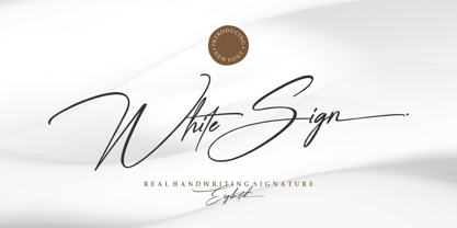 White Sign is Real Handwritting font presentation from Ergibi Studio. Inspired by beautiful writing that has a luxurious feel with additional swash lines perfect for branding, photography, invitations, quotes, watermarks, advertisements, product designs, social media posts, stationery, labels, and more! I hope you enjoy this font. If you have any questions please don't hesitate to drop me a message :) Big Thanks ~ Ergibi Studio
 - Suomi Hand Script by Suomi,
$60.00 This script is made for mimicking handwriting with a fair amount of ligatures: there are more than 700 ligature pairs (or even more characters; I never really counted them) to help you to make very, very convincing lines of text without ever lifting a pen! It’s been a bestseller in FontShop for years, and now it’s available here as well!
 - Gill Hebrew by Lerfu,
$55.00Near the end of his life, legendary type designer Eric Gill lived in Jerusalem, and became interested in the typesetting of the Hebrew alphabet and the challenges it entailed. He designed his own Hebrew font which has not (to my knowledge) been digitized before. It is sometimes held up as an example of how not to do a Hebrew font: Gill introduced strange serifs and shapes that were jarring to readers used to more traditional fonts. But it is quite readable, and does start to grow on you after a while; extended text in Gill Hebrew is possible. I've added a set of alternate digits that are based on the shapes of the letters (Gill's digits are pretty standard text figures). I've also made some of the Unicode Hebrew symbols that Gill didn't (e.g. New Sheqel Sign, Alef-Lamed ligature, etc.) and also included vowel-points. - Taxon by Hoftype,
$49.00 Taxon is a straightlined Sans with a clean, fresh and unsentimental look. Related to classical faces like Optima and Imago, it appears more contemporary and merges the austere linearity of the Grotesk with the elegance of the Antiqua. The Taxon family consists of 12 styles and is well suited for ambitious typography. It comes in OpenType format with extended language support. All weights contain ligatures, superior characters, proportional lining figures, tabular lining figures, proportional old style figures, lining old style figures, matching currency symbols, fraction- and scientific numerals, matching arrows and alternate characters.
 - Senja Mentari by Ahmad Jamaludin,
$15.00 Senja Mentari is elegant modern calligraphy font inspired by delicate inky hand lettering, gorgeous wedding calligraphy and trending minimal branding designs. This beautiful font is for those who are needing of elegance and stylish for their designs and particularly well suited for wedding invitations, cards and feminine branding. I have wanted to create such combination a long time and can’t believe that it is here. I’m super excited and hope you’ll estimate it too. Now all you need for perfect wedding invitation design is in one product. I think this decision will help you to save your time! What's included? More than 100 beautiful swashes in this font Accessible in the Adobe Illustrator, Adobe Photoshop, Adobe InDesign, even work on Microsoft Word. PUA Encoded Characters - Fully accessible without additional design software. Multilingual Support : à á â ã ä å æ ç è é ê ë ì í î ï ñ ò ó ô õ ö ø ù ú û ü ý ÿ š fl fi ž œ ı ç ø š ž æ œ À Á Â Ã Ä Å Æ È É Ê Ë Ì Í Î Ï Ñ Ò Ó Ô Õ Ö Ø Œ Ù Ú Û Ü Ý Ÿ Š Š ŽŁ Ð Ç
 - 8th Avenue by Our House Graphics,
$16.00 Inspired by the strange, blocky lettering on the sides of a set of a set of plastic kitchen containers in my childhood home, 8th Avenue is a sophisticated, somewhat syncopated font with a retro look and feel that at the same time brings a very modern attitude to your design. 8th Avenue works well as display font for packaging, headlines and logos. Those pastel turquoise plastic boxes from the early 1950s, with white screen printed letters reading FLOUR, SUGAR, COFFEE etc. on one side were a simple quiet presence in our home back then and for decades after. Seeing them, even that soft blue-green colour felt like home. SUGAR, the soul survivor of that set has become one of those mundane items of daily life that somehow become simple icons of another time, ripe with memories. Obviously I had to make a font. September 2014
 - Debs by Scholtz Fonts,
$9.95 Debs was inspired by a thank you note sent from one of my friends to another. The recipient liked the handwriting so much that he passed the note on to me after having asked permission from Debs, the writer. I enjoyed the vigor and looseness of the handwriting, as well as admiring its legibility and style. Debs has all the characteristics of modern handwriting: It appears loose, unstructured, and free, while maintaining good form and great legibility. Its baseline is varied, creating an impression of notes written by busy people, while its characters remain well formed and readable. Debs comes in five styles, regular, lite, black, wide and wide-black. Use Debs for advertising, for casual greeting cards, for a casual, handwritten look on music or fashion media. Debs has all the features usually included in a fully professional font. Language support includes all European character sets.
 - America by Peliken,
$14.00 America otf color font. Letters and numbers in national flag design, stripes of red and blue, white stars ornament for festive decoration.You can use this font for design logos, quotes prints on t-shirts, Presidential election posters and other. OpenType-SVG Font was designed with Fontself Maker in Illustrator CC. WARNING Color fonts are pretty new technology - they currently show up in Photoshop CC 2017+, Illustrator CC 2018 and some Mac apps. Learn more about color font support on third-party apps here: https://www.colorfonts.wtf/
 - Nordeco by Leksen Design,
$29.00 Inspired by her Scandinavian heritage, Andrea Leksen created this modern geometric sans serif reminiscent of Scandinavian design and typography. With its tall x-height and monoweight strokes, Nordeco will be best showcased at large sizes, in headlines and other display uses. It contains 100 alternates with ornamental letters, borders, paragraph separators and seamless wallpapers for your designing pleasure. Designs include stripes, dots, art deco and leopard print. See some of the creative ways Nordeco can be used in this YouTube clip. Check out its cousin, Nordique!
 - Adventura by me55enjah,
$14.00 Handmade typeface inspired by permanent marker strokes. Simple, bold and casual shape strokes make this typeface easy to read event in a bunch of text. This can be useful for title, quotes, label, etc. Simple, casual and playful. All caps family comes with different style: Title, Outline and Stripes. Including handwritten style, Adventura Letter with uppercase & lowercase characters, make you have more option to create catchy design. All support basic multi language. Add Adventura Catchwords and Emo icons can gives more personal touch to your design.
 - LOLO Dingcats by Okaycat,
$24.50LOLO Dingcats are here! Need some cats? Find just about any kind of cat you can imagine here. Not just a A-Z & 0-9 font, LOLO Dingcats has many extra characters. Check it out! There's a mother cat nursing kittens, a cat curled up sleeping, running cats and sleeping cats.There are black cats, white cats and striped cats. Even cats you might not expect: a pirate cat, a cat with an afro, even a robot cat -- and MORE! A must-have for any serious cat lover! - Filistique by URW Type Foundry,
$39.99 Filistique is gracious, flexible, and stylish. In the first sketches of this typeface, the one-line drawing principle was the rule. This principal had to perish soon when more complex characters came up. But still the one-line rule was kept in tradition to maintain the behavior of the natural course of the drawing line. Once writing, the characters joined fluidly into words and slipped easily into sentences like they had always belonged there. They have these natural features maybe somewhat familiar on the first sight. Filistique approaches handwriting but likes to be straight up as well. Please, no Christmas card writing with this character! She is best in shape for finger licking good menus of classy restaurants, lyrics on an album cover of a renowned and utterly cool artist, for a letter to your precious loved one and of course for making a hell of an impression anyway!
 - Carlyle Honi by Mightype,
$18.00 Carlyle Honi Script is a modern calligraphy font with the current handwriting style, this font is perfect for branding, wedding invites, magazines, mugs, business cards, quotes, posters, and more, you can try first if you want to buy this font. Carlyle Honi Script is equipped with 475 glyphs and 83 ligatures. And by having many of these glyphs there will be able to choose the letters according to your likes, lots of variations and options for each letter, so you can customize on your design choices. To use a variety of flying machines, you need a program that supports OpenType features such as Adobe Photoshop Cs / Adobe Photoshop CC, Adobe Illustrator CS / Adobe Illustrator CC, Adobe Indesign and Corel Draw and many more programs that support OpenType. If you do not have a program that supports OpenType, you can access all the alternate glyphs using Font Book (Mac) or Character Map (Windows) If you have any question, do not hesitate to contact me by email mightype89@gmail.com Thanks and happy designing :-)
 - Robert Hunster by Mightype,
$16.00 Robert Hunster Script is a modern calligraphy font with the current handwriting style, this font is perfect for branding, wedding invites, magazines, mugs, business cards, quotes, posters, and more, you can try first if you want to buy this font. Robert Hunster Script is equipped with 369 glyphs. and by having many of these glyphs there will be able to choose the letters according to your liking, lots of variations and options for each letter, so you can customize on your design choices. With pleasure and happiness, in this font package you will get: - Robert Hunster Script OTF To use a variety of letters, you need a program that supports OpenType features such as Adobe Photoshop Cs / Adobe Photoshop CC, Adobe Illustrator CS / Adobe Illustrator CC, Adobe Indesign and Corel Draw and many more programs that support OpenType. If you do not have a program that supports OpenType, you can access all the alternate glyphs using Font Book (Mac) or Character Map (Windows) If you have any question, do not hesitate to contact me by email mightype89@gmail.com Thanks and happy designing :-)
 - Arkhania by Adorae Types,
$16.00 Light the fire and get your spells ready for Halloween with this witchy font, Arkhania. This display family offers three different styles from which you can pick the one that best describes the atmosphere and mood of your composition: Striped, fun and wicked, Regular, a more strong and classical look, and Hollow, old styled and classy. All three typefaces inspired by the Triple Moon Goddess and its phases: Maiden, Mother, & Crone. Arkhania family features: 423 glyphs 3 styles 84 icons, drawings, swashes and flags Standard ligatures Alternate characters Contextual alternates Swashes more... In addition, there is Arkhania Sigils, a style filled with swashes, icons, drawings and symbols. Play with them, combine a few, choose from different beginnings and endings and create your own swashes, underlines and frames. You can also find flags and boxes along with common connectors. Tips for a clean and modern look: Combine this typeface with a sans serif, light or thin font, like Aeonian (Aeonian Light was used for these images), and let Arkhania cast a spell on the viewer.
 - Pompeian Cursive by Wordshape,
$30.00 Pompeian Cursive is a calligraphically-inspired display typeface featuring a limited number of alternate characters and a handful of graceful ligatures. A lively set of non-lining numerals accompanies, as well as a few calligraphically-inspired flourishes for ornament. The history of this typeface: Oswald Cooper’s relationship with the Barnhart Brothers & Spindler foundry was one instigated under the auspices of creating new styles of type in lieu of following stylistic trends. In 1927, BB&S requested that Cooper create a script-like cursive typeface design in step with Lucien Bernhard’s Schoenschrift and ATF’s similarly-styled Liberty typeface. In response to BB&S’s desire to emulate instead of innovate, Cooper wrote to Mcarthur, “I am desolated to see Barnhart’s hoist the black flag. Your own efforts through the years to boost the foundry into a place in the sun as an originator seem wasted.” Still, Cooper took up the task at hand, creating a delicate, sophisticated type design which he named Pompeian Cursive. The typeface featured a limited number of alternate characters and a handful of graceful ligatures. A lively set of non-lining numerals accompanied, as well as a few calligraphically-inspired flourishes for ornamenting the end of lines of type accompanied the typeface, as well. By reviewing the few remaining original drawings for the type, as well as copious samples of Pompeian Cursive from both Cooper & BB&S' proofing process and period-specific type specimens, Wordshape presents the first digital version of this classic hybrid script/sans typeface, complete with all original alternate characters and ornaments. Pompeian Cursive has been intensively spaced and kerned for the finest setting for weddings, announcements, and general display work. - What was the inspiration for designing the font? While researching a biographic essay for Japan’s IDEA Magazine, I came across the original proofs and drawings for Pompeian Cursive. While a number of foundries have released interpretations of Cooper’s assorted typefaces, they stray from the original rather dramatically in parts. Cooper is without a doubt my favorite type and lettering designer, and to bring a refined return to his original intentions is an immense gift. - What are its main characteristics and features? Pompeian Cursive is a typeface which functions as both a display face and a limited text face. It features classy, thoughtful, and delicate swash capitals and rugged lowercase characters with a low x-height and gracefully long ascenders and descenders. - Usage recommendations: Display type or text-setting. Perfect for newspaper work, editorial design, materials intended to invoke an "old-timey" flavor, or just about anything in need of personality.
 - CA Capoli by Cape Arcona Type Foundry,
$29.00 CA Capoli is a fine script typeface with a vintage touch. Perfect for illustrative titles or logotypes. It comes in two styles, Regular and Stroke. The inspiration came during our trip to Italy, where we took a short rest in a bar during a hot day. We discovered a simple ceramic ashtray on the table. The word “Nido” was inscribed in a typeface that looked like it dated back to the 1950s. We made some investigations about the word, its meaning and origin but it still remains a big mystery. Was it the name of a hotel or a restaurant or some vintage Italian cigarettes? We don’t know. We were so amazed about the design of the logo that we decided to create a typeface out of it. A sophisticated endeavor because we just had four letters. How could the rest of the letters – if it ever existed – have looked like? Our hypothesis is CA Capoli. A typeface with a full Central European character set and some nice alternative letters to chose from. When we thought about “Nido” and its possible derivation of hotel business, we felt like creating a small side project for this typeface, a brand for a fictional hotel called Hotel Capoli with business cards, letterheads, a reception book, key fobs and embroidered patches for the service dress of the hotel service stuff. The Hotel Capoli is located at the wonderful beach of Cape Arcona on the fictional country of Arcona Islands where our type foundry is located.
 - Rezerv by Gaslight,
$25.00 Reserv was inspired by a logo, which I crated for the company, EVROTERM. Once I saw this logo I asked myself: "Why not font based on this? In two or three weight?" For use in advertising and display typography.
 - Shinn Kickers JNL by Jeff Levine,
$29.00 Conrad X. 'Cobb' Shinn (Sept. 4, 1887- Jan. 28, 1951) was a Fillmore, Indiana-born post card illustrator who sold a series of successful novelty postcard lines which included (among others) Charlie Chaplin, automobiles and the Dutch culture in the beginning years of the 20th Century. After serving in World War I, Shinn found the market for novelty postcards dwindling, and he also lent his artistic skills to cartoon features and illustrating many children's books [including his own, under the nickname 'Uncle Cobb'] which taught easy step-by-step drawing methods. Some time in the 1920s, he eventually migrated into the field of supplying electrotypes and stereotypes of 'stock cuts' of photos and line art to the printing trade. In the days of letterpress printing, this was the forerunner of paper clip art and its successor, electronic clip art. Purchasing many of his designs from 'journeyman' artists of the time, the diversity of Cobb Shinn's stock cuts library grew with the passing years, reflecting changing times, styles and topics. Some of the illustrators whose signed works were presented in Shinn's 'CUTalogs' [as he called his stock cuts catalogs] include Mary Clemmitt, Louis H. Hippe, E.C. Klinge, Nelson White, Harvey Fuller, Bess Livings, Lois Head, Harvey Peake and Van Tuyl. Upon his passing in 1951, it's not known how long the Indianapolis-based company existed before finally closing its doors. One of the more popular series of cartoons were the line illustrations of men and women affectionately called 'little big head guys' by many modern fans of these cuts because the heads of the characters were drawn somewhat larger than the rest of their bodies. Shinn Kickers JNL is a collection twenty-six of these illustrations, and just like a kick in the shin (as the pun in the name implies), these charming cartoons get your attention.
 - The Beautyline by Putracetol,
$14.00 The Beautyline is a modern monoline typeface. Like the font name, this font is made of beautiful lines with additional lines in some characters which makes this font more beautiful. It’s perfect for branding, logos, wedding designs, social media posts, advertisements, invitations, stationery and any projects. The Beautyline comes with uppercase, lowercase, numerals, punctuation and many variations on each character, including OpenType alternates and common ligatures to let you customize your designs.
 - Trad by Powerfonts,
$13.99 Trad (Träd is Swedish for tree) is inspired by viking mythology and runic alphabets. Imagine a viking warrior crudely carving a message into a tree stump with his trusty dagger, sipping on a flagon of ale and pondering a hard days slaying. Like the blade of his blood encrusted axe, Trad is ideal for projects requiring a sharp edge, such as the cover of your next thriller, zombie flick, or death metal album.
 - Dialog by Linotype,
$39.00Dialog is my first sans serif. I had made some attempts earlier, but they didn't satisfy me. Dialog was, on the contrary, so inspiring that I made 19 different fonts of it, the most complete typeface for several years. I usually prefer typefaces with serifs, but I don't miss them in Dialog. The name needs no explanation. Dialog was released in 1993. - Spacy Avocado by PizzaDude.dk,
$15.00 Due to some grease on a menu, I misread "Spicy Avocado" as "Spacy Avocado" which led me to the name of this font. I love Avocados and I love things that are a bit spacy, and I love the combination of these two! Space Avocado is my handdrawn, layered headline font. Mix the layers or use them as a single font - you choose!
 - Brush With Death by Cyberian Khatru,
$20.00 This font was made possible by creating a custom brush in Illustrator. I started with a flat brush dipped in India ink to create the stroke. From a scan of that stroke I made a vector tracing which I then I altered as necessary to get the desired dimensions. The lower case letters have a thinner stroke than the capitals.
 - Much too loud - Unknown license

- Slammer tag - 100% free

- Italiano Fushion Color by RM&WD,
$35.00 Italiano Fushion is part of an expanding project on which we have been working for several years and is the colors ersion of ITALIANO FUSHION. Starts from the study of the great Futurist adventure of the early 1900s by great artists such as DEPERO and MARINETTI, who twisted the world of typography with shapes and colors. Italian Fushion is made up of almost 2,000 glyphs for each weight and in addition to hundreds of alternatives mainly, such as initials and endings of each word but also different alternatives for the letters I, J, Y. Thanks to the characteristics of Open Type, you can change them in automatic many of the alternatives, use it as a simple text font by changing only the I's and J's that have the typical capital dot, and giving the text a more fun breath to the composition. Italiano Fushion is suitable for large texts and to get the most out of it it is compulsory to transform the text into UPPERCASE text using the tabs of graphic applications such as Illustrator, or activate the Alternavive tabs and the various options of SS. You just need do a sandwitch between the 1 ( on the top ) and the 2 ( on the bottom ), choose the 2 different color and you hae finished. by transforming them into traces you can enrich the interaction between the two levels with nuances of pleasure. If you would like to be above layer 2, you can make the text parts transparent without swashes. Ideal for creating Logos, Head Lines, Web Titles, Posters, Epub Covers, Tatoo Projects, T-Shirts, Drink Labels ...
 - Mango Grotesque by Studio DC,
$20.00 A caps-only typeface with a modern twist. When the joy and corpulence of the mango fruit meet the gothic aesthetics, Mango Grotesque is born. In this territory, fun and creepy are mixed. Just like a tropical beach in an expressionist film. Cause it's a bittersweet symphony this life...
 - Strangelove NextSlab by FaceType,
$12.00 Strangelove NextSlab is a serif version of our bestseller Strangelove Next. It contains 3 styles with two weights each. (Be sure to have ‘Contextual Alternates’ activated in your design app of choice to get a more lively look when it comes to subsequent letters like ee, gg ... etc).
 - Liberty Walk by Sipanji21,
$15.00 "Liberty Walk" is a display font featuring characters with straight, upright lines. Fonts like this are often used to give a clean, simple, and assertive appearance to designs. They are suitable for various design projects, including logos, posters, titles, or other design elements that require clear and upright typography.
 - Antoine by Anastasia Kuznetsova,
$19.00 Introducing Antoine — is a vintage retro display typeface. The three font combinations I launched are very compatible if for the victorian classic design concept. As for if the font was worn by itself, without combinations are also brave!! In addition to many get unique character, luxury, brave and elegant. You also have a collection ornament, very suitable if in the gradient. This font is also very easy to use with other design programs or with out design program. Antoine Typeface is perfect for beverage label design project. coffee label. logotype design, badges, classic wedding concept. victorian design concept and so on. gig poster, letterhead, droop cap, titles, and any artworks. Now it’s your time to go crazy and explore the uniqueness of this typeface!! I invite you to familiarize yourself with the preliminary images and hope that you will be imbued with my vision of this creative font, which, I am sure, will be suitable for all the interesting projects you are working on. Fonts can be opened and used in any software that can read standard fonts, even in MS Word. No special software is required to get started. It is recommended to use it in Adobe Illustrator or Adobe Photoshop. Made with love and magic ♡ Thank you for reading it, and do not hesitate to send me a message if you have any questions! ~ Anastasia
 - AZN Knuckles Varsity by AthayaDZN,
$10.00 Introducing "AZN Knuckles Varsity" font by AthayaDZN. Revolutionizing a varsity slab serif, combining sharp and rounded edges, angled serif, and a variety of weights, fitting it into the modern scene. Equipped with 3 styles ( Defined, Regular, Stencil ) Use the Defined version if you are aiming for that slab serif look, just like the name suggested, it defines the modernized slab serif on each letter, giving it that retro look yet still in the modern scene. Especially on the light weight of this version, the slab serif is really prominent. Use the Regular Version if you are aiming for any type of design that you see this font fits especially the modern scene, just like how it's advertised. Use the Stencil version if you are aiming to make a statement, my favorite one is the Bold and Italic version of the Stencil if I was to make a statement, just like the preview where it says "Anarchy", the separated shapes of the letter combined with it's bold and slanted shape is perfect to make a strong statement. Language Support : Afrikaans, Albanian, Danish, Dutch, English, Estonian, Filipino, Finnish, French, Galician, Indonesian, Irish, Italian, Luxembourgish, Norwegian, Portuguese, Romansh, Scottish Gaelic, Spanish, Swedish, Swiss German, Uzbek (Latin). And that's it for this font, thank you for purchasing the product, I wish you success on your projects. Please enjoy the font and let me know if you needed any help or if you have any questions -Athaya twitter.com/Athaya_DZN behance.net/athayadzn

