10,000 search results
(0.015 seconds)
- DR Refunk by Dmitry Rastvortsev,
$20.00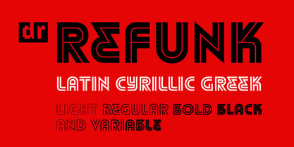 Striped font in the traditions of modernism
 - Black Madness by Mirco Zett,
$12.00 Black Madness is a font inspired by blackletter typography, but instead of clean and accurate lines I gave it an more abstract and intuitive look. Like most of my fonts, Black Madness is made for logos, headlines and other typography related work.
 - Apex Brush by Hanoded,
$15.00 I like playing around with brushes and Chinese ink. I always have some kind of idea of what the final design should look like, but once it’s done, it never ever looks like what I had in mind. Apex Brush is one of those designs: it started off as a few brush strokes, but before I knew it, I had a really nice set of matching brush fonts! Use it for any design that needs a bit of rough, a splash of ink and a pinch of rebel.
 - Lampoon Brush by Rocket Type,
$19.95 Lampoon Brush originates from a film strip of paint brush lettering. It has crisp deliberate brush strokes and is perfect for use in many different applications namely when you’re seeking that retro/vintage feel.
 - Sitting Duck by Kitchen Table Type Foundry,
$15.00 I have no particular affection for ducks, nor do I keep them, but I thought it was about time someone named a font after them! Sitting Duck is a jolly comic/kids font. Handmade (of course), cute and useful. Comes with extensive language support and a cool alternative asterisk in the shape of a duck.
 - Beverly by Pen Culture,
$17.00 Proudly present the new "Beverly - Modern & Luxury Serif Font" Beverly is modern and luxury serif font. Beverly come with elegant stylistic alternate and ligature that perfect for any purpose like branding, logo design, poster, magazine, and many more. this font also has natural and elegant shape, so you can easily to customize it to your needs. I really hope you enjoy it – please do let me know what you think, comments & likes are always hugely welcomed and appreciated. More importantly, please don’t hesitate to drop me a message if you have any issues or queries. Thank you
 - Jantze by Fontosaurus,
$19.95The Jantze font is a project undertaken by Dan Bailey of Fontosaurus and Michael Jantze, creator of the nationally-syndicated comic strip, The Norm. All their royalties from the font will go to The Lance Armstrong Foundation. For those that have been living under a rock for the last five years, Lance is a professional bike racer that overcame advanced testicular cancer to not only come back to his sport, but to dominate its premiere event, the Tour de France. In climbing to the top of his sport, he has become a legend among cyclists and a beacon of hope for those battling cancer and their families. His foundation provides financial grants to researchers working to improve our odds against the disease, individuals stricken with cancer, and survivors of the disease that are advocates for survivorship issues in their communities. Michael Jantze and Dan Bailey would like you to consider the quote from Ralph Waldo Emerson that brought us to this project: "The purpose of life is not to be happy. It is to be useful, to be honorable, to have it make some difference that you have lived and lived well. We hope that you will help us help Lance Armstrong's legacy be more than that of just sports legend. We hope that you will help those that may someday help you as much as we hope that you will never have to suffer the ravages of cancer. We hope. - Dreamworld by Hanoded,
$10.00 The last couple of years felt like I was living in a bad dream: I witnessed crazy leaders, climate change and now Covid. I usually name my fonts after things that affect me and this one is not different. Dreamworld is a font I made with a cheap marker pen I liberated from my kids’ pencil box (I will put it back, pinky promise…). It is a bit rough, but also very easy to read and distinctive enough to make your work stand out. Of course it comes with extensive language support (let me mention Vietnamese again…) and two sets of alternate glyphs, that cycle as you type.
 - Klothilde by Fontroll,
$20.00 Klothilde is a handwriting font which came to life in one of my doodling sessions (I must admit I still doodle with pen and paper). The idea was to create a font which resembles writing with a quill on paper with exaggerated ball terminals. Sometimes there is too much ink which makes the letters fat and the strokes uneven. The paper soaks the ink resulting in blurred line crossings. The form gets blurry. On the other hand, when the quill runs out of ink the stroke gets thinner looking like the light version of Klothilde. In order to emulate the different looks, I created six fonts with a common skeleton but different appearance which can be altered seamlessly by using the Variable Fonts technology (e.g. in latest Adobe apps or CorelDRAW Graphics Suite) along the Weight and Blurred sliders. But even without, Klothilde can be used even in longer copy. Use it from 18 pt upwards, flush left with tight leading and intersecting ascenders and descenders. Due to extensive manual kerning, it gives your text an even colour. To my knowledge, Klothilde is one of the first script Variable fonts in different weights. No, Klothilde’s letters are not connecting. But I added a whole bunch of connecting ligatures which are simply activated by the ligature feature of your app. Even Microsoft Word can do that. Thus Klothilde comes to life, as it should be expected from a handwriting font. In order to add to variety there are additional glyphs for some critical initial and standalone letters. Repeating letter combinations like nn, mm or rr are avoided by replacing the second letter by an alternative form. All features are activated by the standard ligature feature. Ligatures are available for most European languages, some even in Cyrillic (some special Serbo-Croat letters included and accessible through localization or Style Set 08 features). Romanian comma-accent characters and ligatures are accessible through the OpenType locl feature. For the topping on the cake, I added an alternate ampersand (stylistic set 1) and asterisk (ss04), an alternate Cyrillic b (ss02) and t (ss03), a few fleurons, arrows and a skull (OpenType feature ornm), fractions (frac feature), circled numbers (ss06) and an interrobang (ss07) which result in exactly 900 glyphs in each of the six fonts. There should be enough to play with. Should you be missing a special character, do give me a hint.
 - Granite Falls by Pen Culture,
$17.00 Introducing Granite Falls, a captivating modern font that effortlessly blends elegance with contemporary style. With its sleek lines and refined letterforms, this font brings a touch of sophistication to any project. The carefully crafted characters maintain a perfect balance between simplicity and uniqueness, making it ideal for a wide range of design applications. Whether it's branding, logos, headlines, or social media graphics, Granite Falls adds a modern and trendy flair. What will you get: Granite Falls SVG file I really hope you enjoy it – please do let me know what you think, comments & likes are always hugely welcomed and appreciated. More importantly, please don’t hesitate to drop me a message if you have any issues or queries. Thank you
 - Cabrito Sans by insigne,
$24.99 It's time to kick off your shoes and feel the "sans" between your toes. Like Cabrito Inverto , its stress-reversing cousin, the new Cabrito Sans serves up something nice and cool in the heat of the project. A quick recap: the original Cabrito is an insigne Design slab serif produced for the kid's book The Clothes Letters Wear. It's been pretty well-received--even more than I expected. I promised to grow the family with a free-standing inverted style that could pair well with Cabrito. (See Cabrito Inverto.) Now, I'm rounding out the family with this well-crafted sans. And so now, Sans is where it's at. Strip away the serifs of Cabrito, and you have a laid back, rounded sans serif alternative served up over easy. This handwriting-inspired creation--like its relatives--is definitely not uptight about its forms (though not afraid to show them off a little). Cabrito Sans' whole pack of alternates is accessible in any OpenType-enabled program. This kiddo consists of a workforce of alternates, swashes, and alternate titling caps to give the font a little extra sweetener to its flavor. Also bundled are swash alternates, old style figures, and compact caps. Check out the interactive PDF brochure to test out each these options. This font family members also consists of the glyphs for 72 various languages. Cabrito Inverto and Cabrito do pair nicely with Cabrito Sans (in case you doubted). Use Sans--or all three of these amigos--to express friendliness on just about anything: food, candy, toys, cars (if you're feeling bold). Don't wait, though. Purchase Cabrito Sans today, and bring a one-of-a-kind look to whatever your computer's next design party is.
 - Crispy Blue by Bogstav,
$14.00 Crispy Blue is handmade, using a blobby brush. Inspired by a clumsy sign I saw the other day: full of blobby lines and uneven strokes - but full of life and personality!
 - Bloomer by Hanoded,
$15.00 A Bloomer is a crusty loaf of bread with rounded ends. I don’t know why I chose this name, but it may have to do with the fact that my wife signed up for a bread baking course. Bloomer is a rounded, hand made cartoon-ish font. It will look especially good on product packaging, but any design in need of some authenticity could do with a bit of Bloomer! Comes with ligatures and a light dusting of alternates.
 - Just Bekind by Pen Culture,
$17.00 Proudly present "Bekind - Modern & Retro Font" Bekind is a modern & retro serif that perfect for branding, logo design, embroidery project, cricut, and many others. This font come with awesome uppercase and lowercase, number and punctuation, and lovely alternate. I really hope you enjoy it – please do let me know what you think, comments & likes are always hugely welcomed and appreciated. More importantly, please don’t hesitate to drop me a message if you have any issues or queries. Thank you
 - Redaktor by Spinefonts,
$10.00 My friends didn't use capitals when sending me text messages, e-mails and using all their digital toys. At the beginning, I was feeling ignored. But after time I thought, that... I can do something for them. And so, I've made Redaktor. Redaktor is a cute monospaced family of four fonts, which has only lowercase characters and large x-height. If you want to write an uppercase character, you can't do it. (OK, to be fair, there will be small underline, just to show you, what you have done...) You may find Redaktor useful for posters, titling, info-graphics or websites.
 - Insektogram by PizzaDude.dk,
$15.00This baby's got a fancy look to it. I personally used it for the nameplate at my frontdoor. You oughta do the same for your frontdoor too! - Sennit by AType,
$29.95It is not simple sennit. You know that such Russian lapti? It is footwear plaited of stripes a bark of a linden. My font too all is made from stripes. From the first up to last letter. Funny isn't it? - Donut Derby by Rachel White Art,
$16.00 Donut Derby is a playful, hand lettered caps font. It's got smooth lines, a heavy weight, and cute curves. Mix lower and upper cases for a more authentically hand-lettered look. Includes 5 ampersand alternates, because I like to have lots of options for ampersands. :)
 - ITC Tickle by ITC,
$29.99When Patricia Lillie was growing up, she thought the coolest thing in the world would be finding her own name listed in a library catalog. The fantasy came true in 1986 when her first children's book was published. Five more followed. The thrill of seeing her work on library shelves hasn't abated, but today, Lillie is just as likely to see one of her typefaces on the cover of a book. She has created several display faces and image fonts. My first typeface designs were based on lettering I'd done while working for a library, doing graphics work for the children's section," she explains. "I currently do a lot of web design, but type is my favorite thing." The Tickles (ITC Tickle and ITC Tickle Too) are Lillie's first ITC typeface releases. "I was playing around with a Sharpie marker one day and liked the way the letters looked," she recalls. "I started redoing the letters from scratch in Fontographer to see what developed, and liked those letters too." ITC Tickle is a bi-form font (with both cap and lowercase letters of the same size) that clearly breaks a typographic rule or two. ITC Tickle Too has the same basic lettershapes, but they've grown clusters of stipples that give a three-dimensional quality to the design. The result is a friendly, offbeat display family that's guaranteed to add a giggle to your work." - Z-Rex by Cool Fonts,
$24.00 Z-Rex looks like the copies I was getting from a lousy copier before I threw it out. You might think it has been eaten by a T-Rex, or maybe it looks like swiss cheese blech.
 - Crossell by Emboss,
$35.00 Crossell is a display typeface inspired by linoleum cuts and old comic strips. It comes in three weights and can be purchased solo or as a family. Take it home and give it a spin today.
 - Zebron by Fontron,
$35.00A bold, decorative, striped font for display and headlines. - Triron by Fontron,
$35.00A bold, decorative, striped font for display and headlines. - Rummage Sale by Ingrimayne Type,
$11.95 Several years ago I was asked to do a sign for a rummage sale. To print the words RUMMAGE SALE, I took letters from some of the ornate fonts I was working on at the time. I liked the results, so made them into a font. Fonts from which the letters come include HippityDippity, Tuskcandy, Letunical, OakPark, WyomingStrudel, NeuAltisch, WyomingMacroni, WyomingPastad, and Rundigsburg. The original typeface had two variants of each letter, one on the upper-case keys and the other on the lower-case keys. The name of the original font, RummageSaleOne, acknowledged that a greater selection of letters was desirable but it was only with the upgrade of 2020 that the greater selection was added. The additional variants were added in two ways: as a separate typeface (RummageSale-Two) and also as OpenType stylistic alternatives.
 - Fluire by Lián Types,
$37.00 MAS AMOR POR FAVOR (1) (more love, please) Fluire means -to flow- in Italian and that’s what this font is all about. The story began when a friend of mine asked for a tattoo with the word -Fluir- (to flow in Spanish). She didn't want a tattoo full of swashes and swirls, like I'm used to doing, but something more fluent, soft and minimal. My very first attempts were more related to copperplate calligraphy but I wasn't even close: I discovered that I needed to forget a little bit about the classic contrast and speed of the engrosser's nib and started playing with a tiny flat metal nib. Letters started to flow, and I immediately thought of turning them into a font. Inspired by the tattoo I created and by other tattoos I saw, I started the journey of what would be a very fun process. The result is a very cute, almost monoline font with a wide range of uses. USES If not used for a tattoo (my first ‘target’), the font delivers amazing results in combination with Fluire Caps: These two need each other, they go together, they talk. I designed Fluire Caps Down and Fluire Caps Up so it’s easier to manage their colors. Also there’s Fluire Caps Down Lines, which has a decorative thin line to add yet another dimension. Use the fonts in magazines, book covers, posters, greeting cards, weddings, lettered walls, storefronts! TIPS Since the font is Open-Type programmed, I strongly recommend using it in applications that support that feature. Also, the font looks way better when -contextual alternates- are activated, but it’s your choice :) Try Fluire, and keep flowing. NOTES (1) The phrase alludes to maybe the most tattooed phrase in Latin America.
 - Hashtag by Agnieszka Ewa Olszewska,
$5.00 Hashtag is a type family of four types.The font contains over 360 carefully hand-crafted glyphs. Very elegant and gentle in big sizes but is very legible in smaller sizes and longer texts - in print or on screen. As an exclusively OpenType release, these fonts have an extended character set to support Central and Eastern European. Hashtag is perfect for logos, advertising, announcement, invites, thank you�s and correspondence, for packaging, and to create all yours fun and moderns designs you want. There are plenty of options to allow you to create something unique and special. I hope you like him as much as I do!
 - Overnight Oats by Hanoded,
$11.00 I recently walked part of the South West Coast Path in the UK. A couple of days in the hike, I came across a small cafe and I decided to have an oat latte (I am lactose intolerant). Since it was early in the morning, the breakfast menu was out and one of the items I noticed was ‘Overnight Oats’. I normally cook my oats with some lactose free milk and water, but apparently you can soak them overnight, add fruit and nuts and eat it like that. I tried it, it’s ok, but I think I prefer the cooked version. Overnight Oats is a bit of an odd font: it is very higgledy piggledy, yet legible and unique. If you want something out of the ordinary, then this may be your font!
 - Gothikka - Unknown license

- Mundo DemiBold by Type-Ø-Tones,
$40.00 Mundo DemiBold is the perfect counterpart of the Hannover Modern, the other Javier Mariscal typeface in our catalogue. This nice font belongs to a series of drawings used in the Señor Mundo comic strip of the nineties.
 - Organic Tuesday by Bogstav,
$15.00 Sometimes you need things organised in a neat way. Organic Tuesday has that, but also a will to break free at the same time. Years ago I was at a restaurant where the menu was handwritten with a clumsy, but characteristic and charming, monospaced font. I must have focused so much on these letters that I can’t recall what I actually ate. But what I do remember is that it was a Tuesday, and the restaurant was organic!
 - Interzone by MYSTERIAN,
$9.00 This type crept up the sense that it was made in Eastern Europe by poorly trained urbanites from a crippled nation, or that it is the remains of a contemporary gothic (like Eckmann) stencil. The choice of what this type signifies is up to the public. Lately I like the idea of 'putting on' (in McLuhan's sense) a genre of idea that is somewhat different from my tradition's beliefs, and fitting a core category of that toward a teleological/eschatological advantage. Therefore postmodernist/apocalyptic carelessness (which I may 'put on' by using this type) is how I abstain from the cravings of immortality, or more so that wanting it is pointless. It’s stands as memento morí; that I will have to die someday. I have to become less, He must become more. Of course, Interzone may signify a classic Joy Division track from Unknown Pleasures as well as the Cold Warish ongoings of conflicted eastern European life. I considered naming this Lunik 9.
 - Batam Brush by Sulthan Studio,
$12.00 Batam brush - Is pure handwriting using a brush which we dipped in ink and then scratched on paper naturally and I made these letters as they are without being repaired in the slightest. this font looks like life in the harsh wilderness still has to survive.
 - Love Script by Positype,
$55.00 Love Script came about as a way to finally answer the requests by individuals to take my brush pen/marker lettering styles and turn them into a typeface. Literally, everything lined up perfectly and there was a renewed impetus to push this genre, this style of lettering I have adapted over the years into what will become a series of brush pen/marker typefaces. The first I chose to complete was a high-contrast variant… I seem to be attracted to high contrast, high energy letters (think Lust, Lust Slim and Lust Script). As I was finalizing everything, I kept saying ‘I love this script’, which ultimately led the christening of the typeface as Love Script. For more fun, visit the Love Script Minisite Designer’s note: for this font to truly sing, be sure you have Contextual Alternates on in your OpenType settings. Hope you love it as much as I do.
 - ITC Cyberkugel by ITC,
$29.99ITC Cyberkugel is the work of British designer Timothy Donaldson, who occasionally likes to write with an extra-fine ballpoint pen. I like the spindly scrawny forms that it gives me when I follow all the usual 'italic' writing conventions", he says. And there lie the origins of ITC Cyberkugel, although the creative process was moved from pen and paper to software and a Wacom tablet. "I like the fact that people will be buying it to give them a 'human', 'organic', 'non-digital' look, and yet no ink has soiled paper. Although the movements of the hand are still the essence, the whole thing was created in cyberspace." The name comes from combining cyberspace and Kugelschreiber, the German word for ballpoint pen. ITC Cyberkugel is a fresh interpretation of traditional calligraphy." - SPARKS MADE US - Personal use only

- Bertram by ITC,
$29.00Bertram Plain is the perfect font for setting titles in comic strips and similar designs. UK designer Martin Wait created this font 1991, after he was inspired by the casual style of circus graphics. In fact, this jolly and lighthearted font was even named after one circus in particular: the Bertram Mills Circus. Bertram Plain is an all-caps font, with capital letters placed on both the upper and lowercase keyboard strokes. Additionally, Bertram Plain letters sport a 3D-like drop shadow, a distinctive feature when comparing this to many other display fonts. - Shaky Monday by Bogstav,
$17.00 It’s Monday, the weekend’s just ended and there’s a looong way to friday. But let’s get things shaking, even though Monday is considered the worst day of the week (by many, but not all, people!) I like Mondays, that’s why I made this font - in order for you to have a great day using this comic thin lined party font! Fun fact: This font was finished on a Tuesday! :)
 - Chockablock by Elemeno,
$15.00Chockablock is an homage to Charles Schulz's lettering in the comic strip Peanuts. It's not an exact match for Schulz's work, but the inspiration is obvious, as is the designer's love and respect for Sparky's body of work. - Unadorned JNL by Jeff Levine,
$29.00 Unadorned JNL is the stripped down version of 2011's Troubador JNL; an ornate wood type font. With the inner ornamentation removed, this Western-influenced type design takes on a bolder look, yet retains its Victorian decorative charm.
 - Tourist Spot JNL by Jeff Levine,
$29.00 Tourist Spot JNL is the same lettering style as Old Tijuana JNL, but with the squiggly inside lines stripped away. The original design was modeled from the hand lettered title on the cover of the 1939 sheet music for "Class Will Tell" and is available in both regular and oblique versions. Casual and playful in nature, the font can be used by itself or combined with Old Tijuana JNL for any project that promotes festive occasions.

