10,000 search results
(0.031 seconds)
- Carbolith Trips - Unknown license

- Ego trip - Unknown license

- Happy Trip by Vozzy,
$10.00 Introducing vintage label font named Happy Trip. This font has a wide languages support with west european and cyrillic characters (check out all available characters on previews). The font familty has six styles: Regular, Aged, Texture, Outline and three colorful styles. This font will look good on any vintage styled designs like a poster, T-shirt, label, logo, etc.
 - School Trip by Epiclinez,
$16.00 School Trip is a fun and cute handwritten font. It has a playful vibe and it’s easy to read. Get inspired by its simplistic charm and use it to brighten up any creative projects Features : Basic Latin A-Z, a-z, numbers, symbols, and punctuations School Trip is supporting 66 Languages: from Afrikaans Albanian Catalan Danish to Dutch English Spanish Swedish Zulu. Accented Characters : ÀÁÂÃÄÅÆÇÈÉÊËÌÍÎÏÑÒÓÔÕÖØŒŠÙÚÛÜŸÝŽàáâãäåæçèéêëìíîïñòóôõöøœšùúûüýÿžß Thank you
 - Ripe Apricot by ParaType,
$30.00Ripe Apricot is a display typeface with flared semi-serifs. The design was created by renowned Armenian type designer Manvel Shmavonyan who gave to the typeface such a name not because of some associations with letterforms but just because the end of the long work happened at the time of apricot maturity in Armenia. The font family consists of four standard styles. It can be recommended for use in advertising and display matters as well as in magazine and Web design. Released by ParaType in 2010. - Road Trip by Melissa Lapadula,
$19.95This font has wide letterforms and bends which echo the continuous roads traveled on when reaching distant holiday destinations. The typography aims to be clear and legible, as do helpful road signs. This font can function as headings, subheadings and body text. - Sunset Trips by Maulana Creative,
$16.00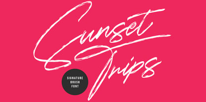 Give your designs an authentic handcrafted feel. Sunset Trips is perfectly suited for signatures, stationery, logos, typography quotes, magazines or book covers, website headers, clothing, branding, packaging design and more. This font includes: - Ligatures - Multilingual Support Thanks for use this font ~ Maulana
 - Ripe Mango by Sohel Studio,
$14.00 Ripe Mango is a retro display serif font that exudes a classic charm and bold character. With its design inspired by retro styles, this font brings an elegant touch and evokes a sense of the past. Each letter is meticulously crafted with careful attention to detail and proportion, resulting in a visually appealing and unique appearance. Ripe Mango is perfect for projects that require a vintage feel, such as posters, logos, packaging, and promotional materials that aim to capture a nostalgic and sophisticated atmosphere. This font will add a special touch to your designs and captivate viewers with its retro allure and distinctiveness. Ripe Mango Features: - 4 Weight (Regular, Slant, Semi Bold, Outline) - Uppercase And Lowercase - Alternates And Ligature - Numerals & Punctuation - Accented characters - Multilingual Support - Unicode PUA Encoded While using this product, if you encounter any problem or spot something we may have missed, please don't hesitate to drop us a message. We'd love to hear your feedbacks in order to further fine-tune our products. Thanks and have a wonderful day .
 - FG Erin by YOFF,
$14.95FG Erin is simply perfect handwriting. I want it! Do you? - 2 Prong Tree - Unknown license

- Daiquiri by Wiescher Design,
$39.50 Daiquiri is a revival of a handlettered font in two weights, from an ad for Puerto Rico Rum dating back to the forties or fifties. I found the ad on a French antique market on my last visit for Mardi Gras in Nice. The ad read "Breeze through the heat, be a Daiquiri fan". That's why they had this "fan" in the illustration! Did they want you to rotate like a fan when you had enough Daiquiris? Or did they just do it for that little "Jeu des mots"? Anyway I found the handlettering very pretty, so I took those few letters and made a whole font out of them. I think Daiquiri has that touch that brings those happy and uncomplicated times back when advertising was still fun. I started something like 20 years later in advertising and things had gotten more stringent. We already had to satisfy those marketing guys with their scholarly attitude. They have taken all the fun out of the job, for the creators as well as for the consumers. I would like to see more uncomplicated ads like this again, yours Gert Wiescher
 - Lisa Bella by Wiescher Design,
$39.50 Lisa is an elegant script family in the tradition of early Italian type designers like Bodoni. I added counter strokes and floral embellishments to the font. Lisa comes in three variations: the beautiful Lisa Bella, the flowery Lisa Fiore and the extra swinging Lisa Piu (which means more in Italian). Enjoy! Your elegant script designer Gert Wiescher
 - Lisa Fiore by Wiescher Design,
$39.50 Lisa is an elegant script family in the tradition of early Italian type designers like Bodoni. I added counter strokes and floral embellishments to the font. Lisa comes in three variations: the beautiful Lisa Bella, the flowery Lisa Fiore and the extra swinging Lisa Piu (which means more in Italian). Enjoy! Your elegant script designer Gert Wiescher
 - Lisa Piu by Wiescher Design,
$39.50 Lisa is an elegant script family in the tradition of early Italian type designers like Bodoni. I added counter strokes and floral embellishments to the font. Lisa comes in three variations: the beautiful Lisa Bella, the flowery Lisa Fiore and the extra swinging Lisa Piu (which means more in Italian). Enjoy! Your elegant script designer Gert Wiescher
 - Mano Danielli by Kate Brankin,
$32.00 Mama, are you doing letters? I want to do letters too! Mano Danielli is based on the writing of a 6 year old child. Great for anything that has to do with children - even the inner ones.
 - ITC Musclehead by ITC,
$29.99ITC Musclehead is the work of type designer Timothy Donaldson, a robust, densely packed handwriting typeface. It almost looks like brushwork but was in fact made with a ruling pen which Donaldson had bought from a company in Salem, Massachusetts. He says, The world's gone ruling-pen mad at the moment [late 1990s] and I was beginning to tire of all the skinny splashiness of the letters that most people were making with them. I wanted to do something heavy and robust with the tool, so that's what I did."" - Swollen - Unknown license

- ITC Needlescript by ITC,
$29.99It's been said that creativity requires ten parts to perspiration to one part inspiration. But not always. According to its creator, Mira Vucko, ITC Needlescript was designed in one breath." An accomplished lettering artist, Vucko was sketching letters one afternoon. "I was using a calligraphy nib and was drawing the alphabet without much thought," she recalls. "When I allowed the down strokes of a couple of letters to fall below the baseline, I realized that I had created the impression of movement. I kept drawing letters in this fashion and did the same with horizontal lines. I added a firm ending to the descenders. Instead of dots above the 'i' and 'j,' I placed strokes in the opposite direction." In this way, the first characters that were to become ITC Needlescript emerged. The finished design is a lively, distinctive alphabet that produces a striking texture on the page. Letters intertwine and overlap to create a sense of movement and graphic intensity, especially when reversed out of a dark background. Vucko lives, works and was educated in Zagreb, Croatia. She lived in France and Sweden while in her twenties, but then returned to Croatia to work as a graphic designer for the country's largest newspaper. It was here that her passion for type and typography was born. Vucko has since gone on to become one of Croatia's leading graphic designers, and has won many awards for her advertising and packaging design. Vucko recommends that ITC Needlescript be used for "titling, lively but 'thorny' content, and anywhere that a little typographic drama is called for."" - Redtab by MKGD,
$13.00 With Redtab I tried to create a typeface that could be used equally well in either in body copy, or in headline form. I like to think that, although it has a more traditional look to it, it still possesses a bit of a creative flourish that sets it apart from similarly designed fonts. Whether used sparingly or in paragraph form, Redtab has the ability to not only read well, but stand out while doing so.
 - Marxis by Juru Rancang Studio,
$15.00 Introducing a retro condensed font called "Marxis". Best font to use as a headline to bring back the propaganda era inspired by Soviet posters, movie titles and book covers. The letterforms are straight and condensed and come in 2 styles: uppercase and small caps with the ligatures. This font will suited well for titles, poster design, web design, branding and packaging works, illustrations, badges and other typography works. Thank you, I hope you like it as I do!
 - Coarse Grind by Hanoded,
$15.00 I bought a new coffee machine - the piston variety. It is shiny, made in Italy and I can make a killer espresso or latte with it. I usually start off the day with a pour over coffee and save my milky coffee for later. I also have two grinders: one for a coarse grind (pour over) and one for a finer grind (espresso and latte). Yes, you will probably say that it’s quite extravagant to have two grinders, but I do like my coffee! Anyways, this is what I thought of when I worked on Coarse Grind. Coarse Grind is a well balanced all caps display font. It comes with extensive language support and a set of alternates for the lower case letters.
 - Briskly by Hackberry Font Foundry,
$24.95 There were several motivations for this font. It was a font in my style, a left-handed designer. But also, I wanted a script designed to work with ePUBs. This means fancy bullets in place of some of the ASCII characters—since ePUB readers do not support OpenType at all. Basically, I just had fun with it. The heifer for the mu figure cracks me up. What can I say?
 - BN Stile Project - Unknown license

- Ink Swipes BRK - Unknown license

- Triple Condensed Gothic by Red Rooster Collection,
$45.00Based on an early wood type design. An original creation. - Triple Condensed Gothic by BA Graphics,
$45.00A triple condensed gothic based on the letter form of Franklin Gothic. Great for fitting a lot into a small space. With its condensed and extra bold appearance it makes a great headline face. - Glenda by Hubert Jocham Type,
$39.00 Since I designed Mommie you can see a lot of script typefaces with big contrast for big sizes. With Narziss I created a roman interpretation with the very expressive Swirls version. Glenda is again an italic script like Mommie. In the Regular the characters join and it looks like a neatly written sprencerian handwriting. But like Narziss it has got a Swirls version too. Every glyph and swirl is carefully designed to work in every connection. Use Glenda at only very large sizes.
 - Neuer Weltschmerz by Hanoded,
$15.00 About 7 years ago, I released a beautiful (imho) Art Deco inspired font called Weltschmerz. Weltschmerz was an all-caps font and I always wanted to do a lower case version as well. But as things so often go in life, I never found the time and forgot about it. Some time ago, I ‘rediscovered’ my good old Weltschmerz font and remembered that I wanted to create a lower case version. Without further ado: here is Neuer Weltschmerz (‘New Weltschmerz’). I redid the whole font, better kerning, better spacing, better looks… and with a proper lower case! I did keep the original handwritten look intact - because, well, it IS hand made!
 - Cyceon Pro by DBSV,
$90.00 Fluted pillars… As for the name of "Cyceon", it is a "juice-drink" that they made in ancient Greece...! In this font the straight lines are not vertical but inclined like something from the Doric columns!!! There are two versions of letters. In the first version, it is of a normal character, while in the second version I have mixed some capitals with lower case letters. I have given them the acronym Msc "miscellaneous". I tried in this way to give another version of the small capitals and I think they show a different view from the purely small capitals… And in this family, the “Strap”/“Strap Msc”/“StrapIt”/ and “Strap MscIt” with “Solid”/“Solid Msc”/“SolidIt”/ and “Solid MscIt” engage in the same way like… “Layered font families” as the previous series. This series is composed and includes twenty-four fonts with 642-658 glyphs each, with true italics and supports Latin, Greek and Cyrillic.
 - Garland Glamour by Pen Culture,
$17.00 Introducing the new Garland. It's modern brush font with beautiful and natural brush stroke that perfect for logo, poster, product, apparel, packaging and many more. Garland come with full all caps, number, punctuation. this font very easy to use, so what you waiting for. I really hope you enjoy it - please do let me know what you think, comments & likes are always hugely welcomed and appreciated. More importantly, please don't hesitate to drop me a message if you have any issues or queries. Thank you
 - Squickt by Wiescher Design,
$39.50 Squickt was the first script I designed. The name is an atrocity, I don't remember what was on my mind, when I decided on that name, but after 25 years it is to late to change, so I have to stick with it. I have recently gone over the script and changed a little stroke here, a curve there and I added Small-Caps. The font is very useful for all kinds of signs, that have to look spontaneous. You can even condense or extend it without me going berserk; Squickt is very robust. Your scribe Gert Wiescher
 - Peanut Ache by PizzaDude.dk,
$17.00 I don't know what it is with me and peanuts. I simply love it! I like peanuts in all kinds of meals: breakfast, lunch, dinner and even in desserts! But with an addiction like this, an overload of peanuts sometimes appear...and I guess that's where the name of this font comes from :) The Peanut Ache font is super clean, and super steady - use it for anything that needs a clean look! I've added 5 slightly different versions of each letter, and this really helps making your text to look even more fresh and lively!
 - Marigold Dreamer by Pen Culture,
$17.00 Introducing Marigold Dreamer, a captivating handwritten script font created with love and care using traditional techniques. Every letter of this font was meticulously handcrafted, resulting in a truly authentic and unique typeface. Marigold Dreamer exudes a whimsical charm that adds a touch of warmth and personality to any project. Its graceful strokes and intricate details capture the essence of handwritten elegance. The font boasts exquisite ligatures and delightful tails, enhancing the fluidity and natural flow of your text. I really hope you enjoy it – please do let me know what you think, comments & likes are always hugely welcomed and appreciated. More importantly, please don’t hesitate to drop me a message if you have any issues or queries. Thank you
 - Bristhony by Queenop Studio,
$12.00 Bristhony - Modern Calligraphy Script Font Proudly Present The New "Bristhony // Classy Calligraphy Font" Bristhony is modern classy calligraphy font, this font come with beautiful ligature and lovely alternate. Bristhony has a very beautiful stroke and will be very suitable if applied to wedding projects, invitations, fashion, and much more. Feature and what will you get: Uppercase and lowercase Number and punctuation Beautiful ligature Lovely alternate PUA Encoded and multilingual support I really hope you enjoy it – please do let me know what you think, comments & likes are always hugely welcomed and appreciated. More importantly, please don’t hesitate to drop me a message if you have any issues or queries. Thanks & Congratulations on the Design.
 - Forgotten Dream by Hanoded,
$15.00 I had a really weird dream the other night, but when I woke up, I had forgotten it. I had the feeling it was about something important, but I cannot, for the life of me, recall what I dreamt about! Forgotten Dream is a horror brush font, which I made with a brushy brush and Chinese ink. It looks like something right out of a nightmare, but you can also use it for something important. Like a ‘keep your distance’ poster, or a sign about the importance of washing ones hands. But then again, if you play in a death metal band, then Forgotten Dream font could be exactly what you need for your album cover!
 - Plague Master by Hanoded,
$15.00 I admit: I had a bit of a crazy week when I thought up an drew this font. I broke my arm during kickboxing training on monday, leaving me in a cast - unable to do most everyday things, like getting a good night's sleep (try sleeping with a humongous cast on your arm). Thank goodness, it is my left arm, so I can still draw letters and use my laptop. So… this font has been made entirely using one arm! It is a bit of a horror font - it sort of sums up my mood right now. Glyphs have very little spacing, adding to the evil look of Plague Master. Comes with a lethal amount of diacritics.
 - Pentagram by Fauzistudio,
$12.00 Pentagram is a typeable three-letter Pentagon monogram font. You can type Monogram a pentagram with a mapped border on the numbers 0-9. With the support of alternative contextual features It works automatically so all you can do is just type. If you liked this feel free to show your appreciation by giving this project a simple like, I will be making a font with a similar feature in the future. Hope you enjoy. Intuisi Creative
 - Letterbot by Comicraft,
$19.00 "If you prick me, do I not bleed? If you tickle me do I not laugh? If you poison me do I not DIE? And if you wrong me shall I not REVENGE?" "I am not a TYPEWRITER! I am not a MACHINE! I am -- NOT -- JUST -- a lettering ROBOT! I -- AM -- A -- HUMAN -- BEING!" Having trouble with YOUR lettering artist? LETTERBOT is here to help. Take all the fuss and muss out of dealing with a real person and install this helpful and responsive robotic font. It has no opinions of its own and will assist you in the lettering of your comic without all that tedious human interaction which lettering artists seem to think they're entitled. Designed by John JG Roshell.* *Now obsolete. Features: Four weights (Regular, Italic, Bold & Bold Italic) with upper and lower case alphabets. Includes Western & Central European accents and Cyrillic characters.
 - Lust Stencil by Positype,
$39.00 When you hear that name, you likely ask yourself, ‘why?!’ I did too, but the number of requests could not be ignored. Once I finally decided to move forward with it, the only way to solve the offering would be to adhere to the same theme of indulgence, I planned for the same number of optical weights AND Italics. Yeah, italic stencils… ok, why not? It’s not a new concept. One thing to note and a creative liberty I assumed during the design. Lust Stencil would not be just a redaction or removal of stress to produce a quick stencil. To do that, would just be a cheap solution. Strokes had to resolve themselves correctly and/or uniquely to the concept of the stencil format. And, it had to be heftier. For it it to look correctly, it needed about 8% additional mass to the strokes for it to retain the effervescent flow of the curves and the resolute scalloped lachrymals. The Lust Collection is the culmination of 5 years of exploration and development, and I am very excited to share it with everyone. When the original Lust was first conceived in 2010 and released a year and half later, I had planned for a Script and a Sans to accompany it. The Script was released about a year later, but I paused the Sans. The primary reason was the amount of feedback and requests I was receiving for alternate versions, expansions, and ‘hey, have you considered making?’ and so on. I listen to my customers and what they are needing… and besides, I was stalling with the Sans. Like Optima and other earlier high-contrast sans, they are difficult to deliver responsibly without suffering from ill-conceived excess or timidity. The new Lust Collection aggregates all of that past customer feedback and distills it into 6 separate families, each adhering to the original Lust precept of exercises in indulgence and each based in large part on the original 2010 exemplars produced for Lust. I just hate that it took so long to deliver, but better right, than rushed, I imagine. It would have taken even longer if not for font engineer and designer, Potch Auacherdkul. Thanks Potch.
 - Snappy Fingers by Kitchen Table Type Foundry,
$11.00 Description: Snappy Fingers is a remake of a really old font, called Joe Schmoe, which I made for my other foundry years ago. I really like this font, but it needed a lower case and some serious tweaking. Snappy Fingers is a fun, handwritten font. I (now) comes with fantastic language support and a new lease on life!


