10,000 search results
(0.037 seconds)
- The Great Escape - Personal use only

- BD Renaissance - Unknown license

- Berthside - Personal use only

- Miss - Unknown license

- Blazing - Unknown license

- Gr-Memories - Unknown license

- A.Lewis - Unknown license

- Iphegenia™ - Unknown license

- Atlas of the Magi - Unknown license

- Asrafel - Unknown license

- Hollyweird by ITC,
$29.00Hollyweird is another original, funky work of California designer Jill Bell, a bold display script with intentionally shaky strokes and tightly curled flourishes. The capitals are ideal as initials and the lowercase is best used tightly set. Hollyweird is a good choice for any work requiring a casual chic appearance. - Gothic Initials One by Gerald Gallo,
$20.00 Gothic Initials One was inspired by the beautifully-written gothic scripts of medieval scribes. The font contains the upper case letters A through Z under both the character set and shift+character set. This font is intended for use as initials, monograms, drop caps or wherever fancy letters are desirable.
 - Gothic Initials Three by Gerald Gallo,
$20.00 Gothic Initials Three was inspired by the beautifully-written gothic scripts of medieval scribes. The font contains the upper case letters A through Z under both the character set and shift+character set. This font is intended for use as initials, monograms, drop caps or wherever fancy letters are desirable.
 - Gothic Initials Seven by Gerald Gallo,
$20.00 Gothic Initials Seven was inspired by the beautifully-written gothic scripts of medieval scribes. The font contains the upper case letters A through Z under both the character set and shift+character set. This font is intended for use as initials, monograms, drop caps or wherever fancy letters are desirable.
 - Gothic Initials Four by Gerald Gallo,
$20.00 Gothic Initials Four was inspired by the beautifully-written gothic scripts of medieval scribes. The font contains the upper case letters A through Z under both the character set and shift+character set. This font is intended for use as initials, monograms, drop caps or wherever fancy letters are desirable.
 - Timeless Wonderland by Letterhanna Studio,
$19.00 Timeless Wonderland is a captivating calligraphic handwritten script font that weaves a story of timeless beauty and enchantment. Each stroke of this font is a testament to the artistry of calligraphy, making it the perfect choice for creative projects that seek to blend elegance with an enduring sense of wonder.
 - Oh Chewy by Motokiwo,
$23.00 Oh Chewy... a sweet bold script font with alternates and lovely swashes. It has fat strokes and smooth edge, that's great for food branding, retro style, and eye-catching logo. Feature: Uppercase Lowercase Numeral & Punctuation Special Character (Standard Multilingual) Stylistic Alternates Stylistic Set (SS01 & SS02) Swash Access All Alternates PUA Encoded
 - Fathyma by Typesthetic Studio,
$13.00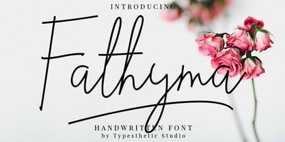 Fathyma is clean & fresh script with a stylish handwritten style make this font looks natural, classy and perfect for any awesome projects that need handwriting taste. With exaggerated strokes and an bouncy baseline, Fathyma has an unmistakable charm; perfect for logos, wedding stationery, cards, gift designs, product packaging and handwritten quotes.
 - Saylon Brush by Stripes Studio,
$20.00 Saylon is a super casual hand brushed script with detailed brush stroke texture, and a quirky, Can be used for various purposes. such as the title, signature, letterhead, signage, labels, newsletters, posters, logos, correspondence, wedding invitations, badges, etc. Saylon Font international Support for a review of most Western languages included.
 - Gothic Initials Six by Gerald Gallo,
$20.00 Gothic Initials Six was inspired by the beautifully-written gothic scripts of medieval scribes. The font contains the upper case letters A through Z under both the character set and shift+character set. This font is intended for use as initials, monograms, drop caps or wherever fancy letters are desirable.
 - Gothic Initials Two by Gerald Gallo,
$20.00 Gothic Initials Two was inspired by the beautifully-written gothic scripts of medieval scribes. The font contains the upper case letters A through Z under both the character set and shift+character set. This font is intended for use as initials, monograms, drop caps or wherever fancy letters are desirable.
 - Gothic Initials Five by Gerald Gallo,
$20.00 Gothic Initials Five was inspired by the beautifully-written gothic scripts of medieval scribes. The font contains the upper case letters A through Z under both the character set and shift+character set. This font is intended for use as initials, monograms, drop caps or wherever fancy letters are desirable.
 - Blammingst by Maulana Creative,
$12.00 Blammingst is a clean script font modern casual and smooth moonlike stroke font includes opentype features Ligatures and Alternate lowercase. It support multilingual more than 100+ language. This font is suitable for logo design, Movie Titles , Books Titles and any awesome project you create. Make stunning work with Blammingst. Cheers, MaulanaCreative
 - Gothic Initials Nine by Gerald Gallo,
$20.00 Gothic Initials Nine was inspired by the beautifully-written gothic scripts of medieval scribes. The font contains the upper case letters A through Z under both the character set and shift+character set. This font is intended for use as initials, monograms, drop caps or wherever fancy letters are desirable.
 - Gothic Initials Eight by Gerald Gallo,
$20.00 Gothic Initials Eight was inspired by the beautifully-written gothic scripts of medieval scribes. The font contains the upper case letters A through Z under both the character set and shift+character set. This font is intended for use as initials, monograms, drop caps or wherever fancy letters are desirable.
 - TessieSpinners by Ingrimayne Type,
$13.95 A tessellation is a shape that can be used to completely fill the plane—simple examples are isosceles triangles, squares, and hexagons. Tessellation patterns are eye-catching and visually appealing, which is the reason that they have long been popular in a variety of decorative situations, such as quilting. Most of the shapes in TessieSpinners suggest a spinning motion. Most do not resemble real world objects. The TessieSpinners fonts contain shapes that can be used to construct tessellation patterns. It has two styles, an outline style and a filled or black style. The black style can be used to construct colored patterns. To see how patterns can be constructed, see the “Samples” file here. Most or all of these shapes were discovered/created by the font designer during the past twenty years in the process of designing maze books, coloring books, and a book about tessellations.(Earlier tessellation fonts from IngrimayneType, the TessieDingies fonts, lack a black or filled version so cannot do colored patterns. Make sure the leading is the same as font size or the rows will not line up.)
 - Scrapbooker by Sudtipos,
$29.00 After previously collaborating on the bestselling Distillery Set, Carolina Marando and Alejandro got together once again to create this Scrapbooker Set, a new series of fonts that multiply the possibilities. One reason scrapbookers became a kind of design demographic is the appeal of what they do. They make albums of memories, diaries composed of different elements that converge together to lead the viewer to a special moment in time. A paper, a photo, a letter, an event ticket, or a dry petal — everything ends up being part of a collage that tells a story. Words have a key role in such a collage. They use different shapes and forms and combinations to state what cannot otherwise be expressed. They make the collage stronger by clarifying a concept, defining an image, and solidifying a memory. These words for memory albums are the reason for this Scrapbooker Set, six different fonts with different impressions and different personalities — so each part of the memory can have its own identity. People tell you to write your own history. Now you can do that in style.
 - Misslena by Din Studio,
$29.00 Have you been looking for a serif font? Do you sometimes have an appetite for a bit more wholesome typography? Do you dream of creating headings that stand out and inspire creativity, imagination, and endless fun? Wait no more, we will give you the best choice. Misslena-A Serif Font One of the most elegant, exquisite yet strong fonts. Misslena is made to bring out a modern and stylish view of what you make. This font contains upper & lowercase characters, all punctuation, and numerals. Also features ligatures and alternates characters to help the text flow naturally and add a custom-made feel. Its lighter weights are well-suited for body text. The available stylistic alternates offer a number of different characters that give your logo or business card a unique look. Misslena includes Multilingual Support to make your branding reach a global audience. Inspire your audience, clients, or guests with this beautiful, statement font. Features: Ligatures Alternates PUA Encoded Numerals and Punctuation Thank you for downloading premium fonts from Din Studio
 - Reading Frequency by Vladvertising,
$10.00 Ever wonder what language looks like? This type decided to dive into this idea... how audible and visual forms play with each other. The forms you see also have been waterjet-cut out of stainless steel sheets. With these physical forms, one day in a recording studio and a mallet in hand later... we get this. Link to Audio Files: http://vladrudakov.com/files/Reading%20Frequency%20Audio.zip (If you use for samples– have fun, just shoot me an email w/ final product) vlad (at) vladvertising.com
 - Beit El MF by Masterfont,
$59.00 Inspired by old letter engraving and tombstones, his font is unique by its flow and contrast, enabling traditional typeface gain a new and clear flow and rhythm. OpenType Pro fonts- Excellent support for Niqqud (Vowels). All marks are programmed to fit each glyph's shape and width. OpenType Pro includes new advanced features like Dagesh Hazak, ShevaNa, Qamatz Katan, Holm Haser and wide letters. Best used with Adobe InDesign CC that support complex Hebrew text. Please check these advanced features in this link: https://tinyurl.com/ybgdsxme
 - Cirkel Pro by Forte Type,
$4.90 Cirkel is a contemporary font family based on circles. Its geometrical and unusual forms gives us a nice feel of modernity and humor. Created by Jarbas Gomes, Cirkel family is composed by 3 weights (Light, Medium & Bold) and its respective ornamented fonts made of patterns (Stripes Light, Stripes Medium & Stripes Bold). The fonts also have a great set of ligatures and swashes that can be accessed in softwares with support to OpenType features. Cirkel is indicated for hype designs, on titles and short texts.
 - Adamant BG - 100% free

- Solo Beats by PizzaDude.dk,
$17.00 It's clear, fat and juicy - it's my Solo Beats font! It has got that organic feeling of something handmade...and that is exactly what it is. Even though I digitally removed some inkblobs here and there, the handmade look is quite clear!
 - Toxic Brew by PizzaDude.dk,
$15.00 The Toxic Brew font was initially designed to be a Halloween font, but I guess it turned out not so scary in the end. But maybe you can use it for something scary anyway? I've added several versions, and they mix very well
 - Life Cinema Screen by Andrey Ukhanev,
$- This font was inspired by an old photographic film package I found. Over time, the vertical slits in the letters have become more complex and acquired slanted sections. The font is suitable for accidences: headlines, posters... maybe you can suggest something interesting ;)
 - Ronsten by Fontron,
$35.00I know there are already quite a few Stencil type fonts but maybe this fills a niche. A very chunky serif stencil where the serifs are closely aligned and help form the the curves of the letters. An Italic is also available. - Ongunkan Atlantis Hollow by Runic World Tamgacı,
$40.00 Atlantis: The Lost Empire is a 2001 I made the alphabet prepared for Atlantis Lost Empire, the first feature-length animated movie of Walt Disney in 2000 years, in 2 versions in accordance with the original. It is suitable for today's use.
 - Macquarie Heavy by Type Associates,
$24.95 Macquarie Heavy was used for a logo back in the mid nineties and never completed until recently when I decided to revive it. It works very well in all-caps blocky headlines and is surprisingly legible in lowers with plenty of strength.
 - Cuckoo by Very Good Fonts,
$19.00Cuckoo was first seen in 1988 when I painted it on a record shop's window. Since then this hand lettered font has been there and done that. Cuckoo is strong, classic and informal display font designed to work well on any job. - Maisonneuve by Beware of the moose,
$17.99 Maisonneuve is named after the fracture I had in 2019. During the period of revalidation this font was born passed on circles and rectangles. A modern – almost modular – font with old school figures and lots of symbols and good readability and legibility.


