10,000 search results
(0.035 seconds)
- The Poisoned Heart by Din Studio,
$29.00 The Poisoned Heart is a beautiful retro script. It's made with a naturally handwritten style. This font will make your design more beautiful and powerful, and is suitable for any design such as branding, quotes, wedding invitations, lettering projects and more. Features: - 76 Alternates - Accents (Multilingual Characters) - 10 Ligatures - PUA encoded - Numerals and Punctuation (OpenType Standard) I hope you enjoy it! Thanks for visiting and purchasing my font! Regards Donis M Din Studio
 - Hello Marlisa by Stripes Studio,
$20.00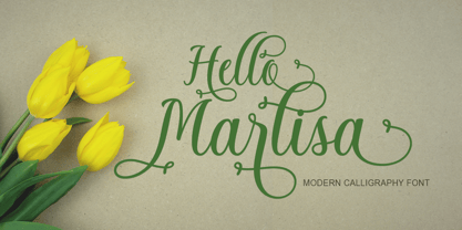 Hi, Introducing the latest styles Hello Marlisa Script with the kind of modern hand scratches, I hope you are interested in this font, if you want to use for your work this font can be used easily and simply because there are a lot of features in it to contain a complete set of letters lower and uppercase letters, assorted punctuation, numbers, and multilingual support. font also contains several ligatures and alternate style Stylistic.
 - Northen by Garisman Studio,
$15.00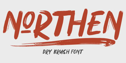 Northen combines attractive curves with a fresh urban edge; delivering a stylish script which is guaranteed to add an eye-catching appeal to your logo designs, brand imagery, handwritten quotes, product packaging, merchandise & social media posts ADVANTAGES: - Simple installation - Work for PC and MAC - Multilingual Support - EXTRA SWASH - Detailed dry brush I hope you enjoy this font. If you have questions, don't hesitate to give me a message :) Thank You! - Garisman Studio
 - Gloomy Saturday by Almeera Studio,
$10.00 Introducing our new font Gloomy Saturday Font Duo. Gloomy Saturday is a luxurious paired typography, consisting of an elegant script & stylish Sans that is equipped with ligature.this is perfect for branding, logos, invitation, signature and more. Gloomy Saturday Features : Uppercase Lowercase Number Punctuation Multilingual PUA Encoded Opentype Ligatures Alternates PUA Encoded I really hope you enjoy it, and please don't hesitate to drop me a message if you have any issues or queries. Thank You
 - Halena Jordan by Bungletter,
$12.00 Halena Jordan is a beautiful script that's perfect for branding, wedding invitations, and other romantic projects. This love centered look makes it perfect for use in all your design projects be it logos, labels, packaging designs, blog titles, posters, wedding designs, social media posts, Instagram designs, etc. Contains full set: -Uppercase -Lowercase -Alternative -Ligature -Punctuation -Number -Multilingual support. I hope you enjoy this font. If you have any questions, feel free to message me.
 - Milky Fruty by Omotu,
$19.00 Milky Fruty! A monoline script font. Comes with two styles, regular and rounded. Milky Fruty font is suitable for branding, logotype, apparel, T-shirt, Hoodie, product packaging, quotes, flyer, poster, book cover, advertising, etc. Whats Include? Opentype support Multilingual support PUA encoded Features: Uppercase, lowercase, numerals, punctuations, extrudes, and ligatures Thanks for looking, and I hope you enjoy it! Please don't hesitate to drop me a message if you have any issues or queries.
 - Rumble Brave Vintage Fonts by Alit Design,
$14.00 Introducing Rumble Brave Vintage Fonts Packages. Lately I've been happy to see the design style with its vintage Victorian classic. Hence from that I launched fonts packages with vintage style. In this package, there are three types of letters: serif, script, and dingbat. The three font combinations are compatible with the Victorian classic design concept. You can also use each font by itself, without combining it with the others in the package.
 - Routerline by Viaction Type.Co,
$15.00 Routerline is a script monoline with 4 styles, nice applied in various products. Complete with multilingual characters, ligature and alternate. It is suitable for quote, clothing design, vintage logo, label, poster, packaging design and other designs. File Include (All Family) : Routerline.otf Routerline.ttf Routerline Slant.otf Routerline Slant.ttf Routerline Bold.otf Routerline Bold.ttf Routerline Bold Slant.otf Routerline Bold Slant.ttf Features (PUA Encoded) : UPPERCASE. LOWERCASE. MULTILINGUAL. PUNCTUATION & SYMBOL. STYLISTIC SET. LIGATURE. I hope you enjoy and thank you.
 - Puzzle by Just My Type,
$25.00 Call me some kind of weird, but I find designing fonts about the most fun you can have out of bed. Legible-scmedgible, sometimes you just have follow the font muse regardless of where she takes you. She threw me a circle, a triangle, a rounded stroke and a rounded-cornered square; “Make glyphs,” she sang. Okay! Is it legible? Yes. Is it readable? Kinda. For the right project, though, that’s enough!
 - Johanna Whimsy JF by Jukebox Collection,
$32.99 Johanna Whimsy is a fun light-hearted script font that is named after a friend of the designer who is a well known folk artist. The design was inspired by a hand lettered sample from the 1960s and has an engaging mid-century feminine style. The font features alternate versions of the h, i, n and m for some typographic variety. The typeface exudes delight and happiness and is perfect for a variety of designs.
 - Trade Gothic Inline by Linotype,
$29.00 Trade Gothic inline is a quirky display companion for Trade Gothic Next, offering five different voices, and a whole lot of personality. The lighter weights are graceful and elegant, embracing negative space to give the sense that the letters are halfway to disappearing. Designer Lynne Yun has incised the darker weights with a super thin inline that emphasises the heaviness of the letters, and creates a reassuring chunkiness. “If I kept the inlines the same, it created a lot of visual noise,” explains Yun. “I wanted each weight to be different enough, so in the end the weight and width of the letters was increasing and decreasing in size, and the inlines were too. The black is almost like an extra black, because the inline is smaller. It's about trying to have different voices for each weight.” Trade Gothic Inline is available in five weights, from light to black.
 - Mabotim Brush by Creative Lafont,
$10.00 Mabotim Brush Font painted, Fun, modern, multi-purpose and operated bold letters combine letters brushing operates with a natural style. Suitable for review, packaging, titles, posters, t-shirts, logos, quotes, invitation, apparel, wedding, advertising, image overlays, greeting cards and web banners, etc.Get substitute alternate glyphs and characters beginning and end of interest to the composition of your design. Comes with Uppercase and lowercase characters, large set of punctuation glyphs, numerals, supports international languages, stylistic alternates for several key lower case characters And this Font has given PUA unicode (specially coded fonts). Letters replacement can be accessed using a program like Adobe Illustrator and Adobe InDesign OpenType Smart. Adobe Photoshop Corel draw X version, and Microsoft Word. I had a lot of fun designing this font. I hope you have even more fun using it. If you have any questions, please don't hesitate to ask. Thank You for Purchase!
 - Rusty Cage by Hanoded,
$15.00 I named this font after one of my favorite songs by Soundgarden: "Rusty Cage". The font is a mishmash of letters, which were hand-drawn and given a photoshop overhaul to make them look grungy and grotesque. I mixed upper and lower case letters, added a whole bunch of alternate letters, spooned in some Salt and Calt and added a pinch of Liga as well. The result is a weird concoction, which looks good on posters, in ads and possibly even tattoos. I dare you!
 - Black Molasses by Hanoded,
$16.00 In Holland we eat pancakes with black syrup and I always thought that this ‘suikerstroop’ was the same as molasses. Turns out that’s not the case; syrup is made from sugar, but molasses is a by-product of the sugar refining industry. To celebrate the fact that I learned something new, I named this font family Black Molasses. Black Molasses was made using various cheap brushes and Chinese Ink. It comes in a ‘fat’ version and a ‘light’ version that work together really well.
 - Bielik by Hotniedog Studio,
$10.00 Bielik was created for a comic book that I’m working on. Main goal was to achieve random character of texts, so I made three glyphs for every letter, even for diacritics. Firstly I was drawing using brush pen with ink, so thickness of letters was really various. I decided to implement this style into a font. So that is how Bielik came into the world. This is good choice for comic books, children books, display designs and much more. Bielik is a polish word for Haliaeetus albicilla.
 - Tosca by Wiescher Design,
$39.50 Tosca is a very elegant and decorative typeface with 730 glyphs. I put a second set of capital letters in the places of the smallcaps. So just type the word in lowercase, then select the first letter and convert it to smallcap in the OpenType menu. I also give you a ton of ligatures that can be accessed via OpenType. I am slowly learning to use these OpenType features, it is fun, but it is a lot of work. Your forever learning type-designer Gert Wiescher
 - Kula by Jadugar Design Studio,
$20.00 I am proud to introduce Kula, a fun font. It is bold with three variations: outline, shadow and blur. These 4 fonts are very pleasing to use in your poster design, giving some headings to your text and many more options to play with these set of fonts. Its unique curves with slab look is fantastic choice for your next project. Kula has been crafted with care and I tried to make this some thing special for you. I hope you will enjoy this font family!
 - Malevich by BBDO Studio,
$19.00 Hi! I am Black Square! Probably the most famous square in the world. Thanks to my godfather Kazimir Malevich, who created me in 1915, this year I am celebrating 100th anniversary. Let me tell you what a great gift I just got! It`s a family of almost 300 letters and symbols suprematic as suprematic can be - shapes, form attacks, booms and even hashtags! All under the name of Malevich Font. Isn`t it a great present for my anniversary? Thank You BBDO Ukraine
 - Easy Does It by Bogstav,
$15.00 I started making this font with a few days left at work before my 4 weeks vacation. I managed to finish the font on the day my vacation started - but with no stress. Now I can look forward to 4 good weeks at the summerhouse, and look back at the release of this laid back, handmade and somewhat quirky font. Personally I’d use it for anything that needs an organic handmade look - perhaps packaging, posters, flyers or maybe even clothes or toys for kids!
 - Peking Duck by Hanoded,
$15.00 I used to be a tour guide and I traveled to China numerous times. Usually, the itinerary mentioned going to a restaurant in Beijing and eating ‘Beijing Roast Duck’ (北京烤鸭), a famous dish that has been prepared since the Imperial era. Typically, the whole duck is sliced at your table. The skin is crisp, glazed and thin and you should eat it with thin pancakes and thinly sliced spring onion. Of course, if I had to guide several ‘China tours’ in a row, I would often eat something else (there is only so much Beijing Duck you can eat). Peking Duck is a nice, handmade, Chinese Ink font. Use it for your restaurant menu, your book covers or your posters, advertising oriental food!
 - Speed Bump by Three Islands Press,
$19.00 I, uh, don't know quite what to say. I'd toiled so long over Pumpkinseed back in '96 that I guess I needed a good, wild ride to shake out the head cramps, or something. Whatever grabbed me, it forced me to sit down and design a typeface real fast directly in Fontographer (had never done that before). Took less than two hours to finish the regular character set. No way to explain it, but the exercise actually paid off -- I think. And now that there was Speed Bump, there simply had to be a companion dingbat set. (Beats the heck out of me.) So check out Speed Bump's wacky character(s) and, if you're really bored, the 200-some-odd little pictures in Speed Bump Pi.
 - Black Pearl by FontMesa,
$30.00 Black Pearl is a revival of an ornate calligraphic font possibly created between 1850 and 1870. I spent two years looking for all the letters of this font; once I found them all, I immediately went to work on recreating this old classic. I was not able to find any numbers for the font, so new to this style are numbers, some punctuation and currency symbols. The Truetype and OpenType formats include an extended character set with Central and Eastern European accented letters. Extra characters in this font are left and right pointing hands in place of the less than and greater than keys; a ship’s wheel, located on the asterisk key; and a boat anchor on the bracket keys.
 - Tokyo Taiyaki by Hanoded,
$16.00 In May of this year, I went to Japan with my (then 11 year old) son Sam. It was his dream to visit Japan, probably because of my tall tales, stemming from the time I was a tour guide! Sam really wanted to try all kinds of Japanese delicacies and one day, when walking around Tokyo, we came across a little stall selling Taiyaki. Taiyaki are fish-shaped waffle/cakes with a red bean or sweet potato filling. They are really delicious! This nice ‘oriental looking’ font was made with a broken popsicle stick and Chinese ink. You are now wondering why I always use Chinese ink and not Japanese ink. Well, I have a stash of the Chinese stuff and it’ll last me a lifetime!
 - Letterpress Text by Chris Costello,
$22.75 This font is based on the popular and timeless Caslon design and was carefully digitized from the pages of an early 19th century book. I was excited to see some unique design treatments of characters such as the lower case italic 'p', the question mark, and various swash caps that I had never seen before. During the conversion process, I made sure to preserve the worn look of faded ink on old paper by maintaining a subtle level of decay and opacity with each character. For missing characters not found in the book, I created new characters that were faithful to the style of the rest of the family. Used as a text font, The Letterpress Text Family successfully reproduces the appearance of old letterpress lithography.
 - Grungy Old Typewriter by FontFuel,
$14.00 Grungy Old Typewriter is based on two typed letters, each on two pages and dated 1901. The results are eroded, rough, irregular and grungy. The final results are a vintage look. As a designer, I wanted as much flexibility as possible, so there are six versions that are designed to work together. Additionally, I decided to keep the grunge and irregularities within the shape and not include surrounding typewriter or paper marks. I leave it to the design to add those elements as desired. One note, the letter spacing is much tighter than an old typewriter. I felt that readability for modern readers suffered from the added space. Of course, you can get that same look by increasing the letter spacing in your favorite design program.
 - Humana by Linotype,
$29.99The story of Humana begins with an exclusive volume about some manuscripts in Biblioteca Palatina in Parma, Italy. The title page uses the characters upon which I designed Humana. I suppose they were drawn for that volume. Examining the reproductions in the book I found that the characters on the title page immitate the lettering in a manuscript from the 15th century with Petrarca's Rime volgari". Not bad as origin! But I cannot free myself from the thought that there may be a typeface with that looks, not just a few characters drawn for that volume. My reference books could not give me any answer about that. The name Humana refers to the humanistic era from which the characters originate. Humana was released in 1994. - Just Another Hand Pro by Stiggy & Sands,
$29.00 My personal handwriting has changed a number of times over the years. Just Another Hand is a narrow brush drawn handwriting font, inspired very loosely by the handwriting of my high school days. There's a little artistic license taken with Just Another Hand in the sense that while I never really wrote with a brush in high school, I wanted a cleaner stroke for this interpretation. A little personality, a little restraint... a style that works for all sorts of projects across the board. The Just Another Hand Pro family contains 659 characters per font. The expanded SmallCaps option for gives the typestyle a little extra versatility, expanding on the original typeface inspiration. Opentype features include: A collection of ligatures Smallcaps Limitless Fractions Full set of Inferiors and Superiors Proportional figures and Tabular figure sets
 - Artic Fiction by LetterStock,
$20.00 Artic Fiction This font was inspired from lettering design that i saw online, It was crafted by hand specially to add natural handmade feeling in its brand identity than i make it clean with pentool. If you looking for Script Monoline Font for your authentic design, this font is a great choice for that. Artic Fiction is original hand writting font its perfect for lettering design or event logotype. Opentype features Artic Fiction font is very good looking in logo, labels, t-shirt prints, product packaging, invitations, advertising and others. What includes * Multilingual support (Western European characters). This fonts works with folowing languages: English, Danish, Dutch, Estonian, Faroese, Filipino, Finnish, French, German, Hungarian, Icelandic, Irish, Italian, Norwegian, Polish, Portuguese, Spanish, Swedish. Thank you for using this font. LS
 - Hopfen by Sudtipos,
$39.00 During many years I have been exploring the translation from lettering or calligraphy to type design. Lately I have been designing more big sans and serif families plenty of weight. One of the main things about Hopfen is to bring back the german lettering of Bentele, who also inspired my fonts Semilla and Bowling Script, to a more versatile and useful world. Hopfen has the spirit from the past but with today's flow, it comes in 5 weights, full of swashes, endings and alternates. We imagine it being used from Breweries to book covers, from packaging to movie posters but we prefer to let our costumers to find the better use. When you license the complete Hopfen set we will include the variable version of the set so that you can find the right weight.
 - Use Your Words by Joanne Marie,
$10.00 Here’s a different kind of font for the hand lettered look! Use Your Words is a catchwords font family consisting of 3 fonts: 1.) Use Your Words Circles 2.) Use Your Words Arrows 3.) Use Your Words Banners It’s all hand drawn and hand lettered in a monoline script font with a shadow effect to boot. This font will be perfect to include on designs such as mugs, t-shirts, bags, notebooks, inspirational quotes for the home and office, and more. There are 215 words (no more than 4 letters per word) in both upper and lowercase, plus numbers, ampersand, question and exclamation marks in all three styles. There are 444 glyphs per font. I love using this font in my hand lettering designs and I hope you will too!
 - Allysa Daguise by Natural Ink,
$12.00 Introducing the latest styles Allysa Daguise Script with the kind of modern calligraphy font, I hope you are interested in this font, if you want to use for your work this font can be used easily and simply because there are a lot of features in it to contain a complete set of letters lower and uppercase letters, assorted punctuation, numbers, and multilingual support. font also contains several ligatures and alternate style Stylistic Sets for those of you who have software that is able to work OpenType (Photoshop / Illustrator / InDesign). Allysa Daguise Script is suitable use for market design developed at this time, this font has a model Trendy, natural and gentle, with this font you can take advantage of the opportunity in every moment of one wonderful way to highlight the celebration of the feast of your best, because this font will be advocates for purposes such as wedding invitations, party, graduation, birthday, gathering, etc. If you need help or have questions, please let me know. I am happy to help :) Thank you & Congratulations on Designing! Thank you,
 - Cedi by Typogama,
$25.99 The Cedi Typeface is a single weight display font that is based on the fluid handwritten style of a work colleague. This design is a fast flowing script that is both lively and original yet equally legible due to it's defined letterforms and open forms. Despite working well in a regular format, during the design process I started to look at ligatures as a solution for solving some problematic combinations. However, this small implementation soon got vastly expanded as I started to focus on the rythm of the letterforms and how best to convey the hand drawn feature in the design. A common problem in most script fonts is the repeating letterforms that would be particularily un-natural for this manual typeface, therefore hinting at it's digital source. The ligature concept soon evolved into over 2400 ligatures, trying to cover all repeating glyphs as well as finding more harmious combiations. This design was created for use in short text settings and use at large point sizes suiting titles, screen use or logo designs.
 - An Unfortunate Event - Unknown license

- wetalmorker - Unknown license

- Trsc by Konrad Trzeszczkowski,
$5.00 This font was based on calligraphic letters I made with pen size 2B.
 - Nerdish Hex by Ingrimayne Type,
$5.95 NerdishHex is a hexagonal distortion of NewNerdish that I thought was rather interesting.
 - Cider by Suomi,
$25.00 Cider is based on a logo I made for a Finnish cider brand.
 - Squiddles by Thomas Käding,
$2.00 This one is just for fun. I named it after my cat, Gwendolyn.
 - Blank Manuscript by Aah Yes,
$14.95Blank Manuscript allows you to produce sophisticated musical scoresheets even on basic Word Processors - anything from simple plain staves to complex full-page orchestral scores of your own design, to write in the notation yourself. The basic stuff is really easy and straightforward, but there's some quite advanced things you can do as well. So Copy and Save these Instructions. • The main stuff is simple and tends to follow the initial letter. Treble, Bass and Alto clefs are on upper case T B A (there are more clefs, below). The 5 Lines for the clefs are on L or l. • A small v will give a small vertical line (like a bar line) and a Big U will give a Big Upright - these can start or end a line or piece. • Time Signatures - type the following letters: Think of W for Waltz and it's easy to remember that 3/4 time is on W. Then from that they go up or down together like this: V=2/4 W=3/4 X=4/4 Y=5/4 Z=6/4 Compound Times are on H I J K like this: H=3/8 I=6/8 J=9/8 K=12/8 Common Time and Cut Common symbols can be found on semi-colon and colon respectively (all begin with Co- ). 2/2 3/2 are on lower case a and b, 7/4 and 7/8 are on lower case c and d, 5/8 is on small k (think POL-k-A) • Flat signs are on the numbers. Flat signs on LINES 1 to 5 are on numbers 1 to 5. Flat signs on SPACES 1 to 5 are on numbers 6 to 0 (space 1 being above line 1, space 5 being above the top line of the stave). Sharp signs are on the letters BELOW the long-row numbers. Which is q w e r t for the sharp signs on Lines 1 to 5, and y u i o p for sharp signs on spaces 1 to 5. Doing it this way means it works the same for all clefs, whether Treble, Bass, Alto, Tenor or any other. Sharp and Flat Signs always go in this order, depending on how many sharps or flats your key signature requires: Treble Clef Sharps t i p r u o e Flats 3 9 7 4 2 8 6 Bass Clef Sharps r u o e t i w Flats 2 8 6 3 1 7 = Alto Clef Sharps o e t i w r u Flats 7 4 2 8 6 3 1 • Guitar Chord Boxes are on G and g (G for Guitar) Upper Case G has a thick line across the top Lower case g has an open top, for chords up the fretboard TAB symbols are available: Six-string Tablature is on s & S for Six. Four-string Tablature is on f & F for Four. (Lower case has the "TAB" symbol on it, Upper Case has just the lines to continue.) Five-string tablature, is on lower case "j" (as in BAN-j-O) and of course L or l will continue the 5 lines. •RARE CLEF SIGNS including Tenor Clef, are on various punctuation marks, i.e. dollar, percent, circumflex, ampersand & asterisk, above the numbers 4 to 8. NOTE: The important symbols were kept on the letter and number keys, which are fairly standard all over, but some of the less important symbols are on various punctuation keys, which in different countries are not the same as on my keyboard. If it comes out wrong on your system, all I can say is it's right on the systems we've tried, and they'll be in here somewhere, probably on a different key. CLOSING THE ENDS OF THE LINES and BAR-LINES is done with the 3 varieties of brackets - brackets, brace and parentheses - Left/Right for the Left/Right end of the line. Parentheses L/R () which are above 9, 0 give a clef with a small vertical upright (the same as a bar line). Brace L/R and Brackets L/R (both on the 2 keys to the right of P on my keyboard) will close off a staff line with tall upright bars. Brace gives a double upright - one thick, one thin. Brackets give a single tall upright. A Big Upright is on Big U, (Big U for Big Upright) and a small vertical line is on small v (small v for small vertical). The Big Upright is the maximum height, and the small vertical is exactly the same height as a stave. And there's a tall upright Bar, on Bar (which is to the left of z on my keyboard, with Shift,) which is the same height as the bar on upper case U but twice as broad. • There's a staff intended for writing melodies, which is a little bit higher up than an ordinary treble clef giving a space underneath to put lyrics in - on m and M for Melody line. Lower case has the Treble Clef on, Upper case M has just the higher-up staff lines with no clef. (Use mMMMMMMM etc.) However this clef will be in the wrong place to put in sharp and flat signs, key signatures and so on, so if you use this clef you'll have to write the sharps, flats and key signature yourself. There's also a clef that's smaller (less tall) than the ordinary clef, but with the same horizontal spacing so it will align with other standard-sized clefs - on slash (a plain clef) and backslash (with a Treble Clef). • There are some large brackets for enclosing groups of staves, such as you'd use on large orchestral scores, on Upper Case N O P Q R, which can aid clarity. N and O on the left, Q and R on the right. P is a Perpendicular line to be used on both sides to increase the height of the enclosure, in this way but with the staff lines in between: N Q P P P P P P O R OTHERS —————————————— • Repeat marks are on comma (left) and period/full stop (right). • Hyphen is left as a sort of hyphen - it's a thin line like a single staff line, with the same horizontal spacing as ordinary staff lines - in case you want to draw a line across for a Percussion Instrument, or a Title or Lyric Line. • Space is a Space, but with HALF the width or horizontal spacing as ordinary staff lines, so 2 space symbols will be the same width as a clef symbol or line. • Grave (to the left of 1 on the long row, or hold down Alt and type 0096 then let go) gives a staff line that is one eighth the width of an ordinary staff line. • If you want manuscript in a clef and key which requires a flat or sharp sign in the space underneath the 5 lines, they’re on = equals and + plus . SYMBOLS • Many of these symbols will only be useful if you have worked out in advance which bars will need them, but they are here in case you've done that and wish to include them. • Symbols for p and f (piano and forte) are on 'less than' and 'greater than' < > (above comma and full stop) and m for mezzo is on Question, next to them. They can be combined to make mp, mf, ff, pp, etc. These signs -- and other signs and symbols like Pedal Sign, Coda Sign and so on -- can be found on various punctuation mark keys, including above 1, 2, 3 in the long row, and others around the keyboard. There's a sort of logic to their layout, but in different countries the keys are likely to give different results to what is stated here, so it's probably best to just try the punctuation and see if there's any you might want to use. (But on my keyboard a Coda sign is on circumflex - because of the visual similarity. Pedal sign is on underscore. A "Sign" symbol is on exclamation mark.) They were only included in case you really need them to be printed rather than handwritten. • However, a Copyright symbol is deemed necessary, and also included are a "Registered" symbol and a TradeMark symbol. They are found in the conventional places, and can be accessed by holding down ALT and typing 0169, 0174 or 0153 respectively in the numberpad section and letting go. • Staff lines with arco and pizz. above are on capital C and D respectively ---C for ar-C-o. • An empty circle above a staff line (to indicate sections by writing letters A, B, C or 1,2,3 inside for rehearsal marks) is on n. The actual signs for an A, B, C and D in a circle above the staff line can be produced by holding down ALT and typing 0188, 0189, 0190 and 0191 respectively and letting go. • The word "Page", for indicating page numbers, is on the numbersign key. • The two quotes keys, (quote single and quote double) have symbols representing "Tempo is", and "play as triplets", respectively. • INSTRUMENT NAMES There's a whole lot of Instrument Names built in (over a hundred) which can be printed out above the clef, and you do it like this. Hold down Alt and type in the given number in the numberpad section, then let go. For Piccolo it's 0130, for Flute it's 0131, Cornet is on 0154, Violin is on 0193, and the numbers go up to over 0250, it's a fairly complete set. There's also a blank which is used to align un-named clefs on 0096. Put them at the very beginning of the line for the best results. Here they are: WOODWIND Piccolo 0130 Flute 0131 Oboe 0132 Clarinet 0133 Eng Horn 0134 Bassoon 0135 Soprano Sax 0137 Alto Sax 0138 Tenor Sax 0139 Baritone Sax 0140 Saxophone 0142 Contrabassoon 0145 Recorder 0146 Alto Flute 0147 Bass Flute 0148 Oboe d'Amore 0149 Cor anglais 0152 Pipes 0241 Whistle 0242 BRASS Cornet 0154 Trumpet 0155 Flugelhorn 0156 Trombone 0158 Euphonium 0159 Tuba 0161 French Horn 0162 Horn 0163 Tenor Trombone 0164 Bass Trombone 0165 Alto Trombone 0166 Piccolo Cornet 0167 Piccolo Trumpet 0168 Bass Trumpet 0170 Bass Tuba 0171 Brass 0172 VOICES Vocal 0175 Melody 0176 Solo 0177 Harmony 0178 Soprano 0179 Alto 0180 Tenor 0181 Baritone 0182 Treble 0183 Bass 0197 (see also PLUCKED STRINGS) Descant 0184 Mezzo Soprano 0185 Contralto 0186 Counter Tenor 0187 Lead 0206 BOWED STRINGS Strings 0192 Violin 0193 Viola 0194 Cello 0195 Contrabass 0196 Bass 0197 Double Bass 0198 Violoncello 0199 Violin 1 0200 Violin 2 0201 Fiddle 0252 PLUCKED STRINGS Harp 0202 Guitar 0203 Ac. Gtr 0204 El. Gtr 0205 Lead 0206 Bass 0197 Ac. Bass 0207 El. Bass 0208 Slide Gtr 0209 Mandolin 0210 Banjo 0211 Ukelele 0212 Zither 0213 Sitar 0214 Lute 0215 Pedal Steel 0216 Nylon Gtr. 0238 Koto 0239 Fretless 0244 KEYBOARDS + ORGAN Piano 0217 El. Piano 0218 Organ 0219 El. Organ 0220 Harpsichord 0221 Celesta 0222 Accordion 0223 Clavinet 0224 Harmonium 0225 Synth 0226 Synth Bass 0227 Keyboards 0228 Sampler 0249 PERCUSSION and TUNED PERCUSSION Percussion 0229 Drums 0230 Vibes 0231 Marimba 0232 Glockenspiel 0233 Xylophone 0234 Bass marimba 0235 Tubular Bells 0236 Steel Drums 0237 Kalimba 0240 OTHERS Harmonica 0246 Mouth Organ 0247 FX 0251 Intro 0243 Verse 0245 Refrain 0248 Chorus 0250 un-named 0096 (this is a small spacer stave for aligning clefs without a name) ALSO copyright 0169 registered 0174 TradeMark 0153 Rehearsal marks 0188-0191 (giving A, B, C, D in a circle, an empty circle is on n ) Clef signs for Treble Bass Alto without any staff lines 0253-0255 An Alphabetic List of all signs: a 2/2 time b 3/2 time c 7/4 time d 7/8 time e sharp sign, centre line f Tab sign for 4-string tab g Guitar Chord Box, no nut h half-width stave I sharp sign, third space up j Tab sign for 5-string tab k 5/8 time l Lines - 5 horizontal lines for a stave m Melody Clef - a standard clef but placed higher up, with Treble sign n Stave with an empty circle above o sharp sign, fourth space up p sharp sign, space above stave q sharp sign, bottom line r sharp sign, fourth line up s Tab sign for 6-string tab t sharp sign, top line (fifth line up) u sharp sign, second space up v vertical line (bar-line) w sharp sign, second line up x Fretboard, four strings y sharp sign, first space up z Fretboard, five strings A Alto Clef B Bass Clef C “arco” above stave D “pizz.” above stave E Double Vertical Lines F Four Horizontal lines (for 4-string tab) G Guitar Chord Box with nut H 3/8 time I 6/8 time J 9/8 time K 12/8 time L Lines - 5 horizontal lines for a stave M Melody Clef - a standard clef but placed higher up, plain N Bounding Line for grouping clefs - top left O Bounding Line for grouping clefs - bottom left P Bounding Line for grouping clefs - Perpendicular Q Bounding Line for grouping clefs - top right R Bounding Line for grouping clefs - bottom right S Six Horizontal lines (for 6-string tab) T Treble Clef U tall, thin Upright line V 2/4 time W 3 / 4 time X 4/4 time Y 5/4 time Z 6/4 time 1 flat sign, first line up (the lowest line) 2 flat sign, second line up 3 flat sign, third line up 4 flat sign, fourth line up 5 flat sign, fifth line up (the top line) 6 flat sign, first space up (the lowest space) 7 flat sign, second space up 8 flat sign, third space up 9 flat sign, fourth space up 0 flat sign, space above stave - Ask For Mercy by Comicraft,
$49.00 She’s tall and thin with elegant, long legs and striking features. She can be seen in Comicraft’s COMIXOLOGY ORIGINALS series, ASK FOR MERCY. No, not Mercy herself — we’re talking about the ASK FOR MERCY font! Yes, you asked for Mercy -- begged for it even -- and now we are granting it to you! Mercy Mercy Me. ASK FOR MERCY contains alternate uppercase alphabets, auto-ligatures for a more random, hand-drawn appearance, and Comicraft's revolutionary Crossbar I Technology™, which puts that tricky character in exactly the right places.

