531 search results
(0.005 seconds)
- DF Riga by Dutchfonts,
$33.00
- Avigail MF by Masterfont,
$59.00
- Bomba MF by Masterfont,
$59.00
- DHF Happy Birthday Ryan - Personal use only

- Def Writer | BASE Cyr - Unknown license

- BMF Love&Hate Pi by BuyMyFonts,
$25.00 - Uncle Bob MF - Unknown license

- Bodie MF Holly - Unknown license

- Long Ears MF - Unknown license

- Blind Date MF by Masterfont,
$59.00 - DF Etalage Script by Dutchfonts,
$33.00
- Biran Ktav MF by Masterfont,
$59.00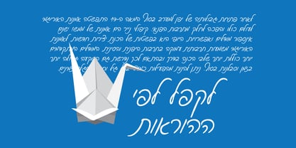
- Ksenia Classi MF by Masterfont,
$59.00 - Sucariot Menta MF by Masterfont,
$59.00 - Shmulik Katz MF by Masterfont,
$59.00 - Rosenberg Serif MF by Masterfont,
$59.00 - Super Block MF by Masterfont,
$59.00 - Baby Shelly MF by Masterfont,
$59.00
- Adva Sagur MF by Masterfont,
$59.00
- Glam Rock MF by Masterfont,
$59.00
- Fried Coteret MF by Masterfont,
$59.00
- DF Staple TXT by Dutchfonts,
$33.00
- Torah Neue MF by Masterfont,
$59.00 - Rosenberg Textile MF by Masterfont,
$59.00
- Herzel Open MF by Masterfont,
$59.00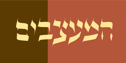
- Bar Yochay MF by Masterfont,
$59.00
- Dov Yam MF by Masterfont,
$59.00
- Start Up MF by Masterfont,
$59.00 - Ben Gurion MF by Masterfont,
$59.00
- Sefel Mashke MF by Masterfont,
$59.00 - Meruba New MF by Masterfont,
$59.00 - Birana Plus MF by Masterfont,
$59.00 - DF Staple Mono by Dutchfonts,
$33.00
- Super Wide MF by Masterfont,
$59.00 - Meteor Condensed MF by Masterfont,
$59.00
- Ron Dror MF by Masterfont,
$59.00 - Shmulik Dorit MF by Masterfont,
$59.00 - Shmulik Diralehaskir MF by Masterfont,
$59.00 - Oron Keshet MF by Masterfont,
$59.00 - Chilli Bezeq MF by Masterfont,
$59.00


