2,623 search results
(0.016 seconds)
- HoTom by Linotype,
$29.99Linotype Ho Tom is part of the Take Type Library, which features winners of Linotype’s International Digital Type Design Contest from 1994 to 1997. Designed by Thomas Hoffman, this font’s historical roots are easily traced to the slab serif style. Ho Tom was originally intended as a lettering system for a project in the center of the old East Berlin. This explains the stable, angular characters and the consistent rectangular base forms, which also makes Ho Tom a very legible font, suitable for longer texts. - Tritura by estudioCrop,
$19.90 Tritura is my personal take on textura fonts. Several methods of drawing were used, both analog and digital, to bring its overall rough feel. Each and every character was designed not from historical references, but from my view on this very peculiar typographic style. Instead of following established rules of character construction, I preferred to just keep in mind the mechanics of the pens used in textura drawings, as well as the little I already knew from the style, to create my own characters from there.
 - Dulcinea Serif by JVB Fonts,
$29.50 The aim of this typeface is to merge two historical moments in the form and style of writing, on the one hand calligraphy uncial, and on the other Roman serif was established as a universal standard for type fonts continuous text at the time. Is intended in terms of their functionality as a font for titles. The family includes some extended range glyphs as several Caps swashes and stylish alternatives for upper and lower case, standard and discretional ligatures, old numerals and other OpenType features.
 - Twentieth Century by Pelavin Fonts,
$20.00 Twentieth Century was designed for the cover of 20th Century French Poetry and was drawn with pure geometric shapes. It is the distillation of a broad variety of styles loosely known as Art Deco but, also categorized under such terms as Moderne, Streamline, Machine Age, Futurist, 70s Art Deco, Memphis among others. If there were a source in particular that I would cite as my inspiration, however, it would definitely be the work of Frank Lloyd Wright. I mean, look at the "W" for cryin' out loud!
 - Marcellus Pro by Stiggy & Sands,
$29.00 Our Marcellus Pro was inspired by classic Roman inscription letterforms. Clarity and beauty are embodied in the standard lowercase, while this historically influenced typeface also nods to the powerful presence of the Trajan titling style with its SmallCaps set. When combined together, Marcellus is a gorgeous flare-serif typeface, rich with presence and usability. Opentype features include: - SmallCaps. - Full set of Inferiors and Superiors for limitless fractions. - Tabular, Proportional, and Oldstyle figure sets (along with SmallCaps versions of the figures). - Stylistic Alternates for Caps to SmallCaps conversion.
 - 6th Aniversario by deFharo,
$21.00 6th Aniversario is a rounded condensed typography, handwritten and elegant, perfect for writing good advertising titles in graphic design of posters, flyers or publications in general where space saving and readability is required. Includes the Bitcoin symbol (ligatures): b# The Commercial version includes: - 492 glyphs. Latin Extended-A • OTF & TTF - OpenType Functions: Fractions, Alternate Annotation Forms, All Alternates, Superscript, Superiors, Slashed Zero, Superior letters, Localized Forms, Numbers Small Caps, Inferiors, Scientific Inferiors, Discretionary Ligatures, Numerators, Standard Ligatures, Subscript, Extended Fractions, Ordinals, Denominators, Oldstyle Figures, Historical Forms.
 - BB Strata (Pro) by Bold Studio,
$49.00 BB Strata™ (Pro) is the first font with only octagon angles (±45°), polyspacing (same width in every weight), optical shape and monoline variants for any type of use. The ideographic system was created for an exhibition in 2015 to visualize the process and results of scientific investigations in a historical and contemporary context. ● 9 Variants (incl. SS19, SS20) ● 37 Opentype-Features/Style ● 60 Stylistic Sets (20/Variant) ● 90 Styles (incl. SS19, SS20) ● 40 OT-Features/Style ● 97 Languages Support ● 31,920 Glyphs (1064/Style)
 - Skinny Joe by Creativemedialab,
$20.00 Inspired by Bell Bottoms pants which are trending through the disco days of the 80s Skinny Joe features a reverse contrast style with a retro and vintage look. That’s simply ideal for summer theme concepts such as posters, book covers, t-shirts, branding, logo, and many more. Consists of 5 weights from thin to bold and a variable format. Skinny Joe also has alternatives for more decorative and unique looks.
 - Aeda Rift by ZP Fonts,
$20.00 Aeda Rift is a high-contrast display typeface characterized by its sharp serifs and graceful contours, mirroring the elegance and hostility of the desert landscape. Consisting of nearly 400 glyphs, this font includes a full upper and lower case Latin-based alphabet, punctuation, symbols, diacritics, and ligatures—all together supporting over 82 languages. Perfect for headlines, pull quotes, and intro decks, Aeda Rift is carefully kerned and primed for creativity.
 - Radial by A New Machine,
$19.00 Radial is a multi-line retro sans-serif font that is reminiscent of fonts from the 70s / disco era. It is all caps, but the lower case glyphs have rounded edges for a subtle difference if you are looking for a softer look. Use open type for some discretionary ligatures of common letter pairs (when set in all caps). Great for use on posters and in headline copy.
 - Harlonia by Meutuwah,
$20.00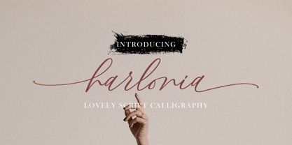 INTRO Harlonia Script, is a modern calligraphy font, with characters dance along the baseline and elegant touch. With almost 375 glyphs. Opentype features with stylistic alternates, ligatures and multiple language support. Can be used for various purposes such as logos, wedding invitation, letterhead, signage,news, t-shirt, heading lable, posters, badges etc. Thank you very much for purchasing and please let me know if you have any questions?
 - Bebedot by Holland Fonts,
$30.00Bebedot originated from doodles and scrabbles in notebooks; irregular forms very well might contain a style for an alphabet. Once used for an intro spread in Wired magazine (#6.04, April 1998): "To keep up you need the right answers. To get ahead you need the right questions". The name was inspired by a women clothing poster at the San Francisco bus stands. The dot is for the com that never came. - Suerte by Resistenza,
$39.00 Say hello to Suerte. This new typeface with inverted contrast and bifurcated serifs was inspired by Caslon’s Italian type and by Aldo Novarese’s Estro, published by the turinese foundry Nebiolo. Our aim was to develop a wood type typeface adding a new personality incorporating Tuscan serifs. The complete alphabet was designed with a flat long brush and Indian ink and then vectorized. Suerte contains a big set of icons and dingbats.
 - HUTagada by Heummdesign,
$15.00 "Disco Pang Pang" is the Korean name for Tagada rides. It is a characteristic typeface that is good to use when you want to make use of a unique and bouncy feeling. Light and Extrabold are made with the thickness of normal typefaces, but Left and Right have strange shapes with stroke thicknesses that are biased to one side. Its unique shape can make a strong impression on people.
 - Caviar Dreams - 100% free

- Mak by Tkachenko design,
$21.00 Mak is a display font with a Ukrainian feeling inspired by Ukrainian music. This is a big update of the first free two styles of Mak (SemiBold High & Black High) that were created in 2019 and become widespread among free display fonts. The big update wasn't been only adding more weights and contrasts but also changing a lot of glyphs and adding new ones. Now Mak supports all Latin-based languages and European Cyrillic. Experiments with historical forms, contrasts, and daring shapes to create a new image of Ukrainian Cyrillic and Latin based on it.
 - Roxale Story by Reyrey Blue Std,
$16.00 Introducing - Roxale Story. a new fresh & modern serif with smooth curves. It comes with elegant style, classy, and contrasts, with features and consist of regular, italic and calligraphy italic. Roxale Story is perfect for luxury logo and branding, classy editorial design, woman magazine, cosmetic brand, fashion promotional, art gallery branding, museum, historical of architectural, boutique branding, stationery design, blog design, modern advertising design, card invitation, art quote, home decor, book/cover title, special events and any more. Features : · All Uppercase and Lowercase · Number & Symbol · Supported Languages · Alternates and Ligatures · PUA Encoded
 - Deco Slaughter by Woodcutter,
$45.00 Deco Slaughter is a unique typeface that blends the elegant Art Deco style with the visceral and broken aesthetic of horror typography. Each letter is meticulously crafted to evoke a sense of intrigue and mystery. The sophisticated and geometric lines of Art Deco intertwine with shattered and bleeding details, creating a striking contrast. This typeface is perfect for projects that aim to break conventions and stand out with a provocative aesthetic. Deco Slaughter captures the essence of classic style with a dark and disturbing twist, providing your designs with a distinctive and memorable character.
 - Space Mode by Justin Penner,
$20.00 Space Mode is a multi-weighted typeface, sent back in time from the distant future. Forward-looking typeface designers often predict a reductive future where Latin letterforms have become increasingly modularized and simplified, or random bits have mysteriously gone missing. Thankfully, this is not the case, and typography has instead flourished and evolved. New forms have appeared, and some revived from historical references. A more complex drawing model has arisen that seems to add new curves in a effort to tame the strange diagonals that appear in the final quarter of the alphabet.
 - Linotype BioPlasm by Linotype,
$29.99Linotype BioPlasm is a display face created by Italian design Mauro Carichini in 2002. It distorts and deletes parts of letters, creating the appearance of a living, typographic organism in pages of text. Lines set in Linotype BioPlasm seems bubble to the surface, and always hints at some sort of unrevealed secret. Although only parts of most letterforms are visible, the high x-heights of Linotype BioPlasm's letters make its text surprisingly legible for such a concept-font. For usage in products ranging from Sonic to Science, Linotype BioPlasm may be the font for you! - YahoschWormy by Ingrimayne Type,
$9.00 Years ago the company that developed Fontographer marketed a program called Font-o-Matic, a program that distorted fonts in various ways. 99% of what it produced was garbage, but every once in a while it would yield something interesting. Since I had designed a lot of typefaces by that time, I had lots of material to feed it and it was fun to see what it produced. YahoschWormy is one of rare results that was interesting enough to save and clean up. The source font was Yahosch.
 - Basile by Tipo,
$85.00 Basile is the conclusion of a process that began with the learning of italic handwriting in a roballos-Naab studio course. In this workshop I developed a variation of chancery handwriting which had a more pronounced wider than its historical model. While making the digitalization, the forms were modified to obtain a similar spirit to the one in the handwriting, but thinking about the text in small sizes. Also incorporating three sets of forms enlarged the family: italic, swash and extra swash. And the addition of initials and terminals sets.
 - Linotype Clascon by Linotype,
$29.99Linotype Clascon is part of the Take Type Library, which features winners of Linotype’s International Digital Type Design Contest. Designed by the British artist Rachel Godfrey, the constructed forms of the capitals are reminiscent of sketches of many famous 16th century artists, Albrecht Dürer and Nicolas Jaugeon among them. This style emphasizes the mathematic construction of the letters, based on the circle, rectangle and triangle, but Clascon’s historical roots lie in Transitional and Modern Face styles. This font is particularly suited to very short texts, headlines and initials. - KolkFizzy by Ingrimayne Type,
$9.95 Years ago the company that developed Fontographer marketed a program called Font-o-Matic, a program that distorted fonts in various ways. 99% of what it produced was garbage, but every once in a while it would yield something interesting. Since I had designed a lot of typefaces by that time, I had lots of material to feed it and it was fun to see what it produced. KolkFizzy is one of rare results that was interesting enough to save and clean up. The source font is Kolkman.
 - MVB Peccadillo by MVB,
$39.00MVB Peccadillo is an interpreted revival of a metal typeface popular in the 19th Century, then known as Skeleton Antique. Highly condensed with extra short descenders, the face makes a big impact in a narrow space. Holly Goldsmith worked from letterpress-printed specimens of 96-point, antique metal type, deliberately retaining subtle distortions due to type wear and letterpress impression. Alan Dague-Greene, referring to printed samples of Skeleton Antique, adapted the design to create two additional optical sizes: “Eight” for smaller text and “Twenty-four” for subheads. - Potus Uncial by Jonahfonts,
$40.00 The Uncial alphabet is a majuscule script with unjoined letters which is found in European manuscripts of the 4th to 8th centuries and from which modern capital letters are derived. Potus Uncial is designed with lowercase letters reflecting the Uncial style while keeping them as close to the original majuscule script Uncials and making it a useful modern day font. I have found it to be appropriate for historic, medical and spatial topics and may be used in packaging designs, medical journals, declarations, greeting cards and prehistoric articles.
 - AlbertBetenbuch by Ingrimayne Type,
$14.95 The inspiration for AlbertBetenbuch came from a typeface drawn by Albert Dürer and an interpretation of that face in Arthur Baker’s Historic Calligraphic Alphabets (Dover, 1980). It is not a recreation of either. The characteristic common to AlbertBetenbuch and the faces inspiring it is the decorative zig-zag with the upper-case letters. In late 2018 the inside of the shadowed style was separated out. It looks very much like the plain face but its spacing matches the shadowed version. It can be layered with the shadowed version to easily create two-colored letters.
 - DR Krapka Square by Dmitry Rastvortsev,
$29.99 In the DR Krapka Square typefamily, the pixel has a square shape. The font supports OpenType features and contains small capitals, ligatures, oldstyle figures, terminal forms, historical forms, stylistic sets. The dingbats, arrows, emoji are also present. For small texts, it is recommended to use DR Krapka Square-FontSize10px in the font size 10 px. DR Krapka Square typefamily supported European languages based on Latin, Cyrillic and Greek scripts. If you want to use fonts with a different shape of pixels, there are also typefaces from DR Krapka family: DR Krapka Round, DR Krapka Rhombus.
 - Libelle by Linotype,
$29.99 Libelle is a 21st century English Copperplate Script typeface. Created by Jovica Veljović, a designer with decades of experience as a calligrapher, typeface designer, and professor, Libelle differentiates itself from other Copperplates Scripts because its letterforms are less mechanical. The hand of the calligrapher shows through the forms, breathing new life into this historic genre. Libelle includes approximately 400 extra glyphs, including alternate forms of many letters and special forms for the beginnings and ends of words. The font includes several stylistic sets, as well as ligatures and ornaments.
 - BaumSquiggle by Ingrimayne Type,
$9.00 Years ago the company that developed Fontographer marketed a program called Font-o-Matic, a program that distorted fonts in various ways. 99% of what it produced was garbage, but every once in a while it would yield something interesting. Since I had designed a lot of typefaces by that time, I had lots of material to feed it and it was fun to see what it produced. BaumSquiggle is one of rare results that was interesting enough to save and clean up. The source font is Baumfuss.
 - Terminax by Monotype,
$29.99Terminax™ is a highly legible monospaced sans serif font with an extensive character set. Unlike other monospaced fonts, Terminax has a personality all its own. Terminax is a futuristic and assertive font which is popular with titles, and headings. Why a Small Caps font you may ask? While most word processing and page layout software offer a small cap feature - this merely distorts the letterforms and creates squashed, uneven results. Terminax features small caps that were designed so their weight matches the upper case letters, providing a clean, attractive appearance. - Heinz by Wiescher Design,
$39.50 Heinz is inspired by the poster design of Heinz Schulz-Neudamm for Fritz Lang’s famous silent movie Metropolis. Heinz Schulz-Neudamm did quite a lot of work for the German branches of big American movie companies like 20th Century Fox or MGM. His most famous work is probably the title lettering for the Metropolis movie. The original drawing for that poster sold in 2005 in London for 398.000 Pound Sterling (approx. US $ 600.000). I designed a completely new font in the feeling of Heinz’s lettering. Enjoy. Yours historically, Gert Wiescher
 - Ongunkan Armanen Runes by Runic World Tamgacı,
$50.00 The Armanen runes (or Armanen Futharkh) are a series of 18 runes, closely based on the historical Younger Futhark, introduced by Austrian mysticist and Germanic revivalist Guido von List in his Das Geheimnis der Runen (English: "The Secret of the Runes"), published as a periodical article in 1906, and as a standalone publication in 1908. The name Armanen runes associates the runes with the postulated Armanen, whom von List saw as ancient Aryan priest-kings. The Armanen runes continue in use today in esotericism and in currents of Germanic neopaganism.
 - Brigette by insigne,
$21.99 This frilly script has been acid dipped, scratched and destroyed for use in grungy design jobs or any other use that calls for a ragged script. Three different degrees of deconstruction are available. The Alternate Two variant is highly distressed, and when rasterised by many programs at smaller point sizes appears almost illegible, but prints just fine. OpenType features include 64 OpenType ligatures that can be used to extend the natural appearance of the lettering oldstye figures and ending swashes. Brigette works great in conjunction with insigne Splats!
 - Journalistic by E-phemera,
$20.00Journalistic is one in a series of fonts designed for use in creating replica vintage newspapers. It is inspired by the nameplate of a New England newspaper from the 1920s. Its rough character is apparent at headline sizes, and it remains nicely legible at smaller sizes for diplomas and other formal documents. The OpenType font contains a variety of discretionary ligatures and contextual alternates, including the long s and other glyphs for classic German typography. Long s substitution can be achieved through either historical or titling alternate OpenType features. - Monasterka by DePlictis Types,
$31.00 Monasterka refers to the preservation of ancient traditions and the right orthodox faith. It is a bold, archaic typeface in two styles especially designed for printing purposes. It is a powerfull, expressive typeface inspired by old cyrillic writing and may do a great job for brochures and publications designs that has to do with religious or historical thematic, mostly as headlines and titles with great impact and personality. This family has an extended language coverage for many languages including latin, cyrillic and greek alphabets and comes in two styles.
 - Aries by FontHaus,
$19.00 In 1995, FontHaus came upon a rare opportunity to create a revival of Aries, a little known and previously unavailable typeface designed by the legendary Eric Gill in 1931. Discovering a lost typeface by one of the major designers of the 20th Century, was the discovery of a buried treasure, and being the first type company to release it in a digital format was an honor. Aries® is now in the fonts catalog of GroupType who owns the the registered trademark and has licensed this historical typeface exclusively to FontHaus as distributor.
 - 1676 Morden Map by GLC,
$42.00 This family was created -- inspired from the engraved typeface (Two styles : Normal & Italic) used in the pack of 52 playing cards who was describing the 52 counties forming a small Atlas of England and Wales and depicting English roads for the first time, published by Sir Robert Morden in 1676. Our OTF and TTF versions are covering Western, Eastern and Central European languages (including Celtic), Baltic and Turkish, containing historical and standard ligatures plus specific Old English abbreviations. The MacTT Classic version is containing the basic standard 256 glyphs including some extra ligatures.
 - Olivita by Plau,
$49.00 Innocent until proven otherwise, Olivita is a heavyweight interpretation of the Typewriter genre. Typewriter fonts have captivated generations of designers and found its way into infinite applications, including Milton Glaser’s classic I heart NY logo. Olivita is a fat-face take on the same idea. There’s a lot to negotiate in making type as bold as possible, with shapes having to contort and distort in order to make a cohesive whole. The x-height is tall yet ascenders and descenders are long. Super size it and see the rich, creamy texture come forward.
 - Aries by GroupType,
$19.00 In 1995, FontHaus came upon a rare opportunity to create a revival of Aries, a little known and previously unavailable typeface designed by the legendary Eric Gill in 1931. Discovering a lost typeface by one of the major designers of the 20th Century, was like the discovery of buried treasure, and being the first type company to release it in a digital format was an honor. Aries® is now in the fonts catalog of GroupType who owns the the registered trademark and has licensed this historical typeface to FontHaus as distributor.
