10,000 search results
(0.025 seconds)
- Spaghetti Joint JNL by Jeff Levine,
$29.00 An image from the Library of Congress showing a New York City Italian Kitchen storefront window and its various neon signs inspired Spaghetti Joint JNL, which is available in both regular and oblique versions. The term “Spaghetti Joint” is old-fashioned slang for any restaurant serving Italian cuisine, especially those featuring spaghetti or other pasta dishes.
 - Open Range by FontMesa,
$20.00 Open Range is a new font design based on an old classics sans serif font from the 1800s. Some may say that this font looks like a western version of the more modern Benguiat but samples of lettering from the 1800s show a similar design to Benguiat and may have been the inspiration for that font.
 - Abelia by Hanoded,
$15.00 Abelia is a rough(ish), cursive, handwritten font. It was made with an almost dried up felt tip pen, so as to create some roughness in the edges. It comes with a generous amount of diacritics. For those who are just dying to know: Abelia is a honeysuckle-like flowering shrub, native to Eastern Asia and Mexico.
 - Midnight Rookie by Hatftype,
$15.00 Midnight Rookie - A Graffiti Display Font is a free style font that has the characteristics of street art that shows freedom and is filled with unique characters. Features : • Character Set A-Z • Numerals & Punctuations (OpenType Standard) • Accents (Multilingual characters) • Ligature • Alternate. There it is. I really hope you enjoy it. Comments & likes are always welcome and accepted.
 - Snowember by Abo Daniel,
$18.00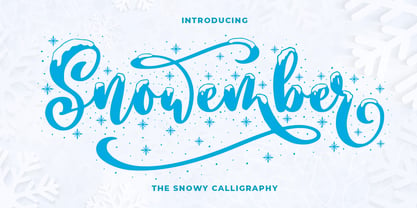 SNOWEMBER is a carefully stunning modern calligraphy with snowy effect. It is great for titling, headline, logo, t-shirt designs, mugs, tote bag designs, cards, banners, social media, and anything of craft projects. Features: - Uppercase - Lowercase - Numeral - Punctuation - Alternates - Multilingual - PUA encoded This font is very worthy to add to your collection regards, Abo Daniel Studio
 - Fauna by Del Alma,
$14.99 Fauna is the set of cute animals you were looking for! We know these animals will give their best in order to give a lovely touch to your work. With a total of 108 characters; the font family is divided into two styles of 54 each: Fauna Blanca and Fauna Negra. Choose one of them... or better, choose both!
 - Kharon Ultra NF by Nick's Fonts,
$10.00A fine, fat Deco face named Ludlow Stygian provided the basis for this delightful typeface. Although generally formal in character, the font shows a hint of playfulness in the distinctive “humpback” h and n characters. This font contains the complete Latin language character set (Unicode 1252) plus support for Central European (Unicode 1250) languages as well. - Arts Glory by Hatftype,
$15.00 Arts Glory - Graffiti Font is a free style font that has the characteristics of street art that shows freedom and is filled with unique characters. Product Include : Arts Glory (OTF,TTF Format) Arts Gloryt Webfont (WOFFFormat) Features : • Character Set A-Z • Numerals & Punctuations (OpenType Standard) • Accents (Multilingual characters) • Ligature • Alternate There it is. I really hope you enjoy it.
 - Uncertainty by Okaycat,
$25.50 Uncertainty 2010 Edition is an intensely textured typeface carefully rendered by hand. This font is faded with a chalk-like texture. Please be aware that working with this highly detailed font may slow some graphics software as it requires more memory. Uncertainty is extended, containing West European diacritics and ligatures, making it suitable for multilingual environments and publications.
 - Eckhardt Inline JNL by Jeff Levine,
$29.00Jeff Levine's Eckhardt Inline JNL furthers a "mini series" of fonts and lettering styles popularized by sign painters and show card writers. Named in honor of the late Albert Eckhart, Jr. (owner of Allied Signs in Miami, Florida until his passing), this inline sans serif more closely resembles hand lettering than "perfectly designed" display type. Limited character set. - Master by Jure Kožuh,
$29.00 Master of the World was included on the front page of a novel in several parts, The Count of Monte Christo (mid 20th century). Typeface characters show design guidelines of the pre-war era (2nd world war). The idea of development origins from a wish to evolve traditional forms of typefaces which were used in Slovenia.
 - Dubuffet by SAMUEL DESIGN,
$19.00 The name of this font is Dubuffet, named after a famous artist. The font style is distinct and unforgettable at the same time, showing a simple temperament. The extra thick strokes bring readers a warmer visual experience. The overall shape is artistic and literary. The serif uses a sharp shape that adds a youthful, modern vibe.
 - Cookie Kit by Bogstav,
$12.00 Cookie Kit is just like that easy recipe for that delicious cake that you probably know - easy to make and it tastes absolutely fabulous - Cookie Kit has the same effect with designs: It's easy to make cool effects with the 4 layers. Play around with your favourite colors and you get great results at the go!
 - McCadden JNL by Jeff Levine,
$29.00 McCadden JNL was inspired by the hand-lettered credits for the George Burns and Gracie Allen Show [1950-1958]. Its casual theme offers a lighthearted approach to titling and display work. The font gets its name from McCadden Productions (the company started by George Burns), which itself was named after a street Burns' brother William once lived on.
 - Top Forty by Jeff Levine,
$29.00 A 1963 issue of Billboard Magazine contained an ad for Jimmy Smith (along with some other artists on the same record label) that was hand-lettered in a free-form style similar to show-card ‘one-stroke’ typographic design. This was the inspiration for Top Forty JNL, which is available in both regular and oblique versions.
 - Miluero by Luxfont,
$18.00 Introducing the stylized Miluero family. Graceful cut, rounded corners combined with austere shapes. Accent fonts with color padding and a classic basic monochrome version in the set. Perfect for logos, headlines and captions. Looks elegant in a minimalist modern design. An assortment of colors will help you get started quickly. This font family is based on the Regular font Pacardo - which means that if necessary you can combine these two families and they will be absolutely stylistically identical and complement each other. Check the quality before purchasing and try the FREE DEMO version of the font to make sure your software supports color fonts. P.s. Have suggestions for color combinations? Write me an email with the subject "Miluero Color" on: ld.luxfont@gmail.com Features: - Free Demo font to check it works. - Uppercase and lowercase the same size but different forms. - Color in letters. - Kerning. IMPORTANT: - Multicolor version of this font will show up only in apps that are compatible with color fonts, like Adobe Photoshop CC 2017.0.1 and above, Illustrator CC 2018. Learn more about color fonts & their support in third-party apps on www.colorfonts.wtf -Don't worry about what you can't see the preview of the font in the tab "Individual Styles" - all fonts are working and have passed technical inspection, but not displayed, they just because the website MyFonts is not yet able to show a preview of colored fonts. Then if you have software with support colored fonts - you can be sure that after installing fonts into the system you will be able to use them like every other classic font. Question/answer: How to install a font? The procedure for installing the font in the system has not changed. Install the font as you would install the classic fonts. How can I change the font color to my color? · Adobe Illustrator: Convert text to outline and easily change color to your taste as if you were repainting a simple vector shape. · Adobe Photoshop: You can easily repaint text layer with Layer effects and color overlay. ld.luxfont@gmail.com
 - Caroni by Franzi draws,
$- Caroni is a cute handmade typeface, which was originally created in 2018 as a free font. It has a simple and clean look, and works great for longer texts. Caroni has already been used in numerous children's books, so now it was time to extend Caroni's look, and add more styles. The Caroni Family at a glance If you like Caroni, you will love the Caroni font family! Caroni now comes in bold and italic, and it has nine awesome siblings: Avenue (all dressed up with stylish serif strokes) Lime (the skinny version of Caroni) Avenue Lime (the skinny version of Caroni Avenue) Tabanca (dark and heavy, this is Caroni's brush version) Doubles (enhanced with fine lines) Fete (with fun little dots) Coconut (Caroni's outline style) Soursop (Outline with dots, a great display font) Carnival (a quirky and fun all-caps version) Caroni was created while staying with a friend in Trinidad, hence the names :) Languages supported: Afrikaans, Albanian, Asu, Basque, Bemba, Bena, Bosnian, Catalan, Cebuano, Chiga, Colognian, Cornish, Corsican, Croatian, Czech, Danish, Dutch, English, Estonian, Faroese, Filipino, Finnish, French, Friulian, Galician, Ganda, German, Gusii, Hungarian, Icelandic, Ido, Inari Sami, Indonesian, Interlingua, Irish, Italian, Javanese, Jju, Jola-Fonyi, Kabuverdianu, Kalenjin, Kinyarwanda, Kurdish, Latvian, Lithuanian, Lojban, Low German, Lower Sorbian, Luo, Luxembourgish, Luyia, Machame, Makhuwa-Meetto, Makonde, Malagasy, Malay, Maltese, Manx, Maori, Morisyen, North Ndebele, Northern Sami, Northern Sotho, Norwegian Bokmål, Norwegian Nynorsk, Nyanja, Nyankole, Occitan, Oromo, Polish, Portuguese, Romanian, Romansh, Rombo, Rundi, Rwa, Samburu, Sango, Sangu, Sardinian, Scottish Gaelic, Sena, Shambala, Shona, Slovak, Slovenian, Soga, Somali, South Ndebele, Southern Sotho, Spanish, Swahili, Swati, Swedish, Swiss German, Taita, Taroko, Teso, Tsonga, Tswana, Turkish, Turkmen, Upper Sorbian, Vunjo, Walloon, Welsh, Western Frisian, Wolof, Xhosa, Zulu
 - Paralucent Slab by Device,
$39.00 Paralucent Slab is an addition to the ever-popular Paralucent family. Paralucent is versatile all-purpose modern sans and slab serif design. Available in seven weights, from Thin to Heavy, with corresponding italics, it avoids some of the more eccentric calligraphic quirks of Akzidenz or Helvetica or the cool precision of Univers for an elegant, functional, yet warm design. Several core ideas inform Paralucent’s design. Prime attention has given to the negative space between characters, giving a more even “colour”, especially in text. For example, the J, L and T have shorter arms than comparable sans typefaces, while the M and W are wider. The A has a lower bar, opening up the interior counter. An unusually high lower-case x-height again helps to give a more even colour and improve legibility. Care has been taken to rationalise repeated elements like the tails on lower-case letters, or the Q and the “ear” of the g. Typographic design solutions that are consistent across all these features add more stylistic cohesion. ‘Ink traps’ are exaggerated incisions used to open up a letter's narrower internal angles, which can become clogged with ink, especially in small point sizes. Now largely redundant due to the high quality of modern print, they are still sometimes used as a stylistic quirk or design feature. Now that digital fonts are often reversed or outlined, or enlarged to enormous sizes, these can also lead to unexpected or obtrusive results. Paralucent takes these inevitable digital manipulations into account, and adds optical corrections without resort to ink traps. The family has been picked up by many UK and US publishers, featuring heavily in magazines like Loaded, Heat and TV Quick, as well as high-end coffee-table photography books and gallery websites. The addition of the Slab family adds even more options for running text and headline.
 - Autoradiographic by Typodermic,
$11.95 Ahoy there, folks! Have we got a typeface for you! It’s called Autoradiographic, and it’s inspired by those trusty old warning signs from back in the day. You know the ones…“Inflammable! Stay away!” And boy oh boy, does it have personality! Back in the post-WWII era, low waistlines were all the rage—but let me tell you, strict waistline alignment was not. No, sir! That’s where Autoradiographic comes in. It’s informational, sure, but it’s also neat as a pin and chock full of personality. And listen to this—Autoradiographic has everything you need to crunch those numbers like a pro. Mathematical symbols? Check. Fractions? Check. Currency symbols? Check, check, and check. And for those times when you really want to make an impact, Autoradiographic’s italics are narrow and loosely spaced. Now that’s what I call a typeface with some serious sass! So what are you waiting for? Grab a copy of Autoradiographic today—it comes in five weights and italics, so you’re sure to find just the right fit for your project. Don’t miss out on the chance to add some mid-century flair to your work—you won’t regret it! Most Latin-based European, and some Cyrillic-based writing systems are supported, including the following languages. A Afaan Oromo, Afar, Afrikaans, Albanian, Alsatian, Aromanian, Aymara, Bashkir (Latin), Basque, Belarusian (Latin), Bemba, Bikol, Bosnian, Breton, Bulgarian, Cape Verdean, Creole, Catalan, Cebuano, Chamorro, Chavacano, Chichewa, Crimean Tatar (Latin), Croatian, Czech, Danish, Dawan, Dholuo, Dutch, English, Estonian, Faroese, Fijian, Filipino, Finnish, French, Frisian, Friulian, Gagauz (Latin), Galician, Ganda, Genoese, German, Greenlandic, Guadeloupean Creole, Haitian Creole, Hawaiian, Hiligaynon, Hungarian, Icelandic, Ilocano, Indonesian, Irish, Italian, Jamaican, Kaqchikel, Karakalpak (Latin), Kashubian, Kikongo, Kinyarwanda, Kirundi, Komi-Permyak, Kurdish (Latin), Latvian, Lithuanian, Lombard, Low Saxon, Luxembourgish, Maasai, Macedonian, Makhuwa, Malay, Maltese, Māori, Moldovan, Montenegrin, Ndebele, Neapolitan, Norwegian, Novial, Occitan, Ossetian, Ossetian (Latin), Papiamento, Piedmontese, Polish, Portuguese, Quechua, Rarotongan, Romanian, Romansh, Russian, Sami, Sango, Saramaccan, Sardinian, Scottish Gaelic, Serbian, Serbian (Latin), Shona, Sicilian, Silesian, Slovak, Slovenian, Somali, Sorbian, Sotho, Spanish, Swahili, Swazi, Swedish, Tagalog, Tahitian, Tetum, Tongan, Tshiluba, Tsonga, Tswana, Tumbuka, Turkish, Turkmen (Latin), Tuvaluan, Uzbek (Latin), Venetian, Vepsian, Võro, Walloon, Waray-Waray, Wayuu, Welsh, Wolof, Xhosa, Yapese, Zapotec Zulu and Zuni.
 - Portada by TypeTogether,
$35.00 For everyone wishing for a modern serif that’s as clear and readable as a sans in restrictive digital environments, meet Portada by Veronika Burian and José Scaglione. Sans serifs are commonly used on small screens to save space and carry a modern tone. Serifs may appear fickle and unsteady, pixel grids change from one product to another, and space is at a premium. Portada now provides a serif option for these restrictive digital environments, putting that old trope to rest. The screen has met its serif match. Portada was created from and for the digital world — from e-ink or harsh grids to Retina capability — making it one of the few serifs of its kind. Portada’s text and titling styles were engineered for superlative performance, making great use of sturdy serifs, wide proportions, ample x-height, clear interior negative space, and its subservient personality. After all, words always take priority in text. It’s not all business, though. Portada’s italics contain an artefact of calligraphy in which the directionality of the instrokes and the returning curves of the outstrokes give the family a little unexpected brio. Yet even the terminals are stopped short of flourished self-absorption to retain their digital clarity. When printed these details are downright comforting. Portada’s titling styles enact slight changes while reducing the individual width of each character and keeping the internal space clear. Titling italics have increased expressiveness across a few characters rather than maxing out the personality in each individual glyph. Digital magazines, newspapers, your favourite novel, and all forms of continuous screen reading benefit from Portada’s features. This family can also cover many of the needs developers have: user interface, showing data intensive apps on screen, even one-word directives and dialogs. And, as a free download, an exhaustive set of dark and light icons is included to maintain Portada’s consistent presence, whether as a word or an image. The complete Portada family (eight text styles, ten titling styles, and one icon set) is designed for extensive, clear screen use — a rare serif on equal footing with a sans.
 - Oktah Neue by Groteskly Yours,
$25.00 Oktah Neue is an extended version of a more limited Oktah family. Since its release in 2019, Oktah Neue received two major updates, the most recent in June 2022. The latest version of Oktah Neue is comes in 22 styles as well as one variable font. Oktah Neue inherits the best traits of Oktah—great legibility, simple geometric letters shapes, low contrast across all styles—but also introduces what Oktah fell short of: extensive language support and enhanced OpenType features. While working on Oktah Neue, we strove to create a neutral typeface that would be a workhorse for designers, typographers and other font users alike. Building onto the familiar shapes of Oktah, we tried to make them more neutral, at the same time preserving the unique character of the typeface. Certain characters remained the same, others have undergone a complete transformation, which left them better tailored for the wide implementation range of Oktah Neue. Over the past years the size of the character set in Oktah Neue was significantly expanded (currently standing at 2500+ characters). In addition to Extended Latin, new language systems (Extended Cyrillic, Greek — both Basic and Polytonic — and Hebrew) were introduced. The already vast Cyrillic set also includes localised forms for such languages as Bulgarian, Serbian and many others. Oktah Neue is OpenType friendly: it knows how to do alternatives, contextual alternatives, switch various between stylistic sets and adjust the height of punctuation and symbols as you type. Small Caps include all listed languages as well as numerals and symbols. Oktah Neue comes equipped with various styles of numerals — from standard Proportional Lining figures to Oldstyle, Tabular Oldstyle. Sub- and Superscript, Fractions and two sets of circled numbers. Oktah Neue is well-kerned with more than 3000 kerning pairs and automatically hinted. Oktah Neue comes in 22 styles (11 uprights and 11 italics), two of which — Ultra Light and Black Italic — can be downloaded free of charge to get a firsthand experience of what Oktah Neue is ready to offer. The latest update of Oktah Neue introduced a fully variable option: now, both axes (Slant and Weight) can be accessed in the same file for utmost convenience.
 - Parks Department JNL by Jeff Levine,
$29.00 A WPA (Works Progress Administration) sponsored Water Carnival taking place in Central Park in the 1930s had "Department of Parks, City of New York" in the thin Art Deco hand lettering which is now available as Parks Department JNL.
 - Esta Pro by DSType,
$26.00The multi award winning ESTA is back, renewed and improved in OpenType format. Now named Esta Pro, is available in Regular, Italic, Bold, Bold Italic, Display and Swashes. Includes plenty of features, like SmallCaps, Alternates, Ligatures and CE characters. - Random Phrase by Bogstav,
$18.00 Every now and then you can use a good phrase, and luckily there's a lot to choose from. This font also have a lot to choose from, because I've added 7 different (and hastily written) versions of each letter.
 - Nouveau Heading JNL by Jeff Levine,
$29.00 Some pleasant Art Nouveau spurred serif hand lettering was found on the cover of a 1902 issue of “The Century Magazine”. This is now the digital typeface Nouveau Heading JNL, and is available in both regular and oblique versions.
 - Just Great JNL by Jeff Levine,
$29.00 A 1940s British music collection of classical music piano pieces entitled "The Great Masters Series" had its title hand-lettered in a free form, casual sans serif with a cartoon style. This is now available as Just Great JNL.
 - Nouveau Stencil Ornate JNL by Jeff Levine,
$29.00 A 1902 publication entitled "Lettering for Schools & Colleges" had an example of an ornate, hand drawn stencil alphabet in the Art Nouveau style. This is now available digitally as Nouveau Stencil Ornate JNL, in both regular and oblique versions.
 - Lawbreaker JNL by Jeff Levine,
$29.00 The December, 1935 movie poster for James Cagney in “Public Enemy” has its title hand lettered in a bold, squared, slab serif type style. Now digitally recreated as Lawbreaker JNL, it is available in both regular and oblique versions.
 - Sign Expert JNL by Jeff Levine,
$29.00 An elegant, yet informal Roman alphabet with Art Nouveau influences was found amidst the pages of the 1922 edition of “The Expert Sign Painter”. It is now available digitally as Sign Expert JNL in both regular and oblique versions.
 - Neue Aachen by ITC,
$40.99 Impressed by the quality of the Aachen typeface that was originally designed for Letraset in 1969 and extended to include Aachen Medium in 1977, Jim Wasco of Monotype Imaging has extended this robust display design to create an entire family. Derived from the serif-accented Egyptienne fonts dating to the early 20th century, Aachen has serifs that are very solid but considerably shorter than those of its precursor. The incorporated geometrical elements, such as right angles and straight lines, provide the slender letters of Aachen with a slightly technological, stencil-like quality. Despite this, the effect of Aachen is by no means static; its dynamism means that this typeface, originally designed for use in headlines, has come to be used with particular frequency in sport- and fitness-related contexts. Jim Wasco, for many years a type designer at Monotype Imaging, recognized the potential of Aachen and decided to extend the typeface to create an entire typeface family. He appropriated the existing Aachen Bold in unchanged form and first created the less heavy cuts, Thin and Regular. Wasco admits that he found designing the forms for Thin a particular challenge. It took him several attempts before he was able to achieve consistency within the glyphs for Thin and, at the same time, retain sufficient affinity with the original Aachen Bold. But he finally managed to adapt the short serifs and the condensed and slightly geometrical quality of the letters to the needs of Thin. The weights Light, Book, Medium and Semibold were generated by means of interpolation. Supplemented by Extralight and Extrabold, the new Neue Aachen can now boast a total of nine different weights. Wasco initially relied on his predilection for genuine cursives in his designs for the Italic cuts. But it became apparent with these first trial runs that the soft curves of cursives did not suit Aachen and led to the loss of too much of its original character. Wasco thus decided to compromise by using both inclined and cursive letters. Neue Aachen Italic is somewhat narrower than its upright counterparts; the lower case 'a' has a closed form while the 'f' has been given a descender, but the letters have otherwise not been given additional adornments. The range of glyphs available for Neue Aachen has been significantly extended, so that the typeface can now be used to set texts not only in Western but also Central European languages. Wasco has also added a double-counter lowercase 'g' while relying on the availability of alternative letters in the format sets for the enhancement of the legibility of Neue Aachen when used to set texts. The seven new weights and completely new Italic variants have enormously increased the potential applications of Aachen and the range of creative options for the designer. While the Bold weights have proved their worth as display fonts, the new Book and Regular cuts are ideal for setting text. And the subtlety of Ultra Light will provide your projects with a quite unique flair. The new possibilities and opportunities in terms of design and applications that Neue Aachen offers you are not restricted to print production; you can also create internet pages thanks to its availability as a web font.
 - Behavior Indihome by Aldedesign,
$15.00 Behavior Indihome is a font with awesome and classy taste, it has a natural touch and many ligatures. We feel this font looks classy, readable, elegant, stylish, catchy and absolutely easy to use. Behavior Indihome is the great choice for a watermark on branding, design, wedding, photography, signature, logo design, album cover, business card, quotes, and many other design projects. This font is for those who want to show something smooth and modern. You may use this font if you want to attract modern buyers. The font design seems to show that you have a passion in the business and give your love to the products and services offered to your customers. Because it is an eye-catching signature font, you can use it for a variety of purposes including wedding invitations, signature, logo, branding, poster, and many more.
 - Black Dope by Colllab Studio,
$19.00 "Hi there, thank you for passing by. Colllab Studio is here. We crafted best collection of typefaces in a variety of styles to keep you covered for any project that comes your way! Introducing Black Dope is a bold brush font, it has a strong character. Inspired by the bold lettering found in classic show-cards and advertisements, it will add character to any design. This font is a blast from the past and a step into future. It’s bold, it has a strong character and it is full of life. Works perfectly in small size and large size. Eye-catching details show the temperament of the font. especially if you need to put a unique and strong character designed for your posters, headlines, T-shirt designs, labels, signage nameplates, brands etc. A Million Thanks www.colllabstudio.com
 - Latter Slant by Aldedesign,
$15.00 Latter Slant is a font with awesome and classy taste, comes with natural touch, and many ligatures. We hope this font looks classy, readable, elegant, stylish, catchy and absolutely easy to use. Latter Slant is the great choice for watermark on branding, design, wedding, photography, signature, logo design, album cover, business card, quotes, and many other design project. This font is for those who want to show something smooth and modern. You may use this font if you want to attract modern buyers. The font design seems to show that you have a passion in the business and give your love to the products and services you are offered to customers. Because it is an eye-catching signature font, you can use it for a variety of purposes including wedding invitation, signature, logo, branding, poster, and many more.
 - Shirah 25 by LightHouse,
$49.00Shirah 25 started as a freehand study, while experimenting with ink and new nibs. Later on, when David decided to have a digital version, he drew it merely with the tablet, trying to keep the spirit of the ink and the nib. Shirah 25 is an OpenType/TTF Unicode font. - Noma by Spinturnix,
$15.00 Noma is a new wide-set display font with a minimal geometric style. I designed Noma because I wanted a tech-inspired font that has plenty of character while remaining legible. Noma is a great choice for high-impact headings and logotypes. I hope you enjoy, thanks for checking it out!
 - Finition by Mans Greback,
$59.00 Finition is a calligraphic brush script. Created by Måns Grebäck, this typeface is perfect to create a youthful logo. With its hundreds of glyphs it supports a wide range of languages. Use underscore to make an underline. Example: Fin_ition With ligatures activated, write multiple underscores for a longer line. Example: Aut___omatic
 - ZT Grafton by Zeune Type Foundry,
$30.00 ZT Grafton is a neo-grotesque typeface based on geometric shapes with contemporary, friendly, and strong emotion. ZT Grafton was built from scratch to be calm, smooth, and clean, while subtle humanist influences add warmth to this typeface. It's available in 8 weights and includes the exciting variable font format.
 - Niguella by Portograph Studio,
$20.00 Niguella is a serif while elegance still maintained. It will boost your design stand out! Niguella is the perfect typeface for any kind of your project, such as advertisements, branding, graphic design, quotes, wedding design, logo for online or offline business, photography, and others. Make your business more elegant beautiful!
 - Omoshiroi by TEKNIKE,
$55.00 Omoshiroi is a display monospace handwriting font. The typeface is a distinct hand drawn font using a marker pen. The Omoshiroi name is derived from the Japanese word omoshiroi (おもしろい) meaning "interesting" or "amusing". Omoshiroi is great for display work, invitations, writing, architecture, posters, labels and headings.
 - Autopilot by Juncreative,
$19.00 Autopilot is an elegant and flowing handwritten font. It is PUA encoded which means you can access all of the glyphs and swashes with ease! It maintains its classy calligraphic influences while feeling contemporary and fresh. Fall in love with this font and bring your projects to the highest levels!