3,579 search results
(0.028 seconds)
- At Tupats by Arttype7,
$12.00 At Tupats is inspired by the name of a common food from Indonesia during Eid: ketupatfood. This font is in the Arabic style but for writing latin characters and words. The ligatures, stylistic sets, and contextual features of this font will make your writing similar to Arabic calligraphy. It is very suitable for writing in a Middle Eastern style and for use in restaurants, magazines, souvenirs, web, and many Ramadhan-themed projects.
 - Cosmata by MauldinType,
$15.00 Cosmata is geometric sans serif family of 10 fonts suitable for both display and reading use. Inspired by Futura, Cosmata developed its own complex, unique life. To that end, I've included alternate letterforms for a finely-tailored typographic experience. The rhythm, kerning, and spacing have been lovingly crafted for an elegant reading experience. I'm excited to share this release with you and hope you enjoy using it as much as I did creating it.
 - Bostary Brush by Stripes Studio,
$20.00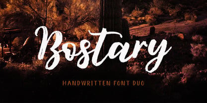 Hi, Introducing the latest styles Bostary Brush with the kind of modern hand scratches, I hope you are interested in this font, if you want to use for your work this font can be used easily and simply because there are a lot of features in it to contain a complete set of letters lower and uppercase letters, assorted punctuation, numbers, and multilingual support. font also contains several ligatures and alternate style Stylistic.
 - Caliente by Imprimatvr,
$28.00 This font is shaped to exhibit a very compact and characterized design, clearly distinguishable from the mainstream condensed sans-serif fonts. That is why Caliente has a conspicuous modulation and a medium-to-high contrast. Both features are seldom observed among ordinary fonts of its kind. However, Caliente is designed to suit perfectly well in a number of applications—from advertising to business letters—while accurately preserving its strong personality even in very small sizes.
 - Kelysia Brush by Stripes Studio,
$20.00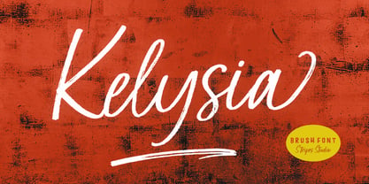 Hi, Introducing the latest styles Kelysia Brush with the kind of modern hand scratches, I hope you are interested in this font, if you want to use for your work this font can be used easily and simply because there are a lot of features in it to contain a complete set of letters lower and uppercase letters, assorted punctuation, numbers, and multilingual support. font also contains several ligatures and alternate style Stylistic.
 - Molynia Script by Stripes Studio,
$20.00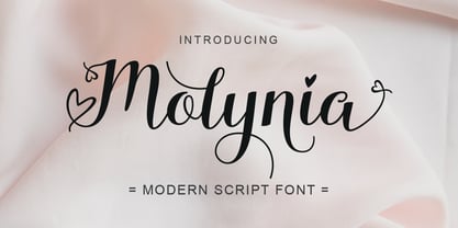 Hi, Introducing the latest styles Molynia Script with the kind of modern hand scratches, I hope you are interested in this font, if you want to use for your work this font can be used easily and simply because there are a lot of features in it to contain a complete set of letters lower and uppercase letters, assorted punctuation, numbers, and multilingual support. font also contains several ligatures and alternate style Stylistic.
 - Prana Pro by URW Type Foundry,
$49.99 Prana Pro is a modern, young and fresh slab serif created by Christoph Ulherr during his studies with Prof. Gertrud Nolte at the faculty of design of the Hochschule Würzburg under the direction of Volker Schnebel, URW's type director. Prana Pro is an excellent headline and display font while, at the same time, very well readable at small sizes. It can be used for any kind of publication including posters and book covers.
 - Floreal by Reyrey Blue Std,
$16.00 Floreal is an elegant, modern and classy serif font with fashionable touch. That includes two styles : regular and true Italic. This font includes alternates and ligatures, with them you can make your project more elegant and unique. Floreal is perfect for corporate identities, websites, publications, titles, books, magazines, business cards, logos, product labels, packaging, or any kind of advertising purpose. Features : · All Uppercase and Lowercase · Number & Symbol · Supported Languages · Alternates and Ligatures
 - Pivnaya-Hebrew by Roman Type,
$35.00 This is the Latin+Hebrew version of poster/display font Pivnaya designed and published by Roman Type. It works for Afrikaans, Arabic, Albanian, Catalan, Croatian, Czech, Danish, Dutch, English, Estonian, Farsi, Finnish, French, German, Hebrew, Hungarian, Icelandic, Italian, Latvian, Lithuanian, Maltese, Norwegian, Polish, Portugese, Romanian, Slovak, Slovenian, Spanisch, Swedish, Turkish, Urdu, Vietnamese, Zulu. Equipped with wider coverage of the International Phonetic Alphabet (IPA), Pivnaya-Hebrew is fit for all kinds of purposes.
 - Cloud Dancer by Reyrey Blue Std,
$16.00 Say Hi to Cloud Dancer. It is bold and high-contrast display serif typeface with delightful nostalgic feeling. Cloud Dancer contain several stylistic alternates that can make it unique and different. This typeface is perfect for corporate identities, websites, publications, titles, books, magazines, business cards, logos, product labels, packaging, or any kind of advertising purpose. Features : · All Uppercase and Lowercase · Number & Symbol · Supported Languages · Alternates and Ligatures · PUA Encoded Hope you enjoy with our font!
 - Jenriv by Linh Nguyen,
$25.00 Inspired by designs of the early Renaissance, Jenriv brings out a sedate atmosphere and generous inner spaces. Starting with the idea of mixing straightforward strokes and curves, it results in kind masculine figures, but calm and humble. It reminds some archaic air but a simplified one. Jenriv embraces text flows, multiple languages, and various styles with standard OpenType features. It is well adapted to various applications, from medium body text to large headlines, or logotypes.
 - Attica by Resistenza,
$39.00 Attica is a slab typeface with inverted contrast that was inspired by Caslon’s Italian type and by Aldo Novarese’s Estro, published by the turinese foundry Nebiolo. We wanted to develop a wood type typeface and we designed the complete alphabet with a flat long brush and slowly we did the whole character set. Attica contains a big set of icons and dingbats. Enjoy it. More About Opentype Features: https://bit.ly/opentype-rsz
 - Godysun by Twinletter,
$15.00 Godysun Arabic style font. Create the perfect Arabic and Islamic decorative design with this collection of exclusive value examples. With this stylish font, you can create all kinds of themes, from elegant to modern, and get the same result as shown. To get a variety of styles into your projects, they come in both upper and lower case, as well as several Alternates. You will be able to easily create quality designs.
 - Los Muertos by Just My Type,
$25.00 Happy Halloween (and All Souls Day and Day of the Dead)! I’ve seen other fonts made up of bones of various kinds, but none with this variety. Henry Gray’s Anatomy of the Human Body (the book, not Grey’s Anatomy, the TV series) was heavily scoured to find more unusual bones shaped like letters. You’ll find Los Muertos both fun and appropriate for the up-coming holidays. (Uppercase is Solid, lowercase is Outline).
 - Octo by Gunjan,
$32.00 Octo is square bold/display font with italics. Letterform is bit quirky and square shaped, it can fill all kind of spaces. Octo has nice form that relate to industrial, machines and italics helps denoting speed. Octo is good for branding in fields of sports, automobile. It has full glyph set of numerals and signs. Octo is an excellent choice for headline-typesetting and logo design. Octo is developed by Gunjan Panchal based in India.
 - Bortane Brush by Stripes Studio,
$20.00 Hi, Introducing the latest styles Bortane Brush with the kind of modern hand scratches, I hope you are interested in this font, if you want to use for your work this font can be used easily and simply because there are a lot of features in it to contain a complete set of letters lower and uppercase letters, assorted punctuation, numbers, and multilingual support. font also contains several ligatures and alternate style Stylistic.
 - Oblik by Tour De Force,
$25.00 Like Refused said in their song ”The Shape of new Punk to come”, Oblik could be “The Shape of new Fonts to come”, we present you our uprising star - Oblik - that could shine in your monitors. Modern family, stylish and secure, with its own personality (it’s photogenic, too), available for all kind of use, even you're an doctor or policeman or butcher or truck driver or maybe rock star, this font will rock your world.
 - Chelson Brush by Stripes Studio,
$20.00 Hi, Introducing the latest styles Chelson Brush with the kind of modern hand scratches, I hope you are interested in this font, if you want to use for your work this font can be used easily and simply because there are a lot of features in it to contain a complete set of letters lower and uppercase letters, assorted punctuation, numbers, and multilingual support. font also contains several ligatures and alternate style Stylistic.
 - Hungry Beast by Bombastype,
$35.00 Hungry Beast is a Victorian theme font. With another old fashioned feel on it, because we were very passionate with that kind of typeface style. This typeface will be suitable for a lot of display purposes like you can see in our previews for the work samples. And don't forget about the Layer system, because who hates layers typeface? We also give you the ornaments for FREE. So let's try this Beast asap.
 - Hello Yasmin by Stripes Studio,
$20.00 Hi, Introducing the latest styles Hello Yasmin with the kind of modern hand scratches, I hope you are interested in this font, if you want to use for your work this font can be used easily and simply because there are a lot of features in it to contain a complete set of letters lower and uppercase letters, assorted punctuation, numbers, and multilingual support. font also contains several ligatures and alternate style Stylistic.
 - Galgo Script by Sudtipos,
$59.00 The Galgo is a Spanish Greyhound, an ancient hybrid breed of dog. Just like the Galgo, the letters of this font are a mix of elegant brush calligraphy and the rough, weathered strokes of speedy scrawl. Galgo Script is quite suitable for logomarks, titles, single sentences or paragraph-length artistic writing passages. Drawn by Angel Koziupa and digitized by Alejandro Paul, Galgo Script was made because of popular demand for this kind of "rush brush".
 - Gromlaith Classic by Sipanji21,
$16.00 This blackletter font is inspired by the classical Gaelic script that was used from the 16th until mid 18th Century. Featured with beautiful lines and bold accents, this font is good for decorative type settings such as headlines, traditional newspapers, pub signs, greetings cards, and advertising purposes. You can even use this typeface for your unique logotype. With your amazing creative idea, you can use this font to make it even more outstanding and cool!
 - Love Style by Stripes Studio,
$20.00 Hi, Introducing the latest styles Love Style with the kind of modern hand scratches, I hope you are interested in this font, if you want to use for your work this font can be used easily and simply because there are a lot of features in it to contain a complete set of letters lower and uppercase letters, assorted punctuation, numbers, and multilingual support. font also contains several ligatures and alternate style Stylistic.
 - Beach Rock by Stripes Studio,
$20.00 Hi, Introducing the latest styles Beach Rock with the kind of modern hand scratches, I hope you are interested in this font, if you want to use for your work this font can be used easily and simply because there are a lot of features in it to contain a complete set of letters lower and uppercase letters, assorted punctuation, numbers, and multilingual support. font also contains several ligatures and alternate style Stylistic.
 - Jingo by Canada Type,
$39.95 This is the digital makeover and major expansion of a one-of-a-kind melting pot experiment done by VGC and released under the name Mardi Gras in the early 1960s. It is an unexpected jambalaya of Art Nouveau, Tuscan, wedge serifs, curlycues, ball endings, wood type spurs and swashes, geometry and ornamental elements that on the surface seem to be completely unrelated. But the totality works in a surprisingly loud and playful way that really defies categorization. Jingo is really five fonts in one: Over 1000 glyphs, four character sets, ornaments, swashes and ligatures. The forms are interchangeable in uppercase, lowercase and unicase settings. There is nothing low-key about this typeface. It is well suited for use on posters and book covers that require happy weirdness. But most of all it's great for those who like to fiddle with their type setting until amazingly conicidental pleasantnesses ensue. If you're that kind of designer and you know what you're doing, get Jingo, start up that glyph palette, and play away.
 - Ares by Adam Jagosz,
$15.00 Ares is a crisp all-caps display typeface suitable for sci-fi logos and titles. It owes its peculiar futuristic vibe to angular, top-heavy letters that hang from the cap-height instead of sitting on the baseline. The typeface consists of six subfamilies available in 10 weights, as well as as two variable fonts of three axes: Weight [wght], ranging from 1 to 1000, Mid-height [MHGT], ranginf from 0 to 1000, Tracking [TRAK], ranging from 0 to -40. The mid-height axis affects the typeface's waistline, including crossbars, and divides the fonts into three subfamilies: Ares Lo, Ares, and Ares Hi. These three families are solid-stroked, and the other three families are their stencil-stylized counterparts: Ares Broken Hi, Ares Broken, and Ares Broken Lo. The tracking axis is only available in the variable versions, and proportionally affects the kerning, thus helping set the type more tightly without effort. Ares supports a wide range of Latin-based orthographies, including not only European, but also Vietnamese as well as major African languages like Hausa, Fula or Ewe.
 - Kentya by Twinletter,
$14.00 Introducing our newest Font, Kentya the name This font is made with elegant calligraphy nuances and there are so many kinds you can combine various kinds of font choices to get the beautiful writing you want, this font is also good for writing your name and trademarks and logos and words, sentences that beautiful of course with the right typography harmony. This font also offers the beauty of abstract typography harmony for a wide variety of design projects, including natural handwriting in digital form for designs, quote designs, for social media business designs, advertisements, trademarks, promotional banners, posts, posters, signatures, and all. the design requires handwriting or whatever design you want. This font is equipped with uppercase, lowercase, numbers, punctuation marks, swhases and several variations on each character including multi-language. ================================================== This font is best suited for open type friendly applications. How to get alternative glyphs from open type fonts: http://adobe.ly/1m1fn4Y PUA Character Code - Fully accessible without additional design software. do not hesitate anymore start using this font. and Feel free to send any message you want to convey.
 - Perron by Fontforecast,
$39.00 Meet the successor of our bestselling design kit 'Chameleon': Perron. The concept of designing multiple contrasting designs under the same name was first introduced by Fontforecast in TyfoonSans and TyfoonScript. Two font families that were designed to complement each other. And that's exactly what this new release does. With the three designs in Perron, which means 'platform' in dutch, you will be able to take your design projects where ever you want them to go. This flexible kit consists of 7 fonts in three basic designs, and when combined Perron No1, No2 and No3 reïnforce each others charm. This offers great potential for creating lively layouts for many different projects, e.g. invites, menu's, magazines, brochures, packaging, greeting cards, T-shirts, etc. Perron No1 is a serif display font with large and small Caps. This font requires an Opentype savvy application to reach its full potential. Turn on contextual alternates and beginning and ending characters are replaced by their alternative versions, as you type. Stylistic sets and swashes offer even more variations. Perron No1 comes in two versions: No1 and No1 Shade. They can be used separate or layered for a colorful or shaded effect (if your application allows you to stack text frames). Perron No2 is a charming handwritten font, with slightly rough contours, that was added for an extra personal touch. It comes in regular and Italic. Perron No3 is a clean, tall and very skinny font family. It has large and small Caps and comes in three weights: Light, Regular and Bold. Because of its clean appearance No3 adds a modern touch to the design kit.
 - Kid Kosmic by Blambot Fonts is a vibrant, energetic typeface that embodies the spirit of adventure and creativity, making it an ideal choice for projects aimed at younger audiences or those seeking t...
- Vitesse SemiBold - Unknown license

- Antique by Storm Type Foundry,
$26.00The concept of the Baroque Roman type face is something which is remote from us. Ungrateful theorists gave Baroque type faces the ill-sounding attribute "Transitional", as if the Baroque Roman type face wilfully diverted from the tradition and at the same time did not manage to mature. This "transition" was originally meant as an intermediate stage between the Aldine/Garamond Roman face of the Renaissance, and its modern counterpart, as represented by Bodoni or Didot. Otherwise there was also a "transition" from a slanted axis of the shadow to a perpendicular one. What a petty detail led to the pejorative designation of Baroque type faces! If a bookseller were to tell his customers that they are about to choose a book which is set in some sort of transitional type face, he would probably go bust. After all, a reader, for his money, would not put up with some typographical experimentation. He wants to read a book without losing his eyesight while doing so. Nevertheless, it was Baroque typography which gave the world the most legible type faces. In those days the craft of punch-cutting was gradually separating itself from that of book-printing, but also from publishing and bookselling. Previously all these activities could be performed by a single person. The punch-cutter, who at that time was already fully occupied with the production of letters, achieved better results than he would have achieved if his creative talents were to be diffused in a printing office or a bookseller's shop. Thus it was possible that for example the printer John Baskerville did not cut a single letter in his entire lifetime, for he used the services of the accomplished punch-cutter John Handy. It became the custom that one type founder supplied type to multiple printing offices, so that the same type faces appeared in various parts of the world. The type face was losing its national character. In the Renaissance period it is still quite easy to distinguish for example a French Roman type face from a Venetian one; in the Baroque period this could be achieved only with great difficulties. Imagination and variety of shapes, which so far have been reserved only to the fine arts, now come into play. Thanks to technological progress, book printers are now able to reproduce hairstrokes and imitate calligraphic type faces. Scripts and elaborate ornaments are no longer the privilege of copper-engravers. Also the appearance of the basic, body design is slowly undergoing a change. The Renaissance canonical stiffness is now replaced with colour and contrast. The page of the book is suddenly darker, its lay-out more varied and its lines more compact. For Baroque type designers made a simple, yet ingenious discovery - they enlarged the x-height and reduced the ascenders to the cap-height. The type face thus became seemingly larger, and hence more legible, but at the same time more economical in composition; the type area was increasing to the detriment of the margins. Paper was expensive, and the aim of all the publishers was, therefore, to sell as many ideas in as small a book block as possible. A narrowed, bold majuscule, designed for use on the title page, appeared for the first time in the Late Baroque period. Also the title page was laid out with the highest possible economy. It comprised as a rule the brief contents of the book and the address of the bookseller, i.e. roughly that which is now placed on the flaps and in the imprint lines. Bold upper-case letters in the first line dramatically give way to the more subtle italics, the third line is highlighted with vermilion; a few words set in lower-case letters are scattered in-between, and then vermilion appears again. Somewhere in the middle there is an ornament, a monogram or an engraving as a kind of climax of the drama, while at the foot of the title-page all this din is quietened by a line with the name of the printer and the year expressed in Roman numerals, set in 8-point body size. Every Baroque title-page could well pass muster as a striking poster. The pride of every book printer was the publication of a type specimen book - a typographical manual. Among these manuals the one published by Fournier stands out - also as regards the selection of the texts for the specimen type matter. It reveals the scope of knowledge and education of the master typographers of that period. The same Fournier established a system of typographical measurement which, revised by Didot, is still used today. Baskerville introduced the smoothing of paper by a hot steel roller, in order that he could print astonishingly sharp letters, etc. ... In other words - Baroque typography deserves anything else but the attribute "transitional". In the first half of the 18th century, besides persons whose names are prominent and well-known up to the present, as was Caslon, there were many type founders who did not manage to publish their manuals or forgot to become famous in some other way. They often imitated the type faces of their more experienced contemporaries, but many of them arrived at a quite strange, even weird originality, which ran completely outside the mainstream of typographical art. The prints from which we have drawn inspiration for these six digital designs come from Paris, Vienna and Prague, from the period around 1750. The transcription of letters in their intact form is our firm principle. Does it mean, therefore, that the task of the digital restorer is to copy meticulously the outline of the letter with all inadequacies of the particular imprint? No. The type face should not to evoke the rustic atmosphere of letterpress after printing, but to analyze the appearance of the punches before they are imprinted. It is also necessary to take account of the size of the type face and to avoid excessive enlargement or reduction. Let us keep in mind that every size requires its own design. The longer we work on the computer where a change in size is child's play, the more we are convinced that the appearance of a letter is tied to its proportions, and therefore, to a fixed size. We are also aware of the fact that the computer is a straightjacket of the type face and that the dictate of mathematical vectors effectively kills any hint of naturalness. That is why we strive to preserve in these six alphabets the numerous anomalies to which later no type designer ever returned due to their obvious eccentricity. Please accept this PostScript study as an attempt (possibly futile, possibly inspirational) to brush up the warm magic of Baroque prints. Hopefully it will give pleasure in today's modern type designer's nihilism. - Franca by René Bieder,
$29.00 Franca is a neo-grotesk family in nine weights plus matching italics. The inspiration for the design came through the constant interest in new interpretations of the classic grotesk model and a study of "neutral“ typefaces like Helvetica, Univers or Normal Grotesk. During the studies, additional attention was given to the American representatives of the genre, resulting in the initial impetus for a reinterpretation, combining both paths into one contemporary design. This is reflected in the name, blending together the names of the most popular typefaces of each genres, (Fran)klin and Helveti(ca). Due to its large x-height and plain design, the family is perfectly suited for all kinds of text. Its mid-weights are optimized for usage in long paragraphs, while the bolder weights, due to a short descender and ascender, create a compact and confident look in headlines or short copy. In order to create strong and dynamic italics, the oblique glyph shapes come with a faint calligraphic hint, defined by a higher stroke contrast and a steeper connection between stems and arcs in, for example, h n m and u. This is followed by different standard shapes for a and y, supporting the dynamic movement of the lowercase in general. A wide range of OpenType features such as ligatures, old style figures, fractions, case-sensitive shapes and many more, are available for professional and contemporary typesetting. This is completed with eleven alternative glyph sets, enabling a quick customization of the typeface. The family supports up to 92 languages and comes with 500+ glyphs per font.
 - Galix Mono by Eclectotype,
$25.00 This monospaced version of Galix was commissioned in 2037 by the space exploration company Earth2, as part of a major overhaul of their branding, which had used, since 2021, a generic sans serif (much like every other company). Many specialists in both design and space exploration suggested that this very rebrand started a chain of events that concluded with the invention of time travel in 2041. Contrary to the perceived notion put forward in popular Science Fiction, time travel is only (as of now) possible in the digital realm. It was considered fitting that included among the first files sent back in time should be the Galix Mono typeface, which was remade in OTF format to ensure that it would work with the technology available in 2019. Earth2, for all their insight, did not foresee that the release of the typeface in September of 2019, would lessen the impact of their rebrand. What kind idiots would rebrand a forward looking company with a font that was, by then, almost 18 years old? The subsequent lacklustre response to the redesign didn’t inspire the tidal wave of R&D funding Earth2 had anticipated, and the company went into administration in the summer of 2039, having never invented the time travel which made the release of Galix Mono in 2019 possible. Experts believe that the files sent back in time, although their very sending made it impossible for them to be sent, remained as “time relics” of the future that might have been.
 - Longhorn by Belldorado,
$20.00 I saw a cool UT-Ligature on an old (maybe 70's or 80's) Texas Longhorns fan-shirt - it was in 3D and I wanted something like that with my own initials A and B to print it on a baseball hat. I started drawing it and when I was finished, I thought it might be nice to do the same for my officemates. I needed another G, T and K. After finishing that I thought it might be cool to do this for other people as well. Since the source of all the 3D glyphs is found in the regular ones which get moved by a 45 degree angle and then connected with lines , I first draw all the uppercase regular glyphs. The thing that followed was kind of an addiction: after finishing the uppercase letters, I wanted to add lowercase letters, after finishing the 3D letters, I thought it would be nice to have a fill version to layer with the 3D letters. Having a rough, woodcut version of the regular style would be cool, too. And the font is also pretty much suited to make a stencil version. When all this was done, I was interested on how the font would look like without the serifs and curves instead of the 45 degree angles, so I did the Longhorn Sans. Good to use for all sports-related designs, especially retro-style soccer/football shirts. Uppercase characters can be combined to form ligatures or logotypes.
 - The font "Kings of Pacifica" created by Dirt2 is an evocative typeface designed to capture the essence of majesty, adventure, and the uncharted territories of the Pacific islands. Its design intricat...
- Hadeya by Typefactory,
$14.00 Hadeya is a modern and beautiful script font. It has a elegant style and is perfect for creating quotes, logos, social media post, clothing, poster, id card, card, and many more.
 - Sagittarius by Hoefler & Co.,
$51.99 A typeface with lightly-worn futurism, Sagittarius is equally at home among the beauty and wellness aisles, or the coils of the warp core. The Sagittarius typeface was designed by Jonathan Hoefler in 2021. A decorative adaptation of Hoefler’s Peristyle typeface (2017), Sagittarius’s rounded corners and streamlined shapes recall the digital aesthetic of the first alphabets designed for machine reading, a style that survives as a cheeky Space Age invocation of futurism. Sagittarius was created for The Historical Dictionary of Science Fiction, where it first appeared in 2021. From the desk of the designer: Typeface designers spend a lot of time chasing down strange valences. We try to figure out what’s producing that whiff of Art Deco, or that vaguely militaristic air, or what’s making a once solemn typeface suddenly feel tongue-in-cheek. If we can identify the source of these qualities, we can cultivate them, and change the direction of the design; more often, we just extinguish them without mercy. Sometimes, we get the chance to follow a third path, which is how we arrived at Sagittarius. During the development of Peristyle, our family of compact, high-contrast sans serifs, I often found myself unwittingly humming space-age pop songs. Nothing about Peristyle’s chic and elegant letterforms suggested the deadpan romp of “The Planet Plan” by United Future Organization, let alone “Music To Watch Space Girls By” from the ill-advised (but delicious) Leonard Nimoy Presents Mr. Spock’s Music from Outer Space, but there they were. Something in the fonts was provoking an afterimage of the otherworldly, as if the typeface was sliding in and out of a parallel universe of high-tech spycraft and low-tech brawls with rubber-masked aliens. It might have had something to do with a new eyeglass prescription. But I liked the effect, and started thinking about creating an alternate, space-age version of the typeface, one with a little more funk, and a lot more fun. I wondered if softer edges, a measured dose of seventies retrofuturism, and some proper draftsmanship might produce a typeface not only suitable for sci-fi potboilers, but for more serious projects, too: why not a line of skin care products, a fitness system, a high-end digital camera, or a music festival? I put a pin in the idea, wondering if there’d ever be a project that called for equal parts sobriety and fantasy. And almost immediately, exactly such a project appeared. The Historical Dictionary of Science Fiction Jesse Sheidlower is a lexicographer, a former Editor at Large for the Oxford English Dictionary, and a longtime friend. He’s someone who takes equal pleasure in the words ‘usufructuary’ and ‘megaboss,’ and therefore a welcome collaborator for the typeface designer whose love of the Flemish baroque is matched by a fondness for alphabets made of logs. Jesse was preparing to launch The Historical Dictionary of Science Fiction, a comprehensive online resource dedicated to the terminology of the genre, whose combination of scholarship and joy was a perfect fit for the typeface I imagined. For linguists, there’d be well-researched citations to explain how the hitherto uninvented ‘force field’ and ‘warp speed’ came to enter the lexicon. For science fiction fans, there’d be definitive (and sometimes surprising) histories of the argot of Stars both Trek and Wars. And for everyone, there’d be the pleasure of discovering science fiction’s less enduring contributions, from ‘saucerman’ to ‘braintape,’ each ripe for a comeback. A moderated, crowdsourced project, the dictionary is now online and growing every day. You’ll find it dressed in three font families from H&Co: Whitney ScreenSmart for its text, Decimal for its navigational icons, and Sagittarius for its headlines — with some of the font’s more fantastical alternate characters turned on. The New Typeface Sagittarius is a typeface whose rounded corners and streamlined forms give it a romantically scientific voice. In the interest of versatility, its letterforms make only oblique references to specific technologies, helping the typeface remain open to interpretation. But for projects that need the full-throated voice of science fiction, a few sets of digital accessories are included, which designers can introduce at their own discretion. There are alternate letters with futuristic pedigrees, from the barless A popularized by Danne & Blackburn’s 1975 ‘worm’ logo for NASA, to a disconnected K recalling the 1968 RCA logo by Lippincott & Margulies. A collection of digitally-inspired symbols are included for decorative use, from the evocative MICR symbols of electronic banking, to the obligatory barcodes that forever haunt human–machine interactions. More widely applicable are the font’s arrows and manicules, and the automatic substitutions that resolve thirty-four awkward combinations of letters with streamlined ligatures. About the Name Sagittarius is one of thirteen constellations of the zodiac, and home to some of astronomy’s most inspiring discoveries. In 1977, a powerful radio signal originating in the Sagittarius constellation was considered by many to be the most compelling recorded evidence of extraterrestrial life. Thanks to an astronomer’s enthusiastically penned comment, the 72-second transmission became known as the Wow! signal, and it galvanized support for one of science’s most affecting projects, the Search for Extraterrestrial Intelligence (SETI). More recently, Sagittarius has been identified as the location of a staggering celestial discovery: a supermassive black hole, some 44 million kilometers in diameter, in the Galactic Center of the Milky Way. <
 - Rexlia Free - Unknown license

- I love fridays by Bogstav,
$18.00 Who doesn't love Fridays? For many people it is the end of the working week and the start of the weekend. What's not to like? I tried to put all that great vibe into this font - it is charming and clumsy and ready for a party...just like my Fridays...ehh...my Fridays are actually quite simple - no parties or staying out till early morning...been there, did that...now I love my Fridays, just the way they are! :)
 - Budskab by Bogstav,
$17.00 This is the kind of font which is up to trouble. Not trouble in a bad way, but trouble like when you are in no way prepared what is going to happen. The font is handmade and playful - and to help that playfullness come to live, the 5 different versions of each letter helps! Watch your words change while you write with Budskab! And, by the way..."budskab" is message in danish...just thought you should know!

