10,000 search results
(0.05 seconds)
- Glittery by Balpirick,
$15.00 Glittery simplifies elegance into one truly outstanding handwritten font. Whether you’re looking for fonts for Instagram or calligraphy scripts for DIY projects, this font will turn any creative idea into a true piece of art!
 - Little Mess by Gleb Guralnyk,
$12.00 Hi! Introducing this handcrafted calligraphic script named "Little Mess". It's made with a calligraphic pen in a casual rough style. It has a multilingual support and several ligatures. Thank you and have a great day!
 - Marylane by Motokiwo,
$17.00 Marylane, a monoline script font that’s great for headline, logo, poster, signage, and more. It supports basic latin multilingual characters and you can also customize with alternates character into the words that great for you.
 - Oaklinn by Awanstudio,
$15.00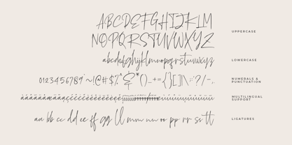 Oaklinn is a handwriting script font. It allows you to create stunning and easy hand-lettering in an instant. Ideal for the logo, quotes, product label/packaging, fashion, letter, advertising, poster, merchandise, greeting cards, etc
 - Cathena by Arttype7,
$12.00 Cathena is a modern script with sweet touches and beautiful curves in each letter. It features a bold, authoritative, luxurious, modern and premium nature. Cathena is great for wedding invitations. magazines, logos, signatures, photography watermarks.
 - Anasite Malela by Stringlabs Creative Studio,
$25.00 Anasite Malela is a bold script with groovy retro style. This font has a unique feel and you can use it to add that special retro touch to any design idea you can think of!
 - Big Tales by Typefactory,
$14.00 Big Tales is a monoline script font. It maintains its classy calligraphic influences while feeling contemporary and fresh. This versatility will appeal to a wide range of crafty ideas, from letterheads and titles, to stationery.
 - Santaria by Essentials Studio,
$16.00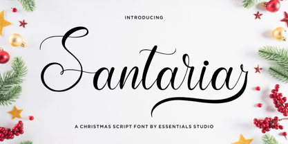 Introducing by Essentials Studio Proudly Present, Santaria Santaria Is a Modern Christmas Script Font Santaria is perfect for product packaging, branding project, megazine, social media, wedding, or just used to express words above the background.
 - Same Same But Different by Hanoded,
$15.00 Same Same, But Different is a loose, handwritten font with excellent legibility. It evokes post-it scripts, or notebook doodles and can be used virtually everywhere! Same Same But Different comes with extensive language support.
 - Milk Child by HafisHidayat,
$20.00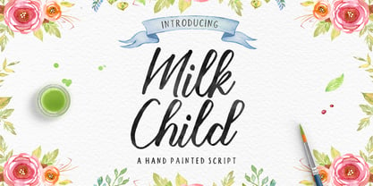 Milk Child is an organic, energetic, dynamic and modern handwriting script that can be used for various purposes, such as with titles, correspondence, wedding invitations, letterheads, signage, labels, signature newsletters, logos, posters, badges, and more.
 - Sackers Solid Antique Roman by Monotype,
$29.99Sackers Roman is an engraver, all-capitals family for invitations and stationery. The letters have strong contrast between thin and thick strokes. See also Sackers Gothic, Sackers Square Gothic, Sackers Script, and Sackers Classic Roman. - Beautica Dreaming by Letterena Studios,
$9.00 Beautica Dreaming is an elegant script font with a contemporary atmosphere and impeccable form, inspired by timeless classic calligraphy. This font is PUA encoded which means you can access all glyphs and swashes with ease!
 - Liony by Tkachev,
$20.00 Liony is a pixel font with four font styles. Liony is an experiment to convert the script-style calligraphy into bitmap format. It looks great in display sizes and also works well when used smaller.
 - ATC Oneshot by Avondale Type Co.,
$20.00 ATC Oneshot, is a handwritten script font based on neighborhood bodega signage. Contains 160+ glyphs, full alphabet, ligatures, numberals, accents and punctuation. File type included in download is .otf. ATC Oneshot was released in 2019.
 - Boldetton by Rockboys Studio,
$26.00 Boldetton is an elegant and bold script font. Fall in love with its incredibly versatile style and use it to create gorgeous wedding invitations, beautiful stationary art, eye-catching social media posts, and much more!
 - Wally by Autographis,
$39.50 Wally is an elegant hand-drawn script that has a very even flow and is readable down to very small sizes. Since it has a similar design it can be mixed with Novita and Novido.
 - Yogyakarta by Letterafandi Studio,
$10.00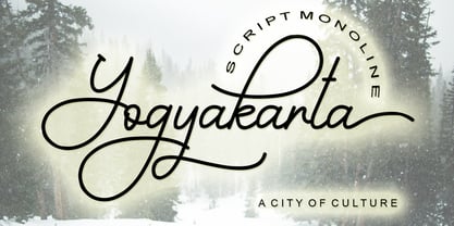 Yogyakarta is a handwritten script font, with an elegant and beautiful look. It looks stunning on invitations, thank you cards, quotes, greeting cards, logos, business cards and every other design which needs a handwritten touch.
 - Janifera by Liartgraphic,
$17.00 Janifera is the newest font from Liartgraphic font with a beautiful and elegant handwritten style. Perfect for those of you who like fonts with the handwritten script genre. Also good for logos, flyers.landingpage, and others
 - Artiste by ITC,
$29.00A casual, open brush script style designed with a shadow effect for a three-dimensional impression by British designer Martin Wait. This typeface looks best with tight letter and word spacing in large display settings. - Brown Love by sizimon,
$18.00 Introducing our latest product Bethany Script! handwritten fonts companion designed to convey elegance and style. Bethany is perfect for fashion, e-commerce brands, trend blogs, or any business that wants to appear classy and chic.
 - Tkachevica by Tkachev,
$15.00 Tkachevica is a decorative face with four font styles. Tkachevica is an experiment to convert the script-style calligraphy into bitmap format. It looks great in display sizes and also works well when used smaller.
 - Work In Progress by StereoType Fonts,
$39.00 Work In Progress is a smooth script font with a very specific style of connected curves. It brings a unique curly style with the possibility to create dynamic dancing words with it's ligatures and alternates.
 - Bottania by Rockboys Studio,
$23.00 Bottania is an elegant and bold script font. Fall in love with its incredibly versatile style and use it to create gorgeous wedding invitations, beautiful stationary art, eye-catching social media posts, and much more!
 - Aetherline by Hazztype,
$20.00 Aetherline is a captivating vintage monoline script font that gracefully marries the nostalgia of the past with the sleekness of modern design. With its carefully crafted, unbroken strokes, Aetherline evokes the essence of classic handwriting.
 - Blocky by Garisman Studio,
$22.00 Blocky combines attractive curves with a fresh urban edge; delivering a stylish script which is guaranteed to add an eye-catching appeal to your logo designs, brand imagery, quotes, product packaging, merchandise & social media posts
 - Sackers Classic Roman by Monotype,
$29.99Sackers Roman is an engraver, all-capitals family for invitations and stationery. The letters have strong contrast between thin and thick strokes. See also Sackers Gothic, Sackers Square Gothic, Sackers Script, and Sackers Classic Roman. - Mountisa by Lemonthe,
$15.00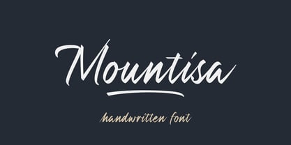 Mountisa is a script font with a dynamic and energetic style. It’s perfect for signature, stationery, photography, social media posts, product packaging, greeting cards, and every other design that needs a unique and striking font.
 - Rebecca YOFF by YOFF,
$9.00 Rebecca bundle is two fonts, one print and one script. You'll get both in one package. Both fonts are updated with smoother curves and support for more languages. Enjoy this bundle of beautiful handwriting fonts!
 - Mercadillo by Monotype,
$16.99 Mercadillo is a casual script typeface based on the hand painted signs you can see in markets, shops and bars. Comes in 4 different weights (Black, Bold, Regular and Light) and it has OpenType features.
 - Arkana by Haksen,
$12.00 Arkana is a new bold, retro script. It is very suitable for advertisement products, branding materials, business designs brand, quotes, posters, t-shirt and more! This font are perfect for all brands. Happy Designing, Haksen
 - Aubrielle by Awanstudio,
$13.99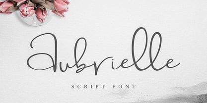 Introducing Aubrielle script font! It allows you to create stunning and easy hand-lettering in an instant. Ideal for the logo, quotes, wedding, product label/packaging, fashion, letter, advertising, invitation, poster, merchandise, greeting cards, etc.
 - SCR-N by URW Type Foundry,
$39.99 SCR fonts are screen optimized (also called 'pixel fonts'). Unlike standard fonts (and like the few well-hinted fonts like Verdana or Arial), they give a crisp look on screen at very small sizes, thus increasing legibility. The perfect applications for those fonts are web pages and software user interfaces (computer, cellular phones, console games and any other system that uses a screen interface). Unlike most pixel fonts, SCR fonts contain kerning information. Kerning is the adjustment of space between certain pairs of characters (like 'AV') to make text look more fluid, thus increasing legibility and appeal. To benefit from this feature, auto-kerning must be activated in the application. In Photoshop, kerning must be set to 'Metrics'. Although SCR fonts are optimized for screen, they can be used for print (in Illustrator or Indesign for example) for a decorative 'computer text' effect. In this case, there is no constraint: they can be used as any other font. For screen use (in Photoshop, Fireworks, Flash... ), they have to keep aligned with the screen pixel grid not to look blurred or distorted. To achieve this, here are the guidelines to follow: RESOLUTION If the application permits it (Photoshop, Fireworks), document resolution must be set to 72 pixels per inch. SIZE The font size must be set to 10 (or multiples of 10) points. POSITIONING & ALIGNMENT The reference points of text fields and text blocks (upper left corner for left aligned text, upper right for right aligned text) must be positioned at integer values of pixels. In Photoshop, text can be precisely moved with [Edit Free Transform]. In Flash, movie clips containing text fields must also be positioned at integer values on the stage. Text must be aligned to the left or right only. Center alignment can be simulated with left alignment by adding spaces at the begin of each line. To dispense with the positioning and alignment constraints, text anti-aliasing can be turned off if the application permits it (Photoshop, Flash MX 2004). OTHER SETTINGS Leading (line spacing), tracking (letter spacing), manual kerning and baseline shift must be set either to integer values of points or to multiples of 100 units (depending on the application). Vertical and horizontal scaling must be set to 100%. Faux bold or Faux italic must not be used. The document must neither be resized on export, nor allow resizing (Flash Movies).
 - SCR-I by URW Type Foundry,
$39.99 SCR fonts are screen optimized (also called 'pixel fonts'). Unlike standard fonts (and like the few well-hinted fonts like Verdana or Arial), they give a crisp look on screen at very small sizes, thus increasing legibility. The perfect applications for those fonts are web pages and software user interfaces (computer, cellular phones, console games and any other system that uses a screen interface). Unlike most pixel fonts, SCR fonts contain kerning information. Kerning is the adjustment of space between certain pairs of characters (like 'AV') to make text look more fluid, thus increasing legibility and appeal. To benefit from this feature, auto-kerning must be activated in the application. In Photoshop, kerning must be set to 'Metrics'. Although SCR fonts are optimized for screen, they can be used for print (in Illustrator or Indesign for example) for a decorative 'computer text' effect. In this case, there is no constraint: they can be used as any other font. For screen use (in Photoshop, Fireworks, Flash... ), they have to keep aligned with the screen pixel grid not to look blurred or distorted. To achieve this, here are the guidelines to follow: RESOLUTION If the application permits it (Photoshop, Fireworks), document resolution must be set to 72 pixels per inch. SIZE The font size must be set to 10 (or multiples of 10) points. POSITIONING & ALIGNMENT The reference points of text fields and text blocks (upper left corner for left aligned text, upper right for right aligned text) must be positioned at integer values of pixels. In Photoshop, text can be precisely moved with [Edit Free Transform]. In Flash, movie clips containing text fields must also be positioned at integer values on the stage. Text must be aligned to the left or right only. Center alignment can be simulated with left alignment by adding spaces at the begin of each line. To dispense with the positioning and alignment constraints, text anti-aliasing can be turned off if the application permits it (Photoshop, Flash MX 2004). OTHER SETTINGS Leading (line spacing), tracking (letter spacing), manual kerning and baseline shift must be set either to integer values of points or to multiples of 100 units (depending on the application). Vertical and horizontal scaling must be set to 100%. Faux bold or Faux italic must not be used. The document must neither be resized on export, nor allow resizing (Flash Movies).
 - Barbou by Besnowed,
$19.99 Barbou was originally cut in 1925 by Monotype as a counterpart to Fournier, siblings that were different in design but both based on the work of Pierre-Simon Fournier. Whether by choice, accident or oversight, Fournier was preserved digitally, and Barbou was lost to history. Barbou was notably used by Stanley Morrison, in particular as the face of The Fleuron. I fell in love with Barbou when I saw it, and knew that I wanted to bring it to a new generation of designers and readers. This is a revival of Barbou, a faithful recutting with new weights, characters and many of the best features that modern font technology brings. Particular attention was paid to the original Monotype Barbou 178 specimen sheet. Originally only available in a single weight, Barbou has been recut with a variable weight, providing a large degree of flexibility between Regular and Bold. Barbou excels as a comfortable reading face for books, and the variable weight allows you to fine tune the darkness and texture of the page in a way never before possible. Barbou has a distinctive softness, and this revival of Barbou preserves much of the effect the medium of metal type had on the letterforms. This results in a subtly rounded yet defined type, elegant not worn, with the utmost attention and respect to the smallest of details. Barbou was originally cut with disparate x-heights for roman and italic, and this revival of Barbou features both the original italic, as well as a new italic redesigned at the same height as the roman. In Fournier’s time, roman and italic would not be mixed on the same line, but the type must change to meet the needs of a new generation. Barbou also features unique ligatures and alternates, old style numbers, small caps and a full Greek alphabet. Barbou is perfect for books and anywhere a comfortable reading face is required, and excels in flexibility.
 - Petrarka by HiH,
$12.00 Petrarka may be described as a Condensed, Sans-Serif, Semi-Fatface Roman. Huh? Bear with me on this. The Fatface is a name given to the popular nineteenth-century romans that where characterized by an extremity of contrast between the thick and thin stroke. The earliest example that is generally familiar is Thorowgood, believed to have been designed by Robert Thorne and released by Thorowgood Foundry in 1820 as "Five-line Pica No. 5." Copied by many foundries, it became one of the more popular advertising types of the day. Later, in the period from about 1890 to 1950, you find a number of typeface designs with the thin stroke beefed up a bit, not quite so extreme. What you might call Semi-Fatfaced Romans begin to replace the extreme Fatfaces. Serifed designs like Bauer’s Bernard Roman Extra Bold and ATF’s Bold Antique appear. In addition, we see the development of semi-fatface lineals or Sans-Serif Semi-Fatfaces. Examples include Britannic (Stephenson Blake), Chambord Bold (Olive), Koloss (Ludwig & Mayer), Matthews (ATF) and Radiant Heavy (Ludlow). Petrarka has much in common with this latter group, but is distinguished by two salient features: it is condensed and it shows a strong blackletter influence, as seen in the ‘H’ particularly. Petrark was released about 1900 by the German foundry of Schelter & Giesecke of Leipzig and is one of the designs of the period that attempts to reconcile roman and blackletter traditions. Making a cameo appearance in this Multi-Lingual font is the Anglo-Saxon letter yogh (#729), which, along with the thorn and the eth, is always useful for preparing flyers in Old English. There are still pockets of resistance to the Norman French influence that washed up on England’s shores in 1066. This font stands with King Canute, seeking to hold back the tide (ignoring the fact that Canute was a Dane). Support the fight to preserve Anglo-Saxon culture. Buy Petrarka ML today. Petrarka Initials brings together the Petrarka upper case letters with a very sympatico Art Nouveau rendering of a female face.
 - Cocogoose Pro Narrows by Zetafonts,
$39.00 Cocogoose Pro Narrows has been completely re-engineered in 2020 to include extra features and technologies. A darkmode weight range has been added to the whole family, to keep consistency of effect when the typeface is used in reverse on the web and in dark mode interfaces. Also, a new Ultra Compressed subfamily has been developed for display usage. Designed by Cosimo Lorenzo Pancini in 2013, Cocogoose was first expanded in 2015 with the help of Francesco Canovaro who co-designed the decorative display weights and Andrea Tartarelli who developed the condensed widths. In 2020 a full redesign of the typeface has been published: Cocogoose Pro now includes new widths, weights, open type features and characters, thanks to the help of Mario De Libero. Influenced by vernacular sign-painting and modernist ideals, Cocogoose is drawn on a classic geometric sans skeleton, softened by rounded corners and slight visual corrections. Its very low contrast, dark colour and tall x-height make it a solid choice for all designers looking for a powerful display typeface for logos, headings and vintage-inspired branding. The tall x-height makes texts set in Cocogoose very readable even at small sizes, while the bold regular weight allows for maximum impact when used as a branding, signage or decorative typeface. Cocogoose Pro was designed as a highly reliable tool for design problem solving, and given all the features a graphic designer needs, starting from its wide range of widths and weights. Its 2000+ latin, cyrillic and greek characters make sure it covers over 200 languages worldwide, while its comprehensive set of open type features allows faultless typesetting thanks to small capitals, positional numbers & case sensitive forms. A wide range of alternate letterforms, developed along nine different stylistic sets, gives you an extra level of design fine-tuning. The layerable and colour-ready display variants include inline, outline, shadow and a letterpress version that can simulate the effect of old print, also thanks to programmed randomization of its letters.
 - Phoenica Std by preussTYPE,
$29.00 PHOENICA is a contemporary humanistic typeface family suitable for traditional high-resolution print purposes, office application and multi-media use. Of the creation formed the basis an idea which was developed for the first time by Lucian Bernhard approx in 1930 with the Berhard Gotic and was taken up in the last time by different written creators repeatedly: the repeated elimination anyway (in comparison to a Antiqua, e.g. Garamond) already very much diminished form Grotesque (as for example Helvetica) by systematic leaving out of the serifs. The horizontal direction of the writing is thereby stressed remarkably by which so-called »Rail effect« originates. The eyes can grasp the line to be read very well what is ordinarily left to a Serif-stressed font. By this desired effect is suited PHOENICA also for big text amounts. In numerous test runs Stems and tracking was compared to experienced fonts and was adapted. The experienced was taken over without renouncing, nevertheless, the modern and independent character PHOENICA. PHOENICA offers to you as a welcome alternative to the contemporary humanistic Sansserif. It is a very adaptable family for text and Corporate design uses. Several companies have discovered PHOENICA meanwhile as a Corporate font for themselves and use them very successfully. She provides a respectable typeface combined with refinement and elegance. Every PHOENICA family has at least six weights in each case in regular and italic. In addition more than three fine Haarline weights (Hairline 15, 25, 35). These are a total of 27 possibilities. Phoenica as well as Phoenica Condensed are excellently readable fonts, because they were optimised especially for amount sentence. Both basic styles (Regular and Condensed) are tuned on each other and follow the same form principle. The family is neither exclusively geometrical nor is constructed humanistically, the forms were sketched on quick and light Recognition effect of every single letter. The PHOENICA family design and logo is suited for all only conceivable uses like newspapers and magazines, for the book typography and Corporate Design.
 - Flink Neue by Identity Letters,
$45.00 Geometric typefaces are a staple in every typographer’s toolbox since the 1920s. It was a time when iconic faces such as Futura, Erbar, and Kabel appeared on the scene and turned the world of type upside-down. Inspired by those early giants as well as later epigones with a legacy of their own (such as 1970’s Avant Garde Gothic), Flink Neue is the Identity Letters take on this genre, characterized by a clean and focused appearance. With neat shapes and the look of pure geometry, Flink Neue adapts to a vast range of applications and topics, from the fine print in contract to website body copy to logo design to billboard-size slogans. Its x-height is considerably larger than in classic geometric sans-serif fonts; its proportions are harmonized as opposed to strictly constructed. This makes for a more contemporary look, setting it apart from the classics. With three different widths, Flink is a true all-rounder. Geometric fonts are usually quite wide, which often leads to text-settings problems with headlines or small print. The Condensed and Compressed variants of Flink Neue solve this problem easily. This font family comes along in 18 weights from Thin to Black with matching Italics. There are almost 1400 characters per style, including nine stylistic sets that offer variations to the look and feel of Flink Neue, making it even more versatile. Besides the default mood of Flink Neue, there is also a Text and Bauhaus variant, where different letters have been changed to create a new mood. In theory, you just need one single font file to change between all three moods, but to make it easier for you, we also exported each mood within a separate file. Plenty of additional Open Type Features like ligatures, small caps, case sensitive forms, old-style figures, tabular figures and symbols make Flink Neue a valuable tool for the discerning typographer. Flink Neue is the reimagination of a classic genre, designed to suit the needs of our time.
 - Special Forces by Typodermic,
$11.95 Special Forces is the commanding slab serif headline typeface that will put some backbone into your message. Its efficient and rugged letterforms will give your words the strength they need to succeed in any mission. With its robust slab serifs, this typeface means business. You won’t find any fancy curves or delicate strokes here—this font is built to withstand the toughest of conditions. Special Forces is ready to take on any challenge, just like our brave soldiers in the field. But this font isn’t just tough—it also commands authority. When you use Special Forces, your message will have the power of a commanding officer. Whether you’re calling your troops to action or announcing a new campaign, this typeface will give your words the weight they deserve. And the best part? Special Forces comes in both regular and oblique styles, so you can choose the right level of intensity for your message. So don’t settle for a weak font that won’t get the job done. Choose Special Forces and take your design to the front lines. Most Latin-based European writing systems are supported, including the following languages. Afaan Oromo, Afar, Afrikaans, Albanian, Alsatian, Aromanian, Aymara, Bashkir (Latin), Basque, Belarusian (Latin), Bemba, Bikol, Bosnian, Breton, Cape Verdean, Creole, Catalan, Cebuano, Chamorro, Chavacano, Chichewa, Crimean Tatar (Latin), Croatian, Czech, Danish, Dawan, Dholuo, Dutch, English, Estonian, Faroese, Fijian, Filipino, Finnish, French, Frisian, Friulian, Gagauz (Latin), Galician, Ganda, Genoese, German, Greenlandic, Guadeloupean Creole, Haitian Creole, Hawaiian, Hiligaynon, Hungarian, Icelandic, Ilocano, Indonesian, Irish, Italian, Jamaican, Kaqchikel, Karakalpak (Latin), Kashubian, Kikongo, Kinyarwanda, Kirundi, Kurdish (Latin), Latvian, Lithuanian, Lombard, Low Saxon, Luxembourgish, Maasai, Makhuwa, Malay, Maltese, Māori, Moldovan, Montenegrin, Ndebele, Neapolitan, Norwegian, Novial, Occitan, Ossetian (Latin), Papiamento, Piedmontese, Polish, Portuguese, Quechua, Rarotongan, Romanian, Romansh, Sami, Sango, Saramaccan, Sardinian, Scottish Gaelic, Serbian (Latin), Shona, Sicilian, Silesian, Slovak, Slovenian, Somali, Sorbian, Sotho, Spanish, Swahili, Swazi, Swedish, Tagalog, Tahitian, Tetum, Tongan, Tshiluba, Tsonga, Tswana, Tumbuka, Turkish, Turkmen (Latin), Tuvaluan, Uzbek (Latin), Venetian, Vepsian, Võro, Walloon, Waray-Waray, Wayuu, Welsh, Wolof, Xhosa, Yapese, Zapotec Zulu and Zuni.
 - The Mainsthen by HKL Studio,
$19.00 The Mainsthen is a calligraphy script font that comes with exquisite character changes, a kind of classic copper decorative script with a modern twist, designed with high detail to bring out an elegant style. Antura script is interesting because it has a soft, clean, feminine, sensual, glamorous, simple and very easy to read typeface, because there are many fancy letter joints. I also offer a number of decent stylistic alternatives for multiple letters. Classic style is very suitable to be applied in various formal forms such as invitations, labels, restaurant menus, logos, fashion, make up, stationery, novels, magazines, books, greeting / wedding cards, packaging, labels or any type of advertising purposes. The Mainsthen is encoded with Unicode PUA, which allows full access to all additional characters without having any special design software. Mac users can use Font Book, and Windows users can use Character Map to view and copy any of the additional characters to paste into your favorite text editor / application.