10,000 search results
(0.03 seconds)
- Gramercy Eight JNL by Jeff Levine,
$29.00Gramercy Eight JNL is an outline and drop shadow treatment of Crestview Six JNL, inspired by some 1930s-1940s era Art Deco hand lettering spotted on a sales flier for some decorator decals. - Easy Eights NF by Nick's Fonts,
$10.00Here's a faithful rendering of a typeface originally named Octic, from the 1884 specimen book of the Palmer & Rey Type Foundry of San Francisco. Its geometric severity is softened by the gently scalloped "bites" taken out of the corner. Sets tight to make attention-getting headlines. Both versions contain the complete Latin 1252, Central European 1250 and Turkish 1254 character sets. - SoHo Nights BF by Bomparte's Fonts,
$40.00 Named after the trendy New York City locale, SoHo Nights BF features sensuous curves and tapering lines that combine to create a unique new look that’s a little bit art deco and a little bit art nouveau. The font also exhibits attributes that can be described as cartoon-like, and even “spooky” when seen in short blocks of large text. Use SoHo Nights BF when your projects require that certain "air of mystique".
 - Night Wind Sent by Ana's Fonts,
$12.00 Night Wind Sent is an elegant handwritten script font family inspired by old-fashioned handwritten postcards and letters. It includes ligatures (for a true handwritten feel), stylistic alternates, handwritten small caps, and swashes (for an extra bit of drama). Plus! Extra versions of the font: underline and strikethrough, and an ornaments font, to help decorate your text. Night Wind Sent is perfect for any design that needs a handwritten look, such as signatures, notes and quotes, logos and branding.
 - Tight Spot BB by Blambot,
$12.00 Based on the feedback provided by manga letterers and translators, Blambot's new comic book dialogue font meets their specific needs for condensed type, unique manga-related glyphs like stars, wavy dashes, and hearts. In addition, Blambot has included contextual alternates to cycle through six sets of alphabets, three sets of numerals, and various punctuation for a more organic, "hand lettered" look. The set includes for fonts: Regular, Italic, Bold, and Bold Italic, each with extensive diacritical letters for multi-language support.
 - Display Digits Eight by Gerald Gallo,
$20.00 Display Digits Eight is a display number font with eight sets of variations of the same digits. The digits 0 through 9, with period and comma in appropriate variations, are prepared as (1) solid, (2) outline, (3) solid with contour outline, (4) outline with 3-D shadow, (5) 3-D shadow only, (6) outline with drop shadow, (7) positive in circle, (8) negative in circle.
 - Golden Night Cyrillic by Ira Dvilyuk,
$17.00 Golden Night Cyrillic is a handwritten script font that will be perfect for branding, logos, social media, labels, packaging design and blog headlines. Golden Night Cyrillic script contains a full set of uppercase and lowercase letters and 32 ligatures - which works automatically to create a more natural handwritten look. The Cyrillic part of the font also contains 18 ligatures for a more natural handwritten look of the typography in your designs. Extensive language support is included. Western European, Central, and South East European too. Multilingual Support for 27 languages: Afrikaans, Albanian, Basque, Bosnian, Catalan, Danish, Dutch, English, Estonian, Faroese, Filipino, Finnish, French, Galician, Indonesian, Irish, Italian, Malay, Norwegian Bokmål, Portuguese, Slovenian, Spanish, Swahili, Swedish, Turkish, Welsh, Zulu And Cyrillic glyphs support for Russian, Belorussian, Bulgarian and Ukrainian languages.
 - Night Life JNL by Jeff Levine,
$29.00 Night Life JNL follows the classic lettering forms of the Art Deco era of the 1930s and 1940s. On the upper case letters, the A,B,E,F,H,K,P and R have extended horizontals, while the lower case a,b,e,f,h,k,p and r have those extensions removed and are more traditional in design.
 - Make Things Right by PizzaDude.dk,
$20.00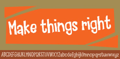
- Haarlem Nights NF by Nick's Fonts,
$10.00A 1920 Dutch poster for Public Placement Services by Johan Dijsktra provided the inspiration for this crisp geometric typeface. Instead of the normal underscore (_), this font features a set of parallel lines flush to the tops of the caps and small caps, which offers some intriguing design possibilities. Both versions of this font include the complete Unicode 1252 Latin and Unicode 1250 Central European character sets. - Beauty Night Script by Letterfreshstudio,
$13.00 Beauty Night Script is a calligraphic script font that comes with exquisite character changes, a kind of classic decorative copper script with a modern twist, designed with high detail for an elegant style. Beauty Night is interesting because it is smooth, clean, feminine, sensual, glamorous, simple and very easy to read, because there are many fancy letter joints. I also offer a number of decent stylistic alternatives for multiple letters. Classic styles are very suitable to be applied in various formal forms such as invitations, labels, restaurant menus, logos, fashion, make up, stationery, novels, magazines, books, greeting / wedding cards, packaging, labels or all kinds of advertising purposes. . To activate the OpenType Stylistic alternative, you need a program that supports OpenType features such as Adobe Illustrator CS, Adobe Indesign & CorelDraw X6-X7, Microsoft Word 2010 or newer versions. There are additional ways to access alternatives / swash, using Character Map (Windows), Nexus Fonts (Windows), Font Books (Mac) or software programs such as PopChar (for Windows and Mac). Thanks You.
 - Good Night Kiss by Epiclinez,
$15.00 Good Night Kiss is a fun and stylish handwritten font. Not too thin and not too thick, balanced, and varied, this font was designed to enhance the beauty of your projects. It is the best choice for creating eye-catching logos, branding, and quotes. Every letter has a unique and beautiful touch, which will make your design come alive!
 - Deco Nights JNL by Jeff Levine,
$29.00 Sheet music for the tune "Put Your Arms Around Me Honey" (from the 1937 film "Coney Island" starring Betty Grable, George Montgomery and Cesar Romero) has the song title hand lettered in a condensed Art Deco sans serif design. This became the basis for Deco Nights JNL, which is available in both regular and oblique versions. For trivia buffs, the song was written by Junie McCree and Albert Von Tilzer and was first featured in the Broadway show "Madame Sherry" in 1910 and was revived for a second time in the 1949 Judy Garland -Van Johnson film "In the Good Old Summertime".
 - Journey of Night by Carpiola Studio,
$12.00 Journey of Night is a lovely and timeless handwritten font. It is the best choice for creating eye catching logos, branding and quotes. This font is PUA encoded which means you can access all of the amazing glyphs and ligatures with ease!
 - Gothic Initials Eight by Gerald Gallo,
$20.00 Gothic Initials Eight was inspired by the beautifully-written gothic scripts of medieval scribes. The font contains the upper case letters A through Z under both the character set and shift+character set. This font is intended for use as initials, monograms, drop caps or wherever fancy letters are desirable.
 - DIN Next Slab by Monotype,
$56.99 Now even more design possibilities with the popular DIN Next. With its technical and neutral character, DIN Next has earned a permanent place in contemporary typography. Now, DIN Next Slab expands the font family further, offering new design potential. Now comes the next step, DIN Next Slab, also produced under the direction of Akira Kobayashi. On a team with Sandra Winter and Tom Grace, Kobayashi is creating the new font variant based on the optimized shapes of DIN Next. The expansion will make the popular font all the more flexible and versatile. Apart from that, the geometric slab serifs underline the technical and formal nature of the font and emphasize a central design element of DIN Next. However, the team did have some challenges to overcome. While it is relatively easy to imagine DIN Next Light with slab serifs, the amount of available space quickly disappears when it comes to the Black styles. Winter explains that many tests and trials were necessary to find a compromise between space, letters and the serif shapes. Experiments with modified contrast in the weight or only one-sided serifs were quickly abandoned. The central, technical and powerful character of the font changed too much. Nevertheless, it was necessary to simplify slightly the shape of some letters, such as the ‘k’ or ‘x’, for example. These changes, first developed in the Black styles, were applied to all weights in order to lend the font a consistent appearance. Like DIN Next, DIN Next Slab also has seven weights, which cover the range from Ultralight to Black, each with matching italic. There are various character sets in all of the styles and the four middle weights have small capitals available. DIN Next Slab harmonizes perfectly with the styles of DIN Next: the basic letterforms and weights are identical. Both versions of the font can work together perfectly, not just in headlines and body text, but also within a text; they complement each other very well as design variations. With the new DIN Next Slab, Monotype expands the DIN Next super family consistently. With DIN Next Slab, you can underscore the technical and formal nature of the understated font not only in headlines, but in texts, as well. In this way, you have new and diverse potential for application, thanks to the way the different styles of DIN Next combine perfectly.
 - PF DIN Mono by Parachute,
$45.00 PF DIN Mono is the latest addition to the ever-growing set of DIN super-families by Parachute. It was based on its proportional counterpart DIN Text Pro but was completely redesigned to reflect its new identity. DIN Mono is a monospace typeface which is comprised of characters with fixed width. Traditionally, monospaced fonts have been used to create forms, tables and documents that require exact text line lengths and precise character alignment. DIN Mono, on the other hand, can prove to be more than a useful typeface for technical applications. In the world of proportionality, DIN Mono stands out as a fresh new alternative to the popular standard, particularly for publishing and branding applications. Additional care was given to the aesthetic form and its pleasing characteristics. The spacing attributes of the glyphs were redefined and legibility was further improved by revising or changing the shape of the letterforms. Furthermore, kerning was not included in order to preserve the monospace nature of this typeface. The family consists of 12 weights including true-italics. Currently, it supports Latin, Eastern European, Turkish and Baltic.
 - URW DIN Arabic by URW Type Foundry,
$99.99 The digital outline fonts, DIN 1451 Fette Engschrift and Fette Mittelschrift were created by URW in 1984 and are the basis for all DIN font families. Both typefaces were designed for the URW SIGNUS system and were mainly used for the production of traffic signs. They have since become so popular that we have developed a complete Arabic DIN family together with Boutros Fonts. The Arabic characters have been designed to harmonize with our Latin URW DIN and come in 24 individual styles, which consist of 8 weights from Thin to Black and three different widths: Regular, Semi Condensed, and Condensed.
 - DIN Next Arabic by Monotype,
$155.99 DIN Next is a typeface family inspired by the classic industrial German engineering designs, DIN 1451 Engschrift and Mittelschrift. Akira Kobayashi began by revising these two faces-who names just mean ""condensed"" and ""regular"" before expanding them into a new family with seven weights (Light to Black). Each weight ships in three varieties: Regular, Italic, and Condensed, bringing the total number of fonts in the DIN Next family to 21. DIN Next is part of Linotype's Platinum Collection. Linotype has been supplying its customers with the two DIN 1451 fonts since 1980. Recently, they have become more popular than ever, with designers regularly asking for additional weights. The abbreviation ""DIN"" stands for ""Deutsches Institut für Normung e.V."", which is the German Institute for Industrial Standardization. In 1936 the German Standard Committee settled upon DIN 1451 as the standard font for the areas of technology, traffic, administration and business. The design was to be used on German street signs and house numbers. The committee wanted a sans serif, thinking it would be more legible, straightforward, and easy to reproduce. They did not intend for the design to be used for advertisements and other artistically oriented purposes. Nevertheless, because DIN 1451 was seen all over Germany on signs for town names and traffic directions, it became familiar enough to make its way onto the palettes of graphic designers and advertising art directors. The digital version of DIN 1451 would go on to be adopted and used by designers in other countries as well, solidifying its worldwide design reputation. There are many subtle differences in DIN Next's letters when compared with DIN 1451 original. These were added by Kobayashi to make the new family even more versatile in 21st-century media. For instance, although DIN 1451's corners are all pointed angles, DIN Next has rounded them all slightly. Even this softening is a nod to part of DIN 1451's past, however. Many of the signs that use DIN 1451 are cut with routers, which cannot make perfect corners; their rounded heads cut rounded corners best. Linotype's DIN 1451 Engschrift and Mittelschrift are certified by the German DIN Institute for use on official signage projects. Since DIN Next is a new design, these applications within Germany are not possible with it. However, DIN Next may be used for any other project, and it may be used for industrial signage in any other country! DIN Next has been tailored especially for graphic designers, but its industrial heritage makes it surprisingly functional in just about any application. The DIN Next family has been extended with seven Arabic weights and five Devanagari weights. The display of the Devanagari fonts on the website does not show all features of the font and therefore not all language features may be displayed correctly.
 - DIN 1451 Mittelschrift by URW Type Foundry,
$35.99
- PF DIN Stencil by Parachute,
$39.00 DIN Stencil on Behance. DIN Stencil: Specimen Manual PDF. Despite the fact that over the years several designers have manually created stencil lettering based on DIN for various projects, there has never been a professional digital stencil version of a DIN-based typeface. After the successful introduction of DIN Monospace a few months earlier, PF DIN Stencil now completes Parachute’s extensive library of DIN superfamilies. It was based on its original counterpart DIN Text Pro and was particularly designed to address contemporary projects, by incorporating elements and weights which are akin to industries such as fashion, music, video, architecture, sports and communications. Traditionally, stencils have been used extensively for military equipment, goods packaging, transportation, shop signs, seed sacks and prison uniforms. In the old days, stencilled markings of ownership were printed on personal possessions, while stencilled signatures on shirts were typical of 19th century stencilling. Two companies dominated the market in the mid-twentieth century: the Marsh Stencil Machine Company in the United States and the Sächsische Metall Schablonen Fabrik in Germany. Ever since the late 1930s, it was the German Sächsische Metall Schablonen Fabrik which used heavily the new DIN 1451 standard font (introduced in 1936), attempting to overthrow the reign of the Didot-style modern roman which was at the time the most common stencil letter in Germany. These letters were manufactured mainly as individual zinc stencils which could be ordered in sizes between 10 and 100mm. The DIN Stencil family manages to preserve several traditional stencil features, but introduces additional modernities which enhance its pleasing characteristics and make it an ideal choice for a large number of contemporary projects. Furthermore, the spacing attributes of the glyphs were redefined and legibility was improved by revising the shape of the letterforms. The DIN Stencil family consists of 8 diverse weights from the elegant Hairline to the muscular Black. Currently, it supports Latin, Eastern European, Turkish and Baltic.
 - Vtg Stencil DIN by astype,
$35.00 The Vtg Stencil DIN fonts were developed to made the most common stencil type of Germany available in digital type. Of course there are several, slightly different stencil designs from different manufactures in circulation, but all share the typical design of DIN type. » pdf specimen « Vtg Stencil DIN comes in many styles – Regular, Alt, Fabric, Halftone and Rough. The Alt style features older designs of letter “a” and figures “6” and “9”. Fabric, Halftone and Rough styles have an eroded, weathered look using up to four glyph variations of each letter. For an random effect an glyph rotator is programmed into the fonts opentype-code and applied by typing in opentype-savvy application.
 - DIN Neue Roman by Vibrant Types,
$43.00 The DIN Neue Roman adds something new to the established concept of the DIN 1451 type’s technical origin. As a serif counterpart it leaves its static appeal to bring some friendliness into this industrial idea. With more contrast than a slab serif and the dynamic stroke of transitional type DIN Neue Roman defies all conventions, but keeps its legibility. To have enough resources for diverse and complex typography this type family offers 7 weights with italics, small caps and all kind of opentype features. Type designer Philip Lammert likes to play with the great potential of contradictions. That brought him to this design combining two essentially different classics. DIN Neue Roman is part of his 2015’s master thesis at the HAW Hamburg which was supervised by Prof. Jovica Veljovic.
 - DIN 1451 Engschrift by URW Type Foundry,
$35.99 - FF DIN Round by FontFont,
$93.99 This welcome addition to FontFont’s most popular family brings a softness to FF DIN’s simplicity and industrial sterility. FF DIN Round is more than a “search-and-replace” rounded version of its predecessor. Albert-Jan Pool and his team redrew each letterform to maintain the structure of the original. This ensures FF DIN and FF DIN Round will work well together in logos, slogans, price tags, etc. as compatible parts of advertising campaigns and corporate identities. FF DIN Round is not only a good companion to FF DIN, its smooth and friendly curves make it work on its own for branding strategies for family cars, bikes, household appliances, sportswear, shoes, or medical products. It’s also very legible on screen. This FontFont is a member of the FF DIN super family, which also includes FF DIN.
 - FF DIN Arabic by FontFont,
$85.99
- DIN Mittel EF by Elsner+Flake,
$35.00The typeface DIN Mittel, offered by Elsner+Flake, is based on the DIN 1451 used in Germany since 1931. The DIN 1451 which was primarily seen in the areas of technology and traffic had to adhere to the so-called DIN Norms. Variations of the DIN 1451 are also employed in Austria, Eastern Europe, Greece and the Near East. With its new release Elsner+Flake has expanded the DIN Mittel with the characters EuropaPlus and Cyrillic. - FF DIN Paneuropean by FontFont,
$92.99 FF DIN: the famous, faithful and first revival of DIN 1451. FF DIN originates in the lettering models from the German standard DIN 1451, and is considered the perfect standard typeface due to methodical and engineered design. FF DIN Variable offers you more FF DIN than ever before. Pushing font technology to its limits, Variable fonts provide creatives a tool to dial in hyper specific variations which thrive in any design space. FF DIN Variable take bold steps in engineering, which the typefaces behaviour which brings in FF DIN’s technical look-and-feel into the smooth and almost organic world of Variable Fonts. Available in both upright and italic styles, there is a lot more FF DIN to discover with new era of type technology. FF DIN Italic is a sloped roman style, however it is optically corrected – slightly thinner, slightly narrower. As a result, FF DIN Italic stands out subtly. FF DIN Variable stays faithful to its parent’s DNA, the utmost care was taken to ensure that the new instances of FF DIN Variable remained consistent with all the well-known weights. Precision is the mantra of FF DIN, the FF DIN Variable is no exception to this design philosophy. Produce exquisitely fine-tuned typography and expressive animated headlines for any design. Infinite styles, intelligent, and powerful.
 - DIN Next Decorative by Monotype,
$40.99 This four-piece family is the DIN design, but not as you know it. The famously, crisp, clean and precise typeface has been given a textured update that's reminiscent of rusted metal, or rubber stamps. Underneath this lies the same sturdy, geometric shapes that have allowed DIN to stand the test of time, but with a new sense of tangibility. “This kind of treatment is more about creating a feeling or a mood that goes beyond the communication of the words themselves,” explains Monotype Studio director Tom Rickner. “I think it expands the repertoire of what DIN Next can express.” Designed for display, these four typefaces – DIN Next Rust, DIN Next Shadow, DIN Next Slab Rust and DIN Next Stencil Rust – show a new side of DIN Next's personality, as if the surface of each letterform has been gradually worn away over the years.
 - FF DIN Slab by FontFont,
$50.99 FF DIN: the famous, faithful and first revival of DIN 1451. FF DIN originates in the lettering models from the German standard DIN 1451, and is considered the perfect standard typeface due to methodical and engineered design. FF DIN Slab is a robust compliment to the FF DIN family. Designed by Antonia Cornelius and Albert-Jan Pool, it offer designers tools to create greater rhythm and design depth. FF DIN Slab’s proportions have been meticulously aligned with its Sans origins, offering the perfect balance between positive and negative space. The serifs are assertive, sturdy and balanced, they are engineered to emphasis a strong horizontal flow through text, a grounded utility and assurance in headlines. The result of this attention to detail is a typeface that harmonizes beautifully with other FF DIN styles. Pushing font technology to its limits, FF DIN Slab is also available as a Variable font. Allowing creatives to design hyper specific variations which thrive in any design space, and even seamlessly animate movement from one state to the next. FF DIN Slab distinctively carries on its parent’s DNA, speaks the same native language — but with a strong peculiar dialect. It expands the DIN family worthily — independent but integrated — and opens totally new possibilities of uses with the whole DIN family.
 - DIN Neuzeit Grotesk by Linotype,
$40.99 The German Standards Committee suggested the light Neuzeit-Grotesk’ font in 1970 for use in official signage, traffic directional systems, etc. The typeface had been designed by Wilhelm Pischner and appeared with the font foundry D. Stempel in 1928. The font Neuzeit Grotesk was once the standard in the print industry, as a timeless typeface with no real distinguishing features. Like other typefaces of the 1920s, DIN Neuzeit Grotesk reflects the philosophy of the times, Form is Function.’
 - DIN 2014 Rounded by ParaType,
$40.00 DIN 2014 Rounded is an extension of the industrial sans serif DIN 2014. It combines the softness and friendliness of the rounded endings with the seriousness and stability of the original typeface. Not a typical childish rounded font. DIN 2014 Rounded works well for medical or architectural topics, headings on the web or in periodicals, brand identity, packaging, and, thanks to the DIN proportions, for signage. DIN 2014 Rounded includes six styles ranging from extra light to extra bold, corresponding to the upright styles of DIN 2014, as well as a variable version. The typeface supports all European languages based on Latin, Cyrillic, and Asian Cyrillic (Tatar, Kazakh, Kyrgyz and other languages). Isabella Chaeva and Alexander Lubovenko worked on the rounded version. The typeface was released by Paratype in 2021.
 - DIN 17 SB by Scangraphic Digital Type Collection,
$26.00Since the release of these fonts most typefaces in the Scangraphic Type Collection appear in two versions. One is designed specifically for headline typesetting (SH: Scangraphic Headline Types) and one specifically for text typesetting (SB Scangraphic Bodytypes). The most obvious differentiation can be found in the spacing. That of the Bodytypes is adjusted for readability. That of the Headline Types is decidedly more narrow in order to do justice to the requirements of headline typesetting. The kerning tables, as well, have been individualized for each of these type varieties. In addition to the adjustment of spacing, there are also adjustments in the design. For the Bodytypes, fine spaces were created which prevented the smear effect on acute angles in small typesizes. For a number of Bodytypes, hairlines and serifs were thickened or the whole typeface was adjusted to meet the optical requirements for setting type in small sizes. For the German lower-case diacritical marks, all Headline Types complements contain alternative integrated accents which allow the compact setting of lower-case headlines. - DIN Next Stencil by Monotype,
$56.99 The DIN Next™ Stencil suite of designs is DIN with an attitude. It’s even more industrial strength than the original. DIN Next Stencil’s seven roman weights are perfect for projects that require a mechanized, military, or commercial vibe. If you’re looking to create commanding display typography, be it in advertising, apparel, packaging, posters, signage, wayfinding – or crash dummy name tags, DIN Next Stencil can be the perfect typographic enhancement. Based on Akira Kobayshi’s DIN Next with stenciling by Sabina Chipară, the wide range of weights and large complement of diacritical and international characters – including those for Cyrillic and Greek – further expand the design’s capabilities. The DIN Next Stencil fonts are powerful tools in their own right – and provide a distinctive supplement to the DIN Next typographic palette.
 - DIN Next Rounded by Monotype,
$56.99 The name DIN refers to the Deutsches Institut für Normung (in English, the German Institute for Standardization). The typeface began life as the DIN Institute's standard no. DIN 1451, published in 1931. It contained several models of standard alphabets for mechanically engraved lettering, hand-lettering, lettering stencils and printing types. These were to be used in the areas of signage, traffic signs, wayfinding, lettering on technical drawings and technical documentation. Rooted in earlier designs for Germany's railway companies, the alphabets were based on geometric shapes in order to be easily reproducible using compass and ruler. In post-1945 West Germany, the DIN alphabets were widely used, for instance on most road signs. They became available as fonts that were appreciated by designers for their industrial, somewhat quirky and “non-typographic” look and feel. From the 1990s onwards, more refined versions became available for use in book and magazine typography. DIN Next is a typographically corrected and expanded version of this quintessential 20th-century design. DIN Next Rounded is its softer, friendlier version.
 - EF DIN 1451 by Elsner+Flake,
$35.00 - DIN 2014 Stencil by ParaType,
$30.00DIN 2014 Stencil is a stencil version of DIN 2014 typeface inspired by signage, data plates and stencilled building inscriptions. The typeface has a pronounced industrial spirit and can be used in the most rigorous conditions. DIN 2014 Stencil family consists of 18 styles which include six weights (corresponding to DIN 2014) with three grades of 'stencilness' for each weight. The typeface was designed by Vasily Biryukov and released by Paratype in 2017. - DIN 1451 Paneuropean by Linotype,
$92.99 - FF DIN Stencil by FontFont,
$50.99 FF DIN: the famous, faithful and first revival of DIN 1451. FF DIN originates in the lettering models from the German standard DIN 1451, and is considered the perfect standard typeface due to the methodical and engineered nature of its design. The FF DIN family breathes an atmosphere of versatility and authority, FF DIN Stencil follows the same design principles with extra flair. The bridges are arranged vertically, which usually replaces the thinnest parts of the strokes — offering depth in your headlines. Go loud and scale up, as the weights get heavier, the width of the bridges skillfully expand and contract, enabling FF DIN Stencil to provide confidence in volume, and in any chosen style. Also made available as a Variable font, creatives can design hyper specific variations to thrive in any design space, and even to animate movement from one state to the next. Get innovative with the entire FF DIN family, FF DIN Stencil’s spacing and kerning is identical to FF DIN, this enables swapping between any FF DIN font without changes in word length or line breaks. For true FF DIN fans, FF DIN Slab and FF DIN Stencil designed by Albert-Jan Pool, Antonia Cornelius and Achaz Reuss, can be seen as harmonious companions to the FF DIN family, rather than alternatives. Bestowed with its parents distinctive DNA, all the FF DIN extensions open up new possibility with their own unique qualities, but stay true to the FF DIN design philosophy of engineered precision.
 - DIN Next Shapes by Monotype,
$29.99 Sabina Chipară's DIN Next Shapes typeface is a twist on the original German industrial classic, taking its skeleton and re-clothing it in dots, hearts, snowflakes and stars. The design offers a more approachable and whimsical tone of voice than the original, while maintaining all the legibility and clarity of form that makes DIN Next such a reliable and versatile design. It works in harmony with DIN Next, and is particularly suited for designers looking to be a little more expressive. DIN Next Shapes includes four fonts: Dots, Flakes, Hearts and Stars, and has pan European language support including Greek and Cyrillic. It also has OpenType features including stylistic alternatives, ligatures and fractions.