10,000 search results
(0.041 seconds)
- Pho Twice by Baqoos,
$18.00 Pho Twice is a boisterous neoteric handwritten typeface apt for headline, editorial, branding, packaging, printed materials and typographic applications. 200+ glyphs including punctuation and numerical.
 - Rhinos Pero by Sipanji21,
$20.00 "Rhinos Pero" is a quirky graffiti font that embodies a playful and unconventional style. Fonts in this category often feature eccentric and unique letterforms, incorporating creative elements that deviate from traditional typographic norms. This particular font might showcase irregular shapes, whimsical characters, or unconventional design traits, offering a distinct and unconventional appearance. With its quirky attributes, "Rhinos Pero" is suitable for designs aiming to convey a fun and offbeat visual impression. It could be applied in various creative projects seeking a playful and distinct graffiti-inspired typographic style. **Uppercase
 - MSung PRC by Monotype HK,
$523.99 Song style typefaces originated in the age of woodblock printing in Song Dynasty. Being an essential Chinese type style for printing and publishing all since Ming Dynasty. Based on the Kaishu calligraphic script, its structure has evolved, regularised and standardised with thick stems (豎), thin horizontal strokes (橫) and triangular finials. Dots (點), hooks (勾) and downstrokes retained some features of calligraphy, hence an appropriate choice for continuous reading. The typeface is equipped with a variety of stroke weights, all highly legible .
 - Bros Signage by Blankids,
$20.00 Are you looking for a vintage layering display font? Do you want of creating Something that stand out and inspire creativity, imagination, and endless fun? Wait no more, we will give you the best choice. Bros Signage a Vintage Layered Font Bros Signage a Vintage Layered Font, Inspiring from old signage typography. This font is perfect for a design that makes it more attractive and playful. made with a very good level of aesthetics making this font suitable for book cover, poster, packging, merchandise, logotype and much more. Bros Signage font includes Multilingual Support, among others : Afrikaans, Albanian, Asu, Basque, Bemba, Bena, Breton, Catalan, Chiga, Cornish, Danish, Dutch, English, Estonian, Faroese, Filipino, Finnish, French, Friulian, Galician, German, Gusii, Indonesian, Irish, Italian, Kabuverdianu, Kalenjin, Kinyarwanda, Luo, Luxembourgish, Luyia, Machame, Makhuwa, Meetto, Makonde, Malagasy, Manx, Morisyen, North Ndebele, Norwegian Bokmål, Norwegian Nynorsk, Nyankole, Oromo, Portuguese, Quechua, Romansh, Rombo, Rundi, Rwa, Samburu, Sango, Sangu, Scottish Gaelic, Sena, Shambala, Shona, Soga, Somali, Spanish, Swahili, Swedish, Swiss German, Taita, Teso, Uzbek (Latin), Volapük, Vunjo, Zulu FEATURES : Uppercase Lowercase Number Punctuation Multilingual PUA Encode Opentype
 - Hernandez Bros by Latinotype,
$29.00 Hernández Bros, is a typeface designed by Daniel and Eli Hernández. Born in the year 2021, in the midst of the Covid pandemic, from a collaborative spirit where everything called them to work together as family, in order to obtain better results in such trying times. The Hernández siblings, started a ping pong of drawings based on Bulfinch found in the 1912 ATF catalogue. From this exercise, Hernández Bros was designed, a modern Sans Serif, with 8 weights ranging from Extralight to Black. This is an elegant font, with beautiful and harmonious contrasts, which makes it ideal for titles, brands, editorial design, magazines among others.
 - 19-PRA by ILOTT-TYPE,
$29.00 Inspired by the elegance of Herman Zapf’s designs crossed with the readability of early 20th century Gothic fonts by Morris Fuller Benton, 19-PRA is a sans-serif with a visible stroke contrast and a humanist tone of voice. The large x-height seen in fonts like News Gothic and Palatino increases legibility and condensed proportions give excellent readability making it perfect for newspaper and magazine publishing. A typeface that can serve for both body text and titling the uppercase excels for headlines and renders beautiful brand names when tracked out. It sets well with both a serif or sans serif and has various open type features including: 12 standard ligatures, 3 discretionary ligatures, tabular figures, old stye figures as well as European accents.
 - Mad Props by Graffiti Fonts,
$19.99Classic & clean tag style lettering that's easy to read & flexible. Mad Props includes 2 full alphabets, full numbers, punctuation & other symbols. This style works well with outlines & effects. - Cro Aloha by FontHaus,
$19.95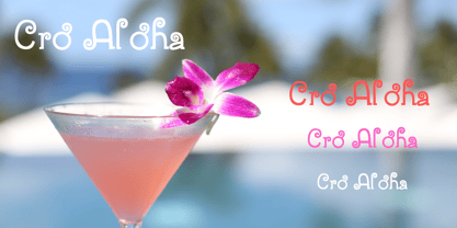
- Choco Bro by Sipanji21,
$18.00 "Choco Bro" is a cute and chubby display font characterized by truncated or shortened characters. Fonts with truncated characters often feature letterforms where certain parts are cut off or abbreviated, giving them a unique and distinctive appearance. This font can be a delightful choice for various design projects, especially those targeting children's themes or playful designs. The truncated characters add a quirky and playful touch to the font, making it suitable for posters, invitations, children's books, or any project that aims for a fun and whimsical typographic style.
 - Chartu Poo by Enfeeltype,
$15.00 Chartu Poo is a stunning modern sans serif font that exudes a sense of luxury and sophistication. Its futuristic concept is truly unique, and makes it stand out from other fonts in its class. The sleek lines and bold curves of Chartu Poo give it a sense of elegance and refinement, while also conveying a sense of modernity and innovation. One of the things that sets Chartu Poo apart is its versatility. It can be used in a wide range of design projects, from logos and branding materials to website designs and advertising campaigns. Whether you're looking to create a bold and impactful headline, or a subtle and understated body copy, Chartu Poo is the perfect font for the job. Another great feature of Chartu Poo is its readability. Despite its bold and unique design, this font is incredibly easy to read, making it a great choice for both print and digital media. Whether you're designing a brochure or a website, Chartu Poo will ensure that your message is conveyed clearly and effectively. In short, if you're looking for a modern sans serif font that combines luxury, sophistication, and innovation, look no further than Chartu Poo. Its unique and futuristic concept, combined with its versatility and readability, make it the perfect choice for any design project.
 - Banzai Bros by Fenotype,
$20.00 Banzai Bros is a deadly efficient multidisciplinary all-caps assault font. It's highly recommended for posters, signs, flags & banners. Banzai Bros comes with a small set of ornaments. Available as a single font or in packs with other Fenotype fonts.
 - Prop Ten by Galapagos,
$39.00Some years ago we developed a monospaced 12 pitch sans serif for a client. We also created a 10 pitch version that was later discarded. PropTen is the 10 pitch version modified to proportional widths. The name PropTen refers to 'Proportional 10 Pitch'- which is a technical impossibility. It does have a slight 'its time to vote' twist to it. You know, after you pick your candidate you also need to vote yes or no on the following Propositions, don't forget Prop10, the team needs those uniforms. - Bros Rover by Blankids,
$27.00 Introducing a new font is Bros Rover Classic Sans Serif. Bros Rover good for logotype, poster, badge, wedding invitation, book cover, tshirt design, packaging and any more.
 - MTF Jumpin Jack EXT by Miss Tiina Fonts,
$10.00 Jumpin’ Jack Extended is a fun, cartoon-like display font capable of taking any product out of the ordinary! Use it on bold and bright creations such as banners, posters, covers, titles, magazines, etc. This bouncy fun font is a perfect addition to your collection!
 - Slab Four Rounded Ext by Wooden Type Fonts,
$15.00 An original slab serif design inspired by the slab serif designs of the 19th century, with a modern geometric look, bold version, extended.
 - KR Valentine Dings 2002 - Unknown license

- KR Get Well Dings - Unknown license

- KR Christmas Dings Two - Unknown license

- MW Ding-A-Lings - Unknown license

- KR Birthday Cake! Dings - Unknown license

- KR Christmas Dings Three - Unknown license

- Head-Ding Maker BRK - Unknown license

- KR Christmas Dings One - Unknown license

- KR First Years Dings - Unknown license

- Don Giovonni Makin Enemies - Unknown license

- KR Lil Ween Dings - Unknown license

- KR Silly Art Dings - Unknown license

- KR Lotsa Time Dings - Unknown license

- KR Party Time Dings - Unknown license

- Dine And Dance JNL by Jeff Levine,
$29.00 Sheet music featuring a song from the 1933 film "Torch Singer" starring Claudette Colbert was the basis for Dine and Dance JNL. A multi-line Art Deco design, it epitomizes both the typographic style and the night life of the time, when supper clubs featuring big bands were at their peak. Torch Singers were female vocalists who typically sang melancholy love songs of lost love and heartbreak.
 - Sixties Pin Buttons JNL by Jeff Levine,
$29.00 During the turbulent era of the 1960s, the youth of America found various ways to protest against "The Establishment". Whether it was campus unrest, protest songs, sit-ins or other methods, the message was the counter-culture movement. Arising from this disenchantment with traditional social standards, a small but effective means of protest arose that made no sound, yet spoke volumes - the pin button. Statements against the war in Vietnam, free love, drug use and other messages popped up on little metal discs pinned to tee shirts, suspenders, head band and hats. Sixties Pin Buttons JNL recreates twenty-six of these messages in both white on black (upper case keys) and black on white (lower case keys). Blank buttons in both white and black are found on the parenthesis keys.
 - Dia De Los Muertos by Intellecta Design,
$21.90 Dia de los Muertos is a colorful collection of skulls based on the lively Mexican fiesta celebration where skulls are used as humorous epitaphs of people still alive, besides being a symbol of celebration. A work of Iza W that can be used for children in arts, arts crafts, among other applications. Buying "Dia de los Muertos" you get FREE a amazing set of eps vectors : 39 naive, intrincated and colored funny skulls, ready to use."
 - Tin Pan Alley JNL by Jeff Levine,
$29.00 According to Wikipedia, Tin Pan Alley is the name given to the collection of New York City music publishers and songwriters who dominated the popular music of the United States in the late 19th century and early 20th century. The name originally referred to a specific place: West 28th Street, between Fifth and Sixth Avenues in Manhattan. With this in mind, Tin Pan Alley JNL, a typeface based on the bold hand lettering from a vintage piece of sheet music is aptly named.
 - Dip Pen Deco JNL by Jeff Levine,
$29.00 The hand lettered title on the cover of the 1938 sheet music for “If It Rains – Who Cares” featured a condensed Art Deco typeface made with a round nib pen. The square shaped characters with rounded corners were a perfect subject for a digital font revival, and are now available as Dip Pen Deco JNL, in both regular and oblique versions.
 - Van den Velde Script by Intellecta Design,
$68.90 Iza and Paulo W (Intellecta Design) are proud to announce Van den Velde Script. A free interpretation of the work of the famous master penman Jan van den Velde, to be found in the “Spieghel der schrijfkonste, in den welcken ghesien worden veelderhande gheschrifften met hare fondementen ende onderrichtinghe. ” (Haarlen, 1605). Van den Velde Script has evocative ancient ligature forms from the XVII Century Dutch master penman Jan van den Velde. Your indescritible writing-book was important not only with regard to the specific period it represents, but also in relationship to the entire history of calligraphy as an art: Van den Velde is rightly credited with having introduced and perfected a new trend in Dutch calligraphy. Our font, Van den Velde Script merges modern necessities o better legibility without loose the taste of his archaic origins. This enhanced OpenType version is a complete solution for producing documents and artworks whith a evocative and voluptuous style of calligraphic script: - dozens of stylistic alternates for each letter (upper- and lowercase), accessed with the glyph palette; - historical ornaments and fleurons in the typical style (and motifs) from the XVII century at the Lower Countryes accessed with the glyph palette using the Ornaments feature); - an extensive set of ligatures (100s of contextual alternates plus discretionary ligatures) providing letterform variations that make your designs really special, resembling real handwriting on the page; - a tour-de-force kerning work: over 700 gliphs in this font was adjusted to your kern pairs handly. In non-OpenType-savvy applications it works well as an unusual and beautiful script style font. Because of its high number of alternate letters and combinations (over 700 glyphs), we suggest the use of the glyph palette to find ideal solutions to specific designs. The sample illustrations will give you an idea of the possibilities. You have full access to this amazing stuff using InDesign, Illustrator, QuarkXpress and similar software. However, we still recommend exploring what this font has to offer using the glyphs palette: principally to get all the power of the Contextual Alternates feature. You can has an idea of the power of this font looking at the “Van den Velde User Guide”, a pdf brochure in the Galçlery section. Two last things: take a special look at the Van den Velde Words (ready words) font and another super script font, Penabico. Van den Velde Script has original letters designed by Iza W and overall creative direction plus core programming by Paulo W.
 - Yoshi's Story (game text) (BRK) - Unknown license

- Yoshi's Story game text BRK - Unknown license

- Linotype Syntax Lapidar Serif Text by Linotype,
$29.99Modeled on the writings chiseled in stone in the second century B.C., Syntax™ Lapidar is an energetic, spirited typeface designed by Hans Eduard Meier in 2000. Linotype Syntax Lapidar Text and Linotype Syntax Lapidar Serif Text have five weights each, with both cap and lowercase letterforms. Lapidar Display and Lapidar Serif Display also have five weights each, with mostly all cap letterforms and many alternates. It's a terrifically fun and inventive family, and if you look closely, you can see the resemblance to the more modern and restrained Syntax™ relatives. Great for menus, artist books, travelogues, or advertising - and if used very sparingly, it could add just the right element of lapidary significance to corporate documents. - Times New Roman Small Text by Monotype,
$67.99In 1931, The Times of London commissioned a new text type design from Stanley Morison and the Monotype Corporation, after Morison had written an article criticizing The Times for being badly printed and typographically behind the times. The new design was supervised by Stanley Morison and drawn by Victor Lardent, an artist from the advertising department of The Times. Morison used an older typeface, Plantin, as the basis for his design, but made revisions for legibility and economy of space (always important concerns for newspapers). As the old type used by the newspaper had been called Times Old Roman," Morison's revision became "Times New Roman." The Times of London debuted the new typeface in October 1932, and after one year the design was released for commercial sale. The Linotype version, called simply "Times," was optimized for line-casting technology, though the differences in the basic design are subtle. The typeface was very successful for the Times of London, which used a higher grade of newsprint than most newspapers. The better, whiter paper enhanced the new typeface's high degree of contrast and sharp serifs, and created a sparkling, modern look. In 1972, Walter Tracy designed Times Europa for The Times of London. This was a sturdier version, and it was needed to hold up to the newest demands of newspaper printing: faster presses and cheaper paper. In the United States, the Times font family has enjoyed popularity as a magazine and book type since the 1940s. Times continues to be very popular around the world because of its versatility and readability. And because it is a standard font on most computers and digital printers, it has become universally familiar as the office workhorse. Times?, Times? Europa, and Times New Roman? are sure bets for proposals, annual reports, office correspondence, magazines, and newspapers. Linotype offers many versions of this font: Times? is the universal version of Times, used formerly as the matrices for the Linotype hot metal line-casting machines. The basic four weights of roman, italic, bold and bold italic are standard fonts on most printers. There are also small caps, Old style Figures, phonetic characters, and Central European characters. Times? Ten is the version specially designed for smaller text (12 point and below); its characters are wider and the hairlines are a little stronger. Times Ten has many weights for Latin typography, as well as several weights for Central European, Cyrillic, and Greek typesetting. Times? Eighteen is the headline version, ideal for point sizes of 18 and larger. The characters are subtly condensed and the hairlines are finer." - Poing by Authentic,
$34.50 Poing is an exceptionally elegant script, I took my fathers Penn font and pimped it to a higher level. It is perfect for invitations and business cards.


