10,000 search results
(0.05 seconds)
- Coomeec by Linotype,
$29.99 Although Andi AW. Masry designed his Coomeec typeface with one eye on comic books, this is more than just another cartoon font. Even in our short profile of the font below, we're sure you'll find enough to be surprised by the calligraphic aesthetic and the wide range of potential uses of Coomeec. Typography had been one of Andy AW. Masry's hobbies before he turned professional in 2008 and formed his own agency in Jakarta in Indonesia. The former construction engineer had already spent many hours of his leisure time in following his pastimes of designing, photography and Latin typography. Fascinated by the close interaction between text and image in comic books, one of his first projects was the development of his font Coomeec™. The condensed letters of Coomeec seem to have more in common with a calligraphic brush typeface than a more conventional cartoon font. With the characteristic line forms of a brush font, the not unextensive variations in line thickness and numerous small embellishments to the glyphs, Coomeec can be used to enhance your projects with animated effects. You can achieve this not just in the larger font sizes; the font is also very legible in small sizes thanks to its large x-height. There are certain unusual letter forms, such as that of lowercase 'g', 's' and uppercase 'Y', that provide Coomeec with a touch of the exotic. As Coomeec has numerous character alternatives, you can use it not only to create diverse designs but also to ring the changes with the character of the text itself. There are variants for most lowercase letters, some of which exhibit only minor differences, such as the lack of a curlicue on the 'b', a modified downstroke on the 'h' and an elongated base for the 'k'. In the case of other letters, such as the 'q' and the 'r', there are significant disparities between variants. The uppercase characters are also available in a lively swash style with significantly extended terminals. Among the range of characters of Coomeec are oldstyle and lining figures designed for proportional and tabular setting. All alternatives are available in the form of the corresponding OpenType versions. Coomeec comes in two weights; Regular and Bold, each with its Italic version. The form of the slightly inclined Italic characters is identical to that of their upright counterparts with the exception of the lowercase 'f', which has an ascender in its Italic version. As an OpenType Pro font, the glyphs available for Coomeec ensure that it can be used to set not only western European but also central European texts. Coomeec is not just at home when used to set headlines. The excellent legibility of this individual and vibrant typeface means that it's also ideal for setting shorter texts. The various alternative letters provide the designer with the opportunity to vary the textual appearance, and to choose between creating a more formal or more light-hearted effect. Coomeec is not only available in an OpenType version but is also obtainable as a web font, so that you can employ its exotic features to good effect when creating internet pages.
 - Sketchnote by Delve Fonts,
$29.00 The Sketchnote typeface was born of necessity: designer Mike Rhode needed a series of hand-drawn fonts to illustrate and produce his book, “The Sketchnote Handbook.” Because of its origin, this typeface was designed to be practical and convey the human character and quirks of his normal handwriting and hand-drawn lettering. The family is comprised of five fonts: Sketchnote Text in Regular, Bold, and Italic, the somewhat compressed and bold Sketchnote Square for headlines, and the playful Sketchnote Dingbats. Sketchnote Text is a casual script with a slightly bouncy baseline. In order to mimic the differences present in natural handwriting, OpenType features are built-in that automatically switch between multiple versions of each letter or number. In total, over 240 alternates in each of the text fonts are employed, making for a more authentic appearance. The warm texture of Sketchnote is the result of actual ink-spread on paper captured in the scans of written letterforms and was intentionally left intact during the digitization process to preserve that feeling. Rhode created Sketchnote Square as a display type to complement Sketchnote Text. Drawn instead of written, the letters often have neat little happenstance voids within the strokes. Sketchnote Dingbats features a selection of icons, rules, and arrows to provide some functional and fun tidbits, handy for bringing additional life to any design.
 - Gradable by Ditatype,
$29.00 Introducing Gradable, a mesmerizing script font that seamlessly blends elegance with boldness. This unique typeface is characterized by its graceful, connected letters that flow effortlessly from one to the next. With a low-contrast design, this font exudes a sense of stability, What sets Gradable apart is its distinctive swinging endings on select letters, adding a touch of playful sophistication to your text. These stylish flourishes give your words an air of dynamic movement, making your message stand out with a touch of charm. Gradable fits in headlines, logos, posters, flyers, branding materials, print media, editorial layouts, and many more designs. Find out more ways to use this font by taking a look at the font preview.
 - Chalga VPoutline by VP Creative Shop,
$20.00 Introducing Chalga Serif Typeface - 3 weighs - Latin and Cyrillic support Chalga is elegant, vintage typeface that contains 3 weights to enchant your next project. They have basic latin, advanced latin, basic Cyrillic and advanced Cyrillic character sets. Very versatile fonts that works great in large and small sizes. Chalga is perfect for branding projects, home-ware designs, product packaging, magazine headers - or simply as a stylish text overlay to any background image. Uppercase, numeral, punctuation & Symbol Light Regular Bold Basic and advanced latin character sets Basic and advanced Cyrillic character sets Alternate Glyphs Ligature Glyphs Feel free to contact me if you have any questions! Mock ups and backgrounds used are not included. Thank you! Enjoy!
 - Birchside Typeface by Get Studio,
$19.00 Introducing Birchside Typeface, our latest display script font, a captivating blend of retro charm and contemporary boldness. This font is designed to make a statement with its distinctive style, capturing the essence of vintage aesthetics while maintaining a modern edge. The bold strokes and unique letterforms create a commanding presence, ensuring your text stands out with flair and confidence. Infused with Opentype features, this font offers a versatile range of alternate characters, allowing you to customize your text and add a touch of individuality to each design. Whether you're working on branding, posters, invitations, or any creative project, this display script font is a dynamic choice that effortlessly combines nostalgia and innovation. Elevate your typography game with this bold and unique font, making every word a visual masterpiece.
 - Roxon by Fo Da,
$7.00 Roxon is a sans serif typeface of 4 weights from Extra Light to Bold and can be used as both a headline and text face. Roxon is recommended for using in long-form writing and articles, since a serif is far more readable for longer passages of text. The typeface has a carefully crafted weight range, with ligatures.
 - Display Ardent by Gerald Gallo,
$20.00 Display Ardent is a display font not intended for text use. It was designed specifically for display, headline, logotype, branding, and similar applications. Display Ardent has the lowercase alphabet only, there is no uppercase alphabet. For convenience, the lowercase alphabet characters were repeated in the shift set.
 - Helvetian Times by Elemeno,
$25.00Helvetian Times is an unusual typeface. It clearly thinks it's a standard text font, but the offbeat letter shapes and inconsistent serifs combine to form something that defies conventional categorization. Helvetian Times works well at any size, but generally evokes the impression that something's not quite right. - Varial Rounded by Cloud9 Type Dept,
$35.00 Varial typefaces are extra-condensed Opentype™ sans-serifs with small caps, extended character set (european languages support) and extra features (fractions, ligatures and alternatives).
 - Handmade Roman JNL by Jeff Levine,
$29.00 Handmade Roman JNL is a simple and clean serif design. Perfect for headlines or titles, this condensed serif font gets attention without being overly formal.
 - Franklin Stencil JNL by Jeff Levine,
$29.00 Franklin Stencil JNL is based on the classic and perennial workhorse design of Franklin Gothic Condensed and is available in both regular and oblique versions.
 - Cattleman JNL by Jeff Levine,
$29.00 Cattleman JNL is a reinterpretation of a classic ultra-condensed wood type in the French Clarendon style often associated with Western-themed fliers and posters.
 - Kumachi by Linecreative,
$12.00 Kumachi is an ultra condensed font with a stamp style, and is perfect for logos, name cards, magazines layouts, headers or oven large scale artwork.
 - Varial by Cloud9 Type Dept,
$35.00 Varial typefaces are extra-condensed Opentype™ sans-serifs with small caps, extended character set (european languages support) and extra features (fractions, ligatures and alternatives).
 - Grecian XX by Wooden Type Fonts,
$15.00A revival of one of the popular wooden type fonts of the 19th century, suitable for display, geometric slab serifs unbracketed, short descenders, very condensed. - Cattle Trail JNL by Jeff Levine,
$29.00 Modeled after an image of an almost complete set of Latin Condensed wood type, Cattle Trail JNL is available in both regular and oblique versions.
 - Singular by Jonahfonts,
$30.00 A semi-heavy face slightly condensed, inspired by the Germanic & European type fonts. Applications include captions, packaging, invitations, cards, posters, ads, book jackets, and manuals.
 - Cohoba by Illuminaut Designs,
$10.00 Cohoba is a chunky condensed sans serif. Cohoba is loud and proud. It comes with a handful of discretionary ligatures. Cohoba is fun and versatile.
 - Generic Gothic JNL by Jeff Levine,
$29.00 Generic Gothic JNL is a straightforward interpretation of the classic typeface Franklin Gothic Condensed, modeled from a sheet of self-adhesive vinyl letters and numbers.
 - Grecian by Wooden Type Fonts,
$15.00 A revival of one of the popular wooden type fonts of the 19th century, suitable for display, geometric slab serifs unbracketed, short descenders, very condensed.
 - Pleasant Hand by Gerald Gallo,
$20.00 Pleasant Hand is designed as a condensed hand-lettered font. The family is casual and informal and is ideal for use in conveying these qualities.
 - PL Fiorello by Monotype,
$29.99The PL Fiorello Condensed font has a Latin influence and has been used to set headings on novels and posters relating to suspense and crime. - Van Dingbats by Vanarchiv,
$30.00 This Dingbat font is designed to work well with the Van Condensed family. The dingbats in it have the same round treatment like the typeface.
 - Brogado JNL by Jeff Levine,
$29.00Make room for Brogado JNL! This bold, yet squat slab serif font takes command when set into headlines. Although not thoroughly in the Western mold, Brogado JNL can still exude enough macho appeal to make its point strongly, yet clearly. - JH Mabel by JH Fonts,
$40.00 JH Mabel is a modern cursive typeface; it has three weights: light, medium and bold. It is a smart type and consists of extra characters to simulate real handwriting. Typical use: branding, greeting cards, long runing text.
 - Paragon by Greater Albion Typefounders,
$12.50 Paragon is a display Roman family of nine faces, combining elements of formality and fun. It embodies a high degree of contrast between near hairline horizontal strokes and bold vertical strokes. The family is offered in three widths and in regular, small capitals and title faces. Use Paragon to lend impact to your next design project.
 - Nikaru by Twinletter,
$18.00 Nikaru is a retro-inspired display font designed in a simple and contemporary style that gives it a modern feel. This elegant typography is perfect for designing any project, especially editorial work, branding, product packaging, and promotional designs with bold and fun characters. It’s time to add some zest to your next project with this font.
 - Transmogrified by PintassilgoPrints,
$24.00 Transmogrified started out as a special project for a client. It's a lovely sans serif font, casual, with sweet swirls over here and there. It is based on Transmogrifier , from which uppercase glyphs were selected. Next, new lowercase glyphs were drawn and a bold cut was also developed for added flexibility. Let your messages be transmogrified!
 - Amerta by Eotype,
$9.00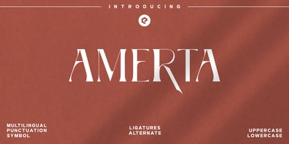 Amerta is a versatile, modern and unique serif font. Designed by Eotype Studio, It has a unique style with stylistic, alternates, ligatures and supports multilingual languages. Create unique & beautiful logotype, use it as an elegant solution for your next magazine layout, or choose Amerta for any graphics that require a bold look with a elegant flair.
 - Cagila by Eotype,
$12.00 Cagila is a versatile, modern and elegant serif font. Designed by Eotype Studio, It has a unique style with stylistic, alternates, ligatures and supports multilingual languages. Create unique & beautiful logotype, use it as an elegant solution for your next magazine layout, or choose Cester for any graphics that require a bold look with a elegant flair.
 - Comic FX - Unknown license

- Wonton - Unknown license

- baldhead - Unknown license

- Baking Pastry by Illushvara,
$10.00 Baking Pastry embodies fun, quirkiness and authenticity. This handwritten font is the perfect fit for all of your logos, branding, social media, and crafty DIY projects.
 - Lemon Melon by RahagitaType,
$16.00 Lemon Melon is a cute & fun display font. This font is the perfect fit for all of your logos, branding, social media, and crafty DIY projects.
 - Platz Groteske FJ by Frncojonastype,
$27.00 fj Platz Groteske™ is the new font from frncojonastype project that culminates after almost 5 years of learning and development. fj Platz Groteske™ is a Neo-grotesk font with slight geometrical proportions with humanistic terminations. For this occasion, this font will show the normal version, however, the entire project contemplate condensed family, extended and the development of alphabets as Cyrrilic and Greek. This proposal is to improve the legibility in the Neo-grotesk fonts with generous gaps, vertical and square counter form and ascendents that exceed slightly the capitals. Counts with old numbers, small caps, modern numbers, tabular, numerators and denominators to fraccions, reference numbers to notes and formulas to face confidant and complex different stages. Ideal to editorial projects of informative content - scientific and titular of a huge impact because of the various alternative characters, stylistic options and a optometrical version to risky designers. To exclusive licenses and to follow the develop of this project, please visit frncojonas.com (WIP) Learn about upcoming releases, work in progress and get to know us better! Instagram: @frnco.jonas
 - Arbordale by Aerotype,
$49.00 OpenType users benefit from an array of alternate glyphs for lowercase characters including non-connecting contextual alternates for word endings. Other features include crossbar ligatures for common letter pairings, case-sensitive quotes and smart apostrophes. Arbordale Pro extends the character set to support Eastern European and Baltic languages.
 - Epic Story by Olivetype,
$18.00 Introducing Epic Story, the perfect typeface for your next big project. This fun, playful font is the right choice for creating bold headlines. With its unique character, Epic Story is sure to make a statement. And it's great for logotypes and branding too. So if you're looking to add some personality to your next project, look no further than Epic Story. Epic Story font includes : Standard Latin All Caps Numbers, symbols, and punctuations Multilingual Support. Fully accessible without additional design software Simple Installations Works on PC & Mac Thank You.
 - Revolution Gothic P by Dharma Type,
$19.99 Revolution Gothic P font family is designed based on Revolution Gothic and a distressed offshoot from the original. Revolution Gothic is an arranged and extended version of PAG Revolucion released from Prop-A-Ganda type foundry in 2008. The original font is inspired by retro propaganda posters and wallpainting in Cuba from the 60s to 80s. And the original PAG Revolucion is the most popular font from Prop-A-Ganda. The glyphs that damaged by printing the original had been tweaked by hand work with great care to be looked like natural damaged effect. This Revolution Gothic P family contains basic Roman, Italic, Bold and it’s Italic to suit a wide range of your creative works and it will be one of the most powerful solutions for printing and web.
 - A10 STAR Black by Mogtahid,
$90.00 As a former typographer / lino and calligrapher, Abdallah NASRI had recourse to the nature of the idea of an "INTERCHANGEABLE" collection for types who in reality offer a police collar parallel to the complex typeface of the variable. Our fashion is outlined by a simple calculation defined by superimposed geometric circles where we used only its ¼ to fill the need for the angles of each of our letters. Always with the idea of having in the same allocated space, the same letter nested as many times as fat example from Hairline to Ultrabold. It was in this way that I was able to obtain a large number of styles, with a very interesting kerning which prompted me to extend the font to other languages with +1000 characters and +600 glyphs. I have always been treasured by the all in "1". I assure you that I sought to obtain the maximum of Visibility for a use S / Titling TV, WEB Pages and Typography Typo; once the difficult thing was done, I was rewarded by a font that has countless typographic openings for the world of graphics with 10 styles of weights in hand, and again I am happy to have personalized the charm of each letter by new details; I do not regret the time spent on thinking about it so that it is useful and at the same time pleasant as a working tool, finally profitable in all sectors and more multilingual, without forgetting that it is a family of inter change c ' is to say: All the types occupy the same height of the body and it is their fats which differs in the same space width of each of the letters, therefore no interference in spacing. Here, an additional alternative, a participation of a septuagenarian in the service of the love of modern digital typography. • TEST: At 50% screen in a body of 12 pixels, the A10 STAR Alphabet subjected to a test, has a clear Readability / Visibility. • P.S: A10 STAR integrates Diacriticism in all its forms. Texte d'origine : Abdallah NASRI a eu recours en étant ancien typographe/lino et calligraphe à la nature de l'idée d'une collection "INTERCHANGEABLE" pour les types qui en réalité offre un collier de police parallèle à la fonte complexe du variable. Notre mode est esquissé par un calcul simple défini par des ronds géométrique superposés où on a utilisé seulement son ¼ pour garnir le besoin des angles de chacune de nos lettres. Toujours dans l’idée à avoir dans le même espacement alloué, la même lettre imbriquée autant de fois de graisse exemple du Hairline à Ultrabold. C’est de cette manière que j’ai pu obtenir un grand nombre de styles, avec un crénage très intéressant ce qui m’a incité à étendre la police à d’autres langues avec +1000 caractères et +600 glyphes. J’ai toujours été prisé par le tout en « 1 ». Je vous assure que j’ai cherché à obtenir le maximum de Visibilité pour une utilisation S/Titrage TV, Pages WEB et Maquette typo ; une fois le difficile fait, j’ai été récompensé par une police qui possède d’innombrable ouverture typographique pour le monde du Graphisme avec comme atout en main 10 styles de graisses, et encore je suis content pour avoir personnalisé le charme de chaque lettre par des détails nouveaux ; je ne regrette pas le temps passé dessus à réfléchir pour qu’il soit utile et à la fois agréable comme outil de travail, enfin profitable tous secteurs confondus et en plus multilingue, sans oublié que c’est une famille d’inter change c’est-à-dire : Tous les types occupent la même hauteur du corps et c'est leurs graisses qui diffère dans un même espace largeur de chacune des lettres, donc aucune interférence dans l’espacement. Voilà, une alternative supplémentaire, une participation d’un septuagénaire au service de l’amour de la typographie numérique moderne. • TEST : A 50% d'écran dans un corps de 12 pixels, l'Alphabet A10 STAR soumise a un test, présente une nette Lisibilité / Visibilité. • P.S : A10 STAR intégre la Diacritique dans toutes ses formes.


