10,000 search results
(0.053 seconds)
- Bachelorette by Mans Greback,
$69.00 Bachelorette is a charming handwriting script font with a delicate and feminine touch. Its smooth curves and gentle strokes give it a natural and authentic look, as if it were written with a brush or pen. Perfect for adding a personal touch to your designs, Bachelorette is versatile and can be used for anything from greeting cards and invitations to social media posts and logos. This cute and beautiful font is designed with a focus on elegance and simplicity, making it ideal for projects that require a touch of sophistication and grace. Let Bachelorette bring a romantic and whimsical feel to your work with its soft, flowing letters and elegant swashes. Bachelorette is available in four styles: Regular, Italic, Bold, and Bold Italic, allowing you to easily switch between different weights and styles to create dynamic and eye-catching designs. Use underscore _ anywhere in a word to make swashes. Example: Bach_elor Use multiple underscores to make different swashes. Example: Love__letter The font is built with advanced OpenType functionality and has a guaranteed top-notch quality, containing stylistic and contextual alternates, ligatures and more features; all to give you full control and customizability. It has extensive lingual support, covering all Latin-based languages, from Northern Europe to South Africa, from America to South-East Asia. It contains all characters and symbols you'll ever need, including all punctuation and numbers.
 - Factually Handwriting by Mans Greback,
$69.00 Factually Handwriting is a stunning signature-style font that conveys a sense of expressive hand-lettering with a genuine touch. Its effortless strokes and wild curves make it perfect for adding a personal touch to your projects. Designed with a focus on authenticity, Factually Handwriting captures the beauty of natural handwriting, and consists of eight styles, including Regular, Italic, Bold, Alternate, Alternate Italic. Each style of Factually Handwriting offers a unique aesthetic, giving you the freedom to experiment with different looks and create truly personalized designs. This font is perfect for everything from logos and branding to social media posts and invitations. With its natural charm and expressive strokes, Factually Handwriting adds a touch of warmth and personality to any project. Use undercore _ anywhere in a to make a swash. Example: Hand_Signature Use multiple underscores to make different swashes. Example: Candy___Bars Use * to make flowers! Beautiful*Spring Blue***Roses The font is built with advanced OpenType functionality and has a guaranteed top-notch quality, containing stylistic and contextual alternates, ligatures and more features; all to give you full control and customizability. It has extensive lingual support, covering all Latin-based languages, from Northern Europe to South Africa, from America to South-East Asia. It contains all characters and symbols you'll ever need, including all punctuation and numbers.
 - Penabico by Intellecta Design,
$23.90 After 13 months of hard work, Iza W and Intellecta Design are proud to announce Penabico. This is a free interpretation of the copperplate script styles to be found in the Universal Penman . London, 1741 , the monumental publication of engraved work by George Bickham (along with collaborators Joseph Champion, Wellington Clark, Nathaniel Dove, Gabriel Brooks, William Leckey and many others). This enhanced OpenType version is a complete solution for producing documents and artworks which need this kind of calligraphic script: 100s of stylistic alternates for each letter (upper- and lowercase), accessed with the glyph palette; 250 ornaments and fleurons (mostly in the copperplate roundhand renaissance style) encoded in the dingbats range and accessed with the glyph palette (plus a special set with over 50 of these ornaments accessed with the ornaments feature); an extensive set of ligatures (100s of stylistic and contextual alternates plus discretionary ligatures) providing letterform variations that make your designs really special, resembling real handwriting on the page; complete, intricate, ready-made calligraphic words; abbreviations (in many languages). The principal font contains the complete Latin alphabet, including Central European, Vietnamese, Baltic and Turkish with all diacritic signs, punctuation marks (including interrobang ). The German ‘ß’ (germandbls, eszett, sharp s) even has over six different alternate forms. And we don't forget to add the unconventional germandbls uppercase. In non-OpenType-savvy applications it works well as an English commercial script style font. Because of its high number of alternate letters and combinations (over 1500 glyphs), we suggest the use of the glyph palette to find ideal solutions to specific designs. The sample illustrations will give you an idea of the possibilities. You have full access to this amazing stuff using InDesign, Illustrator, QuarkXpress and similar software. However, we still recommend exploring what this font has to offer using the glyphs palette. Two last things — we have placed some of the ornaments, catch-words and other material in supplementary fonts, for easier access in non-OpenType-savvy programs. They are: Penabico Words (see the pdf user guide in “Gallery”), Penabico Abbreviations (free font), and Penabico Extras (free font). And, when buying Penabico you get the 'Penabico EPS Bonus Set", a gift pack containing various highly intrincated frames in EPS format, easy and ready to work with your preferred vector design software like Corel or Illustrator (see the pdf in the Gallery). Know too our other superscript font : Van den Velde Script at http://new.myfonts.com/fonts/intellecta/van-den-velde-script/
 - Schnorr Gestreckt by HiH,
$12.00 Peter Schnorr was a German artist/illustrator of Art Nouveau period (called Jugendstil in Germany and Austria). He was quite adept at calligraphy and did a variety of commercial work, including business signs. He designed at least four different alphabets and collaborated with Bruce Rogers on advertising work and title page designs for books. One of their clients was the publishing house of Houghton Mifflin. I have not been able to discover anything else about him, but I suspect he might be the grandson of the Bavarian artist Jules Schnorr von Carolsfeld, who was once commissioned to do a mural by Ludwig II of Bavaria (whose famous castle was copied by Disneyland). Schnorr did not give individual names to his fonts. Where there is no historical name, we like to follow the tradition initiated by Bauer and name fonts after their designer, with a descriptive adjective in the designer’s native language. Gestreckt is German for stretched or elongated. An interesting deign detail of this typeface is the cross bar of the “T” --it is NOT symetrical. The right hand side extends only 88% as far as the left hand side (a ratio of 9:8). I presume this was done for a more pleasing letter fit. Today Schnorr’s design is frequently offered under the name “Ambrosia.” However. close inspection will usually reveal that the serifs have been treated differently. I believe our font has a greater fidelity to the original design. Please also compare the design of the various auxiliary characters to those in other fonts. Often they are either borrowed from an inappropriate font of a different period or are missing altogether. We make every effort to design characters that are in keeping with the overall design and spirit of the typeface. For example, see the superscript Registered Trademark symbol (0174) and the Double s (0223). I think both are quite successful. Schnorr Gestreckt ML represents a major extension of the original release. In addition to the standard 1252 Western Europe Code Page with character slots up to decimal position 255, there are glyphs for the 1250 Central Europe, the 1252 Turkish and the 1257 Baltic Code Pages. There are also two alternate letter forms, one ornament and seven ligatures with Unicode codepoints (Private Use Area) and OpenType aalt, ornm & liga GSUB layout features. There are a total of 318 glyphs and 351 kerning pairs. Please note that some older applications may only be able to access the Western Europe character set (approximately 221 glyphs). This release also incorporates a redesign of several glyphs: the comma, quotes, acute accent, and grave accent.
 - Solantra by Stephen Rapp,
$44.00 Solantra is a solidly crafted handwritten script. I’ve long felt that beautiful writing is more pleasing to the eye than the more attention grabbing swashes and flourishes. That being said, both have their role in design and Solantra has a large slice of each. Solantra combines vintage style handwriting with all its quirks and English Roundhand of that same era. The result is a solid setting script filled with charm and personality. With default Adobe Illustrator settings for Ligatures and Contextual Alternates active, the vintage charm is in full display. Want to add more flair? There are loads of more embellished letters inside the full version. Solantro takes into account how scripts are actually written so that connections from letter to letter are more fluid and rhythmic than the average script font. In natural script/handwriting most letters end at the bottom right and move up to connect with the next. Some letters like o, v, and w, however; end at the top right. Rather than force these letters to dip down and go back up they should ideally connect from that upper right point. This is accomplished through a series of alternate letters and ligatures with extensive contextual feature programming. So, for example, you might get one version of a ligature in the middle of a word and a different one at the beginning or end of that word. Solantra also takes into account another often overlooked feature of natural handwriting. When you write you inevitably pick your pen up from the paper at times. This is often just to reposition the hand, but in the days of writing with dip pens this was also needed to attain a fresh supply of ink. Having these occasional breaks in connections makes the writing less static and more rhythmic. While the Basic versions are limited to a standard character set and several ligatures and alternates for better settings of text, the full pro versions contains 1292 glyphs and an abundance of features. Even with numbers there are options like Oldstyle numbers, fractions, and ordinals. Central European language support is included as well as some select ligatures that use accents. To see more on the technical aspects and instructions on using Solantra, please check out the user’s guide in the Gallery section. **Note: The Pro versions of Solantra which do not have the word “Basic” attached to the title, have everything in them. So if you license a Pro version there is no need to get the Basic versions.
 - Traveller by Holland Fonts,
$30.00A geometric design, published in Rick Poynor’s Typography Now 1 (Booth-Clibborn Editions, London UK,1991). Discussing these kinds of angular styles, the critic Rick Poynor noted that "fate has overtaken the angular post-constructivist type design of Neville Brody, Zuzana Licko and Max Kisman". Poynor described a process by which typefaces, once “fresh, unexpected, precisely attuned to the moment”, get used increasingly often in less and less appropriate contexts and end up looking "irredeemably passé". (Poynor, Rick, ‘American Gothic’ in Eye Magazine, 6/1992) - Demetria by Andinistas,
$39.95 Demetria is a font created in 2012 by Carlos Fabián Camargo and works to form words and headlines with medieval expressiveness. Thus his concept mix uncial, Roman and italic letters resulting serifs some here and there, extended width and high amount of contrast between thick and thin strokes. That way its vigorous ups and downs are higher than its “x” height, highlighting it as a font with regular caliber,outstanding to design headlines with strong proportions and texture. Consequently, typographic and aesthetic possibilities of Demetria are visually appealing by its chaotic forms that are embedded and remain fixed in the minds of its viewers; also, “Demetria Pro” has OpenType features such as “Swash”, “Titling”, “Discretionary Ligatures”, “Standard Ligatures”, Ordinals, Fractions and Superscript that make shine what is written by their abstract shapes resembling elongated paths of black ink diluted in water. This font also works in software without opentype features, so it is recommended to use the remaining files NON-PRO. In short, the expressiveness and mysticism of Demetria is reaffirmed with some capital letters with lower height designed to be interchangeable with similar metrics to lowercase but aesthetically different.Thus the font mimics strong imperfections and splashes that get slim or grow depending on their degree of spontaneity. In that sense Demetria is recommended to compose words, phrases and typographic textures in graphic design projects related to epic, historical or legendary matters.
 - ITC Bodoni Seventytwo by ITC,
$29.99Giambattista Bodoni (1740-1813) was called the King of Printers; he was a prolific type designer, a masterful engraver of punches and the most widely admired printer of his time. His books and typefaces were created during the 45 years he was the director of the fine press and publishing house of the Duke of Parma in Italy. He produced the best of what are known as modern" style types, basing them on the finest writing of his time. Modern types represented the ultimate typographic development of the late eighteenth and early nineteenth centuries. They have characteristics quite different from the types that preceded them; such as extreme vertical stress, fine hairlines contrasted by bold main strokes, and very subtle, almost non-existent bracketing of sharply defined hairline serifs. Bodoni saw this style as beautiful and harmonious-the natural result of writing done with a well-cut pen, and the look was fashionable and admired. Other punchcutters, such as the Didot family (1689-1853) in France, and J. E. Walbaum (1768-1839) in Germany made their own versions of the modern faces. Even though some nineteenth century critics turned up their noses and called such types shattering and chilly, today the Bodoni moderns are seen in much the same light as they were in his own time. When used with care, the Bodoni types are both romantic and elegant, with a presence that adds tasteful sparkle to headlines and advertising. ITC Bodoni™ was designed by a team of four Americans, after studying Bodoni's steel punches at the Museo Bodoniana in Parma, Italy. They also referred to specimens from the "Manuale Tipografico," a monumental collection of Bodoni's work published by his widow in 1818. The designers sought to do a revival that reflected the subtleties of Bodoni's actual work. They produced three size-specific versions; ITC Bodoni Six for captions and footnotes, ITC Bodoni Twelve for text settings, and ITC Bodoni Seventytwo - a display design modeled on Bodoni's 72-point Papale design. ITC Bodoni includes regular, bold, italics, Old style Figures, small caps, and italic swash fonts. Sumner Stone created the ornaments based on those found in the "Manuale Tipografico." These lovely dingbats can be used as Bodoni did, to separate sections of text or simply accent a page layout or graphic design." - ITC Bodoni Twelve by ITC,
$29.99Giambattista Bodoni (1740-1813) was called the King of Printers; he was a prolific type designer, a masterful engraver of punches and the most widely admired printer of his time. His books and typefaces were created during the 45 years he was the director of the fine press and publishing house of the Duke of Parma in Italy. He produced the best of what are known as modern" style types, basing them on the finest writing of his time. Modern types represented the ultimate typographic development of the late eighteenth and early nineteenth centuries. They have characteristics quite different from the types that preceded them; such as extreme vertical stress, fine hairlines contrasted by bold main strokes, and very subtle, almost non-existent bracketing of sharply defined hairline serifs. Bodoni saw this style as beautiful and harmonious-the natural result of writing done with a well-cut pen, and the look was fashionable and admired. Other punchcutters, such as the Didot family (1689-1853) in France, and J. E. Walbaum (1768-1839) in Germany made their own versions of the modern faces. Even though some nineteenth century critics turned up their noses and called such types shattering and chilly, today the Bodoni moderns are seen in much the same light as they were in his own time. When used with care, the Bodoni types are both romantic and elegant, with a presence that adds tasteful sparkle to headlines and advertising. ITC Bodoni™ was designed by a team of four Americans, after studying Bodoni's steel punches at the Museo Bodoniana in Parma, Italy. They also referred to specimens from the "Manuale Tipografico," a monumental collection of Bodoni's work published by his widow in 1818. The designers sought to do a revival that reflected the subtleties of Bodoni's actual work. They produced three size-specific versions; ITC Bodoni Six for captions and footnotes, ITC Bodoni Twelve for text settings, and ITC Bodoni Seventytwo - a display design modeled on Bodoni's 72-point Papale design. ITC Bodoni includes regular, bold, italics, Old style Figures, small caps, and italic swash fonts. Sumner Stone created the ornaments based on those found in the "Manuale Tipografico." These lovely dingbats can be used as Bodoni did, to separate sections of text or simply accent a page layout or graphic design." - ITC Bodoni Ornaments by ITC,
$29.99Giambattista Bodoni (1740-1813) was called the King of Printers; he was a prolific type designer, a masterful engraver of punches and the most widely admired printer of his time. His books and typefaces were created during the 45 years he was the director of the fine press and publishing house of the Duke of Parma in Italy. He produced the best of what are known as modern" style types, basing them on the finest writing of his time. Modern types represented the ultimate typographic development of the late eighteenth and early nineteenth centuries. They have characteristics quite different from the types that preceded them; such as extreme vertical stress, fine hairlines contrasted by bold main strokes, and very subtle, almost non-existent bracketing of sharply defined hairline serifs. Bodoni saw this style as beautiful and harmonious-the natural result of writing done with a well-cut pen, and the look was fashionable and admired. Other punchcutters, such as the Didot family (1689-1853) in France, and J. E. Walbaum (1768-1839) in Germany made their own versions of the modern faces. Even though some nineteenth century critics turned up their noses and called such types shattering and chilly, today the Bodoni moderns are seen in much the same light as they were in his own time. When used with care, the Bodoni types are both romantic and elegant, with a presence that adds tasteful sparkle to headlines and advertising. ITC Bodoni™ was designed by a team of four Americans, after studying Bodoni's steel punches at the Museo Bodoniana in Parma, Italy. They also referred to specimens from the "Manuale Tipografico," a monumental collection of Bodoni's work published by his widow in 1818. The designers sought to do a revival that reflected the subtleties of Bodoni's actual work. They produced three size-specific versions; ITC Bodoni Six for captions and footnotes, ITC Bodoni Twelve for text settings, and ITC Bodoni Seventytwo - a display design modeled on Bodoni's 72-point Papale design. ITC Bodoni includes regular, bold, italics, Old style Figures, small caps, and italic swash fonts. Sumner Stone created the ornaments based on those found in the "Manuale Tipografico." These lovely dingbats can be used as Bodoni did, to separate sections of text or simply accent a page layout or graphic design." - ITC Bodoni Brush by ITC,
$29.99Giambattista Bodoni (1740-1813) was called the King of Printers; he was a prolific type designer, a masterful engraver of punches and the most widely admired printer of his time. His books and typefaces were created during the 45 years he was the director of the fine press and publishing house of the Duke of Parma in Italy. He produced the best of what are known as modern" style types, basing them on the finest writing of his time. Modern types represented the ultimate typographic development of the late eighteenth and early nineteenth centuries. They have characteristics quite different from the types that preceded them; such as extreme vertical stress, fine hairlines contrasted by bold main strokes, and very subtle, almost non-existent bracketing of sharply defined hairline serifs. Bodoni saw this style as beautiful and harmonious-the natural result of writing done with a well-cut pen, and the look was fashionable and admired. Other punchcutters, such as the Didot family (1689-1853) in France, and J. E. Walbaum (1768-1839) in Germany made their own versions of the modern faces. Even though some nineteenth century critics turned up their noses and called such types shattering and chilly, today the Bodoni moderns are seen in much the same light as they were in his own time. When used with care, the Bodoni types are both romantic and elegant, with a presence that adds tasteful sparkle to headlines and advertising. ITC Bodoni™ was designed by a team of four Americans, after studying Bodoni's steel punches at the Museo Bodoniana in Parma, Italy. They also referred to specimens from the "Manuale Tipografico," a monumental collection of Bodoni's work published by his widow in 1818. The designers sought to do a revival that reflected the subtleties of Bodoni's actual work. They produced three size-specific versions; ITC Bodoni Six for captions and footnotes, ITC Bodoni Twelve for text settings, and ITC Bodoni Seventytwo - a display design modeled on Bodoni's 72-point Papale design. ITC Bodoni includes regular, bold, italics, Old style Figures, small caps, and italic swash fonts. Sumner Stone created the ornaments based on those found in the "Manuale Tipografico." These lovely dingbats can be used as Bodoni did, to separate sections of text or simply accent a page layout or graphic design." - ITC Bodoni Six by ITC,
$40.99Giambattista Bodoni (1740-1813) was called the King of Printers; he was a prolific type designer, a masterful engraver of punches and the most widely admired printer of his time. His books and typefaces were created during the 45 years he was the director of the fine press and publishing house of the Duke of Parma in Italy. He produced the best of what are known as modern" style types, basing them on the finest writing of his time. Modern types represented the ultimate typographic development of the late eighteenth and early nineteenth centuries. They have characteristics quite different from the types that preceded them; such as extreme vertical stress, fine hairlines contrasted by bold main strokes, and very subtle, almost non-existent bracketing of sharply defined hairline serifs. Bodoni saw this style as beautiful and harmonious-the natural result of writing done with a well-cut pen, and the look was fashionable and admired. Other punchcutters, such as the Didot family (1689-1853) in France, and J. E. Walbaum (1768-1839) in Germany made their own versions of the modern faces. Even though some nineteenth century critics turned up their noses and called such types shattering and chilly, today the Bodoni moderns are seen in much the same light as they were in his own time. When used with care, the Bodoni types are both romantic and elegant, with a presence that adds tasteful sparkle to headlines and advertising. ITC Bodoni™ was designed by a team of four Americans, after studying Bodoni's steel punches at the Museo Bodoniana in Parma, Italy. They also referred to specimens from the "Manuale Tipografico," a monumental collection of Bodoni's work published by his widow in 1818. The designers sought to do a revival that reflected the subtleties of Bodoni's actual work. They produced three size-specific versions; ITC Bodoni Six for captions and footnotes, ITC Bodoni Twelve for text settings, and ITC Bodoni Seventytwo - a display design modeled on Bodoni's 72-point Papale design. ITC Bodoni includes regular, bold, italics, Old style Figures, small caps, and italic swash fonts. Sumner Stone created the ornaments based on those found in the "Manuale Tipografico." These lovely dingbats can be used as Bodoni did, to separate sections of text or simply accent a page layout or graphic design." - Morris Sans by Linotype,
$40.99 Morris Sans is a newly revised and extended version of a small geometric family of typefaces originally produced by Morris Fuller Benton in 1930 for ATF. His initial design consisted of an alphabet of squared capital letters with a unique twist that characterized its appearance: corners with rounded exteriors and right-angle interiors. The types were intended for use in the fine print found on business cards, banking or financial forms, and contracts. But over the ensuing decades, this design became a popular element in all sorts of design environments, and several foundries revived the typeface in digital form. Since digital fonts are bicameral, with slots for both upper and lowercase letters, new cuts of the type opted filled the lowercase slots with small caps. In 2006, Linotype commissioned its own version of the typeface-an extension for 21st century use. Under the advisement of Linotype's type director Akira Kobayashi, Dan Reynolds redrew the uppercase and added an original lowercase for the first time. Additionally, a number of extras were brought into the fonts, including six figure styles (tabular and proportional lining figures, tabular and proportional oldstyle figures, and special tabular and proportional small cap" figures). Small caps, which have become an iconic element over time, are accessible in each font as an OpenType feature. To differentiate this version from the original, Linotype's new family is named Morris Sans, in honor of Morris Fuller Benton. All fonts in the Morris Sans family are OpenType Com fonts; they include a character set capable of setting 48 European languages that employ the Roman alphabet, including all Central and Eastern Europe languages, those from the Baltics, and Turkish. This glyph coverage extends to the small caps as well. Morris Sans is a wide typeface, especially in its regular widths; the condensed faces set a more conventional line of text. The new lowercase letters are less geometric than the uppercase, except for those that share the same basic forms (e.g., c, o, and s). Instead of following this geometric trend, the new lowercase tends to strengthen the humanist elements that were present in several characters from the original type, including the uppercase D and the figures 5, 6, and 9. Morris Sans also sports a number of glyphic flares, like the stroke found on the original uppercase Q. Morris Sans is a clean, modern design best suited for headlines, advertising, posters, expressive signage (especially on storefronts), and corporate identity work."
 - FATTIP - Unknown license

- Sticky Pops by JSH creates,
$39.95 Sticky Pops is a fun handwritten script font, created by Jonathan S Harris in 2020. This style of lettering looks awesome on clothing, posters, signage/display signs, and just about anything to do with media.
 - Love Angellina by Good Java Studio,
$20.00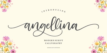 Love Angellina a luxury font with a natural and modern handwritten font. It's perfect for logos, invitations, stationery, wedding designs, social media posts, advertisements, product packaging, product designs, labels, photography, watermarks, special events or anything.
 - MAREGY by Salamahtype,
$19.00 MAREGY is a modern sans-serif font with an elegant style. This font is perfect for branding projects, logos, social media posts, advertisements, product packaging, wedding invitations, product design, labels, photography, watermarks, stationery, and more.
 - Aulietta by Nissa Nana,
$23.00 Aulietta is a delicate, elegant and flowing handwritten font. Get inspired by its authentic feel and use it to create gorgeous wedding invitations, beautiful stationary art, eye-catching social media posts, and cute greeting cards.
 - Hello Dudley by Tlatous Type,
$19.00 Introducing Hello Dudley by Tlatous Type. Hello dudley is a Modern Handwritten Font. This font is perfect for product packaging, branding project, megazine, social media, wedding, or just used to express words above the background.
 - Fondest by Prioritype,
$19.00 Introducing. Fondest: A modern and classic look font that is simple and looks luxurious. Great for branding, social media posts, logos, quotes, magazines etc. Features: Uppercase, Lowercase, Numeral, Punctuation, Multilingual, Ligature, Alternates & PUA Encoded. Thanks.
 - Amila Cuties by Prioritype,
$14.00 Introducing. Amila Cuties: Cheerful and funny font with a natural impression from hand strokes. Great for design projects like quotes, posters, merchandise, social media posts, covers, and more. Features: Uppercase, Lowercase, Numeral, Punctuation & Multilingual. Thanks!
 - Maribast by Brithos Type,
$11.00 Maribast is a flowing and relaxed handwritten font. Fall in love with its incredibly versatile style and use it to create gorgeous wedding invitations, beautiful stationary art, eye-catching social media posts, and much more!
 - Joy Kids by Tlatous Type,
$19.00 Introducing Joy kids by Tlatous Type. Joy Kids is a Modern Handwritten Font. This font is perfect for product packaging, branding project, megazine, social media, wedding, or just used to express words above the background.
 - Matcha Dalgona by Tlatous Type,
$19.00 Introducing Matcha Dalgona by Tlatous Type. Matcha Dalgona is a Modern Handwritten Font. This font is perfect for product packaging, branding project, megazine, social media, wedding, or just used to express words above the background.
 - Stargold by Rockboys Studio,
$19.00 Stargold is an elegant and bold script font. Fall in love with its incredibly versatile style and use it to create gorgeous wedding invitations, beautiful stationary art, eye-catching social media posts, and much more!
 - Milk Made by loryn ipsum,
$12.00 Milk Made | a rounded retro font Milk Made is a fun rounded retro font inspired by mid-century magazine and print advertisements. Perfect for; retro brands, young brands, gen z branding, logos, social media, posters.
 - August Bright by Adita Fonts,
$26.00 August Bright is a modern and elegant serif font. Perfect for us on your logos, quotes social media, business cards, web designs and so much more. COMPATIBILITY Windows Apple/Mac Linux Easily convert to webfont
 - Sf Supernova by S6 Foundry,
$15.00 Supernova is a stylistic display font developed within a set grid. Perfectly suited for headlines, large-format prints, brand identities, social media, advertising, editorial design, posters, magazines, logos, headings, digital and more. Multi-language support.
 - KoreanJeju by Beewest Studio,
$10.00 Korean Jeju Font, is a cool and modern display font and a great companion for your Korean-themed designs. It’s perfect for movie posters, greeting cards, social media content, youtube videos, even logo design, etc.
 - Cavendish by Essentials Studio,
$15.00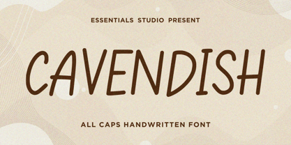 Introducing by Essentials Studio Proudly Present, CAVENDISH CAVENDISH Is a A Cute Handwritten Font CAVENDISH is perfect for product packaging, branding project, megazine, social media, wedding, or just used to express words above the background.
 - Walytime by Stringlabs Creative Studio,
$29.00 Walytime is a relaxed and timeless handwritten font. Fall in love with its incredibly versatile style and use it to create gorgeous wedding invitations, beautiful stationary art, eye-catching social media posts, and much more!
 - Donut & Candy by Tlatous Type,
$19.00 Introducing Donut & Candy by Tlatous Type. Dinut & Candy is a Modern Handwritten Font. This font is perfect for product packaging, branding project, megazine, social media, wedding, or just used to express words above the background.
 - Thescound by Mifiq,
$14.00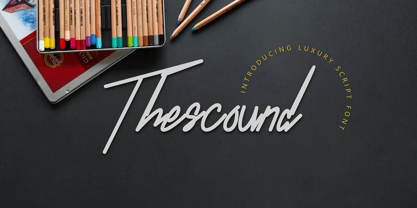 Thescound is a smooth and elegant handwritten font. Thescound is suitable for social media posts, advertisements, logos & branding, invitations, product design, photography, watermarks, labels, wedding designs, product packaging, any event that requires a handwritten look.
 - Monthier by Aestherica Studio,
$9.00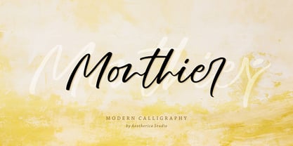 Monthier is a modern and original handwritten font perfect for branding projects, logos, wedding designs, social media posts, advertisements, product packaging, product designs, label, photography, watermark, invitation, stationery, and any projects that need handwriting taste.
 - Lonely Together by Dumadi,
$20.00 Lonely Together is a unique handwritten-style font created with brush tools. if you have a project in the form of romantic nuances, invitation cards, social media designs, branding, valentine events, crafting designs, and more.
 - Bristow by Danielle Eneh,
$10.00 Bristow is a friendly, uppercase display font that's perfect for your next project. Branding, social media posts, advertisements, product packaging, and invitations. It includes 2 uppercase options for more customization. Multilingual Support: AÀÁÂÃÄÅCÇDÐEÈÉÊËIÌÍÎÏNÑOØÒÓÔÕÖUÙÜÚÛWYÝŸ?ŸÆŒßÞþ dis
 - Santaria by Essentials Studio,
$16.00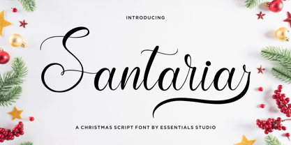 Introducing by Essentials Studio Proudly Present, Santaria Santaria Is a Modern Christmas Script Font Santaria is perfect for product packaging, branding project, megazine, social media, wedding, or just used to express words above the background.
 - Boldetton by Rockboys Studio,
$26.00 Boldetton is an elegant and bold script font. Fall in love with its incredibly versatile style and use it to create gorgeous wedding invitations, beautiful stationary art, eye-catching social media posts, and much more!
 - Vigallse by Krakenbox Studio,
$17.00 Vigallse – Vintage Modern Serif Typeface. It has vintage, modern, classic & elegant. It’s a great font for fashion, apparel projects, signature, album cover, logo, branding, magazine, social media, & advertisements, but also works great for other projects.
 - Untlang by Essentials Studio,
$16.00 Introducing by Essentials Studio Proudly Present, UNTLANG UNTLANG Is a A Bold Handwritten Font UNTLANG is perfect for product packaging, branding project, megazine, social media, wedding, or just used to express words above the background.
