10,000 search results
(0.029 seconds)
- Dime Museum by Solotype,
$19.95This idea of "wrong way weights" was originally called French Clarendon by the Americans, Italienne by the French, and American by the Italians. Sounds like nobody wanted to own up to it. When it was revived by ATF in 1933, it was given the name P. T. Barnum. Many variations have appeared. Dime Museum is an old wood type. - Petroles by Punch,
$9.50 Petroles was designed to transform from an elegant lightweight into a funky heavyweight to create a more casual attitude, giving it the ability to perform in all sorts of designs, coming with several OTF features to adjust it to your likings. Each weight has a complimenting set of almost monoweight small caps to easily bring contrast & variation.
 - Piepie by Dharma Type,
$24.99 Piepie is very heavy typeface for titlings and captions. OpenType Format (.otf) with 461 glyphs! Super mini ascenders and descenders! Ultra big x-height! Fatty weight yet Sharpy sharp detail! Bring it on Retina display! OpenType alternates for K, R and Y! Mac Roman ✓ Windows 1252 ✓ Adobe Latin 1 ✓ Adobe Latin 2 Almost all Adobe Latin 3 Almost all
 - Cat Fight by Tour De Force,
$25.00 Cat Fight is small decorative font family containing two "weights". They are not weights in actual meaning, as they differ by style but to secure safe OTF usage in all OS, they are named as Regular and Bold. Cat Fight is ideal for lively and cheerful usages on posters, packages, labels, website titles, book covers and other similar situations.
 - LTC Fournier Le Jeune by Lanston Type Co.,
$24.95 Based on the all caps decorative face Fournier le Jeune of 1768 by Pierre Simon Fournier for the Peignot Foundry. This version uses more elaborate "Vouge Initials" caps which were offered by ATF in 1920s. Because of the decorative nature of this design, a full character set is not included, but accented characters and basic punctuation are included.
 - White Risolles by pentagonistudio,
$19.00 White Risolles Is Clean Script Font Inspired By Handwritting Characters. Font Features : White Risolles OTF ( Open Type ) White Risolles WOFF ( Web Font ) SOFTWARE REQUIREMENTS : Fonts and alternate : No special software required they may be used in any basic program /website apps that allows standard fonts That's it folks! You can go ahead and get cracking :) Have a Good Day !
 - French Fries by Red Rooster Collection,
$60.00 French Fries is a three-weight decorative font family. It was created and produced by Steve Jackaman (ITF) in 2017. French Fries has a casual, lighthearted, playful, hand-lettered look, and is food for the eyes at any size. The family is surprisingly versatile, and might be right at home on menus, packaging, and early education materials.
 - French Script by Monotype,
$40.99French Script font is based on script handwriting and engraving used in formal announcements and invitations in general, and specifically on a 1905 ATF face named Typo Upright," by Morris Fuller Benton. French Script lends itself to typesetting in which an elegant mood is desired. French Script is an upright script font with an engraved appearance and decorative capitals. " - Ferpa by Typeóca,
$30.00 Ferpa is Typeóca's Fierciest Font Family. Drawn using only straight lines, Ferpa uses every kink, every kink and every serif as an opportunity for expressivity. From Thin to Black in both Roman and Italic constructions, Ferpa is available as 18 otf static font files, with a character set that goes a little beyond Latin Extended A.
 - Fox Sans Pro by TipografiaRamis,
$39.00 Fox Sans Pro – an upgraded version of Fox Sans TRF (2008), with careful refinements to glyph shapes and extension of glyph amounts, which enabled support of more Latin languages as well as support of Cyrillic. Four more styles have been added to the original six styles. This typeface is released in OpenType format with some OpenType features.
 - Iago NF by Nick's Fonts,
$10.00Two classics from American Type Founders specimen catalogs of the 1880s—Othello and ATF Black Caps—inspired this powerful headline face with a decidedly menacing quality. Suitable for creepy, eerie and spooky occasions. Both versions of the font include complete Latin 1252, Central European 1250 and Turkish 1524 character sets, with localization for Moldovan, Romanian and Turkish. - Always Believe by Olivetype,
$18.00 Always Believe is a simple, fun, and relaxed handwritten font. Whether you’re using it for crafting, digital designing, presentations, or greeting card making, it’s perfect! This font is supporting Multi-Languages, which includes: Afrikaans Albanian Catalan Danish Dutch English Estonian Finnish French German Italian Norwegian Portuguese Spanish Swedish Zulu. You will get : Always Believe OTF Thank You
 - Boston Breton NF by Nick's Fonts,
$10.00This engaging slab serif face made its debut in the 1906 ATF specimen catalog, and wears well over a century later. Its warm lines and a wide stance ensure that your headlines will be noticed. Both versions feature the complete Latin 1252, Central European 1250 and Turskish 1254 character sets, with localization for Lithuanian, Moldovan and Romanian. - Qistilla by Ditatype,
$29.00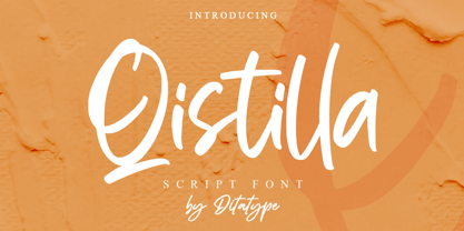 Qistilla is a casual handwritten font. Made for any professional project branding that need a modern and attractive typeface. It is the best for logos, branding and quotes. Every letter has a unique and beautiful touch. Includes: Qistilla (OTF) Features: Standart Ligatures Multilingual Support PUA Encoded Numerals and Punctuation Thank you for downloading premium fonts from Dita Type
 - Mercantile Display NF by Nick's Fonts,
$10.00This older, somewhat funkier relative of the classic face, Engravers Roman, made its last appearance in the 1912 ATF Specimen Book. Here, it has been revived to do yeoman-like duty in a new century. This font contains the complete Latin language character set (Unicode 1252) plus support for Central European (Unicode 1250) languages as well. - ATC Timberline by Avondale Type Co.,
$20.00 ATC Timberline, is an ultra wide-set sans-serif typeface. With its sharp points and extended curves, ATC Timberline feels just at home in mid-century modern as it does in forward-looking modern settings. Contains 370+ glyphs, full alphabet, ligatures, numberals, accents and punctuation. File type included in download is .otf. ATC Timberline was released in 2016.
 - New Horizon by Aboutype,
$24.99Inscriptional capital titling face drawn for a magazine. Suitable for a variety of media if used at 30 point and above. New Horizon requires subjective display kerning and compensation. - Everett Mill by Aboutype,
$24.99Outline brush script originally designed for embroidery application. Everett was designed for all media and works best at 24 point and above. Everett requires subjective display kerning and compensation. - RF Takt by Russian Fonts,
$34.00 RF Takt is a condensed geometric grotesque with closed forms of signs. 14 fonts from Ultralight to Black. 878 glyphs and 3738 kerning pairs. 16 opentype features. Multilingual support: Latin, latin extended, cyrillic and cyrillic extended (more than 91+ languages) We have tried to make RF Takt feel as good as possible in the field of graphic design and became a versatile tool for solving a wide range of graphic tasks. The specific feature of the font is that having condensed forms of characters allows you to place a large amount of information in a limited space. RF Takt will be a bright accent in a large size and will keep the readability in a small size. A large amount of opentype features opens up a wide range of options for experiments and original solutions. RF Takt is ideal for poster design, web design, newspaper design, magazine layout and covers, video titles, infographics, logos and branding, packaging, navigation solutions. Opentype features: ligatures, alternative symbols, ordinary and tabular numbers, old-style and old-style tabular numbers, tabular currency signs, fractions and automatic fraction, arrows and alternative arrows, case sensitive forms, upper and lower case numbers, small capitals.
 - FF Cocon by FontFont,
$65.99 FF Cocon’s designer, Evert Bloemsma (1958—2005) described it as a “serious typeface”. Despite first impressions, the description holds up well. Since its 2001 release, FF Cocon has been used in an astoundingly wide variety of design applications. At large sizes, FF Cocon works as a display face, with beautiful detailing. And at small sizes, it remains surprisingly readable. The lowercase letters a, b, d, g, h, m, n, p, q, r and u, were drawn without spurs, as Bloemsma made an attempt to erase every trace of handwriting; even “normal,” neutral sans serif typefaces still retain elements in their letterforms like this. Bloemsma wanted none of it. Although a difficult starting point for a typeface, this proved successful. Bloemsma’s design is a family of rounded yet rather asymmetrical forms with details reminiscent of brush-strokes, but that were not made with a brush in hand. In spite of its claim to seriousness, FF Cocon is a family of seductive, voluptuous styles. The original FF Cocon had two widths—normal and condensed. Later, a more compact Extra Condensed version was introduced, as well as italics.
 - Kindly Season by Ahmad Jamaludin,
$17.00 Present to you for New Modern Decorative Serif, Kindly Season! Kindly Season has a lowercase that is a unique uppercase letter, You can easily correct this by replacing the alternate letters with uppercase. It's very simple, isn't it? Comes in 3 versions: Condensed, Regular, and Expanded, with a whopping total of 60+ unique ligatures, it's easy to achieve custom typography for stunning logos, headlines, and quotes. Kindly Season has a unique 'S' that is perfect for headers in projects; it can even be used for logos. Additionally, Kindly Season features other cool, decorative-style letters that add a touch of creativity. Type in all lowercase in the type tester to try it out! What's Included? Kindly Season Main File Condensed, Regular and Expanded 60+ Ligatures Instructions (Access special characters in all apps, even in Cricut Design) Accessible in Adobe Illustrator, Adobe Photoshop, Microsoft Word even Canva! PUA Encoded Characters. Fully accessible without additional design software Language Support: Danish, English, Estonian, Filipino, Finnish, French, Friulian, Galician, German, Gusii, Indonesian, Irish, Italian, Luxembourgish, Norwegian Bokmål, Norwegian Nynorsk, Nyankole, Oromo, Portuguese, Romansh, Rombo, Spanish, Swedish, Swiss-German, Uzbek (Latin) Thank you Dharmas Studio
 - Atoverz by Twinletter,
$17.00 Introducing Atoverz, the perfect retro condensed font for your next project. This font features a classic retro design that is both stylish and functional. With 49 curved alternate characters and 32 beautiful ligatures, Atoverz allows you to easily create unique and stunning designs. Its multilingual support also ensures you can use it for projects in any language. The sleek and elegant design of Atoverz makes it perfect for a wide range of projects, from logos and branding to posters and advertisements. Its retro classic style is sure to catch the eye of your audience and leave a lasting impression. So why wait? Add Atoverz to your font collection today and take your designs to the next level. Browse our collection now to discover the versatility and charm of Atoverz retro condensed font. What’s Included : - File font - All glyphs Iso Latin 1 - Alternate, Ligature - Simple installations - We highly recommend using a program that supports OpenType features and Glyphs panels like many Adobe apps and Corel Draw so that you can see and access all Glyph variations. - PUA Encoded Characters – Fully accessible without additional design software. - Fonts include Multilingual support
 - Hornsea FC by Studio Fat Cat,
$18.00 Hornsea FC is a super condensed font family that designed for display purposes. 14 styles of Hornsea FC font will let you to explore more your creativity. Related keywords: modern font, branding font, logo font, magazine font, display font, packaging font, logotype font, contemporary font, elegant font, poster font, headline font, geomatric font, corporate font, serif font, sans serif font, classic font, advertising font, fashion font, editorial font, design font, vintage font, identity font, book font, text font, legible font, grotesk font, grotesque font, technical font, clean font, swiss font, webfont, web font, wordmark font, serif font, retro font luxury font, unique font, typography font, title font, playful font, signage font, german font, workhorse font, versatile font, neutral font, condensed font, expanded font, slab serif font, college font, sports font, sport font, slab font, football font, baseball font, athletic font, varsity font, soccer font, soccer font, basketball font, american font, ligatures font, wedding font, feminine font, classy font, chic font, script font, opentype font, contemporary font, oriq font, handwriting font, handwritten font, urban font, stylish font, fashion font, bold font, handmade font, casual font, trendy font, signature font, marker font, street font, font family,
 - Dilemma by Sudtipos,
$39.00 Dilemma is a sans/sans serif type system with 42 styles; it is inspired by the anonymous Polyphème, Cyclopéen and Extra Condensé designs from the early 1900s at the Peignot Fonderie. From these initial points of reference, Sudtipos went further and reimagined these projects for an actual use by blending them into a unique and complex type system. Dilemma is defined as ‘a situation in which a difficult choice has to be made between two or more alternatives, especially ones that are equally undesirable’ and that is exactly how we designed this font. We created a workhorse system where each style functioned well alone but would be more powerful when working as a team, pairing the sans styles with the serifs. Dilemma comes in 3 different widths and 7 weights in both the sans and the serif, ranging from the more economical yet legible condensed styles, to the opulent bold and expanded weights. Dilemma also contains 2 Variable Fonts. We imagine Dilemma being used in a limitless array of graphic projects including identity systems, digital platforms, public spaces, editorial design and beyond. Now the Dilemma is yours.
 - MVB Diazo by MVB,
$59.00 Mundane information—the sort you might ignore—often appears in the form of very simple, utilitarian lettering, devoid of personality, the sort of industrial lettering you find on old blueprints, park restrooms, and electrical boxes. MVB Diazo is such a thing. It looks like lettering done earnestly with a plastic template. The monoline caps—constructed from straight lines and simple curves—have rounded details as if rendered by a blunt pen on a topographical survey or by a router on a rustic campground sign. The MVB Diazo fonts are compact, available in two widths: Condensed and Extra Condensed. Each width offers four weights from Light to Black. The fonts are perfect for wherever plain and boring letterforms are required. All widths and weights are also available in two distressed textures (#1 and #2) that accentuate the industrial character of the design. Rough #1 is gritty, with finer texture for use at larger sizes. Rough #2 exhibits more damage, the roughness apparent when used at smaller sizes. The Rough fonts include alternates of a number of glyphs so that variation of texture is possible when letters repeat in a word.
 - Getoik by Twinletter,
$18.00 Introducing Getoik, the Retro Condensed Font that will take your designs to the next level. With its clean and smooth edges, this font is perfect for any design project. Getoik features multiple ligatures and alternates, giving you even more design options to choose from. Whether you’re creating a logo, branding materials, or any other design project, Getoik will add a touch of elegance and sophistication to your work. Its condensed shape allows for maximum impact while taking up minimal space, making it perfect for headlines, titles, and subheadings. With its versatility and attention to detail, Getoik is a must-have for any designer looking to elevate their work to the next level. So why settle for less when you can have the best? Get Getoik and take your designs to new heights! What’s Included : - File font - All glyphs Iso Latin 1 - Alternate, Ligature - Simple installations - We highly recommend using a program that supports OpenType features and Glyphs panels like many Adobe apps and Corel Draw so that you can see and access all Glyph variations. - PUA Encoded Characters – Fully accessible without additional design software. - Fonts include Multilingual support
 - Renois by Craft Supply Co,
$20.00 Introducing Renois – Display Sans Serif Powerful Impact, Bold and Condensed Renois – Display Sans Serif is more than just a font; it’s a meticulously designed tool for achieving a commanding presence in a variety of display applications. Command Attention Instantly Furthermore, Renois is purpose-built to command attention instantly. Its bold and condensed design ensures that your message takes center stage and captures the viewer’s gaze right away, making it perfect for headlines and displays that demand immediate attention. Clarity in Boldness Remarkably, despite its boldness, Renois prioritizes clarity. Each character is thoughtfully crafted for optimal readability, guaranteeing that your message is not only impactful but also effectively communicated, even at larger sizes. Versatile for Diverse Displays Moreover, Renois’s versatility shines in various display applications, whether it’s for posters, banners, or promotional materials. This typeface seamlessly adapts to your design needs, making a bold and impactful statement in any context. In Conclusion In summary, Renois – Display Sans Serif is the font of choice when you need to make a powerful and clear statement in your displays. Elevate your designs with Renois, ensuring your message rises above the noise, leaving an indelible and memorable impact on your audience.
 - Romana by Bitstream,
$29.99The French interest in the revival of suitably edited Oldstyle romans as an alternative to a world of Modern typefaces started in 1846 when Louis Perrin cut the Lyons capitals. About 1860, as Phemister was cutting the Miller & Richard Old Style in Edinburgh, Theophile Beaudoire turned the idea of the Lyons capitals into a complete Oldstyle typeface, with similar overwhelming success; it was generally known as Elzevir in France and Roemisch, Romanisch, Romaans or Romana in Germany, Holland and Switzerland. In 1892, Gustav Schroeder, at the Central Division of ATF, expanded the series, adding a boldface under the name De Vinne. It was promptly copied, initially in Europe by Ludwig & Mayer, and spread rapidly throughout the US and Europe, becoming the best known member of the series. ATF made popular an ornamental form under the name De Vinne Ornamental. - Gradl Initialen ML by HiH,
$12.00 Max Joseph Gradl designed Art Nouveau jewelry in Germany. At least some of his designs were produced by Theodor Fahrner of Pforzheim, Germany -- one of the leading manufacturers of fine art jewelry on the Continent from 1855 to 1979. I don't know if he designed for Fahrner exclusively, but every example I found was produced by that firm. I assume it was also the same M.J, who edited a book, Authentic Art Nouveau Stained Glass which was reissued by Dover and is still available. For an artist as accomplished as Gradl was, he is very tough to research. There just does not seem to have been much written about him. The jeweler is visible in most of his typeface designs. They exhibit a sculptural quality as if they were modeled in clay (or gold) rather than drawn on paper. His monograms, especially, reflect that quality. Those shown in plates 112 through 116 in Petzendorfer actually appear to have been designed specifically for fabricating in the form of gold or silver pendents. Of the initial letters that came out of Germany during this period, these by Gradl seem unusually open and lyrical. They seem to be dancing on the page, rather than sitting. Please note that Gradl designed only the decorated initials. All other characters supplied were extrapolated by HiH, including the accented initials. Orn.1 (unicode E004) is based on a jeweled gold clasp designed by Gradl (please check out Gallery Image on Myfonts.com). Also included are an art nouveau girl’s face, a swan and the face from Munch’s “Scream”, from scans of old printer’s ornaments. Gradl Initialen M represents a major extension of the original release, with the following changes: 1. Added glyphs for the 1250 Central Europe, the 1252 Turkish and the 1257 Baltic Code Pages. Added glyphs to complete standard 1252 Western Europe Code Page. Special glyphs relocated and assigned Unicode codepoints, some in Private Use area. Total of 341 glyphs. Both upper & lower case provided with appropriate accents. 2. 558 Kerning Pairs. 3. Added OpenType GSUB layout features: salt, dlig, ornm and kern. 4. Revised vertical metrics for improved cross-platform line spacing. 5. Refined various glyph outlines. 6. Alternative characters: 16 upper case letters (with gaps in surrounding decorations for accents above letter). 8. Four Ornaments: face1, face2, swan and orn1 (silhouette of Gradl clasp) The zip package includes two versions of the font at no extra charge. There is an OTF version which is in Open PS (Post Script Type 1) format and a TTF version which is in Open TT (True Type)format. Use whichever works best for your applications.
 - Figgins Tuscan by HiH,
$12.00 Early in the 19th century, foundries began releasing a variety of decorated ornamental letters based on the Tuscan letterform. Fancy Tuscan letters quickly became so popular, they eventually came to represent the cluttered extremes of Victorian design. Foundries competed with each other to produce most extravagantly decorated letterforms. As often happens, success turned to excess. What is often overlooked is the long history of the Tuscan style. Early examples have been traced back to ancient Rome. Indeed, the characteristic bifurcation may have represented a fishtail to the early Christians, thus sharing in the roll of symbolic identification played by the simple drawing of a fish as a whole. Later. trifurcation was developed as an alternate termination, followed by loops, full fishtails, curls, hooks and other fancy variations. Nicolete Gray provides an extensive history in her Appendix One of NINETEENTH CENTURY ORNAMENTED TYPEFACES. According to Gray, the first metal typeface based on the Tuscan form was the Ornamented of 1817 by Vincent Figgins of London. Thorowgood followed suit in 1821, Fry in 1824 and Caslon in 1830. Each was to re-visit the form many times during the Victorian era. Here we present our interpretation of what Figgins might have produced in a basic, plain Tuscan form - free of the decorative additions. We are pretty safe here because Figgins was very creative. He explored many of the terminal variations listed above and combined them with different decorative devices to produce a constant stream of new faces to meet the demands of the marketplace. Figgins Tuscan ML represents a major extension of the original release, with the following changes: 1. Added glyphs for the 1250 Central Europe, the 1252 Turkish and the 1257 Baltic Code Pages. There are also a few glyphs for Anglo-Saxon, Gaelic and Old Gaelic. Total of 355 glyphs. 2. Added OpenType GSUB layout features: aalt, ornm and liga ˜ with total 34 lookups. 3. Added 351 kerning pairs. 4. Redesigned several glyphs: the comma, quotes, brackets, braces, acute accent, and grave accent. 5. Revised vertical metrics for improved cross-platform line spacing. Please note that some older applications may only be able to access the Western Europe character set (approximately 221 glyphs). The zip package includes two versions of the font at no extra charge. There is an OTF version which is in Open PS (Post Script Type 1) format and a TTF version which is in Open TT (True Type)format. Use whichever works best for your applications.
 - Evanston Alehouse by Kimmy Design,
$10.00 Evanston Alehouse is the first font in a larger collection of typefaces inspired by years leading up to the American prohibition. For the past two years I was living in Evanston, IL, a suburb of Chicago. After learning it was one of the birthplaces of the prohibition movement, I set out to learn more about it, and decided to develop a type collection that captures the dynamic era in our nation’s history. In the century that prefaced the ratification of the 18th amendment, saloons, taverns and alehouses boomed as the American working class enjoyed beer and discovered whiskey and gin. At the same time, the Temperance League was forming and gaining strength. By the turn of the century, these temperance societies were common in the culture of the country, with individual towns and states already on the move to abolish alcohol consumption. However, it was undeniable that by this time in history, America loved to drink. This font is inspired by the signage seen outside such drinking establishments. Back to the modern era, Evanston Alehouse is a 25 font family that includes 3 weights, 4 widths and 3 heights. It has special features that add depth to the font, with discretionary ligatures and stylistic alternatives. It also includes a complementary set of ornaments, including line breaks, frames, borders, and laurels. Here’s a snapshot of what you get with Evanston Alehouse: 2 Styles/Postions: Sharp (regular) and Round 3 Weights: Light, Medium and Black 4 Widths: 1826 (condensed), 1858 (narrow), 1893 (wide) and 1919 (expanded) 3 Heights: Capitals, lowercase and small caps 2 Alternatives: Discretionary Ligatures and Stylistic Alternatives 1 Ornament font with over 100 graphic extras
 - Uecker - Unknown license

- SecretCode - Unknown license

- Iknu font by Iknu,
$10.00 Iknu is a contemporary, minimal font that expresses spiritual life in its simplicity and mistery. Great font for religious / spiritual content and any other that needs a simple attractive font.
 - Boott Stitch by Aboutype,
$24.99Pen drawn in line, outline typeface originally designed for embroidery application. Boott was designed for print media in a wide point size range. Boott requires subjective display kerning and compensation. - Ann’s Valentines by Dingbatcave,
$15.00Ann's Valentines are heart-shaped dingbats that are perfect for web design as well as print that you'll use 'til your heart's content. A dingbat to fall in love with. - Magwey by Hazztype,
$24.00 Magwey is a fun and friendly retro groovy font, with experimental ink traps. suit for magazine cover, brochure, logos, Headlines or Quotes, Stand alone displays, and short paragraphs or contents.
 - Meristmas by HansCo,
$17.00 Meristmas is a beautiful and sweet handwritten font. It is fresh, clean, and elegant. This font will look amazing in a great amount of projects, both formal and informal. Meristmas is the perfect font for making craft original and outstanding designs. Its casual charm makes it appear wonderfully down-to-earth, readable and, ultimately, incredibly versatile. You can also get alternate ornament / swashes in this font. Just type 0 - 9 and block one characters ( number ) / highlight and you can get alternate swash in here. If you use character Map please convert to .ttf format to get swash alternate. Comes with a full uppercase, lowercase, numbers and punctuation + standard multilingual support. It’s great for branding, logo designs, lettering, logotype, craft, posters, packaging and much more. We recommend using Adobe Illustrator or Photoshop. Tutorial how to Install & use Alternate / Special Character : https://hanscostudio.com/tutorial/ Enjoy!
 - Pagoda Script by HKL Studio,
$21.00 Pagoda Script Is a calligraphy Vintage script font that comes with beautiful alternate characters. copper plate mix calligraphy with handlettering style. Designed to convey stylish elegance. Pagoda attracts like a typeface that is smooth, clean, feminine, sensual, glamorous, simple and very easy to read. Pagoda Script comes with a Clean and Aged version, beautiful upper and lower case, binding and loved by many finishes. It has Multilingual support (Western European characters) and works with the following languages: English, Danish, Dutch, Estonian, Finnish, French, German, Hungarian, Icelandic, Italian, Norwegian, Polish, Portuguese, Spanish, Swedish. In my example I show how this script can be used. It's perfect for logos, wedding invitations, alcohol labels, romantic cards, and more. Products include: Clean & Aged Script Versions (TTF) Alternative Upper & Lowercase Styles fastener Recommended for use in Adobe Illustrator or Photoshop. Special features do not work in Microsoft Word.
 - Glorify SH by Sohel Studio,
$12.00 Glorify SH is a Modern vintage serif typeface with Unique alternative , multilingual support with perfect kerning. This typeface is perfect for an elegant & luxury logo , classy editorial design, women's magazine, fashion brand , cosmetic brand, fashion promotion , modern advertising design, invitation card, art quote, home decoration , book/cover titles, special events, Tote bag, T-shirt, Advertising and much more. Glorify SH Features: · 4 Weights font (Regular, Italic, Outline, Semi Bold) · Uppercase And Lowercase · Alternates · Numerals & Punctuation · Accented characters · Multilingual Support · Unicode PUA Encoded If you need another format of this font, such as TTF, WOFF and WOFF2, please contact me. While using this product, if you encounter any problem or spot something we may have missed, please don't hesitate to drop us a message. We'd love to hear your feedbacks in order to further fine-tune our products. Thanks and have a wonderful day .

