10,000 search results
(0.024 seconds)
- Scientist Castle by DLetters Studio,
$13.00 Scientist Castle Family Slab Serif Font Is A Great Font For any project! Available in 4 styles that you can use for various purposes, as a combination or separation according to the design style. Complete with OpenType features, which allow you to give a more calligraphic look! There are regular, Italic, Outline, and Outline Italic styles and very easy to use. Scientist Castle Family Slab Serif Font is a great choice for Projects you like branding, design, wedding, photography, Magazine, logo designs, album, covers Book, business cards, quotes, and projects other designs. What’s Included : – S-Alt – Works on Win, Mac – Simple installations – Accessible in Adobe Illustrator, Adobe Photoshop, Adobe InDesign, even work on Microsoft Word. – PUA Encoded Characters – Fully accessible without additional design software. Thanks for your support, please kindly send us a message for any question about our product. Hope you like it.
 - Onomatopedia by Comicraft,
$29.00 Fans of Comicraft have made a lot of noise (HELP!) about the availability of ready-to-wear, factory surplus sound effects, not unlike those made available over a decade ago in our extremely popular and raucous ZAP PACK. It may sound impossible (WHA--?!), but Comicraft's Sonic Specialist, John JG Roshell, locked himself away (CLIK) in our top-secret SFX lab forming Onomatopoeia at high speeds (FWOOSH) and extreme temperatures (BBRRR), and sounded out over One Hundred (GASP) of the loudest (BTOOM), most intense (UNNGHH), squawkiest (KRAKK), discordant (SPLANGG), dissonant (SQUTCH) -- as well as dulcet and restrained (THWIPP) -- sound effects ever conceived (WOO HOO!) Helpfully arranged in alphabetical order (YIPPEE!), this Library of Onomatopeia -- the ONOMATOPEDIA, if you will (DING) -- is now available for use by the general public. WARNING: Comicraft Sound Effects may explode on contact with skin (AAAH!); please use protective clothing and eyewear when handling the Onomatopedia.
 - Clarks by PintassilgoPrints,
$45.00 Clarks is a modular typeface built from a work by Lygia Clark, one of the giants of Brazilian postwar art. Packed in a font equipped with clever OpenType programming, there are at least 7 different designs for each letter, thus allowing, or rather, proposing, boldly unconventional compositions. The font is programmed to cycle all these different lettershapes, avoiding repetition. The user can also manually pick up preferred forms in a glyph palette. There are choices to both keep and to defy readability and it's almost hypnotic to play with these. Lygia Clark used to invite viewers to touch her works and so we did with her 'Planes in Modulated Surface no. 4', from 1957: we fragment it and turned and inverted and recombined it. Now we return it as audacious typography and invite you to put it to work in your designs. Keep it bold and have fun! Cheers!
 - Letterbot by Comicraft,
$19.00 "If you prick me, do I not bleed? If you tickle me do I not laugh? If you poison me do I not DIE? And if you wrong me shall I not REVENGE?" "I am not a TYPEWRITER! I am not a MACHINE! I am -- NOT -- JUST -- a lettering ROBOT! I -- AM -- A -- HUMAN -- BEING!" Having trouble with YOUR lettering artist? LETTERBOT is here to help. Take all the fuss and muss out of dealing with a real person and install this helpful and responsive robotic font. It has no opinions of its own and will assist you in the lettering of your comic without all that tedious human interaction which lettering artists seem to think they're entitled. Designed by John JG Roshell.* *Now obsolete. Features: Four weights (Regular, Italic, Bold & Bold Italic) with upper and lower case alphabets. Includes Western & Central European accents and Cyrillic characters.
 - Entestats by Typephases,
$25.00 Nearly a hundred human heads, in three dingbat files. The whole series comes from the sketchbook: the original ink drawings were then digitized and refined to create vector outlines. Rather than perfectly smooth, geometrical shapes, the Entestats, like their close relatives in the Capsbats series, the Entestats retain a handmade look and feel. The Entestats are ready-made illustrations, though of course they will appreciate being enriched with colours, textures, an imaginative layout... and use them for a variety of projects. Use them small, as spot illustrations or as big as a whole page or page spread. The Entestats and their kin, the Capsbats, are a terrific resource for presentations, packaging, logos, brochures and advertisements, to name a few applications. The book 1000 Heads is a compendium of the drawings featured in the Capsbats and Entestats and it gives a glimpse of the limitless applications of this collection.
 - Rennie Mackintosh Allan Glens by CRMFontCo,
$35.00Since the 2006 launch of Rennie Mackintosh Glasgow, the world’s first lowercase Mackintosh-style typeface, designer George R. Grant has been pleased with its acceptance by Mackintosh lovers around the world. In fact, “Glasgow” has proved to be as popular as the original “founding” font, the classic Charles Rennie Mackintosh Font. By modifying many of these letterforms, and giving a more “freehand” shaping, George has developed this latest offering. The font has irregular “serifs” at the extremities of each stem - a suggestion of being handwritten. The name “Allan Glens” comes from the high school Mackintosh attended which, coincidentally, George did too. Says George, “As the school no longer exists, I wanted a way to perpetuate the Allan Glen’s name in type. I can think of no better way than associating it with the name of one of the school’s most famous sons. One of the glyphs even features the school logo”. - Leaf by Journey's End,
$12.00This "Leaf" font has been swirling in my head for years - I remember my sister and I making letter formations like these when I was young. It was exciting to see the lettering look even better on paper than it did in my mind! "Leaf" surprised me by having two distinct looks: in size 24 or smaller, the look is delicate, because your eye doesn't see any space in the letters. In size 28 or larger, the eye can discern spaces, which gives a different facet to its personality. As much as I like this font when viewed on a monitor screen, it really shines when printed. The "Leaf" font is a perfect blend of quaint hand-written style mixed with crisp letter formations. This font has a very "happy" quality to it. May using it bring a little more happiness to your day! - Excritura by Linotype,
$29.99Excritura is the third typeface created by the Spanish designer Alex Camacho. The robust personality of this original calligraphy-derived italic font will undoubtedly also win you over.Organic shapes determine the character of Excritura, a calligraphic typeface by Alex Camacho. The font has been modelled on the work of the Spanish Architect Antoni Gaudí and was inspired by his love of natural forms and craftsmanship. This is perhaps unsurprising in view of the fact that Camacho grew up in Barcelona, home to much of Gaudí’s creative oeuvre. Organic shapes determine the character of Excritura, a calligraphic typeface by Alex Camacho. The font has been modelled on the work of the Spanish Architect Antoni Gaudí and was inspired by his love of natural forms and craftsmanship. This is perhaps unsurprising in view of the fact that Camacho grew up in Barcelona, home to much of Gaudí’s creative oeuvre. - ITC Legacy Serif by ITC,
$40.99 ITC Legacy¿ was designed by American Ronald Arnholm, who was first inspired to develop the typeface when he was a graduate student at Yale. In a type history class, he studied the 1470 book by Eusebius that was printed in the roman type of Nicolas Jenson. Arnholm worked for years to create his own interpretation of the Jenson roman, and he succeeded in capturing much of its beauty and character. As Jenson did not include a companion italic, Arnholm turned to the sixteenth-century types of Claude Garamond for inspiration for the italics of ITC Legacy. Arnholm was so taken by the strength and integrity of these oldstyle seriffed forms that he used their essential skeletal structures to develop a full set of sans serif faces. ITC Legacy includes a complete family of weights from book to ultra, with Old style Figures and small caps, making this a good choice for detailed book typography or multi-faceted graphic design projects. In 1458, Charles VII sent the Frenchman Nicolas Jenson to learn the craft of movable type in Mainz, the city where Gutenberg was working. Jenson was supposed to return to France with his newly learned skills, but instead he traveled to Italy, as did other itinerant printers of the time. From 1468 on, he was in Venice, where he flourished as a punchcutter, printer and publisher. He was probably the first non-German printer of movable type, and he produced about 150 editions. Though his punches have vanished, his books have not, and those produced from about 1470 until his death in 1480 have served as a source of inspiration for type designers over centuries. His Roman type is often called the first true Roman." Notable in almost all Jensonian Romans is the angled crossbar on the lowercase e, which is known as the "Venetian Oldstyle e."" Featured in: Best Fonts for Logos
 - ITC Legacy Sans by ITC,
$40.99 ITC Legacy¿ was designed by American Ronald Arnholm, who was first inspired to develop the typeface when he was a graduate student at Yale. In a type history class, he studied the 1470 book by Eusebius that was printed in the roman type of Nicolas Jenson. Arnholm worked for years to create his own interpretation of the Jenson roman, and he succeeded in capturing much of its beauty and character. As Jenson did not include a companion italic, Arnholm turned to the sixteenth-century types of Claude Garamond for inspiration for the italics of ITC Legacy. Arnholm was so taken by the strength and integrity of these oldstyle seriffed forms that he used their essential skeletal structures to develop a full set of sans serif faces. ITC Legacy includes a complete family of weights from book to ultra, with Old style Figures and small caps, making this a good choice for detailed book typography or multi-faceted graphic design projects. In 1458, Charles VII sent the Frenchman Nicolas Jenson to learn the craft of movable type in Mainz, the city where Gutenberg was working. Jenson was supposed to return to France with his newly learned skills, but instead he traveled to Italy, as did other itinerant printers of the time. From 1468 on, he was in Venice, where he flourished as a punchcutter, printer and publisher. He was probably the first non-German printer of movable type, and he produced about 150 editions. Though his punches have vanished, his books have not, and those produced from about 1470 until his death in 1480 have served as a source of inspiration for type designers over centuries. His Roman type is often called the first true Roman." Notable in almost all Jensonian Romans is the angled crossbar on the lowercase e, which is known as the "Venetian Oldstyle e."" ITC Legacy® Sans font field guide including best practices, font pairings and alternatives.
 - Gryffensee by Catharsis Fonts,
$30.00 Gryffensee is designed to be the Futura of blackletter, combining the time-honored gravity and relentlessness of the Gothic script with the clean, contemporary freshness of the geometric sans. Built from a tightly controlled inventory of lines, arcs, sharp cuts, and OpenType features, Gryffensee was born and raised in the digital age, yet retains the powerful charisma and human warmth of its mediaeval blackletter ancestors. As a result, it excels in a wide range of display settings, logotypes, and short text. Unlike most conventional blackletters, it even handles all-caps usage with grace, and includes an extensive Cyrillic character set (in the Pro version). Apart from a generous range of automatic ligatures and contextual alternates, Gryffensee offers stylistic alternates that allow users to customize its appearance to their tastes. The capital letters |AGHIKZ| come in alternate cuts that trade traditional shapes for increased legibility, while the letter |s| appears in three cuts, each with a unique, distinct flavor. All these options are accessible through OpenType stylistic sets in the main Latin font, Gryffensee Eins. For easy use in applications without OpenType support, we provide two additional Latin fonts (Gryffensee Zwei and Drei) in which these options replace the default cuts. Finally, Gryffensee Pro offers all the functionality of Gryffensee Eins, plus Cyrillic support. My intention to devise a contemporary geometric blackletter was inspired by four hand-painted letters, |ABCD|, in Sasha Prood�s online portfolio. I later found out that he had, in turn, taken those letters from an existing font, Bastard, by Jonathan Barnbrook. Luckily, by that time my project had taken on a life of its own. Gryffensee is an original design that bears only the most superficial resemblance to Bastard. Gryffensee is a mediaeval spelling of the lake Greifensee near which I grew up. It is pronounced [?gri?f?n?se?], or "GRIEF-un-say" in English approximation. This font is dedicated to Simone.
 - Minuet by Canada Type,
$24.95 Minuet, an informal script with crossover deco elements giving it an unmistakable 1940s flavor, is a revival and expansion of the Rondo family, the last typeface drawn by Stefan Schlesinger before his death. This family was initially supposed to be a typeface based on the strong, flowing script Schlesinger liked to use in the ads he designed, particularly the ones he did for Van Houten’s cocoa products. But for technical reasons the Lettergieterij Amsterdam mandated the face to be made from unattached letters, rather than the original connected script. Schlesinger and Dooijes finished the lowercase and the first drawings of the uppercase just before Schlesinger was sent to a prison camp in 1942. Dooijes completed the design on his own, and drew the bold according to Schlesigner’s instructions. The typeface family was finished in February of 1944, and Schlesinger was killed in October of that same year. Though he did see and approve the final proofs, he never actually saw his letters in use. It took almost four more years for the Lettergieterij Amsterdam to produce the fonts. The typeface was officially announced in November of 1948, and immediately became a bestseller. By 1966, according to a memo from the foundry, the typeface had become “almost too popular”. This digital version of Schlesigner’s and Dooijes’s work greatly expands on the metal fonts. Both weights include a complete set of lowercase alternates — based on Schlesinger’s own drawings, as well as alternative variations for some of the capitals, a few ligatures, and extended language support covering Western, Eastern and Central European languages, plus Baltic, Celtic/Welsh, Esperanto, Maltese and Turkish. Minuet is available in all popular formats. The OpenType version, Minuet Pro, takes advantage of internal font programming to combine the main and alternate fonts into a single file per weight, making all alternates and ligatures automatically available at the push of a button in OpenType supporting programs.
 - URLOP by Mikołaj Grabowski,
$9.00 Colour is more fun than black, but multicolour is even better. Let me introduce URLOP, a wide type family suitable for your fancy posters, headlines, covers, illustrations, websites, initials, blackmails, chronicles, signboards, poems and many others. Twelve basic styles, which make the overall construction, give a wide range of opportunities. All of them, being able to mix with each other, vary from a thin INSIDE, through a medium FILL, to a double-stem PLUS styles. And then comes a range of colour fonts, so you don’t have to waste any of your precious time for experiments, because I’ve already done it for you! URLOP is an all-caps display collection consisting of three sub-families of fonts, divided by the usage they are designed for. First of all, there is a wide range of alphabets made in the new OpenType-SVG colour fonts format. This is quite a novelty and a very promising technology at the same time. It allows designers to store colour information inside the font. Due to my experience with layered colour thinking that I explored in my first family - Epilepsja , I decided to make several preset layer combinations in this auspicious format. This sub-group is tagged RGB. Make sure that your field of usage and software support OT-SVG format. However, if you feel a need to experiment in the old-fashioned way, you may buy separate layers under the DIY tag. The last group is very similar to the DIY, but it was optimized to look better when standing without other layers. It’s called PRO*. All styles cover Latin alphabets of Europe, basic Cyrillic and Greek sets. Have fun! Before using the font, read the instructions and specimen attached to font files in the purchased package or download them from the Gallery tab on this site. This will help you avoid making unexpected mistakes when combining layers. *PRO subfamily release planned in 2019.
 - Code Next by Fontfabric,
$39.00 10 years later, one of the first geometric typefaces in our portfolio and a popular favorite of yours is rising to a whole new level! We’re revealing the stand-alone type family Code Next—a staggering evolution from Code Pro in functionality, versatility, and application. The transformation includes 6 new weights, 10 new Italics, full support of Extended Cyrillic and Greek, full redesign and glyphs refinement, 2 variable fonts, to name but a few. Going back to 2011, the grotesque-inspired Code Pro was designed to complement memorable pieces that make a statement. Balancing between stylization and simplification, it was encoded with the distinct voice of basic organic shapes to stand the test of time. Little did we know, it would expand and live up to the potential of a “font from the future” as the new Code Next. Today, a type family of 22 styles, this geometric sans solidifies its relevance and carries a strong constructive aesthetic through simplified forms with a twist. These fit any modern design in print, web, and display visualization. Developed to go above and beyond, Code Next comes prepared for multi-script projects with Extended Latin, Extended Cyrillic, and Greek. Explore Code Next’s versatility and switch things up with the help of 2 variable fonts, more than 1280 glyphs, and an extensive OpenType features set including small caps, standard and discretionary ligatures, contextual and stylistic alternates, stylistic sets, case sensitive forms, and much more. Overview: • Font family of 22 fonts • 10 weights • Languages - Full support of Extended Latin; Extended Cyrillic; Greek • Entirely refined design and metrics • Glyph count - 1288 • Variable fonts - 2 fonts OpenType features: • Small Caps • Standard Ligatures • Discretionary Ligatures • Contextual Alternates • Stylistic Alternates • Stylistic Sets • Case-Sensitive Forms • Ordinals • Localized Forms • Lining Figures • Proportional Figures • Tabular Figures • Oldstyle Figures • Subscripts • Scientific Inferiors • Superscripts • Numerators and Denominators • Fractions • Roman figures • Extensive mathematical support • Navigation symbols
 - FS Alvar by Fontsmith,
$80.00 The classic modernist FS Alvar grew out of a library of pure modular shapes gathered by Fontsmith’s master of the abstract starting point, Mr Phil Garnham. “It was a collection that just had to be explored and brought to life in a typographic voice. “We debated long and hard about this. It was big decision to make a shift away from the typefaces that people knew us for. And we didn’t want to compromise our reputation of well crafted typographic quality”. Modular forms A headline font that’s both graphic and functional, in the modernist tradition, FS Alvar focused Fontsmith’s eyes on the bigger issue of what makes a font show its age. “Looking at those fonts from the 1980s that were supposed to represent the ‘future’,” says Phil, “they looked so dated now. With Alvar, we weren’t concerned with creating future-thinking typography but with exploring form for form’s sake, and how that can evolve to create letterforms. Modular forms with a typographic eye.” Stencilled The concept for Alvar first materialised back in 2001 with some sketches Phil made while still at Middlesex University. Eight years later, something made him dig them out again. “There was something really nice about the proportions of that first design. Working on it again, I thought about it properly, but it still needed something to give it that edge. “Jason stood up in the studio and supplied the missing link: ‘Why don’t we make it stencilled?’ He didn’t mean in an obvious way, but by building a kind of architectural stencil into the form. It worked and the idea of using an architect’s name (Alvar Aalto) to describe the font felt perfect.” Featured in... The three weights of FS Alvar are made for standout headlines in advertising campaigns and magazines. Alvar has had a starring role in campaigns for brands from Nike to Amnesty International, as well as on CD covers, record labels and packaging.
 - Kremlin Soviet - 100% free

- Gavers by Nirmana Visual,
$24.00 Introducing our sophisticated modern serif ligatures font, crafted to add an extra touch of elegance and sophistication to your designs. With its intricate ligatures and unique design, this font is perfect for creating eye-catching headlines, logos, and branding.
 - Malito Fashion by Ake,
$15.00 Malito Fashion is an elegant, thin lettered and stylish serif font. It is defined by smoothness and delicacy and is perfect for fashion branding or editorial designs. Add it confidently to your projects, and you will love the results.
 - Sekek by Gholib Tammami,
$14.00 Sekek is a cute display font. It embodies playfulness and authenticity and is the perfect choice for any children’s activity or school project. Add this chunky lettered font to your designs and notice how it makes them come alive.
 - LD Werewolf by Illustration Ink,
$3.00Who says Werewolves don't exist? Well, they do here! LD Werewolf looks like it was clawed and scratched into the very paper it's printed on. Adds a nice touch to a spooky Halloween Party invitation or accompanying fun memories! - Scooter by Ascender,
$29.99 Scooter is an informal handwriting script named for a bashful but lovable yellow Labrador Retriever. The font is perfect for memos, fliers, cards and of course, a personalized dog bed. This font is great for making a wagging impression.
 - Medieval Dragons by Deniart Systems,
$15.00 The beasts of mythological and medieval times. From semi-dragons like lindorms and wyverns to classical and serpent-like dragons, this package features 52 unique medieval beasts that are sure to add a little fire to all your presentations.
 - Marslow by JprintStudio,
$20.00 Marslow is a modern look font with a futuristic vibe, bold and clean. Get inspired by its incredible youthful vibe. Add this lettering font to your designs and watch how it comes to life and your creations stand out!
 - Fairport by Ryan Corey,
$10.00 Fairport is a fully functioning display font based on the lettering from the 1960s folk band Fairport Convention’s debut album. In lieu of lowercase letters, Fairport features a full array of stylistic alternates to add variety to any text.
 - Runegifter by Typeskets,
$15.00 Rune Gifter is a bold, modern and cool Stylish Display Serif font. It is defined by smooth curves and is perfect for fashion branding or editorial designs. Add it confidently to your projects, and you will love the results.
 - Negentherophy by Fromletterel,
$12.00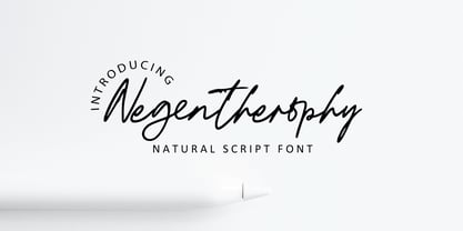 Negentherophy is a natural signature font to beautify your designs with its natural charm, suitable to create gorgeous wedding invitation, beautiful social media post, business card and other beautiful projects. It also contains ligature to add more natural charm.
 - Gojacky Bold Script Font by IbeyDesign,
$17.00 Gojacky Bold Script Font is a gorgeous and bold handwritten font, crafted to give your headlines and logotype projects a stylish touch. This font reads strong, confident, and dynamic and can add tons of nostalgic character to your designs.
 - Agustaf Bold Script Font by IbeyDesign,
$17.00 Agustaf Bold Script Font is a gorgeous and bold handwritten font, crafted to give your headlines and logotype projects a stylish touch. This font reads strong, confident, and dynamic and can add tons of nostalgic character to your designs.
 - Brocklyns by ahweproject,
$14.00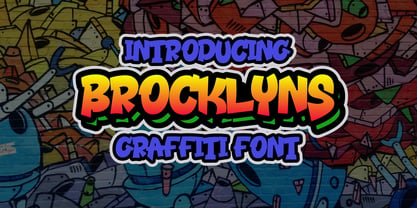 Brooklyn is a cool, graffiti-style display font. Add this font to your urban and casual creations, and you will love the outcome. This font is suitable for designs such as t-shirts, sportswear, logos, advertisements, clothing, and more.
 - Backrush by Garisman Studio,
$20.00 Backrush combines attractive curves with a fresh urban edge; delivering a stylish hand-brushed look which is guaranteed to add an eye-catching appeal to your logo designs, brand imagery, handwritten quotes, product packaging, merchandise and social media posts.
 - Niemi by Blank Is The New Black,
$10.00 Niemi is a continuation of the work started with Versteeg. Where Versteeg was separated into individual circles, Huet connects these circles and adds a sharp geometric style. This creates a nice juxtaposition between the rounded ends, and sharp corners.
 - Cribin by wearecolt,
$18.00 Introducing Cribin: Playful condensed serif inspired by 90s grunge & vintage aesthetics. Its condensed form, strong serifs & high contrast add attitude to logos, headlines, & more. Perfect for web, print, and branding. Embrace nostalgia, and elevate your design. Unleash Cribin's creativity!
 - Fontazia Floradot by Deniart Systems,
$20.00 Fontazia FloraDot features 62 unique dotted floral patterns. These simple swaying FloraDot blooms will add flair to any font library - they're great for backgrounds, greeting cards, posters, summer themes or any project where florals say just the right thing!
 - Typesetter Treasures JNL by Jeff Levine,
$29.00 Cartoon cuts, sales builders, catchwords, mortised cuts, decorative embellishments and stock art are what comprise the images found within Typesetter Treasures JNL. Redrawn from vintage sources, these nostalgic illustrations add warmth and charm to any print or web project.
 - Behila by Letterena Studios,
$9.00 Behila is a classic serif font. Add it to your most creative ideas and notice how it makes them come alive! This font is PUA encoded which means you can access all of the glyphs and swashes with ease!
 - Race Sport by Namara Creative Studio,
$24.00 Race Sport is a modern techno display font, strong and unique style instantly add power and movement to your projects. It’s perfect font for sport or racing-themed projects, such as logo, poster, games, product design and much more.
 - Longstride by Nurrontype,
$15.00 Longstride was inspired by Romans letterforms. A low contrast charismatic typeface with uppercase, lowercase, small caps, numeral, and multilanguage support. I also add ligature and alternate options to make it more versatile when you use it in your project.
 - Ausion by Andfonts,
$14.00 Ausion is a minimal and neat sans serif font. It can easily be matched to an incredibly large set of projects, so add it to your creative ideas and notice how it makes them stand out! Caps only fonts.
 - Florals Bright by Letterena Studios,
$10.00 Florals Bright is a chic and trendy looking serif font. It is PUA encoded which means you can access all of the glyphs and swashes with ease! Add it confidently to your projects, and you will love the results.
 - Danity by Sesa Grafika,
$35.00 Danity is a gorgeous and retro styled display font. Add it confidently to your projects, and you will love the results. This font is PUA encoded which means you can access all of the glyphs and swashes with ease!
