10,000 search results
(0.018 seconds)
- Yippie Yeah by Almarkha Type,
$25.00 Yippie Yeah Sans & Slab is a Cute & Playful Font full of charm . It will take any DIY-project to the next level! Yippie Yeah Sans & Slab is perfect for Crafts, Poster, product packaging, product designs, label, branding projects, logo, wedding designs, social media posts, advertisements, watermark, invitation, stationery and any projects
 - Nicholia by Balpirick,
$15.00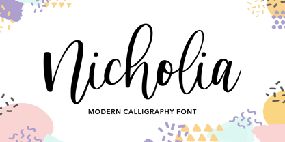 Nicholia is a cute and modern handwritten font with an incredibly friendly feel. It features gorgeous swashes and ligatures that make this script incredibly versatile. Whether you’re looking for fonts for Instagram or calligraphy scripts for DIY projects, Nicholia will turn any creative idea into a true piece of art!
 - Emalia by JprintStudio,
$10.00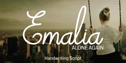 Emalia is a cute and casual handwritten font with an incredibly friendly feel. It features gorgeous swashes and ligatures that make this script incredibly versatile. Whether you’re looking for fonts for Instagram or calligraphy scripts for DIY projects, Emalia will turn any creative idea into a true piece of art!
 - Chumpsy by PizzaDude.dk,
$17.00 Chumpsy is clumsy - I did my best to make an awkward and bouncy hand-written font that was funky, but still legible. I added 11 slightly different versions of each lowercase letter, which automatically cycle as you type, or you can manually choose the one that suits you the best.
 - Coffee Matcha by Awan Senja,
$14.00 Coffee Matcha is a Lovely script font. It features a modern and elegant style that will take your designs to the next level. Whether you�re looking for fonts for Instagram or calligraphy scripts for DIY projects, Coffee Matcha will turn any creative idea into a true piece of art!
 - EB Corp by Eko Bimantara,
$21.00 EB Corp designed to be fit for corporate nuances. its letterforms shaped in tune with technological feels. Its shown simplicity, minimal stroke contrast, moderate spacing. Its consist of 18 styles from Thin to Black, contain 470+ glyphs that support broad latin language, contain variation of linning figures, and some alternates glyphs.
 - Mix Modern by Mix Fonts,
$13.00 MIX MODERN is a layering family of fonts—a bundle of five different styles. These fonts can be used alone or in combination. Switch up among five of my favorite fonts to create fun and whimsical variations. Get creative! This font family is perfect for handmade and DIY themed projects.
 - Lavineta by Balpirick,
$15.00 Lavineta is a beautiful and elegant handwritten font with an incredibly friendly feel. It features gorgeous swashes and ligatures that make this script incredibly versatile. Whether you’re looking for fonts for Instagram or calligraphy scripts for DIY projects, Lavineta will turn any creative idea into a true piece of art!
 - M Hei3 PRC by Monotype HK,
$523.99 Monotype Hei3 PRC is a modulated and transitional Chinese design with structure, diǎn, piē and nà carry Song style, while horizontal & vertical strokes are relatively simple. This mix of ancient and modern elements with low contrast is something that you can find in wood carving: rigid while balanced with softness
 - Bashirah by Cititype,
$14.00 Bashirah is a cute and casual handwritten font with an incredibly friendly feel. It features gorgeous swashes and ligatures that make this script incredibly versatile. Whether you’re looking for fonts for Instagram or calligraphy scripts for DIY projects, Bashirah will turn any creative idea into a true piece of art!
 - Revenge by Juncreative,
$19.00 Revenge is a cute and casual handwritten font with an incredibly friendly feel. It features gorgeous swashes and ligatures that make this script incredibly versatile. Whether you’re looking for fonts for Instagram or calligraphy scripts for DIY projects, Revenge will turn any creative idea into a true piece of art!
 - Educator JNL by Jeff Levine,
$29.00Educator JNL joins the large library of Jeff Levine's stencil fonts and was re-drawn from a set of individual letter stencils with the distinctive look of Franklin Gothic. All of the irregularities of the original die-cut letter forms were left intact, giving a "real world" look to the font. - November Script by Fenotype,
$29.95 November Script is a continuously flowing and spinning font family. It was originally designed for an award winning art calendar published by TAIK (University of Industrial Art & Design) In 2007. Afterwards the font has been waiting for its second coming. November Script is well suitable for headlines, posters, flyers and schoolbooks.
 - Evil Laughter by Hanoded,
$10.00 I am working on my Halloween font collection and realised I did not have a ‘blood drip font’. So, I bought a second hand typewriter and typed all the glyphs. Then I made the blood drips using syrup, paper and gravity! The result is a halloween font with a twist!
 - ITC Ellipse Script by Typorium,
$30.00 The Typorium presents a new optimized and enriched version of ITC Ellipse which first appeared in 1996 in the International Typeface Corporation typeface library. ITC Ellipse Script is a complementary typeface to ITC Ellipse Neo, designed a very legible handwriting style. ITC Ellipse Script is both modern and classic. Modern in the unusual shape based on the geometric ellipse form. And classic in the structure of some letters like the lower cases c, e, g, o, s. These letters alone could come from a traditional typeface, but they fit perfectly with the atypical rest of the alphabet giving it a present-day and traditional mix. Furthermore, the ellipse shape fits naturally in the italic styles, giving the font an organic and fluid feeling. ITC Ellipse Script offers OpenType features such as alternate characters for upper and lower case, and an extended accented character set to support many languages. Five weights have been created for each style to offer a wide range of graphic possibilities in a tidy digital footprint. Designer: Jean-Renaud Cuaz Publisher: Typorium MyFonts debut: Nov 1, 2020 Le Typorium présente une nouvelle version optimisée et enrichie d'ITC Ellipse qui est apparue pour la première fois en 1996 dans la bibliothèque de caractères de l'International Typeface Corporation. ITC Ellipse Script est une police complémentaire à ITC Ellipse Neo, conçue dans un style d'écriture très lisible. ITC Ellipse Script est à la fois moderne et classique. Moderne dans le dessin inhabituel basé sur la forme géométrique de l’ellipse. Et classique dans la structure de certaines lettres comme les minuscules c, e, g, o, s. Ces lettres pourraient provenir d'une police de caractères traditionnelle, mais elles s'intègrent parfaitement avec le reste de l'alphabet plus insolite en lui donnant un mélange de modernité et de tradition. De plus, la forme de l'ellipse s'intègre naturellement dans les styles italiques, donnant à la police une sensation organique et fluide. ITC Ellipse Script offre des fonctionnalités OpenType telles que des caractères alternatifs pour les capitales et les bas de casse, et un jeu de caractères accentués étendu pour prendre en charge de nombreuses langues. Cinq graisses ont été créés pour chaque style afin d'offrir un large éventail de possibilités graphiques pour une empreinte numérique rigoureuse.
 - Amaro by Autographis,
$39.50 Amaro is the Italian word for bitter (amaro) herbal drinks like Ramazotti, Averna and a trillion lesser known ones. These liquors were the literal base for this elaborate set of four fonts. Each has different uppercase letters and some of the lowercase letters vary as well. Amaro-A, B, and C can be mixed freely. The Amaro-D has underlining swashes in two different lengths, the uppercase has the shorter underlines and the lowercase the longer ones. I throw these in for free and the entire set is very reasonably priced. Enjoy and cheers to you!
 - Golden Motion by Allouse Studio,
$16.00 Golden Motion a Modern Handwritting Calligaraphy Font that give you ton extras for your need. Beginning Swash Uppercase, Lowercase, Ending Swash Lowercase, Stylistic ampersand and letter t, stylistic set for b, d, f, h, k, l, g, j, y, z. We highly recommend using a program that supports OpenType features and Glyphs panels like many of Adobe apps and Corel Draw, so you can see and access all Glyph variations. Golden Motion is perfect for any tittles, logo, product packaging, branding project, megazine, social media, wedding, or just used to express words above the background. Golden Motion also come with Multi-Lingual Support.
 - Prinzess Gravur by RMU,
$35.00 In 1905 Berthold released an engraved blackletter font called Prinzess Kupferstichschrift. Based on an old printed remnant, I revived this beautiful open-face fraktur and enriched it with several OpenType features. As usual in my blackletter fonts, the round ‘s’ lies on the number sign key, and a traditional number sign can be accessed via the Discretionary Ligature feature and typing 'N-r-period'. In this font you have also the possibility to turn I, V, X, L, C, D, and M into Roman numerals by activating the Stylistic Alternates feature. And last but not least, various useful ligatures polish up this font.
 - Ollykers by Maulana Creative,
$9.00 Ollykers is a Brush script font, With a rough stroke brush and fun character. It has Opentype features of ligatures, alternate lowercase, swashes and couple of cursive characters lowercase such as b,d,g,h,k,t. Makes it a perfect choice for branding and digital designs. Use this font for logos, social media, websites, blogs, instagram, social media, business cards, branding, and more! Ollykers brush script font support multilingual more than 100+ language. and good pair for your secondary text font with sans or serif. Make a stunning work with Ollykers brush script font. Cheers, Maulana Creative
 - Calps by Typesketchbook,
$55.00 Calps is a condensed sans serif font. An unfussy design, the font is designed to be consistent across such letters as a, b, d, q, p, g and C, G, O, Q, creating a uniformity for the set. Each corner of the line is carved to decrease its sharpness, adding a touch of friendliness. If the standard font is not sufficiently condensed, there is a slim variation offering narrower proportions. In addition to the slim variation, the font also comes in roman and italic versions in 9 weights, offering a total of 36 variations for the font.
 - Gramma by CAST,
$45.00 Gramma is a compact sans with big x-height, a robust and balanced typeface that work well both for headlines and main bodies of text. The initial constructions, assembled from a few well-defined geometric modules, were later polished into more organic forms; the letters’ arches are quite squared, and the counters and other internal negative spaces push outward, creating a tension that balances the forms’ compression. Gramma’s most evident characteristic is its “bird-beak” terminals (present in many letters, including the c, e, f, s...) that replicate the unconnected junctures between stem and curve, visible in the a,b,d,g,h.
 - Rafgins by holyline design,
$15.00 Rafgins is an exquisite and modern sans-serif font. Its clean, minimalist lines and sleek, contemporary style create a sense of understated elegance that is perfect for adding a touch of professionalism to your branding or typography. With its refined and versatile design, this font is sure to impress and inspire. Rafgins have alternate on B, D, P and R. Rafgins perfect for headline, logo, or anything your creativity and want something new with your project. Happy creating with Rafgins by Holyline. It is also PUA encoded which means you can access all of the glyphs and swashes with ease!
 - Golestan by Naghi Naghachian,
$84.00 Golestan is designed by Naghi Naghashian. It is a Font family, in 2 weights, Regular and Bold. This font is a contribution to modernisation of Arabic typography, gives the font design of Arabic letters real typographic arrangement und provides more typographic flexibility. Golestan supports Arabic, Persian and Urdu. It also includes proportional and tabular numerals for the supported languages. Golestan design fulfills the following needs: A Explicitly crafted for use in electronic media fulfills the demands of electronic communication. B Suitability for multiple applications. Gives the widest potential acceptability. C Extreme legibility not only in small sizes, but also when the type is filtered or skewed, e.g., in Photoshop or Illustrator. Golestan’s simplified forms may be artificial obliqued in InDesign or Illustrator, without any loss in quality for the effected text. D An attractive typographic image. Golestan was developed for multiple languages and writing conventions. Golestan supports Arabic, Persian and Urdu. It also includes proportional and tabular numerals for the supported languages. E The highest degree of calligraphic grace and the clarity of geometric typography.
 - Sam Suliman by K-Type,
$20.00 Sam Suliman is a condensed display face supplied in three weights – Regular, Medium and Bold – plus a set of handy italics (obliques). All six fonts are included in the value family pack. The fonts are inspired by lowercase lettering on a Sarah Vaughan album cover designed by Sam Suliman in 1962, a style which contrasts sharp tight outer corners with soft rounded counters. The letters were perhaps influenced by a Solotype font called Herald Square, but without that font’s aversion to diagonals, and adding distinctive perky ascenders/descenders on the lowercase r, a, u, g and n. The Sam Suliman fonts also add the nubs to d, m, p, and q. Suliman was born in Manchester, England in 1927. After working for McCann Erikson in London, he moved to New York where he took on freelance work designing album covers, particularly celebrated are his striking minimalist designs for jazz records. He moved back to England in the early 1960s, designing many book jackets, film titles and fabrics, also working in Spain and India before settling in Oxford in the 1980s.
 - Catenary by Active Depth,
$6.00 The Catenary typeface was designed with the goal of creating an extremely-readable sans-serif font that could weather the future. Inspired by the beauty of the catenary curve, it's a blend of the transitional and the geometric that allows it to be readable while keeping its forms precise and consistent. Every character in its set is unique, leaving no confusion between similar letter forms. Sixes and nines can be distinguished even when they're upside down or sideways. The number one, the lowercase-L, and the uppercase-I can never be confused with one another, even without context. Throw b, d, g, p, and q into a jumble and the challenge of distinguishing the characters can easily be overcome. The Catenary family consists of eight fonts, six of which, the standard light/italic, regular/italic, and bold/italic, work as both excellent text fonts and exceptional display fonts. The two bonus fonts, a stencil and a guerrilla grunge style, make for great additional display font choices. The Catenary family is extremely versatile and ready for your toughest design work.
 - Pegah by Naghi Naghachian,
$98.00 Pegah is a sans-serif font family designed by Naghi Naghashian in three weights. Pegah Light, Pegah Regular and Pegah Bold. This font family is a contribution to modernisation of Arabic typography, gives the font design of Arabic letters real typographic arrangement und provides more typographic flexibility. Pegah supports Arabic, Persian and Urdu. It also includes proportional and tabular numerals for the supported languages. Pegah design fulfills the following needs: A Explicitly crafted for use in electronic media fulfills the demands of electronic communication. B Suitability for multiple applications. Gives the widest potential acceptability. C Extreme legibility not only in small sizes, but also when the type is filtered or skewed, e.g., in Photoshop or Illustrator. Nima’s simplified forms may be artificial oblilqued in InDesign or Illustrator, without any loss in quality for the effected text. D An attractive typographic image. BaBa was developed for multiple languages and writing conventions. BaBa supports Arabic, Persian and Urdu. It also includes proportional and tabular numerals for the supported languages. E The highest degree of calligraphic grace and the clarity of geometric typography.
 - BaBa by Naghi Naghachian,
$98.00 BaBa is a sans-serif font family designed by Naghi Naghashian in three weights. BaBa Light, Baba Regular and Baba Bold. This font family is a contribution to modernisation of Arabic typography, gives the font design of Arabic letters real typographic arrangement und provides more typographic flexibility. BaBa supports Arabic, Persian and Urdu. It also includes proportional and tabular numerals for the supported languages. BaBa design fulfills the following needs: A Explicitly crafted for use in electronic media fulfills the demands of electronic communication. B Suitability for multiple applications. Gives the widest potential acceptability. C Extreme legibility not only in small sizes, but also when the type is filtered or skewed, e.g., in Photoshop or Illustrator. Nima’s simplified forms may be artificial oblilqued in InDesign or Illustrator, without any loss in quality for the effected text. D An attractive typographic image. BaBa was developed for multiple languages and writing conventions. BaBa supports Arabic, Persian and Urdu. It also includes proportional and tabular numerals for the supported languages. E The highest degree of calligraphic grace and the clarity of geometric typography.
 - News Gothic No. 2 by Linotype,
$40.99News Gothic No. 2 is an enhanced version of News Gothic produced by the D. Stempel AG type foundry in 1984. It added more weights to the News Gothic family than were available in other versions, increasing its use in contemporary design and communication. The lighter weights of the original News Gothic were designed by Morris Fuller Benton in 1908 for American Typefounders (ATF). News Gothic typeface is quite similar to Benton's other sans serifs from the early twentieth century, including Franklin Gothic and Lightline Gothic. The bold weights were added to the News Gothic scheme in 1958. The capital letters in News Gothic No. 2, just like those found in News Gothic, have a similar visual width to each other. The lowercase is compact and powerful. These design attributes contributed to Benton's strong handle on the sans serif genre, and for years his types have been popular for newspaper headlines and many other uses. Still a popular presence on the font charts, News Gothic has proven its ability to get the job done right. - Babak by Naghi Naghachian,
$74.00 Babak is designed by Naghi Naghashian. It is a Font family, in 3 weights, Light, Regular and Bold. This font is a contribution to modernisation of Arabic typography, gives the font design of Arabic letters real typographic arrangement und provides more typographic flexibility. Babak supports Arabic, Persian and Urdu. It also includes proportional and tabular numerals for the supported languages. Babak design fulfills the following needs: A Explicitly crafted for use in electronic media fulfills the demands of electronic communication. B Suitability for multiple applications. Gives the widest potential acceptability. C Extreme legibility not only in small sizes, but also when the type is filtered or skewed, e.g., in Photoshop or Illustrator. Nima’s simplified forms may be artificial obliqued in InDesign or Illustrator, without any loss in quality for the effected text. D An attractive typographic image. Babak was developed for multiple languages and writing conventions. Babak supports Arabic, Persian and Urdu. It also includes proportional and tabular numerals for the supported languages. E The highest degree of calligraphic grace and the clarity of geometric typography.
 - Transcity by Ahmad Jamaludin,
$17.00 Say hello to my serif font, Transcity! Transcity is a Bold Playful Elegant Modern vintage font with beautiful ligatures, tons of special alternative glyphs, ornament and multilingual support. It's a very versatile font that works great in large and small sizes. This beautiful font perfect for branding projects, logo design, Clothing Branding, product packaging, magazine headers, or simply as a stylish text overlay to any background image. Features: More than 100 beautiful swashes in this font Accessible in the Adobe Illustrator, Adobe Photoshop, Adobe InDesign, even work on Microsoft Word. PUA Encoded Characters Fully accessible without additional design software. Multilingual Support: à á â ã ä å æ ç è é ê ë ì í î ï ñ ò ó ô õ ö ø ù ú û ü ý ÿ š fl fi ž œ ı ç ø š ž æ œ À Á Â Ã Ä Å Æ È É Ê Ë Ì Í Î Ï Ñ Ò Ó Ô Õ Ö Ø Œ Ù Ú Û Ü Ý Ÿ Š Š ŽŁ Ð Ç
 - Core Sans BR by S-Core,
$20.00 The Core Sans BR Family is a part of the Core Sans Series, such as N, NR, N SC, M, E, A, D, G, R and B. The Core Sans BR Family is designed with rounded stroke endings for visual comfort. This family has very small x-heights and large ascenders(descenders) which give an elegant feeling in body text. It is a sans-serif family but it’s structure is similar to serif fonts, so you can make paragraph beautiful with this font family. It is very legible and readable even in small size because of its open counters and distinctive shapes. This font family consists of 7 weights (Thin, Light, Regular, Medium, Bold, Heavy, Black) and Italics for each format. Core Sans BR supports complete Basic Latin, Cyrillic, Central European, Turkish, Baltic character sets. Each font includes proportional figures, tabular figures, oldstyle figures, numerators, denominators, superscript, scientific inferiors, subscript, fractions and case features. We highly recommend it for use in books, web pages, screen displays, and so on.
 - Hafez by Naghi Naghachian,
$88.00 Hafez is a sans-serif font family designed by Naghi Naghashian in three weights. Hafez Light, Hafez Regular and Hafez Bold. This font family is a contribution to modernisation of Arabic typography, gives the font design of Arabic letters real typographic arrangement und provides more typographic flexibility. Hafez supports Arabic, Persian and Urdu. It also includes proportional and tabular numerals for the supported languages. Hafez design fulfills the following needs: A Explicitly crafted for use in electronic media fulfills the demands of electronic communication. B Suitability for multiple applications. Gives the widest potential acceptability. C Extreme legibility not only in small sizes, but also when the type is filtered or skewed, e.g., in Photoshop or Illustrator. Nima’s simplified forms may be artificial oblilqued in InDesign or Illustrator, without any loss in quality for the effected text. D An attractive typographic image. BaBa was developed for multiple languages and writing conventions. BaBa supports Arabic, Persian and Urdu. It also includes proportional and tabular numerals for the supported languages. E The highest degree of calligraphic grace and the clarity of geometric typography.
 - Damavand by Naghi Naghachian,
$114.00 Damavand is designed by Naghi Naghashian. It is a Font family, in 5 weights, Light, Regular, DemiBold, Bold and Heavy. This font is a contribution to modernisation of Arabic typography, gives the font design of Arabic letters real typographic arrangement und provides more typographic flexibility. Damavand supports Arabic, Persian and Urdu. It also includes proportional and tabular numerals for the supported languages. Damavand design fulfills the following needs: A. Explicitly crafted for use in electronic media fulfills the demands of electronic communication. B. Suitability for multiple applications. Gives the widest potential acceptability. C. Extreme legibility not only in small sizes, but also when the type is filtered or skewed, e.g., in Photoshop or Illustrator. Nima’s simplified forms may be artificial obliqued in InDesign or Illustrator, without any loss in quality for the effected text. D. An attractive typographic image. Damavand was developed for multiple languages and writing conventions. Damavand supports Arabic, Persian and Urdu. It also includes proportional and tabular numerals for the supported languages. E. The highest degree of calligraphic grace and the clarity of geometric typography.
 - Pasargad by Naghi Naghachian,
$108.00 Pasargad is a new font family, designed by Naghi Naghashian. It is a Font family in 3 weights, Light, Regular and Bold. This font is a contribution to modernisation of Arabic typography, gives the font design of Arabic letters real typographic arrangement und provides more typographic flexibility. Pasargad supports Arabic, Persian and Urdu. It also includes proportional and tabular numerals for the supported languages. Pasargad design fulfills the following needs: A Explicitly crafted for use in electronic media fulfills the demands of electronic communication. B Suitability for multiple applications. Gives the widest potential acceptability. C Extreme legibility not only in small sizes, but also when the type is filtered or skewed, e.g., in Photoshop or Illustrator. Pasargad’s simplified forms may be artificial obliqued in InDesign or Illustrator, without any loss in quality for the effected text. D An attractive typographic image. Pasargad was developed for multiple languages and writing conventions. Pasargad supports Arabic, Persian and Urdu. It also includes proportional and tabular numerals for the supported languages. E The highest degree of calligraphic grace and the clarity of geometric typography.
 - Ostad Arabic by Naghi Naghachian,
$64.00 Oustad Arabic is designed by Naghi Naghashian. It is a Bold headline font, in 1 weight. This font is a contribution to modernisation of Arabic typography, gives the font design of Arabic letters real typographic arrangement und provides more typographic flexibility. Oustad Arabic supports Arabic, Persian and Urdu. It also includes proportional and tabular numerals for the supported languages. OstadArabic design fulfills the following needs: A Explicitly crafted for use in electronic media fulfills the demands of electronic communication. B Suitability for multiple applications. Gives the widest potential acceptability. C Extreme legibility not only in small sizes, but also when the type is filtered or skewed, e.g., in Photoshop or Illustrator. Nima’s simplified forms may be artificial obliqued in InDesign or Illustrator, without any loss in quality for the effected text. D An attractive typographic image. Kasha was developed for multiple languages and writing conventions. Nima supports Arabic, Persian and Urdu. It also includes proportional and tabular numerals for the supported languages. E The highest degree of calligraphic grace and the clarity of geometric typography.
 - Core Sans DS by S-Core,
$20.00 Core Sans DS is a rounded version of Core Sans D and a modern interpretation of condensed sans-serif typeface designed by S-Core and the whole family consists of 2 widths (Condensed, Normal), 7 weights (Thin, Light, Regular, Medium, Bold, Heavy, Black) with their corresponding italics. Core Sans DS features a condensed geometric construction and has a large x-height which enhances legibility. The family is ideal for signage, headline as well as body text. Core Sans DS is a part of the Core Sans Series such as Core Sans N SC, Core Sans N, Core Sans NR, Core Sans M, Core Sans G,Core Sans A, Core Sans GS and Core Sans ES. Letterform in this type family is simple, clean and highly readable. The spaces between individual letter forms are precisely adjusted to create the perfect typesetting. Core Sans DS supports complete Basic Latin, Cyrillic, Central European, Turkish, Baltic character sets. Each font includes proportional figures, tabular figures, numerators, denominators, superscript, scientific inferiors, subscript, fractions and case features.
 - Josefov by Ingo,
$28.00 A narrow, modern Slab Serif. JOSEFOV is directly derived from the sans serif text font ”Hedwig“. Therefore, of course, it pairs best with “Hedwig”. The basic thought was to create a font with heavy rounded serifs in the style of ”Clarendon“ but which hardly reminds one of that particular font. The form principle of rounded serifs is applied whenever possible — for example at the points where the individual strokes of the characters join one another. JOSEFOV seems very technical, very constructed (and truly is). In order to soften up the rigid impression, the serifs are applied at some points contrary to the tradition handed down, as with the upper case A C G K M V W and the lower case a b d h i j k l s t. Historically there is no example of the laterally oriented serifs of capital and small s (S) and C G. On the other hand, the double-sided serifs on the stems of b d h k l appear at the beginning of modern times in the very first serif types from five hundred years ago. The double-sided serifs of A M V W were also customary in the first decades of printing. JOSEVOV is particularly suitable for topics such as nature, folklore, culture, music, nutrition.
 - Galix Mono by Eclectotype,
$25.00 This monospaced version of Galix was commissioned in 2037 by the space exploration company Earth2, as part of a major overhaul of their branding, which had used, since 2021, a generic sans serif (much like every other company). Many specialists in both design and space exploration suggested that this very rebrand started a chain of events that concluded with the invention of time travel in 2041. Contrary to the perceived notion put forward in popular Science Fiction, time travel is only (as of now) possible in the digital realm. It was considered fitting that included among the first files sent back in time should be the Galix Mono typeface, which was remade in OTF format to ensure that it would work with the technology available in 2019. Earth2, for all their insight, did not foresee that the release of the typeface in September of 2019, would lessen the impact of their rebrand. What kind idiots would rebrand a forward looking company with a font that was, by then, almost 18 years old? The subsequent lacklustre response to the redesign didn’t inspire the tidal wave of R&D funding Earth2 had anticipated, and the company went into administration in the summer of 2039, having never invented the time travel which made the release of Galix Mono in 2019 possible. Experts believe that the files sent back in time, although their very sending made it impossible for them to be sent, remained as “time relics” of the future that might have been.
 - Pink Shark by Creativemedialab,
$15.00 Introducing Pink Shark, a fun and simple handwriting fonts. Perfect for DIY projects, labels, quotes, greeting cards, posters, wall art, branding, packaging, websites, photos, photography overlays, window art, signs, scrap booking, tags and so more! Pink Shark consists of a Regular and a cute 'Wrap' version and will make your project stand out!
 - Blaze Stanley by Ditatype,
$29.00 Blaze Stanley is a casual, fun handwritten font, created by using a brush pen. Clean and a little bit quirky, this font is the perfect fit for all of your logos, branding, social media, and crafty DIY projects. Featured : Accents (Multilingual characters) PUA encoded Numerals and Punctuation (OpenType Standard) Full Support Dita Type