10,000 search results
(0.087 seconds)
- Gjallarhorn by Scriptorium,
$18.00Gjallarhorn is based on uncial-style lettering by artist Willy Pogany from his titles for Padraig Colum's classic collection of Scandinavian myths, The Children of Odin. It has various peculiar letter forms, and the font includes two or more different versions of many of the characters. An excellent example of stylized hand lettering by one of the great decorative artists of the Art Nouveau period. - Packard New Style by Red Rooster Collection,
$60.00 Steve Jackaman & Ashley Muir. Packard New Style is a smooth version of the lettering drawn by Oswald Cooper for the Packard Motor Company (ATF 1913). The bold weight is credited to Morris Fuller Benton (ATF 1916), but it is highly probable that Benton did the adaptation for both weights. Packard New Style Pro contains all the high-end features expected in a quality OpenType Pro font.
 - Fake Boss by NJ Studio,
$19.00 Hi...Thank for your visit :) Fake Boss Modern Fonts are font designs that are made for various vector designs, printing such as digital wedding invitations, blogs, online shops, social media, while printing can be used in the field of product clothing, accessories, bags, pins, logos, business cards, watermarks and many others ... so it can make your product look elegant and attractive, and also Multilingual support!!! Happy design ...
 - Coolesta by Dilbadil,
$14.00 Hello, let me introduce my new signature font Coolesta. Made with great effort to produce an elegant and modern style. This font is made like handwriting so it is suitable for branding, logos, business cards, photographs, wedding invitations, quotes, clothes, coffee and others. What did you get? By providing OpenType facilities you will get: – Alternates Ss01, Ss02, Ss03, Ss04, Ss05 – Ligatures – Multilingual Support – Swashes – Multilingual’s alternate
 - Dive Gear Stencil JNL by Jeff Levine,
$29.00 Some vintage 1960s-era packaging for dive gear (masks, swim fins, etc.) manufactured by the Voit division of AMF had various merchandise boxes hand-lettered [with some variation of design] in an interesting sans stencil. These packages formed the inspiration of Dive Gear Stencil JNL. Thanks once again to Gene Gable, whom on many occasions has provided Jeff Levine material for type design inspiration.
 - Misheard Lyrics by Bogstav,
$18.00 Did you ever get lyrics from a song wrong? And maybe found out years and years later, that is was wrong...but the wrong lyrics get stuck, even though you know that they are wrong! :) Misheard Lyrics is a font that most likely gets stuck in your design, because it has that bouncy and random look that makes your text come alive - without overdoing it!
 - Balcony Seats JNL by Jeff Levine,
$29.00Balcony Seats JNL is a different take on Jeff Levine's Aisle Seats JNL. The original font was modeled from Redikut die-cut cardboard letters - used in the 1940's and 1950's for display and show card work). Although the basic letter shapes are similar, the horizontal stroke weights have been narrowed, providing a type variation with a classic Art Deco "thick and thin" look. - Albertho by NJ Studio,
$19.00 Hi...Thank for your visit :) Albertho A Bold Fonts are font designs that are made for various vector designs, printing such as digital wedding invitations, blogs, online shops, social media, while printing can be used in the field of product clothing, accessories, bags, pins, logos, business cards, watermarks and many others ... so it can make your product look elegant and attractive, and also Multilingual support!!! Happy design ...
 - Resolute NF by Nick's Fonts,
$10.00 Morris Fuller Benton’s Eagle, designed for ATF in 1934, which did yeoman-like duty on many WPA posters of the time. This version, unicase as was the original, has been designed to set tight, so that it creates dense and commanding headlines. All versions of this font include the Unicode 1250 Central European character set in addition to the standard Unicode 1252 Latin set.
 - NoraPen by sugargliderz,
$40.00 This font is influenced by Walbaum. However, I did not just trace the design, but sort of had the image in my head while I drew the letters. This font is balanced by not being entirely Walbaum, but still basically is. I've named it "NoraPen." Nora comes from the name of the main character in Ibsen's "A Doll's House," and Pen means a cage for livestock.
 - Averago by Gassstype,
$22.00 Introducing of our new product Averago it is a Unique Handmade Font and also that will make your designs look modern, display font. Can make it easier to convey the message in your design. Use for awesome display, labeling, movie sceen, poster, movie title,quotes, posters, DIY projects, branding, packaging, greeting cards, websites, photos, photography overlays, signs, window art, tags and so much more!
 - Persian Ruby by Si47ash Fonts,
$10.00 It's not fragile, it's delicate! :D A Arabic font (Persian typeface), as a gift for you type lovers! This font does not support any Latin characters. Just Persian and Arabic. You can get this font for free by buying another Si47ash Font: https://www.myfonts.com/foundry/si47ash-fonts/ Let me know when you did it and I will send you a promo-code: shahabsiavash [at] gmail [dot] com
 - Sunroof & Summer by Wildan Type,
$15.00 Sunroof & Summer Font is a summer Style font by Wildan Type. It has simple, fun, and sweet look. Sunroof & Summer font is perfect used for; logos, greeting cards, a package design, a brand identity, craft design, any DIY project, book title, packaging, and more. Sunroof & Summer is also included full set of: uppercase and lowercase letters multilingual characters numerals ligature Wish you enjoy our font. :)
 - Quick Meal by Jeff Levine,
$29.00 Quick Meal JNL is a ‘hand lettered’ interpretation of Morris Fuller Benton’s 1905 design “Miehle Extra Condensed Title”, no doubt named for [or on behalf of] the manufacturer of printing and die cutting presses that were used for years within the printing industry. The type face is available in both regular and oblique versions. Quick Meal JNL is a pun on the pronunciation of ‘Miehle’.
 - French Pastry JNL by Jeff Levine,
$29.00 A little ditty from France circa the 1940s called "J'ai Rêvé Dans Tes Bras" (which loosely translated means "I've Dreamed in Your Arms") offered up its title hand lettered in an interesting Art Deco sans. This formed the basis for French Pastry JNL, a tasty typographical tidbit further preserving the wide choice of lettering styles hand-crafted for popular sheet music of past decades.
 - LB Priester 1906 by Jonahfonts,
$30.00 There are many fonts inspired by Lucian Bernhard. I have always admired his 1906 award-winning poster: ‘Priester’— believed to be the birth of the ‘Sachplakat’ (or Object Poster). I have interpreted the hand lettered “Priester” logo into a formal typeface and only hope I have done it justice. Usage recommendations: Captions, fliers, packaging, cards, posters, ads, book jackets, manuals, bulletins, magazines, greetings, announcements.
 - Masbrushy by Sesa Grafika,
$69.00 Masbrushy is a bold and Modern handwritten Lettering font. Clean and a little bit quirky, this font is the perfect fit for all of your logos, branding, social media, and crafty DIY projects. This font especially design for awesome logo project. You can use this font for Logomark Project. This font is PUA encoded which means you can access all of the glyphs and swashes with ease!
 - Toddler Toys by NJ Studio,
$19.00 Hi...Thank for your visit :) Toddler a handmade fonts are font designs that are made for various vector designs, printing such as digital wedding invitations, blogs, online shops, social media, while printing can be used in the field of product clothing, accessories, bags, pins, logos, business cards, watermarks and many others ... so it can make your product look elegant and attractive, and also Multilingual support!!! Happy design ...
 - Folio by Linotype,
$29.99Folio was designed by Konrad F. Bauer and Walter Baum and appeared with the Bauer font foundry (Bauersche Gießerei) in 1957. The designers based their ideas on Helvetica but Folio did not turn out to pose the competition they had hoped. The font has the same applications as Helvetica and is an extremely legible font. Folio is particularly good for text and has an objective, neutral character. - Steak by Sudtipos,
$59.00 Here I am, once again digging up 60-year sign lettering and trying to reconcile it with the typography of my own time. The truth is I've had this particular Alf Becker alphabet in my sights for a few years now. But in the typical way chaos shuffles the days, Buffet Script and Whomp won the battle for my attentions way back when, then Storefront beat the odds by a nose a couple of years ago. Nevertheless, revisiting Alf Becker’s work is always a breath of fresh air for me, not to mention the ego boost I get from confirming that I can still hack my way through the challenges, which is something I think people ask themselves about more often as they get older. You can never tell what may influence your work, or in this case remind you to dig it out of dust drawers and finally mould it into one of your own experiences. On my recent visits to the States and Canada, I noticed that quite a few high-end steak houses try their best to recreate an urban American 1930s atmosphere. This is quite evident in their menus, wall art, lighting, music, and so on. The ambience says your money is well spent here, because your food was originally choice-cut by a butcher who wears a suit, cooked by a chef who may be your neighbour 20 minutes from downtown, and delivered by a waitress who can do the Charleston when the lights dim and who just wouldn't mind laughing with you over drinks at the bar later. So Steak is just that, a face for menus and wall art in those places that see themselves in the kind of jazzy, noirish world where one-liners rule and exclamation points are part of a foreign language. As is usual with my lettering-inspired faces, there is very little left of the original Alf Becker alphabet. Of course, the challenges present in bringing typographic functionality to what is essentially pure hand lettering gives the spirit of the original art a hell of a rollercoaster ride. But I think that spirit survived the adventure, and may in fact be even somewhat magnified here. This font is over 850 glyphs. It’s loaded with ligatures, swashes, ending forms, alternates, ascender and descender variations, and extended Latin language support. Steak comes in 3 versions. According to your taste you can choose Barbecue, Braised or Smoked. It’s up to you!
 - Medyson - Personal use only

- Lovevelyn two - Personal use only

- Raspoutine Classic - Unknown license

- Diploma - Unknown license

- Steady Stream by Akrtype Studio,
$15.00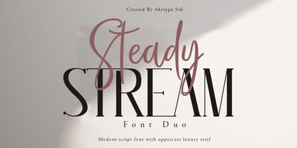 Steady Stream is a fresh modern script and a luxury serif uppercase font. This duo consist of a script font that is truly handmade and featuring ligatures, and of a refined uppercase serif font, allowing you to create unique designs that suit your needs. This font duo is perfect for branding and logo designs, magazine and editorial designs, cards and stationery, and more! The script includes multilingual support. Happy designing.
 - Contempora by My Creative Land,
$25.00 Contempora is a modern sophisticated font family that contains one block condensed sans serif with elegant ink traps, and a set of signature scripts in 4 different styles: Regular, 2 Rough styles (for authentic handwritten look and feel) and Bold (ideal for small text). Both Script and Sans Serif weights benefit from OpenType features. The Script fonts contain a lot of alternates, end-of-word swashes, and ligatures.
 - Nori by Positype,
$49.00 First, the important information…Nori is a hand-lettered typeface that contains over 1100 glyphs, 250 ligatures, 487 alternate characters, 125+ swash and titling alternates, lining and old style numerals. To make sure it is perfectly clear—Nori is the result of brush and ink on paper. The textures produced in each glyph are real and the imperfections are intentional and add to the sincerity of the letters. I say this to be as blunt as possible in order to avoid confusion and to frame what this typeface represents—calligraphic, handwritten letters captured digitally for their warmth and poetic variation for print and screen. Like my handwritten, calligraphic or brush-driven faces before it (the Baka series and the TDC2 2010 winning typeface, Fugu), Nori is a product of my analog and digital hand. To view the words and sentences formed by this typeface is to look at how my hands, yes hands, make letters. The fluidity, as well as the irregularity, is human, honest and intentional—to do so lets the brush I am holding breathe life into each letter. Once digital, any number of points and repetitive processes can’t mask its influences—and I like that. The brush, a simple instrument, my tool, my friend designed to emulate traditional Japanese sumi-e brushes... the Pilot Japan Kanji Fude brush pen. Each letter, each variation was written over and over again until I found the right combination. From there, each was scanned, digitized and optimized. Points were removed in order to ‘clean’ the glyphs up some but I did not want to compromise the integrity of the actual brush stroke. Once this base set of characters (about 350) were completed, the thoughtful manipulation of the glyphs, their gestures and forms were further expanded to solidify the embellishments used within the ligatures, alternates, swashes and additional features. This process was admittedly self-indulgent to an extent. I wanted the words created with this typeface to have the flexibility of variation and cohesiveness of movement that someone fluidly producing these letters by hand might have. I hope you enjoy this typeface as much as I did during the six months working on it. A specimen and style guide is included with the purchased of Nori.
 - Bodoni Classic Cyrillic by Wiescher Design,
$55.00 One day shortly after Christmas 2004, the art-director of Vogue Moscow called me. Would I maybe make a Cyrillic version of my Bodoni Classic Text typeface? Well, since I had been thinking about doing it since a long time, this was the perfect reason to finally do it. It was not an easy venture, since I do not have the faintest idea of Russian but, together with those nice people in Russia and a fellow helpful type designer in Kiev, I managed. I did an enormous amount of kerning, thanks to the help of the Moscow Vogue office. Here the fonts are now for all of you: five text cuts, plus one standard roman cut that has no Cyrillic letters but an extra set of medieval numbers. At Vogue they are happy with the fonts, even though I did not quite adhere to Bodoni's originals in this case. Nastarowje (or whatever you say in Russia), Gert Wiescher
 - Data Error AOE Pro by Astigmatic,
$24.00 The Data Error AOE Family was one of my earliest typefaces, at a time when I had become obsessed with all forms of "digital/techology" typestyles. It's been awhile since the early 2000's, but I've had a hankering for awhile now to revisit this typeface, giving it a more expansive language character set and fill it out with some Opentype features. Inspired by some old printouts of BASIC programs and an Atari 1050 Disk Drive manual with pin printer examples, comes the familiar yet oddly restricted style with this Data Error family. This family comes complete with Regular and Bold versions with their respective Oblique versions. Odd pin printer restrictions inherent in this typeface are: no characters extend below baseline or above ascender line, (except international accents). A nostalgic typeface for computer programmers everywhere, strong and legible at any size, Data Error is perfect for so many purposes, get it today!
 - Rhythm by Positype,
$42.00 I hate the idea of revivals. I have publicly said I choose not to do revivals because they make me uncomfortable. This is as close as I have been to crossing my own line. To be direct, Rhythm is based on the ATF typeface, Ratio (I just recently learned the foundry of origin). I came across this typeface from a printed specimen years ago when I was in school and held onto it. It was unique and I loved how well integrated the inline worked within both the flourish and serif of the glyphs—it was old, but not, reminiscent, but fresh. My specimen was limited in the glyph offering (it was c. 1930ish) and I realized a lot would need to be done to ‘finish’ it and bring it to contemporary expectations. I didn't want to do ‘retro’ and tried to avoid the visual trappings associated with it. What I did want to do is interpret what I had in the specimen and reinterpret it digitally, refining its construction and extending its typographic equity along the way. The ‘One’ and ‘Two’ (and their matching ‘Solids’) styles diverge providing various elaborations that coordinate well between rigid bracketed serifs and compact tails. I further expanded the glyph offering to include a full diacritic set, old style numerals, fractions, stylistic alternates, swashes, titling alternates and controlled flourishes that adhere to the efficient framework of the script. And yes, I refer to it as a ‘script’ because calling it a ‘cutesy serif’ seems wrong :) I hope this is seen less as a slavish revival and more as a championing of a really unique typeface. The Original Typeface was Adastra, designed by Herbert Thannhaeuser for the Foundry D. Stempel AG in Frankfurt, Germany.
 - Brown Marlyn by Ergibi Studio,
$20.00 This is the perfect combination of fonts, we are proud to introduce BROWN MARLYN, these fonts are of two types serif and script. Display Serif inspired by famous logo, This typeface has been made carefully to make sure its premium quality and luxury feel. The ligatures on serif makes this typeface unique and stands out rather than the regular serif font, perfectly for headlines, wedding, social media, logos, posters, packaging, T-shirts,coffee shops, restaurants, magazine’s headers, signs or gift/post cards,cafe’s and weddings or any type of advertising purpose. What's Included : Standard glyphs Ligatures International Accent Works on PC & Mac Simple installations If there is a problem, question, or anything about my fonts, don't hesitate to ask! Big Thanks ~ Ergibi Studio
 - Salt & Spices Mono by Fontforecast,
$29.00 Salt&Spices Mono is the mono lined version of Salt & Spices Pro. Where Salt & Spices Pro has the rough contours and high contrast that is typical for dip pen calligraphy, Salt & Spices Mono has clean crisp smooth letterforms that result in a totally different look and feel. Great for creating neon effects. Fun features like connecting spaces and long swashes for customization of words and phrases are preserved in Salt & Spices Mono. This versatile 10 font family, consisting of 4 casual script styles: Regular, Bold, Shadow and Bold Shadow offers great flexibility. For instance: the appearance of initial and terminal letters can be customized using the glyph pallet. Contextual alternates, Swashes and Stylistic sets give you the ability to replace spaces by 3 alternate connecting spaces or add swashes to initial/terminal letters. Double letter ligatures help sustain the natural flow of handwriting. In addition to the 4 script styles 3 SmallCaps Sans styles and 3 SmallCaps Serif styles were added, all mono lined. They add great variation to your designs and supplement and support each other perfectly. Add exceptional language support to all that and you have the perfect ingredient to spice up even the most demanding design project. You'll need an Open Type savvy application to get the most out of Salt & Spices Mono.
 - La Rosaleda by Mevstory Studio,
$15.00 La Rosaleda Font Duo is a ligature font pair with 30 amazing chic logo templates. With this open type font duo you can explore your creativity in unlimited way. To recreate your brand all you need is mix and match from the La Rosa font duo. This font duo is full of stylish ligatures, so that your writing with La Rosaleda can stand out. - Font Features: All fonts are OpenType fonts All fonts are fully vector designed Accurate kerning for all serif family Amazing ligatures to look natural in script font Alternative characters for script lowercase alphabets Multilingual Support for Both Scrip and Serif All OpenType fonts, Serif and Script. 30 Fully editable logos for Adobe Photoshop or Adobe Illustrator Font installing help file for PC and Mac Web-fonts for Script and Serif
 - Helight by Edignwn Type,
$16.00 The font collection is called "Helight", it is a display font with crafted themes. These collections contain sans serif, script and dingbat. The sans serif comes with 3 style typefaces (regular, inline and outline). This product give more extras illustration pack (13 hand-drawn illustrations). The Helight matches apply in some designs such as the logotype, poster, label, badge, packaging, apparel, branding, and more custom design. Helight features : 3 style typefaces in sans serif (regular, inline and outline) Uppercase, lowercase, numeral, symbol, punctuation, ligatures in script All-caps, numeral, symbol and punctuation in sans serif Multilingual PUA Encoded Helight includes : 5 fonts (script, sans serif and dingbat) 13 hand-drawn illustrations in dingbat Thank you for your support and choosing us.
 - Zabatana Poster - 100% free

- f2 Tecnocratica - Personal use only

- Wanted by ITC,
$29.99 One look at the font Wanted brings to mind swinging saloon doors, double shots of whiskey and sheriff's badges. It belongs to the so-called Italienne typefaces which began to appear at the beginning of the 19th century. The distinguishing characteristic of such typefaces is the robustness of its serifs, which exceeds that of the base strokes. Wanted looks almost as though it were stamped on paper. Small white flecks appear in some of the strongest black strokes just as they would in a stamp which did not get quite enough ink...or are they perhaps the work of a sharp shooter? Wanted is best for short headlines and perfect for anything which should have the look and feel of the Wild West.
 - Hennigar by Sharkshock,
$115.00 Hennigar is a Neo Grotesque sans serif especially useful for display text and headlines. Many of the rounded letters are based on the appearance of the letter O with very little variation in width. Because of it's condensed nature the apertures are narrow with extenders that dip well below the base line. Similarly many of the lowercase characters are based on the lowercase o. Terminals and tails always point east/west giving the entire alphabet a very uniform appearance. Basic Latin, extended Latin, diacritics, punctuation, math symbols, symbols,Greek, Cyrillic, ligatures, fractions, alternates, and kerning are included. Kerning support for Macedonian and Serbian is included via alternate substitutions along with proper italics for Russian. Use Hennigar for a poster, web graphics, or book title.
 - Rare Bird Specimen IV by Rare Bird Font Foundry,
$50.00 This unassuming sans serif, lettered by Toronto based artist Lisa Mavian of Post Calligraphy, is loaded with robust and charming features and illustrations. OBSERVATIONS Specimen IV is a clean, hand-lettered sans with a quirky personality that does not take itself too seriously. These humble and winsome characters are sure to be a winning addition to your flock of fonts! DEFINING CHARACTERISTICS OpenType programming, formal title & preposition word art, Roman numerals, old-style numerals, realistic double-letter ligatures, complete set of swashed uppercase alternates, select swashed lowercase alternates, complete set of swashed numerals, select swooping descender alternates, 7 complete sets of alternate uppercase letters, 52 graphic iconography alternates. POTENTIAL SIGHTINGS Wedding menus, signage, logo design, chocolate packaging, children's literature, mobile apps.
 - Garnet Euro Typewriter by Coniglio Type,
$19.95Garnet is a rare TT typewriter face, made digital from analog samples gathered with great care by Coniglio Type. A time and place; type and life. Garnet Euro Typewriter is the first new release by designer Joseph V Coniglio in over 5 years. It is contemporary designer type, made from the struck steel hammers of an art deco san serif face transferred from a mechanical 1926 Royal Portable typewriter. It has an obsessively complete commercial roman character set ––for the pre-opentype environment of the late 1990's. Yes, it has that great “Monopoly Game” question mark -- and all on a period-piece typewriter! You should have no trouble grafting that sorely needed Euro symbol.” –And he very well did!


