10,000 search results
(0.064 seconds)
- Fartage by Slide Shoot,
$9.00 Fartage Sans Serif is a balanced, smooth, elegant and stylish serif font. He has a beautiful character. It fits perfectly with invitation card designs, company logos, movie titles, movie names, business cards, book titles, brand names and various other designs. Fartage Sans Serif is a subtle serif font that exudes sophistication and elegance. Its stylish alternations and ligatures make this font the perfect partner for any project.
 - Vendya by Slide Shoot,
$15.00 Vendya Serif is a balanced, smooth, elegant and stylish serif font. He has a beautiful character. It fits perfectly with invitation card designs, company logos, movie titles, movie names, business cards, book titles, brand names and various other designs. Vendya Serif is a subtle serif font that exudes sophistication and elegance. Its stylish alternations and ligatures make this font the perfect partner for any project.
 - Twintale by Slide Shoot,
$19.00 Twintale Serif is a balanced, smooth, elegant and stylish serif font. He has a beautiful character. It fits perfectly with invitation card designs, company logos, movie titles, movie names, business cards, book titles, brand names and various other designs. Twintale Serif is a subtle serif font that exudes sophistication and elegance. Its stylish alternations and ligatures make this font the perfect partner for any project.
 - Mothiva by Slide Shoot,
$17.00 Mothiva Serif is a balanced, smooth, elegant and stylish serif font. He has a beautiful character. It fits perfectly with invitation card designs, company logos, movie titles, movie names, business cards, book titles, brand names and various other designs. Mothiva Serif is a subtle serif font that exudes sophistication and elegance. Its stylish alternations and ligatures make this font the perfect partner for any project.
 - 2 Prong Tree - Unknown license

- Dancebats by Canada Type,
$24.95 According to the two most popular statistics companies in England and North America, eight out of every ten people like to dance. Talk about useless information! But with such a market statistic, we thought there would be some collections of dingbats out there with dancers in them. And surprise, surprise; we found not even one! So this was our opportunity to be the first to issue such a collection, and we are very pleased with the results. Dancebats is a font of 75 silhouettes of people dancing. All kinds of dancing. Ballet, techno, slam, rock, swing, aerobic, hip hop, jump, lounge, and much more. Take a close look at the silhouettes and find out why these are shapes that belong on every party design, bar none. The Dancebats outlines were tweaked for use at all sizes, from the very large, as in posters and signs, to the medium height, as in party flyers, invitations and publications, to the very small, as in web banners and pin-on buttons. We are anticipating these silhouettes to be used soon all over posters, signs and web sites everywhere, so get your hands on a copy and give yourself some ammunition for your next party design.
 - Scholz Secession by HiH,
$8.00 We named this font Scholz Secession. Fin-de-siecle Vienna, Austria is the source of this Jugendstil design from Schriftgiesserei Eduard Scholz. The original release was under the name Reklameschrift Secession. Most of the curve strokes look like commas to me. The letters are as soft and plump as the comforter on the bed I slept on in a Salzburg B&B many years ago. I was traveling with a college buddy and our next stop was Vienna. There a kind, young student named Hanna and her boyfriend took us under their wing. One of the places Hanna proudly showed us was Otto Wagner’s Majolika Haus, built in 1898, and only about 8 blocks from Secession Hall. Hanna explained to us that the style was called Jugendstil and represented Art Nouveau as interpreted within the framework of their culture. I even took a picture. After all, memories are part of who we are. Figures are old-style for text use. This font would not be my first choice for a spread sheet. Included are German ligatures ch (alt-0123) & ck (125), two period ornaments (135, 175) and lower case o and u with Hungarian long umlaut (215, 247)). A very likeable and easy-to-use font.
 - Callimathy by Anomali Creative,
$15.00 Broken letters or Gothic letters, also known as German letters, are the typeface used in Europe West from the 12th century to the 17th century. Meanwhile, Danish spoke it until 1875 and German, Estonian and Latvian spoke it well into the 20th century. Fracture is one of the broken typefaces that is often considered to represent the entire broken typeface. Broken letters are sometimes also called Old English, but not in the Old English or Anglo-Saxon sense that was born centuries earlier. This group of letters is so named because it contains Latin letters that have breaks in the curvature of the letters, either in part or in whole designs. The fracture arises from a sudden dip when writing certain parts of the letter. In contrast, letters with perfect, unbroken curves, such as Antikua, are created from smooth, flowing writing movements. Callimathy is a font inspired by the Blackletter typeface, made with a modern impression but still looks strong and unique. In addition, Young Best font is also supported with multilingual characters that can be used in several international languages. Callimathy font is very suitable for use in making music album cover designs, tattoo logos, wishkey labels, packaging pomades and so on which are made with dark and strong concepts.
 - DearJoe 6 by JOEBOB graphics,
$29.00 The dearJoe series of fonts had it’s origin somewhere around 1999, the year I created dearJoe 1, which was a first (and half-assed) attempt at converting my own handwriting into a working font. Being able to type in my own handwriting had always been a childhood fantasy, and even though I only partly understood the software, a working font was generated and I decided to put it on the internet for people to use. And that’s what they did: at this moment the dearJoe 1 font has been downloaded millions of times and can be found on just about anything, ranging from Vietnamese riksjas, a Tasmanian gym to a fancy chocolate store on 5th Avenue. The font is not something I am particularly proud of, but it started me of in building what later became the JOEBOB graphics font foundry. Inbetween creating other fonts, the dearJoe series has become a theme I revisit every once in a while, trying to create an update on how my handwriting evolved, along with my abilities in creating fonts that mimic actual handwriting. In the last decade or so I started implementing ligatures and alternate characters, which helped a lot in making something that can almost pass for actual handwriting.
 - Baka Expert by Positype,
$25.00 Why Baka Expert? There’s actually a simple answer. The original Baka was done as an experiment of sorts. I wanted to quickly capture a rough, frenetic handwriting style that broke normal conventions. Commercially, it was successful, received some accolades ... but I wasn’t completely satisfied, so I went back to the master art and the lettering explorations and produced Baka Too. This addressed some of the line items I wanted to refine in Baka. I liked it. Each font has been out for a few years now, and I have seen them in use. I’m very critical of my work, and I could still see things—modulations of strokes, angle of the nib, ink swell, and so on—that I wanted to change, refine, and reorder. For me, it is typographic indulgence, but I wanted to take this handwriting ‘font’ and turn it into a robust ‘typeface.’ So I did just that and a bit more by adding back more of my initial flourish concepts; attaining tighter, consistent control of the modulation; optimizing points; adding titling options; and expanding the character language set. Baka and Baka Too had to exist to produce this entirely new re-envisioning of an old friend ... and they all play well together :)
 - Silvestre Weygel by Intellecta Design,
$20.90 A complete figurative alphabet was published by one Peter Flotner (ca. 1485-1546) in 1534. In Flotner’s alphabet, naked or nearly-naked figures are posed singly or disposed in pairs to form the various letters. Unlike de Grassi’s alphabet, we find only human figures here, no other animals. And unlike Tory’s illustrations, these letters seem an end in themselves, rather than the means of demonstrating a design strategy. Flotner’s alphabet was imitated by other engravers. The letters G and N are reproduced from an alphabet published by one Martin Weygel in Bavaria in 1560. Peter Flötner , c.1485-1546, German medalist and artisan, possibly Swiss by birth. He was active in decorative sculpture, wood carving, and other crafts, making medals and plaques and furnishing designs of classical motifs for silversmiths. He was in Nuremberg by 1522 and did most of his work there, although he made two trips to Italy. Flötner is now regarded as a pioneer of the German Renaissance. His Kunstbuch was published in 1549. In the Metropolitan Museum are five of his bronze plaques illustrating biblical episodes. A stylistical tip : Use this caps with SchneiderBuchDeutsch, as shown in the banners above, to create a perfect historiated layout.
 - Nurnberg Schwabacher by Intellecta Design,
$29.95"I digitized and to revitalize NurnbergSchwabacher by the extinct Haas'sche Schriftgiesserei, a German/Swiss foundry established in 1790 and based in Basel/Münchenstein. Many of its shares were acquired by D. Stempel in 1927. On the Luc Devroye site this foundry is listed on the Extinct Foundries of the 18th century page. This design is very similar to another Intellecta best seller: Hostetler Fette Ultfraktur Ornamental, both drawn from the classical type specimen book from Hostetler. The ornamental frame that completes the font is a fantastic baroque ornament that I found in another old book, unfortunately lost now. Luc Devroye, whose book is the source for all of my fonts, writes this about Rudolf Hostettler: He was a Swiss type designer, author of “The Printer’s Terms” designed by Jan Tschichold, of "Technical Terms of the Printing Industry" (5th edition was printed in 1995), and of "Type: eine Auswahl guter Drucktypen; 80 Alphabete klassischer und moderner Schriften" (Teufen, Ausser-Rhoden: Niggli, 1958). He also wrote "Type: A Selection of Types" (1949, fgm books, R. Hostettler, E. Kopley, H. Strehler Publ., St. Gallen and London) in which he highlights type made by European houses such as Haas, Enschedé, Deberny and Nebiolo. Jost Hochuli wrote his biography. - Bambusa Pro by Fontforecast,
$29.00 Bambusa Pro is a sturdy expressive modern calligraphy family of 4 fonts: Regular, Bold, Basic and Ornaments. It owes its name to the bamboo pen that was used to draw all of the characters and swashes. The typical ink-strokes of the bamboo pen give Bambusa Pro a distinctively different appearance than dip pen calligraphy fonts like Salt & Spices Pro. Similarities between the two are a wide variety of long swashes that connect to the first and last letter of a sentence or name. But with Bambusa Pro this even goes for accented characters, and all upper and lower case letters. Together with five different connecting spaces you can create phrases that look as if the pen was never lifted from the paper. Like Stylist Pro all characters of Bambusa Pro connect to each other, both lower case and upper case letters and vice versa. Bambusa Pro Basic also is hand-lettered with a bamboo pen, but is a lot more straight forward. It combines beautifully with the connected styles Regular and Bold. On top of that Bambusa Pro Ornaments offers 100+ glyphs for additional designs possibilities. Enjoy! You will need an opentype savvy application to get the most out of Bambusa Pro.
 - Novel Pro by Atlas Font Foundry,
$50.00 Novel Pro is the humanist Antiqua typeface family within the largely extended award winning Novel Collection, also containing Novel Sans Pro, Novel Sans Hair, Novel Sans Condensed Pro, Novel Display, Novel Display Condensed, Novel Display Extra Condensed, Novel Display Compressed, Novel Display Extra Compressed, Novel Mono Pro, Novel Sans Rounded Pro and Novel Sans Office Pro. Classic proportions of a Renaissance Antiqua combined with modern details let Novel appear as a friendly and elegant but functional typeface. The almost upright letters of the narrow Italics create a vital contrast to the generous construction of the roman. All typeface families of the Novel Collection have a carefully attuned character design and a well balanced weight contrast. The fine gradation of 12 weights enable designers to create fine legible typography and combine the design with other members of the Novel Collection to reach highest quality in typography. Novel Pro [914 glyphs] comes in 12 styles and contains small caps, an extra set of alternate glyphs, many ligatures, lining figures [proportionally spaced and monospaced], hanging figures [proportionally spaced and monospaced], small caps figures [proportionally spaced and monospaced], positive and negative circled figures for upper and lower case, superior and inferior figures, fractions, extensive language support, arrows for uppercase and lowercase and many more OpenType™ features.
 - Poultry Sign by Ingrimayne Type,
$5.95 While searching through microfilm of an old, 1932 newspaper, I stumbled on the word "Poultry" written with trapezoidal letters. I did not recall seeing lettering like this and it inspired me to design a typeface that could produce a similar result. Poultry Sign has two widths each with three weights giving the family six styles. It is monoline, monospaced, and all caps. The letters on the lower-case keys reverse the trapezoid of those on the upper-case keys. The designer's expectation is that the most common use for this typeface will alternate upper-case and lower-case keys, and to make this effect easy, included in the font is a contextual alternatives (calt) OpenType feature that automatically produces this result if your word processor supports this feature. To get text with all letters with big bottoms or all letters with with big tops, this feature must be turned off. The spacing of the letters is identical within each width so the styles can be layered to produce bi-colored or tri-colored letters. There is a second set of numbers that can be accessed with an OpenType stylistic alternative. Also accessible with OpenType stylistic alternatives are variations of letters T, N, L, Y, and V.
 - Friendly by Positype,
$29.00 Friendly is an homage to Morris Fuller Benton's adorable Announcement typeface. It is not a strict interpretation, digital revival or reverent reproduction of the original letterforms… but I would be remiss and shady to not acknowledge the letterforms that inspired this typeface. If you are looking for a more accurate 'scanned revival' I would recommend searching "Announcement" on MyFonts. As stated earlier, it is an homage to the original letterforms of the typeface but takes a great bit of freedom tightening the construction up in order to loosen up the movement of the variant letterforms to allow a great deal of usable personality. I enjoy stating this dichotomy… "loosen up to tighten up the forms" and vice versa. It seems counterintuitive or silly but by allowing the letterforms to normalize, I felt more comfortable going back and adding rather indulgent personality. Infused with stylistic alternates, swashes, titling, many many contextual alternates, 9 stylistic sets and 2 stylistic sets with wordmarks, the typeface became far more 'friendly' for me… how could it not? With so many loops, swashes and typographic indulgences, it was bound to be fun. The more elaborate and 'overdone' Friendly got, the more I wanted to slant it. Here's where my thinking differs from MFB's original. I like slanted romans… especially ones with long ascenders, but I do not like much of a slant. It has to be the lettering person in me. It's hard for me to do a completely upright serif and not pair it with an angle, but I did not feel Announcement's 'Italic' offered much and the actual slant needed to be far less. If it's not an italic, I prefer the letters to slant with an angle equivalent to the thickness of the vertical stroke. The Slanted version of Friendly is set at 3.6 degrees, is quite subtle, and very fitting for me. You will find that most characters have a contextual, stylistic, swash and titling alternate assigned to them and some have an echoed alternate to the swash and titling options if the stylistic alt has been selected in tandem. Additionally, all of these are accessible in the glyph palette directly from the base glyph typed or through selecting options through the Stylistic Sets 1–9. Stylistic Sets 10 & 11 are a little different. They are actually configured as complex majuscule ligatures… a result of me getting carried away. Other features like a default old style numeral set and coordinating glyphs have been produced along with case support, ordinals, and more have been added to make it more relevant for contemporary use.
 - Amigie by Craft Supply Co,
$20.00 Introduction to Amigie – Display Serif Amigie – Display Serif is a unique display font that stands out with its distinctive serif design. Its bold and innovative shape makes it perfect for eye-catching displays and powerful branding. This font captures attention, offering a fresh take on traditional serif styles. Design and Innovation Each character in Amigie – Display Serif boasts a unique serif shape, blending classic elegance with modern creativity. The font features sharp, clean lines, and its unique serifs add a touch of sophistication. Furthermore, its balanced proportion ensures that each letter is clear and impactful, perfect for making a statement. Versatility and Functionality Amigie – Display Serif is not just visually striking but also highly versatile. It’s ideal for a wide range of applications, from editorial designs to bold advertising. Additionally, it works exceptionally well for headlines, logos, and packaging, where its unique character can shine. This font is also highly legible, making it suitable for both digital and print media.
 - Itzkarl by Hanken Design Co.,
$25.00 ItzKarl is a unique hybrid typeface with serif and sans serif features that is suitable for headline, logo and poster use.
 - Tsa - Unknown license

- Neue Kurier by RMU,
$35.00 Typoart's popular script font in a new, completely remastered version.
 - Merrimac by Aboutype,
$24.99Broad pen script typeface from 1930s and 40s; magazine advertising. - KG The Fighter by Kimberly Geswein,
$5.00 This pretty script is neat and legible and nicely connected.
 - Menagerie by Funk King,
$5.00 Menagerie is a dot script font containing some unusual glyphs.
 - Gmuender Elan Pro by RMU,
$35.00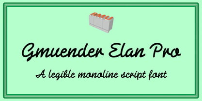 A legible multi-purpose, multilingual monoline-script of great clarity.
 - Ephesis by TypeSETit,
$24.95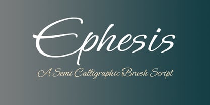 A contemporary script great for casual invitations, cards, tubes, scrapbooking.
 - Balladeer by profonts,
$51.99 Balladeer is an elegant, classical script available in several weights.
 - Charles by Aboutype,
$24.99Broad pen script typeface from 1930s and 40s; magazine advertising. - Nabuco by Omine Type,
$24.00Nabuco is a simple and clean non-connecting script typeface. - Float by Aboutype,
$24.99Broad pen script typeface based on late 1960s Turkish signage. - Narrative BF by Bomparte's Fonts,
$39.00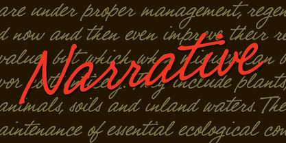 A cool handwritten script with a warm and friendly voice.
 - Cookie Dough by BA Graphics,
$45.00 A nice loose hand written brush or marker type script.
 - Willem by Aboutype,
$24.99Broad pen script typeface from 1930s and 40s; magazine advertising. - Salonika by Aboutype,
$24.99Broad pen script typeface based on late 1960s Turkish signage. - Murray Hill by Bitstream,
$29.99An original informal script designed for ATF by Emil Klump. - Hedwig Pro by Ingo,
$42.00 A modern sans serif with open round forms. The ”round“ letters emphasize the condensed open oval; the light counter forms provide the rhythm of the typeface, causing the typeface to appear gentle and pleasing. The ”modern“ design of a and g being especially contributive here. All of the letters are recognizably narrow, almost ”condensed,“ the forms being very functionally shaped. The construction of the ”triangular“ upper case letters A M N V W as well as v and w, especially catches the eye with the shafts joined together as beams are stacked upon each other. With this construction Hedwig displays a down-to-earth touch. Contrary to the classical sans serifs, a few letters were given light echoes of serifs which promote fluency: a d l are displayed below the line in a reading direction and end in a compressed but also very short serif style; on m n p r the upstroke is gently displayed and on u the downstroke. For all the typo-maniacs among you designers there are alternative forms for a number of letters in Hedwig: A B D G I M R W and a d f g j l ß u. Even an antiquated ”long“ s and an upper case ß is available. Plus, Hedwig includes numerous ligatures which can save that little bit of space where required and which allow the typeface to appear more variable: ch, ck, ct, fi, fj, fl, ff, ffi, ffl, ft, mm, ti, tt, tz.
 - Another Passion by Sarid Ezra,
$19.00 Introducing, Another Passion Script Family, make your own handwritten! Another Passion Script Family contain 4 FONTS including ligatures and underline. Also comes with italic, bold, and bold italic. Another Passion Script is a handwritten font that you can use to make a logo for branding, beautiful fashion design, or handwritten quote. Also already PUA Encoded. Foreign Languages Support: ÀÁÂÃÄÅÇÈÉÊËÌÍÎÏÐÑÒÓÔÕÖØÙÚÛÜÝßàáâãäåæçèéêëìíîïðñòóôõöøùúûüýÿ What Will You Get: Another Passion Regular Another Passion Italic Another Passion Bold Another Passion Bold Italic
 - Stefania by insigne,
$21.99Stefania is an elegant chancery script, designed with wedding invitations specifically in mind. A contemporary take on chancery scripts, Stefania retains a traditional calligraphic feel. Its features include a more pronounced slant for an elegant and dynamic flow and plenty of swash capitals. With ample flourishes and frills, including a score of alternate characters, Stefania works well in a variety of creative uses. This formal script is perfect for projects that call for a sophisticated appearance. - Sonora by profonts,
$51.99 Sonora is a brandnew profonts script typeface family supplied in the new OpenType Pro font format. Sonora contains six styles as light, medium, bold and the corresponding italics. The character set covers about 1.500 glyphs for the complete Latin character set (West, East, Baltic, Turkish, Romanian), and a huge number of handmade ligatures and alternates to make it a perfect OpenType Pro connecting script. Sonora is a very distinguished, elegant and versatile, intentionally non-slanted script font.
 - Valentine by profonts,
$51.99 Valentine is another brand-new profonts script typeface family with versions in light, light italic, medium and medium italic, supplied in the new OpenType Pro font format. Valentine contains about 1.100 glyphs for every weight, covering the complete Latin character set (West, East, Baltic, Turkish, Romanian), and a huge number of handmade ligatures, character combinations and alternates to make it a perfect OpenType Pro connecting script. Valentine is a very distinguished, elegant and versatile script font.
 - Beauty Mermaid by Scratch Design,
$10.00 Introducing Beauty Mermaid script! It's a modern and beautiful script font with texture brushed ink style. It's highly recommended for you who want to make some designs with a texture like a realistic signature style. This font will work for invitation design, logos, wedding invitations, posters, packaging, book cover title, quote, social media post, etc. Open your Opentype features using the script font to use the ligatures and swashes. Also, this font includes alternates for uppercase and lowercase characteristics.

