10,000 search results
(0.074 seconds)
- Fountain Pen Frenzy - 100% free

- Eutemia III - Unknown license

- kallot - Unknown license

- Divine - Unknown license

- Burgundian - Unknown license

- Sequel 100 Wide by OGJ Type Design,
$35.00 Sequel 100 Wide is a static sans-serif or neogrotesque with generous horizontal proportions. A variant of the original Sequel Sans, it considerably expands the stylistic scope of the Sequel superfamily. In addition to its wider letterforms, it has got a larger x-height, slightly shifting the historical flavor from the 1950s to the 1960s. Yet, at its core, it’s as clean and functional as the main font family, with perfectly horizontal stroke endings and vertical terminals. Six weights from 45 (Regular) to 95 (Black), matching italics, and limitless possible interpolations by means of two Variable Fonts offer a rich typographic palette for any situation.
 - Modern Prestige by Letterhend,
$19.00 Modern Prestige is a unique serif which is combined with copperplate script letterform with all the swashes! This typeface has many alternates with swashes that can make your lettering / logotype become more interesting. The clean and neat of a serif combined with the swirl swashes makes this font one of a kind! This font perfectly made to be applied especially in logo, and the other various formal forms such as invitations, labels, logos, magazines, books, greeting / wedding cards, packaging, fashion, make up, stationery, novels, labels or any type of advertising purpose. Features : uppercase & lowercase numbers and punctuation multilingual ligatures alternates swashes PUA encoded We highly recommend using a program that supports OpenType features and Glyphs panels like many of Adobe apps and Corel Draw, so you can see and access all Glyph variations.
 - Kautiva Pro by Sudtipos,
$99.00 Kautiva is a comprehensive modern sans serif family that includes true italics, small caps, and unicase variations. Kautiva was developed to be efficient in both text and display environments. Kautiva serves as a refreshing middle ground between serious geometric and overly humanistic design. This gives it a balance, allowing significantly more flexibility than is normally expected from a sans serif typeface. Versatile in its functionality, Kautiva is also extensive in its features. The OpenType format Kautiva Pro family is available for layout architects who want to take advantage of the numerous features of the format: from true small caps to a variety of ligatures and stylistic alternates, through proportional and tabular figures and complete support for a multitude of Latin-based languages, as well as Cyrillic and Greek scripts.
 - Kautiva by Sudtipos,
$35.00 Kautiva is a comprehensive modern sans serif family that includes true italics, small caps, and unicase variations. Kautiva was developed to be efficient in both text and display environments. Kautiva serves as a refreshing middle ground between serious geometric and overly humanistic design. This gives it a balance, allowing significantly more flexibility than is normally expected from a sans serif typeface. Versatile in its functionality, Kautiva is also extensive in its features. The OpenType format Kautiva Pro family is available for layout architects who want to take advantage of the numerous features of the format: from true small caps to a variety of ligatures and stylistic alternates, through proportional and tabular figures and complete support for a multitude of Latin-based languages, as well as Cyrillic and Greek scripts.
 - Palmire by Mas Anis Studio,
$23.00 Hi There! Meet our first modern serif typeface Palmire Palmire is a stylish font that is both modern and minimal. A light font that is perfect for feminine logo marks, fashion mastheads & editorial design (works great in layout design for quotes or body copy). The ligatures feature is so amazing, you can convert regular random word to elegant logo just by using the ligature. And there is 75+ ligature to support your amazing design project! Is there anything else? Of course! it has multilingual characters too! We work so hard to keep this elegant font looks elegant, classy, readable, stylish, eye-catching, and easy to use. You can easily pair them with script or sans serif font from all over the world to make your work more interesting!
 - Angila by Scoothtype,
$10.00 Angila is a fresh, handmade typeface, made with brush and ink. a contemporary approach to natural hand-painted design as well as subtle script combinations. Works perfectly for logos, magazines, menus, books, invitations, wedding / greeting cards, packaging, labels, t-shirts, Like Novel Titles, Apparel, Invitations, Quotes, Book Titles, Stationery Designs, Branding, Logos, Greeting Cards, T-shirts, Packaging Design, Posters and more. Angila includes a complete set of upper and lower case letters, as well as support for multiple languages, numbers, punctuation, ligatures, and alternative characters. Files include: * Angila .TTF How to access all alternate characters, using Windows Character Map with Photoshop: https://www.youtube.com/watch?v=Go9vacoYmBw How to access all the alternate characters using Adobe Illustrator: https://www.youtube.com/watch?v=XzwjMkbB-wQ If you need help or advice, please contact me via email.
 - Gaga Highland by Putracetol,
$22.00 Gaga Highland - Quirky Slab Serif Font. Gaga Highland is a slab serif inspired by 1970s cowboy and sheriff posters but made flexible enough for everyday use. What makes this font unique is the difference in the height of each character. The baseline is also not the same, so it makes this font seem irregular Gaga Highland best uses for title, invitation, heading, cover, poster, logos, quotes, product packaging, merchandise, social media & greeting cards and many more The alternative characters were divided into several Open Type features such as Swash, Stylistic Sets, Stylistic Alternates, Contextual Alternates, and Ligature. The Open Type features can be accessed by using Open Type savvy programs such as Adobe Illustrator, Adobe InDesign, Adobe Photoshop Corel Draw X version, And Microsoft Word. This font is also support multi language.
 - Telemark by Juri Zaech,
$20.00 Telemark is a monolinear slab serif influenced by the wide serif typefaces of the 19th century. The name refers to the vintage form of skiing which was introduced in Norway at the same period of time and allowed more fluid turns. After the Telemark style was replaced by newer techniques in the Alpine countries it has experienced a rise in popularity in recent years. The Telemark type family features the three weights in an additional label style which allows an uncomplicated creation of editable pointers, banners and cartouches. Different combinations of end pieces result in a great variety of designs. Telemark is suitable for headlines and logotypes and complements script typefaces as well as any neutral grotesque. Details include 207 characters in three weights, a total of six styles and manually edited kerning.
 - Preta by Lián Types,
$39.00 Preta, portuguese for a very pure kind of black, has its name very related to its concept: I wanted to make the fattest/darkest script ever. People who follow my work may notice its forms are very related to works of my past (1) but this time the challenge was to be very cautious with the white spaces between letters. Not only I followed some rules and ductus of the copperplate style of calligraphy but also I took a lot of inspiration in posters of the early Art Nouveau (specially in Alfred Roller of the Vienna Secession) where letters forms looked like black squares if not looked from a close distance. With Preta, I wanted to achieve that same idea of “darkness” and thanks to the always welcomed question -what if?- the font grew a lot. The result is a very fat font, that looks delicious. Due to possible customer needs, I designed Preta Small, so it can be used in smaller sizes. Preta Ao Sol (which literally means under the sun!) is a style with those lovely tiny details to give the sensation of bright. Preta Ao Sol Solo was made to be used as a layered font with Preta. Finally, Preta Capitals serves as a company for Preta. Hope you enjoy the font as much as I did when designing it: The fact that it’s full of alternates, swashes, ligatures and swirls makes it really pleasurable at the moment of using it. Give it a try and dance with Preta! TIPS For better results, use Preta with the ‘standard ligatures’ feature activated. NOTES (1) Beatle in 2014. Seventies in 2015.
 - HT Cafe by Dharma Type,
$19.99 This connected and brush script is very impressive, but is also legible, so it is the best for package of sweets or breads, shop card, shop front and so on. Holiday Type Project offers retro hand drawing scripts. Inspired by retro script on shopfront lettering, wall paint advertisements in Italy around 1950s. Check out the script fonts from Holiday Type!
 - Supernett cn by FaceType,
$19.90 ›Hi! Please note you are visiting Old Supernett. We decided to upgrade it: more styles, more glyphs, more features, more everything! View New Supernett here: Supernett 2019› Georg from FaceType Supernett – a versatile hand drawn/handmade/handwritten font – is tailored for large font sizes but also impresses with an astounding legibility in small typesettings. Supernett is fairly condensed for space-saving headlines. The extensive character set supports Central and Eastern European as well as Western European languages. Each style contains more than 4700 glyphs to let the font look real hand-made. Three OpenType features are specially created to enhance this impression, with a maximum effect when applied to big type: Alternating Letters For a truly hand-drawn look, letters and numerics alternate randomly between three different variants → activate Contextual Alternates Rotating letters All glyphs rotate randomly and slightly around their own axis → activate OpenType Swashes Varying Baseline Shift Each single glyph moves individually up or down → activate OpenType Titling Alternates More OpenType Features: Case Sensitive Forms This feature shifts various punctuation marks to a position that works better with all caps typography → It is deployed when an app’s all-caps styling is applied Slashed Zero The problem with the numeral 0 is that it can look too much like O in some typefaces. This feature replaces every zero with a slashed zero → activate Zero with a Slash Fractions Substitutes figures separated by a slash by proper fraction glyphs. A date however, written like 10/12/2013 will remain unchanged → activate Fractions Stylistic Set 03 Choose between two different styles of bullet (•) → activate Stylistic Set 03 Stylistic Set 04 Choose between two different styles of Y → activate Stylistic Set 04 View other fonts from Georg Herold-Wildfellner: Sofa Serif | Sofa Sans | Mila Script Pro | Pinto | Supernett | Mr Moustache | Aeronaut | Ivory | Weingut
 - Hacky by madeDeduk,
$17.00 Hacky is a stylish luxury serif family. It's clean and have the smooth angle with 9 variable weight and much alternative inside. Suitable to create any branding, product packaging, invitation, quotes, t-shirt, label, poster, logo etc. Feature UPPERCASE Lowercase Number & Symbol International Glyphs Uppercase Alternative Lowercase Alternative Ligatures If you need anything else just shoot me on email at: dedukvic@gmail.com or find more previews on my Instagram here : https://www.instagram.com/acekelgondolayu/?hl=en Hope you enjoy it.
 - Luxurist Vintage by Brothergrounds Studio,
$20.00 Introducing our latest display typeface called Luxurist Vintage - Display Vintage Serif with Ligatures can make your logotype become more interesting. Best Vintage font with special ligatures and multilingual support. inspired by the decorative arts and architecture movement Luxurist Vintage fonts is perfect for your project and allows you to create designs, headlines, posters, logos, badges, t-shirts and many more that are beautiful. It is also best used for posts, logos, posters, certificates, labels and more
 - Regon by Dicubit,
$9.00 Regon is a modern sans serif typeface/font family (18 fonts) designed with carefully handcrafted. This perfectly made to be applied in logo or branding, stationery, books, packaging, fashion, magazines, t-shirt, novels, labels and many advertising purposes. Styles: Thin, Extra Light, Light, Regular, Medium, Semi Bold, Bold, Extra Bold, Black (All with Italic). Features: Uppercase, Lowercase, Number, Punctuation, Symbol, Multilingual. All the pictures used in the preview are not included. They are intended only for illustration purpose.
 - Belagoya by DYSA Studio,
$19.00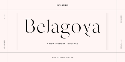 Belagoya is a New Modern Serif Typeface. This another collection of Display is perfect for your next branding project, excellent for your business. Belagoya have a smooth edges, so this font gives an authentic handcrafted feel style. Belagoya is perfect choice for people looking for clean, modern, minimalist, elegant, beauty design styles. Suitable for almost any graphic designs such as logo, branding materials, business cards, gift cards, t-shirt, cover, thumbnail, print, poster, photography, quotes .etc
 - The Chaffy by XdCreative,
$25.00 About The Chaffy The creation of the chaffy is inspired by classic and vintage fonts, with a touch of Slightly calligraphic, with variable stress angle and high contrast. The Chaffy is a display font type, so it is perfectly suited for graphic design and any display use ( for the logos, t-shirts, the web as well as for print, and also great for headings), The Chaffy is perfect pairing for Giane Gothic sans or Giane Serif Thank You _xdCreative
 - Mahezty by DRM Works,
$19.99 Mahezty is a modern, bold and fashionable serif display font. This font is imposing and features uniquely shaped letters, and as a result, it will easily match a wide range of creations that require a distinct touch. Mahezty is perfect choice for people looking for modern, minimalist, elegant, clean, beauty design styles. Suitable for almost any graphic designs such as identity, business cards, branding materials, gift cards, t-shirt, cover, thumbnail, print, poster, photography, quotes .etc
 - Muray House by Flavortype,
$19.00 Muray House is a bold serif font with a rough, balanced look, with beautiful curves and alternate characters. A style that we choose was the natural look hand made, Muray House ha a unique identity. Muray House also comes with alternative characters that are carefully created for adding a minimalist decor of the letters. Stylistic alternates allows versatile design options and works perfectly for Headlines, Posters, Logos Packaging, Branding, T-shirts, Greetings, Presentations and much more.
 - FancyPants by Adriprints,
$8.00 FancyPants is the first script font for Adriprints. It is always a challenge to jump into something new, and cursive script was right up that alley. FancyPants is a semi-linking, quirky, cursive script available with extended glyphs for international use.
 - Adelle Sans by TypeTogether,
$45.00 The Adelle Sans font family by José Scaglione and Veronika Burian provides a more clean and spirited take on the traditional grotesque sans. As is typical with TypeTogether typefaces, the most demanding editorial design problems were taken into consideration during its creation. The combination of lively character and unobtrusive appearance inherent to grotesque sans serifs make it an utterly versatile tool for every imaginable situation. Whether for global branding, screens, signage and advertising, or UI, the keyword behind Adelle Sans’s use is flexibility. To save space and keep legibility high, Adelle Sans is available in eight weights with matching italics and includes a condensed width of seven weights with their matching italics. Each of these 30 styles hits the perfect tone as a headline punch or subdued background hum, and the condensed widths are adept at setting short texts while retaining the expected personality. Rooted in the belief that broad language support is crucial to modern global type design, the Latin-matching variants are yet another push in TypeTogether’s ongoing multilingual efforts. The Latin script may have been first, but Adelle Sans has thus far been expanded into an exhaustive nine script family with extensive language support. Careful research and close collaboration with type experts yielded typographic consistency, legibility, and cultural awareness among all scripts, as well as filling the need for quality editorial typefaces in Arabic, Armenian, Chinese, Cyrillic, Devanagari, Latin Extended, Greek, and Thai, with more planned for the future. In addition to the 30 Latin styles, all other scripts have between seven and fourteen styles, each of which has been engineered to optically match the proportions of its counterparts. And each script comes bundled with the Latin script to ensure an harmonious fit amongst any two or more Adelle Sans families in the same block of text. The full Adelle Sans family delivers consistent, flexible, and personable results in multilingual documents, in apps, and multicultural branding worldwide. Its wide character set includes typographic niceties, small caps, several sets of figures, icons, and support for over 245 Latin-based languages. Be sure to check out the companions for Adelle Sans: Adelle, for a versatile and authoritative slab serif with no shortage of personality; and Adelle Mono, a two-width family flexible enough for developers and graphic designers alike.
 - Swollen - Unknown license

- Greek by Scholtz Fonts,
$8.95The Greek font started from an experiment with designing fonts based on a geometric grid. I joined the points on the grid with straight lines to form the various characters and found that this resulted in a font that closely resembled Greek writing (derived from inscriptions carved in stone) of ancient times. I continued to develop this theme but I now accentuated the look and feel of Greek writing. The three styles shown are the results of this development. I did not kern or letterspace the individual letters since this would have been out of character with the orignal Greek writing. This means that the font is mono-spaced. At a later stage I may produce more refined and "modern" versions of these fonts. Surprisingly, the Greek SCF styles are very readable. The font is fully professional in terms of its character set. It contains over 235 characters - (upper and lower case characters, punctuation, numerals, symbols and accented characters are present). In fact, it has all the accented characters used in the major European languages. - Rough Stamp Times by TypoGraphicDesign,
$9.00 The typeface Rough Stamp Times is designed from 2016–2022 for the font foundry Typo Graphic Design by Manuel Viergutz. The display font based on the original rubber stamps from flea market. The font started from 50+ stamps (analog) and was finally digitalize and extended to 600+ glyphs (digital). 4 font-styles (Rough, Clean, Misprint, Impact) with 601 glyphs incl. decorative extras like icons, arrows, dingbats, emojis, symbols, geometric shapes (type the word #LOVE for ♥︎ or #SMILE for ☺ as OpenType-Feature dlig) and stylistic alternates (9 stylistic sets). For use in logos, magazines, posters, advertisement plus as webfont for decorative headlines. The font works best for display size. Have fun with this font & use the DEMO-FONT (with reduced glyph-set) FOR FREE! Font Specifications ■ Font Name: Rough Stamp Times ■ Font Styles: 4 (Rough, Clean, Misprint, Impact) + DEMO (with reduced glyph-set) ■ Font Category: Display for headline size ■ Font Format:.otf (Mac + Win, for Print) + .woff (for Web) ■ Glyph Set: 601 glyphs incl. extras like icons (decorative extras like arrows, dingbats, emojis, symbols) ■ Design Date: 2016–2022 ■ Type Designer: Manuel Viergutz
 - Plantin by Monotype,
$29.99 Plantin is a Renaissance Roman as seen through a late–industrial-revolution paradigm. Its forms aim to celebrate fine sixteenth century book typography with the requirements of mechanized typesetting and mass production in mind. How did this anomalous design come about? In 1912 Frank Hinman Pierpont of English Monotype visited the Plantin-Moretus Museum in Antwerp, returning home with “knowledge, hundreds of photographs, and a stack of antique typeset specimens including a few examples of Robert Granjon’s.” Together with Fritz Stelzer of the Monotype Drawing Office, Pierpont took one of these overinked proofs taken from worn type to use as the basis of a new text face for machine composition. Body text set in Plantin produces a dark, rich texture that’s suited to editorial and book work, though it also performs its tasks on screen with ease. Its historical roots lend the message it sets a sense of gravity and authenticity. The family covers four text weights complete with italics, with four condensed headline styles and a caps-only titling cut. Plantin font field guide including best practices, font pairings and alternatives.
 - Novel Sans Pro by Atlas Font Foundry,
$50.00 Novel Sans Pro is the humanist grotesque typeface family within the largely extended award winning Novel Collection, containing Novel Pro, Novel Sans Pro, Novel Sans Hair Pro, Novel Sans Condensed Pro, Novel Mono Pro, Novel Sans Rounded Pro and Novel Sans Office Pro. Novel Sans Pro has a carefully attuned character design and a well balanced weight contrast. Classic proportions and the almost upright italic makes Novel Sans Pro being a modern humanist with the calligraphic warmth of a real italic. Many similarities with the other typeface families within the Novel Collection enable designers to combine the families and reach highest quality in typography. Novel Sans Pro [1020 glyphs] comes in 6 weights and contains small caps, an extra set of alternate glyphs, many ligatures, lining figures [proportionally spaced and monospaced], hanging figures [proportionally spaced and monospaced], small caps figures [proportionally spaced and monospaced], positive and negative circled figures for upper and lower case, superior and inferior figures, fractions, extensive language support, arrows for uppercase and lowercase and many more OpenType™ features.
 - Conrad by Linotype,
$29.00The award-winning Conrad was created by Japanese type designer Akira Kobayashi. Its design was based on the fifteenth-century type by Conrad Sweynheym and Arnold Pannartz, two German printers active in Rome at that time. They produced a unique, slightly unbalanced yet attractive type. Kobayashi says of his typeface, “I have designed a couple of typefaces inspired from the past, but this time the original print acted merely as a reference. The distinctive lowercase ‘a’ and some other letters were inspired by Sweynheym and Pannartz’s second roman type, but I revived the type in a more informal way. Here I used the historical type as a springboard. The resulting type looks different, taking on a rather temporary and lively look. I assume that the Conrad is the first revival of the Sweynheym and Pannartz type, though it does not closely resemble the original.” Conrad won first prize for the text typeface category in Linotype’s Third International Typeface Design Contest (2000) as well as the Certificate of Excellence in Type Design from the Type Directors Club (2001). - TT Norms Std Condensed by TypeType,
$35.00 TT Norms® Std Condensed useful links: Specimen | Graphic presentation | Customization options TT Norms® Std Condensed is the logical development of our bestselling TT Norms®. Since the release of TT Norms®, we received a bunch of requests to create its narrow version and even managed to make several custom projects of the narrow TT Norms® before we decided to start creating a full-fledged commercial version of the typeface. At the very beginning of the project, we did some research and tested several options for the possible width of the typeface. Despite the fact that TT Norms® Std Condensed has narrower proportions than the original family, it inherited the classic proportions of characters, attention to detail and meticulous elaboration of each character in the typeface. The TT Norms® Std Condensed font family consists of 18 faces (9 upright and 9 italics). Each style includes a sufficient set of characters that allow you to solve most of the problems that arise in the field of graphic design, branding, packaging design or website design.
 - PF Libera Pro by Parachute,
$79.00 PF Libera was designed at a time of leisure with no particular intention for commercial use. In fact it was offered in the beginning as a freeware. In 2001, designer Charis Tsevis was convinced that it may have some commercial value, so Parachute obtained the rights to sell this typeface. At that time, we did not even imagine what would follow. Since then, PF Libera is one of our most successful typefaces. We have seen it being used in very diverse applications. From publishing to advertising to banking, to transportation, to retail applications. Food, beverages, fashion, automobiles, tourism, the list goes on and on. In any way, this typeface is very personal, modern and provocative. It stays with you and definitely it brings along the message. PF Libera comes in 3 styles. One of them, 'Liberissima', was added later and is more loose than the other two. The new 'Pro' version is powered with 7 OpenType features and is carefully designed to include all languages that are based on Latin, Greek and Cyrillic.
 - Pendulum by Canada Type,
$24.95Pendulum is the much-anticipated digitization and swashy expansion of Americana, an amazing yet long overlooked treasure from the Nebiolo foundry, circa 1945. With heavy descenders and seemingly floating ascenders emanating from one of the most classical attempts at connected upright calligraphy, never did a font have this much charm and complexity at once. To complement the beauty of the original letters, Pendulum comes with two additional sets of swashed ending lowercase we call Swings. These Swings help Pendulum become a fantastic calligraphic plate making tool, as well as a great personalizing headline font. Plenty of alternates and extra custom endings are included for extra choice and variety. The OpenType version of Pendulum comes with the Swings included in the stylistic alternates and contextual alternates features. One click of a button and you have a nice swash ending for your word, or a nice mix of swash lowercase for a calligraphic plate. Pendulum can take your design anywhere your imagination goes. Its use can efficiently vary from simple slogans to richer layouts such as music sleeves or movie posters, and everything in between. - Rocaie by astype,
$37.00 The Rocaie fonts are base on antique Rococo letters from an gilding workshop. I was very lucky to acquire this set of metal letters in early 2018. Each of the letters has ornaments engraved by hand into its cast brass shapes. When drawing the digital outlines, I tried to preserve the handmade look of the original leaf engravings. Each of the letters uses a slightly different ornament pattern: no pattern is repeated identically. I expanded the very limited character set of the original, adding all the missing characters that today’s commercial fonts are expected to contain. I made additional font styles to easily add colour layers, outlines, and 3D shadows to the typeface. It’s up to you to decide how to “build” your colour font! You can combine the predefined font styles Regular, Pearl, Solid, Outline, and Magnum with each other, or with the Fill font styles. But you don't need to use all font styles to compose something nice! Have as much fun as I did with this Baroque beauty and enjoy the vintage.
 - Jazmo by URW Type Foundry,
$49.99 Jazmo is an offspring of an assignment I did for a Dutch architect. A classic building and coincidently the place of my studio in my hometown Zwolle, Netherlands, needed to be renovated. My job was to design the house numbers and signs for this building. This building I refer to was built in 1932 and designed according to the ‘New objectivity’ architecture. Now it accommodates several artist and craftsmen and also houses students. In my design I used elements of the Art Nouveau, which is related to the ‘New Objectivity’. Words as stately, angular, linear, stylish, artful, playful and frolic came to mind. It should be a design with a hint of the past and a flirt with the future. This house numbering is the root wherefrom Jazmo arises. The name Jazmo cites to the Jazz scene, which was a new and very popular artistic influence that time and age and is still a vibrant source of musical renewal. Mo stands for my Name Marit Otto. Together with my intern Arie Blok I created the missing characters and completed the font. Welcome Jazmo!
 - Novel Sans Rounded Pro by Atlas Font Foundry,
$50.00 Novel Sans Rounded Pro is the humanist grotesque typeface family within the largely extended award winning Novel Collection], also containing Novel Pro, Novel Sans Pro, Novel Sans Hair Pro, Novel Sans Condensed Pro, Novel Mono Pro, Novel Sans Rounded Pro and Novel Sans Office Pro. Novel Sans Rounded Pro has a carefully attuned character design and a well balanced weight contrast. Classic proportions and the almost upright italic makes Novel Sans Pro being a modern humanist. Many similarities with the other typeface families within the Novel Collection enable designers to combine the families and reach highest quality in typography. Novel Sans Rounded Pro [1020 glyphs] comes in 6 styles and contains small caps, an extra set of alternate glyphs, many ligatures, lining figures [proportionally spaced and monospaced], hanging figures [proportionally spaced and monospaced], small caps figures [proportionally spaced and monospaced], positive and negative circled figures for upper and lower case, superior and inferior figures, fractions, extensive language support, arrows for uppercase and lowercase and many more OpenType™ features.
 - Absurdies by Typephases,
$25.00 Absurdies is a trilogy of pictorial typefaces with lots of mischief, fun, weirdness, black humour and amusement. It includes 143 digitized illustrations. You will find many inexplicable behaviours, madmen, strange occupations, absurd and chaos-loving characters, and general whimsy. This little crowd can be used in many ways, from spot illustration to big illustration work or graphic designs, taking advantage of the vectorial format of the font file. The characters in Absurdies (together with their kin, the Illustries, Whimsies, Ombres, Bizarries and Genteta dingbats) are drawings from the sketchpad of Joan M. Mas, drawn from imagination and with no reference, except in a handful of cases pulled from historical photography. He wanted an easy-to-use format to collect his hundreds of imaginary ink drawings and he realized a digital typeface was an ideal solution. Having the illustrations gathered in a font file means you can use them instantly in any program you like. You may choose to use the images out of the box, or further customize them with colours and textures. The possibilities are endless.
 - Novel Sans Condensed Pro by Atlas Font Foundry,
$50.00 Novel Sans Condensed Pro is the humanist grotesque typeface family within the largely extended award winning Novel Collection, containing Novel Pro, Novel Sans Pro, Novel Sans Hair Pro, Novel Sans Condensed Pro, Novel Mono Pro, Novel Sans Rounded Pro and Novel Sans Office Pro. Novel Sans Condensed Pro has a carefully attuned character design and a well balanced weight contrast. Classic proportions and the almost upright italic makes Novel Sans Condensed Pro being a space saving, modern humanist with the calligraphic warmth of a real italic. Many similarities with the other typeface families within the Novel Collection enable designers to combine the families and reach highest quality in typography. Novel Sans Condensed Pro [1020 glyphs] comes in 6 weights and contains small caps, an extra set of alternate glyphs, many ligatures, lining figures [proportionally spaced and monospaced], hanging figures [proportionally spaced and monospaced], small caps figures [proportionally spaced and monospaced], positive and negative circled figures for upper and lower case, superior and inferior figures, fractions, extensive language support, arrows for uppercase and lowercase and many more OpenType™ features.
 - Gradl Highstep by HiH,
$8.00 Gradl Highstep is an archetypical Art Nouveau face by the prolific and mysterious Max Joseph Gradl. It epitomizes the visual language of elegance and sophistication. It seems strange that so little information is available today about Max Gradl: He seems to have been well known in his day. In addition to his jewelry design, he did advertising work for customers in Naples, London and New York in addition to customers in cities all over Germany. Gradl Highstep is an all-cap font with a wide range of ligatures: 094=SA, 123=CH, 125=CK, 126=TS, 167=FA, 172=PA, 177=TA, 188=WA and 190=YA. In addtion, 137=Gradl’s dated monogram “MJG 1903,” 175=LLC abbreviation, 181=alternate S. This is a subtle font with thin, variable strokes. It is best used at 28 points and larger to give it the presence it needs to be be appreciated. Gradl Highstep Initials is a companion font, incorporating a deft line drawing of a fashionable woman of the period who is every bit as elegant as the underlying font.


