10,000 search results
(0.106 seconds)
- Whoa Nelly NF by Nick's Fonts,
$10.00In his book of Showcard Alphabets, Dan X. Solo called this one Funhouse, and we couldn't agree more. Wild, wacky and slightly tacky, but suitable for the whole family. The Opentype version of this font supports Unicode 1250 (Central European) languages, as well as Unicode 1252 (Latin) languages. - Deco Moderne JNL by Jeff Levine,
$29.00 The model for Deco Moderne JNL was the hand lettered title on the sheet music cover of "Did You Ever See A Dream Walking" (from the 1933 Paramount musical "Sitting Pretty" starring Jack Oakie, Jack Haley and Ginger Rogers). The typeface is available in both regular and oblique versions.
 - Slim Kim by Wiescher Design,
$39.50 Slim Kim is the sister font of Julienne. It mixes perfectly with Julienn. So whenever you need an especially slim serif font this is it! Slim Kim has very spiky serifs, so I did not want to make an extra-slim version. Enjoy this spiky font, your Gert Wiescher.
 - Saw Mill Stencil JNL by Jeff Levine,
$29.00 A vintage metal stencil from a saw mill with the term "reusable skid" was the model for Saw Mill Stencil JNL. Although the original was what would be termed a semi-stencil (some letters did not have 'breaks' in them), the font was designed with a more traditional look.
 - TagBoyHardcore by PizzaDude.dk,
$15.00TagBoyHardcore is based on my own tagging style when I did graffiti in the mid-eighties. The font is roughly scanned and spaced narrowly in order to keep the original bad boy style. Pump up your text by starting and ending sentences with parentheses, brackets or the curly brackets. - Signboard JNL by Jeff Levine,
$29.00Signboard JNL is based on die-cut cardboard display lettering once made by the Duro Decal Company (now Duro Art Industries) of Chicago, Illinois. Available in various sizes, these letters and numbers could be affixed to a number of different surfaces to make affordable signs, displays and show cards. - Milliard by René Bieder,
$39.00 Milliard is a sharp and contemporary family of 22 fonts, taking inspiration from grotesk typefaces developed in the early twentieth century. Its open counters on lowercase "a", "c" or "e" allow for great legibility in small text sizes, supporting an unobtrusive, clear and modern appearance. When set in headlines, Milliard reveals a part humanistic, part geometric voice ranging from elegant and open thin weights to athletic and powerful heavy weights. Milliard comes with many opentype features including stylistic sets, old style numbers, arrows and many more making it a perfect choice for professional type setting in any digital or analog surrounding that requires a clear and modern voice.
 - Arp by W Type Foundry,
$35.00 Arp is a neo-grotesk type system exploring the relations between contrast, functionality, and graphic character in one family. This typography comes in 5 different weights including fine strokes with inverted contrast (20), a sharp sans serif (80), and a high contrast heavyweight (240). Moreover, its design is formed by short ascenders and descenders aiming higher legibility, ink traps for display-functional purposes, and includes a wide range of icons, arrows, and symbols which allow creating consistent compositions in digital and print designs. All styles of 640 characters include a display weight with geometric and glyphic style alternates, which expand the proprieties and versatility of the system.
 - Fujiwara by W Type Foundry,
$29.00 Fujiwara "A" for sharp contrast neo grotesk & Fujiwara "B" for Display Rounded counterforms is a typeface by WT, these elements plus its aligned counters are Fujiwara's main features. Fujiwara is also the result of studying the proportions of modern Swiss typefaces adding a personal touch to create a versatile and stylized font suitable for all kinds of compositions. Fujiwara includes 20 styles plus 2 VARIABLE FONTS. The slanted versions were very carefully drawn and corrected, it also has a variable option and many open type features like fractions, special numbers, tabular lining numbers, case sensitive forms, standard and discretionary ligatures, emojis, arrows, carefully aligned case-sensitive accents, stylistic alternates, and more.
 - Threepoints North by Type Associates,
$30.00 The Threepoints Series is the result of several years of work that bases three different sans serif type designs on one “shell”. Designed for optimal readability North, with its squarish shapes and rigidity are suggestive of an upright Swiss or Inserat typeface. The East variant takes on the look of another popular condensed grotesk with a softer, more rounded basic shape whilst maintaining the purpose of the original design. With minimal adjustments West leans towards more contemporary European designs. Although these are primarily display typefaces they function extremely well in text sizes in either upper or lowercase composition. Excellent for signage. Each variant comes with matched italic at no additional cost.
 - Devoid by Dropper,
$35.00 Devoid is a sans serif typeface with a no frills stripped down design. The design has all the features of the neo grotesk typeface, horizontally cut endings, modern capitals, oval counters, with a bare bones appearance. The typeface comes in three subtle widths, Devoid Slim, which is spaced most narrowly, Devoid and Devoid Set, which have a wider letterspacing. There are regular, medium and bold weights with accompanying italics. The vertical metrics align across weights and widths, this allows for optical size adjustment as well as adjusting for same size text fit. Dutch designer Pier Taylor designed the typeface in 2020 for use in catalogs, lists and registers.
 - Antapani by Monoco Type,
$15.00 Antapani is a grotesk sans style with some stylistic style to some letter. Designed for readability but can also function as a display text. Come with 9 style from Thin to Black so you can choose which style you want. Designed with opentype features in mind. Each weight includes extended language support (+ Cyrillic), fractions, tabular figures, arrows, ligatures and more. Perfectly suited for graphic design and any display use. It could easily work for web, signage, corporate as well as for editorial design. Designed by Abdurrahman Hanif, a young Jakartans Graphic Designer who fell in love into type design after his graduation. Published by Monoco Type
 - Threepoints West by Type Associates,
$30.00 The Threepoints Series is the result of several years of work that bases three different sans serif type designs on one “shell”. Designed for optimal readability North, with its squarish shapes and rigidity are suggestive of an upright Swiss or Inserat typeface. The East variant takes on the look of another popular condensed grotesk with a softer, more rounded basic shape whilst maintaining the purpose of the original design. With minimal adjustments West leans towards more contemporary European designs. Although these are primarily display typefaces they function extremely well in text sizes in either upper or lowercase composition. Excellent for signage. Each variant comes with matched italic at no additional cost.
 - Enotria by Aspro Type,
$39.99 Enotria is a contemporary neo-grotesk typefaces inspired by the Swiss school but with a Calabrian’s soul (south Italy region). It is composed by 8 weights and 7 widths for 112 styles with also 4 stylistic set for the letters, 2 stylistic set for numbers, 1 more stylistic set for symbols and punctuations, for three languages scripts. Enotria sports elegant 8° italic angle and a lot of adjustment between the letters for a better legibility as well as true fractions, ordinals, tabular and old style figures, numerators and denominators. Enotria typefamily is more then a typeface, it is a huge design and typographic system, flexible and suitable for any occasion.
 - Altone by Eko Bimantara,
$29.00 Altone was created in a pursue of regularity and conventional geometric sans serif typeface which tend to be easy to receive by it's reader, broad usage possibility, shown a simple, bold and strong personality. The letterforms are more likely associated with Grotesk rather than the original classical Bauhaus style, formed in moderate and proportional width, flat apex, closed aperture with straight cuts stroke ends. Consist of 9 weight from Thin to Heavy with each matching Obliques. Contain several OpenType features: Stylistic Alternates, Figures Variation (fraction, tabular lining, numerator, denominator), and also covered broad latin languages. Provided also variable fonts in two styles; Upright and Oblique
 - Threepoints East by Type Associates,
$30.00 The Threepoints Series is the result of several years of work that bases three different sans serif type designs on one “shell”. Designed for optimal readability North, with its squarish shapes and rigidity are suggestive of an upright Swiss or Inserat typeface. The East variant takes on the look of another popular condensed grotesk with a softer, more rounded basic shape whilst maintaining the purpose of the original design. With minimal adjustments West leans towards more contemporary European designs. Although these are primarily display typefaces they function extremely well in text sizes in either upper or lowercase composition. Excellent for signage. Each variant comes with matched italic at no additional cost.
 - Intermediate JNL by Jeff Levine,
$29.00 The letters and numbers of a home movie titling kit from circa the 1950s or 1960s called the Magna Tech Titler Number 312 were die-cut from cardboard with a magnetic backing and were styled after Futura Bold. The user of this set composed the desired title or phrase onto a metalized board and the result was photographed with their 8 or 16mm camera. Because the dies of the characters were handmade, very slight variations in the shape and stroke width of the lettering would occasionally occur. These variations were incorporated into the design of the digital type face. Intermediate JNL is available in both regular and oblique versions.
 - Excalibur Sword by Comicraft,
$19.00 The Sword has been Drawn! The Quest for the Holy Grail has begun! When Arthur took the mighty sword of Excalibur from the Lady of the Lake, little did he know of the stories that would be spun, the myths that would be built around him, the Legend of Camelot and the Knights of the Round Table! And The Font. Merlin might have been King Arthur’s sage advisor, a font of wisdom and magicks, but never was Merlin available in postscript, truetype and opentype formats, nor was Lancelot, Arthur’s First Knight suitable for Celtic Display Lettering! See the families related to Excalibur Sword: Excalibur Stone.
 - Grid Hero by PizzaDude.dk,
$16.00 100.000 years ago years ago, a group of mad scientists from the far away planet ZyrXX, encountered the earth and just waited to conquer the planet. Their masterplan was to use electronic brain waves to manipulate our minds. Sounds cheesy and comic, right? Well, that is the true story about this font. The font was built using a grid (hence the name!) and all I had in mind, was a mixture of old sci-fi movies and computer graphics from the 80ies. I did my best to recall and re-create this - I will let you be the judge to decide whether I succeeded! :)
 - Hyperdrive by Comicraft,
$19.00 If you're about to make the jump into hyperspace, buckle up and engage your R2 unit with our new font release, HYPERDRIVE! Ten years in the making, we've spent almost as much time developing these characters as George Lucas spent developing his! Co-created by Starkings & Roshell (HYPERDRIVE, not George), this font is guaranteed to keep TIE fighters off your tail and will always come in useful if you get menaced by phantoms or attacked by clones. So sit back, relax and enjoy the flight -- but don't forget; let the Wookiee win! Remastered Hyperdrive includes new letter shapes, 200+ connecting letter combos, improved spacing & kerning and support for Western & Central Europe.
 - Outside Voice by Molly Suber Thorpe,
$13.99 Outside Voice is a handwritten, all-caps typeface, created as an homage to the robust history of handwritten protest signs. It's a beautiful display font for a huge range of projects, from poster art to holiday cards. With contextual alternates enabled, this font will automatically cycle through three sets of handwritten alphabets as you type. The result is type that looks as imperfect and handmade as a digital font can get. This makes Outside Voice a wonderful choice for pairing with hand-drawn illustrations. Consider varying the size, slant, and/or color of each line in your layouts. These adjustments make Outside Voice look even more handmade and organic, which is great for fun designs like posters and quotes. This typeface is quirky and ligature-rich, with over 600 glyphs and icons. It supports Latin and Modern Greek alphabets, and includes all European language diacritical markings. It includes a set of decorated word ligatures comprised of common protest words like 'peace,' 'vote', and 'yes!'. Additionally, you'll get a full set of common protest icons, such as a raised fist, planet, dove, and peace sign.
 - PF Mellon by Parachute,
$35.00 PF Mellon is a modernist variable grotesque with mixed roots. Its unconventional aesthetic is the product of an exploration into the art of emphasizing titles, headlines and text in captivating and unpredictable ways. Contrary to conventional practices of highlighting text with heavier weights, PF Mellon proposes an intriguing new scheme based on striking and attention-grabbing compositions of narrow and extended letterforms- even when set in lowercase. Part geometric and part grotesque, PF Mellon’s expressionist alphabet and extravagant style challenge conventions of visual culture in an Art Deco-like manner. PF Mellon’s rebellious idiosyncrasy takes its cues from the eccentric personality of our popular PF Venue, an earlier geometric sans serif characterized by its daring combinations of non-uniform structures. PF Mellon’s basic design skeleton was influenced by nineteenth and early twentieth century condensed sans serif typefaces such as Stephenson Blake's Grotesque No.77 and ATF’s Alternate Gothic, adding an extra contrast to the thickness of strokes. PF Mellon is also available as a variable font format which you may request it free of charge from Parachute® once you purchase the whole type family.
 - Moood by Eotype,
$14.00 Moood is a new modern grotesque typeface consisting of 5 styles. The glyph shape characterized by strong geometric outline with a little smooth rounded edges. Moood font suitable for various projects such as logos, brands, posters and many more. This font comes with alternate and ligature features.
 - Kanakira by Jetsmax Studio,
$15.00 Kanakira is a modern sans typeface that is heavy on a geometric take of the neo-grotesque model, with a special ink-trap feature. Available in 9 weights from thin to heavy, Kanakira is ready to be your “go-to” font for any kind of project.
 - Grota by Latinotype,
$26.00 Grota is a very expressive font, has a gestural character inspired by the hand lettering . Grota is grotesque, unicase and exceptional. It has six weights ranging from thin to black with their italics. It is ideal for logos, brands, magazines, headlines, books. etc. Photography by Matías Troncoso
 - Kiva Sans by Kosinsky,
$30.00 Kiva sans - it is a modern grotesque with open forms and visible contrast. The font is built according to the experimental principle, which, to some extent, makes it stand out. Perfect for both small text and headings. The font supports Cyrillic and Latin. Developed in 2021.
 - Cordillera by Latinotype,
$39.00 Clear, simple and multipurpose. We present Cordillera, a new sans serif designed for corporate use, which mixes classic proportions, geometric and neo-grotesque characters. Its alternative characters will allow you to go from expressive titles to neutral texts easily while maintaining the harmony of the system.
 - P22 Ridley by IHOF,
$24.95 Ridley is a calligraphic-influenced, decorative, medieval font combining Roman and Gothic forms. It is named for Nicholas Ridley and similar in style to Staunton’s Latimer font. Ridley and Latimer were protestants burned together at the stake in 1555 during the reign of Queen “Bloody” Mary.
 - Contype by Wiescher Design,
$39.50 Once I had a young, very eager and interested designer in my employ. We got into talking about where our letterforms come from and the habits in perception we are used to. He did not quite believe me. So I said, let's try to design a typeface where everything is just the opposite of what we are used to. We really had a hard time, our habits crept up on us all the time. But after a couple of weeks we finally finished this typeface and wanted to call it crazytype, but my young apprentice who did most of the manual labor said Contype sounded crazier. So it became Contype and it's really crazy, with a small asian touch to it. Yours very crazy Gert Wiescher
 - Range Sans by Eclectotype,
$36.00 This is Range Sans, the sans-serif counterpart to Range Serif . It can be categorized as a grotesque, with the idiosyncratic angular details from the serif family making themselves known in the arches and bowls of the lower case. The range of weights is larger than Range Serif, with two more weights at the lighter end of the spectrum. The weights from light to black correspond to their seriffed sisters, so can be interchanged with them freely while maintaining a similar text color and vertical metrics. This is useful for adding emphasis; Range Sans is deliberately lacking an italic, but the italics from Range Serif work better than you might expect in running text, particularly for the light and regular weights. Range Sans has a contemporary, somewhat geometric look that lends itself to uses such as corporate identities, minimalist graphic design, and logos. The middle weights do work well in running text, however, with the angled details being less noticeable at small sizes. Designed for demanding typography, supporting most Latin-based languages, Range Sans is equipped with true small caps for all weights, an array of numeral styles (proportional- and tabular- lining and oldstyle figures, small cap figures, numerators, denominators, superscripts and subscripts/scientific inferiors), automatic fractions, a set of useful arrows, case-sensitive forms, and a range of currency symbols including recent additions: Turkish Lira, Indian Rupee and Russian Ruble.
 - Christmas Pattern by Mauve Type,
$29.00 The same procedure as every year? Again Christmas cards and greetings need to be designed... Sick of the usual Christmas imagery? Finally here is the ultimate typographical solution: 4 Christmas Pattern Fonts for display use. Playfull yet straight, Christmassy yet aesthetically pleasing. Pattern is the new sexy! Practical details: - Use in great display sizes only. The bigger – the better! - Fonts gain kind of "transparency" through the patterns – handy for use on top of images. - Characterset is caps only and supports Central, Eastern and Western European languages. - Entertaining 2 min movie explaining the basic concept and making of the Pattern Fonts. - Combine with "non-Christmassy" Pattern Fonts from the Pattern family. - Also available: a blank version in light, regular and bold.
 - MartiniThai Neue Slab V2 by Deltatype,
$39.00 Award winning 2017 font from Demark (Thailand) and G-Mark (Japan) in Graphic Design, MartiniThai Neue Slab is now available with better taste. Deltatype created a better version of MartiniThai Neue Slab V2: refined for better outline, we fine-tuned all outlines for better letterforms. Proportion were adjusted for better consistent. Metrics got new values for increased readability. Kerning, fine-tuned kerning pair for better spacing between the letters. MartiniThai Neue Slab V2 comes in six weights: Thin, Light, Regular, Bold, Extra Bold, Black. Thai Language is included in this package. MartiniThai Neue Slab is a unique slab serif in Thai Script that creates a sense of timeless and contemporary feel and is used by a media provider and nationwide in Thailand.
 - Linotype Sangue by Linotype,
$29.99Linotype Sangue is part of the Take Type Library, selected from the contestants of Linotype’s International Digital Type Design Contests of 1994 and 1997. This prize-winning font was designed by the German artist Gabriele Laubinger. The most distinguishing characteristic of Linotype Sangue is the contrast between the wide, rounded capital letters and the tall, narrow and pointed lower case. Another factor which makes this font so unique is the way Laubinger worked with stroke contrasts, using heavy strokes in the top third of the characters and diminishing to extremely light strokes at the bottom. Linotype Sangue makes a mysterious, secretive impression. It is best used for headlines and displays and shorters texts with point sizes of 12 and larger. - Capital Love by Harald Geisler,
$68.34 Capital Love just contains capital letters decorated with hearts. By pressing a lowercase button a alternative to the uppercase letter will appear. All shapes are drawn individually and do not oblige a geometrical system. The lighthearted vivid ductus remind me of a quality that can be found in the dynamics of Keith Haring drawings. Capital Love is a part of the Light Hearted Font Collection that is inspired by a recording of Jean Baudrillard with the title, "Die Macht der Verführung" (The Power of Seduction) from 2006. Further inspiration came from the article, "The shape of the heart: I'm all yours". The heart represents sacred and secular love: a bloodless sacrifice. by British writer Louisa Young printed in EYE magazine (#43) London, 2002.
 - Cosmic Pattern by Okaycat,
$29.95 Cosmic Pattern is clean, cool & charming. Designed with constellation in mind with bright and dim stars connected together in alphabetical pattern. Cosmic Pattern features extended characters, and contains West European diacritics & ligatures. Highly suitable for international environments & publications. For more universe inspired fonts please check our Star Cursive and Arco Star.
 - Linotype Atlantis by Linotype,
$29.99Lutz Baar was born in Berlin, now living in Gothenburg, Sweden. He is an art director at his own advertising and Web design studio Miraculus. Among his typeface designs you find the award winning Linotype Pisa, the hand tooled looking Linotype Atlantis, and the strictly Linotype Ordinar, designed for Web usage. - Mermaid NY by DP Fonts,
$49.95 MermaidNY font was created from an illustration I did in college for a NYC restaurant. The combination of sea and city come together and are represented with my illustrations of mermaids and urban buildings. This is a base font for what can be amazing invitations, textiles or anything you can imagine.
 - M Hei3 HK by Monotype HK,
$523.99 Monotype Hei3 HK is a modulated and transitional Chinese design with structure, diǎn, piē and nà carry Song style, while horizontal & vertical strokes are relatively simple. This mix of ancient and modern elements with low contrast is something that you can find in wood carving: rigid while balanced with softness.
 - Eckhardt Fancy JNL by Jeff Levine,
$29.00 Eckhardt Fancy JNL was named in honor of Al Eckhardt (1929-2005), a talented sign painter and good friend of font designer Jeff Levine. The design was inspired by a vintage alphabet found within a collection of decorative display alphabets from the type collection of the late Dan X. Solo.
 - Halloween Monoline by Letterafandi Studio,
$8.00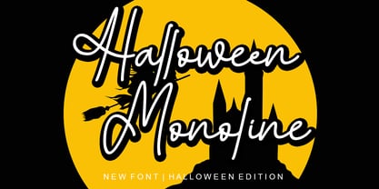 Halloween Monoline is a Script Monoline font by Letterafa Studio. It has flowing letters that will give your designs a unique and sweet look. Halloween Monoline font is perfect; logos, greeting cards, a package design, a brand identity, craft design, any DIY project, book title, wedding invitation, packaging, and more.