10,000 search results
(0.031 seconds)
- FF DIN Stencil by FontFont,
$50.99 FF DIN: the famous, faithful and first revival of DIN 1451. FF DIN originates in the lettering models from the German standard DIN 1451, and is considered the perfect standard typeface due to the methodical and engineered nature of its design. The FF DIN family breathes an atmosphere of versatility and authority, FF DIN Stencil follows the same design principles with extra flair. The bridges are arranged vertically, which usually replaces the thinnest parts of the strokes — offering depth in your headlines. Go loud and scale up, as the weights get heavier, the width of the bridges skillfully expand and contract, enabling FF DIN Stencil to provide confidence in volume, and in any chosen style. Also made available as a Variable font, creatives can design hyper specific variations to thrive in any design space, and even to animate movement from one state to the next. Get innovative with the entire FF DIN family, FF DIN Stencil’s spacing and kerning is identical to FF DIN, this enables swapping between any FF DIN font without changes in word length or line breaks. For true FF DIN fans, FF DIN Slab and FF DIN Stencil designed by Albert-Jan Pool, Antonia Cornelius and Achaz Reuss, can be seen as harmonious companions to the FF DIN family, rather than alternatives. Bestowed with its parents distinctive DNA, all the FF DIN extensions open up new possibility with their own unique qualities, but stay true to the FF DIN design philosophy of engineered precision.
 - DIN Next Shapes by Monotype,
$29.99 Sabina Chipară's DIN Next Shapes typeface is a twist on the original German industrial classic, taking its skeleton and re-clothing it in dots, hearts, snowflakes and stars. The design offers a more approachable and whimsical tone of voice than the original, while maintaining all the legibility and clarity of form that makes DIN Next such a reliable and versatile design. It works in harmony with DIN Next, and is particularly suited for designers looking to be a little more expressive. DIN Next Shapes includes four fonts: Dots, Flakes, Hearts and Stars, and has pan European language support including Greek and Cyrillic. It also has OpenType features including stylistic alternatives, ligatures and fractions.
 - PF DIN Serif by Parachute,
$36.00 DIN Serif: Specimen Manual PDF The DIN Type System: A Comparison Table This is the first ever release of a true serif companion for the popular DIN typeface. DIN Serif originated in a custom project for a watchmaking journal which required a modern serif to work in unison and match the inherent simplicity of DIN. As a result, a solid, confident and well-balanced typeface was developed which is simple and neutral enough when set at small sizes, but sturdy and powerful when set at heavier weights and bigger sizes. It utilizes the skeleton of the original DIN and retains its basic proportions such as x-height, caps height and descenders, whereas ascenders were slightly increased. DIN Serif makes no attempt to impress with ephemeral nifty details on individual letters, but instead it concentrates on a few modern, functional and everlasting novelties which express an overall distinct quality on the page and set it apart from most classic romans. This is a low contrast typeface with vertical axis and squarish form which brings out a balance between simplicity and legibility. Its narrow proportions offer economy of space which is critical for newspaper body text and headlines. At small sizes the text has an even texture, it is comfortable and highly readable. The serifs are narrow at heavy weights and when tight typesetting is applied at large sizes, the heavier weights become ideal for headlines. DIN Serif was inspired by late 19th century Egyptian and earlier transitional roman faces. Bracketed serifs were placed on the upper part of the letterforms (this is where we mostly concentrate our attention when we read) whereas small clean square serifs were placed on and under the baseline to simplify the letterforms. In order to reduce visual tension at the joins and make reading smooth and comfortable, a slight hint of bracketed serif was added at the joins in the form of a subtle angular tapered serif, which softens the harsh angularity. These angular tapered serifs tend to disappear at smaller sizes (or smooth out the joins) but stand out at bigger sizes exuding a strong, modern and energetic personality. What started out as a custom 2 weight family, it has developed into a full scale superfamily with 10 styles from Regular to ExtraBlack along with their italics. Additional features were added such as small caps, alternate letters and numbers as well as numerous symbols for branding, signage and publishing. All weights were meticulously hinted for excellent display performance on the web. Finally, DIN Serif supports more that 100 languages such as those based on the Latin, Greek and Cyrillic alphabet.
 - PF DIN Text by Parachute,
$79.00 The purpose of the original DIN 1451 standard was to lay down a style of lettering which is timeless and easily legible. Unfortunately, these early letters lacked elegance and were not properly designed for typographic applications. Ever since its first publication in the 1930’s, several type foundries adopted the original designs for digital photocomposition. By early 2000, it became apparent that the existing DIN-based fonts did not fulfil the ever-increasing demand for a diverse set of weights and additional support for non-Latin languages. Parachute® was set out to fill this gap by introducing the PF DIN series which has become ever since the most comprehensive and sophisticated set of DIN typefaces. It was based on the original standards but was specifically designed to fit typographic requirements. Its letterforms divert from the stiff geometric structure of the original and introduce instead elements which are familiar, softer and easier to read. The first set of fonts was completed in 2002 as a group of 3 families which included condensed and compressed versions. With its vast array of weights, the extended language support, but most of all its meticulous and elaborate design, it has proved itself valuable to numerous design agencies around the world. Ever since its first release, it has been used in diverse editorials, packaging, branding and advertising campaigns as well as a great number of websites. It was quoted by Publish magazine as being “an overkill series for complex corporate identity projects”. The whole PF DIN Text type system (with normal, condensed and compressed styles) includes 45 weights from Hairline to Extra Black including true-italics. Additionally, every font in the Pro series is powered by 270 very useful symbols for packaging, environmental graphics, signage, transportation, computing, fabric care. There are 2 versions to choose from: The PRO version is the most powerful. All weights support Latin, Cyrillic, Greek, Central/Eastern European, Romanian, Baltic and Turkish, with 20 advanced opentype features including small caps. The standard STD version is more economic. All weights support Latin, Central/Eastern European, Romanian, Baltic and Turkish, with 18 advanced opentype features including small caps. In 2010 Parachute® released 4 new families DIN Monospace, DIN Stencil, DIN Text Arabic and DIN Text Universal. All these are complemented by the popular DIN Display version. Altogether the Parachute DIN series is a set of 8 superfamilies with a total of 96 weights.
 - DIN Next Devanagari by Monotype,
$103.99DIN Next is a typeface family inspired by the classic industrial German engineering designs, DIN 1451 Engschrift and Mittelschrift. Akira Kobayashi began by revising these two faces-who names just mean ""condensed"" and ""regular"" before expanding them into a new family with seven weights (Light to Black). Each weight ships in three varieties: Regular, Italic, and Condensed, bringing the total number of fonts in the DIN Next family to 21. DIN Next is part of Linotype's Platinum Collection. Linotype has been supplying its customers with the two DIN 1451 fonts since 1980. Recently, they have become more popular than ever, with designers regularly asking for additional weights. The abbreviation ""DIN"" stands for ""Deutsches Institut für Normung e.V."", which is the German Institute for Industrial Standardization. In 1936 the German Standard Committee settled upon DIN 1451 as the standard font for the areas of technology, traffic, administration and business. The design was to be used on German street signs and house numbers. The committee wanted a sans serif, thinking it would be more legible, straightforward, and easy to reproduce. They did not intend for the design to be used for advertisements and other artistically oriented purposes. Nevertheless, because DIN 1451 was seen all over Germany on signs for town names and traffic directions, it became familiar enough to make its way onto the palettes of graphic designers and advertising art directors. The digital version of DIN 1451 would go on to be adopted and used by designers in other countries as well, solidifying its worldwide design reputation. There are many subtle differences in DIN Next's letters when compared with DIN 1451 original. These were added by Kobayashi to make the new family even more versatile in 21st-century media. For instance, although DIN 1451's corners are all pointed angles, DIN Next has rounded them all slightly. Even this softening is a nod to part of DIN 1451's past, however. Many of the signs that use DIN 1451 are cut with routers, which cannot make perfect corners; their rounded heads cut rounded corners best. Linotype's DIN 1451 Engschrift and Mittelschrift are certified by the German DIN Institute for use on official signage projects. Since DIN Next is a new design, these applications within Germany are not possible with it. However, DIN Next may be used for any other project, and it may be used for industrial signage in any other country! DIN Next has been tailored especially for graphic designers, but its industrial heritage makes it surprisingly functional in just about any application. The DIN Next family has been extended with seven Arabic weights and five Devanagari weights. The display of the Devanagari fonts on the website does not show all features of the font and therefore not all language features may be displayed correctly. - DIN Next Cyrillic by Monotype,
$65.00DIN Next is a typeface family inspired by the classic industrial German engineering designs, DIN 1451 Engschrift and Mittelschrift. Akira Kobayashi began by revising these two faces-who names just mean ""condensed"" and ""regular"" before expanding them into a new family with seven weights (Light to Black). Each weight ships in three varieties: Regular, Italic, and Condensed, bringing the total number of fonts in the DIN Next family to 21. DIN Next is part of Linotype's Platinum Collection. Linotype has been supplying its customers with the two DIN 1451 fonts since 1980. Recently, they have become more popular than ever, with designers regularly asking for additional weights. The abbreviation ""DIN"" stands for ""Deutsches Institut für Normung e.V."", which is the German Institute for Industrial Standardization. In 1936 the German Standard Committee settled upon DIN 1451 as the standard font for the areas of technology, traffic, administration and business. The design was to be used on German street signs and house numbers. The committee wanted a sans serif, thinking it would be more legible, straightforward, and easy to reproduce. They did not intend for the design to be used for advertisements and other artistically oriented purposes. Nevertheless, because DIN 1451 was seen all over Germany on signs for town names and traffic directions, it became familiar enough to make its way onto the palettes of graphic designers and advertising art directors. The digital version of DIN 1451 would go on to be adopted and used by designers in other countries as well, solidifying its worldwide design reputation. There are many subtle differences in DIN Next's letters when compared with DIN 1451 original. These were added by Kobayashi to make the new family even more versatile in 21st-century media. For instance, although DIN 1451's corners are all pointed angles, DIN Next has rounded them all slightly. Even this softening is a nod to part of DIN 1451's past, however. Many of the signs that use DIN 1451 are cut with routers, which cannot make perfect corners; their rounded heads cut rounded corners best. Linotype's DIN 1451 Engschrift and Mittelschrift are certified by the German DIN Institute for use on official signage projects. Since DIN Next is a new design, these applications within Germany are not possible with it. However, DIN Next may be used for any other project, and it may be used for industrial signage in any other country! DIN Next has been tailored especially for graphic designers, but its industrial heritage makes it surprisingly functional in just about any application. The DIN Next family has been extended with seven Arabic weights and five Devanagari weights. The display of the Devanagari fonts on the website does not show all features of the font and therefore not all language features may be displayed correctly. - DIN Next Paneuropean by Monotype,
$92.99DIN Next is a typeface family inspired by the classic industrial German engineering designs, DIN 1451 Engschrift and Mittelschrift. Akira Kobayashi began by revising these two faces-who names just mean ""condensed"" and ""regular"" before expanding them into a new family with seven weights (Light to Black). Each weight ships in three varieties: Regular, Italic, and Condensed, bringing the total number of fonts in the DIN Next family to 21. DIN Next is part of Linotype's Platinum Collection. Linotype has been supplying its customers with the two DIN 1451 fonts since 1980. Recently, they have become more popular than ever, with designers regularly asking for additional weights. The abbreviation ""DIN"" stands for ""Deutsches Institut für Normung e.V."", which is the German Institute for Industrial Standardization. In 1936 the German Standard Committee settled upon DIN 1451 as the standard font for the areas of technology, traffic, administration and business. The design was to be used on German street signs and house numbers. The committee wanted a sans serif, thinking it would be more legible, straightforward, and easy to reproduce. They did not intend for the design to be used for advertisements and other artistically oriented purposes. Nevertheless, because DIN 1451 was seen all over Germany on signs for town names and traffic directions, it became familiar enough to make its way onto the palettes of graphic designers and advertising art directors. The digital version of DIN 1451 would go on to be adopted and used by designers in other countries as well, solidifying its worldwide design reputation. There are many subtle differences in DIN Next's letters when compared with DIN 1451 original. These were added by Kobayashi to make the new family even more versatile in 21st-century media. For instance, although DIN 1451's corners are all pointed angles, DIN Next has rounded them all slightly. Even this softening is a nod to part of DIN 1451's past, however. Many of the signs that use DIN 1451 are cut with routers, which cannot make perfect corners; their rounded heads cut rounded corners best. Linotype's DIN 1451 Engschrift and Mittelschrift are certified by the German DIN Institute for use on official signage projects. Since DIN Next is a new design, these applications within Germany are not possible with it. However, DIN Next may be used for any other project, and it may be used for industrial signage in any other country! DIN Next has been tailored especially for graphic designers, but its industrial heritage makes it surprisingly functional in just about any application. The DIN Next family has been extended with seven Arabic weights and five Devanagari weights. The display of the Devanagari fonts on the website does not show all features of the font and therefore not all language features may be displayed correctly. - Engschrift DIN 1421 by URW Type Foundry,
$35.00
- Doppel Mittel Lapidar Azure by Intellecta Design,
$20.90 Doppel Mittel Lapidar Azure is a decorative display font great for large header-like usage. A classic font design remastered by the type foundry Intellecta Design, inspired by wood types from the XIX century.
 - Basquiat Irregular by Cuda Wianki,
$29.00 Basquiat Irregular is a font inspired by graffitti and children's writing. Contains 3 alternative characters for each letter, multilanguage support including cyryllic. It's perfect for creating artistic publications, writing quotes and many other designs. The family also has two fonts with frames, lines and ornaments. Its apperance is rough, hand painted and casual. Perfect for music and street art designs. Frames and lines are created by typing uppercase letters for starting or ending frame or creating an arrow and lowercase letters for typing lines.
 - FF Irregular by FontFont,
$41.99 Austrian type designer Markus Hanzer created this display FontFont in 1994. The family has 6 weights, ranging from Light to Black (including italics) and is ideally suited for editorial and publishing and poster and billboards. FF Irregular provides advanced typographical support with features such as ligatures and case-sensitive forms. It comes with proportional lining figures.
 - CC Angular by Okaycat,
$24.50 Angular is all angular. This font has no curves! Dingbat symbols & icons replace a handful of the generally unused alternate characters, to make this font extra fun & useful. Angular is extended, containing West European diacritics & ligatures, making it suitable for multilingual environments & publications.
 - Angular Alchemy by Hipfonts,
$17.00 Introducing Angular Alchemy, a font that pushes the boundaries of modern design and brings a touch of enchantment to your projects. This unique geometric typeface is a true alchemy of creativity and precision, combining sharp angles and clean lines to create a visually striking composition. With its contemporary appeal and captivating charm, Angular Alchemy captures attention and leaves a lasting impression. Whether you're crafting sleek logos, engaging headlines, or cutting-edge branding materials, this font adds a touch of sophistication and allure. Elevate your designs with the magic of Angular Alchemy and witness the transformation as it infuses your work with a sense of modernity and intrigue.
 - HaManga Irregular by Linotype,
$29.99This unusual font was designed by Alessio Leonardi, who plays with the difference between content and impression. At first glance the font looks almost like a row of pictograms or Asiatic characters. The forms become Arabic letters when the characters are set together to form words. HaManga Irregular is a good font to use when the reader is supposed to contemplate not only the text but the form of what he or she sees. - Ano Angular by Alias,
$60.00 Ano Angular was originally designed for a fashion company. It was to be used as a headline type, half way between the logo we had designed — made up of straight lines only — and our circle-based Ano typeface, which was to be used for text. Its design is based on the idea of mixing circles with triangles into letter shapes in a modular, constructed way. The effect is digital, mathematical, remeniscent of the typography of 1980s arcade games such as Asteroids.
 - Mono Hexular by PizzaDude.dk,
$20.00 A wrecked, monospaced font containing 278 ligatures and unique accented characters! You will need to use OpenType supporting applications to use the autoligatures.
 - Mister Loopy - Unknown license

- SexyRexy-Smitten - Unknown license

- Mister Easy - Personal use only

- Alba Matter - Personal use only

- Mister Sinister - Unknown license

- Mister Belvedere - Unknown license

- Mister Firley - Unknown license

- Mister Dope - Personal use only

- Michelle Vacuity - Unknown license

- kitten meat - Personal use only

- Double Hitter by TypeArt Foundry,
$45.00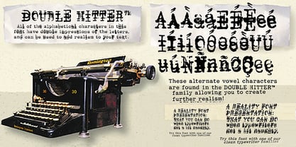
- Mister Dangerous by Arterfak Project,
$16.00 Introducing Mister Dangerous, inspired by the graffiti tags found in urban street art. Designed with dynamic freestyle flair, it brings the spirit of graffiti to your creative ideas. This font is the perfect choice to add an urban touch to your designs, including films, posters, stickers, labels, flyers, apparel, packaging, and more. Mister Dangerous features All-Capitals with numerous special characters for endless combinations, along with additional swashes to make your work stand out. Embrace the artistic power of Mister Dangerous for unforgettable and edgy designs. What you'll get : All-capitals characters Numbers & punctuation Stylistic alternates
 - Linotype MMistel by Linotype,
$29.99 - Sweet Kitten by Yumna Type,
$16.00 Sweet Kitten is a elegant handwritten font. Made for any professional project branding. It is the best for logos, branding and quotes. Every letter has a unique and beautiful touch. Features: Standard Ligatures PUA Encoded Multilingual Support Numerals and Punctuation by Yumnatype
 - Mister Mustard by AdultHumanMale,
$12.00 MisterMustard is a chubby art deco style font, not thin or elegant, but plump and jolly. The font is available in two styles regular and italic. While it was designed to be playful, this font has both an uppercase and a lower case, so it works for practically everything (maybe not a headstone or obituary). It’s loaded with extra foreign glyphs so it gives you plenty of options. Buy. Install. Enjoy.
 - Jully Matters by Maulana Creative,
$12.00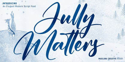 Jully Matters is an elegant modern script font. With high contrast stroke, fun character with a bit of ligatures and alternates. To give you an extra creative work. Jully Matters font support multilingual more than 100+ language. This font is good for logo design, Social media, Movie Titles, Books Titles, a short text even a long text letter and good for your secondary text font with sans or serif. Make a stunning work with Jully Matters font. Cheers, MaulanaCreative
 - Victoria Smitters by Din Studio,
$29.00 It is critical to ensure that your design appearance represents the messages you deliver. However, it can be such a difficult task and time wasting to create a personal, lovely design. Therefore, Victoria Smitter is the answer to what you need. Victoria Smitter is a visually beautiful handwriting font which is perfect to show modern, elegant impressions in a personalized design to impress your customers and to make your messages more prominent than the others. It is designed in a cursive way in which the letters are connected to each other. Details on each letter and cursive wipes on the edges show high contrasts. Furthermore, this font is suitably applicable for big text sizes for better legibility. In addition, you can enjoy the available features here. Features: Stylistic Sets Ligatures Swashes Multilingual Supports PUA Encoded Numerals and Punctuations Victoria Smitter fits best for various design projects, such as brandings, posters, banners, invitations, greeting cards, magazine covers, quotes, printed products, merchandise, social media, etc. Find out more ways to use this font by taking a look at the font preview. Thanks for purchasing our fonts. Hopefully, you have a great time using our font. Feel free to contact us anytime for further information or when you have trouble with the font. Thanks a lot and happy designing.
 - Bitter Robusta by Timurtype,
$14.00 Introducing by Timur type Proudly Present, Bitter Robusta Bitter Robusta A Handwritten Font Bitter Robusta is perfect for product packaging, branding project, megazine, social media, wedding, or just used to express words above the background. Bitter Robusta also multilingual support. Enjoy the font.Thank you!
 - Mister Hand by Chank,
$39.00Mister Hand was created in 1998 from a found object. Chank scanned it in, cleaned it up a little and voila! It's a retro version of the American Sign Language finger spelling alphabet. Uppercase is only the hand shapes, lowercase has the hand shape with the corresponding letter beside it. - Mister Golden by Nathatype,
$29.00 Mister Golden is a beautiful handwritten font. It brings an attractive typeface. Made for any professional projects. The font is suitable for any project like logo, t-shirt printing, wedding invitations, and greeting cards to social media quotes, branding, and more! Outstanding in a wide range of contexts. Featured : Standard Ligatures Stylistic Sets Multilingual Support PUA Encoded Numerals and Punctuation
 - Fancy Matter by Din Studio,
$29.00 Hi, Everyone! Dreaming of a fancy things? Want to travel your audience or customer to a fabulous, beautiful, and elegant world ? Introducing Fancy Matters- A Monoline Signature Font A fancy and elegant handcrafted font that create to impress your audience and make your branding shine. Make your projects dance with this elegant and wonderful font wherever you use it. Use it for your headings, logos, ads, printed quotes, packaging, and even your website or social media branding. Our font always includes Multilingual option to make your branding reach a global audience. Features: Standard Ligature Stylistic Sets Swashes Multilingual Support (84 languages) PUA Encoded Numerals and Punctuation Thank you for downloading premium fonts from Din Studio
 - Mister Honey by Alit Design,
$18.00 Introducing Mister Honey Typeface Mister Honey Typeface is inspired by the classic victorian font style combined with western style which makes the Mister Honey font look cool and unique. This font is perfect for a bold and vintage Victorian concept design. Can be used for the design of alcoholic beverage packaging, pomade designs, barbershops and so on with the Victorian classic concept. Apart from that this font is very easy to use in both design and non-design programs because all alternates and glyphs are supported by Unicode (PUA).
 - Mister Earl by ParaType,
$30.00 Mister Earl was designed for Bitstream in 1991 by Jennifer Maestre. A narrow decorative sans serif. Cyrillic version was developed in 2001 by Natalia Vasilyeva. For use in advertising and display typography.
 - Altaria Miguel by Rillatype,
$15.00 Introducing, my latest font. Altaria Miguel! Altaria Miguel is an elegant and modern sans serif font. altaria miguel can offer a thin font with a modern look that's perfect for your various design needs from headline, branding, logo, advertisement, product design, etc. Altaria Miguel was created with great care and precision with the aim of none other than to make this font perfect as a font that can be used in a variety of needs. The kerning in this font is also done with great care to maintain the perfection of this font. In addition, Altaria Miguel also provides a slanted version which is also re-kerned separately to get maximum kerning results. There it is. We really hope that you enjoy this font, and please feel free to reach me if you have any question. Thank You!


