10,000 search results
(0.029 seconds)
- Billstone Signature by Din Studio,
$29.00 Billstone Signature is a modern signature font in relatively thick weight. Its main character relates to the name given which is similar to a signature in the interconnected letters. Besides, there is no prominent thick line differences on the letter. To improve legibility, use this font for bigger-sized texts. Features: Ligatures Stylistic Set Swashes Multilingual Supports PUA Encoded Numerals and Punctuations Billstone signature fits for any design projects, such as posters, banners, logos, book covers, invitations, quotes, headings, printed products, merchandise, social media, etc. Find out more ways to use this font by taking a look at the font preview. Feel free to contact us for further product information or trouble complaints. Thank you and happy designing. Thank you for downloading premium fonts from Din Studio
 - Urban Blocker by Din Studio,
$25.00 Have you been looking for a graffiti font? Do you dream of creating headings that stand out and inspire creativity, imagination, modernity, and endless fun? Then we’ve got just the font for you! Introducing Urban Blocker-A Graffiti Font This bubble graffiti font can be used for a host of different content needs and projects. An excellent choice to add the right amount of street vibe and playfulness. Create gorgeous printed quotes, standout packaging, or beautiful t-shirts! You can even use it to create amazing headings, logos, menus, and social media graphics. Chalkboard includes multilingual options to make your branding reach a global audience. Features: Standart Ligatures Multilingual Support PUA Encoded Numerals and Punctuation Thank you for downloading premium fonts from Din Studio
 - Repath by Nathatype,
$29.00 Ready to slay your design with a epic font? Get it now. Repath is a awesome serif font. This font expresses a heart desire for strong and sophistication design overall. The weight of the font brings strength to any title or header you apply to it, On the other hand, the curves of the letters and numbers convey sense of elegance. As our commitment to support your brand globally recognized, we always come with multilingual options. Features: Alternates Ligatures Uppercase and lowercase PUA Encoded Numerals and Punctuation It can be used for branding, logos, social media quotes, stickers, posters, vintage designs, wall art, merchandise, social media, and many more. Get more inspiration by seeing the preview. Thank you for purchasing premium fonts from Din Studio! Happy Designing!
 - Sublime by Coniglio Type,
$19.95 Sublime45-Regular Sublime Revised for 2021. One font in Opentype format as Sublime45. Families and all TT Truetype versions eliminated in this wonderful stand alone. The Spring 1997 original release of Sublime —borne an organic creature of black water soluble ink & digitized by Coniglio Type. Sublime is a fun font to use in commercial layouts. It is soft and fluid as ink. Like the wrinkles of time, it is imperfect. That in itself makes it incredibly attractive, warm and “human factor”. Sublime offers legibility so sorely missed in the current recreational font market. Sublime was inspired by World War II US fighter pilot Donald Alling. He flew missions over Nazi Germany. His squadron also dropped food, medicine and relief supplies over the Netherlands. Known as “the Colonel” to his friends. Don as a civic engineer ruled literally miles of ink letter callout’s with a template device called a LeRoy in peacetime on vellum and mylar across his career as a technical illustrator. You didn't want to screw up inking into a template with wet black permanent ink. You really had to have a steady hand and it was all done by hand. You can say Don worked “unplugged”. And that is cool! He was part of the broad stroke of postwar industrial expansion that helped keep America strong, rendering exploded views on top secret projects. Many of us were not even born yet when all this was going on. Today at over 80 years young Don is like a national treasure, savvy and bright—and the ladies love him! The Colonel remains a dedicated master airbrush man, stand–up man, caricature artist and letterman all without use of a computer! He was lucky enough to retire before a desktop cathode tube was put in his face. Today the Colonel enjoys restoring VW’s, flying and freelance consulting when not being called to supper by his lovely wife Rea.
 - Runes - Unknown license

- Janagrace by Jonahfonts,
$40.00 Janagrace is designed for birthday, holiday cards and can be used effectively in other applications for that calligraphy appearance. Regular: Contain ONLY Regular-Caps. Swash: Swash-Caps with NO Regular Caps. OT Swash: Contain BOTH Regular and Swash-Caps. Swash LIGHT: Swash-Caps with NO Regular Caps. Janagrace, Agile, Charming and Lovely.
 - MAWNS' Serif - Personal use only

- HelenaDEMOVERSION - Personal use only

- Fontasia V2.0: The Revenge - Unknown license

- Tiny Tube - Unknown license

- Gyrl Friday - Unknown license

- MDRS-FD01 - Unknown license

- Viney Times - Unknown license

- BR Nouveau Ramblings 2 - Personal use only

- BudHand - Unknown license

- Porspican Serif - 100% free

- Flying Peace PERSONAL USE - Personal use only

- Tonight - Unknown license

- Volute - Personal use only

- Shibuya Dancefloor by Megami Studios,
$10.00 Inspired by Rob’s years of living in Japan, Shibuya Dancefloor is an expanded version of an earlier font that we did, adding hiragana and katakana to the mix. It's perfect for anime artwork, sci-fi lettering or even just making flyers for that party you're planning down in Roppongi!
 - Alonquin by Studio K,
$45.00 Alonquin is a typographical tribute to Dorothy Parker and the New Yorker crowd who haunted the Alonquin hotel in its 1920s heyday, sharing scintillating one-liners over sparkling cocktails. Deco and decadent, it aims to recapture the spirit of the age (mostly gin from what I can make out!)
 - QuaText by LucasFonts,
$39.00 This special newstext version of TheAntiqua was developed in close collaboration with the Berlin newspaper Die Tageszeitung (taz). Its sturdy forms were optimized for newspaper stock. This font family is currently being reworked and will be further developed with variable weights that can be adjusted to clients’ specifications.
 - RMU Herkules by RMU,
$25.00 At the end of the 19th century, the fin de siècle, both Bauer and Berthold released ‚Herkules‘, a heavy Art Nouveau font for ads and posters. This font was carefully redesigned and makes it a great font in Jugendstil surroundings and a splendid partner of the Carlsbad font family.
 - Starling Bright by Yumna Type,
$16.00 Starling Bright is a elegant handwritten font with a natural and unique design will make your project more beautiful. The font is suitable for your branding project, printing, logos dan wedding. Included: Starling Bright (OTF) Features: Beautiful Ligatures Alternates Multilingual Support PUA encoded Numeral and Punctuation by Yumnatype
 - Million Dreams by Typesthetic Studio,
$13.00 Million Dreams is a bold and playful, but also elegant handwritten font. It has beautiful and neat characters and as a result, it matches a wide pool of designs. This font is perfect for many different project such as logos, branding, social media, crafty DIY projects or anything.
 - Chills by Comicraft,
$19.00 Is that the trees rustling, or the hinges on the gate? Pull up your covers as daylight grows dim... there is indeed a chill of fear in your heart and the blood in your veins is turning cold. Try your best not to shiver and shake... The Iceman cometh!
 - Brigade by Alan Meeks,
$45.00 In searching for a Roman to use, I found there were bits of Bembo, Times, Garamond, etc., that I liked and bits that I did not. So I set out to take the best bits of all my favorite Romans and tried to create the ultimate Roman Typeface.
 - Sugar Story by Yumna Type,
$16.00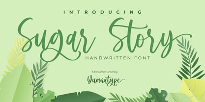 Sugar Story is a sweet handwritten font with a natural and unique design will make your project more beautiful. The font is suitable for your branding project, printing, logos dan wedding. Included: Sugar Story (OTF) Features: Beautiful Ligatures Alternates Multilingual Support PUA encoded Numeral and Punctuation by Yumnatype
 - Stolen Cassette by Gassstype,
$28.00 Stolen Cassette is a Playful Display Font that will make your designs look modern, unique and fun. This is Font Stolen Cassette 2 Style. It’s perfect for labels, quotes, posters, DIY projects, branding, packaging, greeting cards, websites, photos, photography overlays, signs, window art, scrapbooking, tags and so much more!
 - Candymore by Epiclinez,
$18.00 Candymore is a fun and playful handwritten font. Its simple and friendly style is suitable for your DIY or crafting projects. This font has 197 glyphs and its supporting 66 languages, from English to Zulu. Have fun with this super cute font and explore its awesomeness. Thank You!
 - Affiche by RMU,
$35.00 Based on the fin-de-siècle Helios Reklameschrift of the Klinkhardt foundry, Leipzig, Affiche preserves the beautiful art nouveau character of its hot-metal forerunner and was carefully extended to make it multilingual. For more historical authenticity, you can use the long s by typing [alt] and [b].
 - Mix Stitch by Mix Fonts,
$13.00 Mix Stitch, is an embroidery lesson disguised as a font, fit for handmade and DIY themed projects. Can be used to emulate embroidery in images, or as a guide to teach kids how to write. So many uses for this fun font, I don't even know where to begin.
 - Whoa Nelly NF by Nick's Fonts,
$10.00In his book of Showcard Alphabets, Dan X. Solo called this one Funhouse, and we couldn't agree more. Wild, wacky and slightly tacky, but suitable for the whole family. The Opentype version of this font supports Unicode 1250 (Central European) languages, as well as Unicode 1252 (Latin) languages. - Slim Kim by Wiescher Design,
$39.50 Slim Kim is the sister font of Julienne. It mixes perfectly with Julienn. So whenever you need an especially slim serif font this is it! Slim Kim has very spiky serifs, so I did not want to make an extra-slim version. Enjoy this spiky font, your Gert Wiescher.
 - Saw Mill Stencil JNL by Jeff Levine,
$29.00 A vintage metal stencil from a saw mill with the term "reusable skid" was the model for Saw Mill Stencil JNL. Although the original was what would be termed a semi-stencil (some letters did not have 'breaks' in them), the font was designed with a more traditional look.
 - TagBoyHardcore by PizzaDude.dk,
$15.00TagBoyHardcore is based on my own tagging style when I did graffiti in the mid-eighties. The font is roughly scanned and spaced narrowly in order to keep the original bad boy style. Pump up your text by starting and ending sentences with parentheses, brackets or the curly brackets. - Signboard JNL by Jeff Levine,
$29.00Signboard JNL is based on die-cut cardboard display lettering once made by the Duro Decal Company (now Duro Art Industries) of Chicago, Illinois. Available in various sizes, these letters and numbers could be affixed to a number of different surfaces to make affordable signs, displays and show cards. - KG What A Time - Personal use only

- Movement - Personal use only

- Contype by Wiescher Design,
$39.50 Once I had a young, very eager and interested designer in my employ. We got into talking about where our letterforms come from and the habits in perception we are used to. He did not quite believe me. So I said, let's try to design a typeface where everything is just the opposite of what we are used to. We really had a hard time, our habits crept up on us all the time. But after a couple of weeks we finally finished this typeface and wanted to call it crazytype, but my young apprentice who did most of the manual labor said Contype sounded crazier. So it became Contype and it's really crazy, with a small asian touch to it. Yours very crazy Gert Wiescher


