10,000 search results
(0.11 seconds)
- Faust Text by Solotype,
$19.95Barnhart Bros. and Spindler called this Faust Text when they introduced it in 1898. A quarter of a century later, they brought back a number of obsolete faces and renamed them. This one became Missal Text in their 1923 catalog. - RM Victoriana by Ray Meadows,
$19.00 A decorative and fancy slice of the gay '90s (1890s that is). Due to the modular nature of this design there may be a slight lack of smoothness to the curves at very large point sizes (around 100 pt and above).
 - LTC Ornaments Two by Lanston Type Co.,
$29.95 LTC Ornaments Two is the first Lanston Ornament font which uses OpenType features to assist in decorative border creation. The ornaments themselves features designs of Fournier and other classic fleurons and ornaments whose origins date back to the earliest printers.
 - Crimes Times Six by JSH creates,
$39.95 Crimes Times Six is a cool horror font, originally created with a chalk stick back in 2012, by Jonathan S Harris. The typeface design works very well in video games, movies and broadcasting, but also looks great on clothing and posters.
 - Flared by Graphicfresh,
$25.00 A groovy, bold typeface that transports you back to the 70s and 80s. Its sleek curves and sharp angles evoke the spirit of neon signs and vintage design. Get ready to captivate with this striking font that exudes nostalgic coolness.
 - Hvala by Etewut,
$35.00 Hvala is a display typeface based on slab serif. All european languages are included. 'Hvala' means praise. Remember it when you design your graphics using my font. It's a pure magic to express your respects or/and expect them back.
 - Hardwood LP by LetterPerfect,
$39.00 Hardwood is a reworked foundry typeface from the 1930's, providing an interpretation of the Art Deco graphic style. It harkens back to the golden era of poster design and Hollywood movie marquees, while retaining superb legibility at virtually any size.
 - Summer Island by Yoga Letter,
$17.00 "Summer Island" is a unique and elegant display font. This font is equipped with uppercase, lowercase, numerals, multilingual support, and punctuation. Very suitable for stickers, banners, posters, social media, summer, spring, teacher, back to school, father's day, mothers day, and others.
 - Blastered by PizzaDude.dk,
$17.00 Blastered was originally inspired by an old horror movie poster - but I find it more laid back and less horrifying…but feel free to use Blastered for your next horror project and use the more than 300 interlocking ligatures! Wow!
 - TF Wasted Growth by Teenage Foundry,
$19.00 Wasted Growth is a display font with a strong style is back. There are 2 styles, Regular & Blur. Suitable for merchandise designs, covers, posters and others. Features: Uppercase, Lowercase, Numeral, Punctuation & Multilingual. For any questions please contact me 🙂 Thanks!
 - Bricoleur NF by Nick's Fonts,
$10.00 This naïve script was discovered in a French printers' magazine from 1927. Its total lack of pretension makes it warm and inviting. Both versions of this font support the Latin 1252, Central European 1250, Turkish 1254 and Baltic 1257 codepages.
 - Sock Hop JNL by Jeff Levine,
$29.00Back in the 1950s and 1960s a popular event was the sock hop - when kids would meet in the school gymnasium, kick off their shoes and dance to the popular records of the day. Sock Hop JNL recalls those simpler times. - Margin Notes by The Arborie,
$11.00 Margin Notes font offers a natural handwriting look. It had imperfect, organic curves and off set lines that imitate natural hand written writing. Give this handwriting font a try with note-taking, organization or even a back to school poster.
 - Synthemesc by Typodermic,
$11.95 Picture this: you’re sitting in the Korova Milk Bar, sipping on a glass of the old moloko plus, and suddenly, you’re hit with the realization that your designs are missing something. That something, my dear malchiks and devotchkas, is this typeface. Its unconventional style will make your work stand out from the rest and leave your audience in awe. It’s not just about making your designs look pretty, though. It’s about making a statement, about challenging the norm. This font is all about breaking the rules, just like Alex and his droogs did in the streets of London. So, my fellow dim-witted bratchnies, don’t miss out on the opportunity to add a touch of surreal eccentricity to your work. Get this Clockwork Orange-inspired typeface today, and let your designs become a symbol of rebellion and creativity. Most Latin-based European writing systems are supported, including the following languages. Afaan Oromo, Afar, Afrikaans, Albanian, Alsatian, Aromanian, Aymara, Bashkir (Latin), Basque, Belarusian (Latin), Bemba, Bikol, Bosnian, Breton, Cape Verdean, Creole, Catalan, Cebuano, Chamorro, Chavacano, Chichewa, Crimean Tatar (Latin), Croatian, Czech, Danish, Dawan, Dholuo, Dutch, English, Estonian, Faroese, Fijian, Filipino, Finnish, French, Frisian, Friulian, Gagauz (Latin), Galician, Ganda, Genoese, German, Greenlandic, Guadeloupean Creole, Haitian Creole, Hawaiian, Hiligaynon, Hungarian, Icelandic, Ilocano, Indonesian, Irish, Italian, Jamaican, Kaqchikel, Karakalpak (Latin), Kashubian, Kikongo, Kinyarwanda, Kirundi, Kurdish (Latin), Latvian, Lithuanian, Lombard, Low Saxon, Luxembourgish, Maasai, Makhuwa, Malay, Maltese, Māori, Moldovan, Montenegrin, Ndebele, Neapolitan, Norwegian, Novial, Occitan, Ossetian (Latin), Papiamento, Piedmontese, Polish, Portuguese, Quechua, Rarotongan, Romanian, Romansh, Sami, Sango, Saramaccan, Sardinian, Scottish Gaelic, Serbian (Latin), Shona, Sicilian, Silesian, Slovak, Slovenian, Somali, Sorbian, Sotho, Spanish, Swahili, Swazi, Swedish, Tagalog, Tahitian, Tetum, Tongan, Tshiluba, Tsonga, Tswana, Tumbuka, Turkish, Turkmen (Latin), Tuvaluan, Uzbek (Latin), Venetian, Vepsian, Võro, Walloon, Waray-Waray, Wayuu, Welsh, Wolof, Xhosa, Yapese, Zapotec Zulu and Zuni.
 - Brume by Creativemedialab,
$16.00 Brume font is a bold, attractive and beautiful font. "Easy to read, modern and elegant look but stylist", this will be the first words that your client says to your design using this font. Comes with uppercase and lowercase. It has many alternates character with nice curve that you can arrange to create a nice logo lettering, or use it as a display face on a poster and add a few alterations to it to make a beautiful eye catching words. Brume font is best for logo lettering, headlines, product packaging, t-shirt design, wedding theme, poster, book cover, wedding invitation, Christmas and more To access alternate: In Adobe Photoshop go to Window - glyphs In Adobe Illustrator go to Type - glyphs
 - Azbuka by Monotype,
$29.99 The Azbuka™ typeface family has its roots in a fairly pedestrian source. “The idea came in part from an old sign in London that read ‘SPRINKLER STOP VALVE’,” says Dave Farey, designer of the typeface. Like all good sign spotters, Farey took a photograph of the sign and filed it away for possible use in a lettering or typeface design project. In Prague a number of years later, the street signs reminded Farey of the London signage - and his camera came out again. Comparing the two back in his studio, he realized that the signs from London and Prague were not as similar as he initially thought. However, they were enough alike to serve as the foundation for a no-frills, 21st century sans serif typeface family. “I wanted to draw a wide range of weights, italic and condensed designs all in one go,” recalls Farey, “rather than add on to the family later.” His goal was to create a family that could be used for text and display copy, with sufficient weights to provide a broad typographic palette. Indeed, the completed design, created in collaboration with fellow type designer Richard Dawson, consists of twenty typefaces in eight weights ranging from extra light to extra black. The five mid-range designs have complementary italics. Seven condensed designs round out the family. Azbuka’s lighter weights perform remarkably well in blocks of text composition. “They’re clean and legible - and perhaps a little boring,” says Farey, “but they are perfect for copy with a down-to-earth, yet contemporary flavor.” The heavier weights are equally well suited for a variety of display uses. The designs are authoritative but not overbearing and will readily make a strong statement without calling attention to themselves. The condensed weights of Azbuka are ideal for those instances where you have a lot to say - and not much room to say it. The name Azbuka? It’s Russian for “alphabet.” And what more appropriate name could there be for this utilitarian, industrial-strength type family than alphabet? The Azbuka family is available as a suite of OpenType Pro fonts. Graphic communicators can now work with this versatile design while taking advantage of OpenType’s capabilities. The Azbuka Pro fonts also offer an extended character set that supports most Central European and many Eastern European languages
 - Morning Sunshine by Inumocca,
$16.00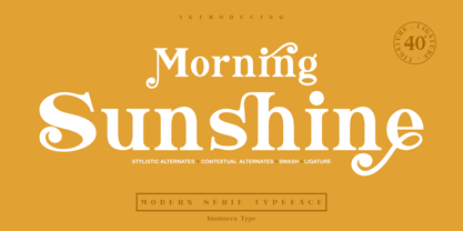 Morning Sunshine Modern Serif typeface , clear and classy characterized, OpenType feature to access Ligature, contextual alternates, stylistic alternates and swash. Really playful typeface to covering your Project, like Magazine, Branding, Poster, wedding invitations, Tshirt, Logos, and more your project design. Unique glyphs Multilingual Characters UPPERCASE Lowercase Numeric Symbol Punctuation Character Ligature Contextual Alternates Stylistic Alternates Swash inumocca _type
 - Clumsy by Gaslight,
$15.00 Clumsy is a two weight all caps handcrafted awkward font with alternates for all characters and digits. The font was inspired by a few lines of text from an old soviet book about vine. Clumsy is a good choice for small amounts of text. When Clumsy is used in OpenType applications, its Contextual Alternates feature produce a striking random-like effect on glyphs distribution, achieved by cycling through alternates. When not using the Contextual Alternates feature, you can still pick the alternates in the Glyphs palette or use the alternates available from the keyboard upper and lower case.
 - Galatia Script by Amarlettering,
$15.00 Galatia Script comes with 444+ glyphs. The alternative characters were divided into several OpenType features such as Swash, Stylistic Sets, Stylistic Alternates, Contextual Alternates. The OpenType features can be accessed by using OpenType savvy programs such as Adobe Illustrator, Adobe InDesign, Adobe Photoshop Corel Draw X version, And Microsoft Word. This Font has PUA unicode (specially coded fonts) so that all the alternate characters can easily be accessed in full by a craftsman or designer. Galatia Script Contains: - Uppercase & Lowercase - International Language & Symbols - Punctuation & Numbers - PUA Unicode - Stylistic Alternates - Stylistic Set 1-19 - Contextual Alternates - Galatia script.OTF
 - Balgin by Studio Sun,
$12.00 Balgin brings back the nostalgic era of 90's. The 90’s were a magical time – a time of the Docs, Game Boys, and Cartoon. As everything that was once old is new again, the 90’s are making a come back. The basic of typeface are from geometric/basic shapes (Triangle, Square, Circle) form. Some character in Display font are modified, like 'R'K' stroke are more dynamic. and the tail of 'g' are more generic. Balgin are available in 3 Flavour Typefaces (Display - Normal - Text) and have 6 different weights (For Normal are available on 5 Widths). Available with Variable Fonts on Balgin Display & Balgin Normal
 - Guanabara Sans by Plau,
$20.00 Guanabara is the third release of Plau Type Foundry. It started from the need of a wayfinding typeface that had personality enough to be the brand typeface for a city. The city of Rio de Janeiro, with its never-ending curves and all year long summer weather provided the constraints and requirements of this typeface. From there, it evolved to be a workhorse, with 8 weights from Thin to Black and matching true italics. It just had to have the features that all us designers have grown to love, such as alternate letters (a, g and r for the romans), tabular and proportional figures in lining and oldstyle set-ups as well as small caps, fractions and all that jazz (I mean, samba). And it needed to be recognizable and distinct. For that, design features like tapered R legs, capitals with classic proportions and calligraphic finishes on the terminals proved crucial. And last, but not least, like Rio, it had to welcome many cultures. We came to think of it as the “Typeface from Ipanema”, with a classic, timeless look, swinging elegance and joyful attitude.
 - Helios Antique by W Type Foundry,
$25.00 Helios Antique & Helios Stencil Check our PDF specimen for more details Helios type family is the result of a mixture between the early sans serif and the modern trends of our era. Its rational structure is subtly wider than the majority of the first sans, generating a higher impact in its uses. All the typeface terminals are more open in order to balance better the whites and blacks of Helios, and where the strokes meet it has a deeper contrast giving more legibility to the reader. Furthermore, in some letters it is possible to see some prominent features such as the leg of the "R" and the tail of the "Q", which are particular gestures that identify this type family. Helios Stencil is the tough version of this type family. All the stencil gaps were measured rigorously, thus in small sizes it conveys a neutral aesthetic whereas in big sizes a display logic appears. Helios Antique is composed by 36 styles, 782 glyphs and small caps. Besides, it has powerful OpenType features for each style, including alternates characters, ligatures, fractions, special numbers, arrows, extended language support and many more.
 - FM Bolyar Ornate Pro by The Fontmaker,
$29.00 FM Bolyar Ornate Pro is the latest member of our renowned Bolyar mega family and the perfect companion for our very successful FM Bolyar Pro . Developed to a new level of excellence this new improved ornate design is quite able to satisfy every typographic taste and meet the ever growing design requirements for high quality typefaces. If you are addicted to classic vintage style, then you could easily use Bolyar Pro Ornate for almost any project of desire - from letterheads, logos and catchy headlines to elegant packaging, book covers and wine labels. Alternates, Swashes and Ligatures will help you customize almost every single letter and fit perfectly to your artwork. Bolyar Ornate Pro provides a broad range of advanced typographical features such as: Five weights ranging from thin (100) to black (900) with full multilingual support of all Latin based languages as well as Cyrillic; 1000 glyphs per weight including three multilingual stylistic sets, swash designs and useful discretionary ligatures; Sub- and superscript basic Latin and Cyrillic glyphs as well as figures. Two positional models for lowercase accessed as OpenType case sensitive forms ñ base to base (default) and spur to spur (vertical center).
 - Runde Wien by Wannatype,
$36.00 Runde Wien Pro, the rounded sans serif by Ekke Wolf. Typeface lovers looking for a modern, well-developed sans serif font with a touch of retro and warm, individual lettering will get excited about a new addition to the font market. The more than complete Runde Wien Pro front comes in three styles and four different weights. In addition to the upright Runde Wien Pro there is the Runde Wien Pro Oblique with a moderate 6° slant and the Runde Wien Pro Superoblique with an 18° slant. Available weights are light, regular, medium, bold and black. These fonts are equipped with extended Latin alphabet for Central and Eastern Europe and also Cyrillic and Greek alphabet. The set of characters includes nine different sets of numbers, plus its own set for the small caps, as well as alternative characters and groovy ligatures. In addition, all Runde Wien Pro styles are also available as unicase with upper case and lower case x-height alignment. The style, metrics and proportions of Runde Wien Pro combine perfectly with the Liebelei Pro and the script fonts of the Calafati Pro.
 - Thorfin by Mans Greback,
$39.00 Thorfin is a sharp serif typeface. Drawn and created between 2020 to 2022, this modern lettering has a distinct personality while maintaining a regularity of a body text. Thorfin gives any project a smart character with its geometric shapes and crisp edges. The Thorfin family consist of 14 fonts, such as Thin, Light, Regular, Medium, Bold, Black and Italic. Also includes a variable font! Only one font file, but the file contains multiple styles. Use the sliders in Illustrator, Photoshop or InDesign to manually set any weight and width. This gives you not only the predefined styles, but instead more than a thousand ways to customize the type to the exact look your project requires. More info about Variable Fonts: https://mansgreback.com/variable-fonts The font is built with advanced OpenType functionality and has a guaranteed top-notch quality, containing stylistic and contextual alternates, ligatures and more features; all to give you full control and customizability. It has extensive lingual support, covering all Latin-based languages, from Northern Europe to South Africa, from America to South-East Asia. It contains all characters and symbols you'll ever need, including all punctuation and numbers.
 - Aviano Copper Variable by insigne,
$199.99 The retro-inspired design of Aviano Copper Variable echos the bold style of America’s Gilded Age. Inspired by the copper-inscribed intaglio printing designs of the early 20th century, the powerful, wide character shape of this font walks softly across your page while carrying a big stick. To create the right balance, small wedge serifs were added onto Aviano Sans, giving you a sophisticated style that looks and acts like it belongs nowhere short of Boardwalk. Developed to a new level of excellence, this design offers a wide range of weights from thin to black. There's full multilingual support of all Latin-based languages and five stylistic sets, swash designs, and 1000 glyphs per weight, including some unique ligatures. Number options include old style figures, tabular figures, and superscripts. Unique median spur alternates, swashes, and ligatures will help you customize every single design. The feel of last century’s personal and business correspondence is waiting for you in this member of the Aviano family. While ideal for headings, displays, logos, and short texts, Aviano Copper’s use for everything from letterhead to wine labels may just give you the monopoly you’re looking for.
 - Newbery Sans Pro by Sudtipos,
$49.00 Newbery Sans is a new contrasted sans serif designed by Alejandro Paul and the Sudtipos team. As Paul has lately found inspiration from different German instructional books, Newbery Sans finds its initial inspirations from the lettering work of E. Nerdinger and invokes the spirit of German designs but is imbued with personality all its own. The idea was to make the letterforms more usable and suitable for everything from corporate branding to editorial. It is an elegant, functional family with contemporary detail that will effortlessly meet the demands of the screen and printed page. From a condensed thin to an expanded black, Newbery Sans provides a usable workhorse system of three widths and seven weights, each with the original design of real italics, a selection of alternate glyphs and a complete set of small caps. Each weight is professionally crafted and includes extended Latin support for Central, East and Western Europe languages. The font’s name nods to its imagined uses in airports and street signage: Jorge Newbery was one of the first Latin American aircraft pilots, Newbery is the street where I live and it is also the name of Buenos Aires’s local airport.
 - Larken by EllenLuff,
$42.00 Larken is a confident serif. Designed to reflect nature, it creates a sense of natural softness and expressiveness. We pushed the concept into a usability focused direction, to work as a bold tool and beautiful communicator. Larken variable allows fluid design across 7 weights, italics and major latin based languages. True italics advance the aesthetics, bringing energy and making it suitable for modern design. The type family melds organic curves and gentle repetition into powerful and harmonious type. At large point sizes you can appreciate the letter shapes, whilst the same restraint and focus creates an even texture for small point sizes and long reading. The font broadens its use by supplying weights all the way from thin to black. The natural curves, swells and sloping trunks, grow in character as the font gains weight. Whilst the thinner weights have lowered contrast and optical corrections to create a warm and gentle appearance. The Larken character set incorporates additional symbols, stylistic alternates, unique ligatures and case sensitive punctuation - producing a stable workhorse family ready to tackle projects of any size.Check out Jeko which is a great pair for Larken.
 - Neue Plak Variable by Monotype,
$344.99A little-known design by Futura designer Paul Renner gets a long overdue update by Linda Hintz and Toshi Omagari, in this reliable and impactful industrial sans serif. Neue Plak offers more weights and widths than the original 1928 design, extending its use for branding, editorial, logos and UIs. The pair based their updated and extended version on the original Plak wood type, uncovering lost details and incorporating them as alternates – including the choice between open or strikethrough counters. Neue Plak's outwardly stubborn personality is counteracted by unexpected details, which make for an unusual juxtaposition of severe and playful. “It felt like we should pay Paul Renner more tribute,” says Hintz, who spent time researching the typeface in Hamburg's Museum der Arbeit. “The forms themselves are partly quirky, partly really fun, but with a German stiffness that makes for a strange mix.” Neue Plak offers 60 weights, including a new text version that pairs well with the display weights, and allows the design to function in print and digital environments, and for a wide range of uses. Neue Plak Text Variables are font files which are featuring one axis and have a preset instance from Thin to Black. - Soprani by insigne,
$39.00 Soprani is a unique typeface inspired by a plaque found in New Zealand dating from the 1920s. The design was contemporized and brought 100 years into the future. The serifs are dramatically flared at the end of the stems, while in the middle, they contract. This leads to a unique shimmering effect that draws the eye and catches your user's attention. This typeface meets the demand for unique serif types that are both eye-catching and delicate. It’s a display face that's ideal for very contemporary work. This typeface has plenty of alternates and has a full complement of OpenType features. The 1920s inspire the design, with a bit of art nouveau and arts and crafts, yet the typeface is designed to meet contemporary design requirements. It has a unique elegance and the letterforms are condensed more than most. Soprani is suggested for table books, menus, and various promotional materials, newspapers, television, motion pictures and other media. There is a wide range of widths and weights available, from the thin, which is delicate and graceful, to a bold and robust black. Production assistance by Lucas Azevedo and ikern.
 - Presley Slab by Sudtipos,
$49.00 The lightest weight of Presley Slab takes inspiration from a late nineteenth-century type specimen, but what began as a decorative and delicate contrasted serif stirred Alejandro Paul’s imagination to conjure voluptuous reverse contrasted letterforms. These became the heaviest weight of Presley Slab, which nods to the lacquered hairstyles from the birth of rock ’n roll with its idiosyncratic ball terminals. Its playful allure and swagger remains visible in the weights that stand between these two extremes but as the curls loosened, many things happened in the design process including the appearance of swashes and alternates. Presley Slab’s personality has breadth; it is a fun, confident and contemporary palette of letters that will perfectly perform for any job, from editorial design to branding. The Extra Bold and Black weights are a powerful option at large sizes for use on posters and billboards; the graceful Thin and Extra Light weights are delicate options for packaging design or fashion branding. Despite it conjuring images of mid-century music halls, Presley Slab is also staunchly European in it’s aesthetic, offering everything from good-humour to elegance with its unique touches.
 - Genera by Wahyu and Sani Co.,
$25.00 Introducing Genera, a strong & clean modern sans serif font family designed in two versions – Genera & Genera Alt, which complement each other for body copy & display text. It comes in 10 weights with matching italics (oblique) styles with 4 variable weight fonts for a total of 44 fonts, will give you a freedom to choose the weight you need between Thin & Black. This typeface also equipped with useful OpenType features such as Ordinal, Superior, Stylistic Alternates, Proportional Figure, Fraction, Numerator & Denominator. Each font file has 470+ glyphs which covers Western & Eastern Europe Latin language, as well as other Latin based languages – over 200 languages supported! This typeface has 44 font members consisting of: 4 variable fonts (Genera; upright & oblique, Genera Alt; upright & oblique), 40 single fonts (Genera; upright & oblique in 10 weights, Genera Alt; upright & oblique in 10 weights). Genera will be a Swiss knife for your creative projects, a real multi-purpose typeface that’ll be perfect for logo, packaging, greeting cards, presentations, headlines, lettering, posters, branding, quotes, titles, magazines, headings, web layouts, mobile applications, art quote, typography, advertising, invitations, packaging design, books, book title, & nearly any other type of creative design you’re working on.
 - MVB Diazo by MVB,
$59.00 Mundane information—the sort you might ignore—often appears in the form of very simple, utilitarian lettering, devoid of personality, the sort of industrial lettering you find on old blueprints, park restrooms, and electrical boxes. MVB Diazo is such a thing. It looks like lettering done earnestly with a plastic template. The monoline caps—constructed from straight lines and simple curves—have rounded details as if rendered by a blunt pen on a topographical survey or by a router on a rustic campground sign. The MVB Diazo fonts are compact, available in two widths: Condensed and Extra Condensed. Each width offers four weights from Light to Black. The fonts are perfect for wherever plain and boring letterforms are required. All widths and weights are also available in two distressed textures (#1 and #2) that accentuate the industrial character of the design. Rough #1 is gritty, with finer texture for use at larger sizes. Rough #2 exhibits more damage, the roughness apparent when used at smaller sizes. The Rough fonts include alternates of a number of glyphs so that variation of texture is possible when letters repeat in a word.
 - Majesty by Monotype,
$25.99 Majesty is a refined and elegant incised serif typeface designed to convey a sense of drama with any implementation of it. However, Majesty’s austerity is softened by the inherent familiarity of its letterforms. Having being inspired by classic engraved type, it has the echoes of familiar stone inscriptions over the centuries embodied within this 7-font type family. Majesty has a branding and titling focus, this is most apparent in the all cap letter combinations that are incorporated. Just activate Discretionary Ligatures and watch your type shape-shift on the fly to create interesting and appealing typography. There are a select number of Swash/Stylistic Alternates included that can also help you embellish your designs. Other features include Proportional, Tabular, and Old Style Figures, as well as Small Caps and Petite Caps, with the latter harmonising perfectly with the lowercase glyphs so that you can create unicase-style typography. You can find out more at majesty-font.com . Key features: • 5 text weights – Light to Black, plus Display and Poster weights • Small Caps, Petite Caps, Ligatures and Discretionary Ligatures • European Character Set – Latin Only • 840 glyphs per font.
 - Respondent by Mans Greback,
$49.00 Respondent is a flowing and handwritten font. Drawn, created and published by Mans Greback in 2021, this script family has a genuine and empathic personality, while being wild and vivid. Respondent can be used in a product or company logo, or in any digital design where you want the appearance of true, released handwriting. Originally inspired by the lettering on the cover of GTA Vice City, over the design process is has evolved to a very diverse typeface that can be used in a wide variety of contexts, much more than a Grand Theft Auto font. The Respondent Family is provided in five weights: Thin, Light, Medium, Bold and Black The different styles supplies a flexibility in both character and size. The font is built with advanced OpenType functionality and has a guaranteed top-notch quality, containing stylistic and contextual alternates, ligatures and more features; all to give you full control and customizability. It has extensive lingual support, covering all Latin-based languages, from North Europe to South Africa, from America to South-East Asia. It contains all characters and symbols you'll ever need, including all punctuation and numbers.
 - Aviano Sans by insigne,
$24.99 insigne returns to Aviano’s classically inspired forms with this sans serif variant. Wide and geometric, Aviano Sans is perfect for any job that calls for a chic and dignified sans serif as seen in this demonstration video. Aviano Sans has consistently topped insigne’s best-seller chart for more than seven years, earning its stripes as an expressive and versatile typeface that belongs in any designer’s tool chest. Aviano Sans' five weights of Regular, Thin, Light, Bold, and Black include 42 Art Deco-inspired alternate characters that can turn you and your project into a force to be reckoned with. The typeface family also includes 40 unique ligatures that add a bit of swagger to this serious sans. insigne released the first Aviano in early 2007. Its beautifully drawn extended letterforms were a hit with designers, and Aviano quickly became one of insigne’s most popular offerings. The simplified variant of Aviano Sans followed soon after, paring down the structure around the core concept. The Aviano series continues to develop further today with new variants on this classic form. Be sure to check out the rest of the Aviano series, including Aviano, Aviano Serif, Aviano Flare, and Aviano Contrast.
 - Aviano Copper by insigne,
$29.99 The retro-inspired design of Aviano Copper echos the bold style of America’s Gilded Age. Inspired by the copper-inscribed intaglio printing designs of the early 20th century, the powerful, wide character shape of this font walks softly across your page while carrying a big stick. To create the right balance, small wedge serifs were added onto Aviano Sans, giving you a sophisticated style that looks and acts like it belongs nowhere short of Boardwalk. Developed to a new level of excellence, this design offers a wide range of weights from thin to black. There's full multilingual support of all Latin-based languages and five stylistic sets, swash designs, and 1000 glyphs per weight, including some unique ligatures. Number options include old style figures, tabular figures, and superscripts. Unique median spur alternates, swashes, and ligatures will help you customize every single design. The feel of last century’s personal and business correspondence is waiting for you in this member of the Aviano family. While ideal for headings, displays, logos, and short texts, Aviano Copper’s use for everything from letterhead to wine labels may just give you the monopoly you’re looking for.
 - Sabon Next by Linotype,
$57.99 The design of Sabon® Next by Jean François Porchez, a revival of a revival, was a double challenge: to try to discern Jan Tschichold´s own schema for the original Sabon, and to interpret the complexity of a design originally made in two versions for different typecasting systems. The first was designed for use on Linotype and Monotype machines, and the second for Stempel hand composition. Because the Stempel version does not have the constraints necessary for types intended for machine composition, it seems closer to a pure interpretation of its Garamond ancestor. Naturally Porchez based Sabon Next on this second version and also referred to original Garamond models, carefully improving the proportions of the existing digital Sabon while matching its alignments. The new family is large and versatile - with Roman and italic in 6 weights from regular to black. Most weights also have small caps, Old style Figures, alternates (swashes, ligatures, etc); and there is one ornament font with many lovely fleurons. The standard versions include revised lining figures that are intentionally designed to be a little smaller than capitals. Featured in: Best Fonts for Resumes, Best Fonts for Websites, Best Fonts for PowerPoints
 - Uniform Italic by Miller Type Foundry,
$25.99 Now Uniform comes in Italics! Uniform is a multi-width geometric type family designed around the circle. The O of the Regular width is based on a circle, the O of the Condensed width is based on 1.5 circles stacked (with straight sides) and the O of the Extra Condensed width is based on two circles stacked with straight sides as well, and all other characters are derived from this initial concept. This unique idea creates a remarkably fresh type family that bridges the gap between circular geometric typefaces and condensed straight-sided typefaces. Uniform also includes many opentype features like Old Style Figures, Tabular Lining Figures, Alternate characters, Ligatures and more. Uniform was first drawn starting with the Black weight. This careful process allows each character to look consistent and balanced through all weights. As a result, the typeface does not ‘break down’ or lose its form in the boldest weights like many typefaces do. The three widths of Uniform Italic make an ideal type family for a host of various uses. From branding to web design, book covers to signage, Uniform is a very versatile solution to complex typographic needs.
 - Velo Serif Text by House Industries,
$33.00 Velo leads layouts with a grand tour champion’s panache but is also a hard-working design domestique for text-heavy applications. Superelliptical shapes and sturdy serifs will keep pace with contemporary culture with an aesthetic agility that will never go out of style. Velo Serif includes sixteen fonts: Twelve display styles ranging from thin to black with complementary italics and four text styles designed for longer settings. Velo Serif Display features an increased x-height for more illustrative headlines while Velo Serif Text maintains a readable cadence in high word count environments. Designed by House Industries, Christian Schwartz, Mitja Miklavčič and Ben Kiel. FEATURES Text vs Display: Velo Text maintains the distinctive style of its Display siblings, but is enhanced for optimum legibility in running text settings. Key ligature combinations keep headlines and running text flowing smoothly. Velo Serif Text includes a complete small cap alphabet to add another typographic dimension to your layouts. Select Velo Serif figures include illustrative alternates to display numerical superiority. Like all good subversives, House Industries hides in plain sight while amplifying the look, feel and style of the world’s most interesting brands, products and people. Based in Delaware, visually influencing the world.