10,000 search results (0.021 seconds)
  1. Ellipsoideogram - Unknown license
  2. Misirlou Cyr - Unknown license
  3. American Donuts - Unknown license
  4. Cathzulu Extraz - Unknown license
  5. Independant - Unknown license
  6. Joint by PizzaDude - Unknown license
  7. FATSOcaps - Unknown license
  8. EMILKOZAK.COM | fartdeco - Unknown license
  9. Kremlin Georgian I 3D - Unknown license
  10. Futurex Slab - Unknown license
  11. Kiloton - Unknown license
  12. SF Archery Black Outline - Unknown license
  13. Xtreme Chrome - Unknown license
  14. SF Collegiate - Unknown license
  15. Café Pop - Unknown license
  16. Poke - Unknown license
  17. Sujeta - Unknown license
  18. !Y2KBUG - Unknown license
  19. stamPete - Unknown license
  20. Abduction2000 - Unknown license
  21. Ren & Stimpy - Unknown license
  22. RoboKoz - Unknown license
  23. VTCKomixationSCBold - Unknown license
  24. VTC Tribal - 100% free
  25. Fudd - Unknown license
  26. Bulka - Unknown license
  27. Refrigeration - Unknown license
  28. ! Jamiroquai ! - Unknown license
  29. Psycnosis - Unknown license
  30. Degrading Morals - Unknown license
  31. ATF Garamond by ATF Collection, $59.00
    The Garamond family tree has many branches. There are probably more different typefaces bearing the name Garamond than the name of any other type designer. Not only did the punchcutter Claude Garamond set a standard for elegance and excellence in type founding in 16th-century Paris, but a successor, Jean Jannon, some eighty years later, cut typefaces inspired by Garamond that later came to bear Garamond’s name. Revivals of both designs have been popular and various over the course of the last 100 years. When ATF Garamond was designed in 1917, it was one of the first revivals of a truly classic typeface. Based on Jannon’s types, which had been preserved in the French Imprimerie Nationale as the “caractères de l’Université,” ATF Garamond brought distinctive elegance and liveliness to text type for books and display type for advertising. It was both the inspiration and the model for many of the later “Garamond” revivals, notably Linotype’s very popular Garamond No. 3. ATF Garamond was released ca. 1918, first in Roman and Italic, drawn by Morris Fuller Benton, the head of the American Type Founders design department. In 1922, Thomas M. Cleland designed a set of swash italics and ornaments for the typeface. The Bold and Bold Italic were released in 1920 and 1923, respectively. The new digital ATF Garamond expands upon this legacy, while bringing back some of the robustness of metal type and letterpress printing that is sometimes lost in digital adaptations. The graceful, almost lacy form of some of the letters is complemented by a solid, sturdy outline that holds up in text even at small sizes. The 18 fonts comprise three optical sizes (Subhead, Text, Micro) and three weights, including a new Medium weight that did not exist in metal. ATF Garamond also includes unusual alternates and swash characters from the original metal typeface. The character of ATF Garamond is lively, reflecting the spirit of the French Renaissance as interpreted in the 1920s. Its Roman has more verve than later old-style faces like Caslon, and its Italic is outright sprightly, yet remarkably readable.
  32. Novin by Naghi Naghachian, $85.00
    Novin Font family is designed by Naghi Naghashian. This Font is developed on the basis of specific research and analysis on Arabic characters and definition of their structure. This innovation is a contribution to modernisation of Arabic typography, gives the font design of Arabic letters real typographic arrangement and provides more typographic flexibility. This step was necessary after more than two hundred years of relative stagnation in Arabic font design. Novin supports Arabic, Persian, and Urdu. It also includes proportional and tabular numerals for the supported languages. Novin Font is available in Light, Regular and Bold. Novin design fulfills the following needs: A Explicitly crafted for use in electronic media fulfills the demands of electronic communication. Novin is based on Aldo Novareses Eurostile Extended. B Suitability for multiple applications. Gives the widest potential acceptability. C Extreme legibility not only in small sizes, but also when the type is filtered or skewed, e.g., in Photoshop or Illustrator. Novin’s simplified forms may be artificial obliqued in InDesign or Illustrator, without any loss in quality for the effected text. D An attractive typographic image. Novin was developed for multiple languages and writing conventions. E The highest degree of geometric clarity and the necessary amount of calligraphic references. This typeface offers a fine balance between calligraphic tradition and the contemporary sans serif aesthetic now common in Latin typography.
  33. ITC Vineyard by ITC, $29.99
    Although inspired by the engraved lettering on eighteenth-century English trade-cards, ITC Vineyard has unusual characteristics of its own. The type retains some quality of copperplate scripts, but the differentiation between thicks and hairlines is not very sharp. There are a few cursive forms, but most of the letters are romanized: they are almost upright and not joining. Occasional flourishes are casually interpreted from various sources such as the lettering on trade-cards and writing masters' copybooks. “I think it is a new kind of 'copperplate script' which is not too formal and easier to read,” claims designer Akira Kobayshi. Irregularities are apparent in the angle of caps and numerals, but the face's quirkiness gives a type page some friendliness rather than cold brilliancy. ITC Vineyard is designed in two weights: regular and bold. Each variation includes several extra characters such as an alternative lowercase 'd' with a long arm, a T-h ligature, swelled rules, and a pair of flourishes. Swash caps are available for both weights. The swash caps variation also includes oldstyle figures. Kobayashi notes: “There are a few swash-cap lowercase combinations that collide or look awkward. In that case, I recommend using the plain caps. Setting all swash cap copy should also be discouraged.” Featured in: Best Fonts for Tattoos
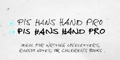
  34. PiS HansHand Pro by PiS, $28.00
    HansHand started out in 2003 as a simple free font, the adaption of my grimy handwriting. For its 10th anniversary it got a complete overhaul and lots of new characters. Now also available in BOLD for the first time, featuring scribbles, strokes, circles and boxes to underline the fast taking-notes-while-on-the-phone look!
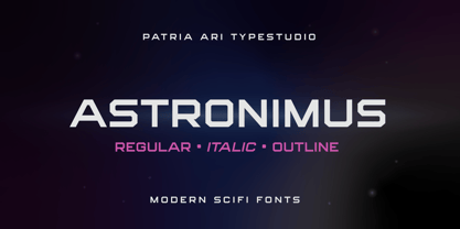
  35. Astronimus by Patria Ari, $15.00
    Astronomus, a cutting-edge sci-fi tech font characterized by its bold box-shaped letters. This modern typeface is meticulously designed, offering a distinctive aesthetic that makes it the ideal choice for various logotype applications. Whether you're in the technology sector, the construction industry, automotive design, or any other heavyweight domain, Astronomus delivers a powerful and futuristic visual impact.
  36. Rostock Kaligraph - 100% free
  37. moebius - 100% free
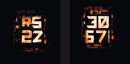
  38. Rip TAPE by TypoGraphicDesign, $19.00
    CONCEPT/CHARACTERISTICS 
The handmade, dirty and yet modern character of the font was designed with analog tape on paper and later digitized. The motto is sticky, wrinkled and rough APPLICATION AREA The dirty, rough and fancy font „rip TAPE“ would look good at dis­play size for poster, flyer, comics and gra­phic novel let­te­ring and logos. Head­lines in maga­zi­nes or web­sites, packa­ging, music covers or webbanner etc. TECHNICAL SPECIFICATIONS 
Head­line Font | Dis­play Font | Grunge/DIY Font „rip TAPE“ OpenType Font with & 78 gly­phs & 2 styles (regu­lar, fixed).
  39. Badly Stuffed Animal by PizzaDude.dk, $17.00
    I have seen my share of badly stuffed animals. Most of them via pictures, but also on vacations here and there. They all had this really bad handcraft vibe, but at the same time some really ordinary and kind of cute looks. I did my best to capture this look and feeling in my Badly Stuffed Animal font: clumsy letters made with a blobbly pen, with naive and irregular lines - and the conclusion is something super useful for a project that needs an organic handmade look!
  40. Cyclo by Cubo Fonts, $39.00
    Ainsi que le considérait Geoffroy Tory, typographe et philosophe de la Renaissance, chaque lettre de l'alphabet peut être dessinée à partir d'un cercle et d'un trait. La fonte "cyclo" actualise et radicalise ce principe graphique visionnaire. Le pack contient une version "regular" assez sage et une version "alternate" plus fantaisiste dans les accents et des signes de ponctuation. La fonte cyclo est dont adaptée à tous les usages (titres, sous-titres, chapitres et blocs de text), et peut servir efficacement l'identité visuelle de votre projet.
Looking for more fonts? Check out our New, Sans, Script, Handwriting fonts or Categories
abstract fontscontact usprivacy policyweb font generator
Processing