10,000 search results
(0.072 seconds)
- EF Techno Script by Elsner+Flake,
$35.00 - Ballantines Script EF by Elsner+Flake,
$35.00 - Estefania Bold Script by Shaltype Co,
$12.00 Estefania is based on Retro Bold Script Typeface that could fit any Graphic Project. Using bold and contrast strokes to get eye-catchy and smooth looking, this project is just born and will come with other styles and more glyphs in the future. Drawn manually by hands, and reform into a clean Typeface. Natural stroke from original lettering. It can be used for Titles or even for writing. In this font, you will get : - TTF & OTF files - WOFF & WOFF2 - Over 299 Glyphs - 11 OpenType features - Support Multilingual languages Get Estefania now! It will be best used for any design requirement, many fonts will come with a unique concept. Thank you! Best Regards, FM-STCO.
 - KG Manhattan Script by Kimberly Geswein,
$5.00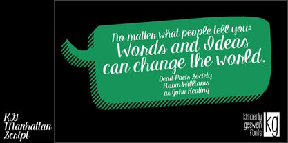 A connected, upright script font.
 - Ongunkan Iberian Script by Runic World Tamgacı,
$50.00 The Iberian scripts are the Paleohispanic scripts that were used to represent the extinct Iberian language. Most of them are typologically unusual in that they are semi-syllabic rather than purely alphabetic.[1] The oldest Iberian inscriptions date to the 4th or possibly the 5th century BCE, and the latest from end of the 1st century BCE or possibly the beginning of the 1st century CE. The characters in this font do not contain all the characters of the Iberian script. If there are friends who need all the characters, contact me so that I can install the font on the system.
 - FF Tartine Script by FontFont,
$51.99 French type designer Xavier Dupré created this script FontFont between 2002 and 2007. The family contains 3 weights: Regular, Bold, and Black and is ideally suited for advertising and packaging, logo, branding and creative industries as well as sports. FF Tartine Script provides advanced typographical support with features such as ligatures, alternate characters, case-sensitive forms, fractions, super- and subscript characters, and stylistic alternates. It comes with a complete range of figure set options – oldstyle and lining figures, each in tabular and proportional widths. As well as Latin-based languages, the typeface family also supports the Greek writing system.
 - FF Masala Script by FontFont,
$68.99 French type designer Xavier Dupré created this script FontFont in 2009. The family contains 3 weights: Regular, Bold, and Black and is ideally suited for advertising and packaging, festive occasions, editorial and publishing as well as poster and billboards. FF Masala Script provides advanced typographical support with features such as ligatures, alternate characters, case-sensitive forms, fractions, super- and subscript characters, and stylistic alternates. It comes with a complete range of figure set options – oldstyle and lining figures, each in tabular and proportional widths. This FontFont is a member of the FF Masala super family, which also includes FF Masala.
 - Taylor Demian Script by Get Studio,
$17.00 Introducing Taylor Demian Signature Font This new script font embodies the essence of a natural signature style. Designed to convey elegance and organic handwriting, it effortlessly exudes a sense of graceful flow. Meticulously crafted, this font can be seamlessly incorporated into various contexts. With its elegant signature style, natural impression, and clever ligature usage, this script font closely resembles authentic handwriting. It brings a personalized and aesthetically pleasing quality to your design projects.
 - The Kogles Script by Letterhend,
$19.00 Please welcome our newest script typeface, The Kogles, a nice script typeface with retro feel. This font is perfect to be applied especially in logos and the other various formal forms such as invitations, labels, logos, magazines, books, greeting/wedding cards, packaging, fashion, make up, stationery, novels, labels or any type of advertising purpose.
 - Lux by URW Type Foundry,
$35.99 Many times, when a new creative process is starting, it is triggered by an everyday action or item. In this case, the looks of a lady’s watch inspired Michael Herold to create his new typeface LUX. The sight of the chronograph sparked associations of the 1950s in Mr. Herold: While this decade was predominantly dominated by brush and feather scripts, there was also a bloom of strict and modern architecture. This special mix of strength and retro style is exactly what Michael Herold is trying to capture in his LUX. The result is a typeface which is perfectly suitable for use on book covers, posters and claims – thanks to its striking impression. The name LUX, Latin for light, is inspired by the high bright-dark contrast within the individual characters. Oft sind es alltägliche Gegenstände, die das Bestreben eines neuen kreativen Prozesses auslösen. So entspringt auch die Inspiration zur Erschaffung der LUX von Michael Herold dem Anblick einer Damenuhr. Der Chronograph löste bei Herrn Herold Assoziationen zu den 1950er Jahren aus: Während diese Zeit hauptsächlich von Schreibschriften aus Federn und Pinseln beherrscht wurde, nahm auch die streng und modern anmutende Architektur starken Einfluss auf die Epoche. Diese Mischung aus Strenge und 50er Jahre Retro-Stil soll in der LUX zum Ausdruck kommen. Das Ergebnis ist eine Schrift, die sich mit ihrer plakativen Wirkung perfekt für Buchumschläge, Poster und Claims eignet. Namensgebend war der starke hell-dunkel Kontrast innerhalb der Schrift – festgehalten in dem lateinischen Wort für Licht.
 - Silky Smoke - Personal use only

- Shade Blue - Personal use only

- Xpress Rounded by Wiescher Design,
$12.00 »XPress-Rounded« is my new addition to »XPress«, my Sans-Serif that impresses – especially in small sizes – with its outstanding readability. »XPress-Rounded« looks very different, almost like a completely new font. But the rounded version has the same seven precisely calibrated weights from »Thin« to »Heavy« and its corresponding italics make this font-family universally usable. The »XPress« fonts got their bearings from the fabulous American »Gothic« fonts of the twenties of last century. Modern, present day elements, high lowercase letters and infinitesimal elegant slight curves in start- and end strokes make the font family not only great for body copy, but also very useful in advertising. Enjoy! »XPress-Rounded« ist meine neue Erweiterung zur »XPress« Familie, die durch aussergewöhnliche Lesbarkeit auffällt. »XPress-Rounded« sieht jedoch vollkommen anders aus als sein älterer Bruder. »XPress-Rounded« hat jedoch die selben sieben präzise aufeinander abgestimmten Schnitte von »Thin« bis »Heavy« und die dazu passenden Kursiven. Das macht die Schriftfamilie vielseitig einsatzfähig. Die »XPress« Schriften basieren auf der Formensprache der grossen amerikanischen Groteskschriften der zwanziger Jahre des letzten Jahrhunderts. Durch moderne Formelemente, große Mittellängen und unendlich leichte, elegante An- und Abstriche ist die Schrift jedoch nicht nur als Textschrift, sondern auch im gesamten Bereich der Werbung vielseitig einsetzbar. Viel Erfolg!
 - Yiggivoo Unicode - 100% free

- Corner by URW Type Foundry,
$35.99 A unique kind of type by Michael Herold: The 14 cuts of Corner are equally distributed to the two style variants A and B. From Thin to Extra Bold, variant A comes with technical and pure forms while B appears with a soft, more personal character. In combination, the two variants add up to a highly versatile family which is very well suited for branding purposes, thanks to its diverse forms of expression. Eine besondere Schriftfamilie von Michael Herold: Die 14 Schnitte der Corner sind auf die beiden Stilvarianten A und B verteilt. Von Thin bis Extra Bold kommt die Corner im Stil A mit technischen, reinen Formen und im Stil B mit weichem, persönlicherem Charakter. Als Kombination ergibt sich eine sehr vielfältige Familie, die sich mit ihren verschiedenen Ausdrucksformen besonders fürs Branding eignet.
 - Slanted ITALIC Shift by TypoGraphicDesign,
$19.00 CONCEPT/CHARACTERISTICS The constructed, clear and modern character of the typeface based on the basic form of the triangle. The motto is geometrically and italic. APPLICATION AREA The modern, futuristic and constructed font „slanted ITALIC shift“ would look good at display size for poster, flyer, comics and graphic novel lettering and logos. Headlines in magazines or websites, packaging, music covers or webbanner etc. TECHNICAL SPECIFICATIONS Headline Font | Display Font | Geometric Font „slanted ITALIC shift“ OpenType Font with & 308 glyphs & 6 styles (thin, light, regular, medium, bold, black). Alternative letters, symbols and ligatures (with accents & €) FONT IN USE www.typographicdesign.de/font-in-use-slanted-italic-shift/
 - Big Chuck by Proportional Lime,
$1.99 Charlemagne, one of the great rulers of the Middle Ages, was instrumental in the reestablishment of formal education in the West. This font was inspired by the notion that he felt the need to protect his communications from people with the ability to read; a rare skill then. Did he really command such a script to exist? He did instigate the development Carolingian minuscule script. Here are two different systems that are both attributed to him. Does it provide any real security? No, but it is fun to think about how such a system might have been used.
 - Architype Catalogue Solid by The Foundry,
$50.00 Architype Crouwel is a collection of typefaces created in collaboration with Wim Crouwel, following his agreement with The Foundry, to recreate his experimental alphabets as digital fonts. Crouwel's most recognized work was for the Van Abbe and Stedelijk museums (1954 –72) where he established his reputation for radical, grid-based design. Architype Catalogue’s soft ‘padded’ letterforms were originally created by Wim Crouwel for the Stedelijk museum’s 1970 exhibition of sculptor Claes Oldenburg.. Crouwel said, ‘When you look at Oldenburg’s work, with all those soft objects, it gets into your system, so you try to integrate that feeling in the design. Claes was very taken with the catalogue's typeface, and asked me if I would do the whole alphabet for him, so I did. I cut it all out in pink paper and pasted it together’.
 - Roundabout by URW Type Foundry,
$35.99 Roundabout is a typeface that is extracted from an ellipse shape. Each and every character started at the same geometrical figure. By cutting it up in sections, twist and rotate the separate characters could be build. The ellipse provides this typeface with evident and smooth looking features. The name Roundabout is misleading, an ellipse is not round. But the word Roundabout has a nice ring to it and it seems to fit this typeface perfectly. The Roundabout as we know it is a place where the traffic circles. Sometimes in the greater metropoles it jams like clotting veins. Various exits are presented for those who know which way to go, for those who don’t it seems an eternal treadmill. Unlike my typeface, that seems rather careless, light weighted and knows her way around. A roundabout in a child’s mind is a playful carrousel or a merry go round. Merry go round has the sweetest sound and a match is found. My Roundabout is a joyful, optimistic and open typeface, which can be used over and over and over again for many or any purposes. ----- Roundabout ist eine Schrift die aus der Form einer Ellipse entstand. So teilen alle einzelnen Zeichen denselben geometrischen Ursprung. Durch das zerteilen, verdrehen und verflechten der elliptischen Grundform konnten die separaten Zeichen so geformt werden, dass sie einen klaren und weichen Charakter erhielten. Der Name Roundabout scheint auf den ersten Blick etwas irreleitend - ist eine Ellipse ja nicht wirklich rund. Er hat aber einen schönen Klang und doch eine tiefe Verbindung zu dieser Schrift. In unseren Gedanken ist Roundabout ein Kreisverkehr: Manchmal, in großen Städten, kann er blockieren, so wie eine verstopfte Ader. Verschiedenste Auswege zeigen sich denen, die ihr Ziel kennen; für alle anderen erscheint dieser Ort wie eine endlose Schlaufe. Dieses Bild widerspricht dem Auftreten meiner Schrift, welche eher sorglos und leichtfüßig ist; sie kennt ihren Weg. In dem Kopf eines Kindes jedoch ist ein Roundabout ein verspieltes Karussell, ein „merry go round“. ,,Merry go round“ klingt bezaubernd und so fiel die Entscheidung. Meine Roundabout ist eine fröhliche, optimistische und offene Schrift, die immer und immer wieder genutzt werden kann, zu jedem erdenklichen Zweck.
 - Shark Snack by Comicraft,
$19.00 Dumm DUM. Dumm DUM. Duh dum duh dum duh dum DUMMMM... Just when you thought it was safe to get back in the water, this font surfaces to take one last bite out of your summer vacation skinnydip! Scream and scream again — it won’t do you any good, SHARKSNACK is rough and ready to EAT YOU ALIVE! It’s too late to close the beaches, Chief Brody, this particular set of saw tooth letters has already consumed Dracula, the Werewolf, the Frankenstein Monster and any number of 70s comic book characters foolish enough to dip a toe in its maw!
 - Remachine Script Personal Use - Personal use only

- Symphony Script - personal use - Personal use only

- Clipper Script (Personal Use) - Personal use only

- SF Foxboro Script Extended - Unknown license

- Pea Girly Girls Script - Unknown license

- Pea Amy*Rica Script - Unknown license

- SF Comic Script Shaded - Unknown license

- SF Foxboro Script Extended - Unknown license

- Pea Glo-Girl Script - Personal use only

- SF Foxboro Script Extended - Unknown license

- SF Foxboro Script Extended - Unknown license

- Pea Marcie's Skinny Script - Unknown license

- SF Burlington Script SC - Unknown license

- SF Comic Script Outline - Unknown license

- SF Burlington Script SC - Unknown license

- SF Burlington Script SC - Unknown license

- SF Comic Script Condensed - Unknown license

- SF Burlington Script SC - Unknown license

- SF Comic Script Extended - Unknown license

- Lovely Nathalie Script Duo by Attract Studio,
$12.00 Lovely Nathalie Script Font DUO in a very soft and beautiful handwriting style. Equipped with 400+ glyphs. Lovely Nathalie is perfect for branding projects, homeware design, product packaging, use in business cards, invitation cards, etc. Simply as a stylish text overlay onto a background image or anything that requires a touch of elegance. To enable OpenType Stylistic alternates, you need a program that supports OpenType features such as Adobe Illustrator CS, Adobe Indesign & CorelDraw X6-X7, Microsoft Word 2010 or a later version. Thanks for checking! I really hope you enjoy it.


