6,592 search results
(0.023 seconds)
- Kaithryn by Din Studio,
$29.00 Kaithryn is a modern calligraphy font. It brings a beautiful and attractive typeface. Made for any professional project branding. It is the best for logos, branding, wedding and quotes. Includes: Kaithryn (OTF) Features: Stylistic Set Beautiful Ligatures Multilingual Support PUA Encoded Numerals and Punctuation Thank you for downloading premium fonts from Din Studio
 - Bakrie by 160 Std,
$20.00 Bakrie is a bold and incredibly unique display font. Masterfully designed to become a true favorite, this font has the potential to bring each of your creative ideas to the highest level! suitable for use in many design forms, for example Headline, Magazines, Postcards, Logos, DIY Projects, Brand, Apparel, Quotes, and much more.
 - MD Grotesque by Margarita Dyakovich,
$12.00 MD Grotesque is sans serif font family with a modern and minimalist feel with high readability. It’s extremely versatile and can be used for a big variety of design projects. Perfect for any simple text. It comes in 3 weights and its matching italics. Each style includes Latin and Cyrillic character set.
 - Angellove by Nissa Nana,
$24.00 Angellove is a beautiful and elegant script font. Its modern and classy look makes it the perfect font for creating outstanding DIY projects! This font is PUA encoded which means you can access all of the glyphs and swashes with ease! It features a varying baseline, smooth lines, gorgeous glyphs and stunning alternates.
 - Nuff Said by Comicraft,
$19.00Comicraft's President and Tiger Rank-and-File (recently demoted from First Tiger for kissing a girl) stayed up all night with a big box of crayons and created a unique series of illustrations which, we confidently predict, will be widely known as the last word in comic book lettering fonts... 'NUFF SAID! - Dattge Hurty by Stringlabs Creative Studio,
$25.00 Dattge Hurty is a cute and casual handwritten font with an incredibly friendly feel. It features gorgeous swashes and ligatures that make this script incredibly versatile. Whether you’re looking for fonts for Instagram or calligraphy scripts for DIY projects, Dattge Hurty will turn any creative idea into a true piece of art!
 - Ventralie by Din Studio,
$29.00 Ventralie is authentic and modern blackletter font. The font is suitable for any branding project like logo, t-shirt printing and many more. Outstanding in a wide range of contexts. Featured : Alternates Accents (Multilingual characters) PUA encoded Numerals and Punctuation (OpenType Standard) Extra Ornaments Thanks for downloading premium font from Din Studio
 - Nirvanium NB by No Bodoni,
$39.00 If John Baskerville had been born in Seattle in the 1960s his type would have looked like Nirvanium: a wide, extended body with chunky Dr. Martin serifs, an assertive inelegance and a sense of rebelliousness. It�s a display face, too big, too chunky and too rambunctious for text, but always friendly.
 - Westlake by Din Studio,
$29.00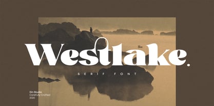 Westlake is a serif font. Made for any professional project branding. It is the best for logos, branding and quotes. Every letter has a unique and beautiful touch. Includes: Westlake (OTF) Features: Standard Ligatures Swashes Stylistic Sets PUA Encoded Multilingual Support Numerals and Punctuation Thank you for downloading premium fonts from Din Studio
 - Sporten by Din Studio,
$29.00 Sporten is a classic sport font. Made for any professional project especially that related to the sports. Beside that, this font can be used for printing, branding and quotes. Includes: Sporten (OTF) Features: PUA Encoded Multilingual Support Numerals and Punctuation Bonus Esport Logo Thank you for downloading premium fonts from Din Studio
 - Anzilam by Din Studio,
$29.00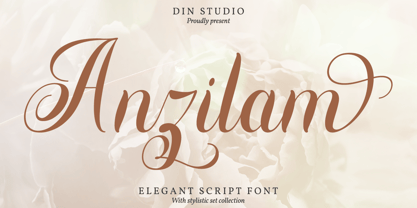 Anzilam is a modern calligraphy font. It brings a beautiful and attractive typeface. Made for any professional project branding. It is the best for logos, branding, wedding and quotes. Includes: Anzilam (OTF) Features: Stylistic Set Beautiful Ligatures Multilingual Support PUA Encoded Numerals and Punctuation Thank you for downloading premium fonts from Din Studio
 - Chimoll by Dieza Design,
$12.00 Inspired by a typical Indonesian food, our Chimoll Script is made. Chimoll Script is a magical handwritten font that is carefully crafted with an elegant touch. Whether you're looking for fonts for Instagram or calligraphy scripts for DIY projects, this font will turn any creative idea into a true work of art!
 - CTCO Hopps by wearecolt,
$11.00 CTCo Hopps Condensed takes inspiration from vintage beer labels, newspaper headlines, and woodcut type. Hopps is the perfect typeface to make a big statement with a classic impact. Hopps comes in 4 flavours: Regular Soft (slightly rounded) Italic Italic Soft CTCo Hopps is a condensed grotesque designed for headlines, posters and logos.
 - Hunters Think by Lettersiro,
$8,990.00 Hunters Think is modern bold script font. Made carefully to get the best curves and unique form that never exist before. Hunters Think is Suitable for any graphic designs such as branding materials, t-shirt, print, business cards, logo, poster, t-shirt, photography, quotes .etc. this font special for big company only
 - Gothiks Condensed by Blackletra,
$50.00 This is the condensed version of Gothiks , a 6-weight display sanserif influenced by Texturas. It is ideal for everything big, compact and powerful. This family has an extensive character set — with extensive language support — and many OpenType features like fractions, small capitals and different figure sets. Default figures align with lowercase.
 - Breaze by PizzaDude.dk,
$19.00 You may think cartoon or kids product, when you take a look at Breaze - and you may be right…but I did have retro grafitti in mind, when I drew the letters. Well, actually I may have mixed both cartoon and grafitti! Anyway, it’s a playful font and is suitable for many things!
 - Eurasian Stencinitials JNL by Jeff Levine,
$29.00Eurasian Stencinitials JNL are modeled from a set of crudely die-cut Old English capital letter stencils that were made in Japan in the Early 1960s. The interesting treatment of the letters (with a slight hint of Japanese calligraphy) has some added bamboo plants for balance and decoration in this digital version. - Jeanneret NF by Nick's Fonts,
$10.00This elegant stencil face is based on lettering used by Charles-Edouard Jeanneret, popularly known as Le Corbusier, on his architectural drawings. Big, bold and beautiful, it's the perfect choice for commanding headlines or subheads. Both versions of this font include the complete Latin 1252, Central European 1250 and Turkish 1254 character sets. - Dynatomic by PintassilgoPrints,
$24.90 A vigorous typeface suited for bold designs, Dynatomic is inspired by an amazing hand-drawn lettering of a 1964 polish movie poster designed by Andrzej Krajewski. It's a very eye-catching typeface that works surprisingly well even at not-so-big sizes, making it a great choice for a wide range of applications.
 - Heaster by Letterara,
$14.00 Heaster is a cute and casual handwritten font with an incredibly friendly feel. It features gorgeous swashes and ligatures that make this script incredibly versatile. Whether you’re looking for fonts for Instagram or calligraphy scripts for DIY projects, Heaster will turn any creative idea into a true piece of art! God bless you!
 - Jafrine by Din Studio,
$29.00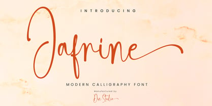 Jafrine is a modern calligraphy font. It brings a beautiful and attractive typeface. Made for any professional project branding. It is the best for logos, branding, wedding and quotes. Includes: Jafrine (OTF) Features: Stylistic Set Beautiful Ligatures Multilingual Support PUA Encoded Numerals and Punctuation Thank you for downloading premium fonts from Din Studio
 - Rough Stuff by Studio K,
$45.00 Cool and contemporary or hot and happening? Street smart or down and dirty? You decide. Either way Rough Stuff will add a dash of style and the stamp of authenticity to your graphic projects. Perfect for tee shirt slogans or gig posters. Suitably distressed 'warning' symbols are also supplied. See also Export Drive.
 - Lucky Brian by Beary,
$15.00 Hello guys Proudly presents our font lucky brian. lucky brian is mazing hand lettering look attractive and natural! Script font carefully created with a touch of elegance. Whether you’re looking for fonts for Instagram or calligraphy scripts for DIY projects, this font will turn any creative idea into a true piece of art!
 - Butterline by Nissa Nana,
$26.00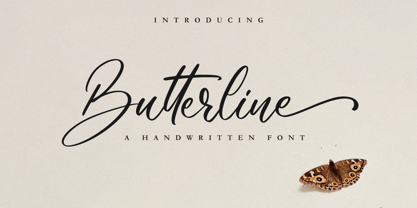 Butterline is a beautiful and elegant script font. Its modern and classy look makes it the perfect font for creating outstanding DIY projects! This font is PUA encoded which means you can access all of the glyphs and swashes with ease! It features a varying baseline, smooth lines, gorgeous glyphs and stunning alternates.
 - Hellomind by Din Studio,
$29.00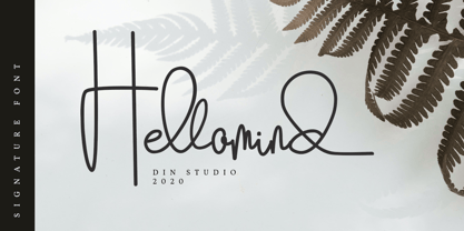 Hellomind is a beautiful signature font. It brings a modern and attractive typeface. Made for any professional project branding. It is the best for logos, branding, wedding and quotes. Includes: Hellomind (OTF) Features: Stylistic Set Beautiful Ligatures Multilingual Support PUA Encoded Numerals and Punctuation Thank you for downloading premium fonts from Din Studio
 - Rundo by Tour De Force,
$30.00 Rundo is all-caps decorative font family available in 5 styles: Fill, Inline, Decline, Stencil and Partenon. With wide proportions and serifs characteristics for slab serif fonts, Rundo is lively family intended to be used for product names on packages, big titles and outdoor graphics. Comes with standard ligatures as OpenType features.
 - Gothiks Compressed by Blackletra,
$50.00 This is the compressed version of Gothiks , a 6-weight display sanserif influenced by Texturas. It is ideal for everything big, compact and powerful. This family has an extensive character set — with extensive language support — and many OpenType features like fractions, small capitals and different figure sets. Default figures align with lowercase.
 - Redkits by Din Studio,
$29.00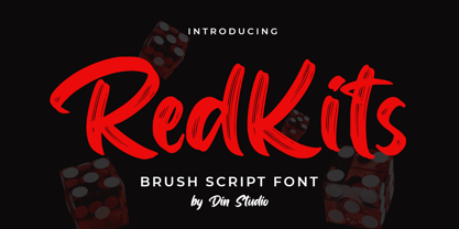 RedKits is a beautiful brush font. The handwritten combined with brush font will make your design project more attractive. Made for any professional project branding. It is the best for logos, branding and quotes. Includes: RedKits (OTF) Features: Multilingual Support PUA Encoded Numerals and Punctuation Thank you for downloading from Din Studio.
 - Meltdown by Comicraft,
$19.00 Misshapen Muck Monster Mutations are on the loose... Their creepy hyper-irradiated bodies have emerged from the blasted desolate wastes of The Forbidden Zone! Could this be Doomsday... or did we just leave one of our typefaces on the radiator? Either way, Meltdown is the perfect font for monstrous inhuman atrocities everywhere.
 - Vintage Melody by Din Studio,
$29.00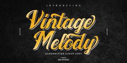 Vintage Melody is a elegant handwritten font. It brings a beautiful and attractive typeface. Made for any professional project branding. It is the best for logos, branding, wedding and quotes. Features: Stylistic Set Standard Ligatures Swashes Multilingual Support PUA Encoded Numerals and Punctuation Thank you for downloading premium fonts from Din Studio
 - Watterline by Din Studio,
$29.00 Watterline is a elegant signature font. It brings a modern and attractive typeface. Made for any professional project branding. It is the best for logos, branding, wedding and quotes. Includes: Watterline (OTF) Features: Stylistic Set Beautiful Ligatures Multilingual Support PUA Encoded Numerals and Punctuation Thank you for downloading premium fonts from Din Studio
 - Wall Scrawler by Comicraft,
$39.00 This slick, marker style font was created by our fontmeister, Mr Fontastic, based on the slick, marker style of... Well, Mr Fontastic himself! Check it out in the pages of Marvel's classic DAREDEVIL story GUARDIAN DEVIL. DD scribe and indy movie maker Kevin Smith himself told us it was the coolest font he'd ever seen in his entire life! No, sorry, that is a lie, but he did tell us he liked the design work Mr Fontastic created for the JAY & SILENT BOB trades, No, seriously, he did. We wouldn't lie to you. Well, except for that last time. By the way, this font also doubles as a dynamite sound effect font, that's why we're charging you twice as much as usual. No, sorry, lying again. About the price, not the sound effect thing.
 - Bleak by Andinistas,
$34.00 @andinistas presents Bleak , an experimental font designed by #carlosfabiancg. Bleak is based on the imaginative use of contrast applied in the empty space and on the dramatic distributions of the wide and compressed horizontal of more than 400 textured symmetric capitals inspired by compositions of the Lissitzky, Theo van Doesburg, among others. In the Europe of the 20s, scarce resources prevailed, which gave these great artists the firm determination and dedication to create a visual vocabulary, characteristic of the composition with movable types of wood and metal. As they did not readily dispose of the forms of the letters they required, they did not hesitate to construct them with metal rulers, ornaments and other improvised pieces and remains and obtained in the forgotten corners of the typographic composition workshop.
 - RF Tone by Russian Fonts,
$29.00 Tone was inspired by classic geometric sans-serif fonts but has a distinct modern day spirit. Contains 16 styles from ultralight to black: 8 regulars and 8 italics. Have a multilingual support and big amount of OpenType features. This typeface is comfortable to read in small sizes. Great for big pieces of text or as the main typeface in website design. Logotypes and branding, packaging, posters, editorial design, music covers, navigation systems, videos — these are just a few areas in which Tone can help you. Opentype features: old-style figures, tabular and tabular old-style, tabular currency symbols, ligatures, stylistic alternates, fractions and automatic frations, circled numbers, arrows and stylistic alternates for arrows, superscript and subscript, case sensitive forms. Multilingual support: Latin, latin extended, cyrillic and cyrillic extended (more than 70+ languages).
 - VVDS Suffer by Vintage Voyage Design Supply,
$10.00 Do you hear that sound of Dick Dale's guitar? Here it is! Introducing you a new font family with retro surf rock vibes! Straight outta retro vinyl covers and surf gig posters to your font collection! We're all missed the sun, so grab this family and get some of the summer vibes. No matter what your next design project – a tiki t-shirt collection / summer rock festival or gigs / greeting cards / or a header for your new zine, - you'll get your goals with this family. A lot of alternates will give you a hand written's mood and absolutely unique typographic style. Up to 10 styles for some of them. Open Type Features as Stylistic Alternates, Small Caps and Fractions. Three styles: Clear, Roughen and Scratched. Three widths: Light, Regular and Bold.
 - KleinsAmazon - 100% free

- Areplos by Storm Type Foundry,
$53.00To design a text typeface "at the top with, at the bottom without" serifs was an idea which crossed my mind at the end of the sixties. I started from the fact that what one reads in the Latin alphabet is mainly the upper half of the letters, where good distinguishableness of the individual signs, and therefore, also good legibility, is aided by serifs. The first tests of the design, by which I checked up whether the basic principle could be used also for the then current technology of setting - for double-sign matrices -, were carried out in 1970. During the first half of the seventies I created first the basic design, then also the slanted Roman and the medium types. These drawings were not very successful. My greatest concern during this initial phase was the upper case A. I had to design it in such a way that the basic principle should be adhered to and the new alphabet, at the same time, should not look too complicated. The necessary prerequisite for a design of a new alphabet for double-sign matrices, i.e. to draw each letter of all the three fonts to the same width, did not agree with this typeface. What came to the greatest harm were the two styles used for emphasis: the italics even more than the medium type. That is why I fundamentally remodelled the basic design in 1980. In the course of this work I tried to forget about the previous technological limitations and to respect only the requirements then placed on typefaces intended for photosetting. As a matter of fact, this was not very difficult; this typeface was from the very beginning conceived in such a way as to have a large x-height of lower-case letters and upper serifs that could be joined without any problems in condensed setting. I gave much more thought to the proportional relations of the individual letters, the continuity of their outer and inner silhouettes, than to the requirements of their production. The greatest number of problems arose in the colour balancing of the individual signs, as it was necessary to achieve that the upper half of each letter should have a visual counterbalance in its lower, simpler half. Specifically, this meant to find the correct shape and degree of thickening of the lower parts of the letters. These had to counterbalance the upper parts of the letters emphasized by serifs, yet they should not look too romantic or decorative, for otherwise the typeface might lose its sober character. Also the shape, length and thickness of the upper serifs had to be resolved differently than in the previous design. In the seventies and at the beginning of the eighties a typeface conceived in this way, let alone one intended for setting of common texts in magazines and books, was to all intents and purposes an experiment with an uncertain end. At this time, before typographic postmodernism, it was not the custom to abandon in such typefaces the clear-cut formal categories, let alone to attempt to combine the serif and sans serif principles in a single design. I had already designed the basic, starting, alphabets of lower case and upper case letters with the intention to derive further styles from them, differing in colour and proportions. These fonts were not to serve merely for emphasis in the context of the basic design, but were to function, especially the bold versions, also as independent display alphabets. At this stage of my work it was, for a change, the upper case L that presented the greatest problem. Its lower left part had to counterbalance the symmetrical two-sided serif in the upper half of the letter. The ITC Company submitted this design to text tests, which, in their view, were successful. The director of this company Aaron Burns then invited me to add further styles, in order to create an entire, extensive typeface family. At that time, without the possibility to use a computer and given my other considerable workload, this was a task I could not manage. I tried to come back to this, by then already very large project, several times, but every time some other, at the moment very urgent, work diverted me from it. At the beginning of the nineties several alphabets appeared which were based on the same principle. It seemed to me that to continue working on my semi-finished designs was pointless. They were, therefore, abandoned until the spring of 2005, when František Štorm digitalized the basic design. František gave the typeface the working title Areplos and this name stuck. Then he made me add small capitals and the entire bold type, inducing me at the same time to consider what to do with the italics in order that they might be at least a little italic in character, and not merely slanted Roman alphabets, as was my original intention. In the course of the subsequent summer holidays, when the weather was bad, we met in his little cottage in South Bohemia, between two ponds, and resuscitated this more than twenty-five-years-old typeface. It was like this: We were drinking good tea, František worked on the computer, added accents and some remaining signs, inclined and interpolated, while I was looking over his shoulder. There is hardly any typeface that originated in a more harmonious setting. Solpera, summer 2005 I first encountered this typeface at the exhibition of Contemporary Czech Type Design in 1982. It was there, in the Portheim Summer Palace in Prague, that I, at the age of sixteen, decided to become a typographer. Having no knowledge about the technologies, the rules of construction of an alphabet or about cultural connections, I perceived Jan Solpera's typeface as the acme of excellence. Now, many years after, replete with experience of revitalization of typefaces of both living and deceased Czech type designers, I am able to compare their differing approaches. Jan Solpera put up a fight against the digital technology and exerted creative pressure to counteract my rather loose approach. Jan prepared dozens of fresh pencil drawings on thin sketching paper in which he elaborated in detail all the style-creating elements of the alphabet. I can say with full responsibility that I have never worked on anything as meticulous as the design of the Areplos typeface. I did not invent this name; it is the name of Jan Solpera's miniature publishing house, in which he issued for example an enchanting series of memoirs of a certain shopkeeper of Jindrichuv Hradec. The idea that the publishing house and the typeface might have the same name crossed my mind instinctively as a symbol of the original designation of Areplos - to serve for text setting. What you can see here originated in Trebon and in a cottage outside the village of Domanín - I even wanted to rename my firm to The Trebon Type Foundry. When mists enfold the pond and gloom pervades one's soul, the so-called typographic weather sets in - the time to sit, peer at the monitor and click the mouse, as also our students who were present would attest. Areplos is reminiscent of the essential inspirational period of a whole generation of Czech type designers - of the seventies and eighties, which were, however, at the same time the incubation period of my generation. I believe that this typeface will be received favourably, for it represents the better aspect of the eighties. Today, at the time when the infection by ITC typefaces has not been quite cured yet, it does absolutely no harm to remind ourselves of the high quality and timeless typefaces designed then in this country.In technical terms, this family consists of two times four OpenType designs, with five types of figures, ligatures and small capitals as well as an extensive assortment of both eastern and western diacritics. I can see as a basic text typeface of smaller periodicals and informative job-prints, a typeface usable for posters and programmes of various events, but also for corporate identity. Štorm, summer 2005 - ALS Scripticus by Art. Lebedev Studio,
$63.00 There are many script typefaces but there is only one Scripticus. Scripticus is like a chameleon: In whatever surroundings you put it, it adapts itself and looks like it couldn't be anywhere else. Be it a sales advertisement, a music Website, a comic strip or a journal with complex chemical formula – Scripticus always solves the problem in a natural and leisurely way. And it never makes compromises concerning clarity. But where does Scripticus come from? … From the good old high school blackboard! Blackboards have become almost obsolete in teaching, but be it a black or white background – clear, strong characters placed on the board while the facts are explained are still one of the best ways to make and keep things understandable. Scripticus is dedicated to my high school chemistry teacher who was an expert in just this. While the letterforms come from different inspirations, its aim is the same as the pedagogical aim of my teacher: Combining clarity with a strong personality. Scripticus has a special trick to give it its natural look: Four alternates for each letter and each number plus rotation coding make the glyphs appear in lively melodic flow. In this way even mathematic equations look nice! Scripticus has a lot of OT-features that help it do its job. They are: capital spacing, localized forms, subscript, scientific inferiors, superscript, numerators, denominators, fractions, ordinals, tabular figures, historical forms, ligatures, stylistic alternates, stylistic set and ornaments. Finally, as is my general goal in type design – Scripticus supports close to one hundred languages from Latin extended to Cyrillic extended.
 - Robard by Dear Alison,
$24.00 My brother is an architect, and I have always loved his lettering, you know, the style of writing that can be found on architectural drawings. There is a common thread to it, yet each architect or engineer brings their own personality to it. I have seen a similar style being used by some hand-letterers for invitations, place cards and signage. Inspired, I set out to create my own, and the result is my new typeface, Robard! I wanted something compact, somewhat modular, done quickly but with control, and sourced from hand-lettering. Starting out with a handful of pigment ink pens, I settled on a 0.1mm Copic Multi-Liner, and using a light table with a grid underneath the paper, I cranked out grouping after grouping, letter after letter, numbers, punctuation, accents, just trying to zero in on the feeling and the look I was after. There were some ideas that didn't work, like unicase (there would be no regular lowercase), or swash alternates. Ultimately, I ended up with a decent array of glyphs to choose from, and alternates like oldstyle numbers, and an alternate set of caps for the lowercase slots, and even alternative figures so doubles like 88 would be different. In the font, the OpenType ligature code automatically alternates the cap and lowercase (alternate cap) letters, and numbers as you type, lending Robard that hand-lettered look in a digital typeface that I was hoping for. There are also oldstyle figures, and unlimited fractions, ordinals, and a few alternate letters. I hope you like Robard!
 - Rather Risque by SilverStag,
$14.00 RATHER RISQUÉ is a brand new & creative contrast serif font, my take on a classical serif typeface, with over 165 unique ligatures and alternates for all uppercase and lowercase letters. This serif font was inspired by fashion editorial fonts, I wanted it to be bold but with a contrast thin touches, modern ligatures and unique features. RATHER RISQUÉ serif font comes with over 165 ligatures and alternates, full language support and it will be perfect for any kind of design work. Whether you're making a poster, logo design, full branding or a website, you can use it and get an amazingly creative result. I invite you to check out the preview images, and I hope you will be immersed in my vision for this creative typeface that, I am sure, will work for all kinds of interesting projects you might be working on this year. It also includes full language support, punctuation, numerals and detailed instructions how to use alternate letters most of the apps on your computer, as well as in Canva. If you end up publishing your designs on Instagram, tag me - @silverstagco and I will make sure to showcase your design and work to my audience as well! RATHER RISQUE | A Ligature Serif Font Includes: RATHER RISQUE.otf - Classical Serif Typeface With Modern Alternates & Ligatures 165+ Creative Alternates & Ligatures Numerals & Punctuation Language Support Web Font Kit is included as well Detailed instructions on how to use alternates in most of the apps on your computer and in Canva Happy creating everyone!
