10,000 search results
(0.029 seconds)
- Tropica Script by ITC,
$29.00Tropica Script was designed by Vince Whitlock, a casual, lighthearted script typeface. The initial capitals are complemented by a lowercase that connects by overlapping the linking elements on the bottom right of each letter, creating the look of true script. - Blapuhy by Sealoung,
$10.00 Blapuhy is a lovely handwritten font, designed with the help of a brush pen. Fall in love with its authentic feel and use it to create gorgeous wedding invitations, beautiful stationary art, eye-catching social media posts, and cute greeting cards.
 - Sevoya by Jonahfonts,
$42.00 Sevoya a captivating robust script font designed with fat strokes for those strong brands and logos. Featuring short ascenders and descenders making it a bit more legible. Sevoya is perfect to create outstanding headings, logos, menus, graphics, and many more applications.
 - FM Rossija by FontMeister,
$24.95 'Rossija' is inspired by russian typographic designs. It's bold look makes a perfect font for the use of titles. You can use these fonts to create posters, greeting cards, scrapbooks, CD labels, T-shirts, coffee mugs, digital videos websites and banners.
 - Segoe Chess by Microsoft Corporation,
$29.00Segoe™ Chess font is part of the Segoe family of fonts from Microsoft. The Segoe Chess font contains the chess figurines and symbols for creating chess diagrams. Segoe Chess was designed by Jim Ford and is a symbol-encoded font. - FF Elementary by FontFont,
$41.99 German type designer Nicole Kapitza created this pi and symbols FontFont in 1995. FF Elementa is a series of three picture fonts: FF Elementary Earth, FF Elementary Life, and FF Elementary Space. It comes with tabular oldstyle and proportional oldstyle figures.
 - Edgewater Small by cm5dzyne,
$16.00Edgewater Small extends the popular Edgewater and Edgewater Square families with the inclusion of lower-case characters, creating a flexible typeface perfect for individual use in medium-to-large sizes or in concert with its sibling fonts in the series. - Glancing by Etcsupply,
$8.00 Glancing™ script typeface with bounce style designed by Ilham Nashrul Huda and published by Etcsupply. Glancing script typeface created inspired from lettering artist in social media. Glancing features: Glancing Vol 1 OTF Glancing Vol 2 OTF Glancing Swash OTF
 - SF Old South Arabian by Sultan Fonts,
$9.99Historical Background Old South Arabian Script (OSA) was used before the Islamic era not only in the southwest corner of the Arabian Peninsula, but actually in the entire Peninsula. In addition, samples of OSA have been found as far as Uruk in Mesopotamia, Delos in Greece, and Giza in Egypt. Archaeological finds show that as far back as the 8th century BCE, OSA was used in trade, religious writing, and in civil records. Following the spread of Islam in Yemen, the decline of OSA began in the 7th century CE as it was gradually supplanted by Arabic script. OSA was typically known by the name of the then-dominant peoples in the Southern Peninsula. At various times, it was known as Sabaean, Qatabani, or Hadramite, among others. Although it was used for a variety of languages, OSA is most strongly associated with Sabaean. Many Peninsular languages borrowed OSA before introducing further changes of their own. Prime examples are the Thamudic, Safaitic, and Lihyanite scripts which eventually developed into independent scripts. The westward migration of the Sabaean people into the Horn of Africa introduced the South Arabian consonantal alphabet into the region. The transplanted script formed the roots of the Geez script of Ethiopia, which, in time and under presumably external influences, developed into a rich syllabary unlike any other Semitic script in history. Even a cursory examination of the letter forms of Modern Ethiopic writing reveal a striking similarity to South Arabian Script. OSA inscriptions typically reveal a dominant right-to-left directionality, although there are also many cases of alternating directions, known as boustrophedon writing. Figure 1 is a fine example of this style of writing. OSA inscriptions were discovered early in the 19th century. Soon thereafter, two orientalists, Gesenius and Rödiger, made great strides towards deciphering the script. Styles of Writing Old South Arabian inscriptions have survived primarily on stone, ceramic, and metallic surfaces. Hundreds of artifacts have been found and, to this day, continue to be discovered. Some of the best examples number of inscriptions on softer materials, such as wood and leather, have also been discovered. Although there is a significant difference between the styles of letters on the hard surfaces and those on the soft. Old South Arabian (Musnad) is composed of 29 letters , that is one letter more than the Arabic alphabet, which is between “S” and “Sh”, and names “Samekh”. Aspects of difference between Musnad and the present Arabic writing is that Musnad is written in separate letters, and the shape of the letters do not change according to its place in the word. However, some letters change according to the beginning of the writing. Musnad is either prominent, or deep. Prominent writings are for important writings and deep writings are for ordinary. The material on which the Musnad was written were stones, rocks, wood, and metal. In the course of its development the Musnad use appeared in the “Lehyanite’, “Thamudic”, “Safaitic”, pen to which many changes and amendments were made. And from it “Habashi’ writing was born. As regards his place among the Arabs of the Peninsula , when we look at the internet and its role in cultural dialogue , the Arabs of the Peninsula considered Musnad inscription which was indisputably their national writing until the dawn of Islam. It was used by people in all parts of Arabia in their homeland and abroad . It was their means of chronology and record of their glories and history.2- Features of Musnad Script: 1. It is written from right to left and vice versa. 2. Its letters are not joined. 3. Shape of letters are uniform despite their positions in the word. 4. Words are separated by vertical lines. 5. A letter is doubled in case of assertion. 6. No points and punctuations. 7. Easy to be learned by beginners. My OSA Musnad Font My design and technical work is only a treatment of the OSA Musnad as a symbol of writing. And it is possible to use in computer.. My design is not aimed at demonstrating the linguistic and intellectual structure of the Old South Arabian (Musnad). It is so simple that it could be easy to learn by learners and those who are interested in the OSA Musnad letters in computer. The basis of such importance is that it spares a lot of time and effort for researchers and students in this field. Formerly they used to write the Musnad texts either by handwriting or scan them , But now they can easily write its texts in OSA Musnad by using keyboard directly, so that they can change , amend and fulfill easily and accurately . So, we made use of speed, easiness and accuracy. And anyone interested in the South Arabian history in any part of the world can due to this design read and write OSA Musnad letters most easily. This design will also be used by historians and archeologists. , as well as specialist linguistics . The design also demonstrates the aesthetics of the Himyarit writing. About this font family Old South Arabian is An Arabic, Old South Arabian and Latin typeface for desktop applications ,for websites, and for digital ads. Old South Arabian font family contains two types: Old South Arabian and Old South Arabian serif. The font includes a design that supports Arabic, Old South Arabian and Latin languages. Old South Arabian typeface comes with many opentype features. - IM FELL French Canon - Unknown license

- Torus Pro by Monotype,
$40.00 Torus Pro is a rounded monoline typeface. As its name suggests, this is a more professional version of my original Torus family released in 2017. Each glyph has been scrutinised and redrawn where necessary. In addition, there are now italics, small caps, old style figures, and numerous other improvements. Torus Pro includes many new decorative alternates and ligatures that will add distinctive flourishes to your typographic compositions. With up to nine alternates for some glyphs, these additional styles include stencilled, simple dots, looped and smooth swashes, plus a more aggressive angled option for those looking for something a little different. When used subtly, these alternates and glyph combinations will add flair and personality to your own creations. Perfect for titling and branding, Torus Pro also packs a punch without these features activated, as well as being a comfortable read in long runs of text. There are 12 fonts altogether, ranging from Thin to Heavy weights in both roman and italic. The variable font versions of the family allow you to define the weight exactly to your liking. Torus Pro has an extensive character set that covers all Latin European languages. Key features: 6 weights in both roman and italic Variable fonts included with full family 212 Alternates 20 Ligatures Small Caps Full European character set (Latin only) 1450+ glyphs per font.
 - Akagi Pro by Positype,
$29.00 Akagi Pro is a complete rebuild and expansion of my popular Akagi typeface. Contemporary, clean, simple and friendly continue to serve as the adjectives for an expansion that includes 250+ additional characters per weight, many new ligature options, expanded stylistic alternates, 4 sets of figures, new symbols, case-sensitive punctuation, superscripts, subscripts, ordinals, expanded language support and two new styles that provide even more flexibility within the lighter weights of the family. When I designed Akagi in 2007, I wanted this new sans serif to "smile" at you — with this new expansion, I hope you smile back. Akagi Pro is economical while keeping a distinctive, expressive personality on the page that distinguishes it from among many of the mechanical/rigid/emotionless sans out there without becoming cliché. Perfect for the page and the screen, the flexible weights available allow for pinpoint selection at whatever size. Each style of Akagi Pro has a robust character set made even more functional with expansive OpenType features. A typesetter's dream — case-sensitive punctuation, tabular and proportional variants of lining and oldstyle numerals, true italics, small caps, expansive language support, an alternate 'g' and 'y', highlight a wealth of features of the typeface. This versatility infused within Akagi Pro will allow it to assume both roles of the utilitarian workhorse and light-hearted go-to typeface — and make the user happy.
 - ITC Weber Hand by ITC,
$40.99LisaBeth Weber's eponymous typeface ITC Weber Hand is deceptively simple-looking. It's a handwriting face in a light, monolineal style with a slightly formal, almost angular appearance. Weber, who is an accomplished singer/songwriter as well as an artist and lettering artist, says she has always had an inherent sensibility with lettering." Her favorite subject in the first grade was penmanship, and when, as an adult, she got her first checkbook, "I thought it was very unfair that the signature always had to be consistently the same." She describes Weber Hand as "a natural progression of my handwriting style, a friendly and versatile font." Its letterfit is naturally loose, and it shows its character best when set with ample leading. In 1999, when LisaBeth Weber's ITC Weber Hand™ typeface was released, it soon became one of ITC's most popular handwriting fonts. A decade later she decided that is was time to update her single-weight design. A light weight would benefit from a bold companion, in addition to condensed variations for much greater versatility. This warm, friendly, and charming design is just as at home in Restaurant menus as it is in brochures, for advertising, and on packaging. With the new weights ITC Weber Hand will surely continue to be a popular handwriting type with broad appeal." - Woodford Bourne PRO by Monotype,
$25.99 Woodford Bourne PRO is the evolution of my original Woodford Bourne typeface that was inspired by the iconic stone cast letters on the façades of the 19th century Woodford, Bourne & Co. buildings in Cork City, Ireland. Woodford Bourne PRO has matured with numerous improvements to make it an even more versatile font family. The fonts have been completely redrawn and spaced, there are now an additional 500 glyphs for you to use across 9 stylistic sets. The additions include underlined caps, small caps, petite caps, catchwords, discretionary ligatures and more. Please view the specification sheet before you purchase to see all the glyphs and features. Key features: • Woodford Bourne PRO is a vintage geometric sans, optically adjusted for improved aesthetics and legibility 2 FONTS IN 1 – Use the default contemporary character set, or switch to vintage style with stylistic sets 9 Weights in Roman and Italic Thin | ExtraLight | Light | Regular | Medium | SemiBold | Bold | Black | Ultra Underlined Caps, Small Caps, Petite Caps, Catchwords, Discretionary Ligatures Full European character set 1000+ glyphs per font UPDATED JULY 2021 (v.3) Woodford Bourne PRO v.3 update includes numerous improvements including rebalanced /S/s/ glyphs to make them less ‘top heavy’. Italics have been redrawn to smoothe out irregularities. Improvements have been made to diacritics and glyph coverage now supports all Latin European languages.
 - Kuschelfraktur by Catharsis Fonts,
$36.00 Kuschelfraktur is a unique, eye-catching take on the theme of blackletter that replaces the broad nib with a brush pen and achieves stroke modulation through stencil-like gaps. It combines the texture and dignity of blackletter with the human warmth of informal handwriting. Kuschelfraktur offers five separate sets of capital letters and several additional customization option via stylistic alternates. The degree of ornamentation in the blackletter capitals can be increased (SS02) or decreased (SS07), while SS04 and SS05 offer two simpler approaches to capital letters that bridge from blackletter to Roman letters (Antiqua). The default single-storey �a� can be replaced with a two-storey version in SS01, and SS08 offers a single-storey capital �A� for the simple capitals. Finally, SS03 restores some of the more unique letter shapes of the Fraktur style of blackletter. The old-style figures can be replaced with lining and/or tabular figures. All these stylistic sets are accessible via OpenType from the main font, Kuschelfraktur, whereas the spin-off fonts (Traditional, Verziert, Text, Schlicht, Antiqua) offer convenient access to those sets even in environments without OpenType support. I am grateful to the helpful souls on the TypeDrawers and Typographie.info forums for encouragement and constructive feedback, and to the Glyphs team for their fantastic type editor. Kuschelfraktur is dedicated to my son Marius.
 - Wasabi by Positype,
$20.00 Remastered in 2019. Wasabi is the re-imagining of my very first release, Iru. Like Iru, Wasabi was heavily influenced by the monument lettering style, Vermarco. The simple, geometric forms allowed for small lettering sizes to be sandblasted cleanly and has been a monument lettering workhorse for decades… the only issue centered around the lack of a lowercase or any other letters beyond the 26 uppercase glyphs and the numerals. Wasabi solves this with the same simple, efficient line reminiscent of the old Vermarco while bringing it into the 21st century. Visual and optical incongruities of the original uppercase were replaced with new interpretations for the capital letters, a new lowercase and small caps were produced and the original single weight alphabet was replaced with six new weights. Wasabi has several ‘lighter’ weights primarily because the thin lines and simple transitions produce very elegant relationships… and I wanted to make sure those relationships could be explored regardless of the scale of letter. Stylistic Alternates show up through the upper, lowercase and small cap glyphs that attempt to simplify these shapes even more when the opportunity arises. Wasabi is as much a utilitarian typeface as it is a headline face. This realization led to the decision to produce a companion Condensed version shortly after the initial regular weights were developed and tested; so, try them all!
 - Wasabi Condensed by Positype,
$20.00 Remastered in 2019. Wasabi is the re-imagining of my very first release, Iru. Like Iru, Wasabi was heavily influenced by the monument lettering style, Vermarco. The simple, geometric forms allowed for small lettering sizes to be sandblasted cleanly and has been a monument lettering workhorse for decades… the only issue centered around the lack of a lowercase or any other letters beyond the 26 uppercase glyphs and the numerals. Wasabi solves this with the same simple, efficient line reminiscent of the old Vermarco while bringing it into the 21st century. Visual and optical incongruities of the original uppercase were replaced with new interpretations for the capital letters, a new lowercase and small caps were produced and the original single weight alphabet was replaced with six new weights. Wasabi has several ‘lighter’ weights primarily because the thin lines and simple transitions produce very elegant relationships… and I wanted to make sure those relationships could be explored regardless of the scale of letter. Stylistic Alternates show up through the upper, lowercase and small cap glyphs that attempt to simplify these shapes even more when the opportunity arises. Wasabi is as much a utilitarian typeface as it is a headline face. This realization led to the decision to produce a companion Condensed version shortly after the initial regular weights were developed and tested; so, try them all!
 - Pauline Script by insigne,
$39.00 Pauline Script is a Vintage inspired Monoline script. It's a contemporary script inspired by the past, now available to the Instagram era. Pauline Script is a follow up to the popular Pauline typeface. Pauline was one of my first typefaces, all the way back in 2008. Inspired by a variety of influences, from Art Deco signage, to a simple spice label, Pauline Script has very little stroke contrast and was inspired by Retro connected scripts. Over the course of its evolution, it started to take on more influence from geometric sans serif typefaces and lost the connectors. There's a strong geometric streak, derived from 1930s sans serifs like Futura. Tall ascenders and descenders give it a unique look. Now, this script version has now come full circle, utilizing the original sans serif face design and adding connectors back in, with an optically corrected dynamic slant. For invitations, signage, logos or other applications, Pauline Script is there when you need something that stands out with a touch of class and a sense of uniqueness. Turning on Contextual Alternates (non connecting ending forms) and Discretionary Ligatures (better letter connections) is highly recommended. There's a wide range of weights available. It's a playful typeface with options to either have everything connected, or alternate forms which allow for letter connections that still maintain the sense of flow of a script. Includes plenty of ligatures!
 - Engria by Eclectotype,
$40.00 Engria is a type family of four weights with corresponding italics that treads the fine line between sans and serif. There are serifs, of a sort, inspired by the brush. Not the marks made by a brush, but the actual splayed shape the bristles make when clamped together. Wedge-like chunks that resemble engraved forms, as the name Engria hints at. But it also has the appearance of a stressed, flared sans. This mixed approach lends a unique voice. Highly legible at text sizes, as indeed it is optimized for, Engria does however shine at display sizes thanks to its characteristic details – flared stems, angular counterforms, rugged ink traps and fluid curves. (I would recommend tracking it a little tighter at larger sizes.) Engria started life way back in 2014, and has been worked and reworked tirelessly to get to this finished product. My intent was to really push the idea of the white shapes being as important, if not more so, than the black. Engria is equipped for typographically demanding applications, boasting as it does an array of OpenType features, including small caps, automatic fractions, stylistic sets, various figure styles, arrows, case sensitive forms and more. It will make a very useful addition to your typographic arsenal, with a flare (ahem) for editorial work, but the individuality for packaging, branding, and logo work.
 - Lalibela by CyberGraphics,
$43.00My motivation for designing the Lalibela family (which is based on Bodoni) was to pay homage to Ethiopic script. The script has been around for about 3 000 years, but I took artistic licence to deviate from the original model and add personal touches. I chose Bodoni as a historical model because of its display value and not its text size use because the extreme contrast made it difficult to read at small sizes. A Modern typeface characterized by consistently horizontal stress, flat and un-bracketed serifs, and a high contrast between thin and thick strokes, were the final step in typography two-hundred-year journey away from calligraphy. The austerity, simplicity and greater contrast style was perfected.Contrary to all the refinements in Bodoni, I have revisited calligraphy with the font Lalibela that mimics Ethiopic Script. It was drawn with a much larger x height and less geometric than Bodoni for its primary use as a display font. For example, a lot of italic serifs were added to the roman face as well as 16 additional ligatures to obtain more a feel of calligraphy. I made the serifs thicker and bracket one side with straight steps obtaining a reduced contrast to withstand breaking up at smaller sizes.An additional variant, "Lalibela Alternate" was designed to provide an interesting mixing possibilities with the Bold face for more expressive headlines. - String by Lián Types,
$45.00 Inspired by the sound of acoustic guitars, delicacy of harps and elegance of the engrossers script, String is a trendy monoline font which will for sure make unique layouts for your pieces of design. Combining String with String Hole in the same word is a good idea when a more playful rhythm is needed. The font works particularly well when standing on photographs, so be ready to use it in magazines with food, landscapes or super models. I like thinking of String as a distilled version of Erotica. A more “pure” relative of hers. When I designed Erotica, I was so in love with the spencerian style that I knew it'd be hard to just abandon it. With that in mind, this time my aim was to take the subtlety of it to the limit. So, in order to do that I had to find out what was actually the secret of its beauty. I found that the essence of Erotica, in other words, its ductus was the most responsible. The result is a font made of hairlines with a lot of emphasis on the pureness of the form and, (with a lot of inspiration in music) the sensation of continuity between its letters as if they were written with a string. Try String and its flowing melody.
 - ZiGzAgEo - Personal use only

- Challah Display by Typophobia,
$25.00 Challah is a display font containing 295 glyphs. Letters are very diverse, but because they contain several shapes characteristic for each other - they retain a certain coherence. When creating the font, the main inspiration was to take from the Brazilian graffiti trend - Pichação and Korean typography. Most of the letters are the same size and width, however, when designing, we also tried to include at certain moments small "surprises" that will surely interest and surprise the user of the above-mentioned typeface. The font fits very well into the urban structure, therefore it perfectly matches the art on the walls with the art on the billboards, creating a kind of dialogue.
 - Rikale by Sensatype Studio,
$15.00 A Fashion Modern serif font that we created special for elegant branding needs, with extra alternates in unique shape will be ready to add value of your brand. It so nice to leverage designer or product owner that need solutions to make their design look more classy and modern. And specially for Gingka font, We prepared any alternate characters to help you create unlimited variations for your creative needs. Rikale Condensed Fashion Modern Font ready with: Any options to get creative variations (combination of Alternate characters) Preview as a inspirations that you can do with Rikale font Ready with Lowercase and Uppercase characters Wish you enjoy our font. :)
 - Glories by Gatype,
$12.00 Elegant, graceful and timeless. Glories is a versatile font with timeless classic appeal, more than a dozen alternatives & ligatures, multilingual support and great precision for you to incorporate into your designs! Each letter has been hand drawn and crafted with great care. The various weights provide a variety of options that will help you find the best typographical character for your project. Perfect for logos, notes, posters, t-shirts, stickers, posters, mugs, labels, etc. To access alternative glyphs, you'll need a program that supports OpenType features such as Adobe Illustrator CS and Adobe Indesign. How to use the open type feature https://helpx.adobe.com/illustrator/using/special-characters.html
 - Black Pink Summer by Letterara,
$13.00 Introducing a new beautiful calligraphy font, Black Pink Summer, the monoline version of Black Pink Signature, created for summer. Black Pink Summer is perfect for beautiful and elegant logos, upscale packaging, wedding stationery, websites, and any other projects requiring a handwritten and luxurious touch. A wide range of swashes (a-z) and alternates (A-Z) are included so that you can give your logo or name a custom, hand-calligraphic look. Moreover, Black Pink Summer was created to look as close to a natural handwritten script as possible by including 109 ligatures. With built in Opentype features, this script comes to life as if you are writing it yourself.
 - Refina by Sensatype Studio,
$15.00 An Refina Feminine Beauty Serif font that we created special for elegant branding needs, with extra alternates in unique shape will be ready to add value of your brand. It so nice to leverage designer or product owner that need solutions to make their design look more classy and modern. And specially for Refina font, We prepared any alternate characters to help you create unlimited variations for your creative needs. Refina Feminine Beauty Serif ready with: Any options to get creative variations (combination of Alternate characters) Preview as a inspirations that you can do with Refina font Ready with Lowercase and Uppercase characters Wish you enjoy our font. :)
 - Anteros by Sensatype Studio,
$15.00 A Sans serif that we created special for unique branding needs, with extra ligatures in unique shape will be ready to add value of your brand. It so nice to leverage designer or product owner that need solutions to make their design look more unique and modern. And specially for this font, We prepared any ligatures characters to help you create unlimited variations for your creative needs. Anteros Modern Unique Stylish Font ready with: Any options to get creative variations (combination of Ligatures) Preview as a inspirations that you can do with Anteros font Ready with Lowercase and Uppercase characters Wish you enjoy our font. :)
 - Quaint Vibe by Look Minus Today,
$12.00 Quaint Vibe is a unique display font created by Look Minus Today. It captures a distinct and charming vibe, blending vintage aesthetics with modern design elements. With its quirky and unconventional letterforms, Quaint Vibe adds a touch of whimsy and character to any project. Whether you're creating retro-inspired posters, playful logos, or eye-catching headlines, this font will evoke a sense of nostalgia and captivate your audience. With its extensive set of alternate characters and ligatures, Quaint Vibe offers endless creative possibilities, allowing you to craft truly unique and captivating designs. Embrace the charm of Quaint Vibe and infuse your projects with its one-of-a-kind appeal.
 - P22 Cezanne by P22 Type Foundry,
$79.94 This font set, created for the Philadelphia Museum of Art, celebrates the work of influential French artist Paul Cézanne. P22’s Cezanne font allows you to beautify your documents with a faithful rendition of the artist’s handwriting, while Cezanne Sketches recreates a variety of imagery from the artist’s work. Cezanne Pro includes full western and central European character sets and Cyrillic for typesetting in dozens of languages. It features several types of numerals, ligatures, snap-on swashes, and word glyphs. The Pro version includes over 1,200 glyphs and “smart features” that will automatically substitute letter combination's to create an even more natural handwriting effect than was possible with Cezanne Regular.
 - Flora by Sensatype Studio,
$15.00 A new Sans serif that we created special for branding needs, with extra ligature in unique shape add value of your brand. It so nice to leverage designer or product owner that need solutions to make their design look more stylish and modern. And specially for Flora font, We prepared any ligatures, and any alternate characters to help you create unlimited variations for your creative needs. Flora - Modern Branding Stylish Font ready with: Any options to get creative variations (combination of Alternate and Ligatures) Preview as a inspirations that you can do with Satisfy font Ready with Lowercase and Uppercase characters Wish you enjoy our font!
 - Silky by Sensatype Studio,
$15.00 A Sans serif that we created special for elegant branding needs, with extra ligatures in unique shape will be ready to add value of your brand. It so nice to leverage designer or product owner that need solutions to make their design look more classy and modern. And specially for this font, We prepared any ligatures characters to help you create unlimited variations for your creative needs. Silky Sans serif font ready with: Any options to get creative variations (combination of Ligatures) Preview as a inspirations that you can do with Silky font Ready with Lowercase and Uppercase characters Wish you enjoy our font. :)
 - Munderic Godas by Ronny Studio,
$99.00 Munderic Godas Font is a cool alternative for you to easily create a logo for your Underground band or whatever. Using alternate front and ending letters brings the font to life, It comes with a basic character set and a small group of symbols and signs often used in the extreme music sector – the classics of Death- and Blackmetal like pentagram drops, roots, spikes and more. How to easily create Death metal & Black Metal logo from font : https://youtu.be/scdtMQUVWXI Features : - All Caps - numbers & punctuation - Alternate - Symbol Ornament - PUA encoded Please contact us if you have any questions. Enjoy Crafting and thanks for supporting us! :) Thank you
 - Maung by Sensatype Studio,
$15.00 A serif that we created special for elegant branding needs, with extra ligature and alternates in unique shape will be ready to add value of your brand. It so nice to leverage designer or product owner that need solutions to make their design look more classy and modern. And specially for Maung font, We prepared any ligatures, and any alternate characters to help you create unlimited variations for your creative needs. Maung serif font ready with: Any options to get creative variations (combination of Alternate and Ligatures) Preview as a inspirations that you can do with Maung font Ready with Lowercase and Uppercase characters Wish you enjoy our font. :)
 - Cagrown by Gassstype,
$25.00 Hello Everyone, introduce our new product font Cagrown is a Unique Brush Display Font, This is a Textured Natural Style and classy style with a clear style and dramatic movement. This font Cagrown is great for your next creative project such as logos, printed quotes, invitations, cards, product packaging, headers, Logotype, Letterhead, Poster, Design this font is great for your creative projects such as watermark on photography, and perfect for logos & branding, invitation,advertisements,product designs, stationery, wedding designs,label ,product packaging, special events or anything that need handwritting taste. That is Cagrown has charming, authentic and relaxed characteristic more natural look to your text.
 - Quning by Sensatype Studio,
$15.00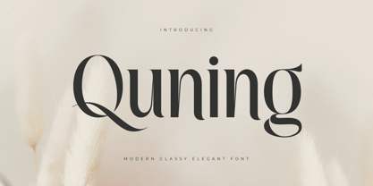 An Elegant serif font that we created special for elegant branding needs, with extra alternates in unique shape will be ready to add value of your brand. It so nice to leverage designer or product owner that need solutions to make their design look more classy and modern. And specially for Quning font, We prepared any alternate characters to help you create unlimited variations for your creative needs. Quning Modern Classy Elegant Serif Font ready with: Any options to get creative variations (combination of Alternate characters) Preview as a inspirations that you can do with Quning font Ready with Lowercase and Uppercase characters Wish you enjoy our font. :)
 - Holigan Style by Sensatype Studio,
$15.00 Holigan is a Modern Sport font that created special for Branding, Title and more stand out typography needs, with extra alternative styles that make your design more memorable. It's so perfect to add your style and headline overview for sport, technology, actions, and fighting theme. And specially for this font, we crafted for bold action style and modern feels so enjoy to create any project that will show your main idea out. Holigan Modern Sport font ready with: 4 Font variation characters prepared to get creative alternatives Preview as a inspirations that you can do with Holigan font Ready with All Uppercase characters Wish you enjoy our font. :)
 - Sheesh by Sanyukt Foundry,
$25.00 Sheesh is a bold and playful font designed with the current trend of combination fonts for daring nostalgia branding trends in mind. It's perfect for branding projects aimed at Gen Z, who are known for their bold and fun style. This font features many stylistic sets and funky icons, making it easy to create eye-catching designs that appeal to this demographic. The font has a modern and fresh look that can add a touch of whimsy to any project. Whether you're creating a logo, a website, or a social media post, Slinky is a font that will help you stand out and make a lasting impression on your target audience.
 - Ruckle by Gassstype,
$25.00 Hello Everyone, introduce our new product Font RUCKLE is a Rough Brush Font.This is a Textured Natural Style and classy style with a clear style and dramatic movement. This font RUCKLE is great for your next creative project such as logos, printed quotes, invitations, cards, product packaging, headers, Logotype, Letterhead, Poster, Design this font is great for your creative projects such as watermark on photography, and perfect for logos & branding, invitation,advertisements,product designs, stationery, wedding designs,label ,product packaging, special events or anything that need handwritting taste. That is has charming, authentic and relaxed characteristic more natural look to your text. You can activate Alternate OpenType panel.
 - Le Cirque by IKIIKOWRK,
$17.00 Introducing Le Cirque - Parade Type, created by ikiiko. A circus vibes with a touch of vintage stye. Le Cirque has both modern and retro look. The perfect one to create layout design in 60s or 70s design projects. This font have unique stylistic set, alternates and swashes that to give to your brand logo, poster, unique & vintage stuff, and another project to a have unique or vintage look. What's included? Uppercase & Lowercase Number & Punctuation Complete Stylistic set Swashes & Alternates Multilingual Support Get also a good offer & FREEBIE at our site : www.ikiiko.com Enjoy our font and if you have any questions, you can contact us by email : ikiikowrk@gmail.com

