7,458 search results
(0.013 seconds)
- Degaule by Forberas Club,
$16.00 Degaule is handwritten font. Will be nice if you application this font for cute, special moment, beauty, tees, simple word quotes, wedding party, invitation.
 - Gelatique by Forberas Club,
$16.00 Gelatique font create with carefully monoline style. Can be use for wedding party, invitation, memorable moment, love story and many more with special moment.
 - Tomiley by Forberas Club,
$16.00 Tomiley font create with carefully monoline style. Can be use for wedding party, invitation, memorable moment, love story and many more with special moment.
 - Illinoise by Just in Type,
$18.00Illinoise is a mutation of one of the most beautiful screen fonts ever. But, there are no straight lines. Everything is shaking. Let's party! - Rainee by Forberas Club,
$16.00 Rain is modern handwritten. Recommended to use this font for signature, wedding party, invitation, memorable moment, love story and many more with special moment.
 - Ratumba by Forberas Club,
$16.00 Ratumba font create with carefully. Can be use for wedding party, invitation, cute, tag, memorable moment, love story and many more with special moment.
 - Melody Cinta by Forberas Club,
$16.00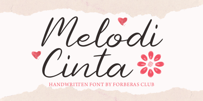 Melody Cinta is modern handwritten. Recommended to use this font for wedding party, invitation, memorable moment, love story and many more with special moment.
 - Sweet Rolling by Forberas Club,
$16.00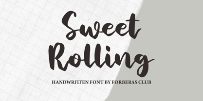 Sweet Rolling is modern handwritten. Recommended to use this font for wedding party, invitation, memorable moment, love story and many more with special moment.
 - Nori by Positype,
$49.00 First, the important information…Nori is a hand-lettered typeface that contains over 1100 glyphs, 250 ligatures, 487 alternate characters, 125+ swash and titling alternates, lining and old style numerals. To make sure it is perfectly clear—Nori is the result of brush and ink on paper. The textures produced in each glyph are real and the imperfections are intentional and add to the sincerity of the letters. I say this to be as blunt as possible in order to avoid confusion and to frame what this typeface represents—calligraphic, handwritten letters captured digitally for their warmth and poetic variation for print and screen. Like my handwritten, calligraphic or brush-driven faces before it (the Baka series and the TDC2 2010 winning typeface, Fugu), Nori is a product of my analog and digital hand. To view the words and sentences formed by this typeface is to look at how my hands, yes hands, make letters. The fluidity, as well as the irregularity, is human, honest and intentional—to do so lets the brush I am holding breathe life into each letter. Once digital, any number of points and repetitive processes can’t mask its influences—and I like that. The brush, a simple instrument, my tool, my friend designed to emulate traditional Japanese sumi-e brushes... the Pilot Japan Kanji Fude brush pen. Each letter, each variation was written over and over again until I found the right combination. From there, each was scanned, digitized and optimized. Points were removed in order to ‘clean’ the glyphs up some but I did not want to compromise the integrity of the actual brush stroke. Once this base set of characters (about 350) were completed, the thoughtful manipulation of the glyphs, their gestures and forms were further expanded to solidify the embellishments used within the ligatures, alternates, swashes and additional features. This process was admittedly self-indulgent to an extent. I wanted the words created with this typeface to have the flexibility of variation and cohesiveness of movement that someone fluidly producing these letters by hand might have. I hope you enjoy this typeface as much as I did during the six months working on it. A specimen and style guide is included with the purchased of Nori.
 - Disco Jaw by PizzaDude.dk,
$20.00 The beat is on, the piano plays the funky tunes and the rhythm guitars do their best to get the party started! The party starts with your design - use the Disco Jaw font if you are working with a theme that involves comic, kids, commercial, arts and crafts, posters ... anything that needs a fresh kick! Included are jumpy alternative letters, which makes your text look alive and kicking - and or course, there is multilingual support!
 - Pulp Fiction by Comicraft,
$19.00 The name's Heironymous Flask. Some of my acquaintances call me 'Hip.' Those that know me really well don't call me at all. In my game, you don't make friends. You make excuses. Like it says on the door, I'm a private hippopotamus. This is my story. This is my font. Features: Six weights (Regular, Italic, Bold, Bold Italic, Heavy & Heavy Italic) with upper and lowercase alphabets.
 - Simeon's Handwritten Blackletter by Simeon out West,
$20.00 Simeon's Handwritten Blackletter is the result of my desire to have my handwritten old English style writing available for my computer. It is a basic Gothic style font with my own touch to the lettering. Simeon's Handwritten Blackletter comes with full punctuation, a character set for most Western European based Latin alphabet languages. Being a decorative font, it works best at larger point sizes.
 - Contempo Elan by Poole,
$36.00Where's the party? Don't forget Contempo Elan! This stunning new font comes with it's own party ornaments. The right solution for any festive occasion, this super innovative face comes in two flavors. Contempo Elan Grand Script is a surprisingly elegant alternative to a more traditional formal script. Designed by Wesley Poole of Hawaii, this alphabet is definitely a hip script. Early reviews call this font "remarkable" and "a masterwork". Contempo Elan Ornamental is elegant and fun! Just perfect for those last minute Holiday announcements or any use that requires a classy, celebratory typeface, Contempo Elan Ornamental fits the bill. Equally at home on board the Enterprise or beckoning revelers at Mardi Gras, Contempo Elan belongs in every type library, just for fun. Party on. - Mc Lemore by Galapagos,
$39.00Back when OpenType hadn't yet opened and Apple was developing the Line Layout Manager called GX Typography I created a test font that I name after my stepdaughter, Kristen (now ITC Kristen). Not wanting to offend my wife I started on a font project and gave her name to this new set of glyphs, Roberta. Unfortunately, the name was already in use so I needed to find another name for the fonts. After September 11th I decided that there were people I'd met during my life who were truly cut from the cloth of the hero. Master Sargent McLemore of the 75th Ranger Battalion was one of these people. I met the Sarge when I was in basic training at Fort Gordon. I saw him 2 weeks before he died in 1970. All of the heroes we see on the silver screen pale in comparison to this man. John Wayne and Clint Eastwood both have played the type well, both could have taken lessons from the Sarge. - KG Primary Whimsy by Kimberly Geswein,
$5.00 This quirky font is a playful take on my This quirky font is a playful take on my KG Primary Penmanship.
 - Sangre BB by Blambot,
$20.00A handwriting font with a decidedly sexy, Mediterranean flair. Perfect for restaurant signage, menus, party invitations and more. Sangre includes a plethora of European characters. - Freunlaven JNL by Jeff Levine,
$29.00Freunlaven JNL is a wild and partying font with a name inspired by the nonsense verbage often uttered by Jerry Lewis in his comedy classics. - Girasol by Lián Types,
$35.00 This is a cute story about a mother and her son. :) About a decade ago my own mother got very interested in my work. She used to say my letters had so many swirls and dazzling swashes, and suggested my job seemed to be very fun. She wondered if she could ever try to make her own alphabet... Well, she is a civil engineer and a maths teacher, and appeared to be a little tired of exact sciences... I remember answering this, while she was listening with her typical tender look: -"Mamá... While type-design may be a really enjoyable thing to do, it also involves having a great eye and knowledge about the history of letters: nice curves and shapes require a meticulous study and, like it happens in many fields, practice makes perfect"-. Well, she raised her eyebrows at me. -"and so what?"- She didn't have any experience neither in the field of art nor in the field of graphic design so, I told her that if she really wanted to get into this she should borrow some of my calligraphic books from my beloved shelves in my office. So... she did. Some weeks after that, she came to me with many sketches made with pencils and markers: some letters where very nice and unique while others naturally needed some work. I remember she added ball terminals to all of her letters (even if they didn't need them) because that was one of the rules she imposed. After some back and forth, we had the basis for what would be today, ten years later, the seed of this lovely font Girasol. Her proposal was nice, something I was not accustomed to do, that’s why many years later I decided to watch it with fresh new eyes and finished it. While she was in charge of making the lowercase letters, I helped with the uppercase and also added my hallmark in the alternates, already seen in others of my expressive fonts. The result is an upright decorative font that follows the behavior of the copperplate nib with a naive touch that makes it really cute and useful for a wide range of products. Many alternates per glyph make Girasol a very fun to use font which will delight you. Above posters are a proof of that! This font is a gift for my mother, Susana, who, in spite of her exacts academic background, taught me that beauty can also be found in the imperfect. 1 NOTES (1) In my fonts I'm always in seek of the perfect curve. When I designed Erotica and Dream Script, I read about Fibonacci’s spirals!
 - Schnebel Sans Pro by URW Type Foundry,
$35.99 It took me 12 years to bring this extensive font family to completion. A lot has been changed, transformed, peeled and developed in all those years. For many of my projects I used it as my quarry and so it might have become something like a synthesis of all my imaginations and experiences. To me »Schnebel Sans« represents the optimal design of a contemporary grotesque that perfectly unites dynamics with statics. For copy text the typefaces are very legible, neutrally and remain in the background, but despite this generate the necessary tension when set as headlines. »Schnebel Sans« is available in 48 different styles. It is available as a Pro Font, containing West, East Greek, and Cyrillic or as the Schnebel Sans ME, also containing Arabic and Hebrew. The scripts include small caps and various figure sets. This big range of styles from Thin to Black and from Compressed to Expanded offer many possibilities for design and fulfill all requirements for a professional use. Because of the supplement of several non-Latin character sets, the »Schnebel Sans« is perfectly suitable for global services too. Volker Schnebel, 2016
 - Schnebel Sans ME by URW Type Foundry,
$35.99 It took me 12 years to bring this extensive font family to completion. A lot has been changed, transformed, peeled and developed in all those years. For many of my projects I used it as my quarry and so it might have become something like a synthesis of all my imaginations and experiences. To me »Schnebel Sans« represents the optimal design of a contemporary grotesque that perfectly unites dynamics with statics. For copy text the typefaces are very legible, neutrally and remain in the background, but despite this generate the necessary tension when set as headlines. »Schnebel Sans« is available in 48 different styles. It is available as a Pro Font, containing West, East Greek, and Cyrillic or as the Schnebel Sans ME, also containing Arabic and Hebrew. The scripts include small caps and various figure sets.This big range of styles from Thin to Black and from Compressed to Expanded offer many possibilities for design and fulfill all requirements for a professional use. Because of the supplement of several non-Latin character sets, the »Schnebel Sans« is perfectly suitable for global services too. Volker Schnebel, 2016
 - Grund by SIAS,
$29.90 GRUND is a new fontographic adaption of a remarkable 1920s epigraphical find in the city of Leipsic. This old well-known European trade fair hotspot struggled with a severe shortage of exhibition space around 1920. The solution was to dig deeper into the matter – literally – and 1924 the world’s first underground trade fair exhibition hall was opened right under the city’s central market square. After several changes of use during the past decades the sophisticated Art Deco entrance structure (architect: Otto Droge) was re-opened in December 2013 as a gateway to a new subway rail track. – The original brass lettering of the UNTERGRUNDMESSHALLE MARKT has been retrieved – and served as the inspiration for this new and unique font. If you’d like to see more exceptional Art Deco type, have a look at my Arthur series. __________________________________________________________________________________________
 - Fat Freddie by CastleType,
$59.00 A bold, playful typeface named after my late and much-missed grey cat, Freddie, who was my best buddy for 18 years.
 - Bauhaus Bugler Soft by Breauhare,
$35.00 Take Bauhaus Bugler, dip it in chocolate, and what do you get? Bauhaus Bugler Soft, of course! Or dip it in butter! You can achieve all sorts of yummy, appealing images with the softness of Bauhaus Bugler Soft, whether it be food, cosmetics, fabric softener, or any number of other fluffy things! Unlike its fellow Bugler fonts, Bauhaus Bugler Soft’s design never appeared in Harry Warren’s 6th grade class newsletter, The Broadwater Bugler, but its design came about during that same period in 1975. Because of this, it has been officially designated an honorary Bugler font! Its theme of broad curves that leap over and under conjure visions of fashion and high-end department stores with their dress boxes and shopping bags, plus hair products, cosmetics, couture, and other stylish personal merchandise of the highest caliber. Bauhaus Bugler Soft also has an art deco flavor, especially when all capitals are used. It comes with two alternate versions of the upper and lower Y to give users more freedom of choice. Put Bauhaus Bugler Soft in your “haus” today! Digitized by John Bomparte.
 - BN-Gangsters - Unknown license

- Roughler by Forberas Club,
$16.00 Roughler is brush font with clean and simple font. This font can apply to banner, wallpaper, tees, music theme, cover and party moment with brush style.
 - Antoni Bokir by Forberas Club,
$16.00 Antoni Bokir is brush font with clean and simple font. This font can apply to kids tees, banner, wallpaper, cover and party moment with brush style.
 - Sirena by Stereo Type Haus,
$10.00 Inspired by hand-painted signage found in ”Little Haiti” Miami, Florida. Sirena’s quirky curls, dynamic slant, and organic nuances capture the essence of Latino street vernacular.
 - 70toxina by FSdesign-Salmina,
$39.00 70toxina. 70s & 80s combined. Both Seventies and Eighties celebrate their comeback in form of a revival, combined in a font. Let’s have a party with 70toxina!
 - ITC Aspera by ITC,
$29.99ITC Aspera is the product of graphic experimentation. Olivera Stojadinovic, who designed the face, recalls, Over the last 15 years, I have made several small prints using Cyrillic characters. Often, I made my first sketches with a special pointed brush which was difficult to manipulate well, but once tamed, gave me interesting results." Stojadinovic decided to see if she could reproduce the unique brush quality in digital form. "The idea was to preserve the look of strokes made by my brush, so I kept the scanned shapes as close as possible to the originals, making interventions just to maintain consistent proportions, slope and weight." While this typeface is not a connecting script, Stojadinovic did create a number of letters, such as the 'o' and 's' that are natural connecting characters. She also drew a set of ligatures and matching ornaments to accompany the design." - Intouch Sky by Yumna Type,
$16.00 Looking for a gorgeous font to captivate your audience, costumers, clients, or party guests? Intouch Sky-An Elegant Handwritten Font. This adorable, fun, and stylish font can be used for a host of different content needs and projects. Create gorgeous party invitations, printed quotes, standout packaging, or beautiful t-shirts! You can even use it to create amazing headings, logos, resumes, and social media graphics. Features: Beautiful Ligatures Alternates Swashes PUA Encoded Multilingual Support Numerals and Punctuation
 - Able by T-26,
$39.00The history of Able’s connection with the Harry Potter phenomenon is really up in the air. It’s a catch-22 in this business - you either promote your own work and negotiate expensive exclusive licenses, or you work with a promoter and sell your designs to anyone and everyone. It could have been an in-house designer at Rowling’s publisher, Scholastic, or a freelancer who proposed Able for the headings and such. The responsible party licensed it from T26, and JK Rowling’s storytelling made it a star. (I suppose it’s ironic that there’s a whole lot of unwritten history in the typography business.) Able’s rise to fame really is a classic love story between reading and type design. If the books weren’t so popular, Able might still be waiting for some Mexican fast food chain to pick it up for packaging design. The movie deal certainly made the font all the more recognizable, what with its merchandising campaign. Popularity can also cripple a great decorative face. It’s always being recognized as “The Harry Potter Font.” It might just have to wait a few decades for the Potter phenomenon to subside to be freed from the “Chamber of Pigeonholed Fonts.” In the meantime, I’m sure that a lot of fledgling graphic design apprentices are reading their new Potter books, being charmed by the idea of type design when they’re not turning the pages too fast to notice. - Roundabout by URW Type Foundry,
$35.99 Roundabout is a typeface that is extracted from an ellipse shape. Each and every character started at the same geometrical figure. By cutting it up in sections, twist and rotate the separate characters could be build. The ellipse provides this typeface with evident and smooth looking features. The name Roundabout is misleading, an ellipse is not round. But the word Roundabout has a nice ring to it and it seems to fit this typeface perfectly. The Roundabout as we know it is a place where the traffic circles. Sometimes in the greater metropoles it jams like clotting veins. Various exits are presented for those who know which way to go, for those who don’t it seems an eternal treadmill. Unlike my typeface, that seems rather careless, light weighted and knows her way around. A roundabout in a child’s mind is a playful carrousel or a merry go round. Merry go round has the sweetest sound and a match is found. My Roundabout is a joyful, optimistic and open typeface, which can be used over and over and over again for many or any purposes. ----- Roundabout ist eine Schrift die aus der Form einer Ellipse entstand. So teilen alle einzelnen Zeichen denselben geometrischen Ursprung. Durch das zerteilen, verdrehen und verflechten der elliptischen Grundform konnten die separaten Zeichen so geformt werden, dass sie einen klaren und weichen Charakter erhielten. Der Name Roundabout scheint auf den ersten Blick etwas irreleitend - ist eine Ellipse ja nicht wirklich rund. Er hat aber einen schönen Klang und doch eine tiefe Verbindung zu dieser Schrift. In unseren Gedanken ist Roundabout ein Kreisverkehr: Manchmal, in großen Städten, kann er blockieren, so wie eine verstopfte Ader. Verschiedenste Auswege zeigen sich denen, die ihr Ziel kennen; für alle anderen erscheint dieser Ort wie eine endlose Schlaufe. Dieses Bild widerspricht dem Auftreten meiner Schrift, welche eher sorglos und leichtfüßig ist; sie kennt ihren Weg. In dem Kopf eines Kindes jedoch ist ein Roundabout ein verspieltes Karussell, ein „merry go round“. ,,Merry go round“ klingt bezaubernd und so fiel die Entscheidung. Meine Roundabout ist eine fröhliche, optimistische und offene Schrift, die immer und immer wieder genutzt werden kann, zu jedem erdenklichen Zweck.
 - Brush Type Italic by Brush Art Design Office,
$52.00My name is Teruyoshi Matsui. I am a Brush Artist living in Japan. I artistically write the letters of the alphabet with a Japanese brush. I believe I am the only one in the world as a brush artist. I once declared on my blog that I would be a world artist. This is my ultimate goal once my name is recognized. I have created the font “ BrushType Italic”. It is an artistic product of mine. I consider this my best font. I am sure you can agree that it is “cool and beautiful”. I know you will be very proud if you use my font of BrushType Italic. Everyone will be envious of your works. I truly believe this. Thank you. - Copperplate Deco by Wiescher Design,
$39.50 Copperplate Deco is my sparingly decorated version of my Copperplate fonts. They can be used as standalone fonts. Yours once more very glitzy Gert Wiescher
 - Ravenholm by NREY,
$19.00 Hello, Friends! Introducing Ravenholm -a new modern gothic font family. Font looks amazing as single words and as full text blocks. It has support for many languages as: Czech, Danish and Norwegian, Deutsch, English, Espanol, French, Italiano, Magyar, Nederlands, Portuguese, Finnish, Swedish, Turkish, Russian etc. Ravenholm font family cast: - Ravenholm Color (color OTF font) - Ravenholm Bold - Ravenholm Inline - Ravenholm Thin - Ravenhol Slant WARNING #1 Color fonts are pretty new technology - they currently show up in Photoshop CC 2017+, Illustrator CC 2018 and some Mac apps. Learn more about color font support on third-party apps here: https://www.colorfonts.wtf/ Enjoy it on your best projects! For any help regarding this font, please feel free to contact me through my profile page and I’ll be glad to offer support. Thanks for buying!
 - Afrobeat by Resistenza,
$39.00 Inspiration The pounding tribal rhythms of Afrobeat music is expressed through this psychedelic brand new font, Afrobeat. Every letter becomes art as every letter is elegantly placed side by side, like music notes, creating music for the eyes. Afrobeat is a musical style performed by many African artists such as Fela Kuti, Femi Kuti, Antibalas and many more, which is a fusion of jazz,funk, and psychedelic rock, originating from the 60s and was based on the political movements of Nigeria. The Font This font is perfect for when you want to use eye-catching big texts for anything from posters and flyers for concerts, events, parties, to CD covers, advertisements, and art, but it’s especially striking for printed projects. Check out also ‘Afrobeat light’
 - Beachclub by Royalclub,
$12.00 Get some beach holiday vibe so needed during a crazy year in the city! BEACHCLUB fonts are inspired by tropical islands hand-painted signs. Bring the summer beach parties feeling with sunshine, music and strong cocktails. We crafted digital versions of woodcrafted letters as if it was made for a beach bar in Hawaii. Then the time, sea and sand did the rest. Use our fonts to bring this fun and relaxed energy to your graphics! Key Features: BEACHCLUB fonts will be a great help and perfect fit for various posters, banners, typography and illustrations. Fonts can be used for both personal and commercial projects. Credits: BEACHCLUB clean and BEACHCLUB grunge are designed by Royalclub. For purchasing the full kit (brushes/frames) proceed to www.royalclub.sh/royalclub-supplies
 - Slankie by Forberas Club,
$16.00 Slankie is modern handwritten with signature style. Recommended to use this font for signature, farmhouse, wedding party, invitation, memorable moment, love story and many more with special moment.
 - Bodoni Classic Free Style by Wiescher Design,
$39.50 Bodoni Classic Free Style is my really fat, high contrast free flowing, liberated designed, script-like non-script extension to my ever expanding Bodoni Classic family.
 - Physe by Typotheticals,
$5.00 Physe. Physe is a basic set of fonts, designed for scrapbooking and general use. It comes in a variety of versions, with a light version, expanding up to bold. Many hurdles were taken to finalize this version, both physical and electronic. Like all of us, as I grow older, my glaucoma keeps pace with my arthritis, while I look on in amusement, hedging my bets on which will be the one to finally complete my retirement.
