10,000 search results
(0.033 seconds)
- Kyrial Display Pro by Mostardesign,
$29.00 Designed in 2011 by Olivier Gourvat, this font family has generous proportions with a range of weights make it a versatile family for print and web design work. Kyrial Display Pro is also a practical typographic choice to express strength, elegance, and conceptual clarity. Kyrial offers lots of OpenType goodness and broad language support.
 - Prismatic Spirals Pro by MMC-TypEngine,
$182.00 PRISMATIC SPIRALS PRO FONT! The Prismatic Spirals PRO is a Decorative Type-System and ‘Assembling Game’, itself. Settled in squared pieces modules or tiles, embedded by unprecedented Intertwined Prismatic Structures Design, or intricate interlaced bars that may seem quite “impossible” to shape. Although it originated from the ‘Penrose Square’, it may not look totally as an Impossible Figures Type of Optical Illusions. More an “improbable” Effect in its intertwined Design, that even static can seem like a source of Kinetical Sculptures, or drive eyes into a kind of hypnosis. Prismatic Spirals Pro has two related Typefaces both more basic or easier to use versions, the Default Family plus its “bold” braided version Prismatic Interlaces… PRO provides a more advanced, complex, and twisted Design, plus requires to be typed alternating caps. Instructions: Use the Map Font Reference PDF as a guide to learn the 'tiles' position on the keyboard, then easily type and compose puzzle designs with this font! All alphanumeric keys are intuitive or easy to induce, you may easily memorize it all! Plus, often also need to consult it! *Find the Prismatic Spirals Pro Font Map Reference PDF Here! (!) Is recommended Print it to have the Reference or open the PDF to also copy and paste, when consulting is required or when it may be difficult to access, depending on the keyboard script or language. The 2 glyphs sets are separated in colors for facilitating. Also use the Map Font with key captions or switch to it for ensure that the characters are alternating between both uppercase and lowercase letters as other Keys as numbers, marks, and punctuation along the strings, holding Shift one by one or actually two by two. As a Tiles Type-System, the line gap space value is 0, this means that tiles line gaps are invisibly grouted, so the user can compose designs, row by row, descending to each following row by clicking Enter, same as line break, while advances on assembling characters. Background History: The first sketches of my Prismatic Knots or Spirals Designs dates back then from 2010, while started developing hand-drawn Celtic Knots and Geometric Drawings in grid paper, while engage to Typography, Sacred Geometry and the “Impossible Figures” genre… I started doing modulation tests from 2013, until around 2018, I got to unravel it in square modules or tiles from the grid, then idealized it as fonts, along with other Type projects. This took 13 years to come out since the first sketches and 6 months in edition. During the production process some additional tiles or missing pieces were thought of and added to the basic set, which firstly had only the borders, corners, crossings, nets, Trivets connectors or T parts and ends, then added with nets and borders integrations. Usage Suggestions: This type-system enables the user to ornate and generate endless decorative patterns, borders, labyrinthine designs, Mosaics, motifs, etc. It can seem just like a puzzle, but a much greater tool instead for higher purposes as to compose Enigmas and use seriously. As like also to write Real Text by assembling the key characters or pieces, this way you can literarily reproduce any Pixel Design or font to its Prismatic Spirals correspondent form, as Kufic Arabic script and further languages and compose messages easily… This Typeface was made to be contemplated, applied, and manufactured on Infinite Decorative Designs as Pavements, Tapestry, Frames, Prints, Fabrics, Bookplates, Coloring Books, Cards, covers or architectonic frontispieces, storefronts, and Jewelry, for example. Usage Tips: Notice that the line-height must be fixed to 100% or 1,0. In some cases, as on Microsoft Word for example, the line-height default is set to 1,15. So you’ll need to change to 1,0 plus remove space after paragraph, in the same dropdown menu on Paragraph section. Considering Word files too, since the text used for mapping the Designs, won't make any literal orthographical sense, the user must select to ignore the Spellcheck underlined in red, by clicking over each misspelled error or in revision, so it can be better appreciated. Also unfolding environments as Adobe Software’s, the Designer will use the character menu to set body size and line gap to same value, as a calculator to fit a layout for example of 1,000 pts high with 9 tiles high, both body size and line gap will be 111.1111 pts. Further Tips: Whenever an architect picks this decorative system to design pavements floor or walls, a printed instruction version of the layout using the ‘map’ font may be helpful and required to the masons that will lay the tiles, to place the pieces and its directions in the right way. Regarding to export PNGs images in Software’s for layered Typesetting as Adobe Illustrator a final procedure may be required, once the designs are done and can be backup it, expanding and applying merge filter, will remove a few possible line glitches and be perfected. Technical Specifications: With 8 styles and 4 subfamilies with 2 complementary weights each (Regular and Bold) therefore, Original Contour, Filled, Decor, with reticle’s decorations and 2 Map fonts with key captions. *All fonts match perfectly when central pasted for layered typesetting. All fonts have 106 glyphs, in which 96 are different keys with 2 versions of each of both caps and shift keys, plus a few repeated for facilitating. It was settled this way in order for exchanging with its Prismatic relative fonts which has only 48 different keys repeated twice. Concerning tiles manufacturing and Printed Products as stickers or Stencils, any of its repeated pieces was measured and just rotated in different directions in each key, so when sided by other pieces in any direction will fit perfectly without mispatching errors. Copyright Disclaimer: The Font Software’s are protected by Copyright and its licenses grant the user the right to design, apply contours, plus print and manufacture in flat 2D planes only. In case of the advent of the same structures and set of pieces built in 3D Solid form, Font licenses will not be valid or authorized for casting it. © 2023 André T. A. Corrêa “Dr. Andréground” & MMC-TypEngine.
 - Calligraphia Latina Versals by Intellecta Design,
$23.90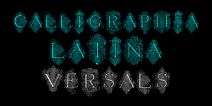
- Kyrial Sans Pro by Mostardesign,
$- Designed in 2011 by Olivier Gourvat, this font family has generous proportions with a range of weights make it a versatile family for print, text, signage, branding and web design work. Kyrial Sans Pro offers lots of OpenType goodness and broad language support.
 - Special Edition JNL by Jeff Levine,
$29.00 The Teapot Dome scandal was a 1920s bribery scandal involving Secretary of the Interior Albert Bacon Fall. Fall leased Navy petroleum reserves at Teapot Dome in Wyoming [along with some California reserves] at low rates with no competitive bidding. The San Francisco Examiner for Feb. 20, 1924 ran the two line headline “U.S. Senator Named as Oil Stock Speculator; Whitney to Face Quiz Today on Slush Fund”. The headline was set in a condensed, slightly squared sans serif typeface. This is now available as Special Edition JNL in both regular and oblique versions.
 - Arial Narrow OS by Monotype,
$54.99Arial was designed for Monotype in 1982 by Robin Nicholas and Patricia Saunders. A contemporary sans serif design, Arial contains more humanist characteristics than many of its predecessors and as such is more in tune with the mood of the last decades of the twentieth century. The overall treatment of curves is softer and fuller than in most industrial style sans serif faces. Terminal strokes are cut on the diagonal which helps to give the face a less mechanical appearance. Arial is an extremely versatile family of typefaces which can be used with equal success for text setting in reports, presentations, magazines etc, and for display use in newspapers, advertising and promotions. - Arial Windows compatible by Monotype,A contemporary sans serif design, Arial contains more humanist characteristics than many of its predecessors and as such is more in tune with the mood of the last decades of the twentieth century. The overall treatment of curves is softer and fuller than in most industrial-style sans serif faces. Terminal strokes are cut on the diagonal which helps to give the face a less mechanical appearance. Arial is an extremely versatile family of typefaces which can be used with equal success for text setting in reports, presentations, magazines etc, and for display use in newspapers, advertising and promotions.
- Romance Fatal Goth Versal - Personal use only

- 5 Fingered Goth SWTrial - Unknown license

- BM spiral Cap Cyr - Unknown license

- Gothic Special Normal Italic by Wooden Type Fonts,
$15.00 A revival of one of the popular wooden type fonts of the 19th century, suitable for text or display, short descenders, tall ascenders, the narrow, italic version, completing the Gothic Special family of 5 fonts in total, sans serif.
 - Gothic Special Medium Italic by Wooden Type Fonts,
$15.00 A revival of one of the popular wooden type fonts of the 19th century, suitable for text or display, short descenders, tall ascenders, the narrow, italic version, completing the family of 6 fonts in total, sans serif.
 - Varial Two Super Rounded by Paavola Type Studio,
$21.00 Varial Two typefaces are new and updated versions of Varial family created 2014: Extra-condensed Opentype™ sans-serifs with small caps, extended character set (european languages support) and extra features (fractions, ligatures and alternatives). Varial Two Super Rounded family is versatile in all design applications, for example all headlines, branding, display use, infographics and more!
 - Calligraphia Latina Versals Two by Intellecta Design,
$21.90 - XXII BLACK-BLOCK-SERIFA by Doubletwo Studios,
$22.22
- Square Line Icons Social by Howcolour,
$17.00 The square icons focus on maximizing the meaning by minimizing the symbols. Let your viewers understand your data without disorientation. Use a metaphorical icon library, designed for fast, intuitive human recognition.
 - Arial for Ortho Clinical by Monotype,
$45.99Arial was designed for Monotype in 1982 by Robin Nicholas and Patricia Saunders. A contemporary sans serif design, Arial contains more humanist characteristics than many of its predecessors and as such is more in tune with the mood of the last decades of the twentieth century. The overall treatment of curves is softer and fuller than in most industrial style sans serif faces. Terminal strokes are cut on the diagonal which helps to give the face a less mechanical appearance. Arial is an extremely versatile family of typefaces which can be used with equal success for text setting in reports, presentations, magazines etc, and for display use in newspapers, advertising and promotions. - 99 Names of ALLAH Spiral by Islamic Calligraphy75,
$12.00 We have transformed the “99 names of ALLAH” into a font. That means each key on your keyboard represents 1 of the 99 names of ALLAH Aaza Wajal. The fonts work with both the English and Arabic Keyboards. We call this Calligraphy "Spiral" because of the spiral like design. The first "Alef" has a "hamzit wasel", this indicates that you can pronounce the names both ways, "AR-RAHMAAN" or "R-RAHMAN". (in the zip file you will find a pdf file explaining the differences in the "harakat", pronunciation and spelling according to the Holy Quran). The "Ye" doesn't have 2 dots at the end of a name, instead we chose to include a small "ye" on the letter "ye". Also, we used the traditional "soukoun" instead of the Quranic "soukoun". Decorative letters used in this calligraphy: "Mim, Aain, Sin, HHe, He, Kaf, Alef & Ye". Purpose & use: - Writers: Highlight the names in your texts in beautiful Islamic calligraphy. - Editors: Use with kinetic typography templates (AE) & editing software. - Designers: The very small details in the names does not affect the quality. Rest assured it is flawless. The MOST IMPORTANT THING about this list is that all the names are 100% ERROR FREE, and you can USE THEM WITH YOUR EYES CLOSED. All the “Tachkilat” are 100% ERROR FREE, all the "Spelling" is 100% ERROR FREE, and they all have been written in accordance with the Holy Quran. No names are missing and no names are duplicated. The list is complete "99 names +1". The +1 is the name “ALLAH” 'Aza wajal. Another important thing is how we use the decorative letters. In every font you will see small decorative letters, these letters are used only in accordance with their respective letters to indicate pronunciation & we don't include them randomly. That means "mim" on top or below the letter "mim", "sin" on top or below the letter "sin", and so on and so forth. Included: Pdf file telling you which key is associated with which name. In that same file we have included the transliteration and explication of all 99 names. Pdf file explaining the differences in the harakat and pronunciation according to the Holy Quran. --------------------------------------------------------------------------------------------------------------------------- Here is a link to all the extra files you will need: https://drive.google.com/drive/folders/1Xj2Q8hhmfKD7stY6RILhKPiPfePpI9U4?usp=sharing ---------------------------------------------------------------------------------------------------------------------------
 - matrix - Unknown license

- Droid Sans - 100% free

- Circuitry - Unknown license

- TR-909 - Unknown license

- Advanced Pixel-7 - Personal use only

- Binary X BRK - Unknown license

- LT Highlight - 100% free

- D3 Smartism TypeA - Unknown license

- Gravitate Segments BRK - 100% free

- I2ArabiaConsole - Unknown license

- Mainframe BB - Personal use only

- Bandwidth BRK - Unknown license

- LED - Unknown license

- Loyola Pro by RodrigoTypo,
$30.00 It is a redesign of "Loyola". This family contains Light, Regular, Bold, ExtraBold, Black, also a set of shadows and dingbats, special for short titles and children.
 - Rolling No One - Personal use only

- Telegrama - 100% free

- Serif Formal Oblique JNL by Jeff Levine,
$29.00 An advertisement in a 1936 issue of “The Film Daily” for the movie “Mr. Deeds Goes to Town” had much of its copy set in an extrabold typeface similar to the Beton/Stymie/Karnac group of slabserif designs. This is now available digitally as Serif Formal JNL in both regular and oblique versions.
 - Tabloid Edition JNL by Jeff Levine,
$29.00 The headline across the October 7, 1918 edition of the UK’s Daily Mail stated: "Germany Asks the Allies for Peace". Set in extrabold sans serif lettering, it’s now available digitally as Tabloid Edition JNL in both regular and oblique versions. This is another “redrawn from the headlines” typeface from Jeff Levine Fonts.
 - Blackletter - Personal use only

- Monoglyceride - Unknown license

- HACKED - Unknown license

- LIGHT EMITTING DIODES - Personal use only


