10,000 search results
(0.197 seconds)
- Blue Elfira by Qwrtype Foundry,
$14.00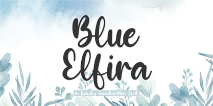 Proudly presenting: Blue Elfira Blue Elfira is a beautyful handwritten script font. Blue Elfira is perfect for product packaging, branding projects, magazines, social media, wedding invitations, or just used to express words above the background. Blue Elfira also comes with multillingual support. Enjoy the font, thank you!
 - Hubby Bunny by Almarkha Type,
$22.00 Hubby Bunny is a quirky and fun sans full of charm . It will take any DIY-project to the next level! Hubby Bunny is perfect for Craft , product packaging, product designs, label, branding projects, logo, wedding designs, social media posts, advertisements, watermark, invitation, stationery and any projects
 - Queeta Brush by Realtype,
$16.00 Queeta inspired by natural brush typeface. Written in fast motion using a little bit dry brush pen. It will give you a fresh and modern design and will look beautiful with offer, magazine mode, offer logo, product packaging, headers, posters, merchandise, social media greeting cards & more.
 - Grand Rainbow Script by Mindtype Co.,
$20.00 Grand Rainbow Script a beautiful modern calligraphy font with Extrude Shadow Style. Comes with 2 layered font handwritten, sophisticated flows. Grand Rainbow Script offers beautiful typographic harmony for a diversity of design projects, signature, stationery, logo, typography quotes, branding, wedding designs, social media posts, advertisements & product designs.
 - Musubi by Jonathan Ball,
$19.00 Musubi is juicy, flavorful display face inspired Tiki culture. Use it to make a big splash on posters and signage. This swinging face's special features include Small Capitals, tropical symbols, and decorative borders. Its funky and flared design is also perfect for a spooky Halloween bash!
 - Gaykin by Muksal Creatives,
$15.00 Gaykin Modern Display Vintage Font, special glyphs, ornament and multilingual support. It's a very versatile font that works great in large and small sizes. Perfect for editorial projects, Logo design, Clothing Branding, product packaging, magazine headers, or simply as a stylish text overlay to any background image.
 - Albertiny by Nurf Designs,
$19.00 Albertiny comes with an awesome look and has a variety of alternative characters. Albertiny is the perfect fit for all of your logos, branding, social media, and crafty DIY projects. It has OpenType features (alternates, swash, ligature) that can help you find different sensations with each use.
 - Spring Easter by Yoga Letter,
$14.00 "Spring Easter" is a very beautiful and elegant handwritten font. This font is very easy to use because it has been specially designed. Equipped with uppercase, lowercase, numerals, punctuation, and multilingual support. It is suitable for birthdays, weddings, engagements, spring, summer, Easter, stickers, banners, posters, and others.
 - Yellow House by Ef Studio,
$15.00 Yellow House is a hybrid typeface, combining a bubbly display with a serious serif. It gives a contemporary and quirky feel to any design you wish to add it to. This font is so versatile, perfect for branding, poster design, editorial design, logotype, packaging, and so on.
 - Poetry Darling by Ergibi Studio,
$15.00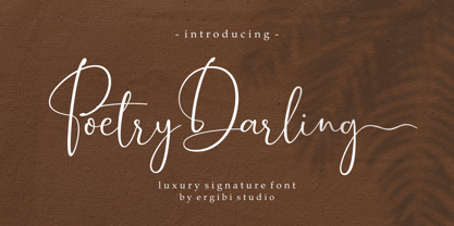 Poetry Darling is a beautiful and classy signature font presentation from Ergibi Studio. This font includes uppercase, lowercase letters, numbers, punctuation, symbols, binders and multilingual support. Poetry Darling is perfect for branding, photography, invitations, quotes, watermarks, advertisements, product designs, social media posts, stationery, labels, and more!
 - Rustler Barter by Showup! Typefoundry,
$20.00 RustlerBarter is an elegant display font inspired by the Art Deco era. It perfectly represents vintage aesthetics in a modern and minimalist way. The font includes special uppercase letters, alternate characters, and beautiful ligatures. Furthermore, the font is perfect for elegant logo design, packaging or invitation cards.
 - Blasqer by Yoga Letter,
$25.00 "Blasqer" is a retro font that has a unique and elegant shape. This font is very easy to use because it has been specially designed. Equipped with uppercase, lowercase, numerals, punctuations and multilingual support. It is suitable for logos, invitations, certificates, awards, film titles and so on.
 - The Boundaries by Dirtyline Studio,
$15.00 The Boundaries is a handmade Clean typeface, with authentic brush imperfections, and a very bouncy baseline It has a perfectly paired complimentary marker font , and a super handy set of bonus Swash. Ideal for logos, handwritten quotes, product packaging, header, poster, merchandise, social media & greeting cards.
 - Created by Muksal Creatives,
$17.00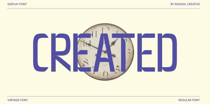 Created Modern Display Vintage Font, special glyphs, ornament and multilingual support. It's a very versatile font that works great in large and small sizes. Perfect for editorial projects, Logo design, Clothing Branding, product packaging, magazine headers, or simply as a stylish text overlay to any background image.
 - Crystal Angles by Balpirick,
$12.00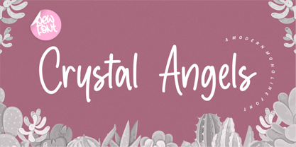 Crystal Angles is a Modern Monoline Font. Crystal Angles is a sweet and relaxed handwritten font. It is perfect for product packaging, branding projects, magazines, social media, wedding designs, or just used to express words on a background. This font includes, Crystal Angles also multilingual support.
 - Beron by Muksal Creatives,
$18.00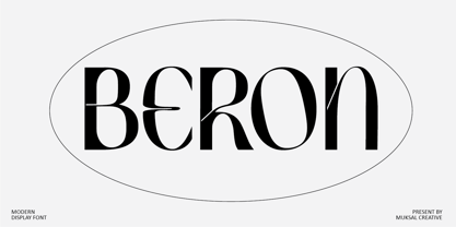 Beron Modern Display Vintage Font, special glyphs, ornament and multilingual support. It's a very versatile font that works great in large and small sizes. Perfect for editorial projects, Logo design, Clothing Branding, product packaging, magazine headers, or simply as a stylish text overlay to any background image.
 - Blotchy Bitter Texture by Dumadi,
$20.00 Blotchy Bitter – Playful Typeface is made with a regular version and a polka-dot textured version ready to perfect the design in your project. Blotchy Bitter is perfect for design, logos, social media, branding, advertising, product design, handwritten quotes, product packaging, headers, posters, merchandise, and other designs.
 - Knoxx by Krakenbox Studio,
$12.00 Knoxx is an extended sans serif typeface. The family includes 5 fonts with stylised caps for each. It has modern, classy, and cool. It’s a great font for fashion, apparel projects, signature, album cover, logo, branding, magazine, social media, & advertisements, but also works great for other projects.
 - Fiorella by Muksal Creatives,
$16.00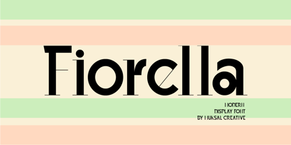 Fiorella Modern Display Font, special glyphs, ornament and multilingual support. It's a very versatile font that works great in large and small sizes. Perfect for editorial projects, Logo design, Clothing Branding, product packaging, magazine headers, or simply as a stylish text overlay to any background image.
 - Vorvalla by Agny Hasya Studio,
$9.00 Vorvalla is a Gothic Decorative Display Serif Font Featured with Uppercase and Lowercase, Numerals, Punctuation, and OpenType Features. Perfect for your design projects like logos, branding, advertising, product designs, stationery, magazine designs, book/cover title designs, photography, art quotes, Special events, labels, product packaging, and more.
 - Heavy Black by Panritype Studio,
$17.00 Heavy Black is all capital brush font, made from real brush pen with original texture. it can work with any design project, such as clothing or street wear logos, headlines, social media, quotes, and more. The original texture will give a strong impression on your design.
 - MC Sarling by Maulana Creative,
$14.00 Sarling monoline script font. This font is good for logo design, Social media, Movie Titles, Books Titles, a short text even a long text letter and good for your secondary text font with signature or script typeface. Make a stunning work with Sarling font. Cheers, Maulana Creative
 - Barkeliy by Balpirick,
$15.00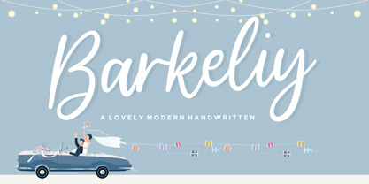 Barkeliy feels distinct and delicate. This flowing handwritten font is the perfect choice for a wide variety of designs. Fall in love with its incredibly versatile style and use it to create gorgeous wedding invitations, beautiful stationary art, eye-catching social media posts, and much more!
 - Makmure by Wasabib Type Foundry,
$11.00 Introducing by Wasabib Type Foundry Makmure is a Unique Display Font Hand drawn font with fun chubby characters. Equipped with various alternative characters to strengthen your visual design. Suitable for branding designs, logos, social media posts, posters etc. Features: Uppercase, Lowercase, Numeral, Punctuation, Multilingual, Alternates & Ligatures.
 - Hello Magnolia by Adante Creative,
$23.00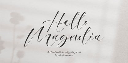 Hello Magnolia A Handwritten Calligraphy Font Hello Magnolia is perfect for product packaging, branding project, megazine, social media, wedding, or just used to express words above the background. Magnolia also multilingual support. Enjoy the font, feel free to comment or feedback, send me PM or email.
 - Montegi by Lemonthe,
$14.00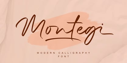 Montegi is a modern calligraphy font. it has a gentle and beautiful flow, and as a result it will elevate each of the designs you wish to create!. It’s the perfect font for wedding invitations, stationery, photography, social media posts, product packaging, greeting cards, and much more!
 - Allitta Calligraphy by AEN Creative Studio,
$12.00 Allitta is an elegant script font. It features beautiful swashes that will take your projects to the next level. Fall in love with its authentic feel and use it to create gorgeous wedding invitations, beautiful stationary art, eye-catching social media posts, and cute greeting cards.
 - MC Hittre by Maulana Creative,
$16.00 Hittre brush font. This font is good for logo design, Social media, Movie Titles, Books Titles, a short text even a long text letter and good for your secondary text font with signature or script typeface. Make a stunning work with Hittre brush font. Cheers, Maulana Creative
 - Jumping Spider by Tigade Std,
$35.00 Jumping Spider. This font is cuteness overload. It is for everyone, for various design purposes. This font is suitable for happy themes, cute, parties, holidays, kids, and many more. It is also suitable for logos, Cards, Branding, Social Media, Youtube Thumbnail, advertisements, Posters, and many others.
 - Kanakira by Jetsmax Studio,
$15.00 Kanakira is a modern sans typeface that is heavy on a geometric take of the neo-grotesque model, with a special ink-trap feature. Available in 9 weights from thin to heavy, Kanakira is ready to be your “go-to” font for any kind of project.
 - Cutie Shop by Goodigital13,
$20.00 This font can be used Such as logo branding, editorial design, stationery design, blog design, modern advertising design, card invitation, art quote, home decor, book/cover title, special events and any more. font suitable for logo, branding, greeting card, poster and any design that you create.
 - Ghetto by Bosstypestudio,
$12.00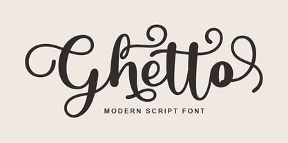 Ghetto is a modern script with handwriting, decorative characters, and dancing baselines! It's very suitable in use like blog headers, t-shirts, and for weddings, social media, product design, stationery, advertising, clothing, book covers, business cards, greeting cards, branding, merchandise, invitations and handmade quotes and more.
 - Blushmine by Adante Creative,
$23.00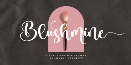 Introducing by Adante.Creative Proudly Present, Blushmine Blushmine A Beautiful Script Font Blushmine is perfect for product packaging, branding project, magazine, social media, wedding, or just used to express words above the background. Enjoy the font, feel free to comment or feedback, send me PM or email.
 - Raspail by Eurotypo,
$48.00 Raspail is a contemporary calligraphic font inspired by copperplate. Raspail has a great inclination with extensions of ascending and descenders strokes, widely ornate, and a special emphasis on the connection of the letters. It includes more than 350 alternates, 50 ligatures and a great set of ornaments.
 - Persephone NF by Nick's Fonts,
$10.00A bold headline font with a decidedly Greek flavor, based on an ATF font called Pericles. A great alternative to Lithos or Lithograph. Both versions of this font contain the Unicode 1252 Latin and Unicode 1250 Central European character sets, with localization for Romanian and Moldovan. - GL Tetuan by Fontbilisi,
$30.00 If you are searching for a stylish font to fit in a not very wide space, GL Tetuan is your font. Slab, modern but with a touch of oldstyle, compatible with many languages, including special characters and very nice ligatures. It includes Cyrilic, Georgian and Greek alphabets.
 - Biograf by Balpirick,
$15.00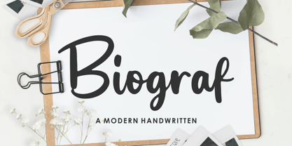 Biograf is a Modern Handwritten Font. Biograf is perfect for product packaging, branding project, megazine, social media, wedding, or just used to express words above the background. Biograf also multilingual support. Enjoy the font, feel free to comment or feedback, send me PM or email. Thank you!
 - Staylist by Jos Gandos,
$15.00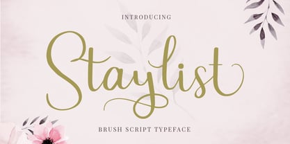 Staylist is a beautiful and cute script for any awesome projects such as wedding cards, watermarks, quotes, social media, posters, invitations, and more. This font is PUA encoded so it will be accessible in the Adobe Illustrator, Adobe Photoshop, Adobe InDesign, even work on Microsoft Word.
 - Silverway by KA Designs,
$14.00 Silverway is a mix of fun and elegance - with a unique take on modern calligraphy. This font has a strong brush texture, making all of your projects looking handwritten! Silverway is perfect for all modern projects, headings, branding, logos, advertisements, bloggers, business cards, social media and more!
 - Rumaisha by Zeenesia Studio,
$14.00 Proudly Present, Rumaisha Script Font. Rumaisha is an Elegant Calligraphy Font. Rumaisha is perfect for product packaging, branding project, megazine, social media, wedding, or just used to express words above the background. Rumaisha also multilingual support, and you get extras ligature and more alternate Enjoy the font!