10,000 search results
(0.013 seconds)
- St Lorie by Stereotypes,
$29.00 St Lorie is inspired by handmade lettering in logos, but it was drawn completely by the digital method.
 - DarkPix - Personal use only

- Sharka by PeGGO Fonts,
$10.00 Sharka is heavy sharp condensed system of 7 display typefaces widths, plus 7 italics and 7 alternative version on each family member, inspired on dangerous personality and aggressive reputation of the great white shark, it was thought to create the feel of high impact, high risk action on extreme situations, polemic public scandals, financial advertisement alert, the italic version specially creates the feel of velocity, powerful mechanical energy and related similar topics. Recommended to use in big headlines, magazine covers, advertisements, robust public visual calls, but also, if it applied with good taste and good typographical skills, could be a good choice not only for prints but also for web and digital media devices.
 - Pronto by Sudtipos,
$59.00 Pronto is a fast and breezy calligraphic handwriting font that moves to a timeless beat. Its catchy rhythm and casually artful forms make it a choice font not only for packaging, but also for signs and café bistro boards and menus. Alternative forms for almost every letter are provided within the font. Pronto is a single feature-rich font that includes extra alternate characters, as well as a wide range of Latin-based languages, including Turkish and the languages of Central and Eastern Europe and the Baltic region. To take advantage of all the OpenType features included in the font, please use within programs that support such advanced typography. Designed by Koziupa and digitized by Ale Paul.
 - Bellflower by Celebrity Fontz,
$24.99 Bellflower is a collection of highly ornamented letters contoured with flourishes and tiny bellflowers. Romantic and classic, this stylized collection looks like something straight out of a fairy tale typography garden and comes with a full set of extended accented characters. Accented characters are also included. This digital format allows colorizing of type and is a perfect font for publications that want to capture the feel of the Victorian and Art Deco eras. Article abstract: Bellflower is a collection of highly ornamented letters contoured with flourishes and tiny bellflowers. Romantic and classic, this stylized collection looks like something straight out of a fairy tale typography garden and comes with a full set of extended accented characters.
 - Stettinum Nicodemus Pro Sansum by Wardziukiewicz,
$20.00 Stettinum Nicodemus Pro is a project to revitalize lettering from tenement houses in Szczecin. The project includes the digitization of letter remains from ul. Kaszubska in Szczecin to form functional fonts. The main idea of the project was to preserve the disappearing remnants of Szczecin's typographic past, which, despite the span of glyphs limited by time, can be an inspiration for many future extensions of the already established family. Stettinum Nicodemus Pro Sansum is a family of typefaces consisting of 7 variations. The block structure with a regular structure and a relatively high minuscule allows for many different applications. Versions 700, 800 and 900 are intended for titles, headings and emphasis, typefaces 300 to 600 are text typefaces.
 - Toastie by Stiggy & Sands,
$29.00 Toastie began as a digitization of a film typeface from LetterGraphics known simply as "Flair 312". The original specimen included standard Capitals and Lowercase and Numerals, a bare bones character set. We've fleshed out the Toastie font to include a full standard character set, an extended international set, SmallCaps, etc. so it can be a powerhouse animated typestyle. See the last graphic for a comprehensive character map preview. Opentype features include: - Full set of Inferiors and Superiors for limitless fractions. - Tabular and Proportional figure sets. - Stylistic Alternates for a variation of the lowercase r characters. Approx. 591 Character Glyph Set: Toastie comes with a glyphset that includes standard & punctuation, international language support, and additional features.
 - Printers Drawer JNL by Jeff Levine,
$29.00 Printers Drawer JNL continues building on a library of letterpress illustrations, cartoons, ad builders, Art Deco ad panels, ornaments, embellishments, and general miscellany. The images are re-drawn from vintage source material, and this font is jam-packed with 89 images spread throughout most all of the standard keyboard positions. This is officially the 1000th release from Jeff Levine Fonts since its inception in January of 2006. Jeff Levine Fonts aims to preserve the almost-lost artwork and lettering styles of the past within a digital type format, and often recreates the designs complete with their evident flaws, idiosyncrasies and eccentricities; allowing for a “real world” and nostalgic look to the computer generated art projects of today.
 - Schwennel by Linotype,
$29.00Linotype Schwennel is part of the Take Type Library, selected from the contestants of Linotype’s International Digital Type Design Contests of 1994 and 1997. This prize-winning font was designed by the German artist Svenja Voss. The figures seem to have been somehow eroded, parts of some strokes are completely missing, contours seem washed away. The eye works to put the pieces together to form a meaningful series of figures. The second weight, lila+negro, completes the letter fragments of the lila weight. Missing pieces are filled in and contours completed, making the resulting text stronger and a bit more legible. Linotype Schnwennel is intended exclusively for headlines in larger point sizes. - Kristall Now Pro by Elsner+Flake,
$49.00 The design of Kristall Grotesk Now is based on a cut by Wagner & Schmidt, Leipzig, from the 30s of the last century as well as the digital version Kristall Grotesk MdK, created for the Stiftung Werkstattmuseum für Druckkunst. The implementation of the Kristall Grotesk MdK, a headline font, was deliberately created as a replica to create a faithful reproduction of the original. The design of the complete family Kristall Grotesk Now is based on the one cut Kristall Grotesk Buchschrift by Johannes Wagner GmbH, 1937, with its function as a text family. Designer: in parts Johannes Wagner GmbH, Redesign Elsner+Flake, Hamburg Designdate: 1937, 2009 Publisher: Elsner+Flake Design Owner: Elsner+Flake Original Foundry: in parts Johannes Wagner GmbH
 - Maxim by profonts,
$39.99Splendor was originally produced and released in 1930 by Schriftgu� AG, Dresden. The typeface was designed by Berlin designer Wilhelm Berg. Ralph M. Unger, who in the last few years has created a whole series of revivals and redesigns from the hot metal era, ?retrieved? this jewel of a typeface design, redesigning, complementing and digitally remastering it for profonts. Splendor is a broad nip, non-connecting handwriting script of timeless elegance, charm and beauty. It needs tight setting with plenty of space around it. The font contains a number of alternate characters: Two uppercase As, Ss (with descender); in addition, two uppercase Ms, Ns and Zs as well as two lowercase zs. - Horatio by ITC,
$29.00British designer Bob Newman's Horatio family is a delightful look back into the modernists experiments of the 1920s. This geometric sans serif design was created in 1971, and was originally released by Letraset. We are please to offer the family in digital form, in light, medium, and bold weights. Many designers during the 1920s were interested in reforming the alphabet, and wanted to reconcile letterforms with the machine and manufacturing technology of the age. Herbert Bayer at the Bauhaus was one of many designers who developed a universal alphabet," creating letters using only the simplest of geometric forms. Similar experiments in 1920s-style revivals were also created during the 1970s, most notably Herb Lubalin's ITC Avant Garde Gothic." - Stencil Patterns JNL by Jeff Levine,
$29.00Stencil Patterns JNL collects into one digital file a number of decorative stencil patterns from decades past. These charming illustrations were re-drawn by Jeff Levine using images of vintage oilboard stencils made over fifty years ago. While these are useful as stand-alone embellishments for any print projects, they can also be scaled and printed out onto card or acetate stock for hand-cutting as new stencil templates. A special note of thanks goes to fellow type designer and author, Leslie Cabarga. He supplied the bulk of the images used in designing this font file. There are left and right pointing hands on the parenthesis keys, and a decorative ampersand on its respective key. - Prescott by Page Studio Graphics,
$25.00The three fonts in the Prescott series are re-creations of 19th century favorites with an Old West flavor. The town of Prescott was the capital of Arizona Territory from 1864 until 1912, when Arizona was admitted to the Union, and the capital moved to Phoenix. In 1986 Page Studio Graphics started its digital foundry in Arizona. The fonts are thoroughly pair-kerned, including all accented characters. Auto-kerning should be turned on in your application program. The font packages include both TrueType and PostScript versions, and are available in either PC/Win or Macintosh format. In order to avoid serious problems, be sure not to install the same fonts in both TrueType and PostScript on the same computer. - Deco Wood Type JNL by Jeff Levine,
$29.00 When people usually think of wood type, images of bold and ornate designs reminiscent of the Old West or the Victorian Era come to mind. In truth, wood type was manufactured well into the late 20th century, and only fell out of favor when the letterpress was replaced by the offset press and computerized typesetting. Although there are hard-core collectors who have started a small resurgence in the preservation and use of wood type, it's the digital interpretations of these classic faces that see the most use in today's electronic layout work. Deco Wood Type JNL reinterprets one of these later designs, a bold sans with a decidedly Art Deco influence.
 - Burlesk by Kustomtype,
$25.00 Burlesk is a modern font family that originated from a Bollywood Hindi movie poster from the 1950's. Using 9 letters, a complete alphabet was made comprising of 360 characters. Everything is hand drawn and digitized afterwards. The Burlesk font family meets all the modern requirements that apply in the graphics sector. Don't take it too seriously with the designs and go for something else. You will probably enjoy it as much as those who see it. The Burlesk Font family is available in 2 styles - making it very popular as a great design on posters, flyers, magazines, packaging and all your other imaginative designs! You want the best deal for the best price? Grab the whole package!
 - Splendor by profonts,
$41.99 Splendor was originally produced and released in 1930 by Schriftgu� AG, Dresden. The typeface was designed by Berlin designer Wilhelm Berg. Ralph M. Unger, who in the last few years has created a whole series of revivals and redesigns from the hot metal era, ?retrieved? this jewel of a typeface design, redesigning, complementing and digitally remastering it for profonts. Splendor is a broad nip, non-connecting handwriting script of timeless elegance, charm and beauty. It needs tight setting with plenty of space around it. The font contains a number of alternate characters: Two uppercase As, Ss (with descender); in addition, two uppercase Ms, Ns and Zs as well as two lowercase zs.
 - Guadalupana by JVB Fonts,
$30.00 On October 12th 1976 a new basilica was inaugurated in honor and in gratitude to the Patron Saint, the Virgin of Guadalupe, loved by the Mexican people. This basilica was designed by the Mexican architect Pedro Ramírez Vázquez (died on April 16th 2012). It stands out by its hug spacious interior, generously decorated with bronze elements. The aesthetic value of these items even includes many signs and text inscriptions in a particular typeface and style, of which this font is a reinterpretation. The purpose of this project is to revival this eclesiastical written letter forms in bronze and taking them to digital format. I was inspired to this on my last trip to Mexico in September of 2012.
 - Nouveau Theme JNL by Jeff Levine,
$29.00 As long as there’s been movie theaters, those establishments became the perfect hideaway for couples who wanted to kiss, hug and snuggle without the watchful eyes of disapproving parents or the pesky attention of younger siblings. Such was evident in the [13 word] title of the 1919 composition “Take Your Girlie to the Movies (If You Can’t Make Love at Home)”. On the sheet music for this song, it is hand lettered in the Art Nouveau fashion of the time by a round nib pen, and made a perfect candidate to be redrawn as a digital typeface. The end result is Nouveau Theme JNL, which is available in both regular and oblique versions.
 - My Left Hand by Breauhare,
$35.00 My Left Hand is exactly what it is...well, not my actual flesh-and-blood left hand but my actual handwriting, and I know that it really is My Left Hand because people tell me all the time, "You're left-handed!" When I hear people say that, it always reassures me that I am left-handed, in case I am ever doubtful about it. Five of the last eight U.S. presidents have been left-handed, so we're in good company, no matter which political party you're a fan of. This font has an appealing rough look at large sizes, but at smaller sizes it looks smooth as silk. Digitized by John Bomparte.
 - Fatimurgeno by Greentrik6789,
$21.00 Sans serif fonts, hundreds, or maybe thousands. There have been a lot of sans serif fonts that have been created and circulated on the internet. This font is here to increase the number of sans serif fonts circulating on the internet to be even more. Fatimurgeno comes with variable font. You can adjust the size of the weight which is suitable for the needs you want. Fatimurgeno is a various sized, clean and modern looking sans serif font. Whether you’re using it for crafting, digital designing, presentations or greeting cards making, it’s perfect! The Thick version will be perfect for a clean and strong look, and the slim version will be perfect for a soft and seductive look.
 - Deutsche Zierschrift - Personal use only

- Liturgisch - Personal use only

- New Bayreuth by URW Type Foundry,
$39.99 New Bayreuth is a new and improved version of the original Bayreuth font (Friedrich Hermann Ernst Schneidler, 1932). New Bayreuth was reworked, redesigned, completed and digitally remastered by Ralph M. Unger for URW++, based on specimen taken from old font catalogues. Besides Ganz Grobe Gotisch and Legende, New Bayreuth is the third type design by Schneidler that URW++ brought back to (digital) life.
 - Divina by Sudtipos,
$35.00 Divina is a Latinized digitization of one of German calligraphy master Rudolph Koch's typefaces. The original typeface, Kurrent, was designed in 1927 and cut in 1935. Its shapes are a variant of the German script to be used as a model for writing in schools at the time. This is the first time Koch's rendition of this particular blackletter calligraphy was ever digitized.
 - Dime Store by Breauhare,
$35.00 Dime Store is a font inspired by childhood memories of dime stores in downtowns and shopping malls in the 1970s. The font was tweaked and digitized by Bob Alonso, who also digitized Breauhare’s Cooper Goodtime font. Dime Store is a cool, hip, nostalgic way of creating a decorative display, and at times it seems to have a slightly futuristic look, too.
 - Black Scratch by Blankids,
$23.00 Hello, Are you looking for a strong bold font? Do you want of creating Something that stand out and inspire creativity, imagination, and endless fun? Wait no more, we will give you the best choice. Black Scratch a Strong Bold Font Black Scratch a Strong Bold Font, Inspiring from strong bold typography. This font is perfect for a design that makes it more attractive and playful. made with a very good level of aesthetics making this font suitable for book cover, poster, packging, merchandise, logotype and much more.
 - Hercílio by Sea Types,
$25.00 Hercílio is a typographic family without condensed serif, modern and geometric inspired by the architectural forms of the Hercílio Luz Bridge in Florianopolis | Brazi Comprising eleven (11), weights of which ten (10) business are: Five weights Romans: Light, Normal, Regular, Medium and Bold Five Italics weights: Light, Normal, Regular, Medium and Bold And a weight (FREE) Hercílio Decorative Comprising 430 glyphs in each source, brings support for 56 languages (Latin and West, Central and East European) still has features Open Type, ligatures and tabular figures. http://www.cort9.com/wp-content/uploads/2016/05/Specimen_Hercilio.pdf
 - Elbflorenz by RMU,
$35.00 Another jewel of the vast treasure of historical font designs was digged out and brought to life again. Due to the courtesy of the Quay Brothers, London, who yielded to me an age-old brochure of Albert Auspurg’s ‚Miami‘, released by Schriftguss in 1934, I was able to redesign this elegant font. This font which I called ‚Elbflorenz‘, a cognomen for Dresden, contains West and Central European type faces as well as those for Romanian and Turkish. To get access to the historical number sign please use either the OT feature additional ligatures or ordinals.
 - Yorso Square JNL by Jeff Levine,
$29.00By any stretch of the imagination, Yorso Square JNL is an imperfect font...by design! Taking a page from the elementary school projects of years past, this sans serif face is square and blocky... looking as if it was manually constructed in haste with a ruler and pencil - just as a student might do for a book report cover, science fair project or class poster. If you need a type face that shows the innocence of youth, or possibly a bit of urban audacity - Yorso Square JNL is your choice of lettering! - Banquet SCF by Scholtz Fonts,
$21.00Banquet SCF is a rough-and-ready brush font with a "warts and all" appearance. Is has a simple, unsophisticated "believable" look. Use it when you want to make your message more honest, more homespun and more real. Use it in menus, invitations and advertisements. When I created it, I was designing a simple brush-written invitation to a medieval banquet. Hence the name: "Banquet". It has a full character set with all upper and lower case, special and accented characters. All characters have been letterspaced and kerned. - Thunderion by Sipanji21,
$20.00 Thunderion is The ThunderStrike font is a striking display font that captures the electrifying energy of thunderstorms. Each character in this unique typeface is adorned with a dynamic thunder accent, adding a powerful and dramatic effect to your text. With its captivating design, ThunderStrike is perfect for headlines, posters, and any creative project that requires a bold and attention-grabbing aesthetic. Whether you want to emphasize a specific word or phrase, or you're looking to make a lasting impact with your design, this font will deliver a thunderous punch.
 - Kilometro Display by Hueso,
$20.00 Kilometro Display is a Font Family inspired by the chrome car emblems of the auto industry. In the early 1950s Car manufacturers started using this sort of joint-lettering (script) to write their brand or model on their cars. The trend quickly made it’s way to other industries like electric appliances and it lasted for a good 30 plus years. Today only a handful of brands still uses this font style for their products. This geometric script re-lives a bold past all the way through 5 styles to a thin future.
 - Starwall by Blankids,
$18.00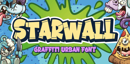 Hello, Are you looking for a graffiti urban font? Do you want of creating Something that stand out and inspire creativity, imagination, and endless fun? Wait no more, we will give you the best choice. Starwall a Graffiti Urban Font Starwall a Graffiti Urban Font, Inspiring from graffiti typography. This font is perfect for a design that makes it more attractive and playful. made with a very good level of aesthetics making this font suitable for book cover, poster, packging, merchandise, logotype and much more. FEATURES : Uppercase Lowercase Number Punctuation Multilingual PUA Encode Opentype
 - Antimage Retro by Rhd Studio,
$15.00 Introducing Antimage Retro, a charming and versatile Bold Retro Script Font that easily takes your designs back in time while adding a modern twist. This typeface exudes nostalgia and is perfect for a variety of creative projects, especially those with a vintage theme. Antimage Retro's timeless elegance and lots of alternative character make it a great choice for designers who want to infuse their work with a sense of the charm of the past. Feature A set of lowercase glyphs Numbers, symbols and punctuation Multilingual Support Alternatives & Ligatures
 - Magenta Diamond by Balpirick,
$15.00 Magenta Diamond - a Monoline Handwritten that's clean, elegant and perfect for a range of design projects! With its smooth, effortless lines and understated sophistication, this font is the perfect choice for those who want a modern look that's still timeless in its appeal. Crafted with precision and care, this font is incredibly versatile and can be used for a range of design projects, including logos, branding, invitations, packaging, and more. With its simple yet refined aesthetic, it's sure to make a lasting impression on anyone who sees it.
 - Le Brond by Fateh.Lab,
$20.00 Le Brond is a sporty, strong and elegant typeface, in a college style. Inspired by design styles that are currently popular, and this is the answer to every need for ideas that you will pour in this modern era, with a thick and sturdy style in each letter as if this font has a soul in it. It excels in posters, social media, headlines, headlines, large format print - and anywhere else you want to get noticed. What are you waiting for get Le Brond soon. Let's play basketball!
 - Melodica by Scholtz Fonts,
$19.95 Melodica was so named because the characters dance easily across the page as music wafts across a room. The font was designed to meet the need of designers that need clarity, sensuousness, a suggestion of the oddball, and a modicum of humor. With its boldly curvy caps, and large x-height lower case characters, Melodica suggests a boldness of purpose while enjoying a well modulated delicacy of line. Use Melodica for any purpose that wants a happy, vibrant, slightly quirky yet "not too far from the norm" solution. Language support includes all European character sets.
 - Behavior Indihome by Aldedesign,
$15.00 Behavior Indihome is a font with awesome and classy taste, it has a natural touch and many ligatures. We feel this font looks classy, readable, elegant, stylish, catchy and absolutely easy to use. Behavior Indihome is the great choice for a watermark on branding, design, wedding, photography, signature, logo design, album cover, business card, quotes, and many other design projects. This font is for those who want to show something smooth and modern. You may use this font if you want to attract modern buyers. The font design seems to show that you have a passion in the business and give your love to the products and services offered to your customers. Because it is an eye-catching signature font, you can use it for a variety of purposes including wedding invitations, signature, logo, branding, poster, and many more.
 - Quick Or Dead by Vozzy,
$5.00 A vintage look layered label font named "Quick or Dead". This font was inspired by American wild west history. The family includes six styles (including effect styles), for sample look at preview. This font will good viewed on any retro design like poster, t-shirt, label, logo etc. For using effects layers: - Type your text in Regular. - Copy that and paste at the same position. - Change the style to Shadow or Texture. Alternates and catchwords: - Capital letters are different than small (look to the preview). - Several small letters have alternates (look to the preview). - For the catchwords type the word (for sample 'with'), select that and turn on 'Discretionary Ligatures' on the 'OpenType' tab. Or paste it from 'Glyphs' tab in any place on your text. This in Illustrator. In Photoshop 'Discretionary Ligatures' you can find in the menu Type - OpenType.


