10,000 search results
(0.017 seconds)
- Scripps College Old Style by Monotype,
$49.00The story of Scripps College Old Style is a heart-warming and inspiring chronicle about a young librarian, a handful of students, a wealthy grandmother, a dedicated educator -- and two eminent American type designers. The story begins in 1938, when Dorothy Drake, the newly hired librarian at Scripps College, a small women's college in southern California, became an impromptu dinner companion of the American type designer Fred Goudy. By the 1990s, the original fonts that Goudy had created for Scripps College in the 1940s had become prized -- but they were seldom-used antiques. Scripps needed digital versions of the metal fonts. This goal posed two immediate challenges: finding a designer familiar with letterpress printing who was skilled at creating digital fonts, and locating the money to commission the designer's services. The first challenge was the easiest to conquer. Sumner Stone was my first and only choice," recalls Kitty Maryatt, the current curator of the Scripps College Press. "I knew he had letterpress experience, was an accomplished calligrapher, and that his typeface designs were simply exquisite. The choice was easy."The second challenge was more difficult. It took the dedication, hard work and tenacity of Maryatt to bring the beautiful Goudy designs into the twenty-first century. While Stone was eager to begin work on the project, the college had no more money for new typeface designs in the 1990s than it did in the1930s. Years of lobbying, cajoling and letter writing were necessary to obtain the college's approval for the design project. Once she had the necessary funding, the design brief posed yet a third challenge. Goudy had provided two sizes of type to the Press: 14 point and 16 point. Which would serve as the foundation for Stone's work? In addition, the Goudy fonts were quite worn. Should Stone use printed samples as his design master, or base his work on the original Goudy renderings? The 14-point master drawings were the ultimate choice, with the stipulation that the finished fonts would provide both a seamless transition from the worn metal versions and a faithful representation of the original Goudy designs. Once the budget and design brief were established, the process of converting the original Goudy drawings into digital fonts took just a little over two months. Stone delivered finished products to Scripps in the fall of 1997. The first official use of the fonts was to set an announcement for a lecture by Stone at Scripps in February of 1998. But the story is not quite finished. Maryatt was so pleased with the new digital fonts, she wanted to share them with the graphic design community. At Stone's suggestion, she contacted Monotype Imaging with the hope that the company would add the new designs to its library. An easy decision! Now Monotype Imaging is part of the story. We are proud to announce the release of Scripps College Old Style as a Monotype Classic font. The once exclusive font of metal type is now available in digital form for designers around the world. " - Sanserata by TypeTogether,
$49.00 Dr. Gerard Unger expands the concept of Sanserata to a sans type family with Sanserata, adding specific characteristics which improve reading. Sanserata’s originality does not overtly present itself at text sizes. Rather, at those sizes, it draws upon its enormous x-height, short extenders, and articulated terminals to improve readability, especially on screens. Having articulated terminals means characters flare as they near their end, but readers likely won’t notice. What they would notice is that their ability to take in more content in a line of text is improved because the lettershapes are more defined. Articulation also makes clearer text from digital sources, where rectangular endings tend to get rounded by the emission of light from the screen. Lately there seems a whispered discontent with the lack of progress in the sans serif category. Designs can either stretch too far beyond what is accepted or be too bland to be considered new. Sanserata’s strength is in being vivid and unique without being off-putting. This bodes well for designers of paragraphs and of branding schemes since, with Sanserata’s two flavors, it is well able to capture attention or simply set the tone. Sanserata’s first voice is a generous, friendly, and even cheerful sans serif. But when using the alternate letterforms its voice becomes more businesslike, though still with nice curves, generous proportions, and a pleasant character. Sanserata comes in seven weights with matching italics, covers the Latin Extended character set, and is loaded with extras. Its OpenType features allow for the implementation of typographic niceties such as small caps, both tabular and proportional lining and oldstyle figures, ligatures, alternate characters, case-sensitive variants, and fractions. The complete Sanserata family, along with our entire catalogue, has been optimised for today’s varied screen uses. Dr Unger worked with Tom Grace on the production of Sanserata. For extended branding use with Sanserata, check out Sanserata, the contemporary, eclectic typeface drawn from roots in Romanesque Europe.
 - Pineapple Daydream by Hanoded,
$15.00 I bought a pineapple the other day, because my kids really like pineapples. Ok, ok, it may not sound like something special to you - but keep in mind that pineapples in Holland are an expensive fruit. We mostly get the canned ones (which I don’t like too much). Anyway, when I was slicing up the pineapple, I thought I should name a font after this bizarre, but tasty, fruit. And so I did. Pineapple Daydream is a handmade serif. I am not sure how to classify it, but I am sure you’ll figure that out. Comes with a plantation of diacritics.
 - Rensor S by Smartfont,
$25.00 Rensor S is minimalist font with smooth and elegant rounded edges. It has been designed with a clean, modern design aesthetic. Rensor S is perfect for poster design, ui design, mobile apps, branding and logo development, wayfinding and signage, digital art and much more.
 - Merchandising JNL by Jeff Levine,
$29.00 With some slight variation, Merchandising JNL was modeled from the lettering on a display box for Meyercord Decal letters and numbers. The phrase "make your own signs with decals" was lettered in a casual brush-like style, and is reproduced for the first time digitally.
 - Arupala Grotesk by Jetsmax Studio,
$15.00 Arupala Grotesk is a Grotesk font this versatile typeface will grab readers’ Attention. This font was inspired by a character named H. Aroepala. This font is suitable for both formal and informal events and is also suitable for various types of print and digital media.
 - Marketing Stencil by Jeff Levine,
$29.00 Vintage (circa 1960s) packaging for Parker Cartridge Pen Erasers had the product description printed in bold stencil lettering featuring a squared look with rounded corners. This design has been recreated digitally as Marketing Stencil JNL, which is available in both regular and oblique versions.
 - No Entry JNL by Jeff Levine,
$29.00 The hand lettered titles and credits from the 1958 war film “The Young Lions” command your attention with a bold block slab serif type style. This design has been digitally recreated as No Entry JNL, which is available in both regular and oblique versions.
 - P22 Folk Art by P22 Type Foundry,
$24.95 Primarily based on the work of German settlers in Pennsylvania, this collection showcases a variety of needlework and folk art styles of the early United States. Produced in conjunction with the Philadelphia Museum of Art, this set is a digital recreation of homespun Americana.
 - Musnad Serif by Sultan Fonts,
$19.99 About this font family Musnad Serif Is Old South Arabian typeface for desktop applications ,for websites, and for digital ads. Musnad font family contains two types: Rigular and bold. The font includes a design that supports Latin, Arabic, and Old South Arabian language systems.
 - Deco Wide JNL by Jeff Levine,
$29.00 A unique and stylized type design with Art Deco influence was found within the French publication “Modèles de lettres modernes par Georges Léculier” (“Models of Modern Letters by Léculier”). This lettering is now digitally available as Deco Wide JNL in both regular and oblique versions.
 - Pen Moderne JNL by Jeff Levine,
$29.00 A classic example of Art Deco lettering made with a round nib ink pen was found within the pages of “Lettering” by Harry B. Wright (circa 1950). Now available as a digital type font, Pen Moderne JNL is available in both regular and oblique versions.
 - Restauranteur JNL by Jeff Levine,
$29.00 The 1960 revised edition of Sam Welo’s “Studio Handbook – Letter and Design for Artists and Advertisers” showcased a beautiful, semi-condensed Art Deco alphabet called “Modern Gothic”. It has been digitally redrawn and is available as Restauranteur JNL in both regular and oblique versions.
 - FM Julie by FontMeister,
$19.95 ‘Julie’ was created with readability in mind, wide and with a handwritten touch. Julie gives a warm and friendly feeling to your layout. You can use these fonts to create posters, greeting cards, scrapbooks, CD labels, T-shirts, coffee mugs, digital videos websites and banners.
 - Austhind by Stringlabs Creative Studio,
$25.00 Austhind is a script font with stylish hand brush style. The Austhind font made with digital brush pen strokes that making this font look authentic and unique concept. This font is perfect for fashion brand, wedding invitation, business card, logo brand, signature, and then calligraphy.
 - Hollywood and Vine JNL by Jeff Levine,
$29.00 A condensed type design with Art Deco influences was used for titles within the February, 1938 issue of Modern Screen Magazine. The digital version is named for the famous “Tinsel Town” street intersection. Hollywood and Vine JNL is available in both regular and oblique versions.
 - SF Mada by Sultan Fonts,
$19.99 Mada is An Arabic typeface for desktop applications, for websites, and for digital ads. Mada font family contains two weights: regular and bold. The font includes a design that supports Arabic and Latin languages. Mada typeface comes with many opentype features including stylistic sets.
 - Pettiford JNL by Jeff Levine,
$29.00 Within the pages of the Pettingill & Co. (Boston) 1901-02 specimen book is Camelot Old Style – a thin stroke spurred serif typeface with traces of Art Nouveau influence. This had been redrawn digitally as Pettiford JNL, and is available in both regular and oblique versions.
 - Judo ND by Neufville Digital,
$29.60 Judo ND is a wide-point italic typeface digitized in close collaboration with Helmut Matheis in honor of his long career and loyalty to typographic beauty. It brings spontaneity and elegance to its uses, always maintaining legibility. Judo is a Trademark of BauerTypes SL
 - Lecheet by Zamjump,
$17.00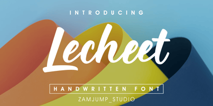 Lecheet is a handwritten script font. It has an authentic modern calligraphy look and feels bold which makes it perfect for digital branding and design. Use this font for logos, social media, wedding decorations, invitations, home decor, websites, blogs, instagram, business cards, branding and more!
 - Breite Kanzlei by URW Type Foundry,
$39.99 Ralph M. Unger, known for his preference for blackletter designs, brought this beautiful blackletter variant back to life. Based on artwork from old catalogues, he redesigned, digitally remastered and completed the character set for this typeface. Breite Kanzlei cannot be avoided by blackletter lovers!
 - Standard Poster by ParaType,
$25.00 Designed at Polygraphmash type design bureau in 1986. Based on "English" bold styles of the Ossip Lehmann type foundry (St.-Petersburg), of mid-19th century. The digital version was developed at ParaType in 1992 by Vladimir Yefimov. For use in advertising and display typography.
 - Eskander Arabic by Protype,
$40.00 Eskander the first version designed at 2018, and re-designed at 2021. Eskander is Arabic typeface with rounded edges and friendly. For web, digital applications and prints, supported languages (Arabic, Persian and Urdu). Eskander is a trademark of Protype Foundry Ltd, Design by Ibrahim Hamdi.
 - Arrevederci JNL by Jeff Levine,
$29.00 The 1954 sheet music for the song "Arrevederci Roma (Goodbye to Rome)" [from the MGM film "The Seven Hills of Rome"] was hand lettered in a medium-wide sans serif. This design is now available digitally as Arrevederci JNL in both regular and oblique versions.
 - Fancy Nouveau JNL by Jeff Levine,
$29.00 The 1907 sheet music for "Take Me Back to Dear Old Dixie" had the song title hand lettered in a decorative serif typeface with strong Art Nouveau influences. This design is now available digitally as Fancy Nouveau JNL, in both regular and oblique versions.
 - Handler by Surotype,
$22.00 Handler a signature typeface great for Logotype, Poster, Digital Lettering Arts, Clean Design, Branding Design, Signs,and more. To enable the OpenType Stylistic alternates, you need a program that supports OpenType features such as Adobe Illustrator CS, Adobe Indesign & CorelDraw X6-X7 and more.
 - Sticky Brash by PizzaDude.dk,
$15.00 Sticky Brash is my laid back kids comic book font - suitable for anything that needs a fresh and quirky attitude, and super legible at the same time. Originally handdrawn, and then manually traced digitally, in order to make those insane clean curves and lines!
 - Sign Lettering JNL by Jeff Levine,
$29.00 In the 1909 edition of the Atkinson Sign Painters’ instruction books is an extra bold sans serif alphabet and numerals called “Advertisers’ Thick and Thin Plug”. This hand lettered display face is now available digitally as Sign Lettering JNL in both regular and oblique versions.
 - Stage Show JNL by Jeff Levine,
$29.00 “9 Garcons...Un Cœur” (“9 Boys...One Heart”) is a 1948 French musical starring Edith Piaf. The hand lettered credits for the film are done in a condensed Art Deco sans alphabet, now available digitally as Stage Show JNL in both regular and oblique versions.
 - FM Secessionist by FontMeister,
$24.95 Art Nouveau typeface ‘Secessionist’ draws inspiration from Wiener Secessionist Joseph Maria Olbrich's handwriting, as seen on his architectural drawings from the 1920’s. You can use these fonts to create posters, greeting cards, scrapbooks, CD labels, T-shirts, coffee mugs, digital videos websites and banners.
 - Elegant Showcard JNL by Jeff Levine,
$29.00 "Baker’s Showcard Book" (1916) was an early 20th Century instructional book on sign lettering. One of the sample alphabets entitled “Decorative Roman” was a spurred serif, Art Nouveau design that has been recreated digitally as Elegant Showcard JNL in both regular and oblique versions.
 - Plz Script by Outside the Line,
$19.00 Plz Script is a warm and friendly script font that can be used as body copy or for headlines. Great with Architectural Lettering or Plz Print. It can also be found in the book "Indie Fonts 3, a Compendium of Digital Type from Independent Foundries".
 - LCD by ITC,
$29.99Alan Birch created the LCD font in 1981. Its name is an abbreviation of the words Liquid Crystal Display," the display technology used in digital watches and clocks the world over. LCD is a great choice when a futuristic, high-tech look is desired. - Zodor JNL by Jeff Levine,
$29.00Zodor JNL is modeled from the packaging for injection-molded plastic letters used as a teaching toy for youngsters in the early 1960s. The hand-drawn alphabet on the sides of the package was quirky enough to merit being made into a digital font. - Golf by FontForum,
$19.99 Golf was originally designed by Henry Reinhard Möller in 1935 for Schriftguss KG. Coen Hofmann redrew the capitals and then added lower case letter and Cyrillic alphabets by himself. This digital version of the original typeface is best used in sizes above 24 points.
 - Fan Magazine JNL by Jeff Levine,
$29.00 In the December, 1934 issue of Modern Screen magazine, a number of feature article headlines were hand lettered in a condensed slab serif with a relatively uniform stroke weight. This is now available digitally as Fan Magazine JNL, in both regular and oblique versions.
 - Picture Show JNL by Jeff Levine,
$29.00 An ad promoting the 1919 silent film comedy “Back Stage” starring Roscoe “Fatty” Arbuckle was hand lettered in a thick-and-thin sans style with Art Nouveau influences. This lettering is now available digitally as Picture Show JNL, in both regular and oblique versions.
 - Six Week Holiday by Kitchen Table Type Foundry,
$16.00 In Holland, all kids have a six week long school holiday during the summer months. To prevent chaos, traffic jams and other madness, the government has divided the country in three regions (North, Middle and South) and school holidays start a few days to a week and a half apart. For kids this is the best time of the year, as they can have fun for a month and a half, but for us parents this sometimes is a bit of a logistic nightmare, as we still have to work! Six Week Holiday is an ode to the chaos of summer. It is a cute handmade ‘school’ font that will put some sunshine in your designs! Comes with extensive language support.
 - Occam by Veil of Perception,
$20.00 Occam is an informal calligraphic script face. The letter forms were drawn and constructed rather than penned or brushed but reflect a definite flat pen influence. The ascenders and descenders incorporate an abstract implied loop form. Some curves that would normally be round are pointed and some transitions that would normally be sharp and pointed have been made round. A few exit strokes curve back instead of moving up and out for a little different look. This font could be put to good use as a contrasting style combined with sans and serif faces in applications such as newsletters, brochures, invitations and annual reports. It could be used for heads, subheads, pull quotes, drop caps and as a title font for covers.
 - EQuity by Nathatype,
$29.00 Are you looking for a serif font? Do you dream of creating headings that stand out and inspire creativity, imagination, and endless fun? Wait no more, we will give you the best choice. EQuity-A Serif Font EQuity is a modern, luxury, but still authentic serif font. This font is perfect for branding, logos, wedding stationery, cards, gift designs, photography, watermark, product packaging and quotes. You won't get cute, whimsical, funny logos with this font. Only high-end, upscale, sophisticated Branding Design. Our font always includes Multilingual Support to make your branding reach a global audience. Inspire your audience, clients, or guests with this beautiful, statement font. Features: Alternates Ligatures Swashes PUA Encoded Numerals and Punctuation Thank you for downloading premium fonts from Natha Studio