10,000 search results
(0.014 seconds)
- Pea Bethany's Doodles - Unknown license

- Impulsa by Just Font You,
$16.00 Impulsa is a very impulsive handwritten font. It is finished with digital touch but still keep holding on to the honest of the handwriting feeling. I believe messages with personalized handwriting vibes always deliver deeper feelings to anybody. Impulsa is an all-caps font. You can play with the uppercase and lowercase mix to get the different vibes of every letters so it looks seamlessly handwritten.
 - Weekend Date JNL by Jeff Levine,
$29.00 Sheet music from 1910 with another one of those ridiculous thirteen word titles (“I Love My Steady but I’m Crazy for My “Once-in-a-While’”) had the lengthy verbiage hand lettered in a bold serif typeface with slightly spurred serifs. This has been recreated in a digital typeface with a much shorter name: Weekend Date JNL, which is available in both regular and oblique versions.
 - Dogfight by Tigade Std,
$8.00 Dogfight is a hand-crafted brush font which created from scratch by using a brush pen on a paper. It is not too sharp with sharp edges, but rather with a softer rounded shape. It is suitable as a display font for printed or digital products. Mainly as an advertisement or video production. It comes with Regular and Italic Multilingual characters AllCaps Ligatures Alternate characters
 - Western Deco JNL by Jeff Levine,
$29.00 The cover of the 1938 sheet music for "Treasure Island March" had its title hand lettered in a rough-hewn Western style with overtones of Art Deco influence. All of the characters were "cleaned up" for the digital font, but still retain the basic designs with their irregular, eccentric look. The result is Western Deco JNL, which is available in both regular and oblique versions.
 - Reply by TOMO Fonts,
$18.00 Discover TOMO Reply, a typeface that breaks the mold, offering a fresh perspective in the realm of sans-serif fonts. Reply seamlessly blends early 20th-century roots with contemporary flair. Ideal for modern graphic design applications, from editorial masterpieces to dynamic web designs. Reply offers an unorthodox yet harmonious font family that stands out in the corporate and digital realms. Experience the fresh perspective!
 - Board Deluxe by Katatrad,
$29.00Display block letters inspired by train station LED board. Board Deluxe is a humanist version of previously release Board based on bitmap diamond cells pixel font. Original Board (released by T.26) provided rounded corners diamond shape cells deliver surprisingly nice texture when use in extra large size. Board Deluxe gives you solid headline letters that spell out the midpoint between Digital and OldStyle. - Linotype Cerny by Linotype,
$29.99Linotype Cerny is part of the Take Type Library, selected from the contestants of Linotype’s International Digital Type Design Contests of 1994 and 1997. Dutch artist Mark van Wageningen designed an alphabet consisting exclusively of capital letters. The font’s most distinguishing characteristic is its irregular outer contour, almost as though they were ripped out of paper. Linotype Cerny is intended exclusively for headlines in larger point sizes. - Attention Getters JNL by Jeff Levine,
$29.00In the days of metal type or paper clip art, spot illustrations with stock phrases were used to embellish ads and fliers in order to grab the attention of potential customers. The convenience of digital type puts art like this at a designer's fingertips. Attention Getters JNL contains fifty-two such ad phrases, certain to add a nostalgic, yet functional appeal to your printed or online piece. - Linotype Konflikt by Linotype,
$29.99Linotype Konflikt is part of the Take Type Library, which features winners of Linotype’s International Digital Type Design Contest from 1994 to 1997. Designer Stefan Pott was inspired by the conflict between the appearance of a typeface in print and on a computer screen. Out of this conflict came a font in which every character has aspects of both flowing handwriting and angular pixel-like strokes. - Bugleboy by Stiggy & Sands,
$29.00 Bugleboy started as a digitized version of "Wood Grotesk," a 1970s film typeface by LetterGraphics. It started with a bare bones character set which we added swash alternates for Capitals, Stylistic Alternates for a Unicase look, and crafted a Sans version without serifs. The Sans style lacks swashes but keeps Stylistic Alternate Unicase forms. See the last graphic for a comprehensive character map preview.
 - Gilhaus by Parker Creative,
$18.00 Inspired by the classic German Antiqua style, Gilhaus is a totally original modern serif rooted in iconic history and built for modern projects including branding, web and digital apps, large format printing, and more. While subtle serifs and soft edges bring in an element of warmth and approachability, Gilhaus is balanced out by the bold angular strokes and high contrast letterforms typically found in classic Antiqua typography.
 - Overbyte by Comicraft,
$19.00 This digitally remastered high density lettering has been bitmapped out for you by Comicraft's Eric Eng Wong. Those of you harddriving through cyberspace on the information superhighway had better zap your prams and reboot your hard disk before you're dragged into your system folder while OVERBYTE makes a major withdrawal from your atm. Do not be fooled by the name, there's nothing goofy about this typeface.
 - Holocene Typewriter by Ana's Fonts,
$16.00 Holocene Typewriter is a soft typewriter font sampled from old documents, for an authentic vintage look. Holocene Typewriter includes: a Typewriter font in Regular, Slant, Underlined and Crossed-out styles SVG fonts of the Regular and Slant styles Use this font in any designs that needs a vintage touch. Use it in long or short texts, in digital collages, branding and packaging, social media posts, logotypes, etc.
 - Satin Blues by PizzaDude.dk,
$18.00 Satin Blues is my easy going and very legible sans. Actually I drew this by hand and then traced each letter digitally, leaving a super steady, yet funky, comic font. I've made two versions: the Regular and Soft. The Soft version has rounded edges, which gives a smoother look. The font is very suitable for anything that needs a clear but wild comic look.
 - National Forest by Rachel Kick,
$12.00 National Forest is a font duo inspired by the National Park Service signs that are all made using a router bit. It was designed to put the timeless nostalgia of national park signs into a digital typeface. National Forest has a quirky, retro style and its’ natural imperfections add to its’ charm. The script and print compliment each other well for branding, display or marketing.
 - Bodoni FB by Font Bureau,
$40.00 Working at American Type Founders from a Bruce Foundry recutting, Morris Fuller Benton worked out the dramatics of the English Fat Face, and in 1928 produced Ultra Bodoni, a headline spectacular. Using Benton’s 1933 Ultra Bodoni Extra Condensed, Richard Lipton digitized Bodoni FB Bold Condensed, then took compression even further and designed Bodoni FB Bold Compressed, a real technical tour de force; FB 1992
 - Maximo by Red Rooster Collection,
$45.00 Designed by Les Usherwood. Digitally engineered by Steve Jackaman.
 - Waverly by Red Rooster Collection,
$45.00Designed by Les Usherwood. Digitally engineered by Steve Jackaman. - Sycamore by Red Rooster Collection,
$45.00Designed by Les Usherwood. Digitally engineered by Steve Jackaman. - Elias by Typemotion,
$25.00 Elias is a digital version of my own handwriting.
 - Remington Elite Typewriter by Intellecta Design,
$24.90a digitization of Remington Elite model typewriter machine alphabet - Little Paws by Tigade Std,
$25.00 Little Paws. Are you team Cat or team Dog? Doesn't matter which side you are pick to, this font is cuteness overload. It is for everyone, not only limited to Cat or Dog but also open for any Pet Lovers. This font is suitable for happy theme, cute, party, holiday, kids and many more. It is also suitable for Logo, Cards, Branding, Social Media, Youtube Thumbnail, Advertisement, Posters, any many others. To make it easier for you to design, we provide two additional font family to enhance the beauty of the design. Features: - Standard Characters (Uppercase and Lowercase) - Numerals - Punctuation - International Characters Disclaimer: Clips arts shown in the posters/images are not included. It is for promotional purpose. Enjoy designing and stay Safe! Tigadestd
 - Triplex Italic by Emigre,
$39.00 The drawings, for what is now Triplex Italic, were done in Iowa City in 1985 by John Downer. The italic was originally conceived as a companion for another typeface being drawn at the same time called Arcatext, which (like Triplex) could be described as a "humanist sans-serif" having simplified character shapes constructed mostly of geometric parts. At one stage, a certain customer was interested in Arcatext but wanted a different italic drawn for it, so the plan for the italic took another direction and the idea for this one was dropped. Five years later, Emigre decided to commission the abandoned italic as a digital typeface in three weights as companions to the Triplex Sans and Serif families designed by Zuzana Licko in early 1990. The ascenders and descenders have been shortened to match those of Triplex and the new capitals embody more of the features that distinguish the lower case, but otherwise the digital version closely follows the original drawings. See also Triplex OT.
 - LiebeKitty by LiebeFonts,
$19.90 Do you like cats? We love them! Cats do so many crazy things, we thought it was time to design a font for cat lovers and their cat-loving friends. LiebeKitty is just right for greeting cards, birthday invitations and to add pretty details to your photo album. We have spent much time on cat-watching research and included over 50 cats and kittens for a wide range of creative applications. Happy cats, mad cats, bad cats, hungry cats, egyptian walk cats, and more. Plus‚ cats love fish, just like we do. Check out LiebeFish, one of our other popular fonts. And if you're looking for a typeface that perfectly fits the hand-drawn looks of LiebeKitty, check out LiebeErika, #1 Hot New Font in October 2010!
 - Schooner Script by Three Islands Press,
$39.00 I happened to mention to the proprietor of an antique barn near here that I'd be interested in any old typewriters she happened to come across. A conversation ensued, the proprietor withdrew into a back room, and she re-emerged with an old handwritten letter, dated 18 Sept. 1825 and spanning nearly three pages. The letter, penned by Samuel Clarke, a Princeton, Mass., pastor, sought donations for the victims of an accident at sea. I thought his script unique, stylistic, and definitely something worth digitizing, so I bought the old letter and took it home. Had to come up with several uppercase characters to round out the set, but the results seem good and proper. Full release has complete character set.
 - Hombre by Monotype,
$50.99 Hombre™ is a sure-fire attention-getter for projects requiring a straight out of the old west flavor. Authentic, weather-beaten, time-ravaged, and a bit haphazard, it’s also a sure-fire attention-getter. Drawn by Thomas Oldfield and loosely based on popular typefaces of the 19th century, Hombre offers all the gun-slinging swagger and rugged style of Jesse James and his crew of outlaws. But don’t typecast this design. The Hombre typefaces are equally at home in ads, banners, headlines and subheads – in both hard copy and digital environments. Add to this, a large character set supporting most Western European and many Eastern European languages, including Cyrillic and Greek, and you can bring a rustic and timeworn look to a passel of applications.
 - Almond Script by Sudtipos,
$79.00 With ascenders and descenders gone tall and wind-bent just the right way and capitals of enough weathered artistry to touch off waves of mystique and experience, Almond Script is calligraphy gone rusty and textured like only Angel Koziupa and Alejandro Paul can make it. Scarred and wavy like an exhausted warrior, slim and delicate like a tango dancer, this typeface is a unique convergence of the rough ancient brush and the modern Latin elegance. Nine out of ten packaging design experts agree: Almond Script has nothing to do with whitening your teeth, but it certainly can brand your product like no other script can. Designed by Koziupa and digitized by Ale Paul this font cover all your packaging needs!
 - Autoray by PizzaDude.dk,
$16.00 Usually fonts that are related to computers, space, future are not handmade, but rather digital made. Autoray is 100% handmade, and I am not sure which category it fits in. It has this futuristic and intergalactic look, but at the same time the handmade details are pointing in a more grafitti and comic way. I will let you decide where to go with Autoray! I have added 5 different versions of each letter, and they automatically changes as you type - and of course, there's multilingual support - and even intergalactic gravity! :)
 - Tioga Script Pro by SoftMaker,
$15.99 SoftMaker’s Tioga Script Pro typeface was designed in 1956, but feels as fresh as if it had been created yesterday. An informal script typeface that comes in three different weights. Tioga Script Pro contains OpenType layout tables for sophisticated typography. It also comes with a huge character set that covers not only Western European languages, but also includes Central European, Baltic, Croatian, Slovene, Romanian, and Turkish characters. Case-sensitive punctuation signs for all-caps titles are included as well as many fractions, an extensive set of ligatures, and separate sets of tabular and proportional digits.
 - Binny Old Style by Monotype,
$29.99Binny Old Style is based on type designs originally cut in Scotland about 1863. Binny Old Style shows the influence of the types cut by William Caslon but was an attempt to make a modernized version by eliminating some of Caslon's more archaic features. It was cut by some American foundries at the end of the nineteenth century and by Lanston Monotype for mechanical composition, in 1908. Binny Old Style was named after Archibald Binny, a Scotsman who established a type foundry in Philadelphia in 1796. The Binny Old Style font is ideal for small point size settings in newspaper advertisements, catalogues etc. - Carnivale - Unknown license

- Kristall H MfD Pro by Elsner+Flake,
$99.00 The design of Kristall Grotesk is based on a cut by Wagner & Schmidt, Leipzig, from the 30s of the last century. The basis for the digital version of the Stiftung Werkstattmuseum für Druckkunst , Leipzig was the standard font (28p) of the manual cuts as offered by the font foundry Johannes Wagner, Ingolstadt. The implementation was deliberately created as a replica to create a faithful reproduction as a starting point for the design of other design sizes. The present Kristall Grotesk is therefore a headline design. The appearance of the typeface can be varied by a number of alternative forms of capitals, which, according to the taste of the time, contain either pointed or flat formations. Designer: Hausschnitt Johannes Wagner, Leipzig, Redesign Elsner+Flake, Hamburg Designdate: 1937, 2009 Publisher: Elsner+Flake Design Owner: Stiftung Werkstattmuseum für Druckkunst , Leipzig Original Foundry: Wagner & Schmidt, Leipzig
 - Bell MT by Monotype,
$39.00 Monotype’s hot metal Bell series from 1931 was based on original types made by the punchcutter Richard Austin for the foundry of John Bell in the 1780s. The different sizes of Monotype’s series were not all based on the same model. As type historian James Mosley wrote on Typophile, “For 18 point and above (the metal type was cut in sizes up to 36 point) Monotype’s model was a larger type [than the model used for the text sizes], the ‘Great Primer’ cut by Austin. This has greater contrast in the capitals and a flat foot to letter a.” The digital Bell closely follows the design of the hot metal 18pt version, and is therefore somewhat lighter in color than the text sizes of Monotype’s original metal face. James Mosley’s Typophile article can be found here.
 - Schoolyard Stencil JNL by Jeff Levine,
$29.00 A vintage lettering stencil manufactured by the E-Z Letter Stencil Company of Baltimore, Maryland was the model for Schoolyard Stencil JNL, available in both regular and oblique versions. Re-drawn digitally and following the actual bend of the steel rule dies used to cut the stencils, this typeface has not been cleaned up from its original design. Upon close examination, you will find straight angles and slight curves in the most unusual places. This was representative of the difficult work involved in bending steel cutting rule material and fitting it into small areas. For many years, E-Z Letter was the main competitor to the Stenso Lettering Company; the originator of the oil board stencil lettering guide complete with automatic spacing holes. Anyone over 40 will well-remember lettering their science fair posters, report covers and ring binders with these stencils.
 - Balloon - Unknown license

- Stop - Unknown license

- Marriage - Unknown license

- Svemir by Wirtu,
$120.00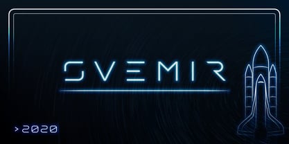 Svemir is display font. Modern, digital, futuristic, clean and simple.
 - American Advertise 008 by Intellecta Design,
$22.90a decorative caps font digitized in the american type heritage


