10,000 search results
(0.016 seconds)
- Dosty by Dhan Studio,
$18.00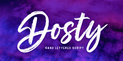 Dosty is a unique textured brush font because this brush font is made digitally. It's a contemporary approach to design, and has underlines and also several ligatures. Suitable for use in title designs such as book tittles, stationery designs, quotes, branding, logos, clothing, invitations, greeting cards, t-shirts, packaging designs, posters and more.
 - Awesome Brush by Gatype,
$10.00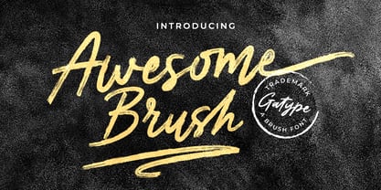 Awesome Brush is a unique textured brush font, because this brush font is made digitally. contemporary approach to design, and has underlines and also has several ligatures. Suitable for use in title designs such as tittle books, stationery designs, quotes, branding, logos, clothing, invitations, greeting cards, t-shirts, packaging designs, posters and more.
 - Kasih Putih by Tigade Std,
$15.00 Kasih Putih is a modern calligraphy font. It supports common international characters and comes with a set of alternates and ligatures. It is suitable for multiple projects from printed to digital products. It is nice to be printed on billboards, bottles or cups as well as for logos or design for apparel.
 - Allabbad by Abjad,
$5.00 Allabbad typeface was inspired by one of the hand letterings that belong to the godfather of Arab graphic design, Mohieddine Allabbad. The typeface is part of the Arsheef Alkhatt Project, a platform that revives and tributes classical Arabic lettering from different resources and presents them as affordable, digital fonts for independent designers.
 - Film Critic JNL by Jeff Levine,
$29.00 An ongoing movie review column known as the "Critic's Forum" (such as was found in the May 23, 1936 issue of The Film Daily) had a simple Art Deco monoline hand lettering of the column's name. Redrawn digitally as Film Critic JNL, this typeface is now available in both regular and oblique versions.
 - Tabloid Edition JNL by Jeff Levine,
$29.00 The headline across the October 7, 1918 edition of the UK’s Daily Mail stated: "Germany Asks the Allies for Peace". Set in extrabold sans serif lettering, it’s now available digitally as Tabloid Edition JNL in both regular and oblique versions. This is another “redrawn from the headlines” typeface from Jeff Levine Fonts.
 - Dingdangits JNL by Jeff Levine,
$29.00Stars, faces, ornaments... a little of this-and-that comprises Dingdangits JNL, the companion dingbat font to Dingits JNL and Dangits JNL. - Berling Nova by Linotype,
$29.99Swedish designer Karl-Erik Forsberg created the original Berling typeface in 1951. Owned by Verbum in Sweden, Berling was completely redesigned and released in 2004, under the name Berling Nova. Forsberg (1914–1995) is considered one of Sweden’s most masterful graphic designers, and his original Berling has come to be seen as possibly the most definitive Swedish typeface. But a redesign was necessary in order to secure that the spirit of Berling would survive in the digital age. Linotype, the distributor of the original Berling™ , provided its collection of source materials to the designers working on Berling Nova. Additionally, Akira Kobayashi — Linotype’s Type Director — lent them his advice as their project advanced. Berling Nova is available in two optical sizes: Text and Display. The original Berling was a classic Renaissance roman face, with fine terminals and sharp, beak-like serifs. If one looks at Berling’s old lead type proofs in the smaller type sizes, it is clear that these had a fuller and more readable form than in later digital versions. So, in order to help return the new Berling Nova to its original splendor, both the base forms and the serifs were softened and inflated. In the text version, the x-height has been increased a bit (by 4%), the diagonal axis is less apparent, and special glyph ranges, such as those for small caps and old style figures, have been included in the font’s character sets. The display version still has the unmistakable “Berling” character that displays Forsberg’s mastery. Berling Nova is well suited for longer text passages in books, publications, and magazines. This typeface fulfils all the demands that one can make on a legible newspaper typeface. Access to both text and display versions are important to the demanding typographer. This is the first time since the typeface was digitalized that it is possible to use it in order to create truly beautiful and functional typography in all type sizes. - Mundo Serif by Monotype,
$50.99 With designs drawn specifically for comfortable reading in everything from on-screen digital content to print in periodicals and books, Mundo Serif is ready to take on just about any project. Carl Crossgrove drew the suite of typefaces to complement his Mundo Sans family’s classic humanistic design traits – and added a subtle modern influence. Restrained stroke modulation, generous counters, commanding x-height and tall ascenders ensure that content set in Mundo Serif is both legible and easy on the eyes. While primarily designed for text copy in print and on screen, Mundo Serif becomes a powerful display type tool in the lightest and boldest weights. Headlines, navigational links and banners are naturals for this versatile collection of typefaces. Mundo Serif is a large family. Nine weights, each with an italic companion, enable precise typographic tuning. Captions, subheads, pull quotes and long-form copy can be melded to create a welcoming page of modulated text. For best results in digital environments, skipping a weight – or even two – ensures hierarchical clarity. Crossgrove did extensive testing of Mundo Serif to ensure the best possible on-screen readability. To further guarantee optimal digital imaging of the family, he gave the design generous inter-character spacing and slightly expanded intricate characters like the lowercase a and g. If the goal is diversified or multi-platform branding, look no further than Mundo Sans. The two designs harmonize with each other perfectly in weight, typographic color and proportion. Both designs benefit from large international character set that includes support for most Central European and many Eastern European languages. For a stronger contrast, pair Mundo Serif with virtually any sans serif grotesque design. Crossgrove has designed a variety of typefaces ranging from the futuristic and organic Biome™ to the warm, clean lines of the Mundo Sans. His work for Monotype also often takes Crossgrove into the realm of custom fronts for branding and non-Latin scripts.
 - Halloween Notes by PhoenixXWay,
$12.00 Every character in this font is meticulously crafted from eerie, yet beautifully haunting music notes. Here are some ways you can use this font to your benefit: Party Invitations: Create spine-chilling invitations for your Halloween party that resonates with the theme, setting the mood for a night of hauntingly good fun. Posters and Flyers: Craft attention-grabbing posters and flyers for haunted houses, Halloween events, or horror movie screenings that evoke the perfect blend of fear and fascination. Merchandise: Design eerie merchandise like t-shirts, mugs, or stickers that cater to Halloween enthusiasts and music lovers alike. Digital Media: Elevate your digital content, including social media graphics, banners, and web elements, to capture the essence of Halloween in a truly unique way. (This font only includes the 26 characters based on the English alphabet)
 - Terry Junior by Monotype,
$40.99 Terrance Weinzierl's Terry Junior typeface is a perfectly imperfect design – one that retains the marks of the brush used to create it and harks back to the craft required to hand make letterforms. Originally drawn during a Monotype Font Marathon, Weinzierl later refined the typeface digitally – adding an Inline version and designing alternates that replicate the irregularity of real-life brush scripts. “It has a natural, cheery and bold appearance,” says designer Terrance Weinzierl. “It's young, but not wild. Painted, but not sloppy. A sign painter's apprentice, perhaps.” Terry Junior is an obvious choice for designers and brands communicating with younger audiences, but would also work well on book covers, packaging, and in digital environments that need a little bit of extra playfulness. The family includes five fonts, including an Inline version.
 - Kloetzchen by TypoGraphicDesign,
$9.00 The typeface Klötzchen (german word for blocks) is designed from 2020 for the font foundry Typo Graphic Design by Manuel Viergutz | Typo Graphic Design × Peter Eckartz | kleinholzTYPO as a political statement #climatejustice The display font based on the original wood letter from Peter Eckartz (kleinholzTYPO). The technic is called Reifendreherei from the Erzgebirge. Craft Tools like Hobel and Fräsmaschine. The idea based from Gert Schaaf (Spielzeugproduzent in Wittlich, 1970s). The font started from 41 wood letters (analog) and was finally digitalize and extended to 374 glyphs (digital). Thanks to Alex Branczyk for the Klötzchen. 3 font-styles (Wood, Clean, Impact) + 1 icon-style with 374 glyphs (Adobe Latin 1) incl. 100+ decorative extras like icons, arrows, dingbats, emojis, symbols, geometric shapes (type the word #LOVE for ❤️or #SMILE for
 - Cougar by Canada Type,
$24.95It is still a mystery to us why Martin Wilke's 1968 Konzept design was ignored by the digital age. It certainly has the elements of attractive yet realistic handwriting, as well as a few very distinctive letters that make it very unique in its class. So here it comes digitally under another feline name from Canada Type. We named it Cougar because the top of the C gives off just that impression. Ditto the G's casual descender, and the gorgeous a and g. With casual letters like these, a handwriting font cannot get any more realistic. Cougar is ideal for handwritten notes, both long letters and friendly short sentences. It's also great for use in scrawl design, titling, or any environment where friendly and casual appearance is of importance. - HWT Star Ornaments by Hamilton Wood Type Collection,
$24.95 Star Ornaments are seen as a long standing companion to many wood type poster layouts. Various manufacturers managed to derive many variations of the five pointed star motif and offered them as a ubiquitous ornament option in almost all of their catalogs. Manufacturers such as Wm. H Page, Morgans & Wilcox, Tubbs Mfg. Co. and of course, Hamilton Wood Type each had their own slight variations. This digital font features almost 100 glyphs of mostly stars, but it also features a unique star border that can create boxes just like the modular offerings of the 19th century. The twist on this digital version is the inclusion of additional connection options that become a unique lettering 'kit' that can create typography or maze-like connections using a limited set of component parts.
 - Meuga by Ferry Ardana Putra,
$19.00 Introducing our sleek and modern condensed sans-serif font - Meuga. Meuga is condensed sans-serif font offers a minimalist design with its narrow width and clean lines, perfect for any branding or design project. This condensed sans-serif font is perfect for anyone looking for a clean and modern look, with its narrow width and elegant lines. Add a contemporary touch to your designs with our condensed sans-serif font, perfect for headlines and titles in digital and print design. This font is perfect for Headlines and titles, digital advertisements, brochures and flyers, infographics and data visualizations, navigation menus and labels, web designs, logotypes, t-shirts, and many more. Meuga features: A full set of uppercase Numbers and punctuation Multilingual language support PUA Encoded Characters OpenType Features Condensed Style +235 Total Glyphs
 - Ongunkan Wardruna Arabic Runes by Runic World Tamgacı,
$50.00 Wardruna Arabic is a method of writing Arabic with a Runic-like alphabet devised by Devin Lester. He imagined that if some vikings had settled in the Middle East, they might have started speaking Arabic and writing it with a version of the Runic alphabet. This particular alphabet is based on Tolkien's Cirth Runes. A band of vikings went to Baghdad after raiding in Europe. The markets in Constantinople were closed as the Turks had just sacked the city. These men had heard of the great market in Baghdad and went there to sell their wares, seeing that this land was warm and fertile they decided to stay. They ended up settling the land and taking Arab wives and having children, because of thier Northern European accent their Arabic evolved into a part-Arabic dialect of Iraqi arabic. This is why today you see a few Arabs with green eyes and dark blonde or red hair. The Arabic alphabet was too fluid for them and vikings disdained the use of paper as a persons writings could be burned, so the evolved their runes to fit Arabic.
 - 8 bit Darling by Norio Kanisawa,
$5.00 8bit darling is digital taste font. I think digital fonts are bitmap fonts generally, but dared to make digital fonts that are not bitmap fonts and made it. The name "8bit darling" borrowed a name from my favorite song. I made it consciously that it is a digital style but not so much inorganic. It contains hiragana, katakana, alphanumeric characters, some symbols. Horizontal writing only, vertical writing is not possible. Although it is slightly unique, I think choose a scene to use too much. I would be pleased if it could help you. <「エイトビットダーリン」紹介文> カクカクしたデジタル風のフォントです。 デジタル風のフォントといえばビットマップフォントかと一般的には思うのですが、敢えてビットマップフォントではないデジタル風のフォントを作りたいと思って作りました。 「エイトビットダーリン」という名前は私の好きな曲から名前を拝借しました。 デジタル風ではあるけれどもあまり無機質にならないように、と意識して作りました。 収録文字はひらがな、カタカナ、英数字、一部記号です。横書き専用、縦書きはできません。 ちょっと個性的ですがあまり使う場面を選ばないかと思います。 みなさまのお役に立てれば幸いです。 <スタイルカテゴリー> 角ゴシック
 - Journal Sans New by ParaType,
$40.00 The Journal Sans typeface was developed in the Type Design Department of SPA of Printing Machinery in Moscow in 1940–1956 by the group of designers under Anatoly Schukin. It was based on Erbar Grotesk by Jacob Erbar and Metro Sans by William A. Dwiggins, the geometric sans-serifs of the 1920s with the pronounced industrial spirit. Journal Sans, Rublenaya (Sans-Serif), and Textbook typefaces were the main Soviet sans-serifs. So no wonder that it was digitized quite early, in the first half of 1990s. Until recently, Journal Sans consisted of three faces and retained all the problems of early digitization, such as inaccurate curves or side-bearings copied straight from metal-type version. The years of 2013 and 2014 made «irregular» geometric sans-serifs trendy, and that fact affected Journal Sans. In the old version curves were corrected and the character set was expanded by Olexa Volochay. In the new release, besides minor improvements, a substantial work has been carried out to make the old typeface work better in digital typography and contemporary design practice. Maria Selezeneva significantly worked over the design of some glyphs, expanded the character set, added some alternatives, completely changed the side-bearings and kerning. Also, the Journal Sans New has several new faces, such as true italic (the older font had slanted version for the italic), an Inline face based on the Bold, and the Display face with proportions close to the original Erbar Grotesk. The new version of Journal Sans, while keeping all peculiarities and the industrial spirit of 1920s-1950s, is indeed fully adapted to the modern digital reality. It can be useful either for bringing historical spirit into design or for modern and trendy typography, both in print and on screen. Designed by Maria Selezeneva with the participation of Alexandra Korolkova. Released by ParaType in 2014.
 - Mas dAsil by ParaType,
$25.00 The typeface was designed for ParaType in 2002 by Dmitry Kirsanov. Based on the Mesolithic images on stones were discovered in a prehistoric cave of Mas d’Asil, France. There is a great number of hypotheses explaining the function of the mysterious stones. They have been considered as vessels of souls, computation tools, fortune-telling and magic symbols, relics of prehistoric writing system.
 - Black Gold VP by VP Creative Shop,
$15.00 Black Gold is sophisticated typeface with tons of alternate glyphs, ornaments and multilingual support. It's a very versatile font that works great in large and small sizes. Black Gold is perfect for branding projects, home-ware designs, product packaging, magazine headers - or simply as a stylish text overlay to any background image. Feel free to contact me if you have any questions!
 - Queenlery by Letterara,
$21.00 Queenlery is an elegant, wavy, and delicate sans serif font. It features a classy look that can be used for logos, branding, poster, advertising, promotion, invitations, stationery, wedding designs, social media posts, and much more! Have fun with this cool font and explore its endless variations. This font is PUA encoded which means you can access all of the glyphs.
 - Inlove by Sudtipos,
$29.00 Ideal for magazines, posters or flyers, Inlove is a modern take of Ariel Di Lisio’s passion for geometric and very contrasted typefaces. Because the strong influence over his work, Ariel was invited during 2009 to be part of the Herb Lubalin Exhibition at New York. Designed by Ariel Di Lisio and digitized by Ale Paul.
 - Roasted Lemon by Balpirick,
$15.00 Roasted Lemon is a Handbrushed Font. Whether you’re using it for crafts, digital design, presentations, or making greeting cards, this font has the potential to become your favorite go-to font, no matter the occasion! This font only has allcaps letters. - also multilingual support Enjoy the font! Feel free to comment or feedback! Thank you!
 - Agmena by Linotype,
$40.99 Created by Jovica Veljović, the Agmena typeface family is a fine melding of digital technology and beautifully crafted Renaissance fonts. This typeface makes skillful use of proportion, form and spacing rather in the way that a practiced storyteller varies the timbre of his voice and deftly inserts longer pauses to bring his tale alive.
 - Linotype Marcu San by Linotype,
$29.99Marcu San is part of the Take Type Library, which features the winners of Linotype’s International Digital Type Design Contest. Designer Markus McCallion designed his sans serif font with unusual forms based on circles and circle fragments. Legibility is thus decreased for the sake of a unique look and a variety of design possibilities. - Nouveau Thin JNL by Jeff Levine,
$29.00 A condensed, light face spurred serif alphabet was shown on an antique catalog page from Spon & Chamberlain Publishers as “French”. The catalog likely sold tools and dies to stonecutters for making inscriptions in marble, granite and so forth. This elegant design is available digitally as Nouveau Thin JNL in both regular and oblique versions.
 - Bamberger by Fontimonim,
$39.00 A bold, vivacious and rough font that includes six weights for widespread use. Bamberger balances the eccentricity of hand-drawn letters with the stability and readability of a basic and neutral sans font. This combination radiates warmth and boldness appeal. It works great on packaging, viral campaigns, restaurant menus, children's books and digital applications.
 - Lektocy by Andreas Lang,
$50.00 Are you looking for an elegant font for digital use? Then this trendy Lektocy font is just right for you! The modern font is perfect for graphic design, flyers, web design, book covers, greeting cards, print on demand, posters, banners or business cards and much more that can be filled with a luxurious text.
 - Wood Serif Poster JNL by Jeff Levine,
$29.00 A type foundry example showcasing some letters from a narrow slab serif wood type design served as the inspiration for Wood Serif Poster JNL. This condensed typeface is available in both regular and oblique versions, and digitally recreates the kind of lettering found on flyers, broadsides and newspaper headlines of the mid-to-late 1800s.
 - Fox by profonts,
$41.99 Fox was originally designed by W. Rebhuhn for the former German Genzsch & Heyse foundry. In reminiscence of the good old times, Ralph M. Unger redrew and digitally remastered this font in 2007. His work is based on artwork taken from old font catalogues. Fox is a very lively script, quite typical for the 50s
 - Tory by Matteson Typographics,
$19.95 Frederic Goudy designed Tory in the spirit of the ‘lettres batarde’ found Geoffry Tory’s Champ Fleury. He was looking to create a romantic type for which to typeset the book Auccasin et Nicolette. It was one of Goudy’s favorite typefaces of his own creation and it is digitized by Steve Matteson to preserve that legacy.
 - Spaghetti Bolognese by Comics Font Store,
$14.00 SPAGHETTI BOLOGNESE is a versatile, discreetly smooth and slightly childlike font, reminiscent of handwriting. It is ideal for authorial and commercial comics and has a lowercase version. The stroke features little modulation, with low or no contrast and is made with a digital brush. The height of the lowercase makes it highly legible and clear.
 - Apprentice Signwriter JNL by Jeff Levine,
$29.00 Inside the book “New Zanerian Alphabets” (1900) by C.P. Zaner is a set of thin monoline letters and numbers along with many chamfered characters offered as alternates to the main design. This simple, but effective type style has been redrawn digitally and is now available as Apprentice Signwriter JNL in both regular and oblique versions.
 - Aftika Soft by Graphite,
$18.00 Aftika Soft is the soft edged version of Aftika type family. It is a clean geometric sans serif family of seven weights. Characterised by a prominent x-height, it is well suited for advertising, packaging, editorial and publishing, logos, branding, posters, billboards, signage as well as for small text for print or digital screens.
 - Sungent by Alexey Makarov,
$16.00 This font was inspired by the mountains of Altay. Soft lines and a little asymmetry add a natural touch to Sungent. This font will help add authenticity and personality to your digital work. Contains over 1500 kerning pairs. Language support: Contains full set of Latin alphabet, including diacritical marks for European languages and Cyrillic alphabets.
 - French Slab Serif JNL by Jeff Levine,
$29.00 Another example of 1930s French Art Deco lettering from the 1934 publication L'Art du Tracé Rationnel de la Lettre (which roughly translates to “The Rational Path Art of the Letter”) resulted in the digital typeface French Slab Serif JNL. This bold and slightly eccentric slab serif design is available in both regular and oblique versions.
 - Maximillian CT by CastleType,
$19.00 Another one of those faces that caught my eye in one of my art deco type books, and I wanted it. After I finished the face, I noticed that there is a more clean-cut version of this face in digital format, but my version retains more of the funkiness of the original drawings.
 - Circensis by RMU,
$35.00 Picking up a concept of Fritz Richter, Circensis is the realization of an adorned diplay font which had not been hitherto available, neither as a hot-metal font nor digitally. It is a great and legible font for circus and variety ads and posters, as well as for films, cafés, ice-cream parlors etc.
 - Free Form Retro JNL by Jeff Levine,
$29.00 The titles and credits from the 1960 French film “Le Passage Du Rhin” (English release title: “Tomorrow is My Turn”)” are hand made in a free form bold alphabet resembling both cut paper and quickly sketched lettering. This avant garde style inspired the digital type revival, which is available in both regular and oblique versions.
 - Free Form Showcard JNL by Jeff Levine,
$29.00 One of the examples in the 1916 publication “Baker’s Showcard Book” [an early 20th Century instructional book on sign lettering] was simply called “Plain Poster”. Somewhat Art Nouveau in style, but with many ‘nonconforming’ character shapes and widths, this novelty design is available digitally as Free Form Showcard JNL in both regular and oblique versions.