10,000 search results
(0.027 seconds)
- Ebony by TypeTogether,
$35.00 Some typefaces need time to ripen; Burian and Scaglione made the first sketches for Ebony back in 2008, but it took a few years of maturing in a drawer to be developed into a multi-functional type family. While keeping in tune with TypeTogether’s focus on complex typographic structures needed for magazine, newspapers and books —whether printed or digital—, Ebony goes far beyond editorial use and promises great performance in branding and advertising. The range of dark weights with taut and powerful curves can boost any headline, while the lighter styles create an approachable and clean feel in blocks of continuous text. Ebony does not fall short on aiding legibility either; letterforms have a distinct direction of ductus and features like the top serif on ‘l’ help making them clearly distinguishable from each other. It is a type family that cleverly seeks a balance between the openness and legibility of humanist sans serifs and the striking and more regularised character of grotesques. The letter-shapes feature generous counters and open terminals with crisp angles, and daringly grow both in colour and width as the fonts get bolder. Infused with this strength, Ebony also shows a quirky side in some of her shapes; the vertical fractions, the at-symbol, the old-style numbers, … The predominantly slanted style of the italics is broken up in some letterforms, such as ‘a e f l’, that are more in line with a classic cursive appearance. This, together with a forceful italic angle, ensure a change in texture within a block of text, despite sharing the same letter weight and width with the uprights. With 18 styles, tending towards the heavier part of the weight-spectrum, this face has a powerful quality!
 - Maiandra by Galapagos,
$39.00The Maiandra family of typefaces were inspired by an early example of Oswald Cooper's hand-lettering, as seen in an advertisement for a book on home furnishing, circa 1909. Although many of Oz Cooper's letterform designs were cast in metal type, this particular one was not. Cooper's design itself was inspired by examples of letterforms he had admired in his study of Greek epigraphy (inscriptions). Cooper combined those ancient forms with the flair characteristic of design styles of his time. The result was an attractive design possessing subtle, purposeful irregularities, or "meanders" in his skilled brushwork. The Cooper design exhibits a unique warmth and harmony in text, while presenting a compelling rhythm, color and texture on the page. "Realizing the presence of this uniform warmth and readability," notes Dennis, "I decided to expand the design into a family of three weights with companion italics." The weights for the Maiandra family were selected for their versatility in usage over a broad range of output device resolutions. Indeed, "the consideration of eventual display resolutions, be they for screen or printer, provided the greatest challenge in the design of this typeface family," explains Dennis. Creating shapes that conform to the rigors of digital letterforms and modern rendering environments, without losing the unique characteristics of Oz Cooper's original design, is what Dennis has accomplished with his tribute to this great designer of the past. Maiandra, whose name derives from the Greek 'maiandros', meaning 'meander,' is intended for extended text use, as well as for informal subject matter, such as business correspondence, brochures and broadsides. "An example of a good use for Maiandra," notes Dennis, "is in printed matter relating to the turn-of-the-century art period known as the Arts and Crafts Movement. It can stand alone or be used with designs that complement its shape and color." - Origami by Monotype,
$29.99In spite of its angular appearance, Origami is composed almost exclusively of curves. Designer Carl Crossgrove derived the typeface from experiments in designing a low resolution type. The resulting face is reminiscent of Eastern European expressionist designers such as Oldrich Menhart and Vojtech Preissig. It is paired with an equally angular chancery italic. Origami works effectively for short blocks of text or at display sizes, while the capitals are especially suitable for titles. - Fractul by Adam Ladd,
$25.00 Fractul is a geometric sans with architectural qualities. Built from the Konnect family, this typeface introduces even more unique and display oriented design details, which you'll see in characters like a, f, g, t, y, etc. where certain strokes have been straightened for an angular and modern appearance. Also included is Fractul that takes the angular design further by styling characters like m, n, u, etc. to be rectangular and avant garde.
 - Stoan by Scholtz Fonts,
$7.00Stoan is a rough, textured grunge font, based on the popular Spaza. Its characters are irregular and funky, with edges that disappear into the distance. - That by Suomi,
$30.00 This is That: a family of four weights with roman and true italics, and also with chiselled medium weight, and Irregular variant for, well, variety.
 - Drakoni Sans by Mans Greback,
$59.00 Drakoni Sans is a bold and rounded font that exudes a strict and angular aesthetic. Its clean lines and subtle curves give it a humanist touch, making it perfect for a wide range of designs. Designed with a vision of comic book headlines, Drakoni Sans is both playful and professional. Its bold and powerful presence commands attention, while its rounded edges and angled cuts add a touch of personality and charm. Available in four styles - Regular, Italic, Bold, and Bold Italic - Drakoni Sans offers versatility and flexibility for any project. Its clean and clear letterforms make it ideal for logos, headlines, and other display purposes. Whether you're looking to add a touch of softness to your designs or to create a bold and commanding presence, Drakoni Sans is the font for you. The font is built with advanced OpenType functionality and has a guaranteed top-notch quality, containing stylistic and contextual alternates, ligatures and more features; all to give you full control and customizability. It has extensive lingual support, covering all Latin-based languages, from Northern Europe to South Africa, from America to South-East Asia. It contains all characters and symbols you'll ever need, including all punctuation and numbers.
 - Nuit by Eurotypo,
$28.00 Nuit, a delightfully handwritten family font with strong character designed by Carine de Wandeleer. Its slight bounce and intentional irregularity, gives your words a wonderful flow. The fatness and thinness of their strokes give an impressive harmony. This new font family includes Regular, Italic, Bold and Bold Italic. It has OpenType features such as Stylistics alternates, Swashes, Ligatures, up to four Stylistic sets by letter, initial and terminal forms in upper and lower, ornaments that allow you to mix and match pairs of letters and a Central European language support to fit your design. This OpenType features may only be accessible via OpenType-aware applications, or the Character Map to view and copy any of the extra characters to paste into your favorite text editor/app. This will help your creativity and make it easier to make expressive and elegant your typographic work. Also with Nuit it is possible to write all in capitals. Nuit looks lovely on wedding invitations, greeting cards, logos, posters, labels, t-shirt design, logos, business-cards and is perfect for using in ink or watercolor based designs, fashion, magazines, food packaging and menus, book covers and whatever your imagination holds! Nuit was made to make your project more beautiful and attractive.
 - Hex Braille by Echopraxium,
$5.62 The purpose of this monospace font is to display braille in an original although rather steganographic way. Its glyphs are built from a flat hexagon which can be read as 3 rows of 2 vertices (i.e. regular braille glyph grid). The initial design is illustrated by glyphs 'ç' (no dot) and 'û' (6 dots) as shown by poster 5. Glyphs are connected to each other, thus 6 connections for each hexagon (2 on left/right and 4 on top/bottom). In the final design many diagonal segments of the hexagon were removed for esthetical reason. Text is displayed not as a honeycomb but as a lattice instead which mixes hexagons, squares and "irregular convex octagons" (mostly unclosed), the design favored squares over octagons. The whole slightly resembling a PCB. Text can be framed with 3 sets of Frame glyphs (as shown in Poster 4): Octagonal: { €, °, £, µ, §, ¥, ~, ¢ } which can be mixed with Rectangular High Rectangular Low: { è, é, ê, ï, î, à, â, ä } Rectangular High: { Â, ù, Ä, Ê, Ë, ô, õ, ë } which can be mixed with Octagonal NB: When using Frame glyphs, it is advised to show Pilcrow (¶) and Non Breaking Space, which are replaced by empty shapes (e.g. in Microsoft Word, use CTRL+8 or use [¶] button in the ribbon).
 - Austral Slab by Antipixel,
$15.00 Austral Slab is a hand-drawn layered font designed by Antipixel, with unique textures & styles that combine giving your work a distinctive impression. This font comes in three weights, Regular, Light & Thin, with irregular outlines and uneven/crooked strokes, giving your work more personality and making it exclusive and powerful. For this same reason it can be used in a vast variety of projects, such as logos & branding, stationery, book covers, magazine design, clothing prints & tags, packaging, animated videos, and many more! Austral Slab has three sets of alphabets in uppercase and lowercase to avoid repeating the same character pattern, and giving the font a more natural handwritten feel. This is included in the Open-Type Contextual Alternates, which applies an automatic substitution of glyphs as long as the Open-Type features are activated. Also, Austral Slab offers other Open-Type features such as Stylistic Alternates, Ligatures, Discretionary Ligatures, Fractions, Superscript, Subscript, Denominator, Numerator, Scientific Inferiors & Kerning. This font has a very large glyph coverage and can be used in a wide range of languages, including English, Spanish, Italian, French, German, Polish, Czech, Vietnamese, Finnish, Icelandic, among many others. The style Maplines Thin is offered Free for commercial & personal use!
 - 360 by Wilton Foundry,
$29.00Distorted fonts are great but are mostly not very practical - 360 is an attempt to create a simple distorted font that can be used far beyond a few logos or headlines. Each 360 character averages roughly half the number of sharp angles of a regular sans serif. This gives it an unusually fresh and timeless appeal and creates a dynamic presence across body text that is very legible and compact without looking overly condensed. 360 was chosen as a name because it can be used as an everyday font, all year round, and because 360 has so many unusual angles that don't conform to normal font conventions. 360 also happens to be a cool number: 360 makes a highly composite number. 360 is also a superior highly composite number and a colossally abundant number. A circle is divided into 360 degrees for the purpose of angular measurement. 360° is also called round angle. 360 is a convenient standard since, 360 being highly composite, it allows a circle to be divided into equal segments with each segment measured in integer degrees rather than fractional degrees. 360 is the sum of a twin prime (179 + 181). A year is roughly calculated as 360 days. - Burgues Script by Sudtipos,
$99.00 Burgues Script is an ode to the late 19th century American calligrapher Louis Madarasz, whose legendary pen has inspired schools of penmanship for over 100 years. His talent has caused some people to call him “the most skillful penman the world has ever known.” I use the word ‘ode’ in a colloquially ambitious manner. If I was an actual poet, my words would be about things I desire but cannot attain, objects of utter beauty that make me wallow in humility, or people of enormous talent who look down at me from the clouds of genius. But I don’t write poems. My work consists of letters drawn to fit together, that become an element of someone’s visual poetry. I am the poet’s assistant, so to speak. Once in a while, the assistant persists on what the subject of the poem will be. And occasionally, the poet gives in to the persistence. I hope you, visual poet, find my persistence justified in this case. The two main sources for Burgues were the calligraphy examples shown in Zaner Bloser’s The Secret of the Skill of Madarasz: His Philosophy and Penmanship Masterpieces, and C. W. Jones’s Lessons in Advanced Engraver’s Script Penmanship by L. Madarasz. These two references were the cornerstone for the concept I was trying to work with. I did have to change many of the letters in order to be able to produce digital calligraphy that can flow flexibly and offered the user a variety of options, while maintaining its attractive appearance. To this end, many ligatures and swashes were made, as well as full flourished sets of letters for use at the beginnings or endings of words and sentences. All of this has been tied together with OpenType and tested thoroughly within today’s standard design and desktop publishing software. After working with digital scripts for so long, at one point I thought that Burgues Script would become a bit of a chore to complete. I also thought that, like with most other scripts, the process would regularize itself after a while and be reduced to a mechanical habit. Surprisingly, and fortunately for me, this did not happen. The past holds as many surprises as the future. Madarasz’s method of penmanship was fascinating and challenging to translate into the strict, mathematically oriented language of the computer. It seems that the extremely high contrast of the forms, coupled with the required flow and connectivity of such lettering, will always be hard work for any visual artist to produce, even with the aide of a powerful machine. I can only imagine what steady nerves and discipline Madarasz must have had to be able to produce fully flourished and sublimely connected words and sentences on a whim. When I think of Madarasz producing a flourished calligraphic logotype in a few seconds, and try to reconcile that with the timelines of my or my colleagues’ work in identity and packaging design, the mind reels. Such blinding talent from over a hundred years ago. Burgues is the Spanish word for Bourgeois. In the end, I hope Burgues Script will serve you well when a flourished word or sentence is required for a design project. One of the wonders of the computer age is the ability to visually conjure up the past, serving both the present and the future. With Burgues, you have a piece of “the most skillful penman the world has ever known,” at your service. Burgues received important awards such as a Certificate of Excellence TDC2 2008 and a Certificate of Excellence at the Bienal Tipos Latinos 2008.
 - Miedinger by Canada Type,
$24.95 Helvetica’s 50-year anniversary celebrations in 2007 were overwhelming and contagious. We saw the movie. Twice. We bought the shirts and the buttons. We dug out the homage books and re-read the hate articles. We mourned the fading non-color of an old black shirt proudly exclaiming that “HELVETICA IS NOT AN ADOBE FONT”. We took part in long conversations discussing the merits of the Swiss classic, that most sacred of typographic dreamboats, outlasting its builder and tenants to go on alone and saturate the world with the fundamental truth of its perfect logarithm. We swooned again over its subtleties (“Ah, that mermaid of an R!”). We rehashed decades-old debates about “Hakzidenz,” “improvement in mind” and “less is more.” We dutifully cursed every single one of Helvetica’s knockoffs. We breathed deeply and closed our eyes on perfect Shakti Gawain-style visualizations of David Carson hack'n'slashing Arial — using a Swiss Army knife, no less — with all the infernal post-brutality of his creative disturbance and disturbed creativity. We then sailed without hesitation into the absurdities of analyzing Helvetica’s role in globalization and upcoming world blandness (China beware! Helvetica will invade you as silently and transparently as a sheet of rice paper!). And at the end of a perfect celebratory day, we positively affirmed à la Shakti, and solemnly whispered the energy of our affirmation unto the universal mind: “We appreciate Helvetica for getting us this far. We are now ready for release and await the arrival of the next head snatcher.” The great hype of Swisspalooza '07 prompted a look at Max Miedinger, the designer of Neue Haas Grotesk (later renamed to Helvetica). Surprisingly, what little biographical information available about Miedinger indicates that he was a typography consultant and type sales rep for the Haas foundry until 1956, after which time he was a freelance graphic designer — rather than the full-time type designer most Helvetica enthusiasts presume him to have been. It was under that freelance capacity that he was commissioned to design the regular and bold weights of Neue Haas Grotesk typeface. His role in designing Helvetica was never really trumpeted until long after the typeface attained global popularity. And, again surprisingly, Miedinger designed two more typefaces that seem to have been lost to the dust of film type history. One is called Pro Arte (1954), a very condensed Playbill-like slab serif that is similar to many of its genre. The other, made in 1964, is much more interesting. Its original name was Horizontal. Here it is, lest it becomes a Haas-been, presented to you in digital form by Canada Type under the name of its original designer, Miedinger, the Helvetica King. The original film face was a simple set of bold, panoramically wide caps and figures that give off a first impression of being an ultra wide Gothic incarnation of Microgramma. Upon a second look, they are clearly more than that. This face is a quirky, very non-Akzidental take on the vernacular, mostly an exercise in geometric modularity, but also includes some unconventional solutions to typical problems (like thinning the midline strokes across the board to minimize clogging in three-storey forms). This digital version introduces four new weights, ranging from Thin to Medium, alongside the bold original. The Miedinger package comes in all popular font formats, and supports Western, Central and Eastern European languages, as well as Esperanto, Maltese, Turkish and Celtic/Welsh. A few counter-less alternates are included in the fonts.
 - Zentenar Fraktur - Unknown license

- Nouveau Showcard JNL by Jeff Levine,
$29.00 The 1920 song “Noah’s Wife Lived a Wonderful Life (‘Cause Noah Had to Stay Home)” is another example of one of those overly-worded song titles from early 20th Century composers. What’s more important for type enthusiasts is that the title was hand lettered with a round nib pen in a slightly ragged Art Nouveau style. Cleaning up the ragged design, the end result became Nouveau Showcard JNL, which is available in both regular and oblique versions.
 - San Jose by Graffiti Fonts,
$19.99 The San Jose type family provides an array of variants representing a simplified, bay area slant on traditional Chicano American street scripts. The styles in this set can be used in all caps for the most authentic appearance or in a more typographically traditional small caps format. This set also includes latin supplement support and a robust character set in six styles. 3 Stroke variants: Regular, Rough & Bold each have a leaned back, traditional slant variant.
 - MC Rilego by Maulana Creative,
$17.00 Rilego is a semi monospaced with serif font. Regular stroke, fun character with a bit of ligatures and alternates. To give you an extra creative work. Rilego font support multilingual more than 100+ language. This font is good for logo design, Social media, Movie Titles, Books Titles, a short text even a long text letter and good for your secondary text font with script or serif. Make a stunning work with Rilego font. Cheers, Maulana Creative
 - Silta The Farming by Alcode,
$15.00 Silta The Farming come with Regular style, it will make this typeface can be used in all design projects and works perfectly for pairing with Display typeface or script fonts, Headlines, Posters, Packaging, T-shirts, Postcards, Invitation, Wedding Sign, Sign Painting, Signboard, and much more. Try Silta The Farming, enjoy the richness of OpenType features and let her fun and elegant excitement make you happy and enhance your creativity! You can use this font very easily.
 - Lemon Press by Attype Studio,
$7.00 Lemon Press is display font of fresh lemon, come up with two font regular and display. It is suitable for any summer event! Lemon Press is perfect for branding, logo, invitation, stationery, social media post, product packaging, merchandise, blog design, game titles, cute style designs, Book/Cover Titles and more. Multilingual Support included for Afrikaans, Albanian, Catalan, Danish, Dutch, English, Estonian, Finnish, French, German, Icelandic, Italian, Norwegian, Portuguese, Spanish, Swedish, Zulu. Hope you enjoy with our font! Attype Studio
 - Scansky by Satori TF,
$20.80 Scansky is a carefully crafted contemporary modern sans serif typeface. It comes with 28 fonts, regular and condensed sub-families, and matching italics. Scansky was designed to give a distinct, corporative look to your artwork, suited for signage, web, and corporate print material. It is equipped with an extended character set to support Central, Eastern and Western European languages. And the good news is that the SemiBold weights are free of charge so you can try it. :)
 - Jekatep by ActiveSphere,
$30.00 Jekatep is a sans-serif display font and works best in text and display applications, such as posters, headline, magazine, logos, titles, product branding, corporate branding and publishing. Jekatep font has three weights; light, regular, and bold, each available in italic, making a total of six styles. Each style has a full upper and lower-case, accents, punctuation and a selection of monetary symbols. Currently Available for Mac and PC, in Open Type, PostScript or TrueType.
 - Testimoney by Maulana Creative,
$11.00 Testimoney is a Fancy Signature script font. With Regular Contrast stroke, slanted and fun character with a bit of ligatures. To give you an extra creative work. Testimoney font support multilingual more than 100+ language. This font is good for logo design, Social media, Movie Titles, Books Titles, a short text even a long text letter and good for your secondary text font with sans or serif. Make a stunning work with Testimoney font. Cheers, MaulanaCreative
 - FF Ropsen Script by FontFont,
$47.99 German type designer Jürgen Brinckmann created this script FontFont in 2001. The family contains 2 weights: Regular and Bold and is ideally suited for advertising and packaging, festive occasions, editorial and publishing as well as poster and billboards. FF Ropsen Script provides advanced typographical support with features such as ligatures, small capitals, alternate characters, and case-sensitive forms. It comes with a complete range of figure set options – oldstyle and lining figures, each in tabular and proportional widths.
 - Metch Bright by Zeenesia Studio,
$16.00 Bright Diamond - Handwritten Font Bright Diamond is a script and regular handwritten font with a simple and classy style, this font is great for your next creative projects such as watermark on photography, logo design, wedding, invitation, quotes, book cover, business card, and many other design project. From business cards to photo watermarks. We hope you enjoy the font, please feel free to comment if you have any thoughts or feedback. Thanks for purchasing and glad to help you!
 - Tape Up by Ingrimayne Type,
$9.00 The letters in TapedUp are constructed from straight pieces of what could be masking tape. The letters have a unsophisticated or unpolished quality to them. The typeface is caps-only but many of the shapes on the lower-case keys differ from those on the upper-case keys. It was formed with a template used for several letterbat fonts and also typefaces Rumpled and Tinkerer. The family has six styles: regular, bold, shadowed, oblique. bold oblique, and shadowed oblique.
 - Sweet Peanuts by Maulana Creative,
$16.00 Sweet Peanuts is a cute sweety handwritten script font. With regular clean stroke, fun character with some of ligatures. To give you an extra creative work. Sweet Peanuts font support multilingual more than 100+ language. This font is good for logo design, Social media, Movie Titles, Books Titles, a short text even a long text letter and good for your secondary text font with sans or serif. Make a stunning work with Sweet Peanuts font. Cheers, MaulanaCreative
 - Another Passion by Sarid Ezra,
$19.00 Introducing, Another Passion Script Family, make your own handwritten! Another Passion Script Family contain 4 FONTS including ligatures and underline. Also comes with italic, bold, and bold italic. Another Passion Script is a handwritten font that you can use to make a logo for branding, beautiful fashion design, or handwritten quote. Also already PUA Encoded. Foreign Languages Support: ÀÁÂÃÄÅÇÈÉÊËÌÍÎÏÐÑÒÓÔÕÖØÙÚÛÜÝßàáâãäåæçèéêëìíîïðñòóôõöøùúûüýÿ What Will You Get: Another Passion Regular Another Passion Italic Another Passion Bold Another Passion Bold Italic
 - Charles Wright by K-Type,
$20.00 Charles Wright is a full typeface in the style used for British vehicle license plates. The standard Bold weight is based on the condensed bold ‘2001’ style with an uppercase which conforms to UK registration plate specifications for character heights of 79mm and widths of 50mm. The 9 font family also includes previously unavailable Medium and Regular weights, Obliques , and a newly designed lowercase. For platemakers, the wider '1935' and lighter 'Motorcycle' fonts are also included.
 - Plastikcycle by Maulana Creative,
$12.00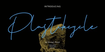 Plastikcycle is casual script font, with clean regular contrast stroke, slanted and fun character. It has Opentype features ligatures of character and alternates lowercases, To give you an extra creative work. Plastikcycle font support multilingual more than 100+ language. This font is good for logo design, Social media, Movie Titles, Books Titles, a short text even a long text letter and good for your secondary text font with sans or serif. Make a stunning work with Plastikcycle font.
 - Southavely Signature by Maulana Creative,
$14.00 Southavely is a casual signature font. With regular mono-line stroke, slanted and fun character with a bit of ligatures. To give you an extra creative work. Southavely font support multilingual more than 100+ language. This font is good for logo design, Social media, Movie Titles, Books Titles, a short text even a long text letter and good for your secondary text font with sans or serif. Make a stunning work with Southavely font. Cheers, MaulanaCreative
 - Contender by Viaction Type.Co,
$17.00 Font Contender with a stamp effect gives a vintage feel and is suitable for adding a vintage feel to your design. There are 2 regular and oblique styles, complete with multilingual characters and stalistic alternatives. It is suitable for quotes, clothing designs, vintage logos, labels, posters, packaging designs and other designs. File Include (Font Family) : - Contender - Contender Slant Features : - Uppercase. - Lowercase. - Multilingual. - Punctuation & Symbol. - Stylistic Set. Thank you for buying. I hope you enjoy and thank you.
 - Logisco by Ideabuk,
$16.00 Introducing Logisco - a sleek and versatile display font family that combines modern geometry with a retro-cool vibe. This six-font collection boasts soft, rounded corners that add a dash of playfulness to any project. Logisco Light, Regular, and Bold offer a range of weights to fit any typographic need, while the Stencil variations add a unique edge to your designs. Whether you're creating sleek logos or funky posters, Logisco has you covered with its stylish and versatile letterforms.
 - Hellowanias by Maulana Creative,
$14.00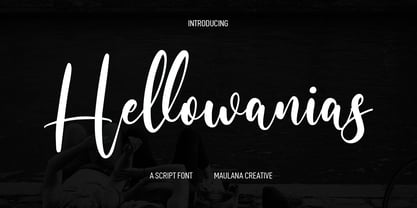 Hellowanias is a fancy handwritten script font. With regular contrast stroke, fun character with a bit of ligatures and alternates. To give you an extra creative work. Hellowanias font support multilingual more than 100+ language. This font is good for logo design, Social media, Movie Titles, Books Titles, a short text even a long text letter and good for your secondary text font with sans or serif. Make a stunning work with Hellowanias font. Cheers, Maulana Creative
 - MC Garmo by Maulana Creative,
$12.00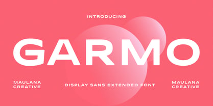 Garmo is a wide strong display sans serif font. Regular stroke, fun character with a bit of ligatures and alternates. To give you an extra creative work. Garmo font support multilingual more than 100+ language. This font is good for logo design, Social media, Movie Titles, Books Titles, a short text even a long text letter and good for your secondary text font with script or serif. Make a stunning work with Garmo font. Cheers, Maulana Creative
 - Quavo by Quatype,
$10.00 Quavo is a round sans font family, including regular and oblique font styles. Round corner of letters show the soft and friendly vibe and some letters for instance: letter a, b and d, they all have a tail at the end. It's sort of personal preference, for I want to add some ornamental elements in this font. Quavo can be applied in lots of areas. Including but not limited in titles, posters, book pages and big display canvas.
 - Winter Day by Larin Type Co,
$10.00 Winter Day is a strong and playful script with a streak and a solid version, as well as a fun handwritten sans serif in a regular and bold style. Inspired by winter beauty and Christmas mood. Fall in love with its charm and take any craft to a new level! Create templates with Winter Day, invitations, book covers, magazines, stationery, children's books, logo design, emphasize your individuality in the blog and social media and much more.
 - Pistoletto by Etewut,
$22.00 Introducing Pistoletto script. I was inspired by works of Roy Lichtenstein and Michelangelo Pistoletto. There are 4 fonts that in different combinations make interesting results: Background, Black, Highlight, Regular. Each style supports European languages. Basic latin has uppercase alternates, two lowercase alternates, many ligatures and swashes. I used for display pictures following works of Roy Lichtenstein: Pistol (1964), Engagement Ring (1961), Oh, Jeff...I Love You, Too...But... (1964), Seductive Girl, Yellow Brushstroke I (1965), Brushstroke (1965).
 - Olgoods by Maulana Creative,
$15.00 Olgoods is a Simply casual script font. With regular stroke, italic and Unique Upper and lower characters with bit of ligatures. To give you an extra creative work. Olgoods font support multilingual more than 100+ language. This font is good for logo design, Social media, Movie Titles, Books Titles, a short text even a long text letter and good for your secondary text font with sans or serif. Make a stunning work with Olgoods font. Cheers, MaulanaCreative
 - Tourist Spot JNL by Jeff Levine,
$29.00 Tourist Spot JNL is the same lettering style as Old Tijuana JNL, but with the squiggly inside lines stripped away. The original design was modeled from the hand lettered title on the cover of the 1939 sheet music for "Class Will Tell" and is available in both regular and oblique versions. Casual and playful in nature, the font can be used by itself or combined with Old Tijuana JNL for any project that promotes festive occasions.
 - Retro Packaging JNL by Jeff Levine,
$29.00 A vintage rubber stamp alphabet and star printing set had a package header with Art Deco-inspired lettering describing the product. Sold by a company called Elvin [circa late 50's-early 1960s], these Japanese-made sets were one of many distributed by independent toy importers and made in various configurations including [at times] tiny animal stamps. The type design on this particular item was the model for Retro Packaging JNL, available in both regular and oblique versions.
